


ggplot 可视化速成
Data visualization, the art of representing data through graphical elements, is an important part of any research or data analysis project. Visualization is essential in both exploratory data analysis and in demonstrating results of a study. Good visualizations can help telling the story of your data and can communicate the important messages of your analyses, since it allows us to quickly see trends and patterns, find outliers, and get insight.
数据可视化是通过图形元素表示数据的艺术,是任何研究或数据分析项目的重要组成部分。 可视化在探索性数据分析和证明研究结果中都至关重要。 良好的可视化可以帮助您讲述数据的故事,并可以传达分析的重要信息,因为它使我们能够快速查看趋势和模式,发现异常值并获得见解。
Often times, it is either not easy to find the type of visualization that best describes your data, or it is not easy to find simple tools for generation of the plots of interest. For example, visualizing trends in high-dimensional datasets with multiple dependent and independent variables (and perhaps with interactions between them) can be tedious.
通常,要么很难找到最能描述您的数据的可视化类型,要么不容易找到用于生成感兴趣的图的简单工具。 例如,在具有多个因变量和自变量(以及它们之间的相互作用)的高维数据集中趋势的可视化可能很繁琐。
In this post, I decided to introduce one of the techniques for visualization of 3D data that I found very effective. This will be helpful if you are new to R or if you have never used ggplot2 library in R. ggplot2 has several built-in function and capabilities that brings the flexibility needed for presenting complex data.
在本文中,我决定介绍一种非常有效的可视化3D数据的技术。 如果您不熟悉 R或从未使用过R中的 ggplot2库,这将很有帮助。 ggplot2具有多个内置功能,这些功能带来了呈现复杂数据所需的灵活性。
Additionally, in this blog, there will be some examples of how to play with the function settings to create publish-ready figures and save them at high resolution. You can also find all the codes in one place in my Github page.
此外,在此博客中,还将提供一些示例,说明如何使用功能设置来创建可发布的图形并以高分辨率保存它们。 您也可以在我的Github页面中的一个位置找到所有代码。
Outline:
大纲:
Part 1: Data explanation and preparation
第1部分 :数据说明和准备
Part 2: Visualize 3D data using facet_grid() function
第2部分 :使用facet_grid()函数可视化3D数据
Part 3: Visualize 3D data with other ggplot2 built-in functions
第3部分 :使用其他ggplot2内置函数可视化3D数据
Part 4: Visualize data with multiple dependent variables
第4部分 :可视化具有多个因变量的数据
第一部分:数据说明和准备 (Part1: Data explanation and preparation)
Here, I will be using an in-house dataset from a real world problem where we want to characterize noise in images of a set of subjects with respect to three key parameters set at the time of image acquisition. We won’t get into details of these parameters and for simplicity, we name them Var1, Var2, Var3. Noise in image as calculated by standard deviation and is named as SD.
在这里,我将使用来自一个现实世界问题的内部数据集,在该问题中,我们要针对在获取图像时设置的三个关键参数来表征一组对象的图像中的噪声。 我们将不涉及这些参数的细节,为简单起见,我们将其命名为Var1,Var2,Var3。 通过标准差计算出的图像噪点称为SD。
Var1: Categorical at four levels of 100, 50, 25, 10Var2: Categorical at three levels of k1, k2, k3Var3: Categorical at three levels of st0.6, st1.0, st2.0SD: Continuous in the range of (0, 500)There are 4x3x3 = 36 combinations of these parameters. Combinations of all these parameters exist in the dataset, meaning that for each subject, there exist 36 images. Each image is at a different combination of the parameter set (see table below).
这些参数有4x3x3 = 36个组合。 所有这些参数的组合存在于数据集中,这意味着对于每个对象,存在36张图像。 每个图像都是参数集的不同组合(请参见下表)。
# set csv_file name
# set working directory
# set output_path# import libraries
library(ggplot2)
library(stringr)
library(ggpubr)
Read the data and prepare data columns. An example of preparation could be data conversion: here Var1 is a categorical variable at four levels. After reading the data, we have to convert this column first into a numerical column with four levels and then sort it so that it appears in order in our plots.
读取数据并准备数据列。 准备的一个示例可能是数据转换:此处Var1是四个级别的类别变量。 读取数据后,我们必须首先将此列转换为具有四个级别的数字列,然后对其进行排序,以使其在我们的绘图中按顺序显示。
# Read data
data = read.csv(csv_file,header = TRUE)
#prepare data
data$Var1 <- as.numeric(data$Var1,levels =data$Var1)
data$Var1 <- ordered(data$Var1)
data$Parameter_Set <- factor(data$Parameter_Set)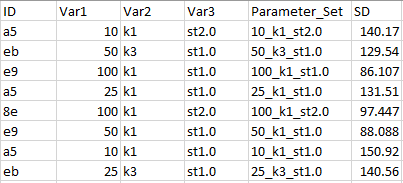
For the purpose of visualization, we will take the mean of noise over the images in each parameter set:
出于可视化的目的,我们将对每个参数集中图像的噪声平均值:
mean_SD = c()
mean_intensity = c()
Var1 = c()
Var2 = c()
Var3 = c()
for (ParamSet in levels(data$Parameter_Set)){
 data_subset = data[which(data$Parameter_Set==ParamSet),]
 mean_SD = c(mean_SD, mean(data_subset$SD))
 mean_intensity = c(mean_intensity, mean(data_subset$intensity))
 Var1 = c(Var1,str_split(ParamSet, “_”)[[1]][1])
 Var2 = c(Var2,str_split(ParamSet, “_”)[[1]][2])
 Var3 = c(Var3,str_split(ParamSet, “_”)[[1]][3])
}
Mean_DF = data.frame(Parameter_Set = levels(data$Parameter_Set),Var1 = Var1, Var2 = Var2, Var3 = Var3 ,mean_SD = mean_SD, mean_intensity = mean_intensity)
####### Prepare the Mean_DF dataframe
data = Mean_DF
data$Var3 <- factor(data$Var3)
data$Var1 <- as.numeric(data$Var1,levels =data$Var1)
data$Var1 <- ordered(data$Var1)
data$Parameter_Set <- factor(data$Parameter_Set)
第2部分:使用facet_grid()函数可视化3D数据 (Part 2: Visualize 3D data using facet_grid() function)
Let’s see the plot
让我们来看看情节
Finally, we are going to visualize the 3D data of the mean noise in images across 3 parameters! facet_grid() function in ggplot2 library is the key function that allows us to plot the dependent variable across all possible combination of multiple independent variables. ggplot2 gives the flexibility of adding various functions to change the plot’s format via ‘+’ . Below we are adding facet_grid(), geom_point(), labs(), ylim()
最后,我们将通过3个参数可视化图像中平均噪声的3D数据! ggplot2库中的facet_grid()函数是允许我们在多个自变量的所有可能组合上绘制因变量的关键函数。 ggplot2提供了添加各种功能以通过'+'更改绘图格式的灵活性。 下面我们添加facet_grid() , geom_point() , labs() , ylim()
ggplot(data, aes(y = mean_SD, x = Var1))+ geom_point(size = 3)+facet_grid(Var3 ~ Var2, scales = "free_x",space = "free")+labs(title =" SD across all parameter sets",x = "Var1 ", y= "Mean SD")+ ylim(0, 500)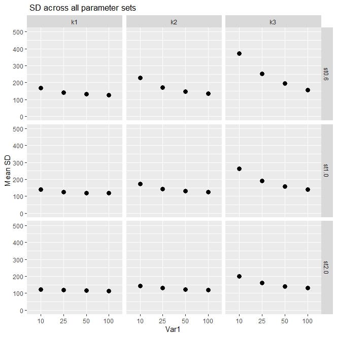
It seems that a lot is going on in this plot, so let’s go over it: we have a plot with nine blocks. Each block is one parameter set at a specific level of Var2 and Var3. (nine blocks : combination of three levels of Var2 and three levels of Var3). Var3 is shown on the rows and Var2 is shown on the columns. In each block, we have Var1 on the horizontal axis, and the dependent variable, mean_SD, on vertical axis within the range of 0–500 (determined by ylim()).
在这个情节中似乎发生了很多事情,所以让我们来看一下:我们有一个包含9个区块的情节。 每个块是在Var2和Var3的特定级别上设置的一个参数。 (九个块:三个级别的Var2和三个级别的Var3的组合)。 在行中显示Var3,在列中显示Var2。 在每个块中,我们在水平轴上有Var1,在垂直轴上有因变量mean_SD,其范围是0-500(由ylim()确定)。
The benefit of using facet_grid() function here is that as our data gets more complex and has larger number of variables, it will be very intuitive to unpack the data and visualize the trend of the dependent variable at different combinations of the independent variables. For example, here, by comparing the block on top right (k3, st0.6)with the block on bottom left (k1, st2.0) we see a clear difference. At (k1, st2.0) mean_SD is constant when Var1 changes from 10 to 100, but at (k3, st0.6), mean_SD shows a substantial variation when Var1 changes. As you can tell, this plot can show you the interactions between the independent variables and their individual impact on dependent variable.
在这里使用facet_grid()函数的好处是,随着我们的数据变得越来越复杂并且具有更多的变量,将数据拆包并以不同的独立变量组合可视化因变量的趋势将非常直观。 例如,在这里,通过比较右上角的块(k3,st0.6)和左下角的块(k1,st2.0),我们可以看到明显的区别。 当Var1从10变为100时,在(k1,st2.0)处,mean_SD不变,但是当Var1变化时,在(k3,st0.6)处,mean_SD表现出很大的变化。 如您所知,此图可以显示自变量之间的相互作用以及它们对因变量的单独影响。
If we want to only plot against two of the parameters (Var1 and Var3), the input of facet_grid will change as following:
如果只想绘制其中两个参数(Var1和Var3),则facet_grid的输入将发生如下变化:
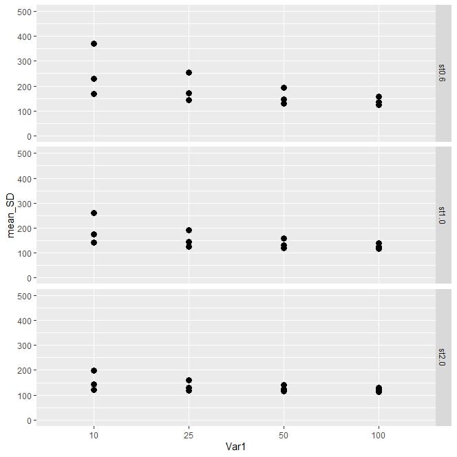
…+facet_grid(Var3 ~ . , scales = “free_x”,space = “free”)+ …in facet_grid() it is helpful if you set space and scale arguments as “free” instead of the default value of “fixed”, so that the scale of the variables and the size of the panels vary freely according to scales of each variable in row and column.
在facet_grid()中,如果将space和scale参数设置为“ free”而不是默认值“ fixed”,则很有用,这样变量的比例和面板的尺寸可以根据每个变量的比例自由变化。行和列。
If you are planning to publish your results or present at a conference you have to pay attention to your plot format fonts/sizes/colors of the fonts, colors/sizes of the points and lines, etc. Here is some help on how to make the above plot look nicer. We simply add the theme() function to play with some details from axis and the elements of the block.
如果您打算发布结果或出席会议,则必须注意绘图格式的字体/大小/字体颜色,点和线的颜色/大小等。以下是有关制作方法的帮助上面的情节看起来更好。 我们只需添加theme()函数即可播放轴和块元素的一些细节。
ggplot(data, aes(y = mean_SD, x = Var1))+
  geom_point(size = 4)+facet_grid(Var3 ~ Var2, scales = "free_x",space = "free")+labs(title =" SD across all parameter sets",x = "Var1 ", y= "Mean SD")+ ylim(0, 500)+
theme(axis.text=element_text(size=16,face= "bold"),  axis.text.x = element_text(colour = "blue3"),
axis.title.y=element_text(size=18,face="bold", colour = "black"),
axis.title.x=element_text(size=18,face="bold", colour = "blue3"),
strip.text = element_text(size=18, colour = "blue3",face="bold"))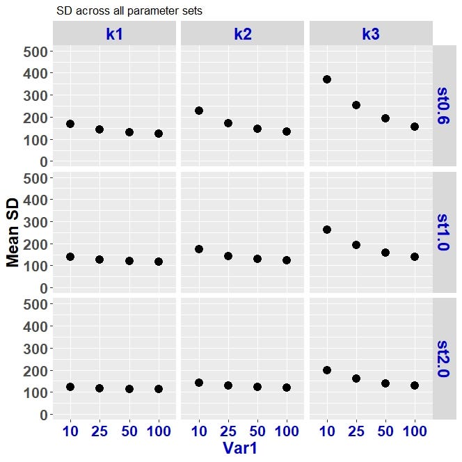
If you want to save your R plots at high resolution you can use the following piece of code.
如果要以高分辨率保存R图,可以使用以下代码。
myplot <- ggplot2(data, aes(y = mean_SD, x = Var1))+ ...tiff(mytitle, units=”in”, width=8, height=5, res=300)
myplot
dev.off()
第3部分:使用其他ggplot2内置函数可视化3D数据 (Part 3: Visualize 3D data with other ggplot2 built-in functions)
Let’s suppose we don’t want to use facet_grid():
假设我们不想使用facet_grid():
Another way of plotting a high dimensional data is just to simply assign different colors and line types to each different level of Var2 and Var3. In the following code, we assign different colors to different levels of Var2 and different line types to different levels of Var3.
绘制高维数据的另一种方法是简单地将不同的颜色和线型分配给Var2和Var3的每个不同级别。 在以下代码中,我们将不同的颜色分配给不同级别的Var2,将不同的线型分配给不同级别的Var3。
Here we will create three data frames with 3 different values of Var2. we will generate a plot for each data frame and will use ggarrange() to combine the plots into one plot.
在这里,我们将创建三个具有3个不同Var2值的数据帧。 我们将为每个数据帧生成一个图,并将使用ggarrange()将这些图组合成一个图。
in the following plot we intentionally played with the background colors and grid lines (panel.background and panel.grid as the options in the theme() function).
在下面的图中,我们有意地使用了背景颜色和网格线(panel.background和panel.grid作为theme()函数中的选项)。
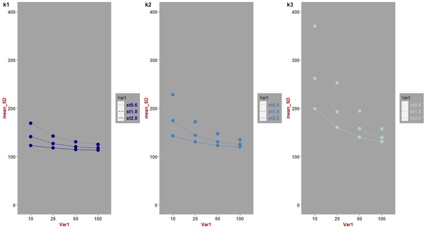
Comparing the plot above with the plot with nine blocks (via facet_grid()) we can see that each have their own cons and pros; One combines data into one diagram, while the other one demonstrates panels of the 3D data that allows for examining data individually and separately. I myself, prefer the version with panels of parameter sets.
比较上面的图和有九个图块的图(通过facet_grid()),我们可以看到每个图都有自己的优缺点。 其中一个将数据组合成一张图,而另一幅则演示了3D数据的面板,该面板允许分别和单独检查数据。 我自己更喜欢带有参数集面板的版本。
Here is the code for the plot in the above:
这是上面绘图的代码:
#separate data frames based on Var2
data_k1 = data[which(data$Var2 == “k1”),]
data_k2 = data[which(data$Var2 == “k2”),]
data_k3 = data[which(data$Var2 ==”k3"),]
## given three dataframes of : data_k1, data_k2, data_k3, we will generate 3 plots for each dataframe and then will use ggarrange() to combine them into one plot.
## we will use theme() function to play with the details of the plot format
######################
# plot each data frame
plot1 <- ggplot( data_k1, aes(x = Var1, y = mean_SD, group = Var3))+ylim(0,400)+
geom_point(color= "navyblue",size = 4)+ geom_line(color= "navyblue",aes(linetype = Var3))+
theme(legend.text = element_text(color= "navyblue",size = 13,face="bold" ))+ labs(title = "All LungRAD categories", x = "Var1", y = "SD") +
scale_linetype_manual(values=c( "dotted","longdash","solid"))+
theme(strip.text = element_text(size = 12,face="bold", colour = "red3"),
axis.text=element_text(size=12, face="bold"),
axis.title=element_text(size=12,face="bold", colour = "red3"),
panel.grid.major.y = element_blank(),
panel.grid.minor.y = element_blank(),
panel.grid.major.x = element_blank(),
panel.grid.minor.x = element_blank(),
panel.grid = element_line(colour= "gray"),
panel.background = element_rect(fill = "gray64"),
legend.background = element_rect(fill = "gray64"))
######################
plot2 <-ggplot( data_k2, aes(x = Var1, y = mean_SD, group = Var3))+ylim(0,400)+
geom_point(color= "steelblue",size = 4)+ geom_line(color= "steelblue",aes(linetype = Var3))+
theme(legend.text = element_text(color= "steelblue",size = 13,face="bold" ))+ labs(title = "All LungRAD categories", x = "Var1", y = "SD") +
scale_linetype_manual(values=c( "dotted","longdash","solid"))+
theme(strip.text = element_text(size = 12,face="bold", colour = "red3"),
axis.text=element_text(size=12, face="bold"),
axis.title=element_text(size=12,face="bold", colour = "red3"),
panel.grid.major.y = element_blank(),
panel.grid.minor.y = element_blank(),
panel.grid.major.x = element_blank(),
panel.grid.minor.x = element_blank(),
panel.grid = element_line(colour= "gray"),
panel.background = element_rect(fill = "gray64"),
legend.background = element_rect(fill = "gray64"))
######################
plot3 <-ggplot( data_k3, aes(x = Var1, y = mean_SD, group = Var3))+geom_line(data = data_k3,aes(x = Var1, y = mean_SD, linetype = Var3),colour = "lightcyan3") +
geom_point(size = 4, color = "lightcyan3",data = data_k3,aes(x = Var1, y = mean_SD)) + ylim(0,400)+
theme(legend.text= element_text(size = 13, face = "bold", color = "lightcyan3")) + labs(title = "All LungRAD categories", x = "Var1", y = "SD") +
scale_linetype_manual(values=c( "dotted","longdash","solid"))+
theme(strip.text = element_text(size = 12,face="bold", colour = "red3"),
axis.text=element_text(size=12, face="bold"),
axis.title=element_text(size=12,face="bold", colour = "red3"),
panel.grid.major.y = element_blank(),
panel.grid.minor.y = element_blank(),
panel.grid.major.x = element_blank(),
panel.grid.minor.x = element_blank(),
panel.grid = element_line(colour= "gray"),
panel.background = element_rect(fill = "gray64"),
legend.background = element_rect(fill = "gray64"))
######################
### plot using ggarrange
ggarrange(plot1,plot2,plot3,
labels = c("k1", "k2", "k3"),
ncol = 3, nrow = 1)第4部分:可视化具有多个因变量的数据 (Part 4: Visualize data with multiple dependent variables)
Let’s suppose we want to visualize the trend of our data by not only the noise in the image but also by the range of intensity values of the image. So we will now have a second dependent variable called intensity. In part one, similar to “mean_SD”, we have calculated the mean value of intensity (“mean_intensity”) across all the parameter sets.
假设我们不仅要通过图像中的噪声,而且要通过图像强度值的范围来可视化数据趋势。 因此,我们现在有了第二个因变量,称为强度。 在第一部分中,类似于“ mean_SD”,我们计算了所有参数集的强度平均值(“ mean_intensity”)。
First, let’s take a look at this simple plot between “mean_SD” and Var1 where we have shown the range of “mean_intensity” values via a color gradients (see the legend)
首先,让我们看一下“ mean_SD”和Var1之间的简单关系图,其中我们通过颜色渐变显示了“ mean_intensity”值的范围(请参见图例)
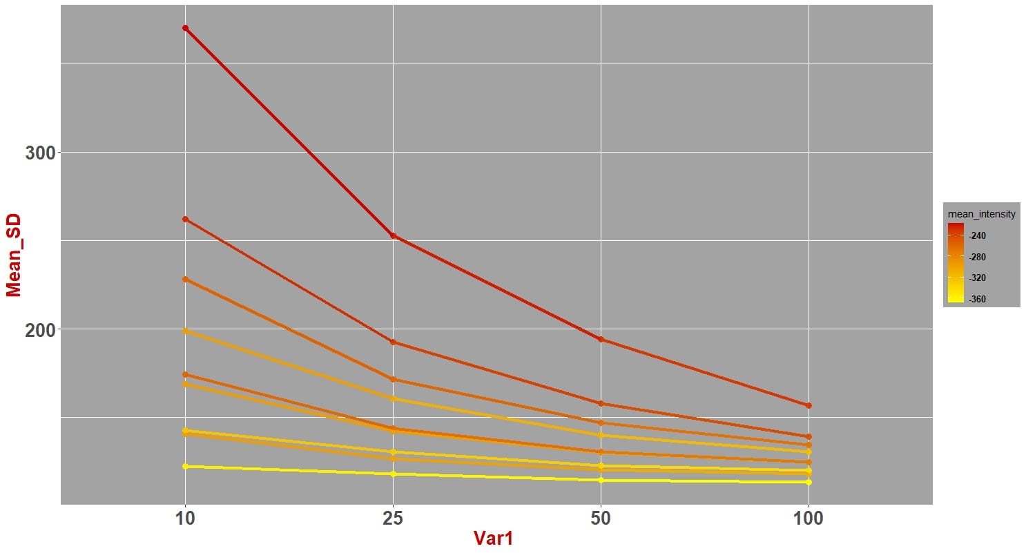
Code for the plot above:
上图的代码:
ggplot(data, aes(x = Var1, y = mean_SD , group = interaction(Var3, Var2)))+ geom_point(size = 3, aes(color = mean_intensity))+
 geom_line(lwd = 1.5, aes(color = mean_intensity))+    scale_colour_gradient(low = “yellow”, high = “red3”)+
 labs( x = “Var1 “, y = “Mean_SD”)+
 theme(strip.text = element_text(size = 20,face=”bold”, colour = “red3”),axis.text=element_text(size=20, face=”bold”),
 axis.title=element_text(size=20,face=”bold”, colour = “red3”),
 legend.text = element_text(size = 10,face=”bold” ),
 panel.grid = element_line(colour= “white”),
 panel.background = element_rect(fill = “gray64”),
 legend.background = element_rect(fill = “gray64”))
Now we can use this idea to once again generate a plot that visualizes high-dimensional data with blocks and demonstrate impact of three independent variables on two dependent variables!
现在,我们可以使用此想法再次生成一个图表,该图表以块形式可视化高维数据,并演示三个自变量对两个因变量的影响!
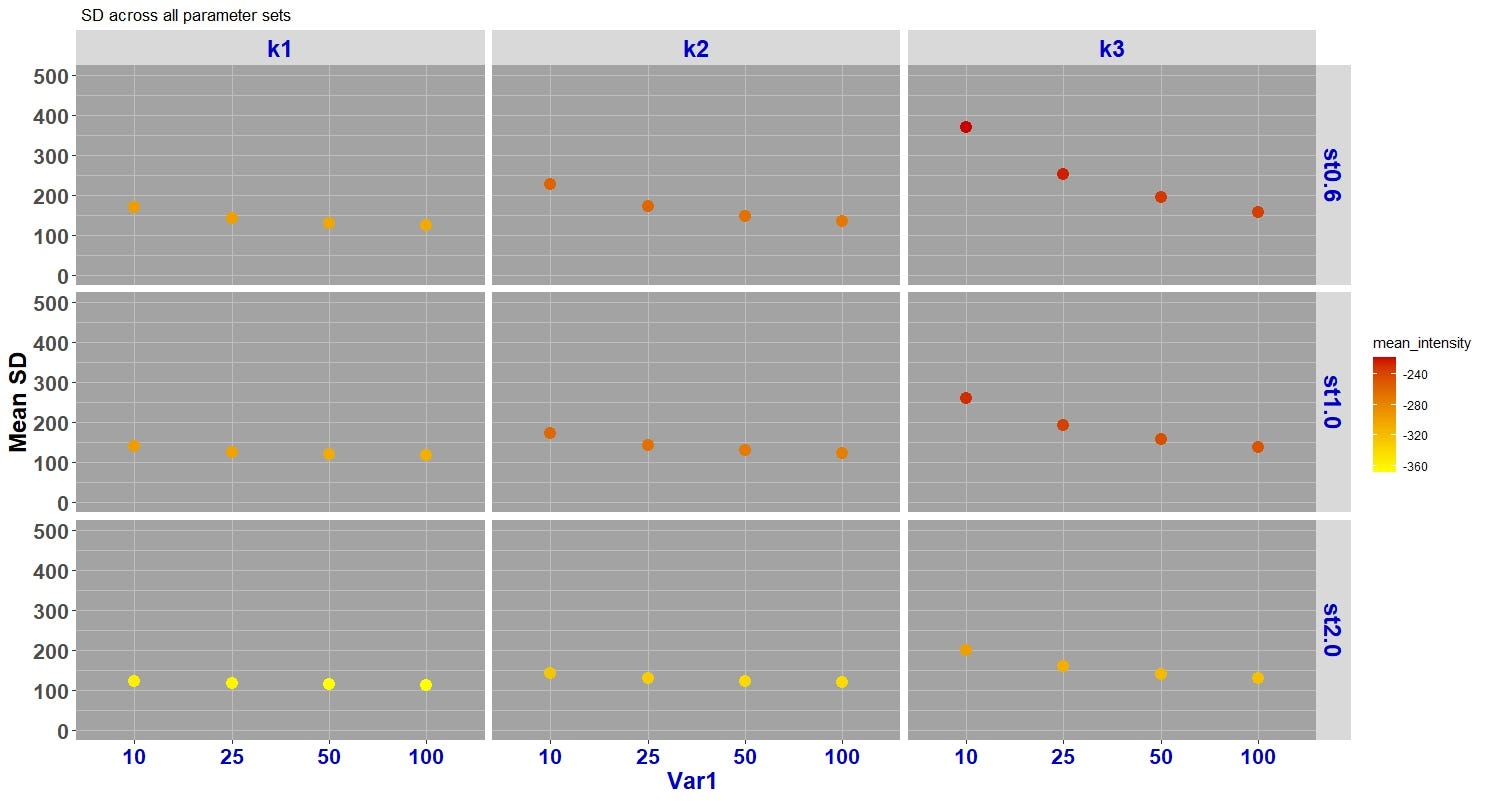
ggplot(data, aes(y = mean_SD, x = Var1))+
 geom_point(size = 4,aes(color = mean_intensity))+facet_grid(Var3 ~ Var2, scales = “free_x”,space = “free”)+ scale_colour_gradient(low = “yellow”, high = “red3”)+
 labs(title =” SD across all parameter sets”,x = “Var1 “, y= “Mean SD”)+ ylim(0, 500)+
 theme(axis.text=element_text(size=16,face= “bold”), axis.text.x = element_text(colour = “blue3”),
 axis.title.y=element_text(size=18,face=”bold”, colour = “black”),
 axis.title.x=element_text(size=18,face=”bold”, colour = “blue3”),
 strip.text = element_text(size=18, colour = “blue3”,face=”bold”),
 panel.grid = element_line(colour= “grey”),
 panel.background = element_rect(fill = “gray64”))
Clear visualization is instrumental to obtain insight from data. Understanding patterns and interactions is especially harder in high-dimensional data. R and its libraries such as ggplot2 provide a useful framework for researchers, data enthusiasts, and engineers to play with data and perform knowledge discovery.
清晰的可视化有助于从数据中获取洞察力。 在高维数据中,了解模式和交互尤其困难。 R及其诸如ggplot 2之类的库为研究人员,数据爱好者和工程师提供了一个有用的框架,使他们可以处理数据并进行知识发现。
R and ggplot2 have many more capabilities creating insightful visualizations, so I invite you to explore these tools. I hope that this brief tutorial has helped in getting familiar with a powerful plotting tool useful for data analysis.
R和ggplot2具有更多功能来创建有见地的可视化效果,因此我邀请您探索这些工具。 我希望这个简短的教程有助于熟悉用于数据分析的强大绘图工具。
Nastaran Emaminejad
纳斯塔兰·艾米纳贾德
Follow me on Twitter: @N_Emaminejad and LinkedIn: Nastaran_Emaminejad
在Twitter上关注我: @N_Emaminejad 和LinkedIn: Nastaran_Emaminejad
ggplot 可视化速成


 250
250


 被折叠的 条评论
为什么被折叠?
被折叠的 条评论
为什么被折叠?
 到【灌水乐园】发言


