


ux设计
重点 (Top highlight)
Every day, people visit online stores and leave them without making a purchase. They are simply unable to find what they need. And this relates to every e-commerce website. There can be multiple reasons for this like the lack of product or contact information, weak CTAs, problems with the checkout process, etc. Yet, very often the main reason is the poor filtering design, driving visitors away instead of delivering profits. Having analyzed the filtering design of about 30 major e-commerce websites, I can now say that even there can be room for improvement.
E极天,人们访问在线商店,让他们没有进行购买。 他们根本找不到所需的东西。 这与每个电子商务网站有关。 造成这种情况的原因可能多种多样,例如缺乏产品或联系信息,CTA薄弱,结帐流程存在问题等。然而,主要原因通常是过滤设计不佳,导致访客流失而不是带来利润。 在分析了大约30个主要电子商务网站的过滤设计之后,我现在可以说,甚至还有改进的空间。
If a website contains a large number of products (and e-commerce websites almost always do), a filtering system is a must. Filtering is useful for any online store, even without extensive lists of products. Filters are a great chance to present a variety of products, improve the UX, reach a wider audience and increase sales. Even the simple act of adding filters at all can increase a website’s conversion by 26%. Fixing issues with filters UX design can produce powerful results.
如果网站包含大量产品(而电子商务网站几乎总是如此),则必须使用过滤系统。 过滤对于任何在线商店都是有用的,即使没有大量产品列表也是如此。 过滤器是展示各种产品,改善用户体验,扩大受众范围并增加销量的绝好机会。 即使简单地添加过滤器,也可以使网站的转化率提高26% 。 解决过滤器UX设计问题可以产生强大的结果。
This article focuses on desktop filtering UX. Mobile filter design is a topic that deserves special attention and a separate write-up. One thing is certain: when developing a UX filter design, the rules for desktop and mobile can differ substantially.
本文重点介绍桌面筛选UX。 移动过滤器设计是一个值得特别注意的主题,需要单独撰写。 可以肯定的是:开发UX过滤器设计时,台式机和移动设备的规则可能会有很大不同。
Also, it’s worth noticing that this article is loosely based on the findings of the Baymard Institute. It’s probably the best place on the net for a designer to get acquainted with the basics of e-commerce filtering design.
另外,值得注意的是,本文是基于Baymard Institute的发现松散地得出的。 对于设计师来说,这可能是网上最好的地方,使他们熟悉电子商务过滤设计的基础。
为什么电子商务过滤器很重要 (Why e-commerce filters are important)
When I was a kid, I remember that most TV remotes were confusing even for adults, let alone kids.
当我还是个孩子的时候,我记得即使对于成年人来说,大多数电视遥控器也令人困惑,更不用说孩子了。
Today, modern TV remotes look different.
如今,现代电视遥控器看起来有所不同。
What’s your opinion?
你怎么看?
Too much of a good can be bad for UX. Hick’s Law illustrates this point. It’s a law of psychology that applies to the web and interface design. It states that the more choice options there are, the more time it takes for a person to select one. That is, to increase conversion, it’s necessary to reduce the number of options.
过多的好处可能对UX不利。 希克定律说明了这一点。 这是适用于网络和界面设计的心理学定律。 它指出,选择选项越多,一个人选择一个选项所花费的时间就越长。 也就是说,为了增加转换率,有必要减少选项数量。
In the ideal buyer world there is a wide choice, but no need to choose. You just get what you need right away. That is why a lot of people would rather pay an expert a pretty penny to be presented with only one, most suitable product or service.
在理想的买方世界中,有很多选择,但没有选择的余地。 您可以立即获得所需的东西。 这就是为什么很多人宁愿付给专家一个美分的费用,而只给他们一个最合适的产品或服务。
The purpose of the website filters is to give a person the opportunity to remove all that is not to the point, so that only what best suits their expectations remains. This means a more personalized experience.
网站过滤器的目的是使一个人有机会删除所有不重要的内容,从而仅保留最适合他们期望的内容。 这意味着更加个性化的体验。
In words of Nielsen Norman Group,
“Filters analyze a set of objects and eliminate any that do not match the selected criteria”.
“过滤器分析一组对象,并消除所有不符合所选条件的对象”。
If an online store offers hundreds of categories of goods, structuring the catalog alone is not enough. Adding a smart filtering system greatly improves a store’s user experience making it enjoyable and effective.
如果在线商店提供数百种商品,仅靠构造目录是不够的。 添加智能过滤系统可以极大地改善商店的用户体验,使其变得既愉快又有效。
Product filters must be functional. It’s not like they are there to reduce the apparent oversupply as such. They are needed to increase the relevance of the results. This is what a user is after. A small number of proposed options + their relevance = your aim.
产品过滤器必须正常运行。 并不是像他们那样减少明显的供过于求。 需要使用它们来增加结果的相关性。 这就是用户所追求的。 少数建议的方案及其相关性=您的目标。
Filters are also very useful for SEO. If users can easily and quickly navigate your website, Google will notice it and appreciate it and make the website more visible.
筛选器对于SEO也非常有用。 如果用户可以轻松,快速地浏览您的网站,则Google会注意到并赞赏它,并使该网站更加可见。
So how to make filters that work? Let’s take a closer look at the filter design best practices.
那么如何使过滤器起作用呢? 让我们仔细看看滤波器设计的最佳实践。
筛选设计最佳实践 (Filtering design best practices)
1.“无过滤器”状态 (1. The “No filter” state)
I am a supporter of the “data first, filters later” principle. It’s easier for a person to first make a choice among several categories and apply filters later than to formulate an abstract query and overwhelmed with an endless list of filters.
我支持“数据优先,之后过滤”的原则。 对于一个人来说,首先要在多个类别中进行选择,然后再应用过滤器,比制定一个抽象查询并被无休止的过滤器列表所淹没,要容易得多。
Like a visit to a brick-and-mortar store never starts with a study of the price list, but rather with studying a window. When in doubt, a salesperson can help to “clarify the request”.
就像参观实体店一样,它从研究价格表开始,而不是从研究橱窗开始。 如有疑问,销售人员可以帮助“澄清要求”。
For example, a visitor to an online photography store expects to find cameras, not checkboxes. Give them some special deals for starters and make it clear how to find the major product categories.
例如,在线摄影店的访客希望找到照相机,而不是复选框。 为初学者提供一些特别的优惠,并明确说明如何查找主要产品类别。
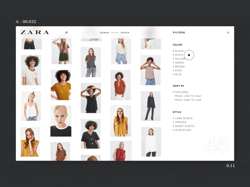
2.选择最佳的过滤器位置 (2. Choose the best filters location)
Baymard has published a large article comparing the different approaches to the arrangement of filters on e-commerce websites. In short, the results of their study show that a horizontal filter bar while not suitable for every website, significantly outperforms the left-sided one in terms of convenience and efficiency.
Baymard发表了一篇大文章,比较了电子商务网站上过滤器排列的不同方法。 简而言之,他们的研究结果表明, 水平过滤条虽然不适用于每个网站,但在便利性和效率方面明显优于左侧的过滤条 。
On the one hand, in the case of sidebars, the problem is that they are visually separated from the results and placed on the side panel, where the navigation, banners, and other service elements are often located, so users frequently overlook it.
一方面,对于侧边栏 ,问题在于它们与结果在视觉上是分开的,并放置在侧面板上,导航,横幅和其他服务元素通常位于该侧面板上,因此用户经常忽略它。
About 80% of online stores use a sidebar for filtering, so most users are used to seeing it there, and such an important part of an e-commerce website as a filtering bar is better to have a predictable location.
大约80%的在线商店使用侧边栏进行过滤,因此大多数用户都习惯在此处看到它,因此,电子商务网站的重要部分作为过滤条最好具有可预测的位置。
As for the horizontal bars, one of their advantages is that they allow for a user to keep their attention in one place. A user is not able to do anything else at the same time anyway.
至于单杠 ,它们的优点之一是它们允许使用者将注意力集中在一处。 无论如何,用户无法同时执行其他任何操作。
Wayfair is one example:
Wayfair是一个例子:
Victoria’s Secret doesn’t have a lot of filter options to offer, so the horizontal filter bar works well for them:
维多利亚的秘密(Victoria's Secret)没有太多的过滤器选项可提供,因此水平过滤器栏对它们很有效:
However, often after checking the results of filtering people tend to slightly adjust the parameters and filter some more. In this case, it’s more convenient when the page displays filters on the sidebar.
但是,通常在检查过滤结果后,人们往往会稍微调整参数并进行更多过滤。 在这种情况下,页面在侧栏上显示过滤器时会更方便。
In addition, the horizontal filter may be less scalable and require an individual layout for different product pages.
另外,水平过滤器的可伸缩性可能较低,并且需要针对不同产品页面的单独布局。
3.选择展示过滤器的最佳方法 (3. Choose the best way to present your filters)
As for the filters web UI, most e-commerce websites display filters in four main ways:
对于过滤器Web UI,大多数电子商务网站以四种主要方式显示过滤器:
- All filter options at once. 一次所有过滤器选项。
- Adding the scroll feature into each filter category. 将滚动功能添加到每个过滤器类别中。
- Showing only the filter headers with a selection option. 仅显示带有选择选项的过滤器标题。
Truncated filters (displaying a subset of the filters and providing a View More or View All hyperlink to represent the rest of the filter options).
截断的过滤器(显示过滤器的子集,并提供“ 查看更多”或“ 查看所有”超链接以表示其余过滤器选项)。
The idea is that a filter bar should display only the fields with high relevance. Remove or hide the rest. Then there won’t be a need for lengthy lists.
想法是,过滤器栏应仅显示相关性高的字段。 删除或隐藏其余部分。 这样就不需要冗长的列表了。
Things to remember when truncating the filter parameters:
截断过滤器参数时要记住的事情:
- Do not crop popular product filter options. When choosing what to hide, choose the ones that are less popular among your typical consumers. 不要裁剪流行的产品过滤器选项。 在选择隐藏物品时,请选择那些在典型消费者中不太受欢迎的物品。
Make sure the “View More” link is clearly visible and easy to use. This may involve adding the various styles, the + and — characters, arrows, or special phrases such as Show / View More.
确保“查看更多”链接清晰可见并且易于使用。 这可能涉及添加各种样式,+和-字符,箭头或特殊短语,例如Show / View More 。
4.互动式批量 (4. Interactive over batch)
Batch filtering means that the page refreshes and gives results only after you’ve made some selection and clicked the Apply button. Interactive filtering is when the system reacts to your every choice and refreshes the page every time.
批量过滤意味着只有在做出选择并单击“ 应用”按钮之后,页面才会刷新并给出结果。 交互式过滤是指系统对您的每个选择做出React并每次刷新页面时。
This was controversial some years back (and maybe sometimes it still is) but I prefer shopping on websites that use interactive filtering. It’s more convenient and requires one less click action. But only when it’s done quickly, of course! I get irritated when I’m made to wait after my every move, so this way of designing filters only applies to websites that don’t have the problem with loading speed. This is pure hell when you need to select more than 1–2 parameters and wait even for one second each time. What if I need to make 15 choices?
几年前这一直是有争议的(也许有时仍然如此),但我更喜欢在使用交互式过滤的网站上购物。 它更加方便,并且只需点击一下即可。 当然,只有快速完成! 每次移动后都不得不等待时,我会很生气,因此这种设计过滤器的方式仅适用于加载速度没有问题的网站。 当您需要选择1至2个以上的参数并每次甚至等待一秒钟时,这真是天壤之别。 如果我需要做出15个选择怎么办?
Interactive filtering is very popular among the major e-commerce websites, including Amazon or 6pm.
交互式过滤在包括Amazon或6pm在内的主要电子商务网站中非常流行。
However, it doesn’t mean that you have to choose interactive filtering.
但是,这并不意味着您必须选择交互式过滤。
When designing a filter system, the choice between introducing batch or interactive filters depends on the user’s intention (whether they plan to use several selections criteria or only one) and the site speed (how quickly a user gets the search result).
在设计过滤器系统时,在引入批处理过滤器或交互式过滤器之间的选择取决于用户的意图(他们打算使用多个选择标准还是仅使用一个选择标准)和站点速度(用户获得搜索结果的速度)。
Those users who do not have a clear idea of what exactly they want should first understand the structure of the search and what choice options they have. In this case, they will benefit more from interactive filters.
那些不清楚自己到底想要什么的用户应该首先了解搜索的结构以及他们拥有哪些选择选项。 在这种情况下,他们将从交互式过滤器中受益更多。
Batch filtering is beneficial if a website has speed problems. It saves a user time between requests. That is, instead of waiting for the result of each request, a user waits only once.
如果网站出现速度问题,则批量过滤将非常有用。 它为用户节省了两次请求之间的时间。 也就是说,用户不必等待每个请求的结果,而只需等待一次。
A huge disadvantage of batch filtering is the risk that a user selects a set of criteria leading to a null result.
批量过滤的一个巨大缺点是用户选择一组标准导致无效结果的风险。
Actually, during my research of the major e-commerce websites from Amazon to Nordstrom and Adidas to Nike, I found very little examples of batch filtering. One of them is Newegg:
实际上,在研究从亚马逊到Nordstrom,从阿迪达斯到耐克的主要电子商务网站时,我发现很少有批量过滤的例子。 其中之一是Newegg :
5.允许多项选择 (5. Allow multiple selections)
In order to avoid any errors and misunderstandings on a user’s part, as well as to remind them about the available filters, it’s a good idea to allow making several selections in the same category at once. This may seem like a very simple idea, however, 32% of e-commerce sites do not stick to this principle.
为了避免用户方面的任何错误和误解,并提醒他们有关可用的过滤器,最好允许一次在同一类别中进行多个选择。 这似乎是一个非常简单的想法,但是,有32%的电子商务网站不遵守这一原则。
Filters limited to one option can adversely affect site usability and customer satisfaction.
限于一种选择的过滤器可能会对站点的可用性和客户满意度产生不利影响。
A good example of an e-commerce site that gives its users the ability to filter by several criteria is Nordstrom:
Nordstrom是电子商务网站的一个很好的例子,它为用户提供了按几个条件进行过滤的能力:
6.永远不要说“没发现” (6. Never say “Nothing found”)
Continuing with the previous point, this rule is also pretty basic. Luckily for the prospective buyers, this error is not so often now as it was in the past.
继续上一点,该规则也是非常基本的。 幸运的是,对于潜在的买家来说,这种错误现在已经不像过去那样常见了。
There is nothing more frustrating for a visitor who selects and fills out selection criteria than getting irrelevant or, worse still, null results. If the value “0” is returned by any filtering criterion, it should be excluded from the list of available product characteristics or visualized as inactive in accordance with the design.
对于选择并填写选择标准的访问者而言,没有什么比获得无关紧要的或什至更糟的是无效结果更令人沮丧的了。 如果通过任何过滤标准返回值“ 0”,则应将其从可用产品特征列表中排除,或者根据设计将其可视化为非活动状态。
One example is the Nike website, where all the unexisting options get filtered away over the course of making selections:
耐克(Nike)网站就是一个例子,在选择网站的过程中,所有不存在的选项都会被过滤掉:
7.清楚显示应用了哪些过滤器 (7. Clearly show which filters are applied)
In addition, it’s also useful to display the filtering options of your product, both vertically on the left side of the screen and horizontally, directly above the search results. In other words, repeat the selected filters at the top of the page.
此外,在屏幕左侧垂直显示和在搜索结果正上方水平显示产品的过滤选项也很有用。 换句话说,在页面顶部重复选择的过滤器。
When working with vertical and horizontal product filters, make sure that they:
使用垂直和水平产品过滤器时,请确保它们:
- Display applied filters 显示应用的过滤器
- Highlight the options that have been selected 突出显示已选择的选项
- Can be deleted at any time. 可以随时删除。
Etsy does it:
Etsy做到了:
As well as Zappos:
以及Zappos :
8.注意复制 (8. Pay attention to the copy)
Apply the rules of UX writing to the filtering design. Patterns of filter design UX include not only the logic behind but the way the filter options are formulated and presented.
将UX编写规则应用于过滤设计。 过滤器设计UX的模式不仅包括背后的逻辑,还包括过滤器选项的制定和呈现方式。
There are several basic points:
有几个基本要点:
- Make it predictable. 使它可预测。
- Make it free of jargon. 使其免于行话。
- Make it simple and understandable. 使它简单易懂。
9.持续改善用户体验 (9. Continually improve the user experience)
Think of the filtering system on your site as another option for improving the UX site. Treat product filters as solutions for dealing with users’ problems. Good filtering design not only allows customers to find the product that is the best bet for them but also shows them that you know your product inside out.
将站点上的筛选系统视为改进UX站点的另一种选择。 将产品过滤器视为解决用户问题的解决方案。 良好的过滤设计不仅可以让客户找到最适合他们的产品,还可以向他们表明您完全了解您的产品。
Always be on the lookout for more convenient ways to present your products and how to improve your design of filters.
始终在寻找更便捷的方式来展示您的产品以及如何改进过滤器设计。
For example, how about adding some pictures? Yes, right to the filters. Using visual images tips instead of words is great when a person is not acquainted with various types of necklines, for example, like on AliExpress:
例如,如何添加一些图片? 是的,就在过滤器右边。 当一个人不熟悉各种类型的领口时,例如,在AliExpress上,使用视觉图像提示而不是单词是很好的选择:
结论 (In conclusion)
Filters may seem like a small and insignificant part of a website. But in reality, it’s the filters that provide a seamless shopping experience. Filters and categories are a necessary standard that allows excluding unnecessary items from massive search results. Everything that improves a website’s UX is good for business. Each improvement means an increase in sales.
过滤器似乎只是网站中很小的一部分。 但实际上,过滤器提供了无缝的购物体验。 过滤器和类别是必要的标准,允许从大量搜索结果中排除不必要的项目。 改善网站用户体验的一切都对业务有利。 每一项改进都意味着销售额的增长。
Be ahead of your competitors by giving the best filtering as your user interface special feature, as well as using other useful e-commerce tips and tricks.
通过提供最佳过滤作为用户界面的特殊功能,并使用其他有用的电子商务提示和技巧 ,领先于竞争对手。
Well-designed filtering is the fastest way to carry your consumers from the homepage to the product page and thus making it easier for them to make a purchase.
设计合理的过滤是将您的消费者从首页带到产品页面的最快方法,从而使他们更容易进行购买。
And finally, an important point: do not forget that the effectiveness of the filter depends on the relevance of the results, and this is determined by the correct product tagging.
最后,重要的一点是:不要忘记过滤器的有效性取决于结果的相关性 ,而这取决于正确的产品标签。
翻译自: https://uxplanet.org/9-filtering-design-best-practices-to-improve-e-commerce-ux-edac50560f94
ux设计


 1625
1625

 被折叠的 条评论
为什么被折叠?
被折叠的 条评论
为什么被折叠?
 到【灌水乐园】发言


