


 本文深入探讨了Isotype图表的设计理念与应用,介绍了Isotype研究所的历史背景,以及创始人Otto和Marie Neurath如何利用模块化象形图创造直观的数据可视化。文章详细分析了《仅隔一片海洋》一书中的多个Isotype图表案例,展示了如何结合定性和定量数据,以及图表设计如何反映文化和社会信息。
matlab 创建同型矩阵
同型的教训-第1部分 (Lessons of Isotype — PART 1)
There’s much to be told in the story of the Isotype. The International System Of Typographic Picture Education (ISOTYPE) was invented by Otto Neurath in collaboration with his wife Marie Neurath, and Gerd Arntz. While assisted by many, this core Isotype team sought to create educational designs to bringing statistics alive through a visual language of modular pictograms. In 1925, Otto founded a museum in Vienna for educating the public on social and economic issues (Gesellschafts- und Wirtschaftsmuseum) with the motto: “It is better to remember simplified images than to forget exact figures.”
Isotype的故事有很多要说的。 该国际变体系华氏度 泰 pographic P ictureË知识教育(同种型)是由发明了奥托·纽拉特与合作, 他的妻子玛丽·纽赖特和格尔德·安茨 。 在许多人的协助下,这个核心的Isotype团队寻求创建教育性设计,以通过模块化象形图的可视语言使统计数据生动起来。 1925年,奥托(Otto)在维也纳建立了一个博物馆,向公众宣传社会和经济问题(Gesellschafts和Wirtschaftsmuseum博物馆),其座右铭是: “记住简化的图像比忘记准确的数字更好。”
While many have discussed and explored the team’s work over the years (to which I have recently tried to shine a light on the pioneering role of Marie Neurath in particular) it is also common to be a little confused about what an Isotype actually is. More so, the story of the Isotype begins in the mid-1920s and spans all the way to 1971 when Marie retired, so there is a lot of work to consider.
虽然 很多 已经 讨论 和 探讨的团队 工作 过的年 (到这是我最近想照到光玛丽·纽赖特的先锋作用 ,特别)也是常见混淆什么同型实际上是一点点。 更重要的是,Isotype的故事始于1920年代中期,一直延续到1971年Marie退休为止,因此有很多工作需要考虑。
What better way to learn more about Isotype and gain inspiration from their designs than to view and discuss the work itself?
有什么比观看和讨论作品本身更好的方法来更多地了解Isotype并从其设计中获得启发?
This article — part of a series on Isotype — seeks to explain and celebrate the work of the Isotype Institute while revealing the process and design concepts used to create it. By focusing on the books published by Adprint in from 1941–48, I want to explore the techniques and mindset behind each chart and the system behind the combined series in order to inspire new information design concepts today.
本文是有关Isotype的系列文章的一部分,力求解释和庆祝Isotype Institute的工作,同时揭示用于创建Isotype的过程和设计概念。 通过重点研究Adprint在1941-48年间出版的书籍,我想探索每个图表背后的技术和思维方式以及合并后的系列背后的系统,以激发当今的新信息设计概念。

同型研究所:在英格兰创造新生活 (Isotype Institute: Creating A New Life in England)
As I discussed in my last article, Otto Neurath and Marie Reidemeister were ensnared in a British internment camp after they fled the advancing Nazi army in 1941. They quickly married after they were released, and a year later, Otto and Marie co-founded the Isotype Institute. That same year, the Isotype Institute found an important collaborator with a book packaging company called Adprint.
正如我在上一篇文章中讨论的那样,Otto Neurath和Marie Reidemeister在1941年逃离前进的纳粹军队后被困在英国拘留营。他们在获释后Swift结婚,一年后,Otto和Marie共同创立了同型研究所。 同年,Isotype Institute与一家名为Adprint的书籍包装公司找到了重要的合作伙伴。
Founded by a fellow Austrian, Adprint’s collaboration with the Isotype Institute led to the creation of a number of books that promoted cultural understanding between Britain and its allies during the war. As the war was still in full swing, Adprint and the Neuraths collaborated with the British government to create two series of books that featured Isotypes: “America and Britain” followed by “The Soviets and Ourselves”. Each book was by a different author and the Isotype charts have no real overlap with the writing in each book (other than the general subject matter) so the Isotype Institute was given additional credit as authors on the cover.
由同胞奥地利人创立的Adprint与Isotype Institute的合作促成了许多书籍的出版,这些书籍促进了战争期间英国及其盟国之间的文化理解。 由于战争仍在进行中,阿德普特(Adprint)和尼古拉斯(Neuraths)与英国政府合作,创作了两本具有同种型的书籍:“美国和英国”,其次是“苏维埃和我们自己”。 每本书都是由不同的作者撰写的,并且Isotype图表与每本书的文字并没有真正的重叠(除了一般主题),因此Isotype Institute作为封面上的作者获得了额外的荣誉。

They began working on the charts for the book series — Otto in research and Marie in ‘Transformation’ (a skillset using research, data science, and design process) — but as they were working Otto suddenly died, presumably of a stroke. Now, on her own, Marie writes in her memoir “I had to carry the work on, and I had to take final responsibilities myself.”
他们开始制作这本书系列的图表-研究中的奥托(Otto)和“变换”(转换,使用研究,数据科学和设计过程的技能集)中的玛丽(Marie)-但在工作时,奥托突然去世,大概是中风。 现在,玛丽独自在回忆录中写道:“ 我必须继续进行这项工作,而我必须自己承担最终责任。”
同型进化的过渡时期 (A transitional period in the evolution of Isotype)
This series of books represents an interesting moment in the life of the core team of Otto, Marie, and Gerd. In 1940 Gerd Arntz, a German-born artist who helped refine the aesthetics of Isotype by applying his modernist and design sensibilities, chose to remain in the Netherlands as the Neuraths fled the war. The Neuraths retained basic design elements from the years of collaboration with Arntz — and indeed agreed that they collectively ‘owned’ the work — but did not have contact with him for a few years after they settled in England.
这一系列书籍代表了Otto,Marie和Gerd核心团队生活中一个有趣的时刻。 1940年,德国出生的艺术家Gerd Arntz通过运用现代主义和设计敏感性帮助改善了Isotype的美学,当Neuraths逃离战争时,他选择留在荷兰。 在与Arntz合作多年后,Neurath保留了基本的设计元素-并确实同意他们共同“拥有”该作品 -但在定居英国后的几年中一直没有与他联系。
This series of Isotype charts in these two book series are, in some ways, the pinnacle of Isotype design. Otto and Marie’s collaboration on these books would have been some of the last projects that Otto worked on before his death and also shows the first steps by Marie in evolving the form and visual language of Isotype. The line between what was planned and designed before and after his death is something I couldn’t find details on. Otto was alive for the duration of the design and publishing for the first three books in the series “America and Britain”. The second three books in the “The Soviets and Ourselves” series was completed by Marie and her new team.
在某些方面,这两个系列丛书中的该同型图图表在某些方面是同型设计的顶峰。 奥托和玛丽在这些书上的合作将是奥托去世前从事的最后一些项目,也表明了玛丽在发展Isotype的形式和视觉语言方面的第一步。 我无法找到他去世前后的计划和设计之间的界线。 奥托在“美国和英国”系列的前三本书的设计和出版期间还活着。 玛丽和她的新团队完成了“苏联和我们自己”系列的后三本书。
同型的第一课:定性和定量 (The First Lesson of Isotype: Qualitative and Quantitative)
The first concept to understand is that Isotypes often mix qualitative and quantitative data. By simplifying the concepts trying to be communicated (often qualitative) and then elaborating with pictograms (quantitative), Isotypes aggregate both types of information into an easy to understand message. Of course, they do this in many ways so we’ll examine just how they do this in the examples below.
要了解的第一个概念是,同型通常会混合定性和定量数据。 通过简化试图交流的概念(通常是定性的),然后用象形图(定量的)进行细化,同类型将这两种类型的信息汇总为一条易于理解的消息。 当然,它们以多种方式执行此操作,因此我们将在下面的示例中研究它们的执行方式。
1943年之间只有海洋 (Only An Ocean Between, 1943)
(Images from Thom White’s Blog, cover from Eagereyes, and author’s copy.)
(图像来自 Thom White的Blog , Eagereyes的 封面 和作者的副本。)
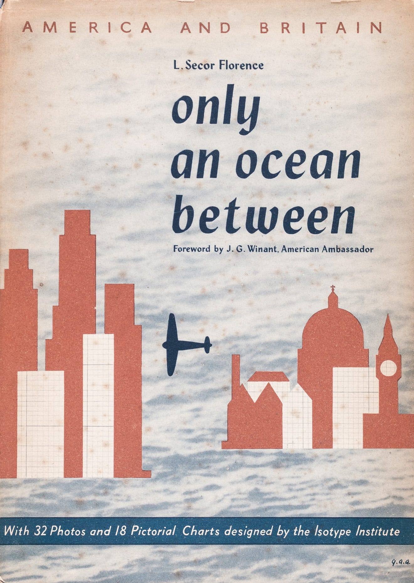
The first book from the “America And Britain” series was written by Lella Secor Florence, an American pacifist and feminist living in England. It was created to educate the people of both countries on the differences and similarities in geography, climate population, and touches lightly on infrastructure and business. It contains some of the more iconic Isotypes that we see referred to regularly in books and online. Of the three books in the series, it focuses the most on the cultural commonalities and comparisons between the two countries.
美国和英国的和平主义者和女权主义者莱拉·塞科·弗洛伦斯 ( Lella Secor Florence )撰写了“美国和英国”系列的第一本书。 它的创建是为了对两国人民进行地理,气候人口差异和相似性教育,并略微涉及基础设施和商业。 它包含一些我们在书籍和在线上经常提到的更具标志性的同型。 该系列的三本书中,最着重于两国之间的文化共性和比较。
It is important to point out that while many of these images and charts have been shared, few of them have been actually discussed for their content. That said, the noted dataviz historian Robert Kosara also covered this Isotype book (and others) with a number of keen observations and shares a passion for explaining the nuance of the work itself, so check out his work if this is interesting for you. Hopefully, others will join in too, as there is so much work to explore and discuss.
重要的是要指出,尽管许多图像和图表已经共享,但实际上很少针对它们的内容进行过讨论。 也就是说,著名的数据历史学家罗伯特·科萨拉(Robert Kosara)还通过大量敏锐的观察报道了这本Isotype书籍 ( 及其他 书籍 ),并热衷于解释作品本身的细微差别,因此如果您感兴趣,请查看他的作品。 希望其他人也能加入进来,因为有很多工作需要探索和讨论。
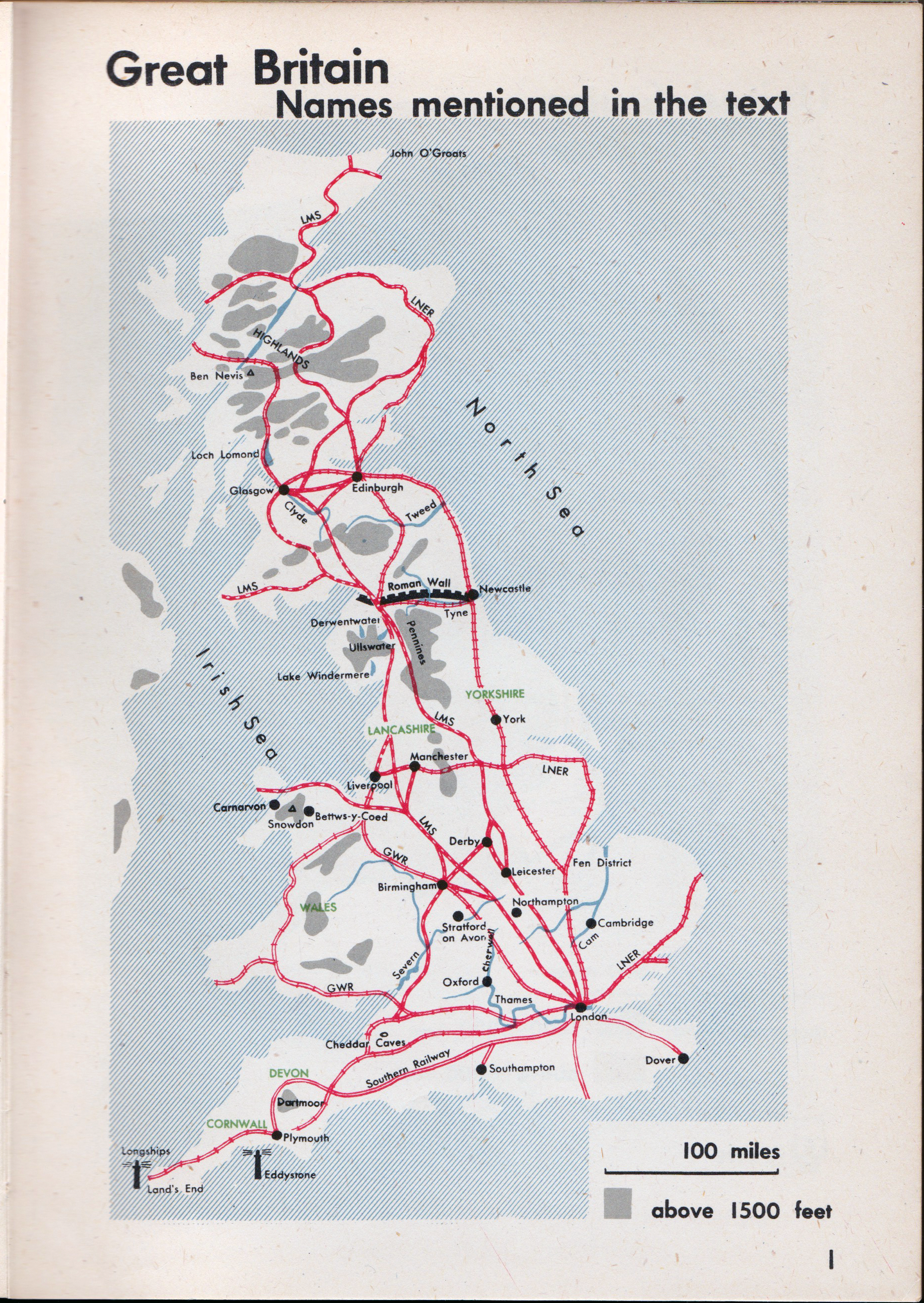
The first Isotype in the book is a map of Great Britain, which includes the whole of England, Scotland, and Wales, but not Northern Ireland. It has one of the few indications to the actual text of the book, with the names of landmasses, rail lines, elevation, and some special locations added for good measure.
本书中的第一个同种型是英国的地图,其中包括整个英格兰,苏格兰和威尔士,但不包括北爱尔兰。 它是本书实际文本中为数不多的指示之一,其中包括陆块,铁路线,高程的名称,并添加了一些特殊的位置以方便度量。
Like most Isotype charts, this map’s function is to get the reader acquainted with the geography and infrastructure by simplifying the information it portrays. Interesting to note how the locations, transportation, and elevation are mixed in the map above. The detail for each is reduced to show the proximity and location while still surfacing the relative complexity of the map. Certainly, we are culturally used to seeing multi-dimensional maps, but the selected focus in these two maps is consistent with how the other Isotype charts ride the line between simplicity and complexity.
与大多数Isotype图表一样,此地图的功能是通过简化其显示的信息来使读者熟悉地理和基础结构。 有趣的是,请注意上面地图中的位置,交通和海拔高度是如何混合的。 减少每个细节,以显示出接近程度和位置,同时仍显示地图的相对复杂性。 当然,我们在文化上习惯于查看多维地图,但是在这两个地图中选择的焦点与其他Isotype图表如何在简单性和复杂性之间保持一致是一致的。
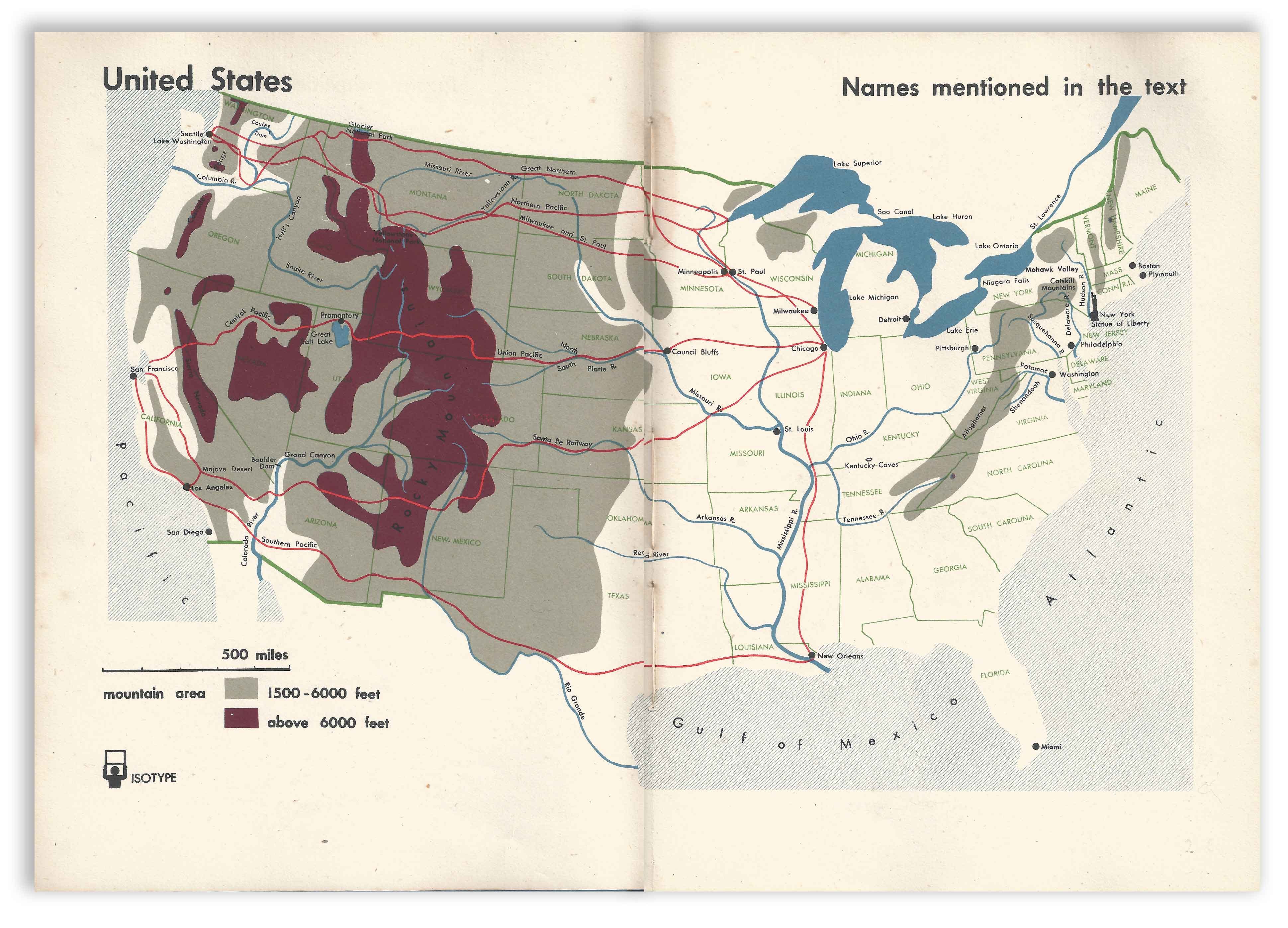
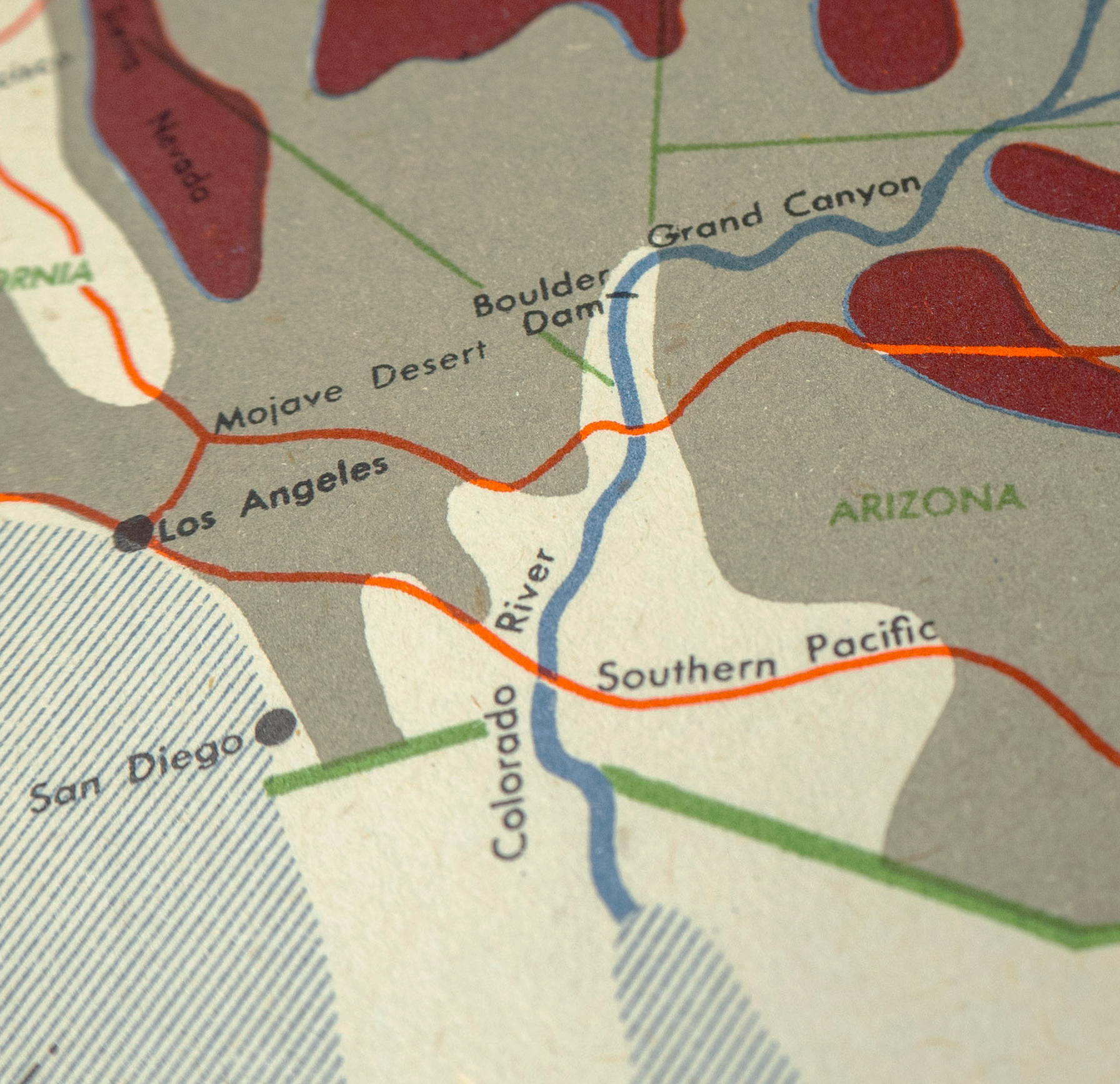
Like the Great Britain map, the map of the United States provides a high-level geographic understanding of American cities, topography, and rail lines along with locations of importance referenced in the text such as the Boulder Dam. It acts as a sort of meta-legend to orient the reader to the places and scale of the United States. The subtlety in the color and linework in signifying the difference between natural and political borders shows the care used in crafting it.
与大不列颠地图一样,美国地图也提供了对美国城市,地势和铁路线以及文本中所提及的重要位置(例如博尔德大坝)的高级地理理解。 它可以作为一种使读者了解美国的地点和规模的元传说。 颜色和线条的微妙性象征着自然边界和政治边界之间的差异,显示了制作Craft.io时所用的谨慎。
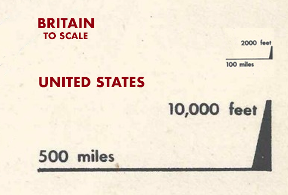
Like the map of Britain above, this map also shows a selective focus and attention to presenting information in larger units. By only displaying the rail lines which enabled western expansion, they show the massive distances covered, and touch on the preponderance of track in the eastern third of the country in a subsequent map. The elevations on this map are also reduced into three groups: low, medium and high to indicate a broad understanding of the regional differences. Lastly, the distance legend also breaks up its 500-mile length into five units reinforcing the visual vocabulary.
就像上面的英国地图一样,此地图也显示了选择性地关注和注意以更大单位呈现信息。 通过仅显示使西部扩张的铁路线,它们可以显示出覆盖的距离,并在随后的地图中触及该国东部三分之一的主要轨道。 该地图上的海拔高度也被分为三类:低,中和高,以表示对区域差异的广泛理解。 最后,距离传奇还将其500英里长分为五个单元,以增强视觉词汇量。
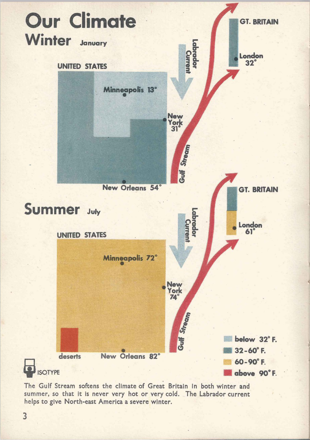
By grouping both countries under the title “Our Weather” it shows a unity between the 2 countries despite the huge difference in the range of temperature changes, across seasons, and the natural phenomenons that influence them. In the US, we see 2 blocks representing Winter and Summer, with Minneapolis and New Orleans plotted as extremes and New York City tucked in the middle. The arrows to the right literally point out the differences in latitude and double as diagrams of the warm Gulf Stream and arctic Labrador current off the American coast.
通过将两个国家归为“我们的天气”标题,尽管两个国家的温度变化范围,季节和影响它们的自然现象差异很大,但它显示了两个国家之间的团结。 在美国,我们看到两个分别代表冬季和夏季的街区,明尼阿波利斯和新奥尔良被绘制为极端,纽约市则位于中间。 右边的箭头从字面上指出了纬度的差异,并与美国海岸附近的海湾热流和北极拉布拉多海流的图表一样。
While more data could have been surfaced in this chart, the Neurath’s focused on two seasons (hot and cold) linked to three US cities/regions (hot, temperate, cold) broken into four temperature units. The use of color is systematic — freezing light blue, cool blue, warm yellow, and hot red — showing the overlap between countries, and is also applied to the arrows reflecting the weather influences as well. The text below the chart reinforces the message and links the two climates which, on the surface seem very different, but are actually linked by global conditions.
尽管可能在此图表中显示更多数据,但Neurath的重点是与三个美国城市/地区(炎热,温带,寒冷)相关的两个季节(炎热和寒冷),该季节分为四个温度单位。 颜色的使用是系统的-冻结淡蓝色,冷蓝色,暖黄色和热红色-显示国家之间的重叠,并且还应用于反映天气影响的箭头。 图表下方的文字强化了这一信息,并将两种气候联系在一起,这两种表面上看似大不相同,但实际上是由全球条件联系在一起的。
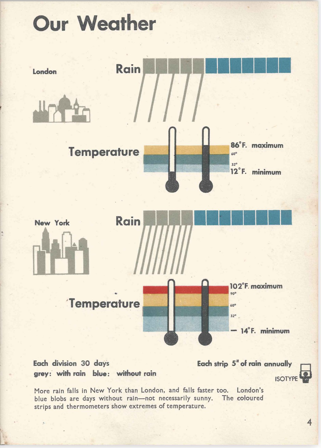
“Our Weather” shows a comparison between the temperature and rainfall in London and New York. The text at the bottom explains that contrary to the stereotype, NYC actually gets more rain by volume than London, while London is certainly more overcast.
“我们的天气”显示了伦敦和纽约的温度和降雨量之间的比较。 底部的文字说明,与刻板印象相反,纽约市的降雨量实际上比伦敦多,而伦敦的阴雨当然要多得多。
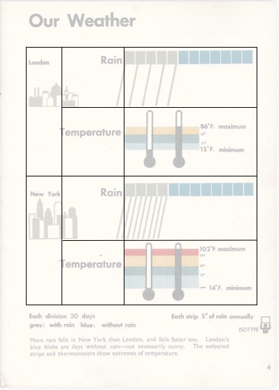
The Isotype system is again applied to create an efficient and logical diagram. The color scale continues from the previous chart, showing the four temperature ‘strips’ with the dual thermometer shapes representing the minimum and maximum temperatures in black for each. The 12 blocks represent the months per year that it regularly rains in each city while the density of the diagonal lines represents the flow of rain.
再次将同型系统应用于创建有效的逻辑图。 色标从上一个图表继续,显示了四个温度“条”,双温度计形状分别以黑色表示最低和最高温度。 12个街区代表每年每个城市定期降雨的月份,而对角线的密度则代表降雨的流量。
The page design is also laid out like a table, with the two cities aligned to the left, labels right-aligned in the center, and the diagrams on the right. This information architecture supports an easier comparison between the different types of data and creates a clear story that belies its complexity.
页面设计也像桌子一样布局,两个城市在左侧对齐,标签在中心右侧对齐,图表在右侧。 这种信息体系结构支持在不同类型的数据之间进行更轻松的比较,并创建一个掩盖其复杂性的清晰故事。
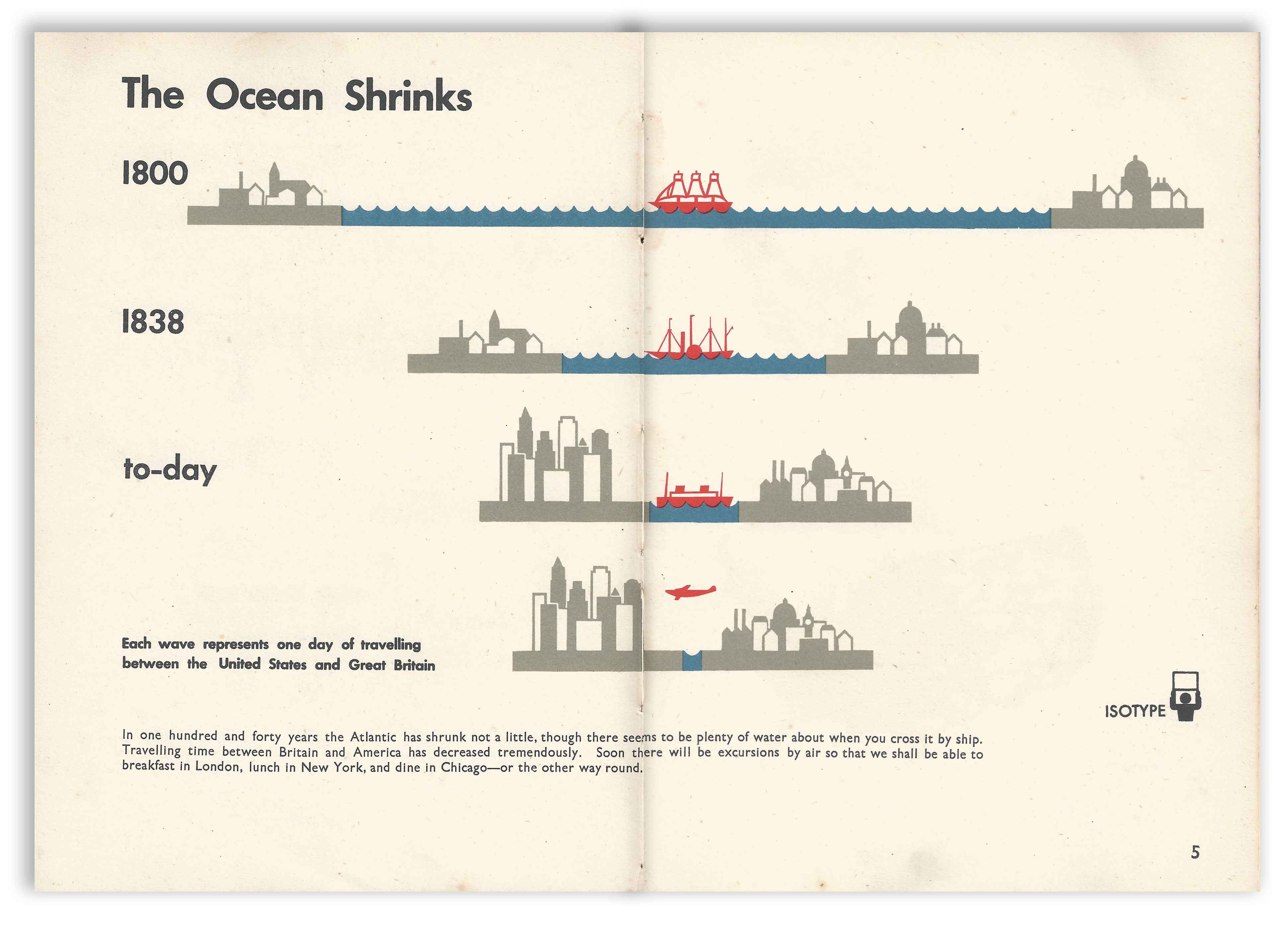
One of the more well-known Isotype charts is “The Ocean Shrinks”. It shows the time gains in travel via technology from a historical perspective but does so by creating the unusual metaphor of a shrinking ocean. The ingenious label on the row with the airplane explains that each wave represents one travel day, which helps the reader understand the chart as distance per unit of time. So distance collapses into time and the ocean indeed shrinks.
最著名的同型图之一是“海洋收缩”。 它从历史的角度显示了通过技术旅行所获得的时间收益,但是通过创造了一个不断缩小的海洋的不寻常隐喻来做到这一点。 飞机上那排独具匠心的标签解释说,每一波都代表一个旅行日,这有助于读者理解图表作为单位时间的距离。 因此,距离随着时间的推移而崩溃,海洋的确缩小了。
The shrinking distance also reinforces the growing ‘closeness’ of the two countries and cultures. The subtle update across each of the four time periods in the illustrations of London and New York also creates visual interest and adds nuance to the progressive story.
距离的缩小也加强了两国和文化之间日益紧密的“亲密关系”。 伦敦和纽约插图中四个时间段中每个时间段的微妙更新也创造了视觉上的趣味,并为渐进式故事增添了细微差别。
(By the way, the archaic spelling of ‘to-day’ is just unusual.)
(顺便说一下,“今天”的古语拼写是不寻常的。)
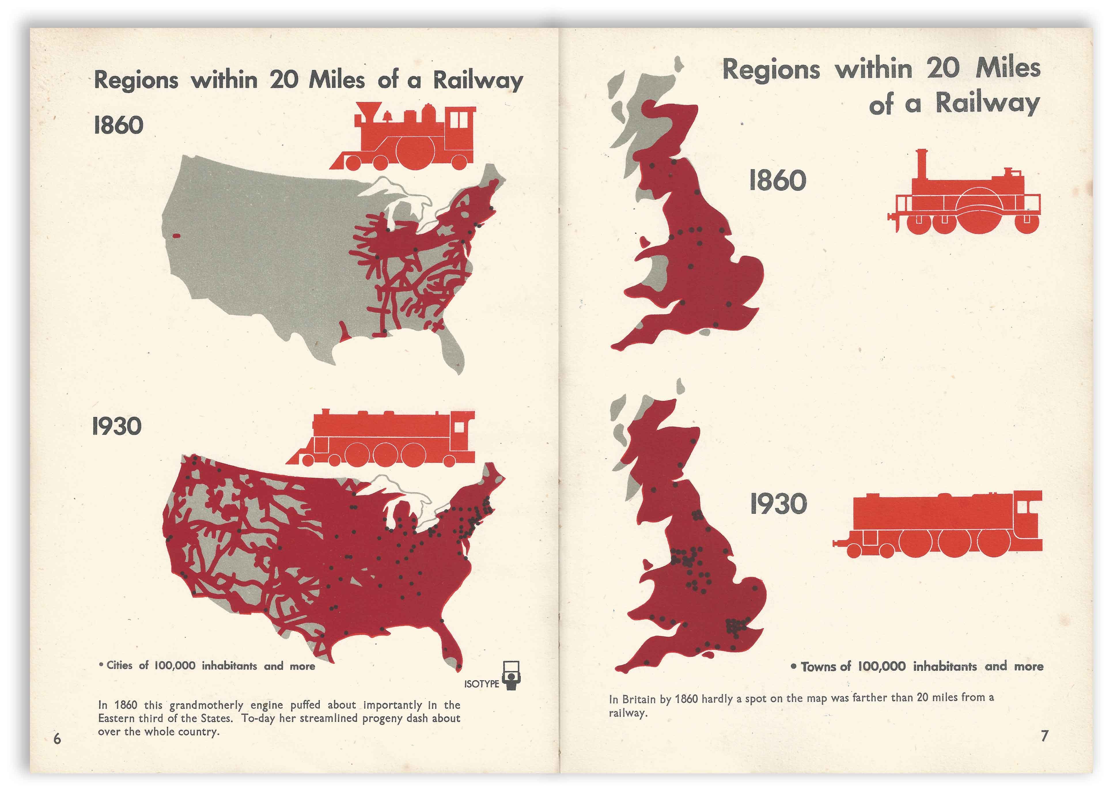
The two pages above (presented together but not like this in the book) flip the perceived narrative about connectivity and transportation. While the US is considerably larger than England, its smaller landmass allows for its rail infrastructure to be more interconnected than the U.S. by almost 100 years.
上面的两页(在一起呈现,但书中并非如此)颠覆了人们对连通性和交通的叙述。 尽管美国比英国大得多,但由于其较小的陆地,其铁路基础设施比美国多了近100年的互连性。
The detail on the train illustrations is approximate yet informative. Sporting a modernist flat aesthetic, each engine reflects a typology of train design per era for comparison. The shade of red on the brown-grey for the maps and the pure red for the train helps tie the whole design together and affords a connection between the two.
火车插图上的细节是近似的,但能提供很多信息。 每个引擎都具有现代主义的扁平美学,可以反映每个时代的火车设计类型,以进行比较。 地图上棕灰色的红色阴影和火车上的纯红色阴影有助于将整个设计联系在一起,并在两者之间建立了联系。
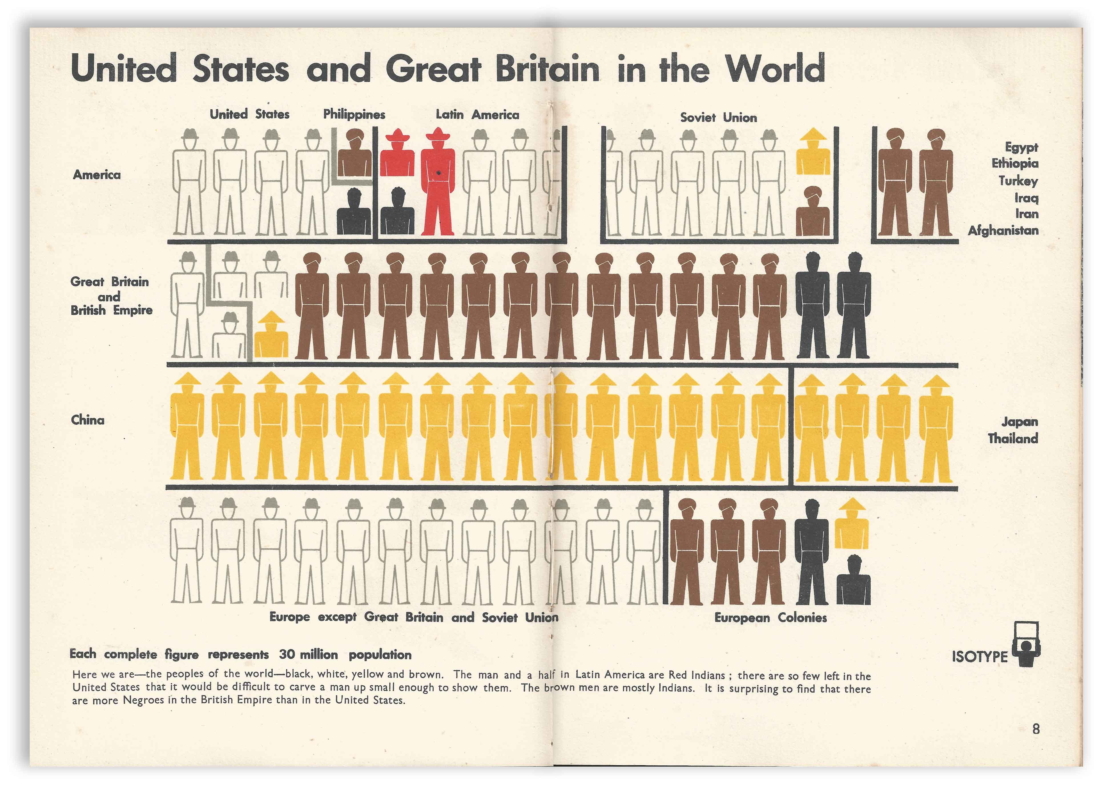
“United States and Great Britain in the World” shows a greatly aggregated view of the entire population of the world’s population by race. The design is segmented by a combination of country and region and the racial makeup has been grouped into five categories, by color, each displayed by a customized icon.
“美国和世界上的大不列颠”显示了按种族划分的世界人口总数的总体视图。 该设计按国家和地区进行了细分,种族构成按颜色分为五类,每类由一个自定义图标显示。
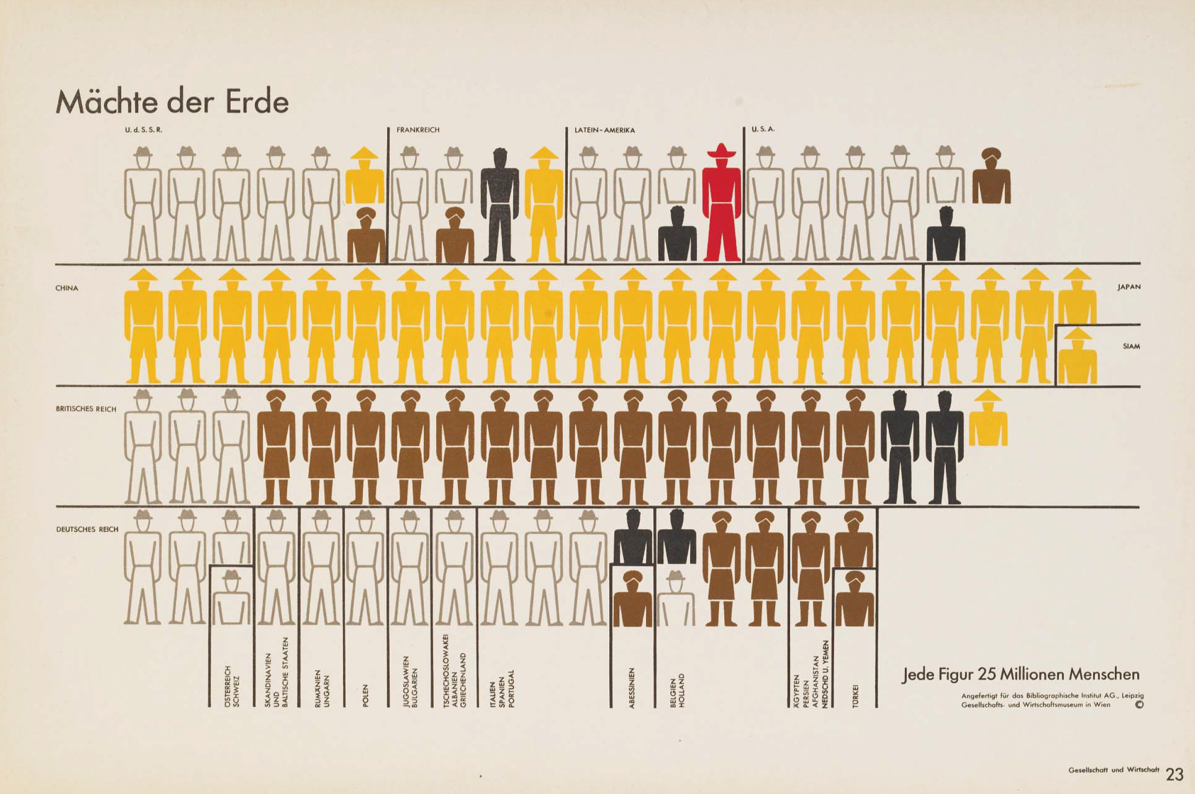
The team regularly recycled this design to ensure that the data or story being discussed was considered with an understanding of the statistical racial footprint. The above chart is a design that the Isotype Institute had been iterating on since at least since 1932, as seen in the publication that matches the name of Otto’s museum in Vienna, the Gesellschafts- und Wirtschafts on page 23.
该团队会定期回收此设计,以确保在考虑统计种族足迹的情况下考虑正在讨论的数据或故事。 上图是至少从1932年以来Isotype Institute一直在进行的一项设计,正如该出版物与第23页上的维也纳奥托博物馆名称“ Gesellschafts- and Wirtschafts”相匹配。
Otto Neurath fiercely opposed any kind of racism throughout his entire career. While the icons in this Isotype chart representing the races of the world do not fit in our cultural norms for inclusivity today, Neurath’s intention was exactly the opposite at the time. The fact that Neurath represented the non-white population was a radical concept, as the very existence of these populations were regularly ignored. Then, by showing the white, western world that they were not the majority, Neurath challenged the notion of cultural supremacy held by many academics but especially by Nazi Germany. The icons themselves are not unequal in any way and the white population is outlined as to visually recede into the background. While the Isotype Institute was focused primarily on presenting facts, they did regularly display a certain educational agenda — likely originating in their leftist intellectual involvement in “Red Vienna” in the years before WW2.
奥托·纽拉特(Otto Neurath)在他的整个职业生涯中都坚决反对任何种族主义。 尽管这张等值线图中的图标代表着世界的种族,但如今不适合我们的包容性文化规范,但当时的努拉特的意图恰恰相反。 内拉特代表非白人人口这一事实是一个激进的概念,因为经常忽略这些人口的存在。 然后,通过向白人白人世界证明他们不是多数 ,尼古拉斯对许多学者,尤其是纳粹德国所持有的文化至上的观念提出了挑战。 图标本身在任何方面都不是不相等的,并且白色人口被概述为在视觉上退回到背景中。 尽管同型研究所主要关注事实的陈述,但他们确实定期展示某些教育议程,这很可能是由于二战前几年左翼知识分子对“红色维也纳”的参与。
While the updated version in “Only An Ocean Between” is nearly identical to its predecessor, it has been further reduced to show larger regional groups with fewer icons overall. By pointing out the surprising statistic on the corresponding black populations and also referencing the scarcity of Native-Americans in the US, Neurath points out the racial inequality in a subtle but pointed way. Fellow Nightingale writer Paul Kahn also points out that the chart was a product of the Colonial world, by grouping the brown half-icon for the Philippines with the US population as it was a US colony at this time.
虽然“只有海洋之间”的更新版本与其前身几乎相同,但已进行了进一步缩小,以显示较大的区域组,总体上具有较少的图标。 通过指出令人惊讶的统计数据,显示相应的黑人人口,并参考了美国原住民的稀缺性,诺伊拉斯以一种微妙但明确的方式指出了种族不平等。 夜莺组织的学者保罗·卡恩 ( Paul Kahn)也指出,这张图是殖民地世界的产物,通过将菲律宾的棕色半图标和美国人口分组在一起,因为此时它是美国的殖民地。
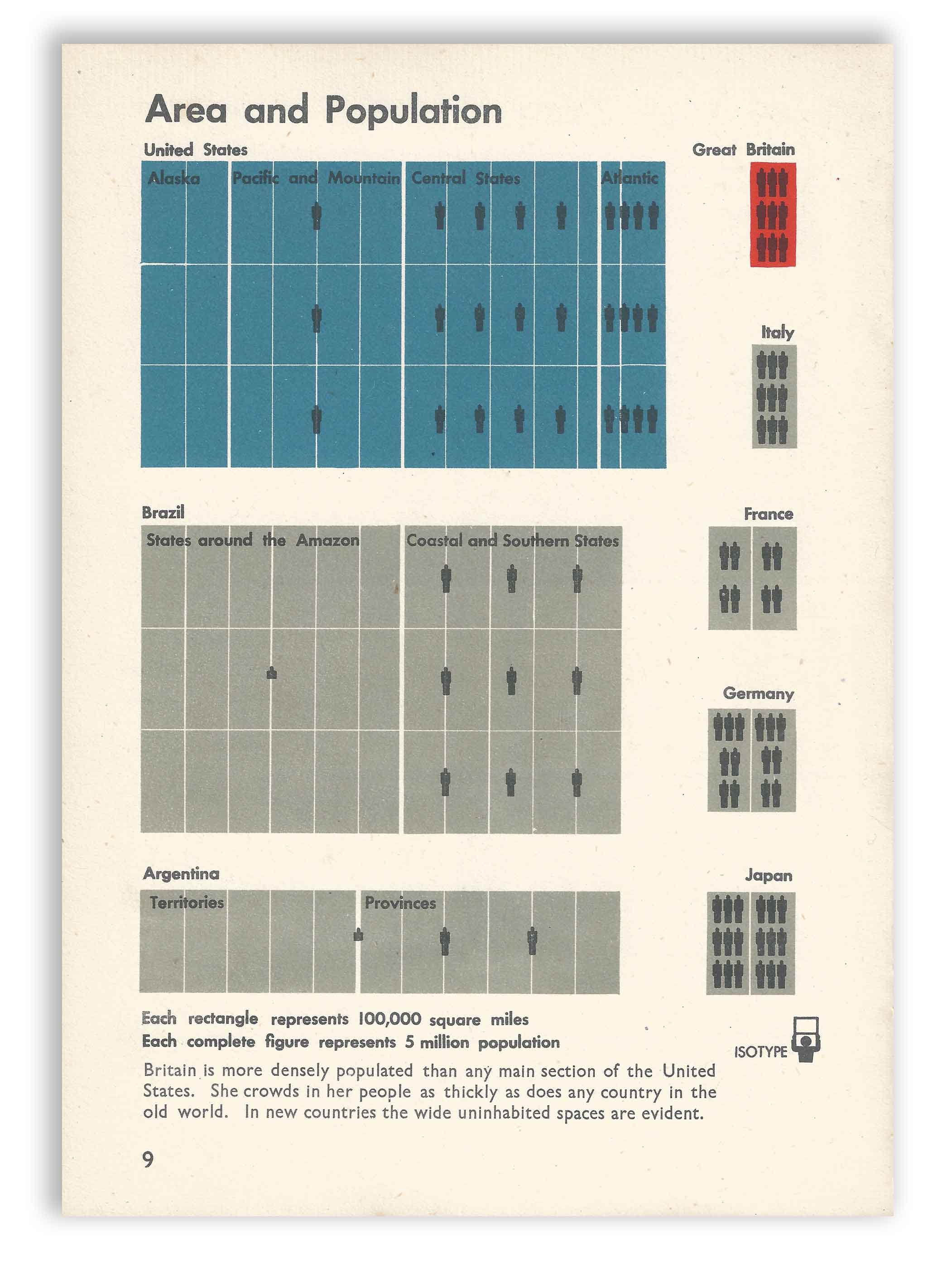
The United States is a big place and “Area and Population” shows just how big and sparsely populated it is by comparing each region to other countries of comparable size and density. You’ll notice that the unit of measure (100K square miles) is consistently applied across all countries, it’s layout is a sort of small-multiple with the population overlaid on each. By coloring the US as Blue and Britain as Red it keeps the focus on each while including the grey for global comparison.
美国是一个大国,“地区和人口”通过将每个地区与具有相同规模和密度的其他国家进行比较,显示出美国的人口众多和人口稀少。 您会注意到,度量单位(100K平方英里)始终适用于所有国家/地区,其布局是小数乘以每个人口覆盖的人口。 通过将美国涂成蓝色,将英国涂成红色,它不仅关注灰色,而且还进行了全球比较,从而使每个方面都得到关注。
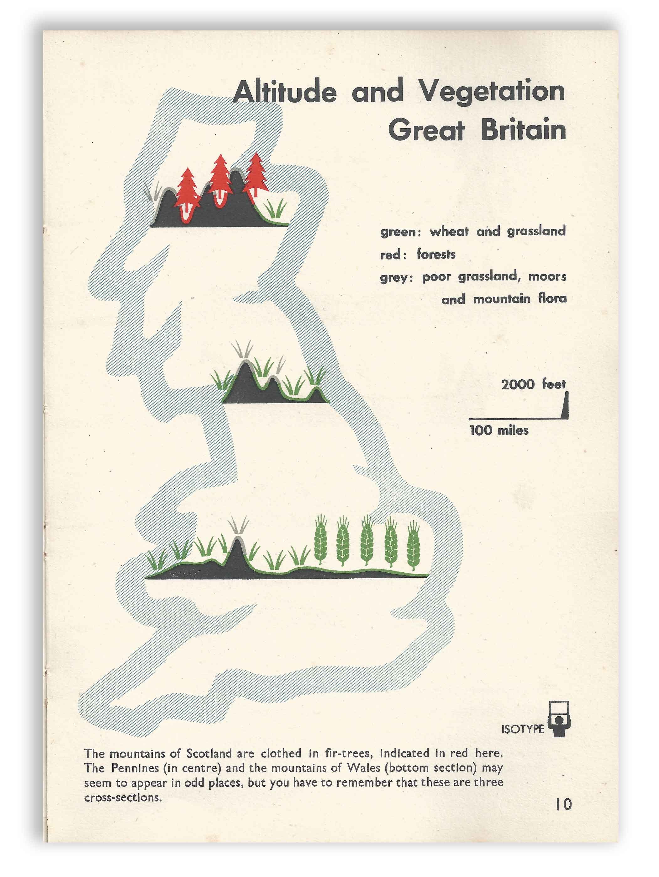
The above diagram is a type of map that is unique to the Isotype. It shows the shape of the country with three cross-sections showing the altitude of the landscape plus the kind of vegetation or crop that is known for that region. Turn the page and you’d see the US version below, note the matching colors and icons for both maps.
上图是Isotype唯一的一种映射。 它用三个横截面显示了国家的形状,三个横截面显示了景观的高度以及该地区已知的植被或农作物的种类。 翻页,您会在下面看到美国版,请注意两个地图的匹配颜色和图标。
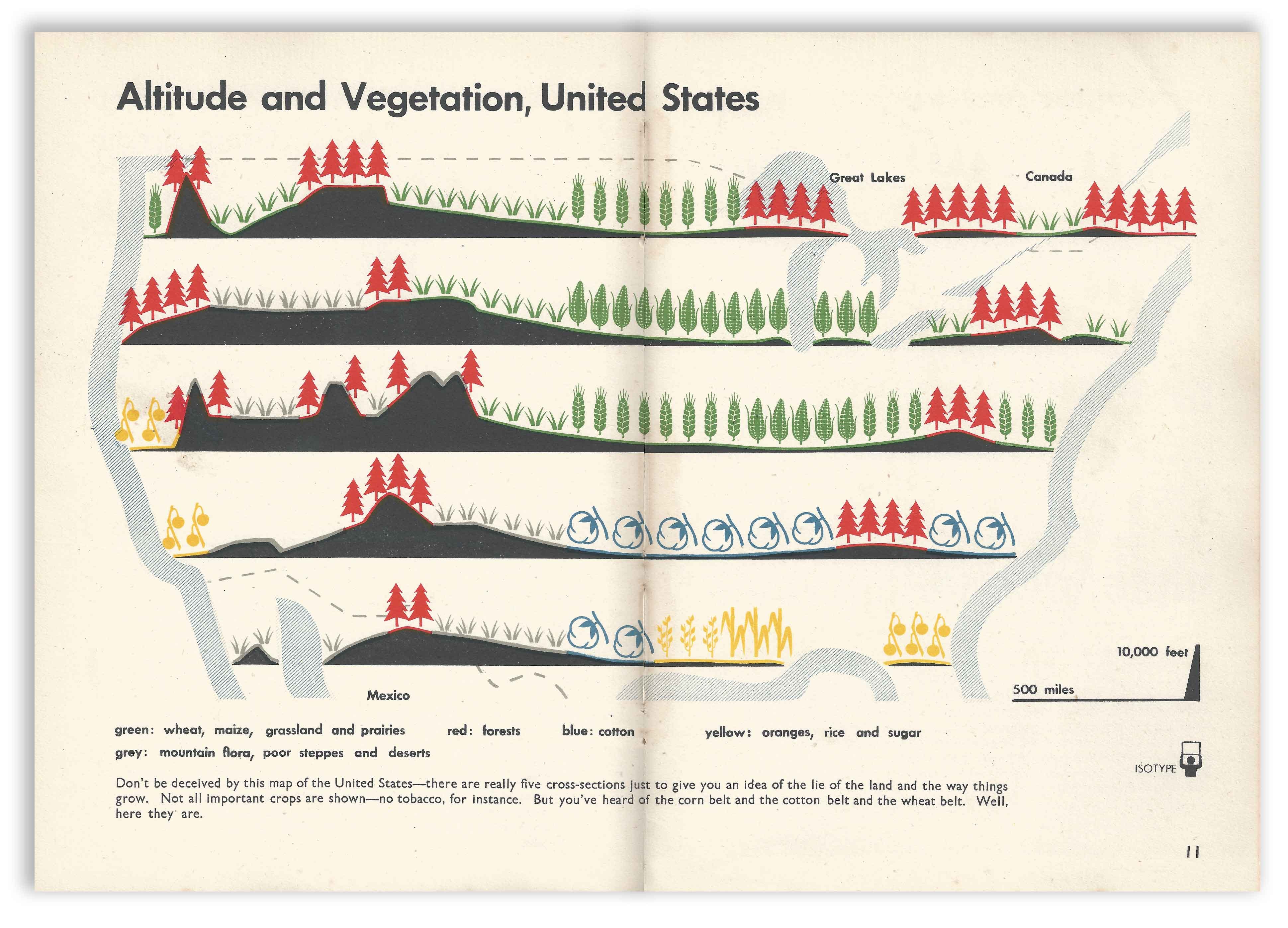
The American version of the same map shows a different picture in terms of scale and natural resources. An expanded series of icons represents a generalized layout of major crops, mountains, and forests. It’s clear that the US has vastly more natural resources than England but the range of resources is also clear. The design helps to convey a tremendous amount of information very efficiently. Imagine seeing an Isoline map displaying the same data; it would provide a more granular view of the data but could only display a single aspect, the altitude or the vegetation/crop but not both.
同一张地图的美国版在比例和自然资源方面显示出不同的图片。 一系列扩展的图标代表主要农作物,山脉和森林的一般布局。 显然,美国比英国拥有更多的自然资源,但资源范围也很明确。 该设计有助于非常有效地传达大量信息。 想象一下, 等值线图显示了相同的数据; 它可以提供更细致的数据视图,但只能显示一个方面,海拔高度或植被/作物,而不能同时显示两者。
Like everything in the Isotype system, every aspect of the map is reduced to convey the general information. The brilliantly reduced legend is no exception, showing only a horizontal line for length and a right triangle for altitude. The legend integrates into each map very perfectly and matches the general understanding that is intended.
与Isotype系统中的所有内容一样,地图的每个方面都被简化以传达一般信息。 精简的图例也不例外,仅显示水平线表示长度,并显示直角三角形表示高度。 图例非常完美地集成到每个地图中,并且与预期的一般理解相匹配。
Comparing the maps requires attention to the details as the 5:1 ratio reveals they are not on the same scale. While the legend is clearly labeled, we don’t register the difference in the scale because we are not looking for that kind of comparison. As readers, we are only looking for general locations.
比较地图需要注意细节,因为5:1的比例表明它们的比例不同。 虽然图例上有清楚的标签,但我们没有记录比例的差异,因为我们没有在寻找那种比较。 作为读者,我们只在寻找一般位置。
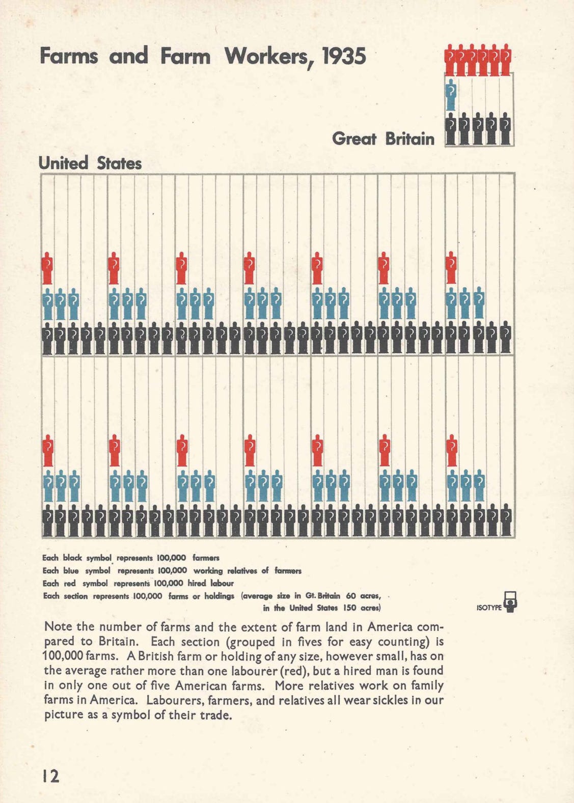
Because of their past in creating museum exhibitions, Otto and Marie often created Isotype charts to be read in sequence. This Isotype chart builds nicely from the preceding map by exploring the role of farmers and the land. Likewise, it also borrows a similar design (by unit) as seen in “Area and Population” before the maps. The scythe icon on each figure had been previously used by the Isotype Institute to represent agricultural workers but this chart introduces it for the first time in this book.
由于他们过去在博物馆展览中的创作,Otto和Marie经常创建Isotype图表以按顺序阅读。 该同型图通过探索农民和土地的作用,从前面的地图很好地构建。 同样,它也借鉴了类似的设计(按单位),如地图前的“面积和人口”所示。 Isotype Institute以前曾使用每个图形上的大镰刀图标来代表农业工人,但此图表在本书中首次进行了介绍。
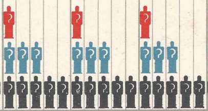
“Farm and Farm Workers, 1935” compares three types of workers: farmer (black), working relatives of farmers (blue), and hired labor (red). Each icon represents 100,000 workers, each cell represents 100,000 farms assorted into groups of five. While it takes a second to read the chart, there are two immediate understandings: that Britain has far fewer farms than the US, but hires far more laborers per farm. The text at the bottom explains the details.
“农场工人,1935年”比较了三种类型的工人:农民(黑人),农民的工作亲戚(蓝色)和雇用的劳工(红色)。 每个图标代表100,000个工人,每个单元代表100,000个农场,分为五个组。 阅读图表需要花费一秒钟的时间,但有两个直接的认识:英国的农场远少于美国,但每个农场雇用的劳动力却更多。 底部的文本说明了详细信息。
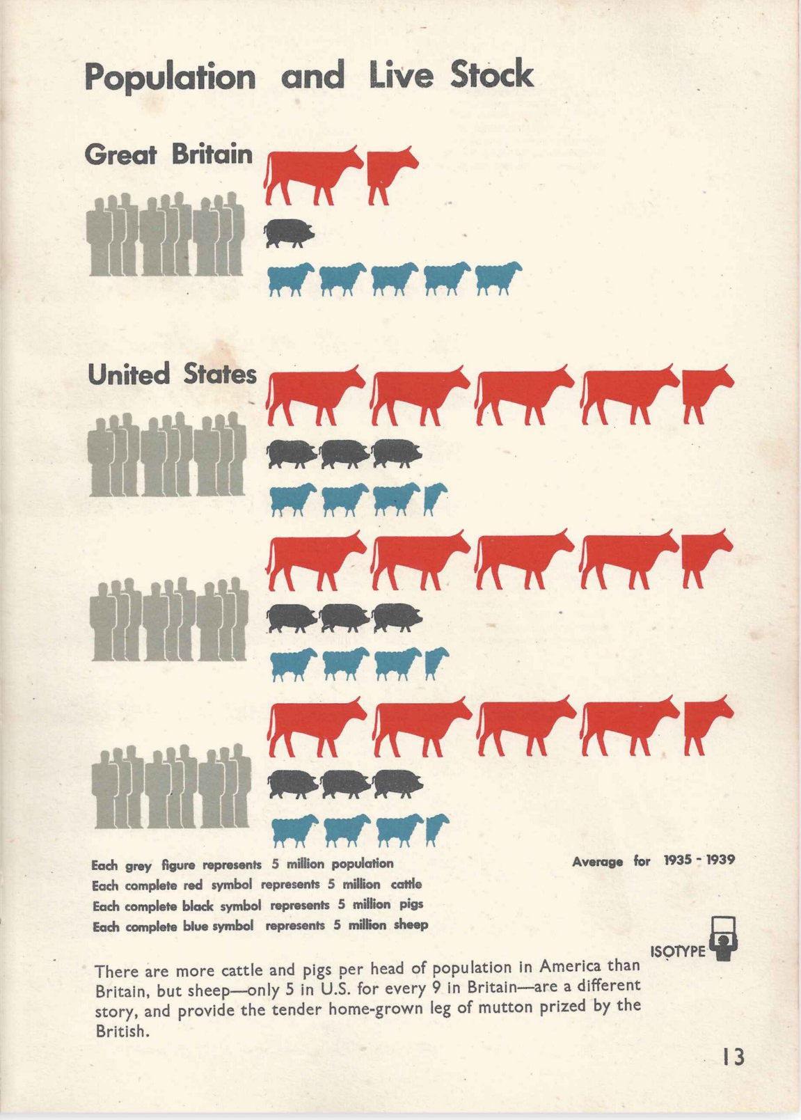
We’ve seen how Isotypes group and organize both qualitative and quantitative data in the charts above. “Population and Live Stock” is a great example of how the design of the grouped icons helps to reveal the story despite groups that are very different sizes.
我们已经在上面的图表中看到了Isotypes如何分组和组织定性和定量数据。 “种群和牲畜”是一个很好的例子,说明尽管大小不同的小组,分组图标的设计如何有助于揭示故事。
The focus of the chart is not the overall size of the populations, but a subtle insight to tell a more interesting story. By breaking the larger US population into three equal rows, it helps to make a more natural comparison between all four rows. Paul Kahn adds, “UK population in 1939 was 47.5M. US population in 1939 was 130.9M. This chart simplifies these numbers to emphasize the 1:3 ratio. So you can see there are three times as many Americans who eat less sheep and more pigs and cows.” Marie Neurath’s work as the Transformer in collecting the data, calculating the story, and designing its layout is complicated when you think about it, but the ultimate simplicity of the design makes it simple and elegant. Comparatively speaking, the British rely more on sheep than the US.
图表的重点不是总体人口规模,而是一个微妙的见解,可以讲述一个更有趣的故事。 通过将更多的美国人口分成相等的三行,有助于在所有四行之间进行更自然的比较。 保罗·卡恩(Paul Kahn)补充说: “ 1939年英国人口为4750万。 1939年美国人口为1.309亿。 此图表简化了这些数字,以强调1:3的比例。 因此,您可以发现,少吃羊,多吃猪和牛的美国人是美国人的三倍。” 考虑到Marie Neurath作为Transformer的工作,它在收集数据,计算故事以及设计布局时非常复杂,但最终的简单性使其变得简洁大方。 相对而言,英国比美国对绵羊的依赖更大。
Every detail of an Isotype chart is considered — even the direction of the icons. Having the animals move in the direction of the X-axis (from left to right) it helps establish how they are read, both in the same (visual) way that we read a horizontal bar chart, but also (conceptually) that the animals are an independent population from the people. Had the animals faced toward the people it might have a different meaning as animals in line to be eaten — but that’s a different chart in a later book in the series.
同构型图表的每个细节都将被考虑-甚至是图标的方向。 让动物沿X轴方向(从左到右)移动,这有助于建立如何读取它们的方式,不仅以与我们读取水平条形图相同的(视觉)方式,而且(从概念上)使动物是人民独立的人口。 如果这些动物面对人们,它可能与被吃掉的动物具有不同的含义-但这是该系列下一本书中的另一幅图表。

“The World’s Merchant Marine” helps us to understand just how many ships the British Navy has in relation to the total number of ships globally. It also helps us understand the quantity of coal-burning (black), “oil-burning” (green) and wind-powered by creating icons for each. The 6x7 block of British ships in 1914 becomes the predominant group of measure, showing not only how the British Navy was equal to all ships in the world minus the Americans, but also how they modernized their fleet by 1939. The chart is easy to make comparisons not only between the two countries in focus but in the context of the entire world’s fleets.
“世界商人海军陆战队”帮助我们了解英国海军相对于全球总舰队数量而言的数量。 通过为每个图标创建图标,还可以帮助我们了解燃煤(黑色),“燃油”(绿色)和风力发电的数量。 1914年,英国战舰的6x7区块成为主要的度量标准,不仅显示了英国海军等于世界上减去美国人的所有战舰,还显示了他们如何在1939年使舰队现代化。该图很容易制作不仅要在两国之间进行比较,而且要在整个世界范围内进行比较。

This is another favorite subject of Otto’s, having created a similar version 11 years earlier in 1932. In the earlier version, the extended flags created a sort of diverging bar chart to show the rapid growth of the American Navy. The ship icons below each bar represent 5 million gross tons (instead of 500,000 in the one above) and the story is not only the growth of global shipping but the strength of the British and American navies.
这是奥托(Otto)另一个最喜欢的主题,在1932年前创建了一个类似的版本。在早期版本中,扩展标志创建了一种发散的条形图,以显示美国海军的快速发展。 每个条形图下方的船形图标表示500万吨,而不是上面的50万吨,其故事不仅是全球航运量的增长,还在于英美海军的实力。
The difference between “The World’s Merchant Marine” and the earlier 1930 version (at left) is significant in two ways. First, it tells a different story by focusing on the growth in the tonnage of ships over 79 years. By visualizing the icons as 5 million tons we see a more easily compared “bar” of ship icons that are equal in color with more fidelity in nationality. Second, in the earlier version of the chart, it shows the growth of the American Navy, where the latter shows the massive power of the British Navy. Because of the comparison between the two versions, we can see how important the layout and quantity of the icon units are to interpreting the message.
“世界商船队”与1930年代早期版本(左)之间的区别有两个方面。 首先,它通过讲述79年间船舶吨位的增长来讲述一个不同的故事。 通过将图标显示为500万吨,我们可以比较容易地比较颜色相同且国籍更加真实的船舶图标“条”。 其次,在图表的早期版本中,它显示了美国海军的增长,而后者显示了英国海军的强大力量。 由于两个版本之间的比较,我们可以看到图标单元的布局和数量对解释消息的重要性。
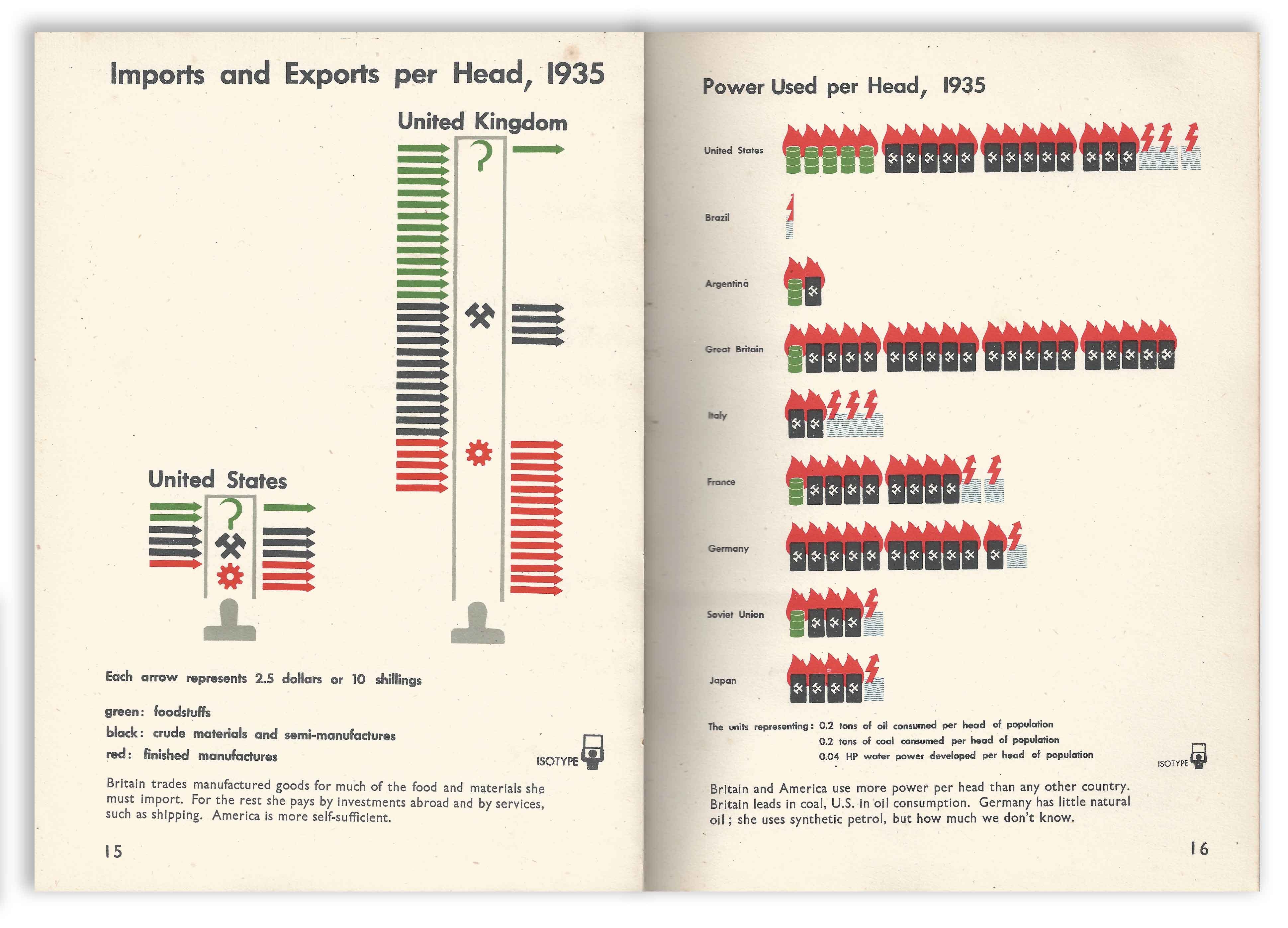
Isotypes were often criticized for the data that was omitted or aggregated. The left page, “Imports and Exports per Head, 1935” would certainly be an example of why. We are presented with two diagrams comparing the total average person’s imports and exports for both countries. While it is easy to see the difference, it is not very easy to understand what the arrows represent, made especially more troubling by the lack of numbers. Sure, the text below explains that Americans are far more self-sufficient and that the British ultimately manufacture the vast majority of their exports, but the scales are too mysterious.
同种型经常因缺少或汇总的数据而受到批评。 左边的页面 “人均进出口,1935年”肯定是其中一个例子。 我们提供了两个图表,比较了两个国家的平均总人均进出口量。 虽然很容易看出差异,但要理解箭头所代表的含义并不是一件容易的事,由于缺少数字,箭头尤其令人不安。 当然,下面的文字解释说,美国人更加自给自足,英国最终制造了绝大部分出口产品,但是规模太神秘了。
The right page, “Power Used per Head, 1935” is easier to scan, and shows a snapshot of global energy use by type (oil, coal, and hydro). The countries are ordered by longitude, North America first, then South America, Europe, then the far east. The inclusion of hydroelectric is likely a nod to the increases in the American infrastructure as a result of the Public Works Administration which the Isotype Institute explores in the 3rd book in the series, “Our Two Democracies At Work”.
右侧页面 “人均使用的功率,1935年”更易于扫描,并显示了按类型(石油,煤炭和水力发电)分类的全球能源使用情况的快照。 这些国家按经度排序,首先是北美,然后是南美,欧洲,然后是远东。 Isotype研究所在“我们的两个民主国家”系列丛书的第三本书中探讨了公共工程管理局的工作 ,将水力发电纳入其中可能是对美国基础设施建设增长的致敬。
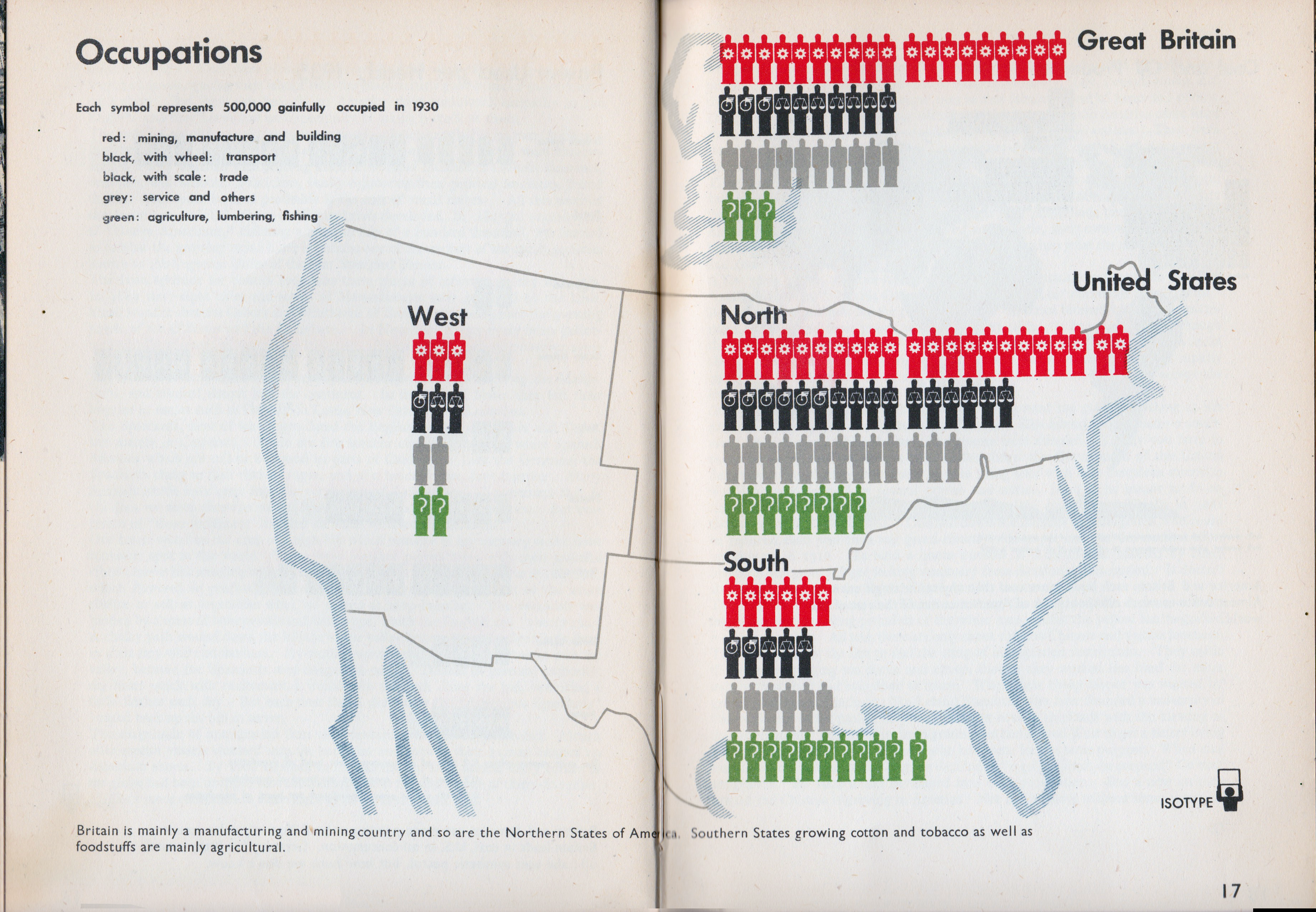
The map in “Occupations” shows a different kind of grouping mechanism than we see in this book (but we do see throughout this series). It breaks the US into three areas for comparison to Britain as a whole. By doing so it creates regions that are non-traditional but are still meaningfully comparable. For example, the Northern third of the US has more workers overall, but comparatively less than the South. The West has a fraction of the population from the other two, but it is distributed similarly to the North. Britain and the North share a similar make-up of occupations, probably because of British immigrants to that region.
“职业”中的地图显示的分组机制不同于本书中所见的分组机制(但我们在整个系列中都可以看到)。 它将美国分为三个区域,可以与整个英国进行比较。 通过这样做,它创建了非传统但仍然有意义地可比的区域。 例如,美国北部三分之一的工人总体上较多,但比南部少。 西方人口仅占其他两个人口的一小部分,但分布与北方相似。 英国和北部的职业构成相似,可能是由于英国移民到该地区。
As we have seen in other charts in this book, the grouping of the information really affects what is being communicated. By reducing this map to only three parts for the US and one for the British, it also focuses the reader’s attention. Likewise, The grouping of the icons into clusters of 10, also allows the eye to quickly sum the data as well.
正如我们在本书其他图表中所看到的,信息的分组确实会影响所传达的信息。 通过将地图缩小为美国的三部分和英国的三部分,它也吸引了读者的注意力。 同样,将图标分组为10个群集,还可以使眼睛快速汇总数据。
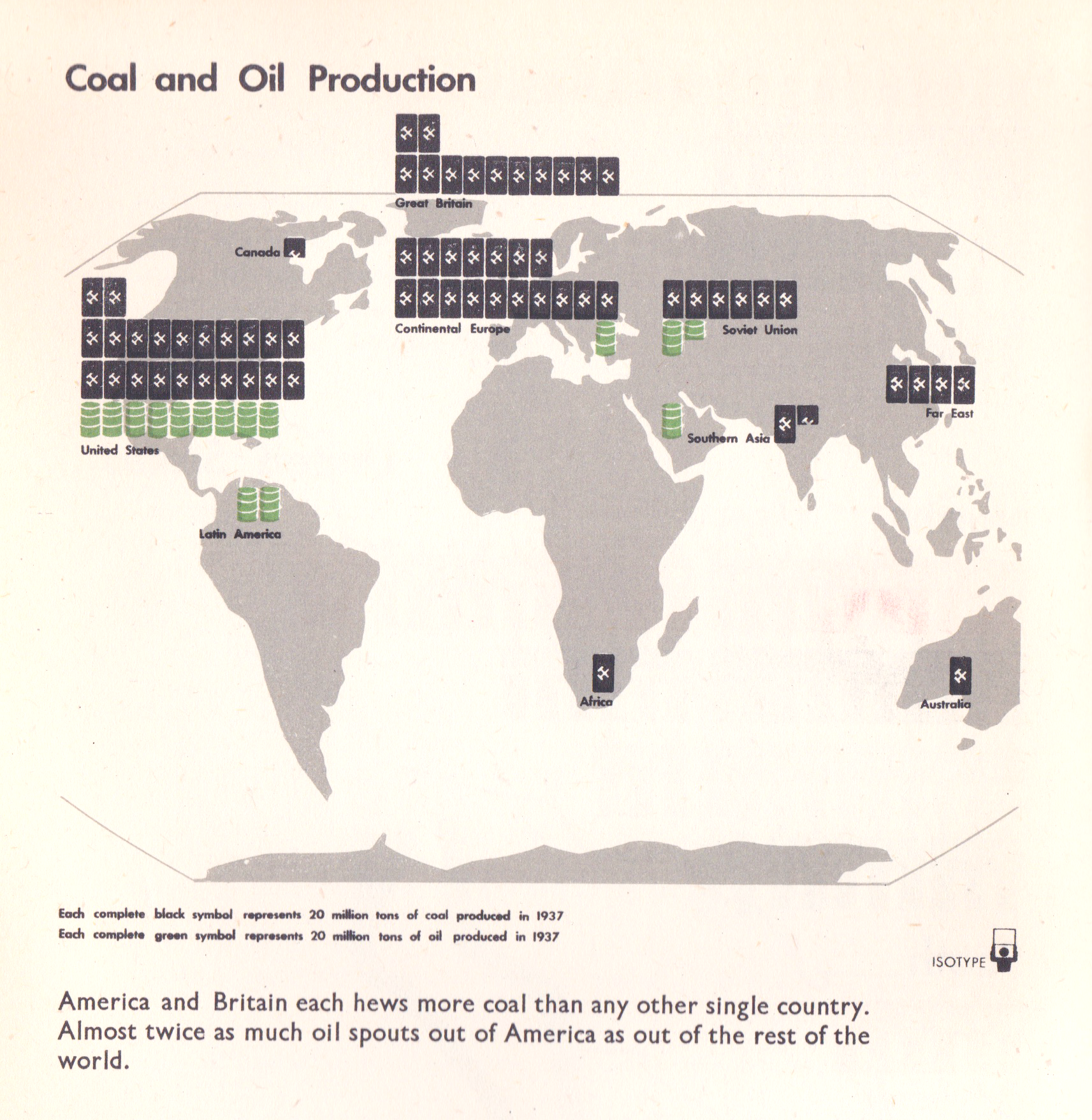
The last Isotype in this book is the global map of “Coal and Oil Production”. It shows exactly how disproportionate the US, England, and Europe were to the rest of the world in fossil fuels in 1937. While the icons are approximations, it is clear to see who had it and who did not. The single barrel of oil in “Southern Asia” (current Saudi Arabia) in interesting as oil was discovered in the region in 1908 but did not take over the global demand for oil until the 70s and 80s.
本书的最后一个同类型是“煤炭和石油生产”的全球地图。 它确切地显示了1937年美国,英国和欧洲在化石燃料上与世界其他地方的比例不成比例。虽然这些图标是近似的,但很明显可以看到谁拥有和没有谁。 有趣的是,“南亚”(现为沙特阿拉伯)的一桶石油于1908年在该地区被发现 ,但直到70年代和80年代才接管了全球对石油的需求。
Lastly, note the consistent use of icons for coal and oil across all the charts in the book. By the time this book was made, Otto and Marie were using a very consistent set of icons tested in their Vienna museum, and the color usage is consistent with earlier charts in the book as well.
最后,请注意本书所有图表中煤和石油图标的使用情况。 在本书编写之时,奥托和玛丽使用了在维也纳博物馆中测试过的非常一致的图标集,并且颜色用法也与本书中的早期图表保持一致。
系列首创 (The First In A Series)
The charts in “Only An Ocean Between” typify the approach made by the Isotype Institute during this period. Otto and Marie took a systematic approach to craft a larger system for understanding the meta-story, broke this larger narrative into themes, then focused each chart in the series to tell a story. It is brilliant work that builds a cohesive approach to educating the public on the core concepts of the book. The next book in the series, “Our Private Lives”, continues the systematic exploration by focusing on the cultural life of the two countries.
“之间只有一片海洋”中的图表代表了Isotype研究所在此期间采取的方法。 奥托(Otto)和玛丽(Marie)采用了系统的方法,设计了一个较大的系统来理解元故事,将较大的叙述分为主题,然后将系列中的每个图表聚焦为一个故事。 这项出色的工作建立了一种凝聚力的方法,以教育公众了解本书的核心概念。 该系列的下一本书“我们的私人生活”通过关注两国的文化生活,继续进行系统的探索。
This article comes as part of a series on Isotype and derives mainly from research on the design process created by the team at the Isotype Institute, and the life and work of Marie Neurath. My goal is to teach people about the techniques and mindset of this data-driven design team, in order to inspire new information design concepts today.
本文是有关Isotype的系列文章的一部分,主要来自Isotype Institute团队创建的设计过程研究以及Marie Neurath的生活和工作。 我的目标是向人们介绍这个数据驱动设计团队的技术和思维方式,以激发当今的新信息设计概念。
Major thanks to Alyssa Bell, RJ Andrews, Georges Hattab, Paul Kahn, and Elijah Meeks for the editing and continued support!!
非常感谢 Alyssa Bell , RJ Andrews , Georges Hattab , Paul Kahn 和 Elijah Meeks 的编辑和继续的支持!
同型的教训–第2部分 (Lessons of Isotype — PART 2)
Check out the next article in the series here:
在这里查看该系列的下一篇文章:
同型的教训–第3部分 (Lessons of Isotype — PART 3)
玛丽·尼拉特(Marie Neurath)的失传 (The Missing Legacy of Marie Neurath)
Focuses on the primary designer of Isotypes for 45 years.
专注于同型印刷的主要设计师长达45年。
解释单一同种型:从复杂性创建简单性 (Explaining a Single Isotype: Creating Simplicity from Complexity)
This deep-dive explains a single Isotype’s design as well as many aspects of the Russian economy.
这种深入的了解解释了单一同型飞机的设计以及俄罗斯经济的许多方面。

翻译自: https://medium.com/nightingale/exploring-isotype-charts-only-an-ocean-between-part-1-399f227e1c69
matlab 创建同型矩阵


 3万+
3万+

 被折叠的 条评论
为什么被折叠?
被折叠的 条评论
为什么被折叠?
 到【灌水乐园】发言


