


Talking about Tableau by pretending to use it for the first time
假装第一次使用Tableau来谈论它
反正风在吹 (Anyway the Wind Blows)
Ok well, first my boss, then her boss said I need to learn Tableau, and I’m teleworking today. So here I am. Seems like all I do anymore is learn. I just spent two months studying for this AWS exam that I failed last August. I passed my retake last week, but now my boss says I have to learn a BI tool next.
好吧,首先是我的老板,然后是她的老板说我需要学习Tableau,并且今天我正在远程办公。 所以我在这里。 似乎我现在所做的只是学习。 我刚刚花了两个月的时间来学习这项AWS考试,但去年八月却失败了。 上周我通过了重考,但现在老板说我接下来必须学习BI工具。

Why do I need to learn this, anyway? I make plenty of charts in Python. Everything I need, just write some code.
无论如何,为什么我需要学习这个? 我在Python中制作了大量图表。 我需要的一切,只需编写一些代码。
But Danielle says I have to try Tableau. She says it’s the best of both coding and visual apps like Excel or the Adobe, and now’s a good time since everyone’s doing remote work. And why are we teleworking? COVID-19, which sounds less like a virus and more like a pop punk band.
但是Danielle说我必须尝试Tableau 。 她说,这是编码和可视化应用程序(例如Excel或Adobe)最好的选择,现在是每个人都在进行远程工作的好时机。 为什么我们要远程办公? COVID-19 ,听起来不像是病毒,而更像是流行朋克乐队。

Regardless, I should probably learn Tableau in case Python stops working due to the virus. Here we go, rubber ducky, it’s me and you.
无论如何,我可能应该学习Tableau,以防Python由于该病毒而停止运行 。 我们走了, 橡皮鸭,是我和你。
我看到一个男人的小剪影 (I see a little silhouetto of a man)
Ok, Tableau. Internet search, “Tableau”. There’s a free version called Public. It only allows cloud saves for your charts and only lets you connect to a limited number of sources, but, it’s free. Ok, click to download & install.
好的,Tableau。 互联网搜索,“ Tableau”。 有一个名为Public的免费版本 。 它仅允许为图表保存云,并且仅允许您连接到有限数量的源,但是它是免费的。 好的,单击下载并安装。
And… loaded. Sample datasets, interesting, but I’ll use a spreadsheet I’ve been working on recently. And that’s loaded, very fast, and I see a button called New Worksheet to click at the bottom.
然后...加载。 样本数据集,很有趣 ,但是我将使用最近使用的电子表格。 加载非常快,我在底部看到一个名为“新建工作表”的按钮。
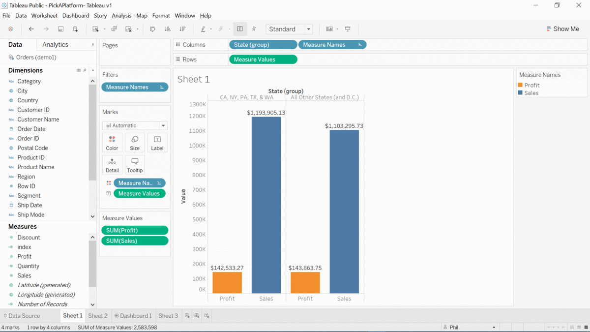
Column names on the left, huh. It’s on the right in Excel. And the columns are split into two groups called Measures and Dimensions. What is this “Marks” box next to the column names? And there’s two sections called Columns and Rows at the top center.
列名称在左侧,是。 在Excel中位于右侧。 然后,这些列分为两组,分别称为“度量”和“维”。 列名称旁边的“标记”框是什么? 顶部中心有两个部分,分别称为列和行。
Wonder what’s a nice, easy, paint-by-numbers recipe for this thing for beginners? I’ll just make something up for now.
想知道对于初学者来说,这东西有什么好,简单,按数字绘制的食谱吗? 我现在就弥补一下。
Scaramouche,Scaramouche,你会做Fandango吗? (Scaramouche, Scaramouche, will you do the Fandango?)
When I make a chart in Python, I usually keep my data tidy inside a Pandas dataframe. From there, I usually “pivot” or summarize the data somehow. Excel’s PivotCharts are the same way. Tableau seems to assume that I want to aggregate values from the get-go (and to be honest, that’s kinda nice). I’ll try dragging “Sales” to this Rows section, and then States to Columns. Boom, I have a chart. No pivoting or coding required, just like that.
当我用Python制作图表时,通常会将数据保持整齐在Pandas数据框中。 从那里,我通常以某种方式“ 透视 ”或汇总数据。 Excel的数据透视图是相同的方式。 Tableau似乎假设我要从一开始就汇总值(老实说,这很好)。 我将尝试将“销售”拖到“行”部分,然后将“状态”拖到“列”。 繁荣,我有一张图表。 这样就无需进行透视或编码。
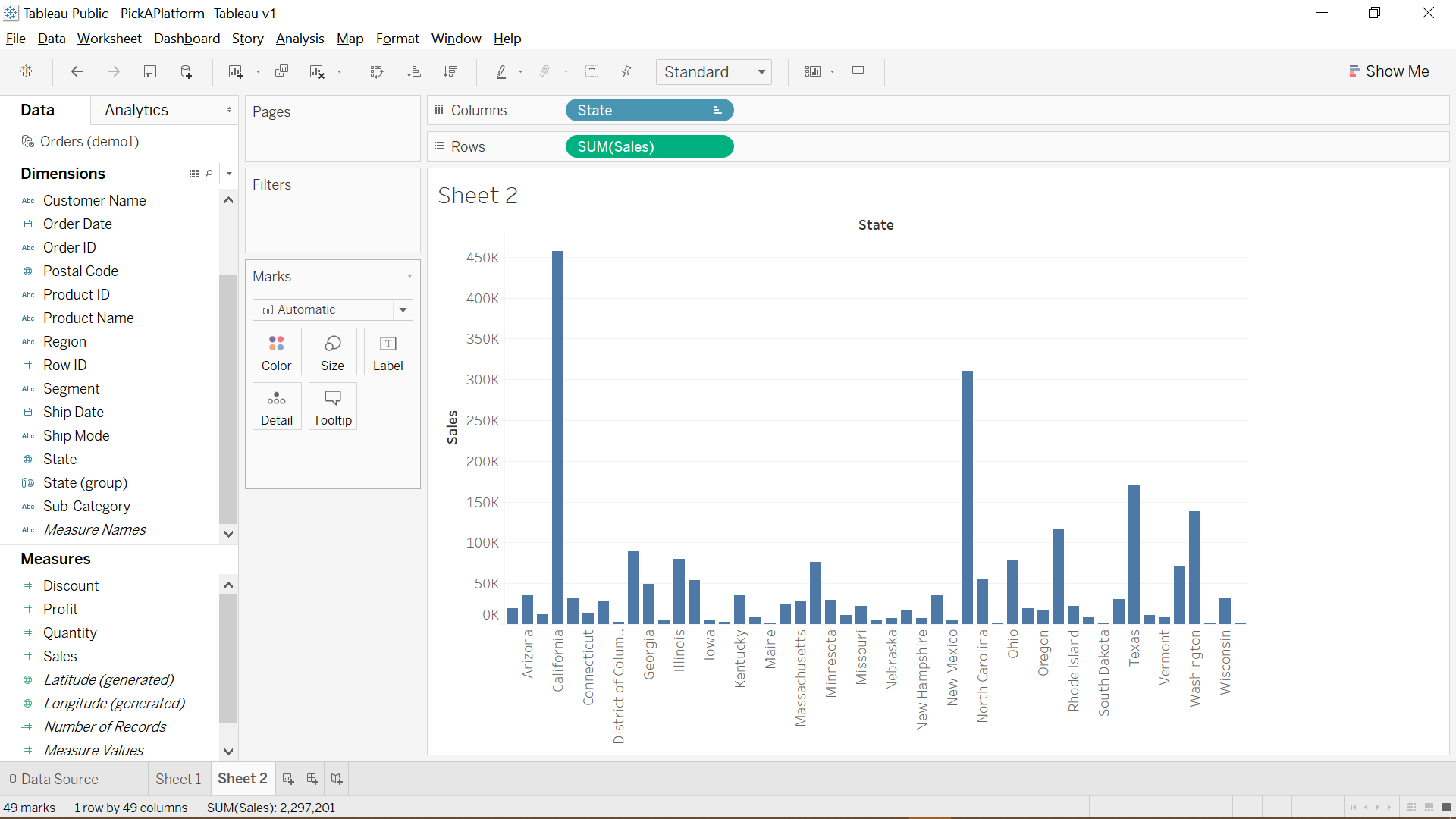
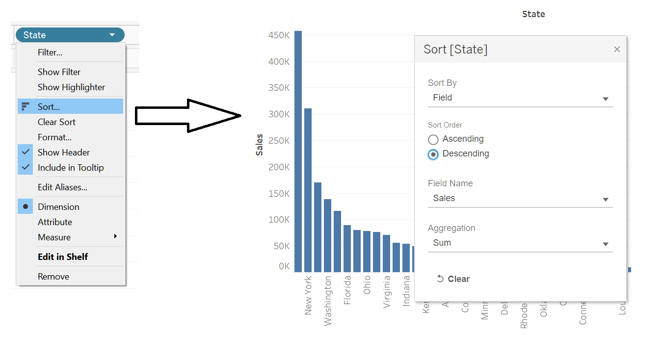
Let’s sort this from highest Sales to lowest. Internet search, “Tableau sort chart,” wow, first result, there’s literally an icon just for sorting. In Python I have to edit a line of code to do that, although that’s not hard. And that’s waaaay easier than Excel, which makes me hunt three or four clicks down in PivotTable settings. I’ll right-click on State and tweak it to sort on Sales. That right-click menu looks like it does a lot.
让我们从最高销售额到最低销售额进行排序。 互联网搜索“ Tableau排序图”,哇,第一个结果,字面上是一个仅用于排序的图标。 在Python中,我必须编辑一行代码来做到这一点,尽管这并不难。 这比Excel容易得多,这使我在数据透视表设置中搜寻三到四次单击。 我将右键单击“状态”,然后对其进行调整以对“销售”进行排序。 右键单击菜单看起来很有用。
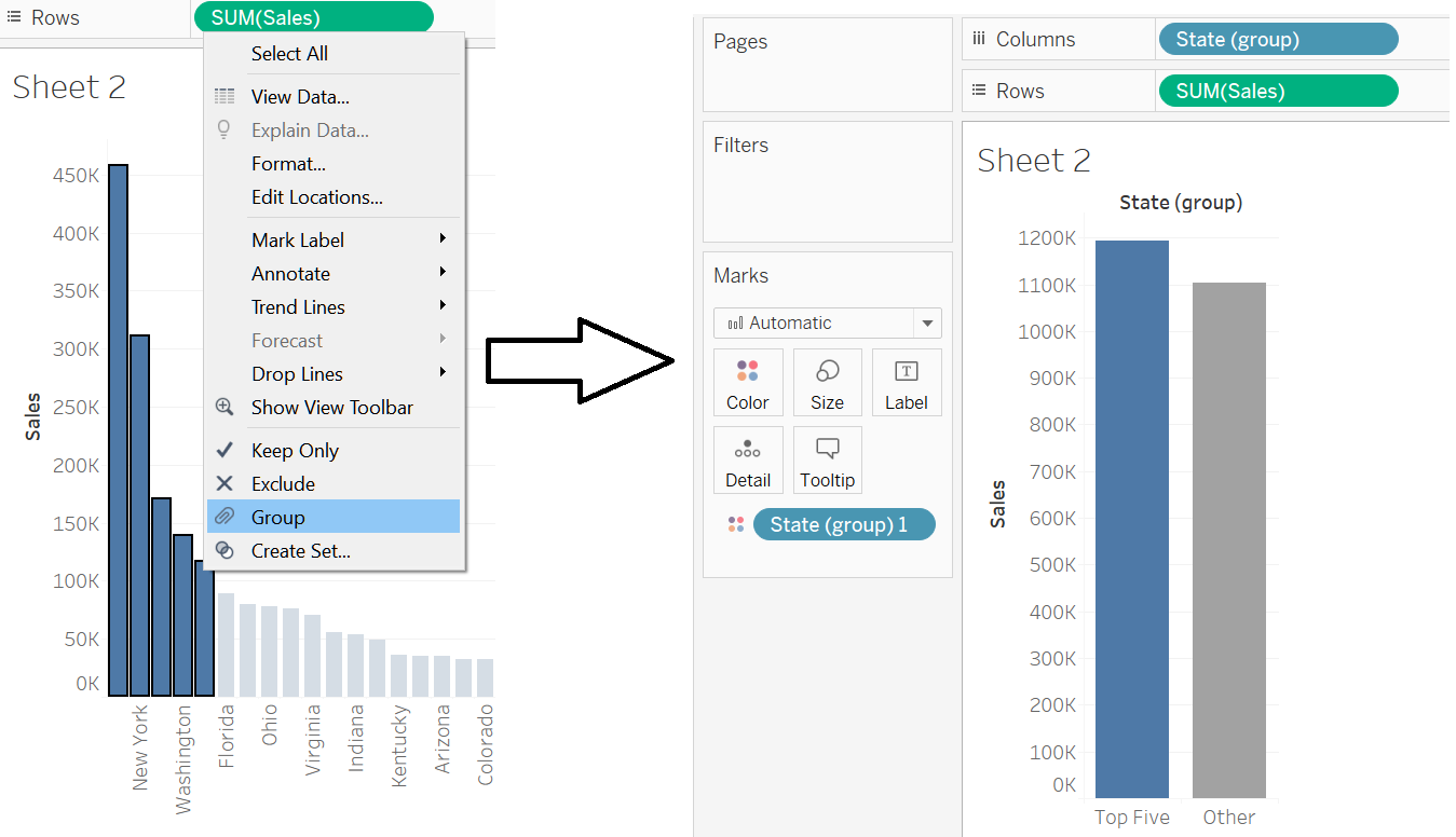
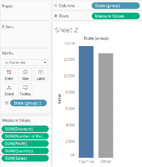
What if I need to group certain States? I had a job once where I noted the top five biggest markets in some data. It took a while to edit my data to support it. I can click on these different bars, so, can I just drag-select what I want? Ok internet search, “tableau group from select”. Several results talk about making groups, I’m gonna read this one that talks about doing it directly from the chart.
如果我需要对某些国家进行分组怎么办? 我曾经做过一份工作,在其中我指出了一些数据中的前五个最大市场。 花了一些时间来编辑我的数据以支持它。 我可以单击这些不同的栏,所以我可以拖动选择我想要的东西吗? 好的互联网搜索,“选择的Tableau组”。 几个结果谈谈制作组,我要读这一个关于直接从图表做了会谈。
Wait, so I just highlight what I want, right-click, and select “Group”? That’s… wow, that is really easy. What else… I can tweak group names by right-clicking on the group and selecting Edit Group. I’ll switch the States Group with States on my Columns section.
等待,所以我只突出显示我想要的内容,右键单击并选择“组”? 哇,那真的很容易。 还有什么...我可以通过右键单击组并选择“编辑组”来调整组名称。 我将在“列”部分中将“状态组”与“状态”进行切换。
比斯米拉! (Bismillah!)
Ok fine, but I probably want more than one of these “measures.” How would I do that? I could have each measure be a bar on its own. That’s called a grouped bar chart, right? Internet search: “tableau grouped bar”. Looks like they want me to watch a Youtube video. I’ll read some more articles, they say to use…. what… what is… “Measure Values?” Huh?
好的,但是我可能想要多个“措施”之一。 我该怎么做? 我可以让每项措施单独成为一个标准。 这就是所谓的分组条形图,对吗? 互联网搜索:“桌面分组栏”。 好像他们要我观看Youtube视频。 我会读一些更多的文章,他们说使用...。 什么...什么是“度量值”? ??
Internet search, “tableau measure values”. Oh no, the first result is a crazy long article. Ok, trying “tableau measure values group bar”… Ok, I think I just want to build this and then I’ll figure out what it is.
互联网搜索,“表格度量值”。 哦,不, 第一个结果是一篇冗长的疯狂文章 。 好的,尝试“表格度量值组栏”……好的,我想我只是想构建它,然后我会弄清楚它是什么。
Sounds like it lets me have more than one measure on the chart, which is what I want… kinda. I’ll switch Sales with Measure Values…
听起来好像让我在图表上拥有多个指标,这就是我想要的……有点。 我将使用度量值切换销售…
I don’t really know what this is. I can see down in the Measure Values card that literally every measure got added regardless of the fact that I only needed a couple. And also it’s still 2 bars, not 4 bars in a grouped bar chart.
我真的不知道这是什么 我可以在Measure Values卡中看到,实际上每个度量都被添加了,而不管我只需要几个。 而且它仍然是2条,而不是分组条形图中的4条。
So what does “Measure Names” do? I saw that in one of the articles earlier. Is this like in a PivotChart in Excel where I put something in “Columns” and it makes like a hierarchy? Well… let’s… let’s try it.
那么“度量名称”是做什么的呢? 我在前面的一篇文章中看到过。 这就像在Excel中的数据透视图中,我在“列”中放置了一些东西,它就像一个层次结构一样吗? 好吧,让我们尝试一下。
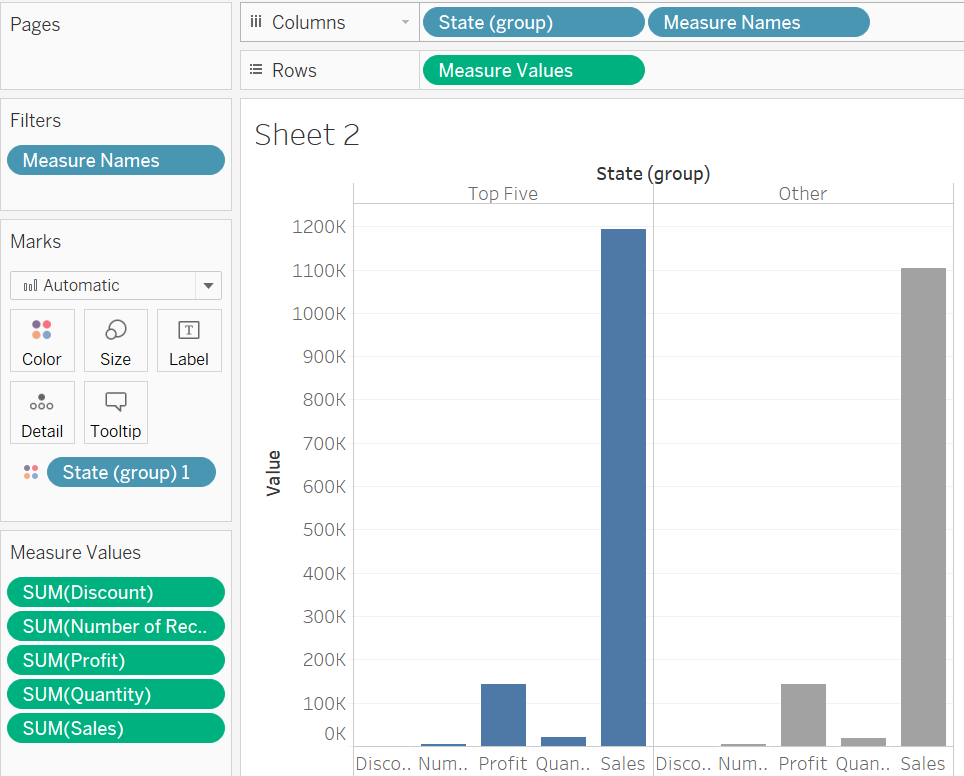
Oooooooooooh. The Measure Values card holds Measures I choose, and Measure Name splits the bars out.
哦,哦。 “度量值”卡保存我选择的度量,“度量名称”将各个条分开。
Wow, “Measure Values” is not a good name to describe what that actually is. It’s more like “Select multiple measures” or “Use to pick more than one… thingy.” I guess I just click-drag off all the measures I don’t want and it’ll reduce the bars each time… yeah ok, let’s keep it at Profits and Sales. And let’s also have Measure Names to the left of my grouped States.
哇,“度量值”不是描述实际含义的好名字。 它更像是“选择多个度量”或“用于选择一个以上……很重要”。 我想我只需单击并拖动我不需要的所有度量,它就会每次减少限制...是的,让我们将其保留在“利润和销售”中。 在分组国家的左侧还有度量名称。
I think I need to swap my States with the Measure Names. Wait, just drag one to the other side of the other? Huh, that’s easy too.
我认为我需要用措施名称交换我的国家。 等一下,将一个拖到另一边? 嗯,这也很容易。
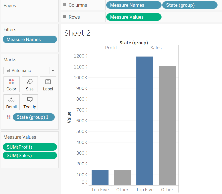
How can I make those bars a different color? They identify different attributes of my data so I want them different. Searching for “tableau measure values color”…. measure names on colors marks card. Colors marks card, where is that? Search for “tableau colors marks card”…. Oh! This article has a gif! I love it when articles have gifs instead of videos SO MUCH!
我该如何使这些条形颜色不同? 它们标识了我数据的不同属性,因此我希望它们与众不同。 搜索“表格度量值颜色”…。 测量颜色标记卡上的名称。 颜色标记卡,在哪里? 搜索“桌面颜色标记卡”…。 哦! 这篇文章有一个gif ! 当文章包含gif而不是视频时,我喜欢它!
But yeah. Measure Values can select more than one measure at once, but you have to specify which measures you want or Tableau will absolutely try to show every Measure. “Measure Names” is also pretty arcane, especially when it represents differing measures you’ve added to your chart.
但是,是的。 度量值可以一次选择多个度量,但是您必须指定所需的度量,否则Tableau绝对会尝试显示每个度量。 “度量名称”也很神秘,尤其是当它代表您添加到图表中的不同度量时。
别西卜为我,为我,为我预留了一个魔鬼! (Beelzebub has a devil put aside for me, for me, for me!)
So now I have a chart. I’m curious about the formatting, though. I’ll search “tableau formatting.” Oh…. oh no. Oh dear. Pane? Worksheet level? What is even half of this? I just want these lines taken off!
所以现在我有一张图表。 不过,我对格式感到好奇。 我将搜索“表格格式”。 哦…。 不好了。 噢亲爱的。 窗格? 工作表级别? 哪怕是一半呢? 我只希望这些线脱掉!
Two hours later…
两个小时后…
If you don’t want the grey lines separating the two groups of columns, you have to 1. right-click on the bar chart or its whitespace, but NOT on: the axis labels, field names at the top, empty space to the right, or column names at the bottom, then 2. Select Format, 3. Locate the icon for “Borders”, which happens to be the 4th one in the Format pane, 4. Scroll down to Column Divider, and 5. Set “Pane” for Column Divider to None. And what’s a pane? No idea.
如果您不希望用灰线分隔两组列,则必须1.右键单击条形图或其空白,但不要单击:轴标签,顶部的字段名称,空白的空格右侧,或底部的列名,然后2.选择格式,3.在“格式”窗格中找到“边框”的图标,该图标恰好是第4个,4.向下滚动到“列分隔符”,然后5.设置“窗格”将“列分隔符”设置为“无”。 什么是窗格? 不知道。
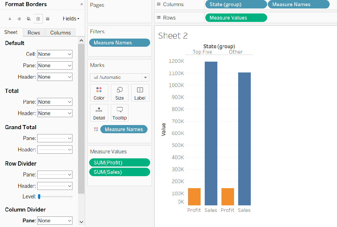
This seriously strains the mind. That seems like a small change but it requires some deep knowledge of the software — unless I could find and follow a guide.
这严重使人紧张。 这似乎是一个很小的变化,但是它需要对软件有深入的了解-除非我能找到并遵循指南。
刚要出去,要就在这里! (Just gotta get out, just gotta get right outta here!)
Honestly, when this program is drag-and-drop or double-click, it really is very good. It’s when I do the other stuff like the format bar that it’s hard.
老实说,当该程序是拖放或双击时,它确实非常好。 当我做其他事情,例如格式栏时,这很困难。
Like a title. I bet you I can double-click the “Sheet 1” title and type in some conclusion that summarizes what the chart shows. Heh, that’d be great if it was that easy. Like I just…
像标题一样。 我敢打赌,我可以双击“ Sheet 1”标题并输入一些结论,以总结图表显示的内容。 嘿,那真是太好了。 就像我一样
Ok, let's tackle a background. Personally, I don’t care for all-white backgrounds in my charts and tend to use a background whose hex code value I memorized by using it in Python: #f0f0f0.
好吧,让我们讨论一下背景。 就我个人而言,我不在乎图表中的全白背景,而是倾向于使用我在Python中使用其记忆的十六进制代码值的背景:#f0f0f0。
Now searching: Tableau worksheet background.
现在搜索:Tableau工作表背景。
Sigh. I’m getting kinda tired… checks email…. checks Reddit… checks Slack… checks Instagram… checks Reddit again… checks Facebook… checks Reddit again…
叹。 我有点累... 查看电子邮件...。 检查Reddit…检查Slack…检查Instagram…再次检查Reddit…检查Facebook…再次检查Reddit…
45 minutes later
45分钟后
Wait, what was I doing? Right, the background.
等等,我在做什么? 对,背景。
Top result has it… wait, Tableau has its own help forums? With users from their own community?! YES!
结果是最好的 ...等等,Tableau有自己的帮助论坛? 与来自自己社区的用户吗? 是!
Ok, so my frenemy the Format pane made the background change. I’ll also play with the font and spacing a bit, but those look dramatically easier to tackle.
好的,所以我非常喜欢“格式”窗格进行了背景更改。 我还将使用字体和间距,但是看起来很容易解决。
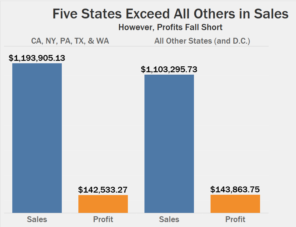
I mean… that looks ok, but I hate that distance between my orange and blue bars. Can I fix that somehow?
我的意思是……看起来还不错 ,但我讨厌橙色和蓝色条形之间的距离。 我可以解决这个问题吗?
Searching: “tableau smaller distance between grouped bar chart”. And…. no. This relatively minor thing is not available in Tableau. *sigh. I guess I need to fuss with the Pane formatting again to make this look how I want.
搜索:“画面之间的条形图间距较小”。 和…。 没有。 Tableau中没有相对较小的功能。 *叹。 我想我需要再次对Pane格式进行修改,以使它看起来像我想要的。
I’m just… I’m amazed at how quickly Tableau starts you off, and then almost immediately it requires fussing with advanced settings to do things that you’d think are simple. It’s pretty and it’s fast but… fine. Here’s my chart.
我只是……Tableau启动您的速度如此之快,让我感到惊讶,然后几乎立即需要对高级设置进行处理,以完成您认为简单的事情。 很漂亮,很快,但是...很好。 这是我的图表。
没关系,任何人都可以看到 (Nothing really matters, anyone can see)
Gonna call it a day. As with many apps, my proficiency with it determines what I can make with it. I’ve argued with data scientists claiming R or Python is the better computer language for this or that task. When I ask them how good they code in both languages, I get the predictable answer- they’re fluent in one and very ignorant of the other.
会称之为一天。 与许多应用程序一样,我对它的熟练程度决定了我可以用它做什么。 我曾与数据科学家争论过,声称R或Python是完成此任务的更好的计算机语言。 当我问他们使用两种语言编写代码的能力如何时,我得到了可以预见的答案-他们精通一种,而另一种却很无知。
Apps like Tableau? It seems like the same deal. But unlike, say, the Adobe Creative, Tableau gave me a totally free version, NOT a trial. Plus those forums are really something.
像Tableau这样的应用程序? 似乎是同一笔交易。 但是与Adobe Creative不同,Tableau给了我一个完全免费的版本,而不是试用版。 再加上那些论坛真的是东西。
Wonder what they’re like on social media. Most tech companies have Twitter, right? WHOA. #MAKEOVERMONDAY. THIS IS AMAZING. Ah, where’s this been all my life?!
想知道他们在社交媒体上的感受。 大多数科技公司都有Twitter,对吗? WHOA。 #MAKEOVERMONDAY 。 这真太了不起了。 啊,我这辈子在哪里?
Ok, so Tableau is as good as advertised, and it has a growing community that constantly pushes its limits. I think I mostly agree with Danielle’s comparison to the Adobe Creative earlier. I still feel like Tableau is closer to data than, say, Photoshop. Though Illustrator can do data… oh buddy, you know what? It’s way too late at night for that debate.
好的,Tableau的表现与广告宣传的一样好,并且它的社区在不断发展,不断推陈出新。 我想我大体上同意Danielle与Adobe Creative的比较。 我仍然觉得Tableau比说Photoshop更接近数据。 尽管Illustrator可以处理数据 …哦,伙计,您知道吗? 这场辩论到深夜太晚了。
But what’s interesting, after all this work I’ve done, is how my clients see Tableau differently. I’ve had clients get the impression somehow that it’s a fun toy, maybe a PowerPoint knockoff or spreadsheet automation tool at most. And the full version isn’t free, which they hate.
但是,在我完成所有这些工作之后,有趣的是,我的客户如何看待Tableau。 我给客户留下了某种印象,那就是它很有趣,或者最多是PowerPoint仿制品或电子表格自动化工具。 完整版不是免费的,他们讨厌。
Just for the sake of argument, let’s say that they do pay the money. Then what? They’re able to make any chart, understand any piece of data, and all with ease? Come on. I’m experienced with data, and I ran into issues getting Tableau to do what felt like basic tasks. You want a beginner to make something I see people doing in #MakeoverMonday? Not happening.
仅出于争辩的目的,让我们说他们确实付了钱。 那呢 他们能够制作任何图表,了解任何数据,并且都轻松自如吗? 来吧。 我对数据有丰富的经验,遇到了让Tableau进行基本任务之类的问题。 您想让初学者做一些我在#MakeoverMonday中所做的事情吗? 没有发生。
There’s a really big gap with Tableau between these insane experts and the average person that doesn’t have several years of experience. But because Tableau has so many experts, people buying the license think “oh, this’ll let me make charts like that” and immediately become sorely, badly mistaken.
这些疯狂的专家与没有几年经验的普通人之间,Tableau之间确实存在很大的差距。 但是由于Tableau有这么多的专家,所以购买许可证的人认为“哦,这会让我做这样的图表”,然后立即变得非常痛苦,严重错误。
It really is the best of Excel and Adobe, to a fault. Untrained users can expect a product that quickly makes standard charts with great design principles. Trained users can make outstanding custom products.
确实是Excel和Adobe的最佳选择。 未经培训的用户可以期望一款产品能以出色的设计原理快速制作标准图表。 受过培训的用户可以制作出色的定制产品。
Plus I bet they can sense Microsoft breathing down their neck with Power BI. I’ve seen Power BI demos. If Microsoft ever puts the same quality of visuals into Power BI as Tableau has, then Tableau will be in serious trouble.
另外,我敢打赌,他们可以感觉到Power BI使Microsoft垂涎三尺。 我看过Power BI演示。 如果Microsoft在Power BI中使用与Tableau相同的视觉效果,则Tableau将会遇到严重麻烦。
Ok, fine. I’ll get good at Tableau, but only with a healthy sense of awareness.
好的。 我会在Tableau上表现不错,但只有具有健康的意识。

翻译自: https://medium.com/nightingale/so-you-want-to-pick-a-dataviz-platform-part-iii-tableau-8066ffbac230


 1377
1377


 被折叠的 条评论
为什么被折叠?
被折叠的 条评论
为什么被折叠?
 到【灌水乐园】发言


