


gatsby
Although Gatsby is built upon React, and many of us are comfortable with the React framework, there are many distinguishing features. So, I thought the best approach would be to comb through the Gatsby team’s official tutorial, for any useful nuggets along the way. I’ll be starting part zero of their tutorial. For each section, I’ll point out things that seems to be unique to the platform versus vanilla React — Hopefully saving your time if you’re already familiar with React and want to get going with Gatsby.
尽管Gatsby是基于React构建的,并且我们许多人都对React框架感到满意,但仍有许多不同的功能。 因此,我认为最好的方法是梳理Gatsby团队的官方教程,以寻找沿途的有用掘金。 我将从他们的教程的零开始。 在每个部分中, 我都会指出平台与原始React相比似乎是独一无二的—如果您已经熟悉React并想开始使用Gatsby,希望可以节省您的时间。
0.设置您的开发环境 (0. Set Up Your Development Environment)
Everything here was fairly smooth, and Gatsby has its own CLI tool to provide a modified version of create-react-app called gatsby new. On Ubuntu, my version of node (13.5.0) failed to build with gatsby new, but switching to (11.15.0) temporarily fixed the issue. The rest of the tutorial at this point was basic things I already had taken care of on my machine (git, an IDE, etc).
这里的一切都相当顺利,而且Gatsby拥有自己的CLI工具,可以提供名为gatsby new的修改版本的create-react-app 。 在Ubuntu上,我的节点(13.5.0)版本无法使用gatsby new进行构建,但是切换到(11.15.0)暂时解决了该问题。 此时,本教程的其余部分是我已经在计算机上处理过的基本内容(git,IDE等)。
1.认识盖茨比积木 (1. Get to Know Gatsby Building Blocks)
Primarily, Gatsby offers two ways of ‘templating’ to get started: starters and themes. The distinction here is that starters can’t be updated after you begin from one, so there’s no going back or rebasing with updates to starter materials. With themes, you’re able to import changes to the theme as their developers introduce them.
盖茨比主要提供两种“模板化”入门方法:入门者和主题 。 这里的区别在于,从一个开始就无法更新启动器,因此无需回溯或重新启动对启动器材料的更新。 使用主题,您可以在开发人员介绍主题时将更改导入主题。
With Gatsby pages, anything you put in src/pages/, automatic routing will make the page accessible at localhost:wxyz/pagenamehere. Just like standard React apps hosted on a development server. At this point in the docs, I had a problem with their tutorial:
使用Gatsby页面时,无论您在src / pages /中放置什么内容,自动路由都会使该页面可在localhost:wxyz / pagenamehere进行访问 。 就像托管在开发服务器上的标准React应用一样。 在文档的这一点上,我对他们的教程有疑问:
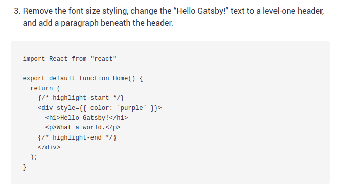
Using their code, I was initially confused as to why it wouldn’t compile. The hightlight-start and hightlight-end commented out code seemed to be causing an issue, but I wasn’t exactly sure as to why. I looked up React comment syntax and… yup, looked good. After tinkering, I realized that comments need to exist inside of a <div /> element somewhere. Upon emailing them to alert them of the error, I was impressed to see them get back to me within 24 hours!
使用他们的代码,我最初对为什么不编译感到困惑。 在高光开始和高光结束处注释掉的代码似乎引起了问题,但是我不确定为什么。 我查找了React注释语法,然后…看起来不错。 修改之后,我意识到注释需要存在于<div />元素中。 给他们发送电子邮件以警告他们错误时,给我留下深刻的印象,看到他们在24小时内回复了我!
Hi Corey!
嗨,科里!
Thanks for pointing that out! Looks like we’ve got a bug with our highlighting syntax — that shouldn’t even be displaying! It should look like the attached. We’ll get it fixed — thanks for letting us know!
感谢您指出了这一点! 看起来我们的突出显示语法有一个错误-甚至不应该显示! 它应该看起来像附件。 我们将修复它-感谢让我们知道!

This section of the tutorial also introduces sub-components, components you wish to reuse in multiple pages (such as a header or footer), which it recognizes in src/components. This is in contrast to page components, which are the automatically routed-to pages mentioned earlier. The rest of this section introduces things that are also React standard, such as the Link component and syntax <Link />. However, the section ends with instructions on how to specifically continuously deploy your Gatsby site using Surge and their very own Gatsby Cloud.
本教程的这一部分还介绍了子组件 ,这些子组件是您希望在多个页面中重用的组件(例如页眉或页脚),它可以在src / components中识别。 这与页面组件相反,后者是前面提到的自动路由到的页面。 本节的其余部分介绍了也是React标准的内容,例如Link组件和语法<Link />。 但是,本节以有关如何使用Surge及其自己的Gatsby Cloud专门连续部署Gatsby站点的说明结尾。
2.盖茨比风格简介 (2. Introduction to Styling in Gatsby)
Generally, most of what you know in React applies here. Want to use SCSS? Make sure and npm install it. One exception here is for your universal css file (usually styles.css, but in this case must be global.css), you need to declare it within a gatsby-browser.js file, and it will be imported automatically site-wide. Next, component-scoped CSS is introduced, which follows some naming conventions.
通常,您在React中了解的大多数内容都适用于此。 要使用SCSS吗? 确保和npm安装它。 通用css文件(通常为styles.css,但在这种情况下必须为global.css)是这里的一个例外,您需要在gatsby-browser.js文件中声明它,并将其在整个站点范围内自动导入。 接下来,介绍了组件范围CSS,该CSS遵循一些命名约定。
import React from "react"
import containerStyles from "./container.module.css"
export default function Container({ children }) {
  return <div className={containerStyles.container}>{children}</div>
}
Then, you create a file called container.module.css with whatever style declarations you desire (in this case, with related to the .container. The entire purpose of scoped styling here is that using files appended with module.css will automatically generate unique class names such as about-css-modules-module-avatar-1ICmi that prevent any conflicts from occurring.
然后,使用所需的任何样式声明(在这种情况下,与.container相关)创建一个名为container.module.css的文件。作用域样式的整个目的是使用附加了module.css文件将自动生成唯一的诸如about-css-modules-module-avatar-1ICmi类的类名称,可防止发生任何冲突。
3.创建嵌套的布局组件 (3. Creating Nested Layout Components)
Remember the sub-components mentioned above? That’s what we’re working with here, reusable UI and page elements. Here, they introduce the concept of not only React plugins, but Gatsby specific plugins, of which there are plenty of gems to choose from. New to me, is an introduction to the vanilla JS plugin Typography.js and its Gatsby counterpart.
还记得上面提到的子组件吗? 这就是我们在这里使用的,可重用的UI和页面元素。 在这里,他们不仅介绍了React插件的概念,还介绍了Gatsby特定插件的概念,其中有很多选择 。 对我来说,新手是对香草JS插件Typography.js及其Gatsby的介绍 。

While you can install any plugin you wish to Gatsby, I wanted to install this one to understand how to interact with specific Gatsby-watched files like gatsby-config.js. So, I’ll directly paraphrase part of the docs for a moment to touch on what’s Gatsby unique. If you already use React, not much is new here when installing this plugin and it’s dependencies. npm install --save gatsby-plugin-typography react-typography typography typography-theme-fairy-gates. However, we now need to edit the gatsby-config.js file to include it. Basically, whichever plugins you install, they need to be addressed in the gatsby-config.js file.
虽然您可以将任何插件安装到Gatsby,但我想安装该插件以了解如何与受Gatsby监视的特定文件(如gatsby-config.js进行交互。 因此,我将直接解释部分文档,以介绍Gatsby的独特之处。 如果您已经使用过React,那么在安装此插件及其相关性时,这里并没有多少新内容。 npm install --save gatsby-plugin-typography react-typography typography typography-theme-fairy-gates 。 但是,我们现在需要编辑gatsby-config.js文件以包含它。 基本上,无论您安装了哪个插件,都需要在gatsby-config.js文件中进行处理。
module.exports = {
  plugins: [
    {
      resolve: `gatsby-plugin-typography`,
      options: {
        pathToConfigModule: `src/utils/typography`,
      },
    },
  ],
}
NOTE: Let’s talk about ES6 and arrow functions for a moment. If you haven’t noticed by now, the Gatsby docs don’t declare things in the most modern way (I’m assuming to not leave late adopters and legacy code bases out). For example, React boilerplates, via something like the VS Code plugin Code plugin Simple React Snippets, take some extra labor on your part to align with the Gatsby docs. For example:
注意:让我们暂时谈论一下ES6和箭头功能。 如果您现在还没有注意到,那么Gatsby文档不会以最现代的方式声明事物(我假设不会将后期采用者和遗留代码库排除在外)。 例如,React样板通过VS Code插件Code插件Simple React Snippets之类的东西 ,需要花费一些额外的精力来与Gatsby文档保持一致。 例如:
Gatsby docs explaining out to use a Layout component
Gatsby文档解释了如何使用Layout组件
import React from "react"
export default function Layout({ children }) {
  return (
    <div style={{ margin: `3rem auto`, maxWidth: 650, padding: `0 1rem` }}>
      <h3>MySweetSite</h3> {/* highlight-line */}
      {children}
    </div>
  )
}
Same idea, with an ES6 arrow function
同样的想法,带有ES6箭头功能
import React from "react";const Layout = ({ children }) => (
     <div style={{ margin: `3rem auto`, maxWidth: 650, padding: `0 1rem` }}>
       {children}
     </div> );  export default Layout;
The rest of this section centers around the idea of reusable Layout components in React — nothing exclusive here. Although, the next section certainly is and where Gatsby begins to set itself apart.
本节的其余部分围绕React中可重用的Layout组件的概念进行讨论-这里没有排他的内容。 虽然,下一节肯定是盖茨比开始脱颖而出的地方。
4.盖茨比中的数据… (4. Data in Gatsby…)
TO BE CONTINUED…
未完待续…
Check later this next week (of August 10, 2020) for this to be further built out :) Until then!
下周晚些时候(2020年8月10日)检查此内容是否可以进一步构建:)直到那时!
gatsby


 1368
1368


 被折叠的 条评论
为什么被折叠?
被折叠的 条评论
为什么被折叠?
 到【灌水乐园】发言


