


ux设计
How would you illustrate the concept of ‘culture design’? What about ‘designing for trust’, or ‘disability design’?
您将如何说明“文化设计”的概念? 那么“为信任而设计”或“残疾设计”呢?
Over an 18-month period from 2018, I illustrated over 75 banners for various UX design articles across Adobe’s design blogs. These have been a career highlight for me, both as a designer and as an illustrator.
从2018年开始的18个月中,我在Adobe的设计博客中为各种UX设计文章展示了75多个横幅 。 无论是作为设计师还是插画家,这些都是我职业生涯的亮点。

Prior to this role, I had limited expertise in illustration. I had been practicing UX design for a few years and I’d done a lot of sketchnoting (a.k.a. visual note-taking), but that wasn’t the same as producing finished illustrations.
在担任此职位之前,我在插图方面的专业知识有限。 我从事UX设计已经有几年了,我做了很多素描(也就是视觉笔记),但这与制作完成的插图不同。
So when people occasionally asked me, ‘Hey, what’s your process for creating these?’, it was a good question.
因此,当人们偶尔问我:“嘿,创建这些文件的过程是什么?”,这是一个很好的问题。
这不是简单的炼金术 (It’s not simple alchemy)
When the task involves translating complex ideas into a simple visual, it isn’t just about having ‘drawing skills’. It’s about creating something new.
当任务涉及将复杂的想法转换为简单的视觉效果时,不仅仅具有“绘画技巧”。 这是关于创建新的东西。
For these banner illustrations, I had to be creative in order to solve specific problems. Such as:
对于这些横幅插图,我必须具有创造力才能解决特定的问题。 如:
- How do you take a 1,000 to 2,000-word article, break down the main concepts, and represent them in one image? 您如何撰写一篇1,000至2,000字的文章,分解主要概念,并以一张图片来表示它们?
- How do you keep images fresh and unique, in a way that draws people’s attention without feeling repetitive? 您如何保持图像的新鲜度和独特性,从而引起人们的关注而又不引起重复?
- How do you do this multiple times per week, day-in, day-out? 您如何每天,每天,每天多次执行此操作?
设计过程 (A design process)
After much trial and error, I landed on a fairly reliable process to get from an article to a finished piece. Surprise, surprise — the steps in my process looked somewhat similar to a design process.
经过反复的尝试和错误,我找到了一个相当可靠的过程,可以从一篇文章到完成一篇文章。 惊喜,惊喜—我的过程中的步骤看起来与设计过程相似。
步骤1.发现 (Step 1. Discovery)


This is where I investigate the article.
这是我调查本文的地方。
Just like a user interview, I take lots of notes and explore the topic as much as I can. To get more depth, I look up the author and any other articles they’ve written, any motifs in their work, and any visual metaphors they use in their language.
就像用户面试一样,我会做很多笔记并尽可能地探索该主题。 为了更深入,我查找了作者和他们写的任何其他文章,他们的作品中的图案以及他们在语言中使用的任何视觉隐喻。
步骤2.视觉综合 (Step 2. Visual synthesis)
This is where I translate concepts from the article into visual language.
这是我将文章中的概念转换为可视语言的地方。
First, I look at my concept map and highlight any key themes. I then try to produce some images for those themes.
首先,我查看概念图并突出显示所有关键主题。 然后,我尝试为这些主题生成一些图像。
As I synthesise the content, I’ll go to search engines like Google Images and The Noun Project to find images that match the key themes. The images I gather then become stimulus for the next step.
在合成内容时,我将使用Google图片和The Noun Project等搜索引擎来查找与关键主题匹配的图片。 然后,我收集的图像将成为下一步的刺激。
步骤3.构想 (Step 3. Ideation)
This is where I sketch as many concepts for the image as possible.
这是我为图像绘制尽可能多的概念的地方。
Using a method called thumbnail sketching, I put down miniature versions of any concepts that come to mind. This is a quick way to generate ideas, which is great because at this stage, quantity is key.
使用一种称为“ 缩略图绘制”的方法,我记下了所想到的任何概念的微型版本。 这是产生想法的快速方法,这很不错,因为在此阶段数量是关键。

If I ever run out of ideas, I’ll use a random word generator to generate some random words. From there, I’ll try to make forced associations between those words and the main topic, which helps me to come up with new thumbnails.
如果我用尽了所有想法,我将使用随机词生成器来生成一些随机词。 从那里,我将尝试在这些单词和主要主题之间建立强制关联,这有助于我提出新的缩略图。
Of course, most of these concepts won’t get used in the end. Being OK with discarding ideas is part of the process for creating something great. Behind the 75 illustrations I’ve done are over a thousand concepts that have been thrown away.
当然,大多数这些概念最终都不会使用。 摒弃想法是好的创造过程的一部分。 在我完成的75幅插图后面,有超过一千个概念被抛弃了。
4.细化 (4. Refinement)
This is where I take a concept and turn it from a sketch to an illustration.
在这里,我接受一个概念并将其从草图变成插图。
Firstly, I’ll turn two of my best concepts into larger, rough sketches for my editor to choose from.
首先,我将把我的两个最佳概念转换成较大的粗略草图,以供编辑器选择。

After the editor picks one of them, I’ll take this image from draft to completion. I start by recreating the image on an Apple iPad Pro, using the Procreate app. My style involves two steps:
编辑者选择其中一个后,我将这张图像从草稿到完成。 我首先使用Procreate应用程序在Apple iPad Pro上重新创建图像。 我的风格涉及两个步骤:
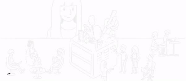
A. Line work: Taking my time, I go over the lines repeatedly until they look clean and finished. I sketch over previous layers of outlines as if they were faint pencil drawings.
A.线路工作:花些时间,我反复检查线路,直到看起来干净整洁。 我在前几层轮廓上画草图,好像它们是淡淡的铅笔图一样。
B. Colour: I colour the piece in different blocks, making sure to separate them as layers. For each layer, I experiment with the Hue-Saturation-Brightness dials until the overall balance feels right. I prefer a simple, two-tone pastel colour scheme that isn’t too distracting. My assistant helps me with this step.
B.颜色:我将作品分成不同的块,以确保将它们分层。 对于每一层,我都尝试使用“色相-饱和度-亮度”刻度盘,直到感觉整体平衡良好为止。 我更喜欢一个不太分散注意力的简单的两色柔和配色方案。 我的助手可以帮助我完成这一步骤。
而已 (That’s it)
It’s not simple alchemy, but it does feel like there’s a little magic involved.
这不是简单的炼金术,但确实确实涉及到一点魔术。
Each illustration presented its own challenge. The more difficult topics were the abstract ones, including culture design, design systems, design ethics, artificial intelligence and UX journalism.
每个插图都提出了自己的挑战。 难度更大的主题是抽象主题,包括文化设计,设计系统,设计伦理,人工智能和用户体验新闻。
Regardless, the above process has been a dependable one. Since I landed on it, I’ve deployed it for all kinds of visualisations in my design work.
无论如何,上述过程都是可靠的过程。 自从我找到它以来,我已经在设计工作中将其部署用于各种可视化。
强调 (Highlights)
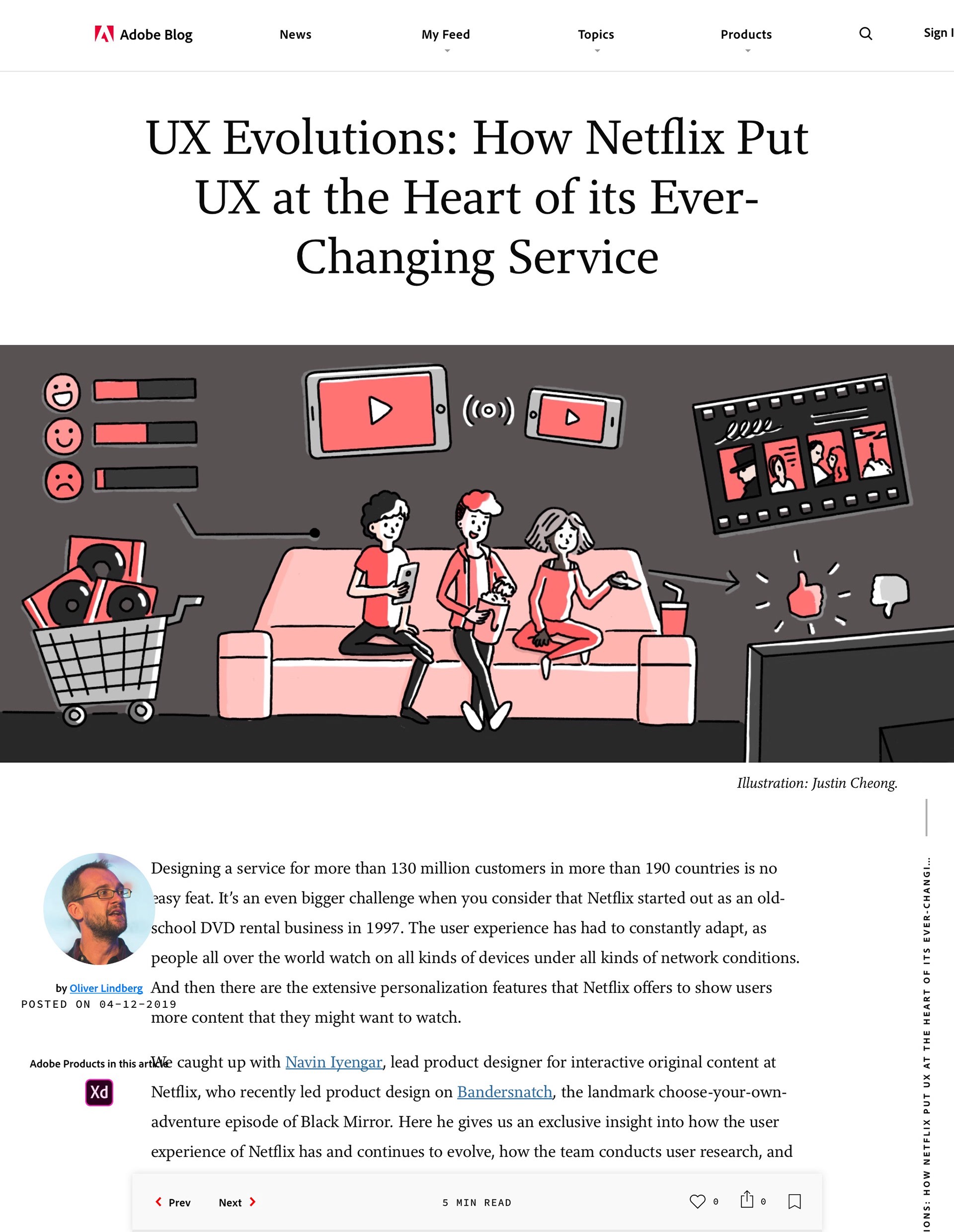
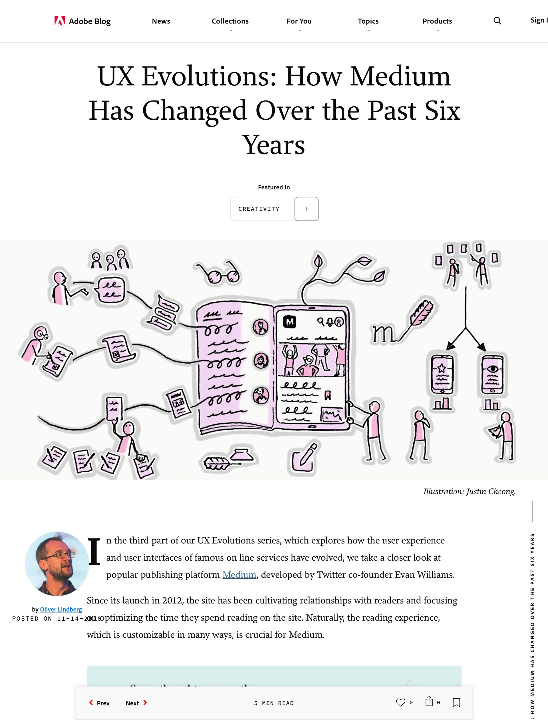
The work gave me a chance to illustrate for many excellent articles written by some really great designers. Here are some of the highlights.
这项工作使我有机会举例说明一些真正伟大的设计师撰写的许多优秀文章。 这儿是一些精彩片段。
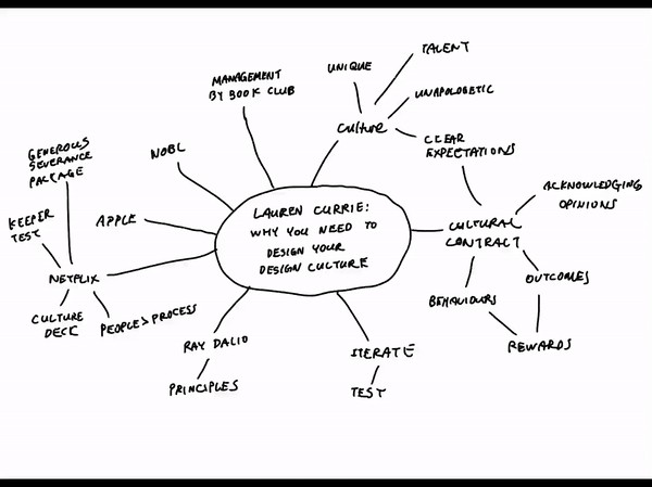
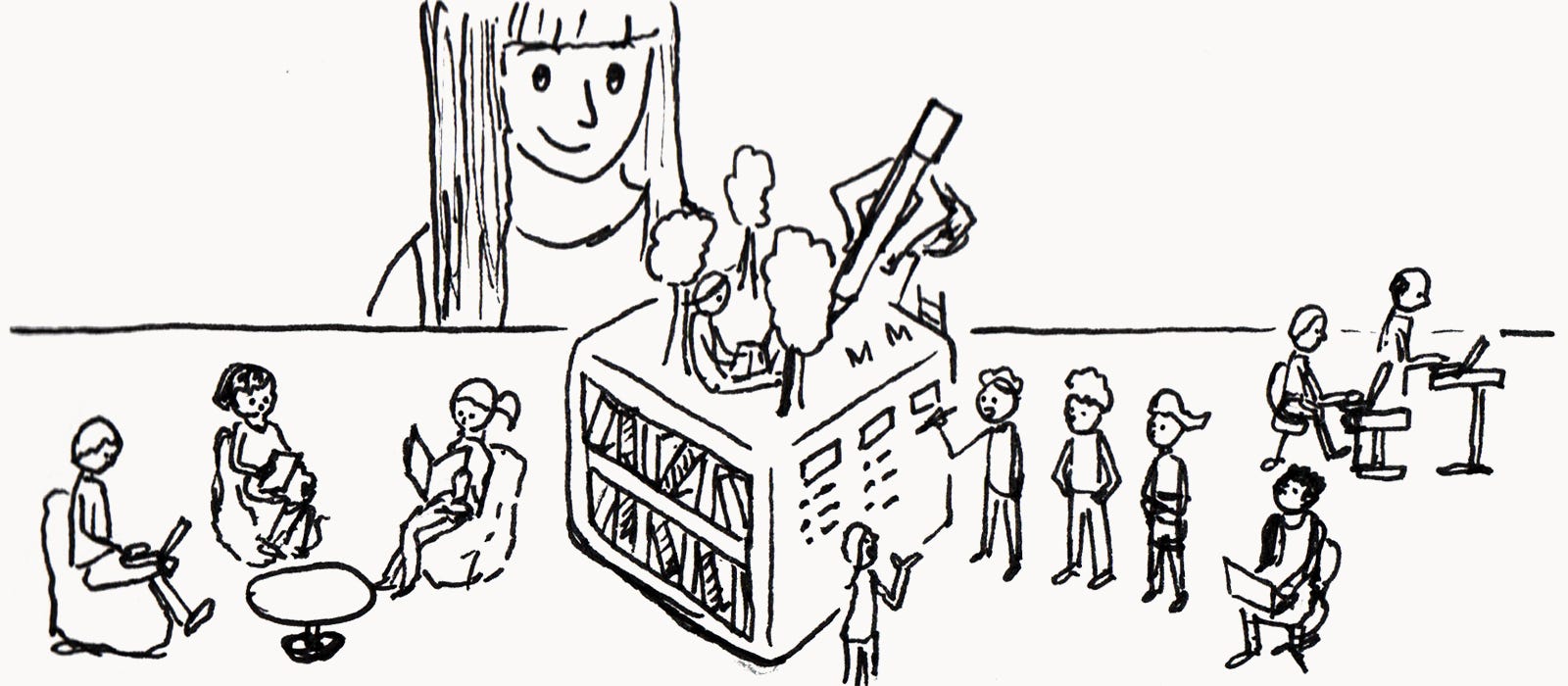
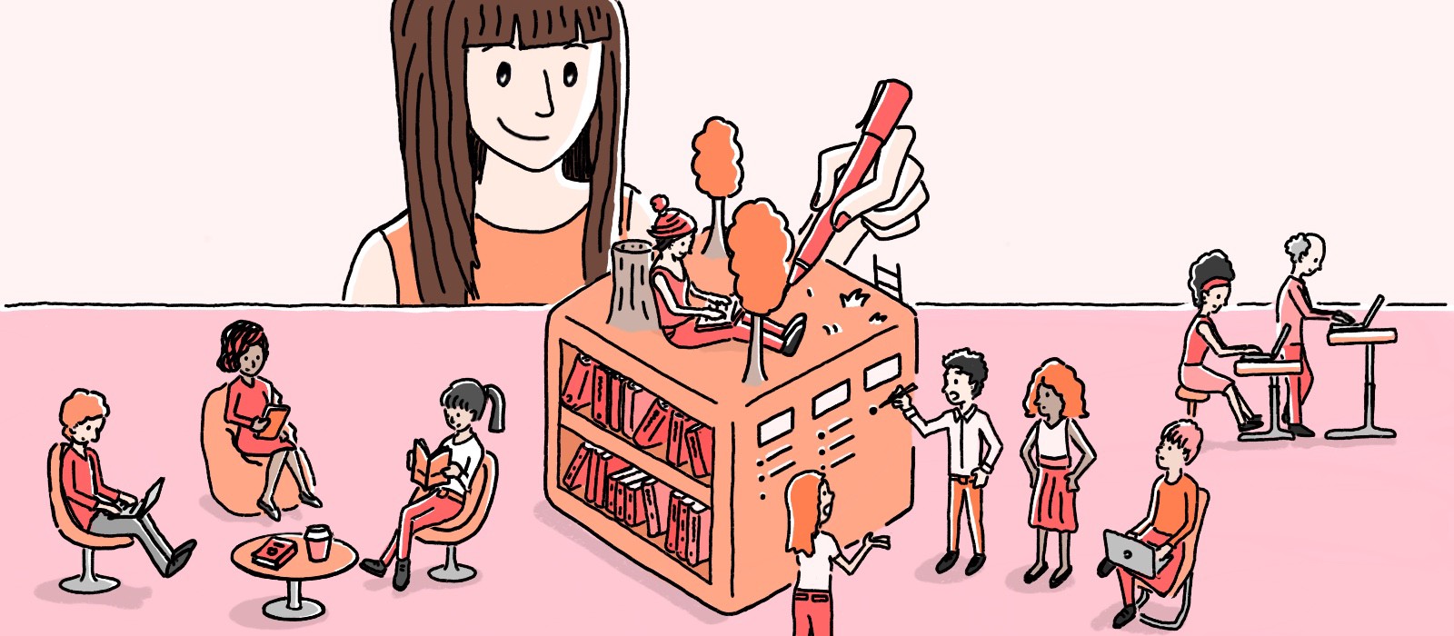
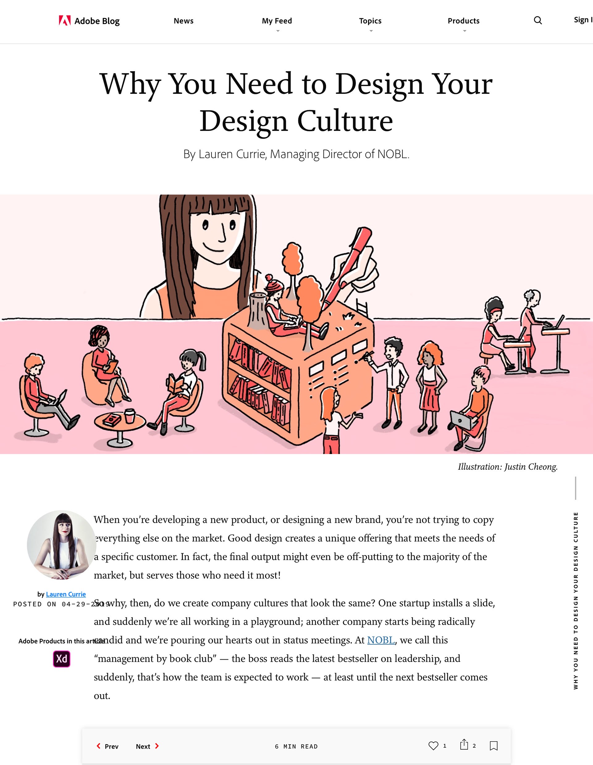
Articles by Lauren Currie, Don Norman and an interview article with Liz Jackson:
劳伦·柯里 ( Lauren Currie) , 唐·诺曼 ( Don Norman)的文章以及利兹·杰克逊 ( Liz Jackson)的访谈文章


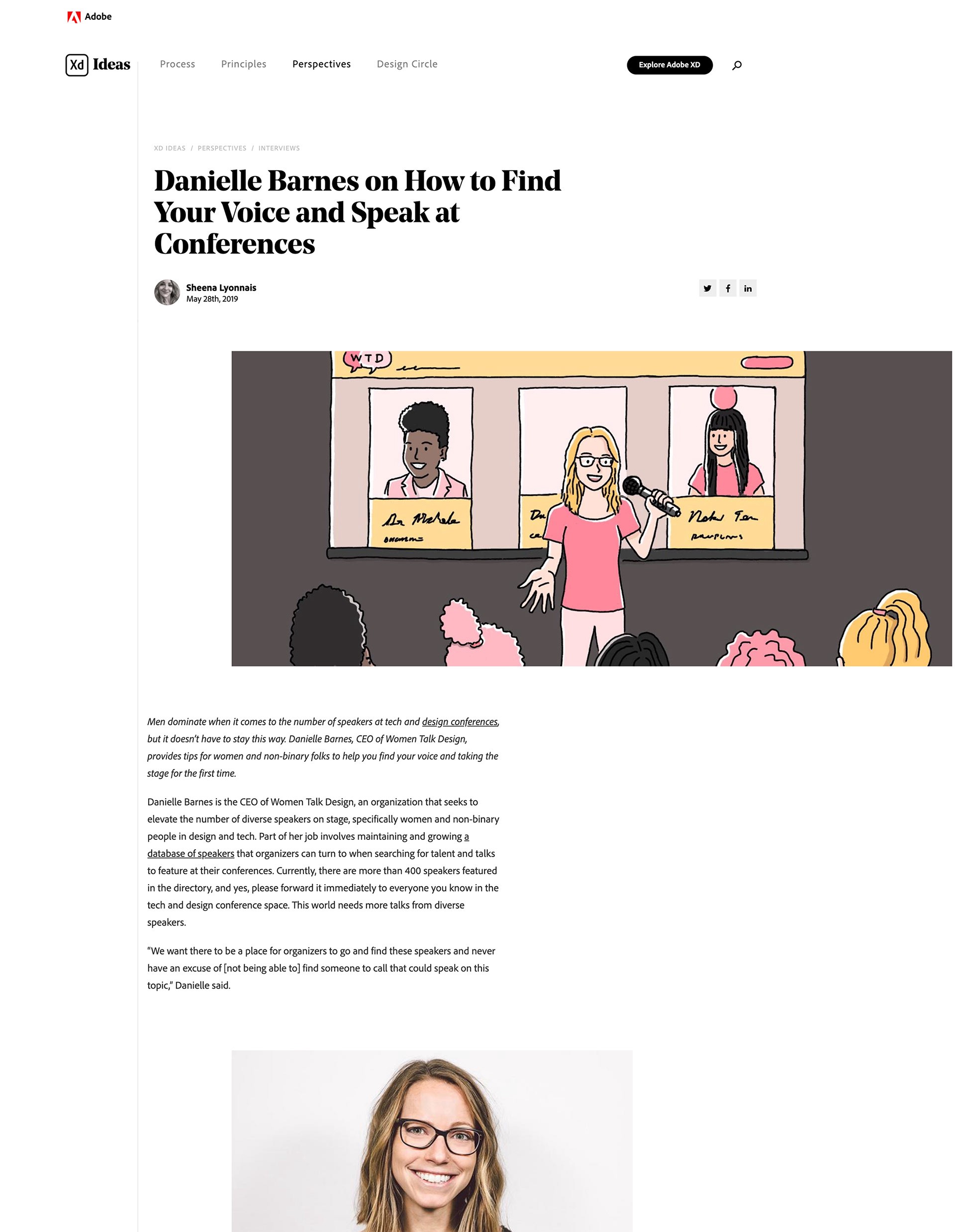
Ladies that UX interviews with Grace Phang, Katie Langerman and Danielle Barnes:
UX采访Grace Phang , Katie Langerman和Danielle Barnes的女士:


Thanks to Patrick Faller for being an awesome editor and to Annie Ji for assisting me with illustrations.
感谢 Patrick Faller 担任出色的编辑,并 感谢 Annie Ji 协助我进行插图创作。
The content in this article was originally delivered as a conference talk at UX Australia 2019.
本文中的内容最初是在 UX Australia 2019上 作为会议演讲提供的 。

翻译自: https://uxdesign.cc/how-to-sketch-ux-article-ac3f1724abf5
ux设计


 837
837


 被折叠的 条评论
为什么被折叠?
被折叠的 条评论
为什么被折叠?
 到【灌水乐园】发言


