


构建轻量级vue
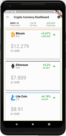
In this second part of our FlutterIn5Series, we are going to build widgets in 5 simple steps. More specifically, we are going to build a dashboard in the AppBar along with a simple bottom navbar, as shown in the image below:
在 FlutterIn5Series的第二部分中,我们将通过5个简单的步骤来构建窗口小部件。 更具体地说,我们将在AppBar中构建一个仪表板以及一个简单的底部导航栏 ,如下图所示:

As we already built a card list in the past, this post assumes readers would already have the code required to render the card list. If not, please do check out our post that helps you create one:
由于我们过去已经建立了卡片列表,因此本文假定读者已经具有呈现卡片列表所需的代码。 如果没有,请查看我们的文章,以帮助您创建一个:
先决条件: (Prerequisites:)
创建Flutter™App Bar仪表板的5个步骤 (5 Steps to Create Build a Flutter™ App Bar Dashboard)
>>步骤1:基本的AppBar创建 (>> Step 1: Basic AppBar Creation)
In this step we are going to build the app bar and bottom navbar as two widgets.
在这一步中,我们将构建应用程序栏和底部导航栏为两个小部件。
The advantages of using them as widgets are-
将它们用作窗口小部件的优点是-
Reusability
可重用性
Easy to read code
易于阅读的代码
First, create a package/folder called ‘widgets’ under the ‘lib’ folder. Create two dart files under widgets-
首先,在“ lib”文件夹下创建一个名为“ widgets ”的包/文件夹。 在小部件下创建两个dart文件-
- custom_app_bar.dart custom_app_bar.dart
- custom_bottom_bar.dart custom_bottom_bar.dart
Open custom_app_bar.dart and create a statelessWidget called ‘CustomAppBar’ and import the required packages. Add a mixin to the widget to use the PreferredStateWidget class. We do this because we will call this widget in the Scaffold’s appBar attribute.
打开custom_app_bar.dart并创建一个名为“ CustomAppBar”的无状态窗口小部件,然后导入所需的程序包。 将混合添加到窗口小部件以使用PreferredStateWidget类。 我们这样做是因为我们将在Scaffold的appBar属性中调用此小部件。
Add this line outside the Widget build method. Using this, we are enabled to set the height of our CustomAppBar.
将此行添加到Widget构建方法之外。 使用此功能,我们可以设置CustomAppBar的高度。
@override
 // TODO: implement preferredSize
Size get preferredSize => Size.fromHeight(100.0);
As we aim to build a reusable AppBar, lets parameterize a few basic things such as title, leading icon and a boolean value to show or hide the dashboard. This gives us an option to reuse the same AppBar by passing some values.
至于我们的目标是建立一个可重复使用AppBar,让参数一些基本的东西,如书名 , 导致图标和AB oolean值显示或隐藏仪表板。 这使我们可以通过传递一些值来重用相同的AppBar。
Next, we declare three variables with suitable type and add them as parameters in the CustomAppBar constructor.
接下来,我们声明三个具有适当类型的变量,并将它们作为参数添加到CustomAppBar 构造函数中 。
Below is the code incorporating all of the above mentioned:
以下是包含上述所有内容的代码:
Note: We declared default values for title and bottomBar in the constructor. If we pass a different value while calling this widget, the new value will override the old value.
注意:我们在构造函数中声明了title和bottomBar的默认值。 如果在调用此窗口小部件时传递其他值,则新值将覆盖旧值。
import ‘package:flutter/cupertino.dart’;import ‘package:flutter/material.dart’;class CustomAppBar extends StatelessWidget with PreferredSizeWidget {
 String title;
 IconData icon;
 bool bottomBar;
 //constructor
 CustomAppBar(
 {this.title = ‘Crypto Currency Dashboard’,this.icon = Icons.menu,this.bottomBar = true});
 @override
 Widget build(BuildContext context) {return AppBar(
 backgroundColor: Colors.white,
 elevation: 5,
 leading: IconButton(icon: Icon(icon)),
 actions: <Widget>[
 IconButton(
 icon: Icon(
 Icons.settings,
 color: Colors.black,
 ),
 ),
 ],
 );
 }
 @override
 // TODO: implement preferredSize
 Size get preferredSize => Size.fromHeight(100.0);
 }
>>步骤2:将标题和图标添加到我们的AppBar (>> Step 2: Add Title and icons to our AppBar)
In this step we are going to add the title, leading icons and action icons.
在这一步中,我们将添加标题 , 前导 图标和动作图标 。
Add the code below under the AppBar class-
在AppBar类下添加以下代码-
title: Text(
 title,
 style: TextStyle(color: Colors.black),
 ),
 leading: IconButton(
 icon: Icon(icon),
 color: Colors.black,
 ),
 actions: <Widget>[
 IconButton(
 icon: Icon(
 Icons.settings,
 color: Colors.black,
 ),
 ),
 ],
>>步骤3:在AppBar中添加内容 (>> Step 3: Add Content in AppBar)
In this step, we add the dashboard content by creating a row with FlatButtons as its children.
在此步骤中,我们通过创建一个以FlatButtons作为其子级的行来添加仪表板内容。
为什么选择FlatButtons? (Why FlatButtons?)
The benefit of using FlatButtons is that we need not explicitly add any border for it. We can just add a background color and add Text in the child. I haven’t added any background color as of now. If one wishes, they can add this code under FlatButton:
使用FlatButtons的好处是我们不需要为其显式添加任何边框。 我们可以只添加背景色,并在子级中添加文本。 到目前为止,我还没有添加任何背景色。 如果愿意,他们可以在FlatButton下添加以下代码:
onPressed: (){},
 color: Color(0xFFE7EAED),
Without using onPressed, the button will be disabled. Hence, any color added will not be shown on the button.
如果不使用onPressed ,则该按钮将被禁用。 因此,添加的任何颜色都不会显示在按钮上。
An added advantage of using FlatButton is that, in a scenario where there is a need to build individual screens that show in-depth data about each widget, we would simply add navigation code in the onPressed method.
使用FlatButton的另一个优点是,在需要构建单独的屏幕以显示有关每个小部件的深入数据的情况下,我们只需在onPressed方法中添加导航代码即可 。
Next we add the code below under dashboard.dart:
接下来,我们在以下dashboard.dart下添加以下代码:
Widget moneyValues() {return Row(
 mainAxisAlignment: MainAxisAlignment.spaceEvenly,
 children: <Widget>[
 FlatButton(
 child: RichText(
 text: TextSpan(
 text: ‘\$6091.12’,
 style:
 TextStyle(fontWeight: FontWeight.bold, color: Colors.black,),
 children: [
 TextSpan(
 text: ‘\nTotal Value’,
 style: TextStyle(
 color: Colors.grey, fontWeight: FontWeight.bold))
 ]),
 ),
 ),
 FlatButton(
 child: RichText(
 text: TextSpan(
 text: ‘+13.18’,
 style:
 TextStyle(fontWeight: FontWeight.bold, color: Colors.green),
 children: [
 TextSpan(
 text: ‘\n24 Hour’,
 style: TextStyle(
 color: Colors.grey, fontWeight: FontWeight.bold))
 ]),
 ),
 ),
 FlatButton(
 child: RichText(
 text: TextSpan(
 text: ‘+676.25%’,
 style:
 TextStyle(fontWeight: FontWeight.bold, color: Colors.green),
 children: [
 TextSpan(
 text: ‘\nTotal Gain’,
 style: TextStyle(
 color: Colors.grey, fontWeight: FontWeight.bold))
 ]),
 ),
 )
 ],
 );
 }
Now call this method from AppBar. Add the below code under AppBar class. This is what it looks like:
现在从AppBar调用此方法。 在AppBar类下添加以下代码。 看起来是这样的:
bottom: PreferredSize(
 child: Column(
 children: <Widget>[
 bottomBar == true
 ? moneyValues()
 : SizedBox(
 height: 20,
 )
 ],
)),‘Bottom’ is used to add content in the bottom part of the AppBar.
“ 底部”用于在AppBar的底部添加内容。
This is followed with a call to CustomAppBar from the Scaffold in dashboard.dart as shown below:
接下来,从dashboard.dart的Scafold中调用CustomAppBar ,如下所示:
home: Scaffold(
 appBar: CustomAppBar(),
 body: Container(
 …
 );
 …
 );
>>步骤4:创建底部栏小部件 (>> Step 4: Create Bottom Bar Widget)
To create the BottomBar widget, we first open custom_bottom_bar..dart and create a statelessWidget called CustomBottomBar and import the required packages shown in prompts.
要创建BottomBar小部件,我们首先打开custom_bottom_bar..dart并创建一个名为CustomBottomBar的无状态小部件,然后导入提示中显示的所需包。
Next, return BottomBar widget in the ‘Widget Build Method’ and add ‘row’ as its child. Let us see what the code for this looks like:
接下来,在“ Widget Build Method ”中返回BottomBar Widget并添加“ row”作为其子代。 让我们看看它的代码是什么样的:
import ‘package:flutter/cupertino.dart’;import ‘package:flutter/material.dart’;class BottomNavBar extends StatelessWidget {
 @override
 Widget build(BuildContext context) {return BottomAppBar(
 child: Row(
 mainAxisSize: MainAxisSize.max,
 mainAxisAlignment: MainAxisAlignment.spaceEvenly,
 children: <Widget>[
 ],
 ),
 color: Colors.white,
 );
 }
 }
>>步骤5:在子项下添加IconButtons (>> Step 5: Add IconButtons under children)
In this last step we are going to use ‘Typicons’ package to add icons under the children. Import the same in this class.
在这最后一步,我们将使用“Typicons”包给孩子下添加图标。 在此类中导入相同的内容。
The code below renders the four icons:
下面的代码呈现了四个图标:
IconButton(
 iconSize: 30.0,
 color: Colors.pinkAccent, //set color to mock active page color
 padding: EdgeInsets.only(left: 28.0),
 icon: Icon(Icons.wb_sunny),
 onPressed: () {},
 ),
 IconButton(
 iconSize: 30.0,
 padding: EdgeInsets.only(left: 28.0),
 icon: Icon(Typicons.arrow_shuffle),
 onPressed: () {},
 ),
 IconButton(
 iconSize: 30.0,
 padding: EdgeInsets.only(left: 28.0),
 icon: Icon(Icons.explore),
 onPressed: () {},
 ),
 IconButton(
 iconSize: 30.0,
 padding: EdgeInsets.only(left: 28.0),
 icon: Icon(Icons.account_balance_wallet),
 onPressed: () {},
 ),
This is followed with a call the CustomBottomBar from Scaffold widget in dashboard.dart.
其次是通过调用从脚手架的CustomBottomBar在dashboard.dart部件。
To do so, add the line below under Scaffold:
为此,请在脚手架下方添加以下行:
bottomNavigationBar: CustomBottomBar(),
bottomNavigationBar: CustomBottomBar(),
This is what the output looks like:
输出如下所示:
We have now successfully built a reusable AppBar with a basic dashboard and BottomBar.
现在,我们已经成功构建了具有基本仪表板和BottomBar的可重用AppBar。
Go ahead, try yourself and make sure to time it!
继续,尝试一下并确保定时!
DLT Labs is a trademark of DLT Global, Inc. Flutter™ is a trademark of Google LLC and its use here does not indicate endorsement or affiliation.
DLT Labs是DLT Global,Inc. 的商标 。Flutter ™ 是Google LLC的商标,在此使用并不表示认可或从属。
Author — Arun Kashyap Karri, DLT Labs™
作者— DLT Labs ™的Arun Kashyap Karri
About the Author: Arun Kashyap Karri is an active learner and an enthusiastic Web / Mobile Developer. He has worked on Angular, Node.js, Flutter, RPA, Chatbots and few more technologies. At DLT Labs, Arun has worked on applications such as Element DB, DL Certify(Mobile) and We Agree.
关于作者: Arun Kashyap Karri 是一个活跃的学习者和热情的Web /移动开发人员。 他从事过Angular,Node.js,Flutter,RPA,Chatbots等技术的研究。 在DLT Labs中,Arun致力于诸如Element DB,DL Certify(Mobile)和We Agree之类的应用程序。

翻译自: https://medium.com/swlh/how-to-build-a-flutter-app-bar-dashboard-in-10-minutes-or-less-621693fe9c5f
构建轻量级vue


 163
163

 被折叠的 条评论
为什么被折叠?
被折叠的 条评论
为什么被折叠?
 到【灌水乐园】发言


