


地理空间数据可视化(Geospatial Data Visualization)
总览(Overview)
The geography of counties and county-level equivalents are often oddly-shaped and meandering. A smaller county may be nearly-if-not-completely surrounded by a larger, separate jurisdiction. Using a centralized pair of longitude and latitude coordinates to describe the location of the larger county might, instead, locate a point in the middle of the smaller county. Fortunately, there are ways to get around this problem.
县和县级等价物的地理位置通常是奇怪且曲折的。 较小的县可能(如果不是完全)被较大的独立管辖权所包围。 相反,使用一对集中的经度和纬度坐标来描述较大县的位置,可能会在较小县的中间定位一个点。 幸运的是,有一些方法可以解决此问题。
In this article, we will explore the following:
在本文中,我们将探讨以下内容:
- Identifying states and counties with Federal Information Processing Standards (FIPS) codes 使用联邦信息处理标准(FIPS)代码识别州和县
- Mapping a dataset without geographic coordinates映射没有地理坐标的数据集
- Animating geodata maps in Tableau PublicTableau Public中的地理数据地图动画
动机(Motivation)
If you are only looking for instructions on accessible ways to visualize worldwide or country-level geodata, you are in luck. There is no shortage of relevant software and library documentation and tutorials. Information can be a bit more sparse if you are looking into ways to visualize data on a county level.
如果您只是在寻找有关可视化全球或国家/地区级地理数据的方法的说明,那么您很幸运。 不乏相关软件和库文档以及教程。 如果您正在寻找可视化县级数据的方法,则信息可能会更加稀疏。
In this example, we are working with data — for counties and independent cities in Virginia — that does not include longitude and latitude coordinates. In notebooks at the related Github repository, we explore how cases of Coronavirus, consequent hospitalizations, and related deaths in Virginia’s Hampton Roads region compare to those reported in other areas of the state and particularly in the state’s capital city of Richmond. We relied on interactive plotting in Python with Plotly Express, to visualize data for multiple localities (including population data) on a single figure with the option to hover or drill — down for greater detail.
在此示例中,我们正在使用不包含经度和纬度坐标的数据(弗吉尼亚州的县和独立城市)。 在相关Github存储库中的笔记本中,我们探索了弗吉尼亚州汉普顿路地区的冠状病毒病例,随之而来的住院治疗和相关死亡与该州其他地区,尤其是该州首府里士满的报道相比。 我们依靠Plotly Express在Python中进行的交互式绘图,可以在单个图形上可视化多个地点的数据(包括人口数据),并可以选择悬停或向下钻取-以获得更详细的信息。
Animated plots used in our previous notebooks enable us to quickly make visual comparisons across multiple localities, over time. Bar-plots and scatter-plots we include clearly show the Fairfax (county) area as having been more severely impacted than other localities. However, the plots do not easily reference some factors likely influencing the spread of the virus. They do not show us that Fairfax borders Washington, D.C., or that Virginia Beach (in Hampton Roads) is a regional tourist destination. This type of information might be better communicated, at a glance, by incorporating relevant map images into our visualizations. That is what we will do in this current exploration.
我们以前的笔记本中使用的动画图使我们能够随着时间的流逝在多个地区快速进行视觉比较。 我们所包括的条形图和散点图清楚地表明费尔法克斯(县)地区受到的影响比其他地区更严重。 但是,这些图不容易提及一些可能影响病毒传播的因素。 他们没有向我们显示费尔法克斯与华盛顿特区接壤,或者弗吉尼亚海滩(在汉普顿路)是区域性旅游目的地。 通过将相关的地图图像合并到我们的可视化中,一眼就能更好地传达此类信息。 这就是我们在当前探索中将要做的。
布卢夫 (B.L.U.F.)
We will recall the primary dataset from our previous effort and stay within the same timeframe, for the sake of consistency. We also want to maintain a level interactive publishing ability, comparable to that which we previously attained.
为了保持一致性,我们将从先前的工作中调出主要数据集并保持在同一时间范围内。 我们还希望保持与我们之前获得的水平相当的交互式发布能力。
In our dataset, counties are identified by name and by FIPS code. A three-digit FIPS code represents a county or county-equivalent within a particular state. In Virginia, for example, the code “171” represents Shenandoah. Since the same code represents different counties in 13 other states, five-digit FIPS codes may be created by prepending a two-digit state code. The state code for Virginia is “51”, so “51171” is the five-digit FIPS code for the county of Shenandoah.
在我们的数据集中,县由名称和FIPS代码标识。 三位数的FIPS代码代表特定州内的县或县。 例如,在弗吉尼亚州,代码“ 171”代表谢南多厄。 由于相同的代码代表其他13个州的不同县,因此可以通过在两位状态代码之前添加五位FIPS代码来创建。 弗吉尼亚州的州代码为“ 51”,因此“ 51171”是谢南多厄县的五位数FIPS代码。
When we worked with our data in Python, we used the Plotly Express (PX) library. To add geodata to our visual analysis, it would be reasonable to start where we left off. Unfortunately, while PX previously supported generating choropleth maps from FIPS code data, via its “figure factory” method, that method has since been deprecated. Current methods include a GeoJSON-based approach and an alternative Mapbox tile-based approach. These are both solid options, however, either approach requires centering maps on geographic coordinates. We could turn to other Python libraries, such as Folium or Geopandas, but they also require geographic coordinates and/or shapefiles.
当我们使用Python处理数据时,我们使用了Plotly Express(PX)库。 要将地理数据添加到我们的视觉分析中,从我们上次中断的地方开始是合理的。 不幸的是,尽管PX以前支持通过FIPS代码数据通过其“图工厂”方法生成Choropleth映射,但此方法已被弃用。 当前的方法包括基于GeoJSON的方法和基于Mapbox的替代方法。 这些都是可靠的选择,但是,任何一种方法都需要以地理坐标为中心的地图。 我们可以转向其他Python库,例如Folium或Geopandas,但它们也需要地理坐标和/或shapefile。
扰流板警报 (Spoiler Alert)
To simplify this exercise, we will step away from Python and the Pandas library. Instead, we will visualize our data in the free analytics platform, Tableau Public. In Tableau, we can select a “geographic role” for a column’s data. Using data already built into its map server, Tableau will assign longitude/latitude coordinates.
为了简化此练习,我们将远离Python和Pandas库。 相反,我们将在免费的分析平台Tableau Public中可视化我们的数据。 在Tableau中,我们可以为列的数据选择一个“地理角色”。 使用已经内置在其地图服务器中的数据,Tableau将分配经度/纬度坐标。
For a column including state names, you can select the “State/Province” Geographic role to enable Tableau to visualize the data on a map. Similarly, we can assign the “County” geographic role to our Locality field in order to map the data. In the same way, Tableau accepts FIPS codes as valid data for county-level geography.
对于包含州名的列,您可以选择“州/省”地理角色以使Tableau可视化地图上的数据。 同样,我们可以将“县”地理角色分配给我们的“ Locality字段,以便映射数据。 同样,Tableau接受FIPS代码作为县级地理的有效数据。
Let’s take a look at how we can take advantage of this functionality.
让我们看看如何利用此功能。
加载数据中 (Loading Data)
Having originally obtained our data in CSV format from the Virginia Open Data Portal, we will use a local version of the data file. Our downloaded subset spans the period from March 17 to July 31, 2020, and descriptions of dataset columns are available on the data portal website.
最初从Virginia Open Data Portal获得CSV格式的数据后,我们将使用数据文件的本地版本。 我们下载的子集跨度为2020年3月17日至2020年7月31日,有关数据集列的说明可在数据门户网站上找到。
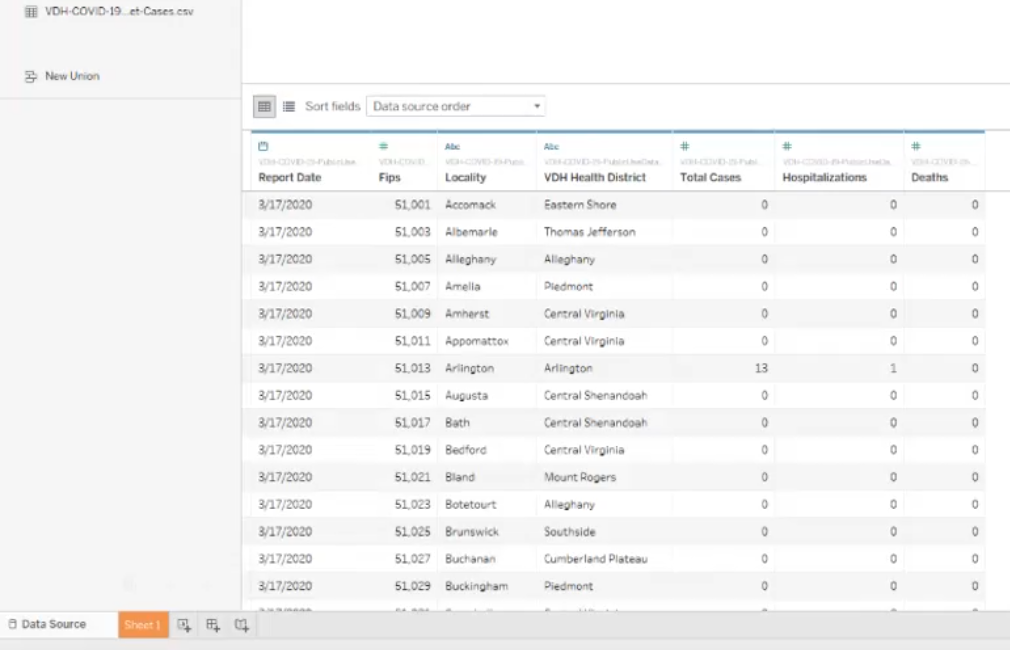
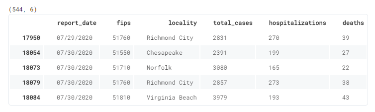
In Tableau (in this case, the 64-bit Tableau Desktop Public Edition, on Windows 10), we connect to our data file as a text file. As we load the data, we immediately can view the columns, data-types, and values in our dataset. We find Total Cases, Hospitalizations, and Deaths columns with daily values for each Locality sorted by Report Date. The locality indicates the name of the county or independent city represented in each record.
在Tableau(在本例中为Windows 10上的64位Tableau Desktop公共版)中,我们以文本文件连接到数据文件。 加载数据时,我们可以立即查看数据集中的列,数据类型和值。 我们找到“ Total Cases ,“ Hospitalizations ”和“ Deaths数”列,其中每个地区的每日值Locality Report Date排序。 位置指示每个记录中代表的县或独立城市的名称。
As expected, there is also a column indicating the FIPS (Fips) for each locality. In addition, we have a column indicating the VDH Health District for each locality which we will not need for this particular exploration.
不出所料,还有一个列指示每个地区的FIPS( Fips )。 此外,我们还有一列指示每个地区的VDH Health District ,我们不需要进行此特定的探索。
轻磨砂 (A Light Scrub)
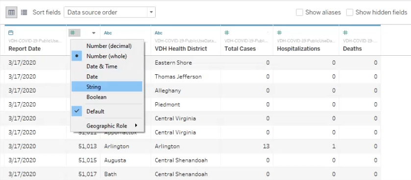
The first issue we will address is the Fips data-type, which loads as an integer. We can expand a contextual menu by selecting the symbol located above the column name and choose “String” as the field’s type. Since our data is limited to counties in Virginia, we will also add a State column to our dataset by opening the dropdown menu from the top-right of one of our column names.
我们要解决的第一个问题是Fips数据类型,它以整数形式加载。 我们可以通过选择列名称上方的符号并选择“字符串”作为字段的类型来展开上下文菜单。 由于我们的数据仅限于弗吉尼亚州的县,因此我们还将通过打开其中一个列名右上角的下拉菜单,在数据集中添加“ State列。
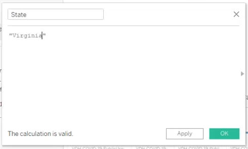
From this menu, we select “Create Calculated Field…” to open a dialog in which we may enter “State” as our desired field name. Below the field name, we can enter a calculation to be performed along the column. In our case, we only want to the value “Virginia” for each row of the dataset.
在此菜单中,我们选择“创建计算字段...”以打开一个对话框,在其中可以输入“状态”作为所需的字段名称。 在字段名称下方,我们可以输入要沿该列执行的计算。 在我们的例子中,我们只想为数据集的每一行取值“弗吉尼亚”。
Next, we select Sheet 1 and rename it. We can see Tableau has automatically made some assumptions, dividing our data table into (qualitative) dimensions and (quantitative) measures. Note that these assumptions may not necessarily suit your precise needs.
接下来,我们选择工作表1并重命名。 我们可以看到Tableau自动进行了一些假设,将我们的数据表分为(定性)维和(定量)度量。 请注意,这些假设可能不一定适合您的确切需求。
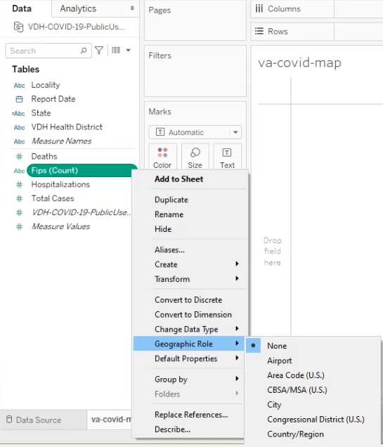
In our case, Tableau assumes that Fips is a measure to be counted. We need to set the field’s geographic role, so Tableau will correctly recognize the field as a dimension and a unique identifier for a county.
在我们的案例中,Tableau假定Fips是要计算的指标。 我们需要设置字段的地理角色,以便Tableau可以正确地将该字段识别为一个维度和一个县的唯一标识符。
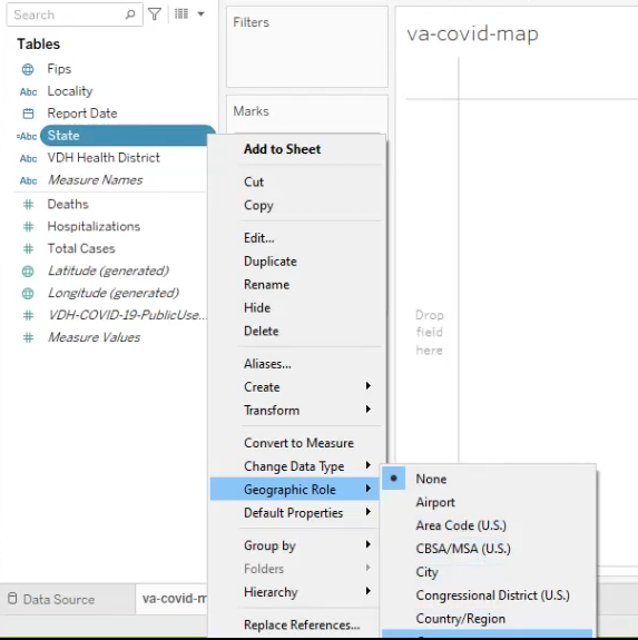
We follow similar steps to assign the proper geographic role for our State dimension. Note how Tableau has changed the icon associated with Fips from alpha-characters (when the field was identified as a text measure) to a globe symbol, now that we have assigned its role as a geographic dimension.
我们遵循类似的步骤为State层面分配适当的地理角色。 请注意,既然我们已经将其角色分配为地理尺寸,请注意Tableau如何将与Fips相关的图标从字母字符(当该字段被识别为文本度量时)更改为地球符号。
可视化尺寸 (Visualizing Dimensions)
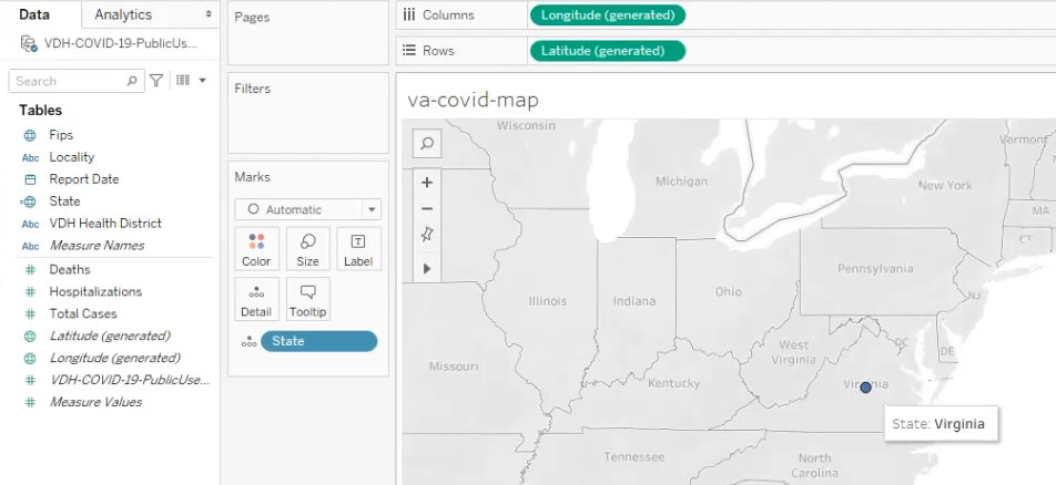
When we drag an appropriately named geographic dimension onto the Marks card’s “Detail” property, Tableau recognizes the data and generates relevant longitude/latitude values as columns and rows to locate the geodata on a map background. In the image, above, we see a blue point that indicates the intersection of the geographic coordinates
当我们将适当命名的地理维度拖到Marks卡的“ Detail”属性上时,Tableau会识别数据并生成相关的经度/纬度值作为列和行,以在地图背景上定位地理数据。 在上图中,我们看到一个蓝点,表示地理坐标的交点

When we change the mark type from automatic to map, Tableau fills-in color for states in our dataset. Our data is limited to the state of Virginia. Of course, we are interested in county-level data.
当我们将标记类型从自动更改为地图时,Tableau会为数据集中的状态填充颜色。 我们的数据仅限于弗吉尼亚州。 当然,我们对县级数据感兴趣。

With the geographic role for Fips set to “County,” we can drag the dimension onto the Marks card’s “Detail” property to add county borders to the state map. We see that dimensions added to the detail property show in the tooltip for areas beneath the cursor.
将Fips的地理角色设置为“县”,我们可以将维度拖动到Marks卡的“ Detail”属性上,以将县边界添加到州地图上。 我们看到添加到detail属性的尺寸显示在工具提示中的光标下方区域。
Note:
Localityis not a recognized geographic role, in Tableau. We will need to set the dimension’s geographic role to “County” for Tableau to recognize the field values as geodata.注意:在Tableau中,
Locality不是公认的地理角色。 我们将需要将维度的地理角色设置为“县”,Tableau才能将字段值识别为地理数据。
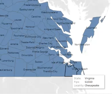
We add names to our mapped localities by dragging the dimension onto the “Label” property. In addition, the locality names will be added automatically to the tooltip that appears as we pass our cursor over the map.
通过将维度拖动到“ Label”属性上,可以将名称添加到我们的映射地点。 此外,当我们将光标移到地图上时,地点名称将自动添加到显示的工具提示中。
可视化措施 (Visualizing Measures)
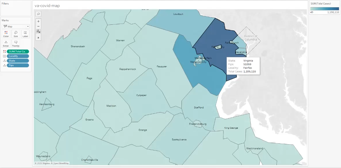
Now we will visualize Total Cases data on our map. We drag the measure onto the Marks card’s “Color” property, and Tableau colors each locality based on the sum of its cases over the period of observation. A legend is also generated, defining upper- and lower-bound values and color associations. Here, the upper-bound is 1,106,116, which we can see — using the tooltip — is the case-count for the county of Fairfax.
现在,我们将在地图上可视化Total Cases数据。 我们将该度量拖到Marks卡的“颜色”属性上,Tableau会根据观察期间的案例总数为每个位置着色。 图例也会生成,定义上限值和下限值以及颜色关联。 在这里,上限是1,106,116,使用工具提示可以看到,这是费尔法克斯县的病例数。
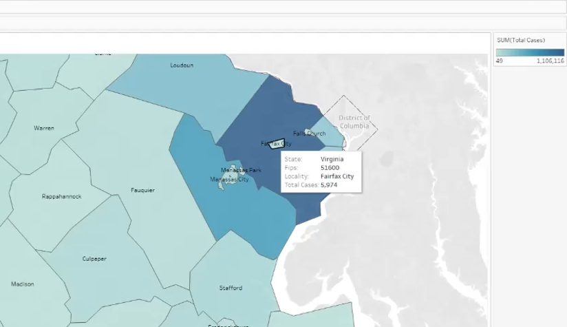
In contrast, Fairfax City’s total case-count is below 6,000. Had we tried to use a single, central pair of geographic coordinates to define the county of Fairfax, we might have identified a point within Fairfax City (where the sum of total cases is 185-times lower).
相比之下,费尔法克斯市的总病例数低于6,000。 如果我们尝试使用单一的中央地理坐标对来定义费尔法克斯县,那么我们可能已经在费尔法克斯市内确定了一个点(总病例数低185倍)。
地图动画 (Map Animation)
Now that we have an idea of how we can visualize our geographic data on a map, we can explore our data over distinct periods of time. Ideally, we will be able to animate our map to view the changes in Total Cases.
现在我们有了一个关于如何在地图上可视化地理数据的想法,我们可以在不同的时间段内探索数据。 理想情况下,我们将能够对地图进行动画处理以查看Total Cases的更改。
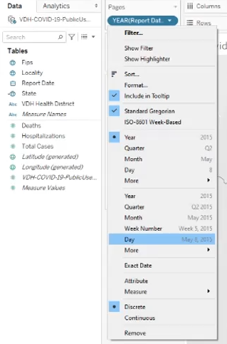
We drag the Report Date dimension onto the Pages card and indicate the period of time by which we wish segment our data views. Our data is reported daily. We will filter by “Day”, to create a page-view for each date.
我们将“ Report Date维度拖到“页面”卡上,并指明希望对数据视图进行细分的时间段。 我们的数据每天都会报告。 我们将按“日期”过滤,以为每个日期创建一个页面视图。
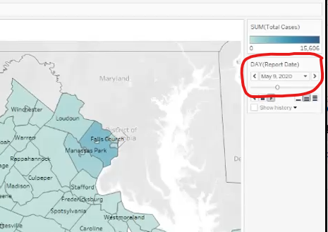
A new card appears on our sidebar, where we can select a specific date to visualize on our map. We also can change the map’s color-theme, from the legend’s dropdown menu.
新的卡片会显示在我们的侧边栏上,我们可以在其中选择特定的日期以在地图上进行可视化。 我们还可以从图例的下拉菜单中更改地图的颜色主题。

Since our dataset comprises such a large number of cases in Fairfax County, colors for our localities of interest (Richmond City and those in the south-eastern, Hampton Roads region) do not appear too different from areas that were not hotspots.
由于我们的数据集包含费尔法克斯县如此众多的案例,因此我们感兴趣的地区(里士满市和东南部的汉普顿路地区)的颜色与非热点地区的颜色看起来并没有太大差异。
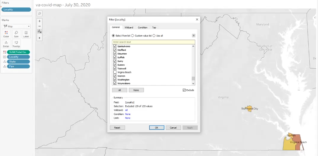
We can add the Locality dimension to the Filters card, to highlight only our areas of interest. Alternatively, we can adjust the center value for our legend's color scale.
我们可以添加Locality维度的过滤器卡,仅强调我们感兴趣的领域。 另外,我们可以调整图例色阶的中心值。
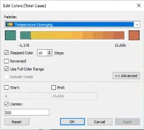
Selecting the “Edit Colors” option from Tableau’s legend menu, we will choose a center value of 500, to ensure that we move from green to gold as cases reach 500 for any locality. We also set the legend to use the full range of colors in our palette, segmented into ten steps. You can easily experiment with these settings, to see how they reflect changes in the data over time.
从Tableau的图例菜单中选择“编辑颜色”选项,我们将选择一个中心值500,以确保在任何情况下案例数达到500时,我们从绿色变为金色。 我们还将图例设置为使用调色板中的所有颜色,分为十个步骤。 您可以轻松地尝试这些设置,以了解它们如何反映数据随时间的变化。
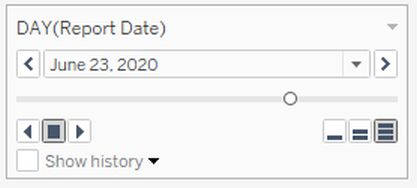
You can drag the slider to preview changes. To animate the map, simply select the right-facing triangle below the slider. The animation control includes additional options for adjusting animation speed and direction.
您可以拖动滑块以预览更改。 要为地图设置动画,只需选择滑块下方的向右三角形。 动画控件包括用于调整动画速度和方向的其他选项。
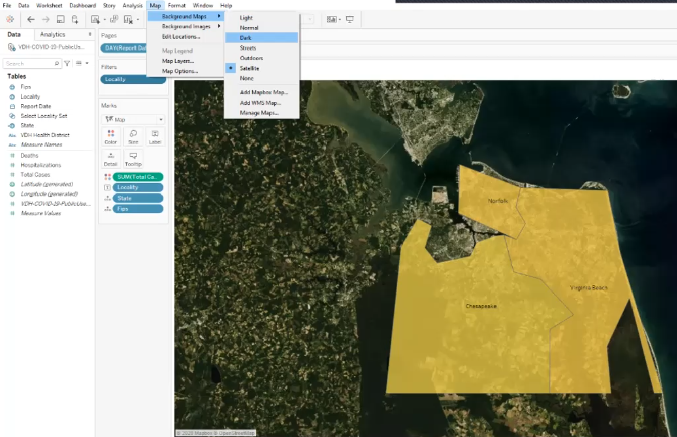
The Tableau Public menu bar contains additional APIs for adjusting the appearance of your visualization, such as projecting your geodata over a satellite image map.
Tableau Public菜单栏包含用于调整可视化外观的其他API,例如将地理数据投影到卫星图像地图上。
继续 (Carry On)
Using Tableau to visualize geodata is not limited to FIPS codes: it accepts several options, including GeoJSON formatted data, shapefiles, and of course, geographical coordinate pairs. For practicing Data Science, I am a fan of computational notebooks. However, presenting analysis sometimes calls for a more accessible alternative. Tableau Public lets you export your data views (and animations) to their public servers, where you can make your data visualizations freely available to practically anyone with an internet connection.
使用Tableau可视化地理数据不仅限于FIPS代码:它接受多个选项,包括GeoJSON格式的数据,shapefile,当然还有地理坐标对。 对于实践数据科学,我非常喜欢计算笔记本。 但是,提出分析有时需要一种更易于访问的替代方法。 通过Tableau Public,您可以将数据视图(和动画)导出到其公共服务器,在此服务器上,几乎所有具有Internet连接的人都可以免费使用数据可视化。
翻译自: https://medium.com/analytics-vidhya/how-to-map-data-on-the-county-level-in-tableau-9178610cd964


 1285
1285


 被折叠的 条评论
为什么被折叠?
被折叠的 条评论
为什么被折叠?
 到【灌水乐园】发言


