


优衣库不雅
I am a big fan of Uniqlo because they sell innovative clothing that is great quality at great prices. So when all their stores closed during the “Covid-19 Circuit Breaker” in Singapore, I turned to their website and was surprised how difficult it was to find the item I was looking for.
我是优衣库(Uniqlo)的忠实拥护者,因为他们出售质优价廉的创新服装。 因此,当他们所有的商店在新加坡的“ Covid-19 Circuit Breaker”期间关闭时,我转向他们的网站,并惊讶地发现要寻找的商品有多么困难。
The homepage is extremely cluttered, which is in contrast to their clean and modern branding. So in this article, I want to show how I would design a more modern looking homepage for them and the thinking behind it.
主页非常混乱,这与其简洁现代的品牌形成鲜明对比。 因此,在本文中,我想展示如何为他们设计外观更现代的首页以及其背后的思路。
问题 (The Problem)
We design to solve problems, so let me highlight the problems that I am trying to solve with this exercise:
我们旨在解决问题,因此,让我重点介绍一下通过本练习尝试解决的问题:
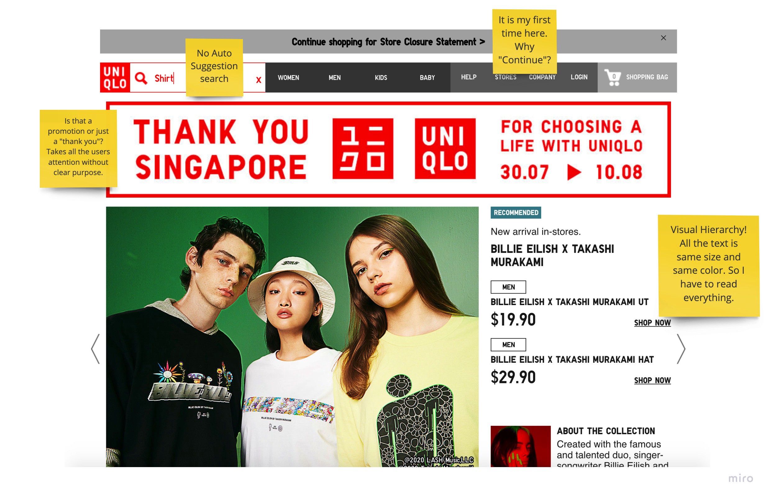
The homepage is loooooong. See for yourself (uniqlo.com) and compare it to gap.com or nike.com, for example. It is even longer on mobile. Why is this a problem? (1) It results in a slow loading website (needs more than 11 seconds). (2) From my experience doing heatmapping, nobody will scroll that far, which means about 50% of the content will never be seen by human eyes.
主页是loooooong 。 自己看看( uniqlo.com ),然后将其与gap.com或nike.com进行比较。 在移动设备上甚至更长。 为什么这是个问题? (1)这导致网站加载缓慢(需要超过11秒)。 (2)根据我进行加热贴图的经验,没有人会滚动到那么远,这意味着约有50%的内容不会被人眼看到。
“Above the fold” (the screen you see when you open the site without scrolling), is visually too noisy, which leaves the user wondering where they should go (Hick’s UX Law). Below I annotated a screenshot to show some UX no-nos: The main issue here is “hierarchy” which refers to how much weight you give each element on the page as a designer. There should be a cascading structure, where you have one big element that you want to highlight and then other elements in smaller sizes or different colors. Apple (screenshot below) does that to perfection.
“折叠之上” (在不滚动的情况下打开网站时看到的屏幕)在视觉上太嘈杂,使用户想知道应该去哪里( 希克的《用户体验法》 )。 下面,我为屏幕快照添加了注释,以显示UX的一些错误:此处的主要问题是“层次结构”,它是指您以页面设计师的身份给页面上的每个元素分配多少权重。 应该有一个层叠的结构,其中有一个要突出显示的大元素,然后有其他较小尺寸或不同颜色的元素。 苹果(下面的截图)做到了完美。
All this will have a negative effect on the conversion rate (primary KPI for any ecommerce store) because people leave.
所有这些都会对转换率(任何电子商务商店的主要KPI)产生负面影响,因为人们会离开。

研究 (Research)
Ideally during this phase, I would do usability research, which involves asking users to do a certain task on the website (“find a dress”) and observe what challenges they encounter on the way.
理想情况下,我会进行可用性研究,其中涉及要求用户在网站上执行某项任务(“找一件衣服”)并观察他们在途中遇到的挑战。
In this case, I am not trying to fix the whole website, but only come up with a new homepage design based on best UX practices. So for this phase, I looked at other companies that do homepages well. Let me highlight a few best practices that I observed:
在这种情况下,我不是要修复整个网站,而只是根据最佳UX做法提出一个新的首页设计。 因此,在此阶段中,我研究了其他网页效果良好的公司。 让我重点介绍一些我观察到的最佳实践:
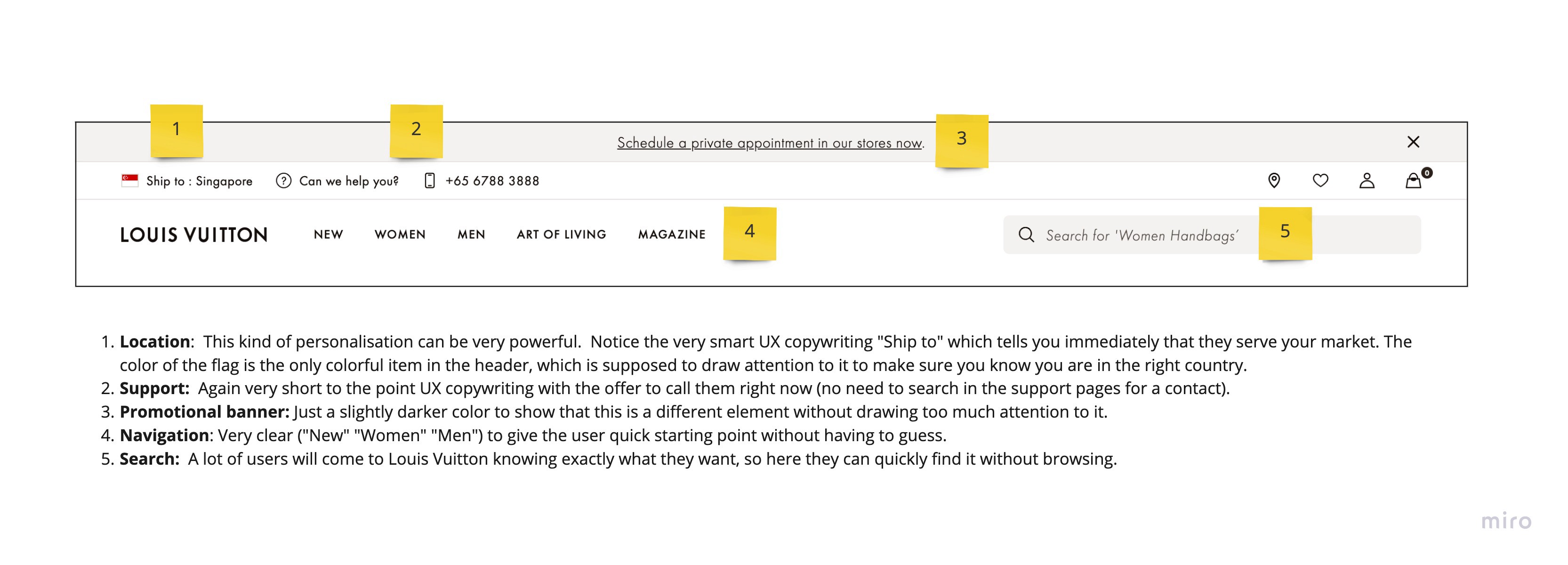
标头 (Header)
All the sites have a very clean header (lots of whitespace, clear copywriting and easy to understand icons. Here is one example from the Louis Vuitton website.
所有站点的标题都非常整洁(很多空白,清晰的文案和易于理解的图标。这是路易威登网站上的一个示例。
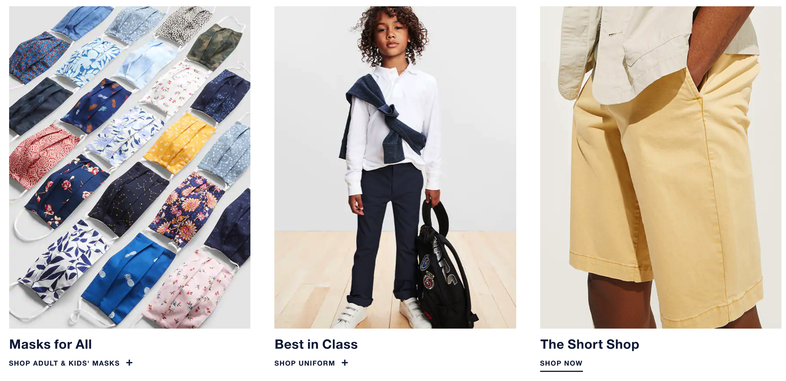
Large ImageryA couple of years ago large images did not load well. Technology has advanced and large images can now be loaded quickly. Notice also how small the text is (because the imagery speaks for itself).
大图像几年前,大图像无法很好地加载。 技术先进,现在可以快速加载大图像。 还请注意文本的大小(因为图像说明了一切)。
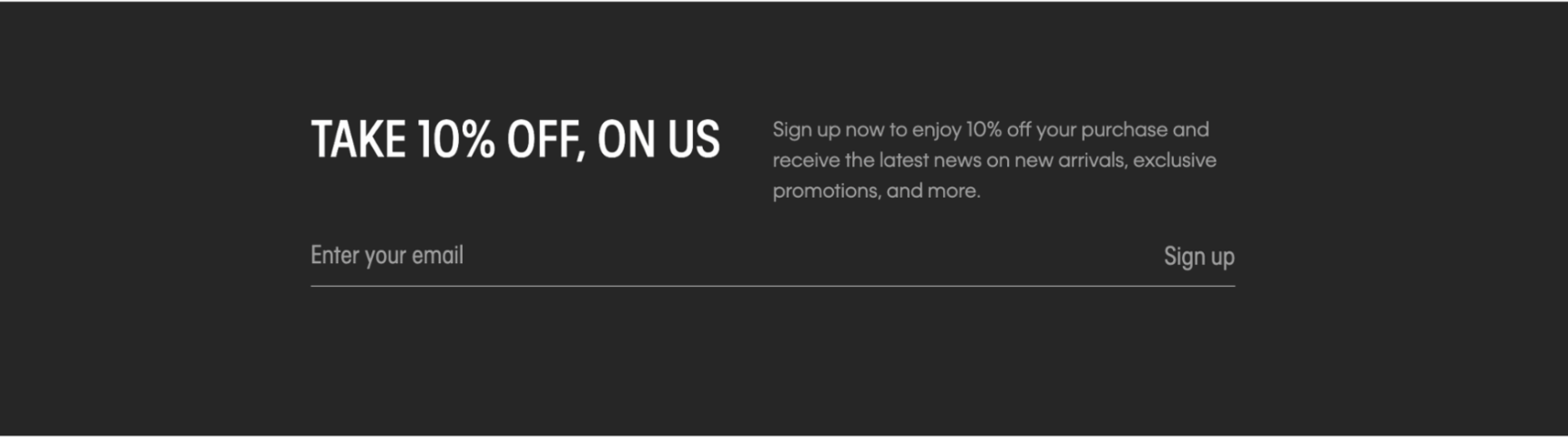
Email Sign-upFirst party information (email addresses) has become more important than ever to stay in touch with your customers. So almost every website has a sign-up form on it that gives people a monetary incentive to subscribe and asks for only the email address (the more information you want, the less people will be willing to subscribe).
电子邮件注册与您保持联系的第一方信息(电子邮件地址)比以往任何时候都变得更加重要。 因此,几乎每个网站上都有一个注册表格,可以使人们有金钱上的订阅动机,并且只要求提供电子邮件地址(您想要的信息越多,人们愿意订阅的人就越少)。
New and Promotional Items Most fashion website have a sales promotion on their homepage. The interesting thing to observe is that it is only an announcement without going into which products are on sale. The objective is to get visitors drawn in without bombarding them with too much information upon arrival.
促销新品大多数时尚网站的首页上都有促销。 有趣的是,这只是一个公告,而没有介绍哪些产品正在销售。 目的是吸引游客,但不要在到达目的地时向他们轰炸。
Conclusion Why is it so important to look at other websites? To answer that, let me introduce Jacob’s Law and the concept of mental models (
结论为什么浏览其他网站如此重要? 为了回答这个问题,让我介绍雅各布定律和心理模型的概念(
Users spend most of their time on other sites. This means that users prefer your site to work the same way as all the other sites they already know.
用户将大部分时间都花在其他网站上。 这意味着用户更喜欢您的网站以与他们已经知道的所有其他网站相同的方式工作。
- Users will transfer expectations they have built around one familiar product to another that appears similar. 用户会将他们围绕一种熟悉的产品建立的期望转移到看起来相似的另一种产品上。
- By leveraging existing mental models, we can create superior user experiences in which the user can focus on their task rather than learning new models. 通过利用现有的思维模型,我们可以创建出色的用户体验,使用户可以专注于自己的任务而不是学习新的模型。
角色 (Personas)
Next, personas. There are many opinions on how to create them (or if we even need them) out there, so here is my take: If you design for the user it helps a lot if you see them in front of you. It is a good reminder on who will be using your design eventually (not you or the client ;-).
接下来,角色。 关于如何创建它们(或者甚至我们是否需要它们)有很多意见,因此,我的看法是:如果为用户设计,那么在您面前看到它们会很有帮助。 这很好地提醒了最终将由谁使用您的设计(而不是您或客户;-)。
How to create them? In my opinion, they should be based on data (surveys) that you gathered from your users and they represent 2–3 of your core users. You don’t need a lot of details (“has a dog and loves drinking coffee in the afternoon,…) but it should be clear what are their motivations and fears, which is what your design should and can address.
如何创建它们? 我认为,它们应该基于您从用户那里收集的数据(调查),它们代表了您的核心用户的2-3。 您不需要很多细节(“有一只狗,喜欢在下午喝咖啡,……”),但应该弄清楚它们的动机和恐惧是什么,这是您的设计应该并且可以解决的问题。
For example, if you ask your users why they are not buying from your website, you will very quickly learn about their current frustrations and fears (“not sure if the size is correct”, “don’t want to pay for shipping”,…). Now we can design for it (come up with an awesome size guide, highlight free shipping,…).
例如,如果您问用户为什么不从您的网站上购买商品,您将很快了解他们当前的沮丧和恐惧(“不确定尺寸是否正确”,“不想支付运费”, …)。 现在,我们可以为它设计(提供出色的尺寸指南,突出显示免费送货…)。
草图和线框 (Sketching & Wireframes)
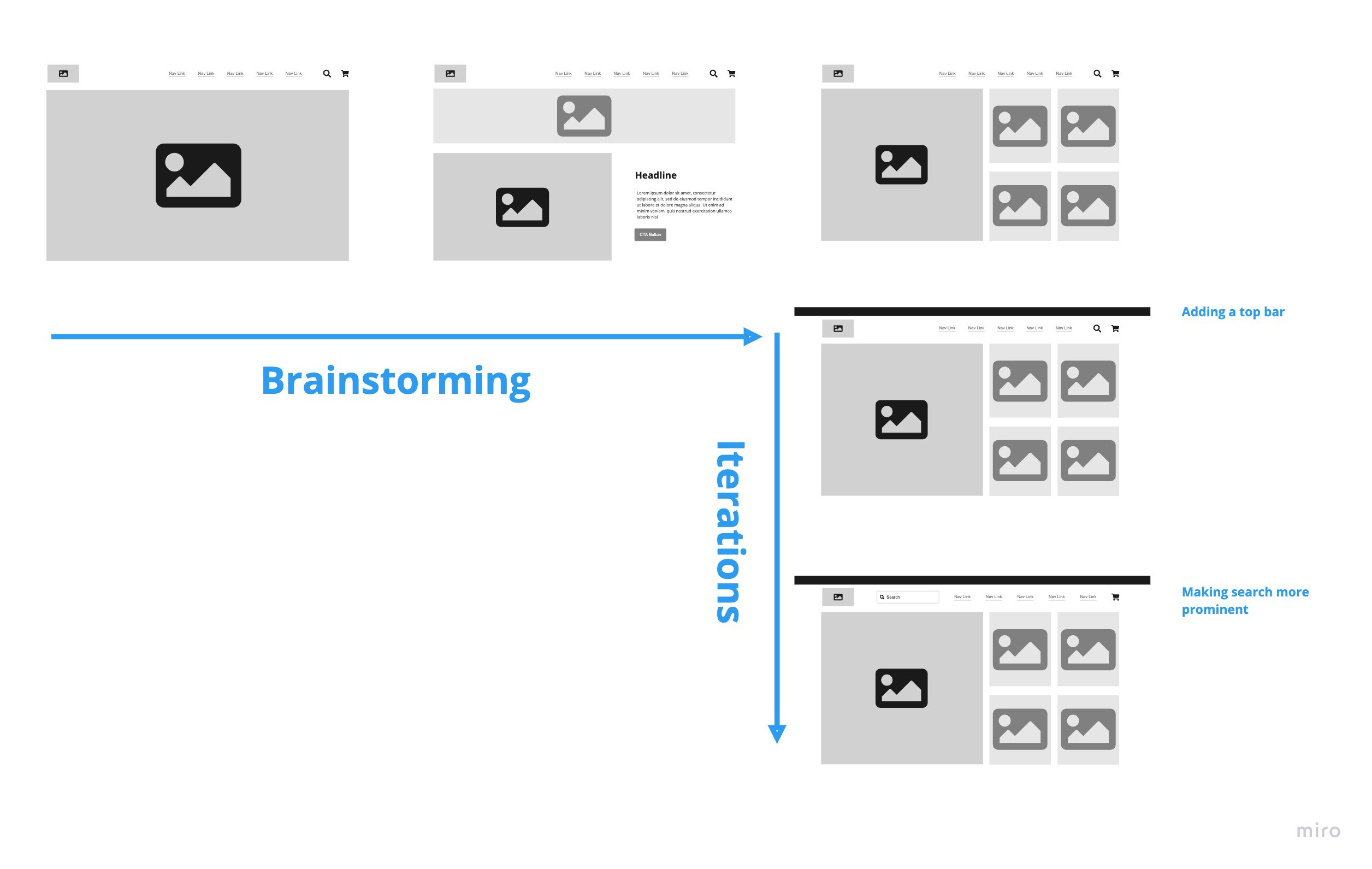
I spare you my hand drawn paper/pen sketches, but here is how my process usually looks like: I give myself 10 minutes to come up with at least 8 concepts on how the page could look like (prior to this I will have some idea what kind of content is required on the page). This exercise forces me to think of different ideas and not to go with the first one.
我为您省下了手绘纸/笔的草图,但是这通常是我的过程:我给自己10分钟时间,提出了关于页面外观的至少8个概念(在此之前,我会有一些想法页面上需要什么样的内容)。 这种练习迫使我思考不同的想法,而不是第一个想法。
In the low fidelity wireframes below you can see that I was considering a large slider (left), a smaller hero image with a promo banner (center) and a hero image with four smaller images for feature items (right). Eventually I decided to go with the last design because it provides a clean design and allows Uniqlo to highlight all their current feature items(“AIRism, masks,etc). You would usually also involve the client at this stage and even do some early usability tests. The earlier you find issues the easier/cheaper they are to fix.
在下面的低保真度线框中,您可以看到我正在考虑使用一个较大的滑块(左),一个带有促销横幅的较小英雄图像(中间)和一个具有四个较小图像的英雄图像(右侧)。 最终,我决定采用最后一个设计,因为它提供了简洁的设计,并允许优衣库突出显示其所有当前功能项(“ AIRism,口罩等”)。 在此阶段,您通常还会邀请客户参与,甚至进行一些早期的可用性测试。 您越早发现问题,越容易解决。
Finally, I would fine tune the chosen concept.
最后,我将微调所选的概念。
设计 (Design)
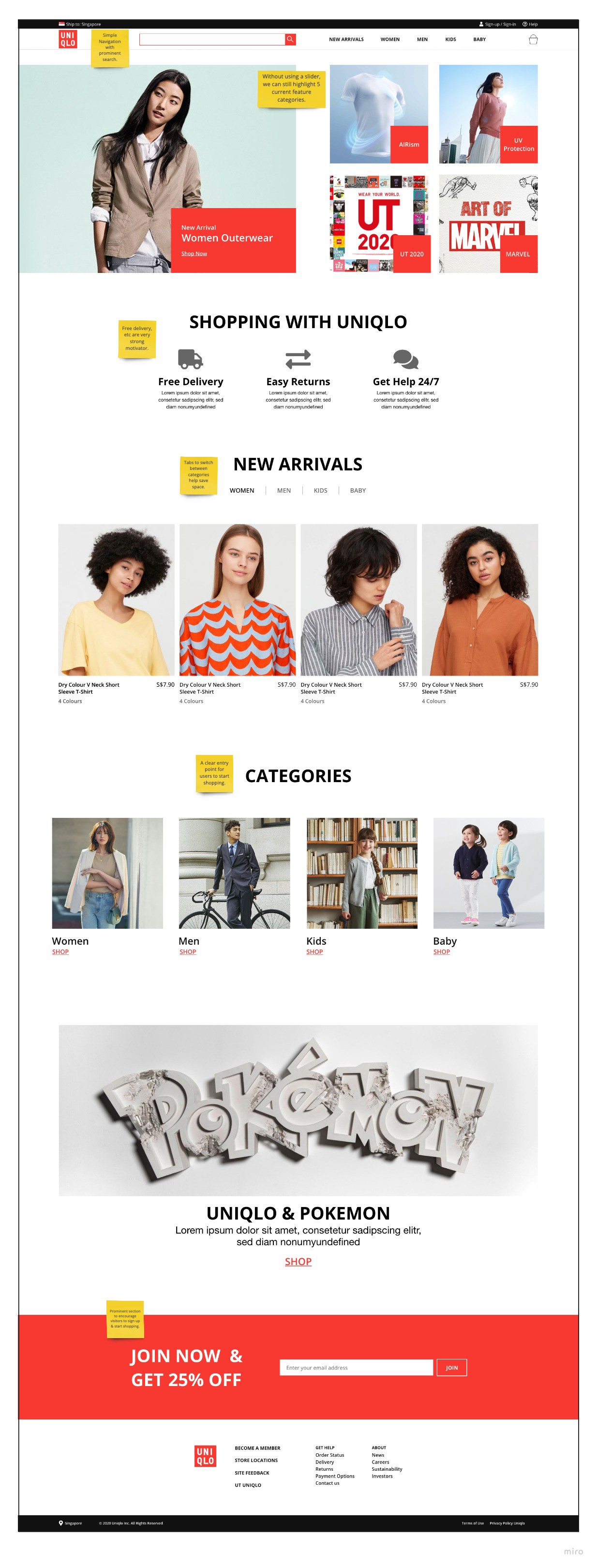
So finally, we start to populate our wireframes with content and UI elements. Here are my main thoughts behind this design:
因此,最后,我们开始使用内容和UI元素填充线框。 这是此设计背后的主要思想:
- There is a trend in online fashion stores to use as little color as possible and let the imagery do the talking. You can see this at Zara.com, for example. In Uniqlo’s case, their color is red and they have a vibrant youthful brand, so a little bit color to accentuate element makes sense. 在线时装商店中存在一种趋势,即使用尽可能少的颜色并让图像进行对话。 例如,您可以在Zara.com上看到它。 就优衣库而言,它们的颜色是红色,并且拥有一个朝气蓬勃的年轻品牌,因此,强调一点色彩是很有意义的。
- Uniqlo does have a lot of different things to highlight like their AIRism technology, their UV protection clothing line, their t-shirts with cartoons, etc. and people go to Uniqlo just for these items, which is why they deserve a spot “above the fold”. (This would be a great section for A/B testing (what product groups lead to the lowest bounce rate?) or even a dynamic recommendation engine to show you personalised results.) 优衣库的确有很多不同之处值得一提,例如他们的AIRism技术,防紫外线服装系列,带有卡通漫画的T恤等。人们只为这些物品而去优衣库,这就是为什么他们应该在“折”。 (这将是A / B测试的重要部分(哪些产品组导致最低的跳出率?),或者甚至是动态推荐引擎,以向您显示个性化的结果。)
- A lot of people coming to Uniqlo will be first time visitors, so I wanted to address their fears (from the “Persona” section) quickly and highlight free delivery, etc. 很多来Uniqlo的人都是第一次来访,所以我想快速解决他们的担忧(来自“ Persona”部分),并强调免费送货等。
- The other segment will be returning users to check if there is a sale or what’s new. For them I have a “New Arrival” section. 另一个细分受众群将是回头客,以检查是否有销售或新变化。 对于他们来说,我有一个“新到货”部分。
最后的想法和下一步 (Final Thoughts & Next Steps)
Where are the mobile screens? Although I designed them, they are missing here because I wanted to focus on the design process in general (and also because mobile screens are difficult to display here).
手机屏幕在哪里? 尽管我设计了它们,但是这里缺少它们是因为我想总体上专注于设计过程(也因为在这里很难显示移动屏幕)。
Next steps would be to create more pages including the mega-menu as a Adobe XD prototype that we can share with users to get feedback, which will lead to changes in the design.
下一步将创建更多页面,包括作为Adobe XD原型的巨型菜单,我们可以与用户共享以获取反馈,这将导致设计变更。
Finally, please feel free to share your thoughts on this. Designing is an endless loop of improving things and I am sure there plenty of other good design options out there for a new Uniqlo homepage. Let’s discuss!
最后,请随时分享您的想法。 设计是不断改进的无穷循环,我相信对于Uniqlo主页,还有很多其他好的设计选项。 让我们讨论!
翻译自: https://medium.com/swlh/uniqlo-homepage-a-ux-case-study-1b70a1389552
优衣库不雅


 4994
4994

 被折叠的 条评论
为什么被折叠?
被折叠的 条评论
为什么被折叠?
 到【灌水乐园】发言


