


figma下载
While doing research for the book “Designing in Figma”, I discovered a powerful way to lay out objects using a combination of Layout Grid and Constraints. The interface of Figma does not indicate a connection between the two, so it can be discovered either by a happy accident or from reading a help article. Luckily, the latter is my kind of fun pastime.
在为《 Figma中的设计 》一书进行研究时,我发现了一种结合使用布局网格和约束来布置对象的有效方法。 Figma的界面并不表示两者之间的联系,因此可以通过意外事故或阅读帮助文章来发现它。 幸运的是,后者是我的一种消遣方式。
Let’s start with a quick overview of how Constraints and Layout Grids work on their own, and then see how they can be used together.
让我们首先快速了解一下约束和布局网格如何独立工作,然后了解如何将它们一起使用。
约束条件 (Constraints)
Constraints define how objects respond when their parent frame is resized. This is useful when the same frame or component is being used in multiple sizes. Constraints can be set separately along both the horizontal and vertical axis. The object can scale with the frame, or stick to its center, one side, or both sides.
约束定义对象在调整其父框架的大小时的响应方式。 当同一框架或组件以多种尺寸使用时,这很有用。 可以沿水平和垂直轴分别设置约束。 对象可以随框架缩放,也可以固定在其中心,一侧或两侧。
布局网格 (Layout Grids)
Figma has three tools for creating Layout Grids — Grid, Columns, and Rows. They can be combined in any way, even with multiple grids of the same type overlaying one another. For our use case, we’re interested only in Columns and Rows. They can be created either fixed or stretchy.
Figma具有用于创建布局网格的三个工具-网格,列和行。 它们可以以任何方式组合,即使同一类型的多个网格相互重叠也是如此。 对于我们的用例,我们仅对Columns和Rows感兴趣。 可以将其创建为固定的或拉伸的。
Fixed columns and rows have fixed width or height and can be aligned to either side or center of the frame. Fixed columns are useful if your mockup has a fixed width or you design for a single screen size, which is quite rare nowadays. Fixed rows are great for creating baseline grids and aligning text to them.
固定的列和行具有固定的宽度或高度,并且可以与框架的一侧或中央对齐。 如果您的模型具有固定的宽度或设计为单个屏幕大小,则固定列很有用,这在当今非常罕见。 固定行非常适合创建基线网格并将文本对齐它们。
Stretchy layout grids have almost the same properties as fixed, but their width or height is automatically calculated based on dimensions of the frame, number of columns or rows, gutter, and margin. Stretchy columns and rows provide a great foundation for responsive design on the web and adaptive layouts in the apps.
可拉伸的布局网格具有与固定的几乎相同的属性,但是它们的宽度或高度是根据框架的尺寸,列数或行数,装订线和边距自动计算的。 可伸缩的列和行为Web上的自适应设计和应用程序中的自适应布局奠定了良好的基础。
约束+布局网格=❤️ (Constraints + Layout Grids = ❤️)
Layout Grid is not just a visual aid. When applied to the frame, it helps Figma align nested objects when the frame is being resized. If you use stretchy grids, a child’s Constraints will be based on the nearest column or row of the grid instead of the frame. This helps maintain fixed gutters and results in more realistic scaling behavior.
布局网格不仅是视觉上的帮助。 应用于框架时,它可以在调整框架大小时帮助Figma对齐嵌套对象。 如果使用拉伸网格,则孩子的约束将基于网格的最近列或行而不是框架。 这有助于保持固定的装订线并导致更实际的缩放行为。
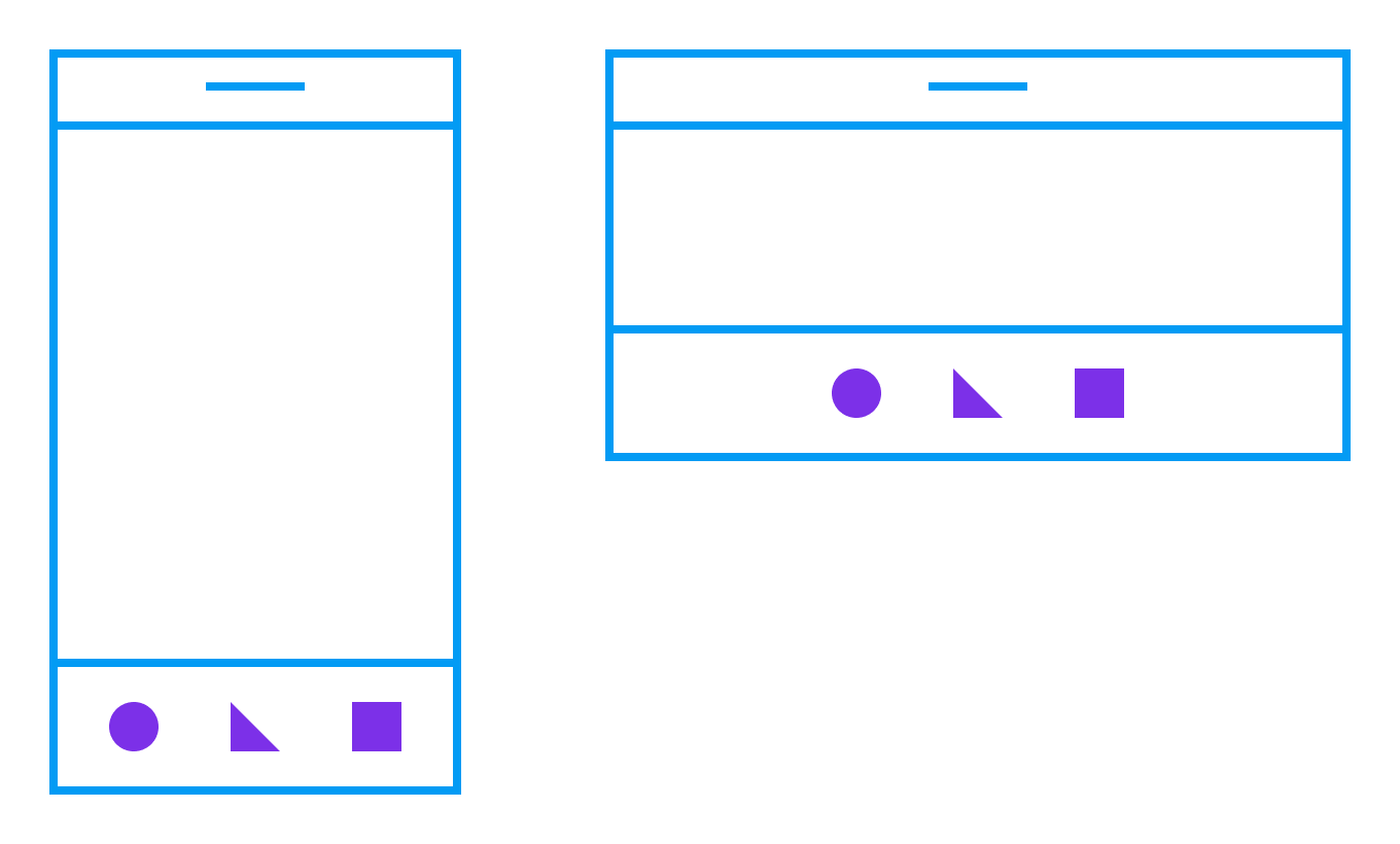
分配对象 (Distribute Objects)
To experiment with this behavior, let’s prototype a toolbar of the mobile app and set Constraints of the icons to Center and Center. It works fine when we change the orientation, but there is definitely room for improvement:
为了试验这种行为,让我们为移动应用程序的工具栏设计原型,并将图标的约束设置为Center和Center。 当我们更改方向时,它可以很好地工作,但是肯定还有改进的空间:
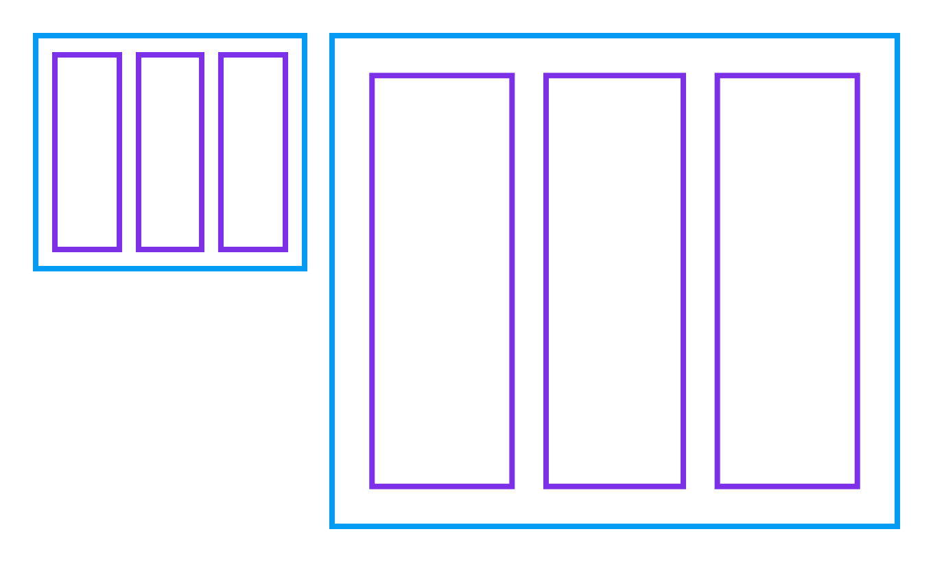
Now, let’s apply Layout Grid with three stretchy columns to the toolbar:
现在,将带有三个可伸缩列的布局网格应用于工具栏:
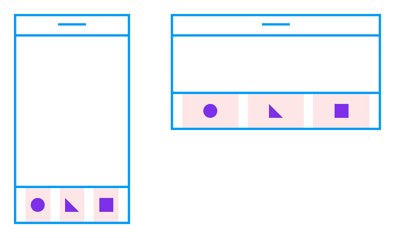
Icons are aligned to the columns, and their Constraints are set to Center and Center. When we change frame’s orientation to the landscape now, they’re properly distributed in the toolbar.
图标与列对齐,并且其约束设置为居中和居中。 现在,当我们将框架的方向更改为横向时,它们已正确分布在工具栏中。
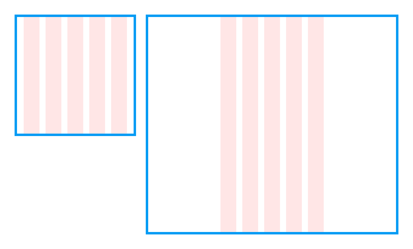
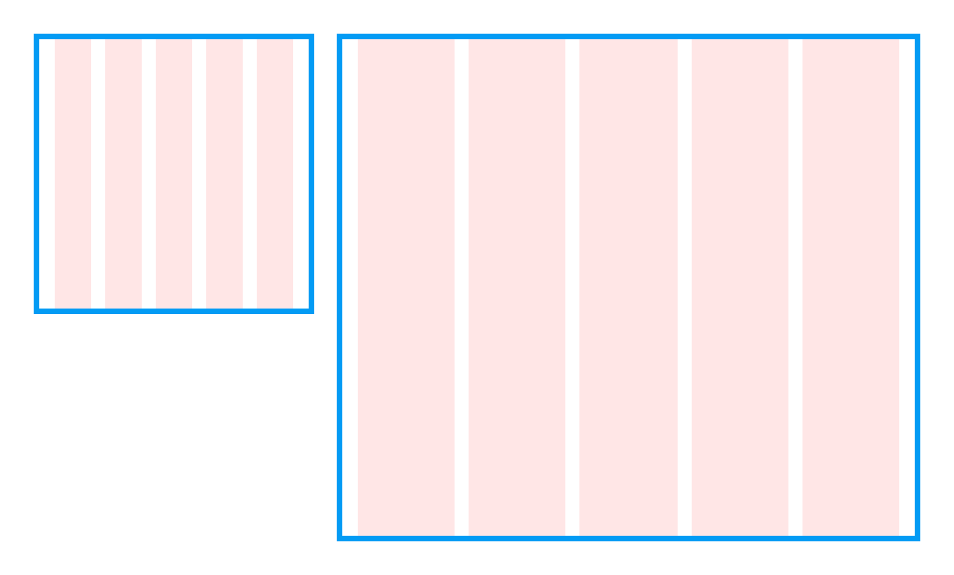
固定间距 (Fixed Spacing)
The same technique can be used for maintaining fixed gutters and margins when resizing the frame. In the next example, Layout Grid wasn’t used, and both horizontal and vertical Constraints on the blocks were set to Scale. When the parent frame is resized, both gutters and margins are scaled proportionally.
调整框架大小时,可以使用相同的技术来保持固定的装订线和边距。 在下一个示例中,未使用“布局网格”,并且块上的水平和垂直约束都设置为“缩放”。 调整父帧的大小时,装订线和边距均按比例缩放。
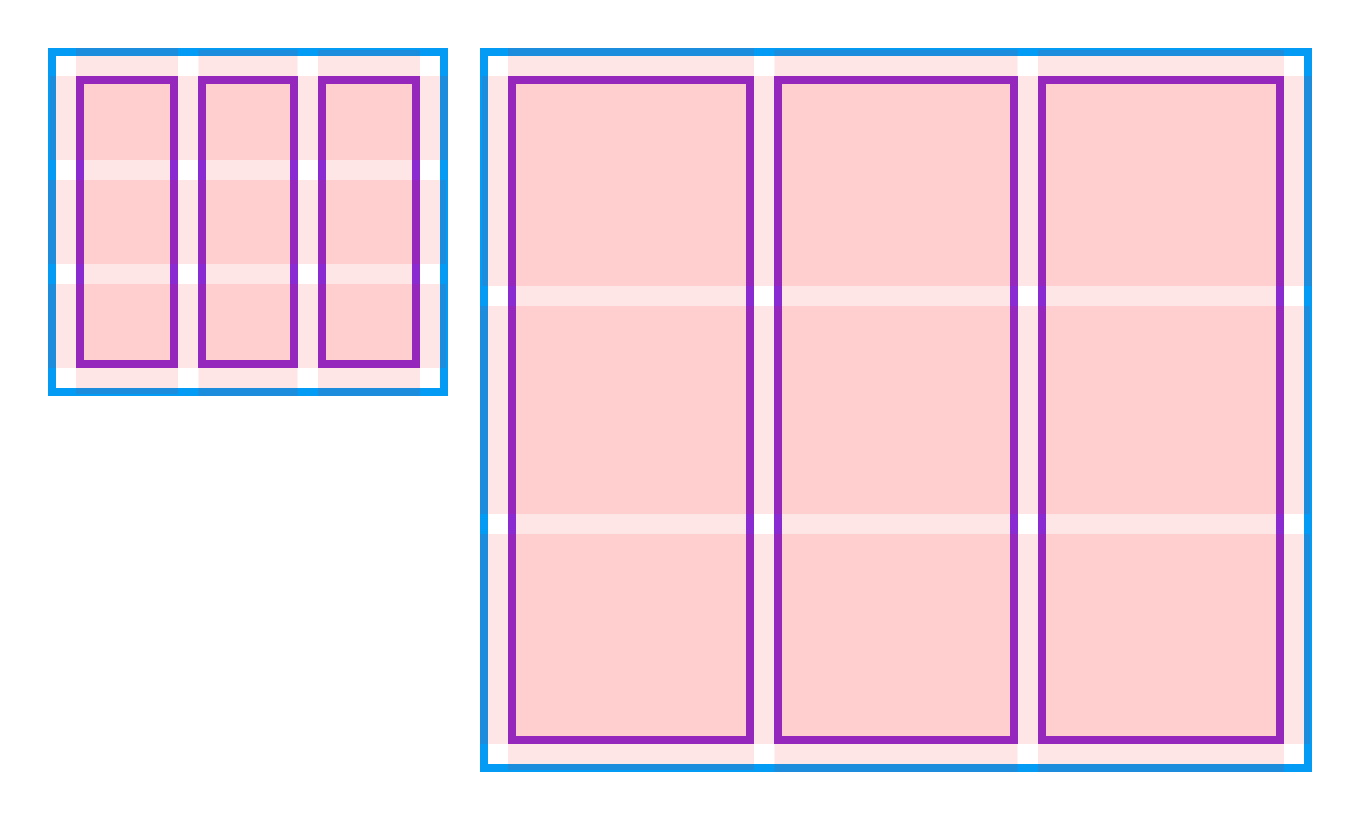
On a fixed example, the Layout Grid was defined with stretchy columns and grids, and Constraints of the blocks were set to Left-Right and Top-Bottom. When resized, all objects stick to the grid and spacing around them is unchanged.
在固定示例中,使用可伸缩的列和网格定义“布局网格”,并将“块”的“约束”设置为“左-右”和“上下”。 调整大小后,所有对象都将粘在网格上,并且周围的间距不变。
结论 (Conclusion)
After learning about a powerful combination of Constraints and Layout Grids, I couldn’t stop thinking about why it has no presence in the interface. Maybe it’s a simple oversight, or perhaps the team at Figma plans to evolve Auto Layout to make this combination obsolete. In any case, right now there is no better way to distribute objects and create consistent spacing than with Constraints and Layout Grids. By adding this tool to our toolbox, we can remove another barrier to creating flexible layouts and truly reusable components when designing in Figma.
在了解了约束和布局网格的强大组合之后,我就停止思考为什么它在界面中不存在。 也许这只是一个简单的疏忽,或者Figma的团队计划开发Auto Layout来使这种组合过时。 无论如何,目前没有比约束和布局网格更好的方法来分配对象和创建一致的间距。 通过将此工具添加到我们的工具箱中,我们可以消除在Figma中进行设计时创建灵活布局和真正可重用组件的另一障碍。
You can play and experiment with all the examples from this article by duplicating a Figma Community file.
您可以通过复制Figma社区文件来播放和尝试本文中的所有示例。
翻译自: https://blog.prototypr.io/using-constraints-with-layout-grids-in-figma-609ad3d9ef69
figma下载


 4091
4091


 被折叠的 条评论
为什么被折叠?
被折叠的 条评论
为什么被折叠?
 到【灌水乐园】发言


