


 本文提供了一篇关于如何在Figma中通过7个简单示例掌握UI动画的教程链接,帮助设计师提升动效设计技能。
figma下载
Originally published on my personal blog.
最初发布在我的 个人博客上 。
Most designers will spend many hours perfecting every pixel of their static UI designs but will barely spend any time perfecting the transitions between these pages.
大多数设计人员将花费大量时间来完善其静态UI设计的每个像素,但几乎不会花费任何时间来完善这些页面之间的过渡。
When you design a mobile menu you design both states, the opened menu, and the closed menu. But if a user clicks to open the menu, does it just suddenly appear? Does it slide in? From what side? How fast? Is the animation linear or does it ease in and/or out?
在设计移动菜单时,您同时设计了两个状态:打开的菜单和关闭的菜单。 但是,如果用户单击打开菜单,它是否突然出现? 它滑进去了吗? 从哪一边? 多快? 动画是线性的还是入场和/或出场轻松?
There are many ambiguities if you just supply the developer implementing the design with two static screens. Adding a one-line note to it that says “it slides in” is not nearly detailed enough.
如果您仅提供给开发人员两个静态屏幕来实现设计,就会有很多歧义。 在上面添加单行注释说“它会滑入”还不够详细。
Motion plays an important role in your designs and can help the user understand what’s happening when they interact with and navigate around your app.
Motion在您的设计中起着重要的作用,可以帮助用户了解与应用程序进行交互和浏览时发生的情况。
We’ll cover some of the most common animations found in apps and websites today and how to implement each one into your designs using Figma.
我们将介绍当今在应用程序和网站中发现的一些最常见的动画,以及如何使用Figma将每个动画实现到您的设计中。
基础 (The Basics)
Feel free to skip this section if you are familiar with the basics of animation in Figma and want to go straight to the examples.
如果您熟悉Figma中的动画基础并且想直接看示例,请随意跳过本节。
First, let’s start with the basics of how animation in Figma works.
首先,让我们从Figma中动画工作原理的基础开始。
To add a transition from one screen to another in Figma you’ll need to create a connection between two frames, a trigger that starts the transition and an animation type to shape what the transition between the frames will look like.
要在Figma中从一个屏幕过渡到另一个屏幕,您需要在两个框架之间创建一个连接,一个触发器开始过渡,并使用动画类型来塑造框架之间过渡的外观。
Figma has a variety of animations and interactions to choose from and we’ll take a look at which ones you can use to replicate the most common animations on the web and in mobile apps.
Figma有多种动画和交互方式可供选择,我们将研究可用于复制网络和移动应用程序中最常见动画的动画。
智能动画 (Smart Animate)
Figma also has a ‘special’ animation type called Smart Animate which tries to automatically figure out how to best transition between two states using layer names and hierarchy.
FIGMA也有称为“特殊的”动画类型智能动画它会尝试自动找出如何使用图层名称和层次两个状态之间最好过渡。
Layer names play an important role in Figma’s Smart Animate to determine which layers change and how they change. Make sure the layers in both compositions match exactly so Figma can keep track of them correctly.
图层名称在Figma的Smart Animate中起着重要的作用,它可以确定哪些图层发生更改以及如何更改。 确保两个合成中的图层完全匹配,以便Figma可以正确跟踪它们。
You can rename one or multiple layers by pressing using the keyboard shortcuts:
您可以通过使用键盘快捷键按来重命名一层或多层 :
- Mac: Command ⌘ + R Mac:Command⌘+ R
- Windows: Ctrl + R Windows:Ctrl + R
To check if Figma can correctly track a layer across compositions, open the prototype tab in the sidebar and Figma will automatically highlight the layers in other frames that will be matched by Smart Animate by adding a purple border.
要检查Figma是否可以正确跟踪整个合成中的图层,请打开侧栏中的原型选项卡,然后Figma将通过添加紫色边框自动突出显示其他帧中的图层,这些帧将与Smart Animate匹配。

You can also choose to apply another animation type and enable Smart Animate for only the matching layers. Figma will then apply your animation only to the layers that should be updated.
您还可以选择应用其他动画类型,并仅对匹配的图层启用“智能动画”。 然后,Figma将仅将动画应用于应更新的图层。
If you do not check this option, the animation will be applied to the entire composition including layers that do not change. This will result in also applying the animation to common elements like the iOS or Android status bar which should not animate when navigating to a different page.
如果不选中此选项,则动画将应用于包括不改变图层的整个合成。 这还将导致将动画应用于iOS或Android状态栏等常见元素,当导航到其他页面时不应动画。
Important: All of these examples are available in Figma so you can test and experiment with each demo yourself.
重要提示: Figma中提供了所有这些示例,因此您可以自己测试和试验每个演示。
#1汉堡菜单 (#1 Hamburger Menu)
Almost every (mobile) website and app has one, the infamous hamburger menu. Luckily this one is super easy to create in Figma using the Smart Animate feature.
几乎每个(移动)网站和应用程序都有一个臭名昭著的汉堡包菜单。 幸运的是,使用Smart Animate功能可以在Figma中轻松创建此图形。
How To Create This Animation
如何制作动画
All we have to do is to create two versions of it like we normally would when designing a hamburger menu. One with the menu in a closed state and one with the menu in an opened state.
我们要做的就是像平常设计汉堡菜单时一样创建两个版本。 一种是菜单处于关闭状态,另一种是菜单处于打开状态。

We’ll then add the connection, trigger and animation as explained in the basics.
然后,我们将按照基础知识中的说明添加连接,触发器和动画。
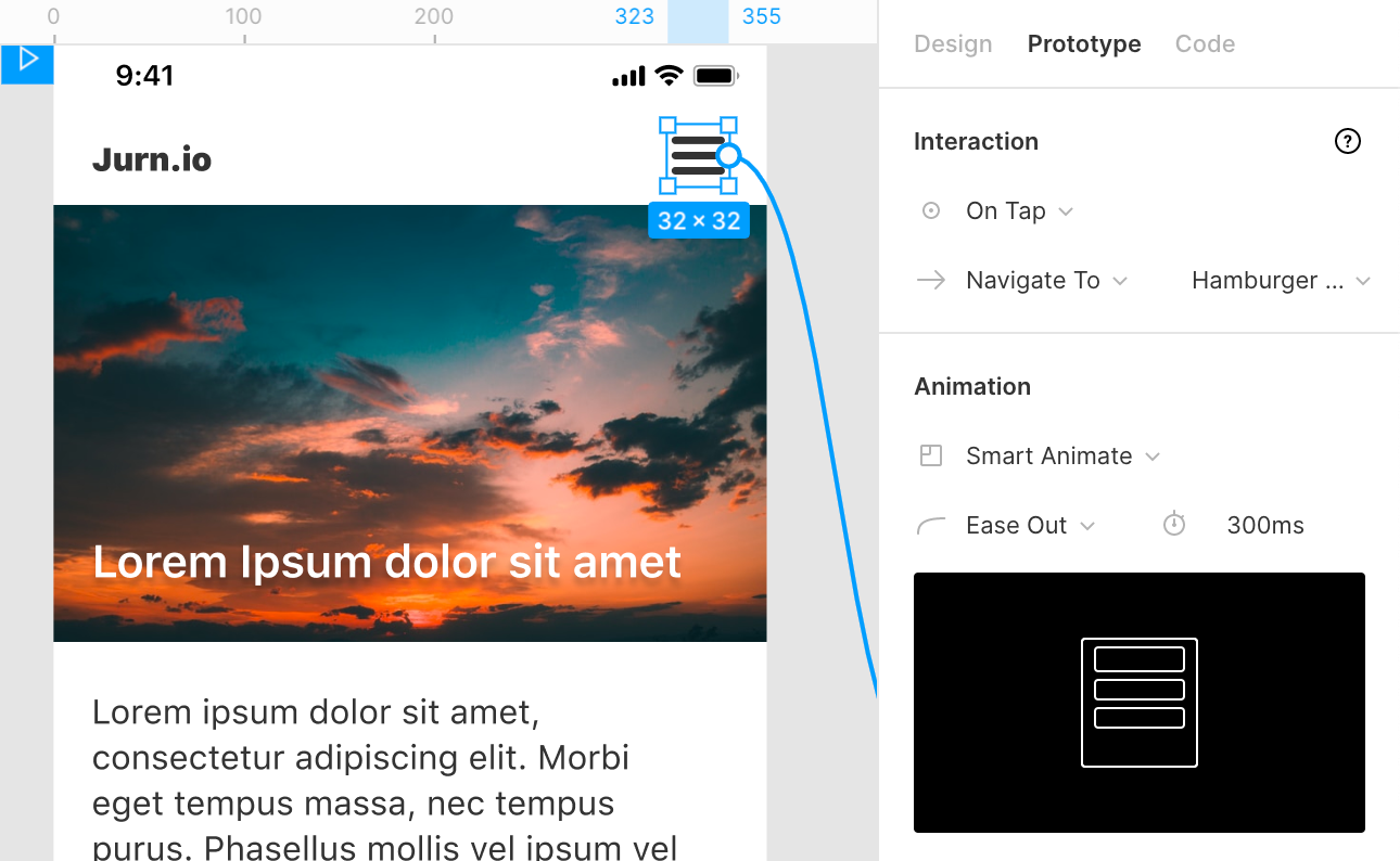
Select the hamburger icon in the first frame and open the prototype tab in the right sidebar. Select On Tap as the interaction to set the animation trigger.
在第一帧中选择汉堡包图标,然后在右侧栏中打开原型标签。 选择“点击时”作为交互设置动画触发器。
Set the interaction to Navigate To and select the other frame with the mobile menu in an opened state or click on the node and drag it to the next frame.
将交互设置为“ 导航至”,然后在移动菜单处于打开状态的情况下选择其他框架,或者单击该节点并将其拖动到下一个框架。
In the Animation section, select Smart Animate from the Transition Field.
在“ 动画”部分中,从“ 过渡”字段中选择“ 智能动画 ”。
(optional) Apply Easing or change the Duration of the transition.
(可选)应用缓动或更改过渡的持续时间 。
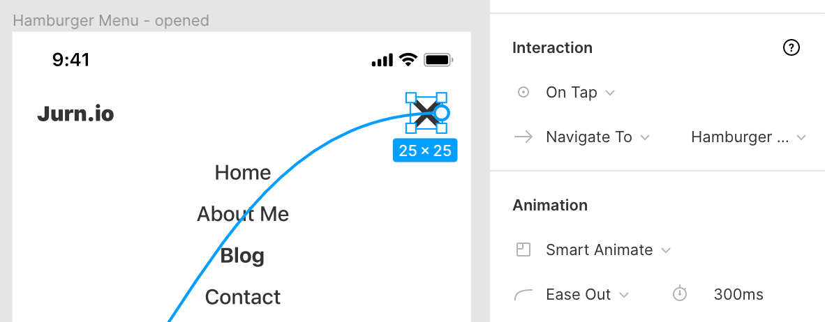
You can now open the menu but we haven’t set the trigger to be able to close the menu again.
您现在可以打开菜单,但我们尚未将触发器设置为能够再次关闭菜单。
Repeat the previous steps on the second frame but set Navigate To back to the frame with the menu in the closed state.
在第二个框架上重复前面的步骤,但是在菜单处于关闭状态的情况下将“ 导航到”设置回该框架。
That’s it! You can then go to test the animation by clicking the play icon in the top right of Figma to open presentation view. You can now open and close the hamburger menu and see the transition between the two states.
而已! 然后,您可以通过单击Figma右上方的播放图标来测试动画,以打开演示视图。 现在,您可以打开和关闭汉堡菜单,并查看两个状态之间的转换。
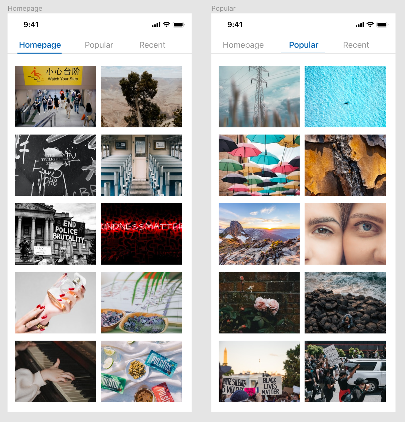
#2滑片 (#2 Sliding Tabs)
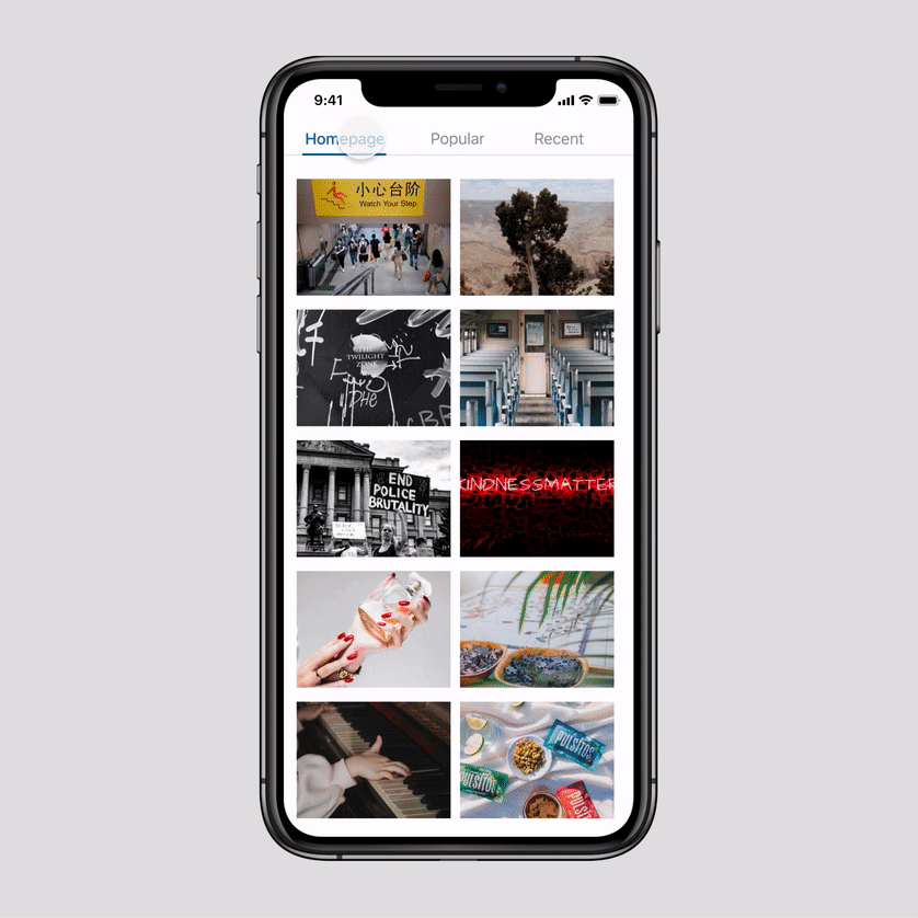
Tabs are a very common design pattern, especially in mobile apps. Having no animation when switching tabs makes the transition feel very sudden. By positioning the new tab content relative to the action that opens it we can show continuity in the transition between the tabs. This helps the user make sense of where the information comes from.
选项卡是一种非常常见的设计模式,尤其是在移动应用程序中。 切换选项卡时没有动画会使过渡感觉非常突然。 通过相对于打开操作的位置来定位新标签页内容,我们可以在标签页之间的过渡中显示连续性。 这可以帮助用户了解信息的来源。
How To Create This Animation
如何制作动画
To create this animation we’ll first make the two static UI screens with tabs that we can navigate between.
要创建此动画,我们首先要制作两个静态UI屏幕,并在其中进行导航。
The user needs to be able to transition between the tabs in two ways, by clicking the tab title and by swiping between pages, so we’ll add two animation triggers.
用户需要能够通过两种方式在选项卡之间进行转换,方法是单击选项卡标题并在页面之间滑动,因此我们将添加两个动画触发器。
One for tapping the tab title and one for swiping between the different tabs.
一种用于点击标签页标题,另一种用于在不同标签页之间滑动。
Let’s start with the first trigger; clicking on the tab title.
让我们从第一个触发器开始; 单击选项卡标题。
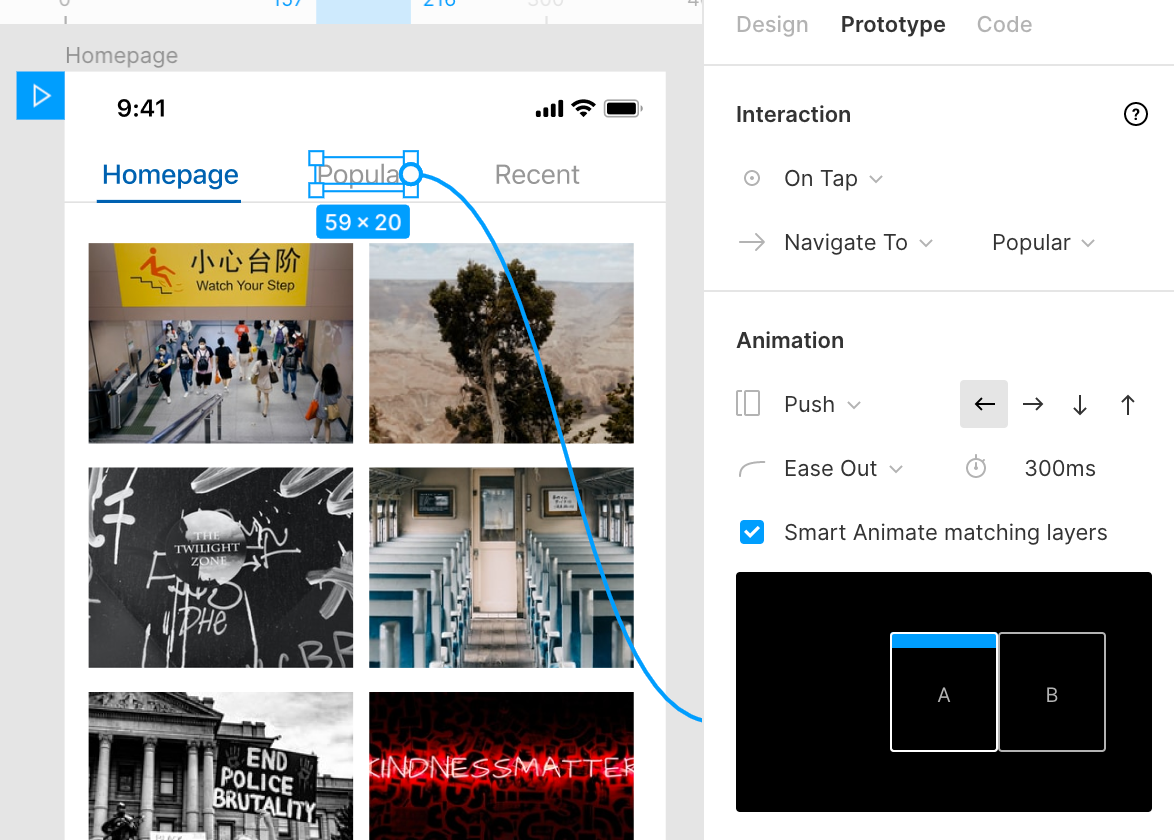
Select the tab title layer and open the Prototype tab again in the sidebar. Select On Tap as the interaction to set the animation trigger.
选择选项卡标题层,然后再次在侧栏中打开“原型”选项卡。 选择“点击时”作为交互设置动画触发器。
Set the interaction to Navigate To and select the screen with the other tab.
将交互设置为“ 导航至”,然后使用其他选项卡选择屏幕。
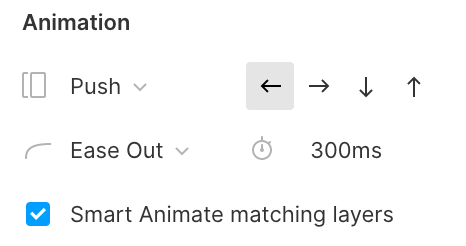
In the Animation section, select Push from the Transition Field and select the Left arrow. As the new tab is position on the right of our current tab, we want it to push from right to left.
在“ 动画”部分中,从“ 过渡字段”中选择“ 推入”,然后选择“ 向左箭头” 。 由于新选项卡位于当前选项卡的右侧,因此我们希望它从右向左推动。
Make sure Smart Animate matching layers is checked. That way Figma doesn’t apply the transition to the elements that both frames have in common, such as the background of the tab or the phone status bar.
确保已选中“ 智能动画”匹配层 。 这样,Figma不会将过渡应用于两个框架共有的元素,例如选项卡的背景或电话状态栏。
For this transition to work, however, it’s very important that the actual tab content isn’t smart matched by Figma as Smart Animate will otherwise override our push animation with a fade animation because of the matching of layers.
但是,为了使过渡生效,非常重要的一点是,Figma不能智能地匹配实际的选项卡内容,因为由于图层的匹配,智能动画会以淡入淡出的动画覆盖我们的推送动画。
To prevent this from happening we need to make sure the layer names for these do not match. You don’t have to rename each individual layer but instead, you can simply group them and rename the group (e.g. homepage content and popular content).
为了防止这种情况的发生,我们需要确保这些图层的名称不匹配。 您不必重命名每个单独的图层,而是可以简单地将它们分组并重命名组(例如,主页内容和受欢迎的内容)。
Now that we’ve set up the first trigger we can move on to adding the ability to swipe between tabs.
现在我们已经设置了第一个触发器,我们可以继续添加在选项卡之间滑动的功能。
For this, we’ll select the entire group that makes up the tab content and add the On Drag trigger.
为此,我们将选择组成选项卡内容的整个组,并添加“ 拖动时”触发器。
Set the interaction to Navigate To and select the screen with the other tab.
将交互设置为“ 导航至”,然后使用其他选项卡选择屏幕。
We can use the same animation settings as the first trigger. In the Animation section, select Push from the Transition Field but this time we’ll select the Right Arrow. As the tab we want to navigate to is now on our left.
我们可以使用与第一个触发器相同的动画设置。 在“ 动画”部分中,从“ 过渡字段”中选择“ 推入”,但这一次,我们将选择“ 向右箭头” 。 作为我们要导航至的选项卡现在位于我们的左侧。

Both swiping and tapping on the tab title will now work for the first tab but we can’t yet navigate back to the homepage so we’ll need to add the same triggers for the Popular tab.
现在,在第一个标签上滑动和点击标签标题都可以使用,但我们仍无法导航回首页,因此我们需要为“流行”标签添加相同的触发器。
All of the settings for these triggers are the same except we’ll reverse the direction in the animation settings as the direction is now reversed.
这些触发器的所有设置都相同,除了我们将在动画设置中反转方向,因为现在反转了方向。
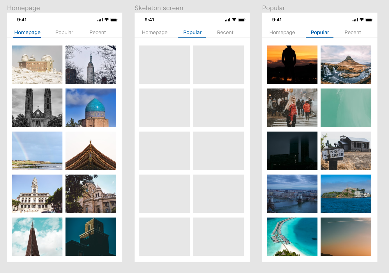
#3载入画面 (#3 Loading screens)
Apps and websites need to load content and this might take some time, especially for users on slow connections or when loading big files.
应用和网站需要加载内容,这可能需要一些时间,特别是对于连接速度较慢或加载大文件的用户而言。
To improve the user experience, a lot of apps and websites display a skeleton loading screen while the data is being downloaded. This helps to make the loading feel faster to the user and show them the status of the interface.
为了改善用户体验,许多应用程序和网站在下载数据时显示骨架加载屏幕。 这有助于使加载感觉更快,并向用户显示界面状态。

Loading states are often forgotten by designers but a thoughtfully designed loading state can greatly improve the user experience.
设计人员通常会忘记加载状态,但是精心设计的加载状态可以极大地改善用户体验。
We’ll recreate our previous sliding tabs animation but this time we’ll simulate a loading state by showing a skeleton screen before showing the actual page content.
我们将重新创建之前的滑动选项卡动画,但是这次我们将通过在显示实际页面内容之前显示框架屏幕来模拟加载状态。
How To Create This Animation
如何制作动画
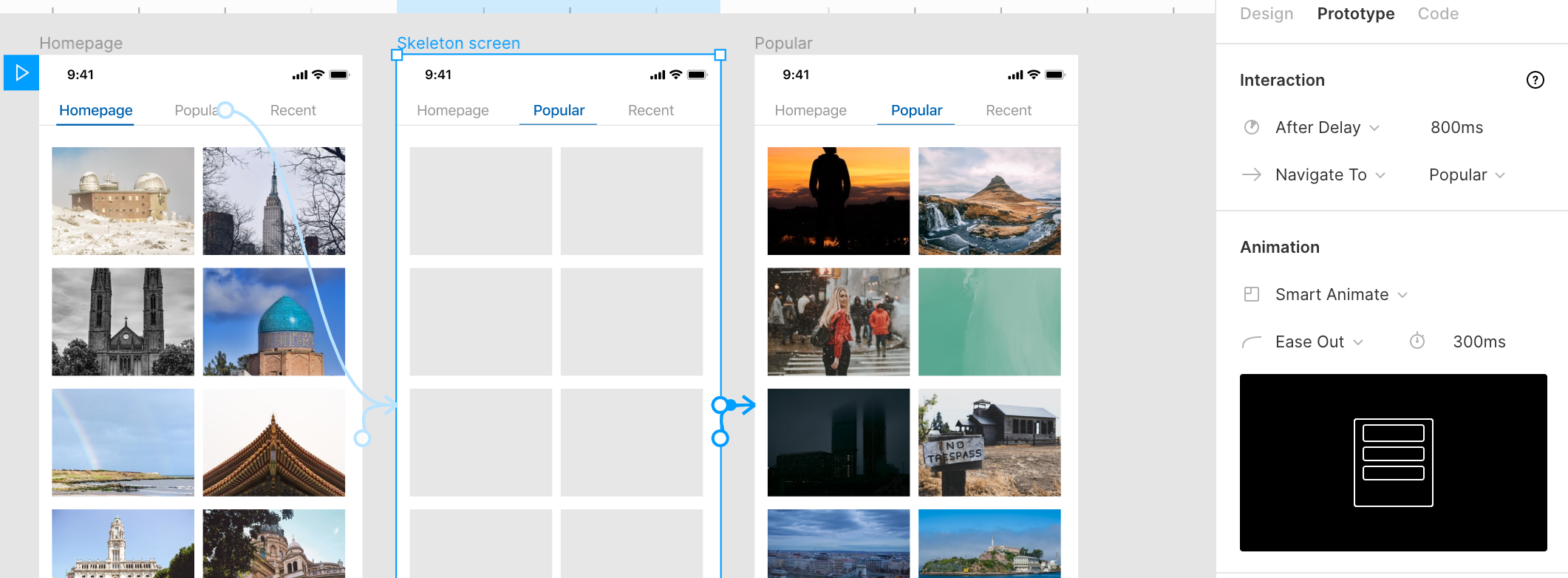
First, let’s copy the design used in our previous sliding tab animation. We’ll then add an extra frame in between that contains our loading state design.
首先,让我们复制之前的滑动标签动画中使用的设计。 然后,我们将在两者之间添加一个额外的框架,其中包含我们的加载状态设计。
Now we can add the same triggers and animations as before, but instead of going straight to the ‘Popular’ tab. Set it to Navigate To and select the frame with the loading state.
现在,我们可以添加与以前相同的触发器和动画,而不必直接进入“热门”标签。 将其设置为“ 导航至”,然后选择具有加载状态的框架。
On the frame with our loading state. Select the After Delay trigger and set it to Navigate To the next frame in the sequence. In this case it’s the Popular tab. You can set the delay to as long as you want, in our animation it will wait 800ms before it’s ‘finished’ loading and the content is visible.
在我们加载状态的框架上。 选择“ 延迟后”触发器,并将其设置为“ 导航到序列中的下一帧”。 在这种情况下,它是“流行”选项卡。 您可以将延迟设置为所需的时间,在我们的动画中,它将等待800毫秒 ,直到“完成”加载,并且内容可见。
Set the Animation to Smart Animate so the skeleton screen is replaced by the actual content with a smooth fade transition.
将“ 动画”设置为“ 智能动画”,以便用平滑的淡入淡出过渡将骨架屏幕替换为实际内容。
The same After Delay transition can be applied to a variety of situations where a user might encounter a loading or processing state.
相同的“ 延迟后”过渡可以应用于用户可能遇到加载或处理状态的多种情况。
A splash screen when you open an app, when a credit card purchase is being processed or when a user is uploading files or after submitting a form.
当您打开应用程序,正在处理信用卡购买时,或者用户正在上传文件时或提交表单后,将显示初始屏幕。
#4页面转换 (#4 Page Transitions)
Over the years, apps have become a lot more complex in flow and hierarchy than just loading a new page on every link. We regularly ‘layer’ content on top of other content, especially in single-page apps (SPA’s). That means we don’t do full page loads but instead move content in and out in different directions and want to model that in our designs.
多年来,应用程序的流程和层次结构变得比仅在每个链接上加载新页面更加复杂。 我们会定期在其他内容之上“分层”内容,尤其是在单页面应用程序(SPA)中。 这意味着我们不进行整页加载,而是将内容沿不同方向移入和移出,并希望在设计中对其进行建模。
We’ll make an animation where the content moves in from the bottom which we can then swipe away like it’s an overlay.
我们将制作一个动画,其中内容从底部移入,然后我们可以像叠加层一样将其滑走。
How To Create This Animation
如何制作动画
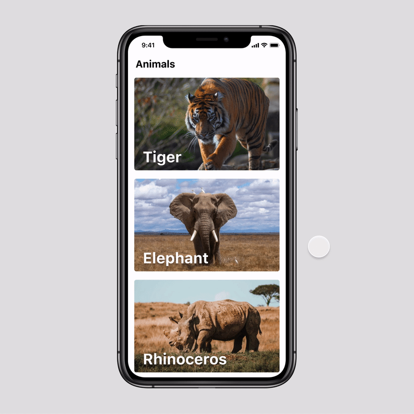
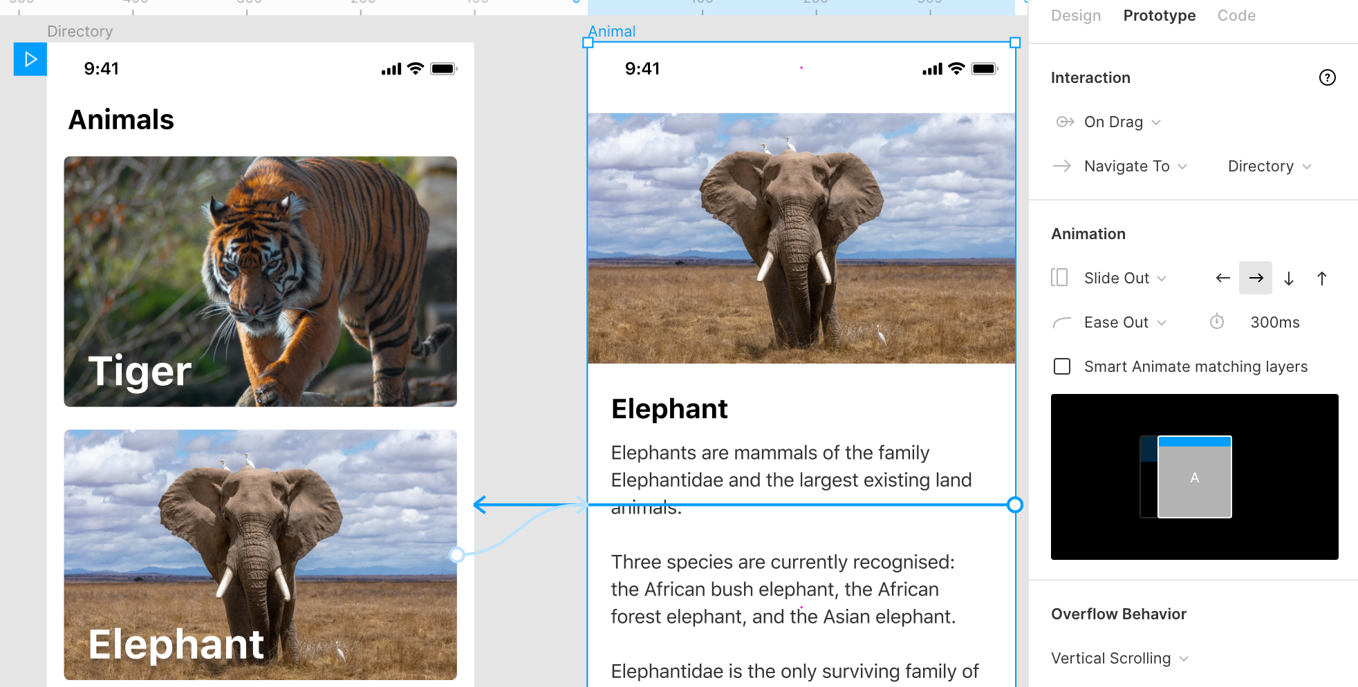
We’ll create an animal directory with a page for every animal. Important for making this transition is that the layer name of the page content matches so Figma can match these using Smart Animate.
我们将创建一个动物目录,其中包含每个动物的页面。 进行此过渡的重要条件是页面内容的层名称匹配,因此Figma可以使用Smart Animate匹配它们。
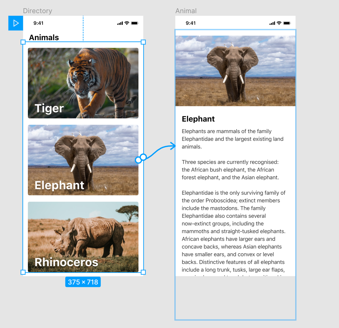
Select the one of the animal blocks, in this case the elephant, and set the trigger to On Tap and Navigate To the corresponding animal page.
选择其中一个动物块(在本例中为大象),然后将触发器设置为“点击”并导航到相应的动物页面。
Set the transition type to Smart Animate. You can tweak the easing settings and speed but this is optional.
将过渡类型设置为Smart Animate 。 您可以调整缓动设置和速度,但这是可选的。
If you made sure the layers are correctly matched than it will now slide in the new page from the bottom.
如果确定图层正确匹配,则现在它将从底部滑入新页面。
Swipe to close
滑动即可关闭
To then be able to swipe away the page we’ll need to add a trigger and transition for that to happen on the animal page.
为了能够滑走页面,我们需要添加一个触发器并进行转换,以使其在动物页面上发生。
Select the page content, add the On Drag trigger and set it to Navigate To our animal directory page.
选择页面内容,添加“ 拖动时”触发器并将其设置为“ 导航到我们的动物目录”页面。
In the Animation tab, select the Slide Out transition and select the Right Arrow so we can swipe in the right direction to close it.
在“ 动画”选项卡中,选择“ 滑出”过渡,然后选择“ 向右箭头”,以便我们可以向右滑动以将其关闭。
Leave the Smart Animate matching layers option unchecked as we want to swipe the entire page away instead of having a smooth transition between the two pages.
取消选中“ 智能动画匹配层”选项,因为我们要滑整个页面,而不要在两个页面之间进行平滑过渡。
#5拉动刷新 (#5 Pull to Refresh)
This one speaks for itself. A very common UI pattern when refreshing a page or fetching new content, especially in feeds for news, mail and social media.
这是不言而喻的。 刷新页面或获取新内容时的一种非常常见的UI模式,尤其是在新闻,邮件和社交媒体的提要中。
How To Create This Animation
如何制作动画
At first it seems like a very complex animation to create in Figma but once you break it down in smaller steps, it’s much easier to understand what’s going on.
最初,在Figma中创建一个似乎非常复杂的动画,但是一旦将其分解成较小的步骤,就可以更容易地了解发生了什么。

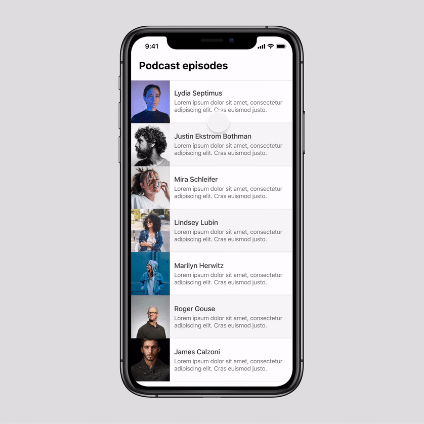
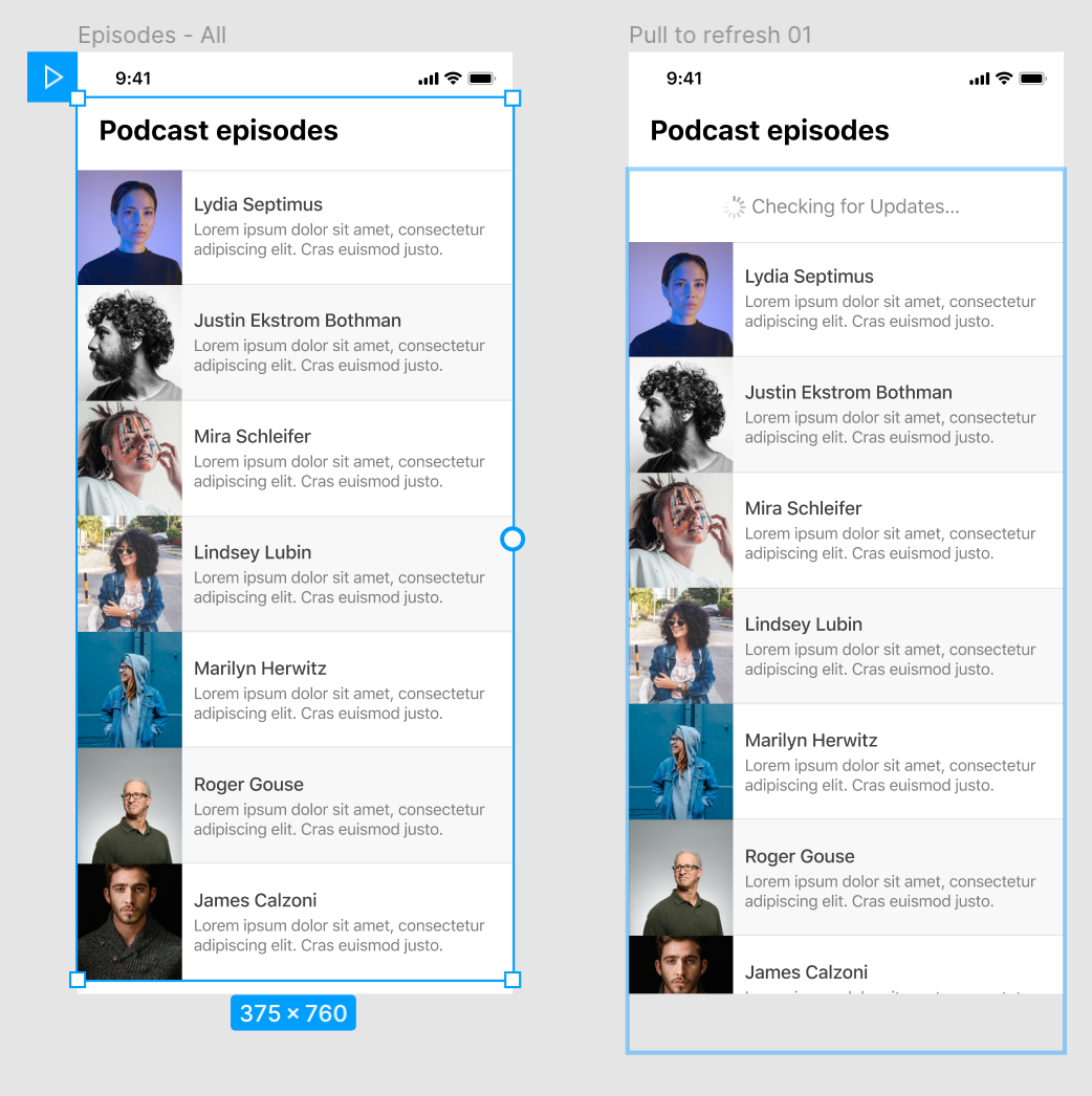
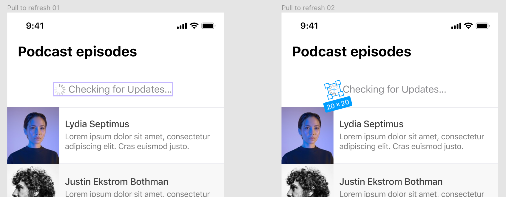
We’ll start out with a list of podcast episodes. To enable this animation we’ll need to turn this entire group of layers into a frame. By turning it into a frame instead of a group of layers we can make the content of this frame bigger than the dimensions of the frame to allow vertical scrolling.
我们将从播客片段列表开始。 要启用此动画,我们需要将整个图层组变成一个框架。 通过将其变成框架而不是一组图层,我们可以使该框架的内容大于框架的尺寸,以允许垂直滚动。
The “Checking for Updates” content is already in the first frame, although it’s not yet visible as it’s hidden behind the page title.
“检查更新”内容已经在第一帧中,尽管它不可见,因为它隐藏在页面标题后面。
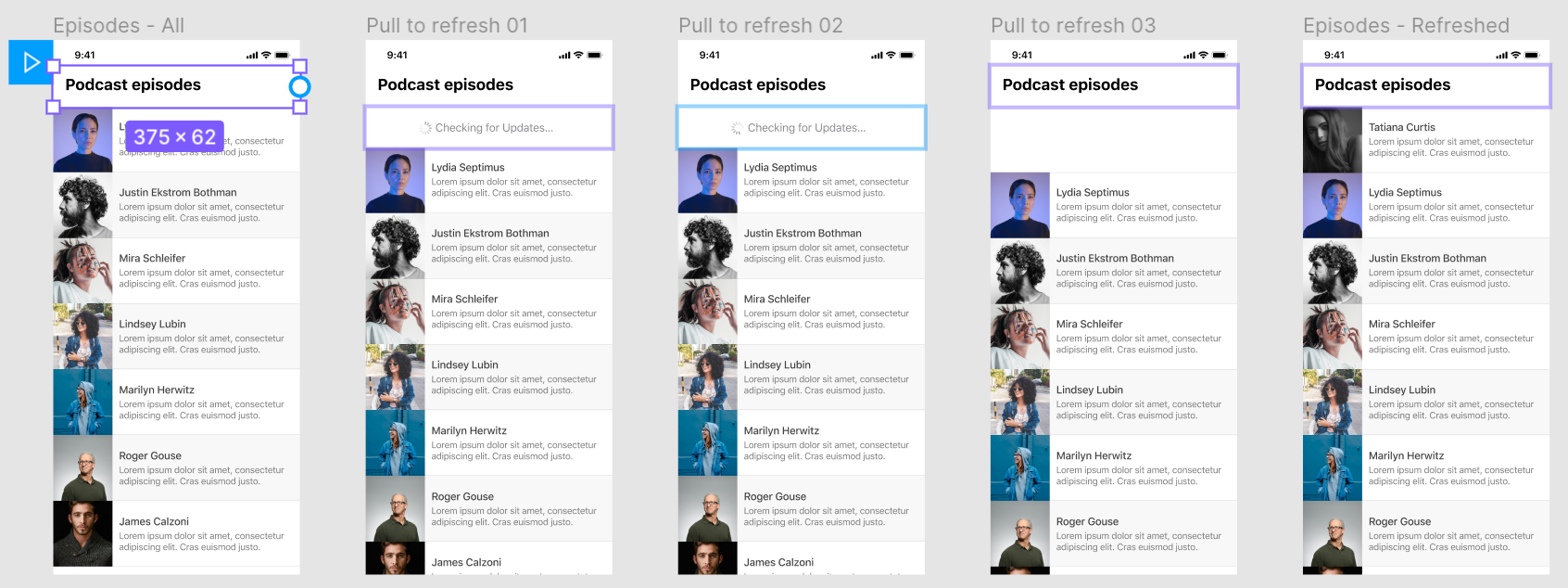
Frame 1 to frame 2
框架1至框架2
We’ll set the first frame in our sequence to On Drag and Navigate To the second page in our sequence ‘Pull to refresh 01’. In this second frame we’ll make a duplicate of the first frame but move the content down so the “Checking for Updates” group is now in view.
我们将序列中的第一帧设置为“拖动时”,然后导航到序列“拉动刷新01”中的第二页。 在第二帧中,我们将复制第一帧,但是将内容向下移动,以便现在可以看到“检查更新”组。
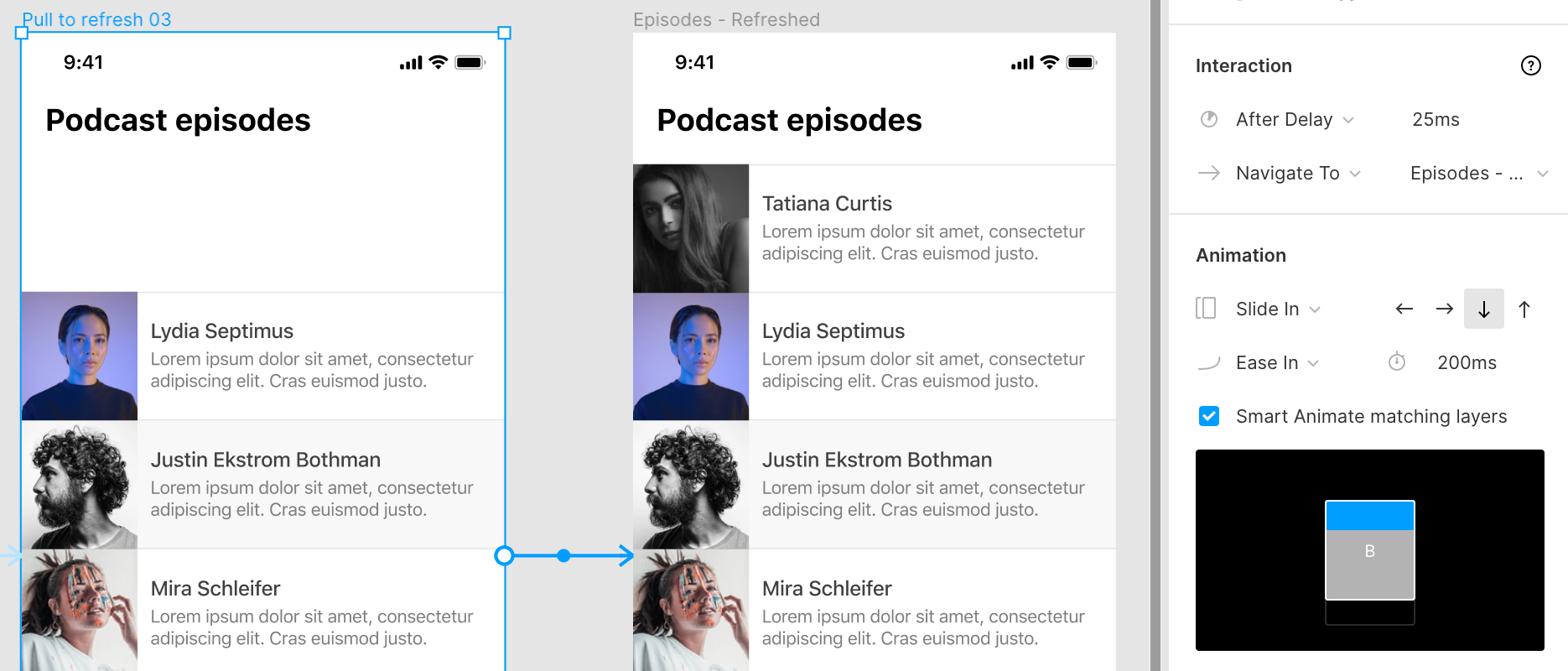
Frame 2 to frame 3
框架2到框架3
In the second frame of our sequence we’ll simulate a loading animation. This isn’t strictly necessary but makes the sequence of actions feel more like a finished product instead of static UI screens that are stitched together.
在序列的第二帧中,我们将模拟加载动画。 这不是严格必要的,但是可以使操作序列看起来更像是成品,而不是缝合在一起的静态UI屏幕。
We’ll duplicate the second frame for the third frame but in the 3rd frame we’ll set the rotation to the spinner to -165°
我们将第二帧复制为第三帧,但在第三帧中,将旋转器的旋转角度设置为-165°
For the transition between these two frames we’ll use After Delay and set it to navigate to the third frame in our sequence after 500ms. We’ll set the transition to Smart Animate and use Ease In as the type of transition with a delay of 500ms. The delay for loading the next frame and the transition are the same.
对于这两个帧之间的过渡,我们将使用After Delay ,并将其设置为在500ms之后导航到序列中的第三帧。 我们将过渡设置为Smart Animate,并使用“ 缓入”作为过渡类型,延迟为500ms 。 加载下一帧和转换的延迟是相同的。
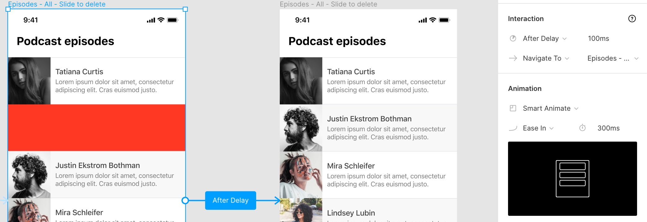
Frame 3 to frame 4
框架3至框架4
In this frame we’ll create space for new content that will be loaded. This step makes the animation a lot smoother instead of the content just appearing out of nowhere. Don’t remove the “Checking for Updates” group completely but move it behind the page title like it was in the first frame and leave the exact amount of vertical space that is required for the new content.
在此框架中,我们将为将要加载的新内容创建空间。 这一步使动画更加平滑,而不是内容无处不在。 不要完全删除“检查更新”组,而是将其移动到页面标题后,就像在第一帧中一样,并保留新内容所需的确切垂直空间。

To make it look like the data was fetched and is being loaded in we’ll set up another After Delay and Navigate To the next frame after a delay of 1000ms.
为了使数据看起来像已被提取并正在加载中,我们将设置另一个After Delay并在延迟1000ms之后导航到下一个帧。
For the Animation we’ll use the Dissolve transition so the “Checking for Updates” status disappears. We’ll use a shorter duration of 100ms for this animation so it disappears fast.
对于动画,我们将使用“ 溶解”过渡,因此“检查更新” 状态消失。 我们将为该动画使用100ms的较短持续时间,以使其快速消失。

Frame 4 to Frame 5
框架4至框架5
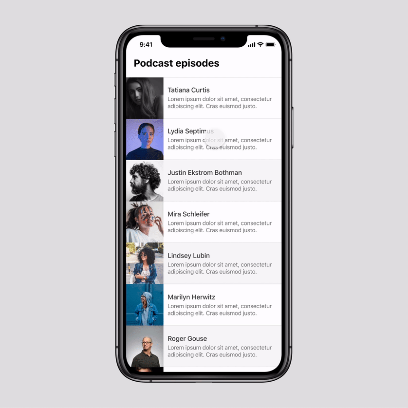
All that’s left is to show the newly loaded content in the space we created in our previous frame. Add the new content in the last frame and set up another After Delay with a very short 25ms delay before navigating to the last frame.
剩下的就是在上一帧中创建的空间中显示新加载的内容。 在最后一帧中添加新内容,并在导航到最后一帧之前以非常短的25ms延迟设置另一个After Delay 。
Since the users swipes down the refresh it looks more natural if the content slides in from the top so we’ll set the Animation to Slide In and choose the Down Arrow so the new content slides down into view. We can add a 200ms duration for this transition.
由于用户向下滑动刷新,如果内容从顶部滑入,则看起来更自然,因此我们将“ 动画”设置为“ 滑入”,然后选择“ 向下箭头”,使新内容滑入视图。 我们可以为此过渡添加200ms的持续时间。
#6滑动动作 (#6 Swipe Actions)
Another common UI pattern we see in mobile apps is swiping items left or right to reveal more actions. For example in email apps this pattern is often applied to mark mails as read/unread, reply or delete them.
我们在移动应用中看到的另一种常见的UI模式是向左或向右滑动项目以显示更多操作。 例如,在电子邮件应用程序中,此模式通常用于将邮件标记为已读/未读,回复或删除。
How To Create This Animation
如何制作动画
To prototype this in Figma we’ll create two designs. One in the ‘normal’ state and one where the actions are visible. For the latter, it’s very important that the action does not overlap but ‘pushes’ the old content because, just like with the pull to refresh animation, we need to have the content exceed the frame size to enable scrolling.
为了在Figma中进行原型制作,我们将创建两个设计。 一种处于“正常”状态,另一种处于可见状态。 对于后者,动作不重叠而是“推”旧内容非常重要,因为就像拉动刷新动画一样,我们需要使内容超过帧大小才能启用滚动。
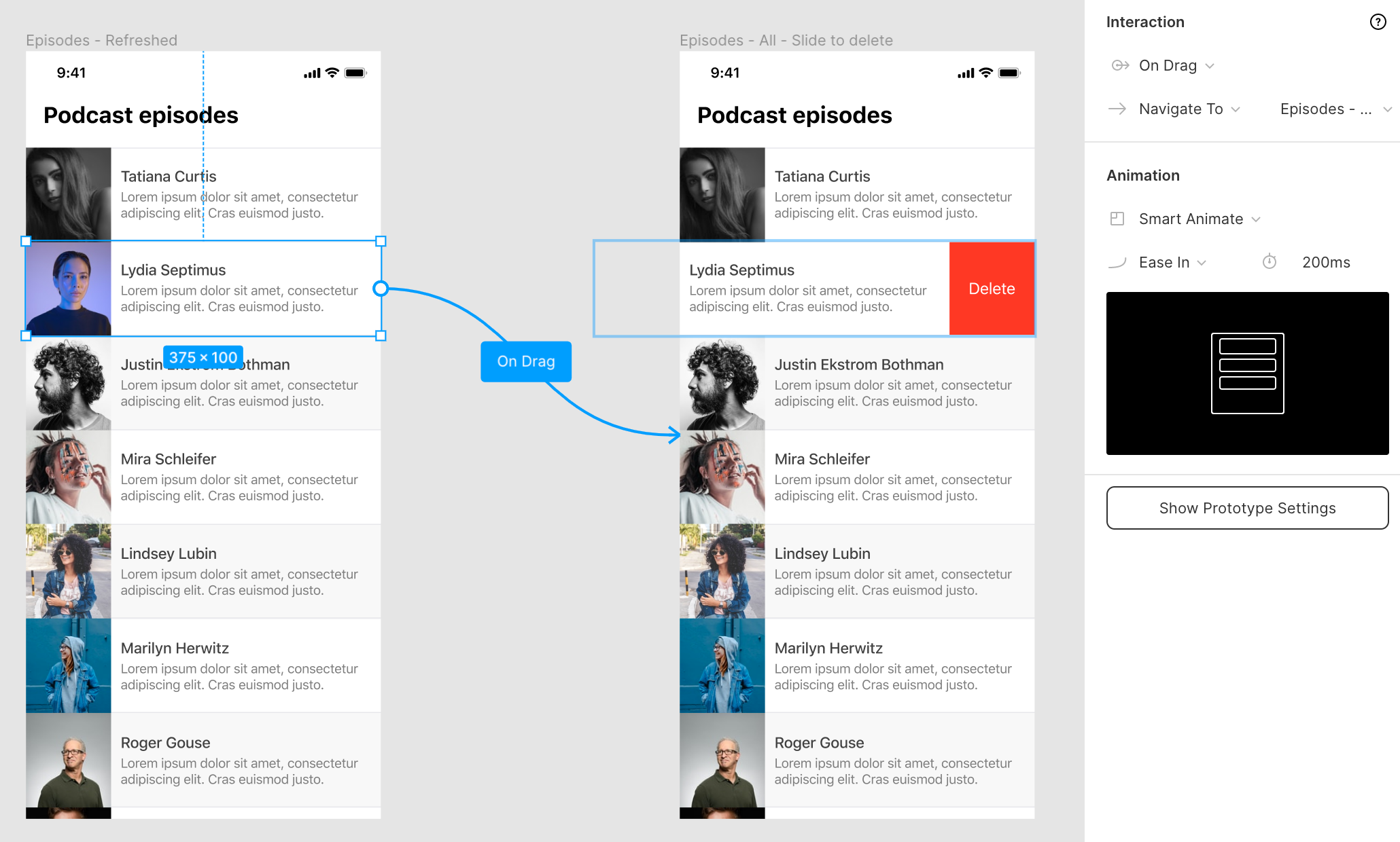
Select the element you want to enable the action on and select the On Drag trigger, then set it to Navigate To the second view where the actions are visible.
选择要启用操作的元素,然后选择“ 拖动时”触发器,然后将其设置为“ 导航到可见操作的第二个视图”。
For the Animation, select Smart Animate and Figma will automatically know how to transition between these two states.
对于“ 动画” ,选择“ 智能动画”,并且Figma将自动知道如何在这两种状态之间转换。
Once the actions are visible we need to give the user two options, to cancel the action or to perform the action. We’ll create a trigger for each one, clicking on the podcast episode cancels the action. Clicking on the delete button will navigate to the next frame in the sequence.
可见操作后,我们需要为用户提供两个选项,以取消操作或执行操作。 我们将为每个触发器创建一个触发器,单击播客情节可取消操作。 单击删除按钮将导航到序列中的下一帧。
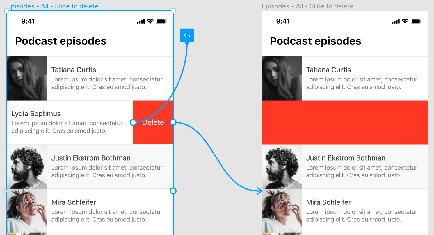
For cancelling the action: Select the entire item excluding the delete button. Set the trigger to On Tap and simply select Back in the actions dropdown to go back to the previous frame.
要取消操作:选择除删除按钮以外的整个项目。 将触发器设置为“点击”,然后只需在操作下拉菜单中选择“ 后退”即可返回上一帧。
To delete the element: Select the delete button, select the On Tap trigger, set it to Navigate To and select the next frame in the sequence. The animation type is Slide In and select the Left Arrow, the same direction as our swipe to reveal the delete button. Note that you can simply navigate to the next frame where the item is gone but to make this transition look better I’ll first make the entire row red to show which item was deleted.
删除元素:选择删除按钮,选择“ 点击”触发器,将其设置为“ 导航至”,然后选择序列中的下一帧。 动画类型为“ 滑入”,然后选择“ 向左箭头” ,与我们滑动以显示删除按钮的方向相同。 请注意,您可以简单地导航到项目消失的下一帧,但是为了使过渡效果更好,我首先将整个行设为红色,以显示已删除的项目。
For the last frame we simply add the After Delay trigger again and set it to Navigate To the last frame where the item is deleted after a delay of 100ms.
对于最后一帧,我们只需再次添加After Delay触发器,并将其设置为Navigate To Navigate To the last frame,在此延迟100ms后将删除该项目。
We can use Smart Animate again to transition between these two frames.
我们可以再次使用Smart Animate在这两个帧之间进行过渡。
Now the sequence is complete and you can preview the animation in prototype mode!
现在序列已完成,您可以在原型模式下预览动画!
#7模态 (#7 Modal)

Modals are widely used in apps and websites for everything from offering discounts to paywalls to confirmation dialogs. Learning how to add these to your prototypes will come in handy in a lot of design projects.
从提供折扣到付费专区再到确认对话框,模态在应用程序和网站中广泛使用。 在许多设计项目中,学习如何将这些添加到原型中非常方便。
How To Create This Animation
如何制作动画
Unlike what I see most designers doing when they create modals, you don’t have to duplicate the complete design multiple times to add a modal to each one.
与我看到的大多数设计师在创建模态时所做的工作不同,您不必多次重复完整的设计即可向每个模型添加模态。
You can create a separate frame that contains the modal design and add it using Figma’s prototyping tools. This saves a lot of clutter in your design files, especially when you are working with modals that have multiple steps.
您可以创建一个包含模态设计的单独框架,并使用Figma的原型工具将其添加。 这样可以在设计文件中节省很多混乱,尤其是在使用具有多个步骤的模态时。

Select the button or link that you want to use to trigger the modal opening. Select the On Tap trigger and use Open Overlay to link it to the frame that contains your modal.
选择要用于触发模式打开的按钮或链接。 选择“ 点击”触发器,然后使用“ 打开叠加层”将其链接到包含模态的框架。
In the Overlay section, you can choose the settings for your modal. In this case we’ll go with the Centered position and check the Close when clicking outside option.
在“ 覆盖”部分,您可以选择模态的设置。 在这种情况下,我们将选择居中位置并选中“单击外部时关闭”选项。
Next, make sure the Add background behind overlay option is checked. We’ll set the background to black (#000) and use 40% opacity. This helps the modal stand out and show the user the rest of the page is not accessible while the modal is opened.
接下来,确保选中了 在叠加后添加背景选项。 我们将背景设置为黑色(#000),并使用40%的不透明度。 这有助于模式突出,并向用户显示打开模式时无法访问页面的其余部分。
For the Animation we’ll select Move In in the downward direction by selecting the Down Arrow. This will move the modal in from the top.
对于动画 ,我们将通过选择向下箭头选择移动在向下的方向。 这将从顶部移入模态。
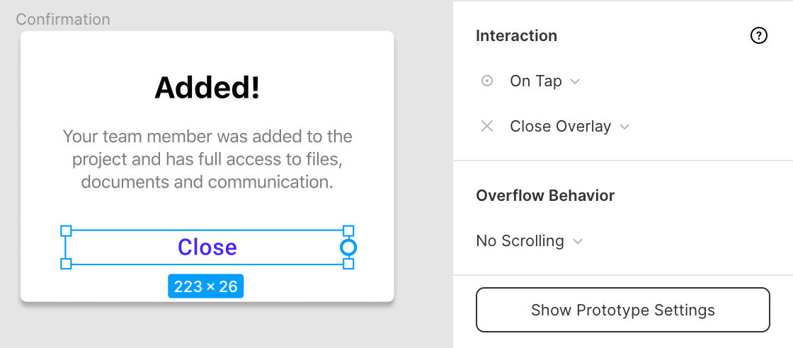
When the user clicks to confirm they will get a confirmation dialog so we need to add an extra step to our modal. Select the Confirm button and use On Tap to set that as the trigger. Next, select Swap With and select the next step in our modal. Set this animation to Instant.
当用户单击以确认时,他们将获得一个确认对话框,因此我们需要在模态中添加一个额外的步骤。 选择“确认”按钮,然后使用“点击时”将其设置为触发器。 接下来,选择“ 交换为 ”,然后选择模态中的下一步。 将此动画设置为Instant 。

All that’s left to do for the user is to close the modal. Select the ‘Close’ text link and use the On Tap trigger for the Close Overlay action. You can also apply this option to the ‘Cancel’ button in the previous step of our modal.
剩下要做的就是关闭模式。 选择“关闭”文本链接,并将“点击触发”用于“ 关闭叠加”操作。 您也可以在模态的上一步中将此选项应用于“取消”按钮。
Now that you know how you can create these animations in Figma, I hope you’ll spend more time thinking about them in your next project and make it easier for developers to translate your designs into working products.
现在,您知道如何在Figma中创建这些动画,我希望您在下一个项目中花更多的时间考虑它们,并使开发人员更轻松地将您的设计转换为可用的产品。
Although we can create a lot of the most common animations in Figma using the techniques described above, some more complex animations can’t yet be created or require many frames to get right which will clutter up your design files.
尽管我们可以使用上述技术在Figma中创建许多最常见的动画,但仍无法创建一些更复杂的动画,或者需要很多帧才能正确处理,这会使您的设计文件混乱。
The built-in animation features of Figma cover most of the basics but fall short when you try to create more complex animations and transitions. There are some more advanced alternatives like Figmotion (Figma plugin) or Principle (external software) for these type of animations but for a lot of designers, these basics should be enough for their projects.
Figma的内置动画功能涵盖了大多数基础知识,但是当您尝试创建更复杂的动画和过渡效果时,这些功能就不够了。 对于这些类型的动画,有一些更高级的替代方法,例如Figmotion (Figma插件)或Principle (外部软件),但是对于许多设计师而言,这些基础知识对于他们的项目应该足够了。
如果您需要下一个项目的帮助,请给我发送电子邮件: hello@jurn.io (If you’d like help with your next project, shoot me an email: hello@jurn.io)
翻译自: https://uxdesign.cc/mastering-animations-in-figma-with-7-simple-demos-204106bff310
figma下载


 扫一扫
扫一扫


 1827
1827

 被折叠的 条评论
为什么被折叠?
被折叠的 条评论
为什么被折叠?
 到【灌水乐园】发言


