


根号 巴比伦
重点 (Top highlight)
In this post I’ll explain the first phase of creating our Babylon DNA, the design system for Babylon Health, and how we moved the Babylon design team from Sketch to Figma.
在这篇文章中,我将解释创建巴比伦DNA的第一阶段,巴比伦健康的设计系统,以及我们如何将巴比伦的设计团队从Sketch转移到Figma。
If you work in the digital design industry, you’ve more than likely read a dozen articles about the big transition from Sketch to Figma, it’s nothing new.
如果您从事数字设计行业,那么您可能已经读了十几篇关于从Sketch到Figma的重大过渡的文章,这并不是什么新鲜事。
However, in this post I’ll walk you through the difficulties the team were facing using the previous setup, why we selected Figma, and what we’re still learning.
但是,在这篇文章中,我将向您介绍团队使用以前的设置所面临的困难,我们为什么选择Figma以及我们仍在学习什么。
In July 2019 I joined Babylon with the task of starting to create Babylon DNA — Babylon Health’s new design system. As a new designer in a fast-growing business, it was essential for me to get up to speed quickly and efficiently. To do that, I had to look at the tools being used by the design team, their ways of working, and the condition of the existing design system and pattern libraries.
在2019年7月,我加入了巴比伦,开始创建巴比伦DNA(巴比伦健康的新设计系统)。 作为快速发展的业务领域的新设计师,对我而言,快速高效地起步至关重要。 为此,我必须查看设计团队使用的工具,它们的工作方式以及现有设计系统和模式库的状况。
My main focus was to streamline and improve the native iOS and Android design libraries and the tools the team were using. It was crucial to communicate with the design and engineering teams to understand what was working well, what wasn’t, and to analyse the existing process.
我的主要重点是简化和改进本机iOS和Android设计库以及团队使用的工具。 与设计和工程团队进行沟通以了解什么有效,什么无效以及分析现有过程至关重要。
设计师面临的障碍 (The obstacles our designers faced)
After speaking with the existing design team, we identified several areas of concern. The most notable amongst designers was the sheer number of design tools they had to work with.
与现有设计团队交谈后,我们确定了几个需要关注的领域。 在设计师中最引人注目的是他们必须使用的大量设计工具。
On a day-to-day basis, our designers were reliant on multiple tools including Sketch, Miro, Zeplin, Abstract, Invision, JIRA and other methods of prototyping. Designers using this amount of software is not uncommon, and it was clearly causing issues here at Babylon.
在日常工作中,我们的设计师依赖多种工具,包括Sketch,Miro,Zeplin,Abstract,Invision,JIRA和其他原型制作方法。 使用这种软件的设计人员并不少见,这显然在巴比伦引起了问题。
Designers were also working from multiple, unmanaged Sketch libraries. We spent some time observing our designers, watching them try, painstakingly, to use the Sketch set up. We found it took them longer to find components than to design the actual screens. With no ownership over these libraries, they had become extremely difficult to navigate and use.
设计人员还使用多个非托管的Sketch库进行工作。 我们花了一些时间观察我们的设计师,辛苦地看着他们尝试使用Sketch设置。 我们发现查找组件要比设计实际屏幕花费更长的时间。 由于没有这些库的所有权,因此它们变得非常难以导航和使用。
Once designs were completed, they were uploaded and split between two design hand-off tools, Abstract and Zeplin. With both being used it was incredibly difficult to know which tool an image had been uploaded to, and where it could be found.
设计完成后,将它们上传并在两个设计移交工具(摘要和Zeplin)之间拆分。 两者都使用时,很难知道图像已上传到哪个工具以及在哪里可以找到。
Zeplin had become a dumping ground for design and there was very little management of it within the team. Not all screens were tagged and many designs would sit under ‘untitled’ sections, making it extremely difficult for anyone to navigate.
Zeplin已成为设计的垃圾场,团队内部对其的管理很少。 并非所有屏幕都带有标签,许多设计都位于“无标题”部分下,这使任何人都很难导航。

And many of the team had come to loathe the combination of Sketch and Abstract, too. It had become painfully slow and frustrating to use, and designers felt it hindered the speed with which they could work. Its consistent ability to lose and failure to commit work had earned it a bad reputation with the design team.
许多团队也讨厌素描和抽象的结合。 它变得非常痛苦,使用缓慢,令人沮丧,设计师感到它阻碍了工作速度。 它一贯的失落和失败的能力在设计团队中赢得了良好的声誉。
A lack of documentation and rules around existing components was causing complications. It was unclear what existing components or patterns were for, or how they should be used. As a result, components were being used incorrectly and implemented in products and scenarios they were never intended for. Designers were calling out for clear documentation and a dedicated design systems team.
缺少有关现有组件的文档和规则导致了复杂性。 目前尚不清楚什么是现有的组件或模式,或如何使用它们。 结果,组件使用不当,并在原本不希望的产品和方案中实现。 设计师们呼吁提供清晰的文档和专门的设计系统团队。
沮丧的工程师 (Frustrated engineers)
Designers weren’t the only ones feeling frustrated. With no access to the Sketch libraries, our native engineers had zero visibility of what our designers were designing from. They were reliant on the files in Zeplin and Abstract being up to date.
并非只有设计师感到沮丧。 由于无法访问Sketch库,我们的本机工程师对设计师的设计几乎没有任何了解。 他们依赖Zeplin和Abstract中最新的文件。
Design focused on iOS first and then Android, with iOS design patterns often filtering into Android designs. Engineers were not being included in the design process and would only see designs at the hand-off stage. At this point, there was often back and forth, as engineers and designers had to agree a compromise between what had been designed and what could be implemented. This lack of transparency was fundamentally reducing the speed of delivery.
设计首先关注iOS,然后关注Android,而iOS设计模式通常会过滤到Android设计中。 工程师没有被包括在设计过程中,只能在交接阶段看到设计。 在这一点上,经常会来回走动,因为工程师和设计师必须同意在设计内容和可以实施的内容之间做出折衷。 缺乏透明度从根本上降低了交付速度。
We also discovered that our native engineering teams had access to their own extensive UI galleries that our designers were unaware of. Set up by Maxime Mazzone and Sergey Shulga, the galleries contained all the core UI components. These galleries also had ‘unsupported components’ which were not intended for widespread use. The main purpose of these galleries was to provide visibility of all components that had been created.
我们还发现,我们的本机工程团队可以访问自己的广泛的UI画廊,而我们的设计师对此并不了解。 画廊由Maxime Mazzone和Sergey Shulga共同建立 ,包含所有核心UI组件。 这些画廊还具有“不支持的组件”,这些组件不打算广泛使用。 这些图库的主要目的是提供所有已创建组件的可见性。
“We just wanted to list what was available for our engineers. After a few weeks we added the ‘unsupported components’ as a request from Android engineers that wanted to know all the components, not only the official ones.”
“我们只是想列出我们的工程师可以使用的功能。 几周后,我们根据Android工程师的要求添加了“不受支持的组件”,这些工程师希望了解所有组件,而不仅仅是正式组件。”
Maxime Mazzone, Android Software Engineer
Android软件工程师Maxime Mazzone

需要什么? (What was needed?)
Our initial idea was to clean up the existing libraries and hand-off tools. But this still would not have solved problems such as the lack of collaboration, and would not have made our design libraries visible to our engineers.
我们最初的想法是清理现有的库和切换工具。 但这仍然无法解决诸如缺乏协作之类的问题,也不会使我们的设计库对我们的工程师可见。
It was clear that we needed a fresh start, and we needed to provide our designers, engineers and squads with a better experience when designing and building healthcare products. Collaboration was key, and we needed to identify a viable tool or process that would encourage this.
显然,我们需要一个新的起点,我们需要在设计和制造保健产品时为我们的设计师,工程师和班子提供更好的体验。 协作是关键,我们需要确定一个可行的工具或流程来鼓励这一点。
Someone needed to own this work, too. Teams across Babylon needed a central point of contact for libraries, components and the design system.
也需要有人拥有这项工作。 巴比伦各地的团队需要图书馆,组件和设计系统的中心联系点。
Moving away from Sketch was our starting point.
远离Sketch是我们的出发点。
实验Figma (Experimenting with Figma)
To begin with, we considered 2 options; Figma or Framer. We feared that Framer would involve too much upskilling and we needed the team to adapt quickly and efficiently. So me, Daniel Souza, Chris Clarke, Ed Russel, Romi Fellows and Joao Araujo experimented with Figma.
首先,我们考虑了2个选项: Figma或成帧器。 我们担心Framer会涉及过多的技能提升,因此我们需要团队快速有效地适应。 所以我, 丹尼尔·索扎 ( Daniel Souza) , 克里斯·克拉克 ( Chris Clarke) , 埃德·罗素 ( Ed Russel) , 罗米 ·费洛斯 ( Romi Fellows)和乔奥·阿劳霍 ( Joao Araujo)对Figma进行了试验。
We listed the pros and cons of our current set up and used that as a benchmark to see if Figma could work for us. The pros eclipsed any cons we could find.
我们列出了当前设置的优缺点,并以此为基准来查看Figma是否可以为我们工作。 优点使我们找不到任何缺点。
Here are just a few of the benefits we identified:
以下是我们确定的一些好处:
- By virtue of being browser based, Figma allows access to files anywhere with an internet connection; perfect for working remotely, our international teams, and sharing files throughout the business 通过基于浏览器,Figma允许通过互联网连接到任何地方访问文件; 非常适合远程工作,我们的国际团队和在整个企业中共享文件
- Multiple users can work on the same file, all with different access requirements 多个用户可以处理同一个文件,所有文件都具有不同的访问要求
- It offers a commenting and tagging feature 它提供了注释和标记功能
- It lets you add descriptions to components 它使您可以向组件添加描述
- Figma’s speed and performance is significantly better than Sketch Figma的速度和性能明显优于Sketch
- Existing Sketch files can be uploaded 可以上传现有的草图文件
- Lots of useful library features, like version control 许多有用的库功能,例如版本控制
- Figma is set up in a similar way to Sketch, so in theory the move could be straightforward and would only require a small amount of upskilling. Figma的设置与Sketch相似,因此从理论上讲,此举很简单,只需要少量的技能培训即可。
- Built in analytics tools let us see how people are using the libraries 内置的分析工具可让我们了解人们如何使用图书馆
After experimenting and using the list of pros and cons, our decision was made: we were going to move to Figma.
经过试验并使用了利弊清单后,我们做出了决定:我们将移至Figma。
使用Figma重新创建UI画廊 (Recreating the UI galleries with Figma)
Initially we decided to focus on creating the component libraries for Android and iOS.
最初,我们决定专注于为Android和iOS创建组件库。
We could have simply uploaded the existing Sketch libraries into Figma and continued from there, but we wanted to test Figma in its entirety. We agreed to bypass existing files from Sketch, Zeplin and Abstract and start again using what was in our coded native UI galleries.
我们可以简单地将现有的Sketch库上载到Figma中并从那里继续,但是我们想对Figma进行整体测试。 我们同意绕过Sketch,Zeplin和Abstract中的现有文件,并再次开始使用编码的本机UI画廊中的内容。
Working with Maxime and Sergey, it was crucial the master components in our new Figma library matched what was in the UI galleries already built. The master component would live within the library, and designers would be using a copy of the component in their designs.
与Maxime和Sergey一起工作,至关重要的是,我们新的Figma库中的主组件必须与已经建立的UI库中的组件相匹配。 主组件将位于库中,而设计人员将在设计中使用该组件的副本。
Using Figma’s sharing and comments feature ensured that everyone had visibility of progress, and that we could provide direct feedback on a component if it was incorrect. I also introduced a post-it note component to highlight important aspects that needed to be addressed. The fact that Figma is browser-based allowed us all to interact and participate in the file at the same time, which was invaluable as Maxime works remotely in a different part of the UK.
使用Figma的共享和评论功能可以确保每个人都可以看到进度,并且如果组件不正确,我们可以提供直接反馈。 我还介绍了便利贴组件,以突出需要解决的重要方面。 Figma基于浏览器,这一事实使我们所有人都可以同时互动和参与该文件,这对Maxime来说是无价的,因为Maxime在英国的其他地区进行远程工作。

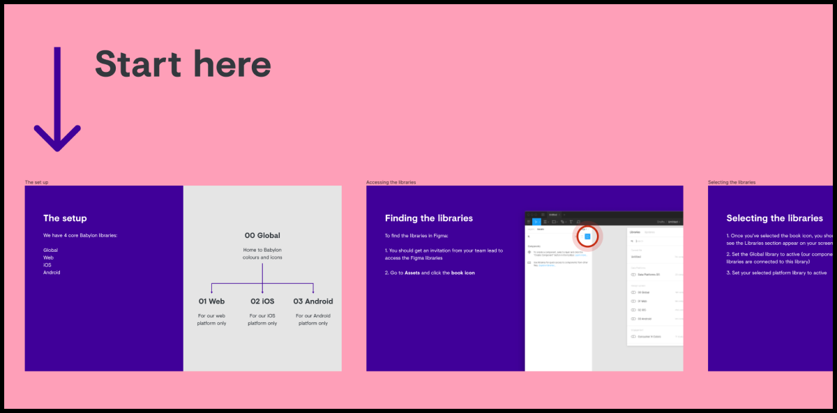
我们的Figma设置 (Our Figma setup)
Our setup consists of four core libraries; 00 Global, 01 Web, 02 iOS and 03 Android. Owned by the design system squad, only certain users have access to edit to the master components.
我们的设置包括四个核心库。 00 Global,01 Web,02 iOS和03 Android。 由设计系统小组拥有,只有某些用户有权编辑主组件。
The 00 Global library is arguably our most important library. It hosts the foundations of our products including colours, icons and will soon contain illustrations. 00 Global feeds our iOS and Android libraries, any alterations we make here then filter down into the libraries that are linked to it. Approaching it this way reduces any unwanted potential rebranding, colour or iconography updates to the component libraries.
00 Global库可以说是我们最重要的库。 它包含了我们产品的基础,包括颜色,图标,并将很快包含插图。 00 Global提供了我们的iOS和Android库,我们在这里进行的任何更改都将过滤到与其链接的库中。 以这种方式进行处理可减少对组件库的任何不必要的潜在品牌重塑,颜色或图标更新。
We had to add our text styles to each of the specific platform libraries. Currently we use different fonts; Roboto for Android, San Francisco (SF) for iOS and Visuelt for Web. Ideally we would use one type style across all platforms, and host this within the 00 Global library.
我们必须将文本样式添加到每个特定的平台库中。 当前,我们使用不同的字体。 适用于Android的Roboto,适用于iOS的San Francisco(SF)和适用于Web的Visuelt。 理想情况下,我们将在所有平台上使用一种字体样式,并将其托管在00 Global库中。
For our native libraries we included larger type sizes, so that designers can see how their designs work if a user has larger accessible sizes selected. This is similar to what I did in a previous role, instead of just text we included components with larger text sizes to illustrate the importance of accessibility when designing layouts.
对于我们的本机库,我们包括了较大的字体大小,以便设计人员可以查看如果用户选择了较大的可访问大小的设计工作。 这与我上一个职位的工作类似,而不仅仅是文本,我们包括了具有较大文本大小的组件,以说明设计布局时可访问性的重要性。

We consciously avoided the popular atomic model in the setup of our component libraries. We needed to highlight the vast number of components we already had available to use. It also meant we could organize our components more effectively by displaying and naming them by function, like app bar, banner or bottom navigation, making them easier for designers to find.
在组件库的设置中,我们有意识地避免了流行的原子模型 。 我们需要强调我们已经可以使用的大量组件。 这也意味着我们可以通过按功能显示和命名组件(例如应用栏,横幅或底部导航)来更有效地组织组件,从而使设计师更容易找到它们。
All components are organised within frames. Each frame acts as the grouping for that particular component — containing any variants and applications — as well as making it easier to scan and identify components. Organising within frames also lets us include lightweight documentation and examples of components to show how they should be used — for example, highlighting the different rules for using separators on iOS and Android.
所有组件都组织在框架中。 每个框架都是该特定组件的分组-包含所有变体和应用程序-并使扫描和识别组件更加容易。 在框架内进行组织还可以使我们包括轻量级文档和组件示例,以显示应如何使用它们-例如,突出显示在iOS和Android上使用分隔符的不同规则。

At a component level we applied and set up the correct constraints so that we could define how components react when they’re resized. This allows designs to be tested across varying screen sizes.
在组件级别,我们应用并设置了正确的约束,以便我们可以定义调整大小后组件的React方式。 这样可以在不同的屏幕尺寸上测试设计。
Components can be updated using different instances, for example replacing one alert style with another. Instances within a component can also be updated, an example being updating or removing an icon.
可以使用不同的实例来更新组件,例如用一种警报样式替换另一种警报样式。 组件内的实例也可以更新,例如更新或删除图标。
雪花 (Snowflakes)
These are components that we think are useful, but aren’t quite ready for widespread use in the component library.
这些是我们认为有用的组件,但还没有准备好在组件库中广泛使用。
We adopted the term ‘Snowflake’ based on the article ‘Design Systems: Why Snowflakes Are Counterintuitively Integral’ by Mike Rivera. However, our ‘Snowflakes’ were inspired by the existing work in the Android UI gallery and their non-supported UI area. This area was already acting as a ‘Snowflakes’ section within our coded UI gallery. To provide greater visibility we decided everything would go into our Figma libraries, and created a ‘Snowflakes’ page.
我们根据Mike Rivera的文章“ 设计系统:为什么雪花是反直觉的整体 ”采用了“雪花”一词。 但是,我们的“ 雪花 ”灵感来自Android UI画廊及其不支持的UI区域中的现有作品。 该区域已经在我们的编码UI画廊中充当“雪花”部分。 为了提供更大的可见性,我们决定将所有内容都放入我们的Figma库中,并创建了一个“ 雪花 ”页面。
We wanted to demonstrate that the new libraries would not hamper creativity, and instead show that we actively encourage it.
我们想证明新图书馆不会妨碍创造力,而是表明我们积极鼓励它。
We still ask creators to add some basic documentation to their Snowflakes though, so it’s clear to everyone what each element is and what it’s being used for.
我们仍然要求创建者在其Snowflakes中添加一些基本文档,因此每个人都清楚每个元素的含义和用途。

零高度 (Zeroheight)
Whilst creating components in Figma, we synchronized the completed components to Zeroheight; an online platform teams can use to create and maintain design system documentation.
在Figma中创建组件时,我们将完成的组件同步到Zeroheight。 一个在线平台团队可以用来创建和维护设计系统文档。
Zeroheight allowed us to quickly create documentation and share it with the wider team. The tool was extremely impressive and worked well with Figma, making updates easy.
Zeroheight使我们能够快速创建文档并与更广泛的团队共享。 该工具给人留下了深刻的印象,并且与Figma配合良好,使更新变得容易。
This was an interim solution until we were in a position to share the Figma libraries throughout the business and had a dedicated team to build our own platform, which would give us more flexibility.
这是一个临时解决方案,直到我们能够在整个业务中共享Figma库并拥有一个专门的团队来构建我们自己的平台,这将为我们提供更大的灵活性。
发行Figma (Releasing Figma)
During the process of recreating the libraries, a few members of the team had access to test them out, most notably Joao Araujo. Joao tested components, the library and file structures for us, and he even generated a pain and gains file in Figma to share his feedback
在重建库的过程中,团队的一些成员可以对其进行测试,其中最著名的是Joao Araujo。 Joao为我们测试了组件,库和文件结构,他甚至在Figma中生成了一个痛苦和收获的文件来分享他的反馈
We then started the rollout with one squad using the Figma libraries. The rollout was gradual, with our US team based in Austin being one of the first adopters. We collated feedback from our first set of users, and quickly rectified any inaccuracies or issues with components.
然后,我们使用Figma库以一个小组开始部署。 部署是逐步进行的,我们位于奥斯丁的美国团队是最早采用该软件的人之一。 我们整理了第一批用户的反馈,并Swift纠正了任何不正确或组件问题。
Moving individual squads over gradually meant we could identify and solve any problems early on. It allowed us to answer and resolve any concerns about the libraries and Figma in smaller batches and in greater detail.
逐步移走各个小队意味着我们可以及早发现并解决任何问题。 它使我们能够以较小的批次并更详细地回答和解决有关库和Figma的任何问题。
After this, we were confident enough to roll Figma out to each squad ready to use the libraries. Before releasing globally we included a ‘Getting started’ guide for new users to Figma and our libraries, which explained how the libraries worked, the file structure used, and who to contact for support.
此后,我们有足够的信心将Figma推广到每个准备使用库的小组。 在全球发布之前,我们包括了一个供Figma和我们的库的新用户使用的“入门指南”,其中解释了库的工作方式,使用的文件结构以及与谁联系以获得支持。
Figma自动版式 (Figma Auto Layout)
Figma also released a new feature just before launch, Auto Layout. Auto Layout ‘allows you to create dynamic Frames that respond to their contents’. In simple terms, if your content needs to grow, then Auto Layout will respond and grow with it.
Figma还在发布前发布了一项新功能,即自动版式。 自动布局“允许您创建动态框架以响应其内容”。 简而言之,如果您的内容需要增长,则自动版式将响应并随之增长。
For now, we’ve only added this to a few components, as including this in every one effectively would mean completely refactoring the libraries. The absence of Auto Layout isn’t currently blocking anyone, and for the moment, it’s vital we have visibility in every instance available.
目前,我们仅将其添加到了几个组件中,因为将其有效地包含在每个组件中将意味着完全重构库。 目前,没有自动版图功能并没有阻止任何人,目前,至关重要的是我们对每个可用实例具有可见性。
团队的React (The team’s reaction)
After releasing Figma we had to gauge how our teams were adapting to the move. We asked several members of the team how they found the initial transition.
发布Figma之后,我们必须评估我们的团队如何适应这一举动。 我们询问了团队中的几位成员,他们是如何找到最初的过渡的。
“The biggest benefit has been sharing. Loads of other little features are nice (autolayout etc.) but I used to have to spend ages exporting things, putting them in Miro, or in Drive, sending people screenshots for feedback. Don’t have to anymore and it has saved me a lot of my sanity.”
“最大的好处就是分享。 其他小功能的负载也不错(自动布局等),但是我过去不得不花很多时间来导出东西,将它们放到Miro或Drive中,向人们发送屏幕截图以获取反馈。 不必再这样做了,它为我节省了很多理智。”
Ed Russel, Product Designer
产品设计师Ed Russel
“Having everything available and not just a list of screenshots, compared to Zeplin, is really useful.”
“与Zeplin相比,拥有所有可用功能,而不仅仅是屏幕快照列表,真的很有用。”
Maxime Mazzone, Senior Android Developer
高级Android开发人员Maxime Mazzone
“Some of the biggest benefits have been not having to use Zeplin, not having to use Abstract and being able to collaborate with content in one space. My main pain now is not being able to link screens in a flow easily. Sometimes I’ll still use Miro but then it means exporting it and managing a second lot of screens. Overall though it’s definitely been positive. Also positive for the speed of my computer!”
“一些最大的好处就是不必使用Zeplin,不必使用Abstract以及能够在一个空间中与内容进行协作。 我现在的主要痛苦是无法轻松地以顺畅的方式链接屏幕。 有时我仍然会使用Miro,但是这意味着将其导出并管理第二批屏幕。 总体来说,这肯定是积极的。 对我的计算机速度也很满意!”
Georgia Kent-Braham, Product Designer
产品设计师Georgia Kent-Braham
“Moving to Figma has made life easier as I can now collaborate and iterate much quicker. It helps me try out ideas, layouts and hierarchies in context and share these with designers or stakeholders, without having to worry about merge conflicts.”
“迁移到Figma使生活变得更轻松,因为我现在可以进行协作并更快地进行迭代。 它帮助我在上下文中试用想法,布局和层次结构,并与设计者或利益相关者共享这些概念,布局和层次结构,而不必担心合并冲突。”
Nick Cowan, Lead UX Writer
UX首席作家Nick Cowan
“I like that everything is linked and you can go and see master components. I also like being able to extract icons myself.”
“我喜欢一切都链接在一起,并且您可以去查看主要组件。 我也喜欢自己提取图标。”
Sergey Shulga, Senior iOS Developer
Sergey Shulga,高级iOS开发人员
“It’s made content/designer collaboration much easier, and particularly asynchronous collaboration. There are still some things I don’t love about it — particularly in comments, which I find hard to organise and sometimes don’t seem to show up; and navigation. But overall it’s a beautiful tool.”
“这使内容/设计人员的协作更加容易,尤其是异步协作。 我还有一些我不喜欢的东西-特别是在评论中,我发现这些评论很难整理,有时似乎没有出现; 和导航。 但总体而言,这是一个漂亮的工具。”
Kevin Telfer, Lead UX Writer
用户体验首席作家Kevin Telfer
“Well I haven’t really used Abstract/Sketch at Babylon because I joined as we switched, but based on using abstract/sketch at my previous place the biggest thing would be Shareability. Being able to send someone a link so that they can leave comments is great, and it means you can collaborate between engineers and design much easier because there’s instant visibility. Also in my previous company opening a Sketch file via Abstract could take 10/15 minutes so even if you were just trying to show someone something on your own screen it was hard to share/reference a selection of files.”
“我在巴比伦时并没有真正使用过Abstract / Sketch,因为我是在切换时加入的,但是基于在我之前的位置使用Abstract / Sketch的最大考虑就是共享性。 能够向某人发送链接以便他们发表评论是很棒的,这意味着您可以在工程师之间进行协作并更轻松地进行设计,因为它具有即时可见性。 同样在我以前的公司中,通过Abstract打开一个Sketch文件可能需要10/15分钟,因此,即使您只是想在自己的屏幕上向某人显示某些内容,也很难共享/引用选择的文件。”
Sarah Benson, Product Designer
产品设计师Sarah Benson
So far the move to Figma has proven to be a wholly positive experience and a welcome move by the team. However, there is more we can do to improve the set up for everyone.
到目前为止,事实证明,转入Figma是一种完全积极的经历,也是车队可喜的举动。 但是,我们还有很多工作可以改善每个人的设置。
接下来是什么? (What next?)
分析工具 (Analytics)
Using the built-in analytics feature, we plan on identifying which components are being detached from the library and why. This will help us understand how the libraries are being used and which areas to focus on improving. We can also investigate components that are not being adopted by teams. We’ll ask why they’re not being used and can archive them if necessary, to make sure the libraries only contain what they need to.
使用内置的分析功能,我们计划确定从库中分离出哪些组件以及原因。 这将帮助我们了解库的使用方式以及需要改进的领域。 我们还可以调查团队未采用的组件。 我们将询问为什么不使用它们,并可以在必要时对其进行归档,以确保这些库仅包含它们需要的内容。
辅助功能改进 (Accessibility Improvements)
Not all of our components passed WCAG 2.1 AA accessibility criteria when we began this work. Now that the libraries are visible to everyone in the business, we can begin to roll out fundamental accessibility changes and improvements. Any changes we make to components can be updated across all files linked to the libraries.
当我们开始这项工作时,并不是我们所有的组件都通过了WCAG 2.1 AA可访问性标准。 现在,库对于企业中的每个人都是可见的,我们可以开始进行基本的可访问性更改和改进。 我们对组件所做的任何更改都可以在链接到库的所有文件中进行更新。
贡献 (Contribution)
Creating contribution guidelines is one of our biggest upcoming areas to focus on. We need to learn the best way to help teams contribute new components to the design system and our Figma libraries. It’s important that the design system team doesn’t become a bottleneck and that the process is clear, obvious and accessible for everyone and something they can easily follow.
制定贡献准则是我们即将关注的最大领域之一。 我们需要学习帮助团队为设计系统和Figma库贡献新组件的最佳方法。 重要的是,设计系统团队不要成为瓶颈,并且过程对于每个人来说都是清晰,明显和可访问的,并且他们可以轻松地遵循。
网页 (Web)
Now that we’ve completed the first phase of work on our iOS and Android components, we’re moving our attention to the web. We’ve got our work cut out for us, as there’s a lot more variation across our web platforms than in native. Once we’ve completed the transition of our web library, we can then take our final steps of sunsetting programs such as Sketch, Zeplin, Abstract and Zeroheight.
现在,我们已经完成了有关iOS和Android组件的第一阶段工作,现在我们将注意力转移到了Web上。 我们已经为我们完成了工作,因为我们的Web平台上的变化要比原生平台多得多。 一旦我们完成了网络库的转换,我们就可以完成日落程序的最后步骤,例如Sketch,Zeplin,Abstract和Zeroheight。
The move to Figma and updating our libraries is just the first step in our design system journey. The process wasn’t perfect and it took time to get it to where it is now. Most importantly, we’re still learning.
迁移到Figma并更新我们的库只是我们设计系统旅程的第一步。 这个过程并不完美,需要花费一些时间才能达到现在的水平。 最重要的是,我们仍在学习。
How can we continue to collaboratively build our libraries?
我们如何继续合作建立图书馆?
How can we help our designers follow a consistent file structure?
我们如何帮助设计师遵循一致的文件结构?
How can we better support contribution?
我们如何更好地支持捐款?
Our team is working tirelessly to find answers to these questions, as well as continuing to grow our design system. One thing is for certain, the move to Figma was a good one, and our teams are reaping the rewards of collaboration.
我们的团队正在不懈地努力寻找这些问题的答案,并继续发展我们的设计系统。 可以肯定的是,迁移到Figma是一个很好的选择,我们的团队正在收获合作的回报。
COVID-19和Figma (COVID-19 and Figma)
With the outbreak of COVID-19, Babylon has moved swiftly to generate a Coronavirus care plan. The goal was to provide a self-isolation care plan for patients that contained information, and symptom tracking. This was for patients that had been directed to self-isolate by a clinician due to a possible case of COVID-19.
随着COVID-19的爆发,巴比伦Swift采取行动,制定了冠状病毒护理计划。 目的是为包含信息和症状追踪的患者提供自我隔离护理计划。 这是针对可能由于COVID-19的情况而被临床医生指示自行隔离的患者。
With the outbreak of COVID-19 the team had to work remotely and deliver this critical piece of work.
随着COVID-19的爆发,团队不得不进行远程工作并交付这项关键工作。
“We had to work collaboratively for an entire weekend, that would have been impossible with Sketch. Copywriters, designers and stakeholders all got directed to Figma to review and work in the same file.
“我们必须在整个周末进行协作,而使用Sketch不可能做到。 撰稿人,设计师和利益相关者都被引导到Figma进行审阅并在同一文件中工作。
We did have some issues when we had more than 20 viewers in the file. But that gives you an idea of how many people were involved and needed to be in the file. ❤️ Figma.”
当文件中有20个以上的查看器时,我们确实遇到了一些问题。 但这使您了解文件中涉及并需要多少人。 ❤️Figma。”
Adrian Lopez, Lead Product Designer Health Management Tribe
健康管理部首席产品设计师Adrian Lopez
“The Babylon DNA design system was instrumental in allowing us to put our new COVID flows in production quickly and easily, to experiment and iterate — focusing on nailing the content only, while relying on a robust design library. It’s also allowed us to prototype concepts really fast, for the next phase of COVID Care Assistant.”
“巴比伦DNA设计系统有助于我们快速轻松地将新的COVID流程投入生产,进行实验和迭代-仅关注内容,同时依赖可靠的设计库。 它还使我们能够为下一阶段的COVID Care AssistantSwift地原型化概念。”
Catarina Afonso, Design Manager
Catarina Afonso,设计经理
This work demonstrated the brilliance of Figmas collaboration features. It allowed the team to deliver rapidly under pressure, and in uncertain times. With the whole team having to work remotely, this speed of delivery would have been impossible under the previous work flow.
这项工作证明了Figmas协作功能的辉煌。 它使团队能够在压力和不确定的时间内Swift交付。 由于整个团队都必须远程工作,因此在以前的工作流程下,这种交付速度是不可能的。
翻译自: https://uxdesign.cc/building-a-design-system-for-babylon-health-a547f3f24485
根号 巴比伦


 784
784

 被折叠的 条评论
为什么被折叠?
被折叠的 条评论
为什么被折叠?
 到【灌水乐园】发言


