


ui设计基础
第5部分 (Part 5)
After we went through all the very basics of UI design based on Designing User Interfaces free chapters it’s time to start moving those rectangles!
在基于“免费设计用户界面”一章介绍完UI设计的所有基础知识之后,是时候开始移动这些矩形了!
This is the exciting part!
这是令人兴奋的部分!
If you missed the previous chapters (1,2,3) and all the types of screens you’ll be designing for,
如果你错过了前几章( 1 , 2 , 3 )和所有类型的屏幕 ,你将设计的,
When you’re just starting out, it’s good to do the “project init” screens from scratch. That will give you the practice and confidence you’ll need at this point. After a while, however, you can build your own starting templates to make the process even faster.
当您刚入门时,最好从头开始进行“项目初始化”屏幕。 这将为您提供此时所需的实践和信心。 但是,过一会儿,您可以构建自己的启动模板以使过程更快。
The first question should be:
第一个问题应该是:
您要设计什么? (What are you going to design?)
If you’re just starting out and/or building your portfolio, it’s best to work on mobile apps first. That’s simply because due to the smaller canvas, it’s actually easier and faster to come up with something good. Making a website — and especially a landing page — requires more skill, due to the fact that the screen is larger, so you need to figure out a complex structure of content vs (often large) whitespace.
如果您只是开始和/或构建自己的产品组合,最好先使用移动应用程序。 那是因为由于画布较小,所以想出更好的东西实际上更加容易和快捷。 由于屏幕较大,因此制作网站(尤其是登录页面)需要更多的技能,因此您需要弄清楚内容与(通常是大)空白的复杂结构。
This can get tricky. So let’s start with apps, shall we?
这可能会很棘手。 那么,让我们从应用程序开始吧?
行动应用程式设计 (Mobile app design)
First thing to do, is deciding on the device your design will “live on”. Again, if you’re aiming to build out a UI portfolio first, it’s likely up to you, whether you’ll use an iPhone or and Android as reference.
首先,要确定您的设计将“存在”的设备。 同样,如果您打算首先构建UI组合,则是否使用iPhone或Android作为参考完全取决于您。
If you want a truly unique, engaging showcase of your work, you shouldn’t really use Material Design or iOS components all too much anyway. They make the project look generic, and in the fast-paced modern world people will simply scroll right through them without pause.
如果您想要一个真正独特,引人入胜的作品展示,那么您不应该过多地使用Material Design或iOS组件。 它们使项目看起来通用,在快节奏的现代世界中,人们将在其中无停顿地滚动浏览。

Android and iOS, although very different as platforms, are constantly moving closer to one another in terms of UI norms. There are some things that should likely still be platform-specific (like textfields in forms), but most of the design can be made platform-agnostic.
Android和iOS,尽管在平台上有很大的不同,但在UI规范方面却不断地彼此接近。 有些事情可能仍然应该是特定于平台的(例如表单中的文本字段),但是大多数设计都可以与平台无关。
接电话 (Pick your phone)
So if you’re a daily Android user, design for Android. Try to pick a phone with a 16:9 or taller aspect ratio. If you’re in the Apple camp, go ahead and start with the regular iPhone Pro (not Max).
因此,如果您是每天使用Android的用户,请为Android设计。 尝试选择宽高比为16:9或更高的手机。 如果您在Apple营地,请继续使用常规的iPhone Pro(而不是Max)。
从基础开始 (Start with the basics)
For this exercise, I’m going to pick the iPhone. The first thing to do, is adding an Artboard by pressing A on the keyboard. Find the right device on the list and select it.
对于本练习,我将选择iPhone。 要做的第一件事是通过按键盘上的A添加画板。 在列表中找到合适的设备并选择它。
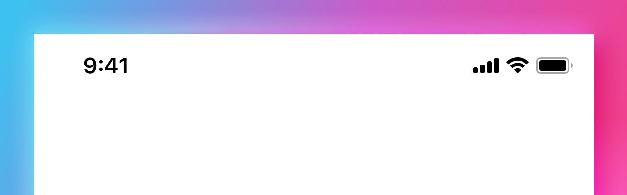
状态栏 (Status bar)
The next thing is to add a status bar — you can do it from the build-in iOS library in Sketch. Figma also has a similar option. Then make a guide at the bottom of your status-bar and hide it. In showcase, portfolio designs they can be an unnecessary visual clutter, so they’re often not shown. But the guide is there so you know which line not to cross.
接下来是添加状态栏-您可以从Sketch的内置iOS库中完成此操作。 Figma也有类似的选择。 然后在状态栏底部创建一个指南并将其隐藏。 在展示柜中,项目组合设计可能会成为不必要的视觉混乱,因此通常不会显示出来。 但是那里有指南,所以您知道不可以越过哪条线。

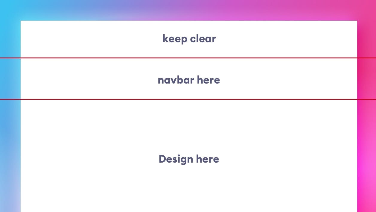
导航栏 (Navbar)
Navbar, or Android’s Action bar, is the title bar just under the status bar. It can have a couple of different heights, and you can check the proper one in the guidelines. They do change every now and then, so here’s a different idea, that will help you get the right height instinctively.
导航栏(即Android的操作栏)是状态栏正下方的标题栏。 它可以有几个不同的高度,您可以在准则中检查正确的高度。 它们确实会不时地发生变化,所以这是一个不同的想法,它将帮助您本能地获得正确的身高。
Go to your phone and find an app that has the navbar and background separated. It just has to show the division. Most of the built-in Apple apps are a good pick here. I picked one of the Settings screens. Then take a screenshot and send it to your computer.
转到手机上,找到一个导航栏和背景分开的应用程序。 它只需要显示划分即可。 在这里,大多数内置的Apple应用程序都是不错的选择。 我选择了“设置”屏幕之一。 然后截取屏幕截图并将其发送到您的计算机。

Drop that screenshot onto your artboard, set another guide where the navbar ends, and then remove it. Now you know how high it should be, based on a real, visual product. That will make it easier to remember and recall than remembering a number that changes every few years. It will also give you a lot more context of how things fit on the navbar, than simply entering some number into a box.
将该屏幕截图放到您的画板上,在导航栏结束处设置另一个指南,然后将其删除。 现在,您知道基于真实的视觉产品应该达到的高度。 与记住每隔几年更改一次的数字相比,这将更容易记住和回忆。 除了简单地在框中输入一些数字,它还为您提供了更多有关导航栏的信息。
保证金 (Margins)
Grids can be scary. Coming up with the right one, and then sticking to it is something that doesn’t come easily. So instead of spending a lot of time on drawing grid-lines, make a soft-grid starting with setting the side-margins. These are “lines you do not cross”. They’re also something most designers don’t pay too much attention to.
网格可能会令人恐惧。 提出正确的建议,然后坚持下去,这并非易事。 因此,与其花大量时间在绘制网格线上,不如从设置边距开始制作一个软网格。 这些是“您不交叉的线”。 它们也是大多数设计师不太重视的事情。
Often, when I audit the designs you guys send me, the left and right margins are different, sometimes by just 1 or 2 points. That shifts your entire design optically to one side and has a negative impact on readability. That’s why I believe it’s a good place to start.
通常,当我审核你们发送给我的设计时,左右边距有所不同,有时仅相差1或2个百分点。 这将整个设计从光学角度转移到一侧,并对可读性产生负面影响。 因此,我认为这是一个不错的起点。

但是什么值呢? (But what value?)
The main two soft-grids right now are an 8-multiple and a 10-multiple. I prefer the former, but you can use the 10 if it’s easier to calculate. It means that 8 and 10 respectively, are usually the smallest margins your content can have. Then 16 and 20 are one step higher, with 24 and 30 being the next set of values.
现在主要的两个软网格是8倍和10倍。 我更喜欢前者,但是如果更容易计算,则可以使用10。 这意味着通常8和10通常是您的内容可以具有的最小边距。 然后16和20高一个步骤,下一个值是24和30。
Design needs to breathe, so for most mobile projects I set the margins at either 24 or 32 points. For dense projects with a lot of data in column views, it’s best to go with 24, and for simpler, less condensed screens use 32.
设计需要呼吸,因此对于大多数移动项目,我将边距设置为24或32点。 对于在列视图中具有大量数据的密集项目,最好使用24,对于更简单,更少压缩的屏幕,最好使用32。
Then use that number and smaller numbers to set up the right hierarchy in your design.
然后使用该数字和较小的数字在设计中建立正确的层次结构。
现在怎么办? (What now?)
If you have a rough idea of what you’re trying to design in mind, you can start by blockframing it. It’s a useful technique of working with “bounding-boxes” instead of content. Just make sure they’re all properly aligned.
如果您对要设计的内容有一个粗略的了解,则可以从对它进行框架化开始。 这是一种使用“边界框”而不是内容的有用技术。 只要确保它们都正确对齐即可。
For example, if you wanted to recreate a popular photo-sharing app it would look something like this:
例如,如果您想重新创建一个流行的照片共享应用程序,它将看起来像这样:

Blockframes are a good way to understanding the rigid rules behind a good design. It’s not all random artwork, as some may believe.
块框架是了解良好设计背后严格规则的好方法。 正如某些人可能相信的那样,这并不是全部随机的艺术品。
Each element’s height, width and position in relation to other objects should be thoughtfully calculated and planned. Don’t leave anything to chance.
每个元素相对于其他对象的高度,宽度和位置都应进行周密的计算和计划。 不要留下任何机会。
Rule of Proximity is essential here. The closer the objects are, the more they are perceived as a group that belongs together. When designing a card layout, obviously the content inside the card will be closer together, than the cards themselves.
邻近规则在这里至关重要。 这些对象越接近,它们就越被视为一个整体。 在设计卡布局时,很明显,卡内部的内容比卡本身更紧密。
Once you have the blockframe complete, you can group it and lock it with reduced opacity (10% will be enough).
完成块框后,可以对其进行分组并以降低的不透明度对其进行锁定(10%足够)。

Then start adding the real content but fitting it within those strict guidelines. After you’re done with this part, simply hide the blockframe group and you’re all set to share it with the world.
然后开始添加真实内容,但要使其符合那些严格的准则。 完成此部分后,只需隐藏块框组,即可将其与世界分享。

After a while, build your “init-templates” that include a navbar/actionbar rectangle and pre-made grid-guides. But at the beginning of this journey it’s good to do them by hand to get the feel for how they work.
过一会儿,构建您的“初始模板”,其中包括导航栏/操作栏矩形和预制的网格向导。 但是,在此旅程的开始,最好手动进行操作,以了解它们的工作方式。
Good luck!
祝好运!
This article has been a quick overview of the upcoming update chapters of the 🦄 Designing User Interfaces Ebook 🦄, and you can download 50 pages for free today 🍒 Learn the basics of design 📺 Design Basics on YouTube!
本文是🦄 设计用户界面电子书即将更新的章节的快速概述。 🦄,你可以下载50页免费 今天 🍒了解设计的📺基本设计基础 上的YouTube!
翻译自: https://uxdesign.cc/ui-design-basics-how-to-start-ffbbdd735c8a
ui设计基础


 370
370


 被折叠的 条评论
为什么被折叠?
被折叠的 条评论
为什么被折叠?
 到【灌水乐园】发言


