


Before we get started, I have to say that I am not at all commenting on Kanye’s politics or his right to run for office. Mostly because I don’t know what his politics are, but also because I want to keep this about
在我们开始之前,我不得不说,我根本没有评论坎耶的政治或他竞选公职的权利。 主要是因为我不知道他的政治背景,也是因为我想保持这种状态
his website and how it could be better. Also, I understand that he had some personal issues with his wife lately, which I hope are resolved. This is as good a time as any to remind anyone in UX that all critiques should 他的网站以及如何做得更好。 另外,我了解到他最近与妻子有一些个人问题,希望这些问题能解决。 这与提醒UX中的任何人一样是个好时机,所有批评都应该 only be about the design, not the designer. 只针对设计,而不是设计师。First, credit where it’s due: From a content perspective, there’s nothing on it to distract. Everything on it is vital, almost to a google.com degree. I appreciate that.
首先,归功于应收账款:从内容角度来看,没有什么可分散注意力的。 一切都至关重要,几乎达到了google.com的程度。 我很感激。
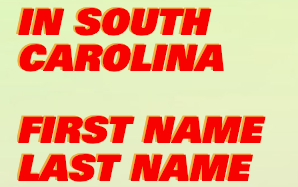
From there: The site appears to have one main goal, which is to get Kanye on the ballot in South Carolina. All well and good, except… I would have no idea what it’s for if I just arrived at the site on its own, mostly because there are approximately zero affordances or signifiers. (The “click here” is technically a signifier, but it’s pretty crappy.)
从那里:该站点似乎有一个主要目标,那就是让Kanye参加南卡罗来纳州的投票。 一切都很好,除了……我完全不知道如果我只是独自到达这个站点,那是什么意思 ,主要是因为大约有零个供应或指示符 。 (“点击此处”从技术上讲是指,但确实很糟糕。)
Again, I like websites with a clear focus. The best example I can remember is a website from 2012 for something that was called Brisket Lab, where they sold brisket at pop-up-ish locations mostly in Brooklyn. The website only asked how many 1/2 lbs of brisket you wanted and then let you pay. It was gloriously simple and I used it as a model for other companies I worked with, and still remember it as a lesson on taking screenshots because the internet is only forever about the things you wish it weren’t.
同样,我喜欢明确关注的网站。 我能记住的最好的例子是2012年的一个名为Brisket Lab的网站,他们在那里主要在布鲁克林的弹出式窗口中出售了Brisket。 该网站仅询问您想要多少1/2磅的牛ket,然后让您付款。 它非常简单,我将其用作与我合作过的其他公司的模型,但仍然记得它是拍摄屏幕截图的一课,因为互联网永远只是您不希望的事情。
But back to Kanye: Focus is on signing up, but he already loses people with the lack of distinguishing font between the intro and the text fields:
但是回到坎耶:重点是注册,但是他已经失去了介绍人和文本字段之间缺乏区分字体的人:
In other websites, text entry fields are well defined and distinguished from other copy. You know exactly what the fields are supposed to do because you’ve seen thousands of them before.
在其他网站中,文本输入字段定义明确并与其他副本区分开。 您确切知道这些字段应该做什么,因为您之前已经看过数千个了。
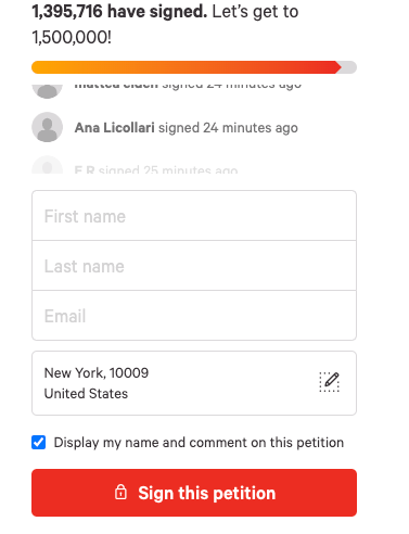
In the above example the fields to fill out are basically the same as in Kanye’s, except there are boxes around the fields to enter and the text for what it’s asking is lighter from the rest of it, suggesting it’s a placeholder. It’s about as obvious as it comes.
在上面的示例中,要填写的字段与Kanye的字段基本相同,除了要输入的字段周围有方框,并且要问的内容比其余内容要浅时,表明它是一个占位符。 它几乎是显而易见的。
Assuming you fill it out, when you get to the end of the form you’re presented with this:
假设您填写了表格,当到达表格末尾时,将显示以下内容:
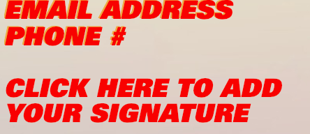
This action is the whole point of the site and it’s okay, sort of. While hyperlinks are the standard way to signify a link to another page, it’s not too unclear if they also do some double lifting by functioning as a button, as this one would here. But one thing virtually all hyperlinks have in common is that they’re underlined. While the drop shadow was inexplicably lost, there’s similarly no particular reason why the conventional underlining wasn’t included, other than it was style choice that could only have a negative effect on users accomplishing the task. In general (and probably in specific too), it’s not a great idea to camouflage things you want your users to do. Usability should never be sacrificed for aesthetics, no matter how small. Put another way: Form should follow function.
该操作是整个站点的重点,这还可以。 虽然超链接是表示链接到另一个页面的标准方法,但并不是很清楚它们是否也可以通过充当按钮来实现某种双重提升,就像这里所说的那样。 但实际上,所有超链接的共同点是带下划线。 尽管投影幕莫名其妙地消失了,但没有类似的原因也没有特别的原因,其中不包括传统的下划线,只是样式选择只会对用户完成任务产生负面影响。 总的来说(可能也是具体而言),伪装您希望用户执行的操作不是一个好主意。 无论多么小,都绝不应该为了美观而牺牲可用性。 换句话说,表格应该遵循功能。
But say you get to the end, everything’s filled out, and you submit your signature. This is the result:
但是说到最后,一切都准备好了,然后提交签名。 结果如下:

Staying true to its roots: the main purpose of the site is to collect signatures to put Kanye on the ballot. But it’s a lost opportunity. Getting users to go to your site is usually the biggest hurdle of all, followed closely by getting them to do the thing you want them to do most. If they’re interested enough to go to your site and trust you enough with your personal data, it’s a waste to not give them a reason to stick around, maybe find out what the candidate’s policies are, visions for the future, etc. Furthermore (and more importantly), there’s no mention of what they will or won’t do with your data. Which, depending on where you live, might be illegal. At very least it’s considered good etiquette to do, and bad etiquette to not do.
忠于其根源:该站点的主要目的是收集签名,以将Kanye纳入选票。 但这是一个失去的机会。 吸引用户访问您的网站通常是最大的障碍,其次是让用户去执行您最希望做的事情。 如果他们有足够的兴趣去您的网站并对您的个人数据足够信任,那么浪费时间就是不给他们留下理由,或者找出候选人的政策,对未来的展望等。此外(更重要的是),没有提及它们将对您的数据做什么或不做什么。 根据您的居住地,这可能是非法的。 至少它被认为是好的礼节和不好的礼节。
All told, the website isn’t the worst. It’s minimalist, direct, and even a little lighthearted.
总而言之,网站并不是最糟糕的。 它极简,直接,甚至有些轻松。

In fact, I’d even go so far as to say that some sites should take lessons in restraint from them. But there’s a happy medium somewhere and it wouldn’t take much for Kanye’s team to get there. Of course, clients can be challenging and I have no reason to think Kanye would be an exception. But if your client is doing anything short of a vanity project, as experts it’s our job to save them from themselves.
实际上,我什至可以说有些站点应该从中克制下来。 但是,某个地方有一个快乐的媒介,Kanye的团队到达那里并不需要很多。 当然,客户可能会充满挑战,我没有理由认为Kanye是个例外。 但是,如果您的客户正在做一个虚荣项目之外的任何事情,那么作为专家,我们的工作就是将他们从自己手中救出来。


 174
174

 被折叠的 条评论
为什么被折叠?
被折叠的 条评论
为什么被折叠?
 到【灌水乐园】发言


