


Matplotlib is the most widely used visualization tools in python. It is well supported in a wide range of environments such as web application servers, graphical user interface toolkits, Jupiter notebook and iPython notebook, iPython shell.
Matplotlib是python中使用最广泛的可视化工具。 它在Web应用程序服务器,图形用户界面工具包,Jupiter笔记本和iPython笔记本,iPython Shell等广泛的环境中得到很好的支持。
Matplolib体系结构 (Matplolib Architecture)
Matplotlib has three main layers: the backend layer, the artist layer, and the scripting layer. The backend layer has three interface classes: figure canvas that defines the area of the plot, renderer that knows how to draw on figure canvas, and event that handles the user inputs such as clicks. The Artist layer knows how to use the Renderer and draw on the canvas. Everything on a Matplotlib plot is an instance of an artist layer. The ticks, title, labels the plot itself everything is an individual artist. The scripting layer is a lighter interface and very useful for everyday purposes. In this article, I will demonstrate all the examples using the scripting layer and I used a Jupyter Notebook environment.
Matplotlib具有三个主要层:后端层,美工层和脚本层。 后端层具有三个接口类:定义绘图区域的图形画布,知道如何在图形画布上绘制的渲染器以及处理用户输入(例如单击)的事件。 Artist层知道如何使用Renderer并在画布上绘制。 Matplotlib图上的所有内容都是艺术家图层的实例。 标题的滴答声标记了情节本身,一切都是个人艺术家。 脚本层是一个较浅的界面,对于日常用途非常有用。 在本文中,我将使用脚本层演示所有示例,并使用Jupyter Notebook环境。
I suggest that you run every piece of code yourself if you are reading this article to learn.
如果您正在阅读本文以学习,建议您自己运行每段代码。
资料准备 (Data Preparation)
Data preparation is a common task before any data visualization or data analysis project. Because data never comes in the way you want. I am using a dataset that contains Canadian Immigration information. Import the necessary packages and the dataset first.
在任何数据可视化或数据分析项目之前,数据准备是一项常见任务。 因为数据永远不会以您想要的方式出现。 我正在使用包含加拿大移民信息的数据集。 首先导入必要的软件包和数据集。
import numpy as np
import pandas as pd
df = pd.read_excel('https://s3-api.us-geo.objectstorage.softlayer.net/cf-courses-data/CognitiveClass/DV0101EN/labs/Data_Files/Canada.xlsx',
                       sheet_name='Canada by Citizenship',
                       skiprows=range(20),
                       skipfooter=2)
df.head()
I am skipping the first 20 rows and the last 2 rows because they are just text not tabulated data. The dataset is too big. So I cannot show a screenshot of the data. But to get the idea about the dataset, see the column names:
我跳过了前20行和后2行,因为它们只是文本而不是列表数据。 数据集太大。 因此,我无法显示数据的屏幕截图。 但是要了解有关数据集的想法,请参见列名:
df.columns#Output:
Index([    'Type', 'Coverage',   'OdName',     'AREA', 'AreaName',      'REG',
        'RegName',      'DEV',  'DevName',       1980,       1981,       1982,
             1983,       1984,       1985,       1986,       1987,       1988,
             1989,       1990,       1991,       1992,       1993,       1994,
             1995,       1996,       1997,       1998,       1999,       2000,
             2001,       2002,       2003,       2004,       2005,       2006,
             2007,       2008,       2009,       2010,       2011,       2012,
             2013],
      dtype='object')
We are not going to use all the columns for this article. So, let’s get rid of the columns that we are not using to make the dataset smaller and more manageable.
我们不会在本文中使用所有列。 因此,让我们摆脱一些不用的列,这些列使数据集更小,更易于管理。
df.drop(['AREA','REG','DEV','Type','Coverage'], axis=1, inplace=True)
df.head()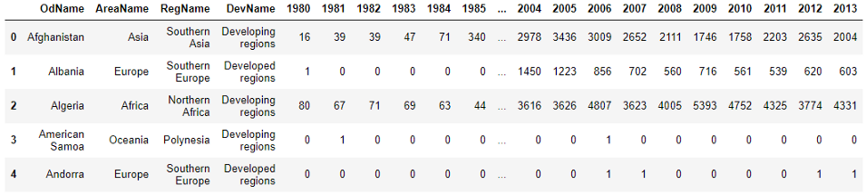
Look at the columns. The column ‘OdName’ is actually country name, ‘AreaName’ is continent and ‘RegName’ is the region of the continent. Change the column names to something more understandable.
查看列。 “ OdName”列实际上是国家名称,“ AreaName”列是大洲,“ RegName”列是大洲的区域。 将列名称更改为更易于理解的名称。
df.rename(columns={'OdName':'Country', 'AreaName':'Continent', 'RegName':'Region'}, inplace=True)
df.columns#Output:
Index([  'Country', 'Continent',    'Region',   'DevName',        1980,
              1981,        1982,        1983,        1984,        1985,
              1986,        1987,        1988,        1989,        1990,
              1991,        1992,        1993,        1994,        1995,
              1996,        1997,        1998,        1999,        2000,
              2001,        2002,        2003,        2004,        2005,
              2006,        2007,        2008,        2009,        2010,
              2011,        2012,        2013],
      dtype='object')
Now, the dataset has become more understandable. We have Country, Continent, Region, DevName that says if the country is developing, or developed. All the year columns contain the number of immigrants in that particular year. Now, add a ‘total’ column which will show the total immigrants that came into Canada from 1980 to 2013 from each country.
现在,数据集变得更加容易理解。 我们有“国家/地区”,“大陆”,“地区”,“ DevName”,用于说明该国家/地区是发展中国家还是发达国家。 所有年份列均包含该特定年份的移民人数。 现在,添加一个“总计”列,该列将显示1980年至2013年从每个国家进入加拿大的移民总数。
df['Total'] = df.sum(axis=1)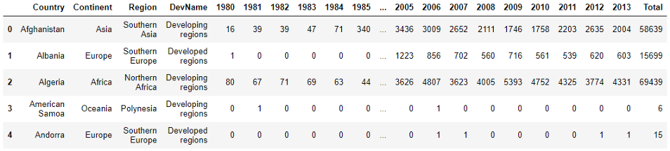
Look, a new column ‘Total’ is added at the end.
看,最后添加了一个新列“总计”。
Check if there are any null values in any of the columns
检查任何列中是否有空值
df.isnull().sum()It sows zero null values in all the columns. I always like to set a meaningful column as an index instead of just some numbers.
它在所有列中播入零个空值。 我一直喜欢将有意义的列设置为索引,而不仅仅是一些数字。
Set the ‘Country’ column as the index
将“国家/地区”列设置为索引
df = df.set_index('Country')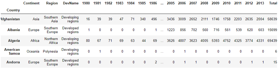
This dataset was nice and clean to start with. So this was enough cleaning for now. If we need something else we will do that as we go.
该数据集很好,而且一开始就很干净。 因此,到目前为止,这已经足够清洁。 如果我们需要其他东西,我们将继续进行。
绘图练习 (Plotting Exercises)
We will practice several different types of plot in this article such as line plot, area plot, pie plot, scatter plot, histogram, bar graph.
我们将在本文中练习几种不同类型的图,例如线图,面积图,饼图,散点图,直方图,条形图。
First, import necessary packages
首先,导入必要的软件包
%matplotlib inline
import matplotlib.pyplot as plt
import matplotlib as mpl
Chose a style so you do not have to work too hard to style the plot. Here are the types of styles available:
选择一种样式,这样您就不必花太多精力来为情节设置样式。 以下是可用的样式类型:
plt.style.available#Output:
['bmh',
 'classic',
 'dark_background',
 'fast',
 'fivethirtyeight',
 'ggplot',
 'grayscale',
 'seaborn-bright',
 'seaborn-colorblind',
 'seaborn-dark-palette',
 'seaborn-dark',
 'seaborn-darkgrid',
 'seaborn-deep',
 'seaborn-muted',
 'seaborn-notebook',
 'seaborn-paper',
 'seaborn-pastel',
 'seaborn-poster',
 'seaborn-talk',
 'seaborn-ticks',
 'seaborn-white',
 'seaborn-whitegrid',
 'seaborn',
 'Solarize_Light2',
 'tableau-colorblind10',
 '_classic_test']
I am taking a ‘ggplot’ style. Feel free to try any other style for yourself.
我采用的是“ ggplot”样式。 随意尝试其他样式。
mpl.style.use(['ggplot'])Line plot
线图
It will be useful to see a country’s immigration tend to Canada by year. Make a list of the years 1980 to 2013.
看到一个国家的移民逐年趋于加拿大将很有用。 列出1980年至2013年的清单。
years = list(map(int, range(1980, 2014)))I picked Switzerland for this demonstration. Prepare the immigration data of Switzerland and the years.
我选了瑞士参加这次游行。 准备瑞士的移民数据和年份。
df.loc['Switzerland', years]
Here is part of the data of Switzerland. It’s time to plot. It is very simple. Just call the plot function on the data we prepared. Then add title and the labels for the x-axis and y-axis.
这是瑞士数据的一部分。 现在该作图了。 这很简单。 只需对我们准备的数据调用plot函数。 然后添加标题以及x轴和y轴的标签。
df.loc['Switzerland', years].plot()
plt.title('Immigration from Switzerland')
plt.ylabel('Number of immigrants')
plt.xlabel('Years')
plt.show()
What if we want to observe the immigration trend over the years for several countries to compare those countries’ immigration trends to Canada? That’s almost the same as the previous example. Plot the number of immigrants of three south Asian countries India, Pakistan, and Bangladesh vs the years.
如果我们想观察几个国家多年来的移民趋势,以比较这些国家向加拿大的移民趋势,该怎么办? 这几乎与前面的示例相同。 绘制三个南亚国家印度,巴基斯坦和孟加拉国的移民人数与年份的关系图。
ind_pak_ban = df.loc[['India', 'Pakistan', 'Bangladesh'], years]
ind_pak_ban.head()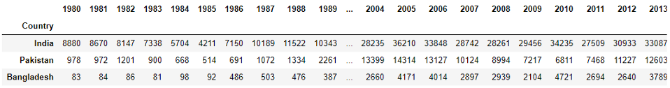
Look at the format of the data. It is different than the data for Switzerland above. If we call the plot function on this DataFrame(ind_pak_ban), it will plot the number of immigrants for each country in the x-axis and the years in the y-axis. We need to change the format of the dataset:
查看数据格式。 它与上述瑞士的数据不同。 如果在此DataFrame(ind_pak_ban)上调用plot函数,它将在x轴上绘制每个国家的移民人数,在y轴上绘制年份。 我们需要更改数据集的格式:
ind_pak_ban.T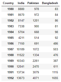
This is not the whole dataset. Just a part of it. See, how the format of the dataset changed. Now it will plot the years in the x-axis and the number of immigrants for each country on the y-axis.
这不是整个数据集。 只是一部分。 请参阅,数据集的格式如何更改。 现在,它将在x轴上绘制年份,并在y轴上绘制每个国家的移民人数。
ind_pak_ban.T.plot()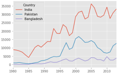
We did not have to mention the kind of the plot here because by default it plots the line plot.
我们不必在这里提及绘图的类型,因为默认情况下它会绘制线图。
饼图 (Pie Plot)
To demonstrate the pie plot we will plot the total number of immigrants for each continent. We have the data for each country. So, group the number of immigrants, to sum up, the total number of immigrants for each continent.
为了演示饼图,我们将绘制每个大陆的移民总数。 我们有每个国家的数据。 因此,对移民数量进行分组,以总结出每个大陆的移民总数。
cont = df.groupby('Continent', axis=0).sum()Now, we have data that shows the number of immigrants for each continent. Please feel free to print this DataFrame to see the result. I am not showing it because it is horizontally too big to present here. Let’s plot it.
现在,我们有了显示每个大陆移民人数的数据。 请随时打印此DataFrame以查看结果。 我没有显示它,因为它太大了而无法在此处显示。 让我们来绘制它。
cont['Total'].plot(kind='pie', figsize=(7,7),
                  autopct='%1.1f%%',
                  shadow=True)
#plt.title('Immigration By Continenets')
plt.axis('equal')
plt.show()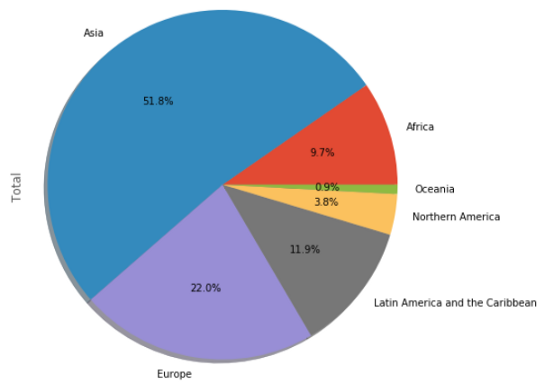
Notice, I have to use the ‘kind’ parameter. Other than the line plot, all other plots need to be mentioned explicitly in the plot function. I am introducing a new parameter ‘figsize’ that will determine the size of the plot.
注意,我必须使用'kind'参数。 除了线形图,其他所有图都需要在图函数中明确提及。 我正在引入一个新参数'figsize',该参数将确定绘图的大小。
This pie chart is understandable. But we can improve it with a little effort. This time I want to choose my own colors and a start angle.
此饼图是可以理解的。 但是,我们可以稍作改进。 这次我想选择自己的颜色和起始角度。
colors = ['lightgreen', 'lightblue', 'pink', 'purple', 'grey', 'gold']
explode=[0.1, 0, 0, 0, 0.1, 0.1]
cont['Total'].plot(kind='pie', figsize=(17, 10),
                  autopct = '%1.1f%%', startangle=90,
                  shadow=True, labels=None, pctdistance=1.12, colors=colors, explode = explode)
plt.axis('equal')plt.legend(labels=cont.index, loc='upper right', fontsize=14)
plt.show()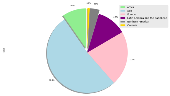
Is this pie chart better? I liked it.
此饼图更好吗? 我喜欢
箱形图 (Box plot)
We will make a box plot of the immigrant’s number of China first.
我们将首先以箱式图形式说明中国的移民人数。
china = df.loc[['China'], years].THere is our data. This is the box plot.
这是我们的数据。 这是箱形图。
china.plot(kind='box', figsize=(8, 6))
plt.title('Box plot of Chinese Immigratns')
plt.ylabel('Number of Immigrnts')
plt.show()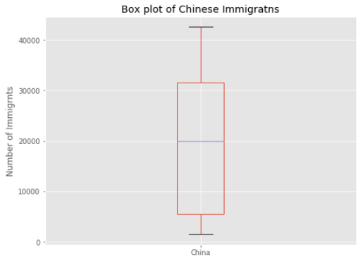
If you need a refresher on boxplots, please check this article:
如果您需要有关盒装图的复习,请查看以下文章:
We can plot several boxplots in the same plot. Use the DataFrame ‘ind_pak_ban’ and make box plots of the number of immigrants of India, Pakistan, and Bangladesh.
我们可以在同一图中绘制多个箱形图。 使用DataFrame'ind_pak_ban'制作箱形图,以显示印度,巴基斯坦和孟加拉国的移民人数。
ind_pak_ban.T.plot(kind='box', figsize=(8, 7))
plt.title('Box plots of Inian, Pakistan and Bangladesh Immigrants')
plt.ylabel('Number of Immigrants')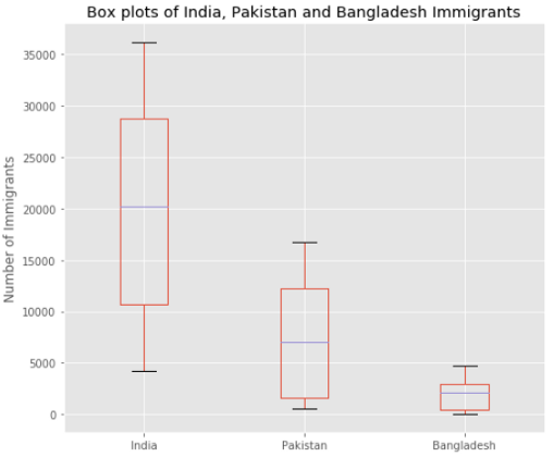
散点图 (Scatter Plot)
A Scatter plot is the best to understand the relationship between variables. Make a scatter plot to see the trend of the number of immigrants to Canada over the years.
散点图是理解变量之间关系的最佳方法。 绘制散点图,查看多年来加拿大移民的趋势。
For this exercise, I will make a new DataFrame that will contain the years as an index and the total number of immigrants each year.
在本练习中,我将创建一个新的DataFrame,其中将以年为索引,并包含每年的移民总数。
totalPerYear = pd.DataFrame(df[years].sum(axis=0))
totalPerYear.head()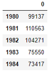
We need to convert the years to integers. I want to polish the DataFrame a bit just to make it presentable.
我们需要将年份转换为整数。 我想稍微修饰一下DataFrame只是为了使其美观。
totalPerYear.index = map(int, totalPerYear.index)
totalPerYear.reset_index(inplace=True)
totalPerYear.head()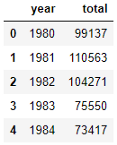
For the scatter plot, we need to specify the x-axis and y-axis for the scatter plot.
对于散点图,我们需要为散点图指定x轴和y轴。
totalPerYear.plot(kind='scatter', x = 'year', y='total', figsize=(10, 6), color='darkred')
plt.title('Total Immigration from 1980 - 2013')
plt.xlabel('Year')
plt.ylabel('Number of Immigrants')plt.show()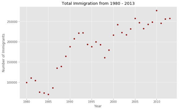
Looks like there is a linear relationship between the years and the number of immigrants. Over the years the number of immigrants shows an increasing trend.
看起来年数与移民人数之间存在线性关系。 多年来,移民人数呈上升趋势。
面积图 (Area Plot)
The area plot shows the area covered under a line plot. For this plot, I want to make DataFrame including the information of India, China, Pakistan, and France.
面积图显示了线图下覆盖的面积。 对于此图,我想制作包含印度,中国,巴基斯坦和法国信息的DataFrame。
top = df.loc[['India', 'China', 'Pakistan', 'France'], years]
top = top.T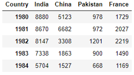
The dataset is ready. Now plot.
数据集已准备就绪。 现在绘图。
colors = ['black', 'green', 'blue', 'red']
top.plot(kind='area', stacked=False,
        figsize=(20, 10), colors=colors)plt.title('Immigration trend from Europe')
plt.ylabel('Number of Immigrants')
plt.xlabel('Years')
plt.show()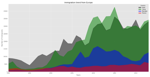
Remember to use this ‘stacked’ parameter above, if you want to see the individual countries area plot. If you do not set the stacked parameter to be False, the plot will look like this:
如果要查看各个国家/地区的区域图, 请记住使用上面的“ stacked”参数 。 如果未将stacked参数设置为False,则绘图将如下所示:
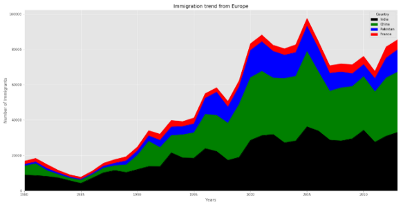
When it is unstacked, it does not show the individual variable’s area. It stacks on to the previous one.
取消堆叠时,它不会显示单个变量的area 。 它堆叠到上一个。
直方图 (Histogram)
The histogram shows the distribution of a variable. Here is an example:
直方图显示变量的分布。 这是一个例子:
df[2005].plot(kind='hist', figsize=(8,5))
plt.title('Histogram of Immigration from 195 Countries in 2010') # add a title to the histogram
plt.ylabel('Number of Countries') # add y-label
plt.xlabel('Number of Immigrants') # add x-label
plt.show()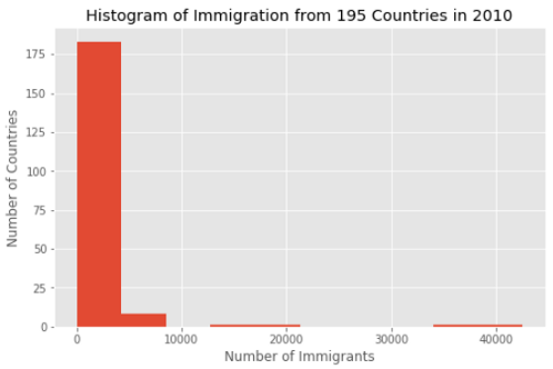
We made a histogram to show the distribution of 2005 data. The plot shows, Canada had about 0 to 5000 immigrants from most countries. Only a few countries contributed 20000 and a few more countries sent 40000 immigrants.
我们制作了直方图以显示2005年数据的分布。 该图显示,加拿大有来自大多数国家的约0至5000个移民。 只有少数几个国家捐款2万,还有几个国家派遣了40000移民。
Let’s use the ‘top’ DataFrame from the scatter plot example and plot each country’s distribution of the number of immigrants in the same plot.
让我们使用散点图示例中的“顶部” DataFrame,并在同一图中绘制每个国家的移民数量分布。
top.plot.hist()
plt.title('Histogram of Immigration from Some Populous Countries')
plt.ylabel('Number of Years')
plt.xlabel('Number of Immigrants')
plt.show()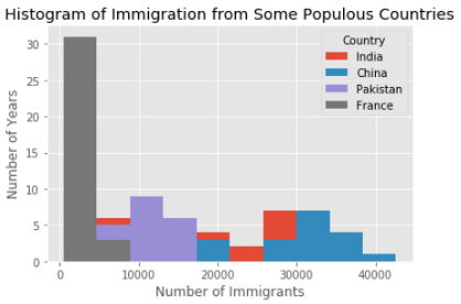
In the previous histogram, we saw that Canada had 20000 and 40000 immigrants from a few countries. Looks like China and India are amongst those few countries. In this plot, we do not see the bin edges clearly. Let’s improve this plot.
在上一个直方图中,我们看到加拿大有来自2个国家的20000和40000移民。 看起来中国和印度在这几个国家中。 在此图中,我们看不到垃圾箱边缘。 让我们改善这个情节。
Specify the number of bins and find out the bin edges
指定垃圾箱数量并找出垃圾箱边缘
I will use 15 bins. I am introducing a new parameter here called ‘alpha’. The alpha value determines the transparency of the colors. For these types of overlapping plots, transparency is important to see the shape of each distribution.
我将使用15个垃圾箱。 我在这里介绍一个称为“ alpha”的新参数。 Alpha值确定颜色的透明度。 对于这些类型的重叠图,透明性对于查看每个分布的形状很重要。
count, bin_edges = np.histogram(top, 15)
top.plot(kind = 'hist', figsize=(14, 6), bins=15, alpha=0.6,
        xticks=bin_edges, color=colors)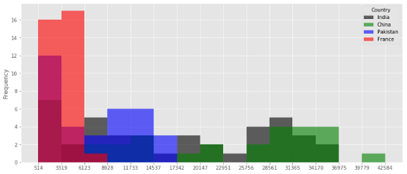
I did not specify the colors. So, the colors came out differently this time. But see the transparency. Now, you can see the shape of each distribution.
我没有指定颜色。 因此,这次的颜色不同。 但是请看透明性。 现在,您可以看到每个分布的形状。
Like the area plot, you can make a stacked plot of the histogram as well.
像面积图一样,您也可以制作直方图的堆积图。
top.plot(kind='hist',
          figsize=(12, 6),
          bins=15,
          xticks=bin_edges,
          color=colors,
          stacked=True,
         )
plt.title('Histogram of Immigration from Some Populous Countries')
plt.ylabel('Number of Years')
plt.xlabel('Number of Immigrants')
plt.show()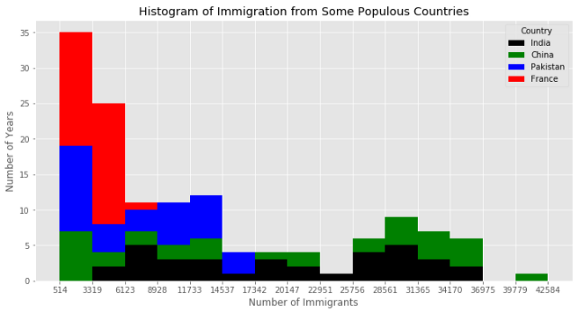
条形图 (Bar Plot)
For the bar plot, I will use the number of immigrants from France per year.
对于条形图,我将使用每年来自法国的移民人数。
france = df.loc['France', years]
france.plot(kind='bar', figsize = (10, 6))
plt.xlabel('Year')
plt.ylabel('Number of immigrants')
plt.title('Immigrants From France')
plt.show()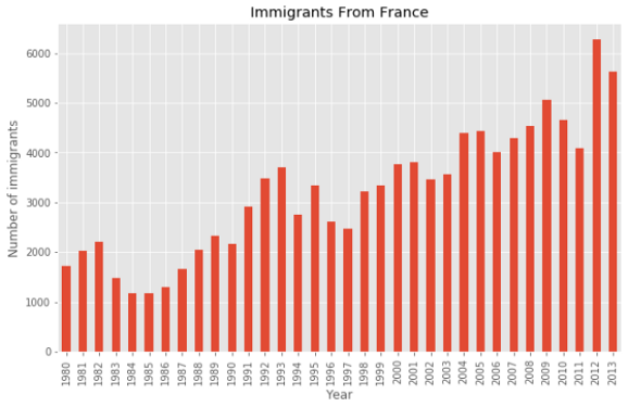
You can add extra information to the bar plot. This plot shows an increasing trend since 1997 for over a decade. It could be worth mentioning. It can be done using an annotate function.
您可以向条形图添加其他信息。 该图显示自1997年以来十多年来的趋势。 值得一提。 可以使用注释功能来完成。
france.plot(kind='bar', figsize = (10, 6))
plt.xlabel('Year')
plt.ylabel('Number of immigrants')
plt.title('Immigrants From France')plt.annotate('Increasing Trend',
            xy = (19, 4500),
            rotation= 23,
            va = 'bottom',
            ha = 'left')plt.annotate('',
            xy=(29, 5500),
            xytext=(17, 3800),
            xycoords='data',
            arrowprops=dict(arrowstyle='->', connectionstyle='arc3', color='black', lw=1.5))
plt.show()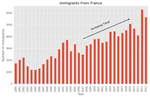
Sometimes, showing the bars horizontally makes it more understandable. Showing a label on the bars can be even better. Let’s do it.
有时,水平显示条形使其更易于理解。 在条上显示标签甚至更好。 我们开始做吧。
france.plot(kind='barh', figsize=(12, 16), color='steelblue')
plt.xlabel('Year') # add to x-label to the plot
plt.ylabel('Number of immigrants') # add y-label to the plot
plt.title('Immigrants From France') # add title to the plotfor index, value in enumerate(france):
    label = format(int(value), ',')
    plt.annotate(label, xy=(value-300, index-0.1), color='white')

plt.show()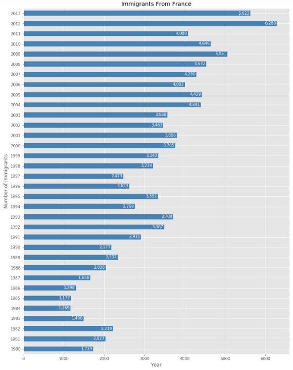
Isn’t it better than the previous one?
是不是比前一个更好?
In this article, we learned the basics of Matplotlib. This should give you enough knowledge to start using the Matplotlib library today.
在本文中,我们学习了Matplotlib的基础知识。 这应该给您足够的知识,可以立即开始使用Matplotlib库。
此处的高级可视化技术: (Advanced Visualization Techniques Here:)
翻译自: https://towardsdatascience.com/your-everyday-cheatsheet-for-pythons-matplotlib-c03345ca390d


 97
97

 被折叠的 条评论
为什么被折叠?
被折叠的 条评论
为什么被折叠?
 到【灌水乐园】发言


