


matplotlib
Hello and welcome to Part Five of this mini-series on data visualization with the most popular Python visualization library called matplotlib.
您好,欢迎使用包含最流行的Python可视化库matplotlib数据可视化迷你系列的第五部分。
The goal is to take you from beginner to expert in data visualization via matplotlib,without unnecessary details that you don’t need to know.
目的是通过matplotlib,将您从初学者带到数据可视化领域的专家matplotlib,而又不需要您不需要知道的不必要的细节。
They say a picture is worth a thousand words, but when it comes to Data, a chart is worth a thousand lines…
他们说一张图片值一千个字,但是当涉及到数据时,一张图表值一千行…
This is a beginner-friendly roadmap that is designed for everyone interested in data visualization. The only requirement is basic programming experience with Python and some interaction with pandas or numpy.
这是适合初学者的路线图,适用于对数据可视化感兴趣的每个人。 唯一的要求是具有Python基本编程经验 和一些互动 pandas 还是 numpy 。
In part one, we explored the matplotlib architecture, created plots with the three layers and 26 different plot styles. In part two we explored the matplotlib-pandas synergy via the plot() function. In part three we went deeper into intermediate pandas for data visualization. In part four we went deep into the most common plots:- Line and Area plots. We explored stacked and unstacked Area plots and played with colour-maps and the 148 colours of matplotlib.
在第一部分中,我们探索了matplotlib架构,创建了具有三层和26种不同绘图样式的绘图。 在第二部分中,我们通过plot()函数探索了matplotlib-pandas协同作用。 在第三部分中,我们更深入地研究了pandas以进行数据可视化。 在第四部分中,我们深入了最常见的图:-线图和面积图。 我们探索了堆积和未堆积的面积图,并使用了颜色图和matplotlib.的148种颜色matplotlib.
Part 1. Part 2. Part 3.Part 4.
For Part 5, we shall continue Explorative Data Analysis (EDA) and displaying visual plots that depict our analysis. The dataset we’re exploring is the immigration to Canada dataset from 194 countries to Canada from 1980 to 2013.
对于第5部分,我们将继续探索性数据分析(EDA)并显示描述我们分析的可视化图。 我们正在探索的数据集是1980年至2013年从194个国家到加拿大的加拿大移民数据集。
Download the updated raw CSV file from Github here.
在此处从Github下载更新的原始CSV文件。
目录第5部分: (Table of Contents Part 5:)
- Intro. 介绍。
- Histograms. 直方图。
- Customizing Histograms. 自定义直方图。
- Stacked Histograms. 堆积直方图。
- Unstacked Histograms. 未堆积的直方图。
- Interpreting Stacked and Unstacked Histograms. 解释堆积和未堆积直方图。
介绍: (Intro:)
First, let’s import and load the dataset we explored last in part 4:
首先,让我们导入并加载第4部分中最后探讨的数据集:

As seen, the dataset contains migrations data from 194 countries to Canada, from 1980 to 2013. Data Link.
如图所示,数据集包含1980年至2013年从194个国家到加拿大的移民数据。数据链接。
Since we may be referring often to columns from 1980 to 2013, let’s save these as a list of strings
由于我们可能经常引用1980年至2013年的列,因此我们将其保存为字符串列表
years = [str(year) for year in range(1980,2014)]Next, let’s set the index of the Dataframe to Country. So we can easily refer to countries by their names as we explore the data.
接下来,让我们将数据框的索引设置为Country。 因此,当我们浏览数据时,我们可以轻松地用国家名称来指代国家。
canada_df.set_index('Country', drop=True, inplace=True)直方图: (Histograms:)

A Histogram is a way of representing the frequency distribution of a numeric dataset. It works by partitioning the spread of the numeric data into bins, assigns each data point in the data set into bins and then counts the number of Data points that have been assigned to each bin.
直方图是表示数值数据集频率分布的一种方式。 它通过将数字数据的散布划分为bin,然后将数据集中的每个数据点分配到bin中,然后计算已分配给每个bin的数据点的数量来工作。
So the vertical axis is actually the frequency or the number of data points in each bin.
因此,垂直轴实际上是每个仓中的频率或数据点数。
In other words, given a distribution of data in a list or an array, for example, a Histogram can tell us how often numbers within a range(bin) occur in the distribution.
换句话说,例如,给定列表或数组中的数据分布,直方图可以告诉我们在该分布中范围(bin)中的数字出现的频率。
Histograms are used to represent the frequency distribution of a numeric dataset.
直方图用于表示数字数据集的频率分布。
问题1: (Question 1:)
2013年,从各个国家到加拿大的移民人数(人口)的频率分布是什么? (What is the frequency distribution of the number (population) of immigrants from the various countries to Canada in 2013?)
Let’s try to visualize the immigrations to Canada in the year 2013, using our data set… The easiest way to do that is with a Histogram.
让我们尝试使用我们的数据集来可视化2013年加拿大的移民情况。最简单的方法是使用直方图。
First, let’s create a fontdict. It’s a dictionary object that we can easily use to customise the fonts in our titles, suptitles, and labels of our plots.
首先,让我们创建一个fontdict。 这是一个字典对象,我们可以轻松地使用它来自定义标题 , 字幕和剧情标签中的字体。
# Let's create a fontdict for the font style and properties


dict_={'fontsize': 14,
       'family': 'serif',
        'fontweight' : 'bold',
        'verticalalignment': 'baseline',
      'color': 'darkred'}
Let’s plot the migrations data for 2013
让我们绘制2013年的迁移数据
sns.set_style('ticks')
df_2013 = canada_df[['2013']]
df_2013.plot(kind='hist', figsize=(8,6))


plt.title('Histogram of migrating Countries to Canada: 2013', fontdict=dict_)


dict_['fontsize'] = 12
plt.ylabel('Nunber of Immigrants', fontdict=dict_)
plt.show()
So as usual, we call the plot() function on the df_2013 DataFrame that contains only migrations data for 2013. Then we pass the dict_ object as the argument to the fontdict parameter within the function.
因此,像往常一样,我们在仅包含2013年迁移数据的df_2013 DataFrame上调用plot()函数。然后,将dict_对象作为该函数内fontdict参数的参数传递。
Trivia: Can you tell what the code:-
sns.set_style(‘ticks’)actually does in the plot? Answer: Visit part twoTrivia :您能说出代码:
sns.set_style('ticks')在图中的实际作用吗? 答案:访问第二部分

Looking at the Histogram for the year 2013, we can see that most (about 175 countries) had less than 5000 migrations, with some outliers at around 28000 to 35000 migrations at the right-end.
查看2013年的直方图,我们可以看到大多数(大约175个国家/地区)的迁移量少于5000,而一些离群值在大约28000至35000的迁移量位于右端。
But notice how the bins are not aligned with the tick marks of the horizontal axis. This can make it hard to read. So let’s fix this.
但是请注意,垃圾箱如何与水平轴的刻度线不对齐。 这会使阅读变得困难。 因此,让我们修复此问题。
One way to solve this is to borrow the histogram function from the numpy library.
解决此问题的一种方法是从numpy库中借用直方图函数。
Yea, the best Data Scientists out there don’t cram or recite code lines… The best Data Scientists are simply better at accessing and utilizing available tools from various libraries and frameworks… Learn to know your tools and where they can be found… Even The best, often Google it.
是的,最好的数据科学家不会塞满或背诵代码行…最好的数据科学家只是更擅长访问和利用来自各种库和框架的可用工具…学习了解您的工具以及在哪里可以找到它们……最好,通常是Google。
count, bin_edges = np.histogram(df_2013['2013'])
print('Count is:',count, 'and Bin-edges is:', bin_edges)


"""
Count is: [178  11   1   2   0   0   0   0   1   2] and
Bin-edges is: [    0.   3412.9  6825.8 10238.7 13651.6 17064.5 20477.4 23890.3 27303.2 30716.1 34129. ]
 """
So we basically use the np.histogram() function to define the bin-edges for the Histogram as well as the counts per bin. By default, this method breaks up the dataset into 10 bins. The bullet-points below summarize the bin ranges and the frequency distribution of immigration to Canada in 2013…
因此,我们基本上使用np.histogram()函数定义直方图的bin边缘以及每个bin的计数。 默认情况下,此方法将数据集分成10个bin。 以下要点总结了2013年移民加拿大的垃圾箱范围和频率分布…
178 countries contributed between 0 to 3413 immigrants
178个国家为0至3413名移民做出了贡献
11 countries contributed between 3413 to 6826 immigrants
11个国家贡献了3413至6826名移民
1 country contributed between 27303 to 30716 immigrants,
1个国家/地区在27303至30716名移民之间做出了贡献,
And 2 countries contributed between 30716 and 34129 immigrants.
2个国家贡献了30716至34129个移民。
So let’s replot the histogram using the bin-edges from numpy. Then we can add some little customizations too.
因此,让我们使用numpy的bin-edge重新绘制直方图。 然后我们也可以添加一些小定制。
df_2013.plot(kind='hist', figsize=(8, 6), xticks= bin_edges, edgecolor='red', linewidth=1.2)


plt.title("Histogram showing Migrations to Canada in 2013", fontdict=dict_)


dict_['fontsize'] = 12
plt.ylabel('Number of Countries', fontdict=dict_)


plt.show()
Alright, so here’s the updated Histplot, we set the following parameters within the plot() function
好了,所以这是更新的Histplot,我们在plot()函数中设置以下参数
xticks=bin_edgesxticks=bin_edgesedgecolor=’red’edgecolor='red'linewidth=1.2linewidth=1.2
xticks aligns the bin-edges to the ticks on the x-axis of the plot, whilelinewidth defines the width as depicted by the edgecolor on each bar of the histogram.
xticks将bin边缘与图的x轴上的刻度对齐,而linewidth定义宽度,如直方图每个条上的edgecolor所描绘。
有关Plot()方法的更多信息: (More on the Plot() method:)
Note that we can also use the plot method chained to a chart function directly. For example, we can do df_2013.plot.hist() directly. This chains the plot() method and the hist() function together. This can be done for all the plots callable by the plot() method such as:-
请注意,我们还可以使用直接链接到图表函数的plot方法。 例如,我们可以直接执行df_2013.plot.hist() 。 这将plot()方法和hist()函数链接在一起。 可以对plot()方法可调用的所有图执行此操作,例如:
Let’s chain the plot() and hist() functions together, and change the colour of the plot to ‘aqua’.
让我们将plot()和hist()函数链接在一起,然后将图的颜色更改为“ aqua”。
df_2013.plot.hist(xticks=bin_edges, figsize=(8, 6), edgecolor='red', linewidth=1.2, color='aqua')


plt.title("Histogram showing Migrations to Canada in 2013", fontdict=dict_)


dict_['fontsize'] = 12
plt.ylabel('Number of Countries', fontdict=dict_)


plt.show()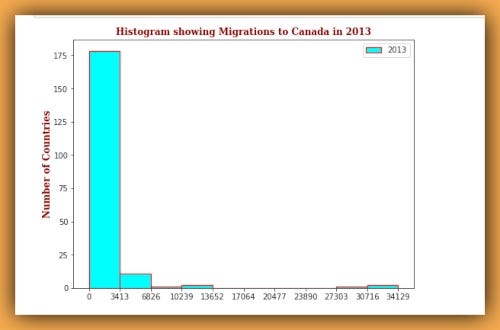
未堆积的直方图: (Unstacked Histograms:)
The default behaviour of matplotlib is to plot unstacked Histograms. So except we pass the parameter stacked=False, we’re gonna have an unstacked Histogram. Let’s see an example…
matplotlib的默认行为是绘制未堆积的直方图。 因此,除了传递参数stacked=False ,我们将获得未堆叠的直方图。 让我们看一个例子……
问题2: (Question2:)
1980-2013年,尼日利亚,加纳和肯尼亚的移民分布是什么? (What is the immigration distribution for Nigeria, Ghana, and Kenya for years 1980–2013?)
So as usual, the first thing we do is to slice out the data for Nigeria, Ghana and Kenya for the periods 1980 to 2013.
因此,与往常一样,我们要做的第一件事就是对尼日利亚,加纳和肯尼亚1980年至2013年期间的数据进行剖析。
df_NigGhaKen = canada_df.loc[['Nigeria', 'Ghana', 'Kenya'], years]


# Next we transpose the DataFrame
df_NigGhaKen = df_NigGhaKen.T
The next step is simply to set the bin-width like before, using the np.histogram() function and plotting the charts:
下一步就是像以前一样简单地设置bin宽度,使用np.histogram()函数并绘制图表:
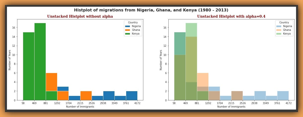
These are two unstacked plots, from precisely the same data and identical colours and parameters. The first plot on the left has no transparency or alpha, the second has an alpha of 0.4. Ironically, the first plot is the default Histplot of matplotlib given the data for Nigeria, Ghana and Kenya.
这是两个未堆叠的图,它们来自完全相同的数据,相同的颜色和参数。 左侧的第一个图没有透明度或alpha,第二个图的alpha为0.4。 具有讽刺意味的是,考虑到尼日利亚,加纳和肯尼亚的数据,第一个图是matplotlib的默认直方图。
We can see that the first 2 bins of the first plot, don’t tell us anything about the distribution split of the data. We can only see that these bins have heights of about 15 and 17, representing the highest frequency for each bin. But by adding some alpha on the second plot we can see the split somewhat, for the three countries.
我们可以看到,第一个图的前两个bin没有告诉我们有关数据分布拆分的任何信息。 我们只能看到这些容器的高度大约为15和17,代表每个容器的最高频率。 但是,通过在第二个图上添加一些alpha值,我们可以看到这三个国家的分割程度。
It’s still difficult to tell precisely which country has what frequency because although we can see the markings, the colours have transformed to other tertiary colours as the default colours are mixed together.
仍然很难准确地确定哪个国家/地区使用哪个频率,因为尽管我们可以看到标记,但是由于默认颜色混合在一起,因此颜色已转换为其他第三种颜色。
NOTE: It is best to always use some transparency for unstacked plots, and when you do, be aware that color distortions or transformations may occur as different colors are mixed together in individual bars of the Histogram, this could sometimes make it harder to accurately interpret an unstacked Histogram.
注意:最好始终对未堆叠的图使用一些透明度,并且在这样做时,请注意,由于直方图的各个条形中将不同的颜色混合在一起,可能会发生颜色失真或变换,这有时可能使准确解释变得更加困难未堆积的直方图。
So to find out precisely how many years from 1980 to 2013 for Nigeria, Ghana and Kenya, have migrations within the first bin of the Histogram above, we can simply use the bin limits and run simple codes:-
因此,要准确找出从1980年到2013年尼日利亚,加纳和肯尼亚有多少年在上述直方图的第一个bin内迁移,我们可以简单地使用bin限制并运行简单的代码:
nigeria_bin1 = [i for i in df_NigGhaKen['Nigeria'] if i >= 58 and i <= 470]
ghana_bin1 = [i for i in df_NigGhaKen['Ghana'] if i >= 58 and i <= 470]
kenya_bin1 = [i for i in df_NigGhaKen['Kenya'] if i >= 58 and i <= 470]


print(f'Nigeria = {len(nigeria_bin1)},\nGhana = {len(ghana_bin1)},\nKenya = {len(kenya_bin1)}.')


"""
Nigeria = 15,
Ghana = 10,
Kenya = 15.
"""
This tells us Nigeria and Kenya both have 15 years of migrations within the range of the first bin (58–470) and Ghana has 10.
这告诉我们尼日利亚和肯尼亚在第一个垃圾箱(58-470)范围内都有15年的迁徙,加纳则有10年。
堆积直方图: (Stacked Histograms:)
Stacked Histograms are visually more appealing and easier to interpret. At first glance, they may seem daunting and complex, but I’d show you how easy it is to interpret these. If we do not want the plots to overlap each other, we can stack them using the stacked parameter.
堆叠直方图在视觉上更具吸引力,更易于解释。 乍一看,它们似乎令人生畏且复杂,但是我将向您展示解释它们的难易程度。 如果我们不希望这些图相互重叠,则可以使用stacked参数将它们stacked 。
问题3: (Question 3:)
使用“艺术家”图层显示1980-2013年间加拿大排名前5位国家的移民分布? 使用具有15个仓位和透明度值为0.5的重叠堆积图。 (Use the Artist layer to display the immigration distribution for the top 5 Countries to Canada for the years 1980–2013? Use an overlapping stacked plot with 15 bins and a transparency value of 0.5.)
So how do we proceed? I’m pretty sure by now, we have the confidence to tackle subsetting data. Remember the extensive pandas exercises we ran in part-2 and part-3?
那么我们该如何进行呢? 我现在很确定,我们有信心处理子集数据。 还记得我们在第二 部分和第三 部分中进行的大熊猫练习吗?
Okay, I think we should look at our dataset again…
好的,我认为我们应该再次查看数据集…
So the next step is to sort the DataFrame in descending order by the Total column, then slice off the years' columns (1980 to 2013), select the first 5 entries and transpose these for the plot.
因此,下一步是按“ Total列按降序对DataFrame进行排序,然后切下年份的列(1980年至2013年),选择前5个条目并将其转置为图表。
# First we select the top 5 countries
top_5 = canada_df.sort_values(by='Total', ascending=False).head()


# Let's select only the index countries and the years and also Transpose it
top_5 = top_5.loc[top_5.index, years].T


top_5.head()
So here we have the Top-5 countries:- India, China, United-Kingdom-of-Great-Britain-and-Northern-Ireland, Philippines and Pakistan.
因此,这里有前5个国家/地区:-印度,中国,大不列颠及北爱尔兰联合王国,菲律宾和巴基斯坦。
Let’s rename the lengthy United-Kingdom name, to something shorter.
让我们将冗长的联合王国名称重命名为更短的名称。
top_5.rename(columns={'United Kingdom of Great Britain and Northern Ireland':'United_Kingdom(GB/NI)'}, inplace=True)There we have it, so the next step is to define the bin-width, using the np.histogram() function again. This time passing 15 as the second argument, so that we have 15 bins instead of the default 10.
我们已经有了它,因此下一步是再次使用np.histogram()函数定义bin宽度。 这次传递15作为第二个参数,因此我们有15个bin,而不是默认的10个bin。
count, bin_edges = np.histogram(top_5, 15)And now we plot the distribution for the Top-5 countries in response to the question.
现在,我们针对该问题绘制了前五名国家/地区的分布情况。
import matplotlib.pyplot as plt
fig = plt.figure()
ax = fig.add_subplot(1, 1, 1)


# Artist layer Histogram
top_5.plot.hist(xticks=bin_edges,
                   stacked=True,
                   alpha=0.5,
                   color=['orange','brown','mediumpurple', 'tomato', 'black'],
                   figsize=(10,6),
                bins=len(count),
                ax=ax)


ax.set_title('Histplot of migrations from Top-5 countries to Canada (1980 - 2013)',fontstyle='italic', fontdict=dict_)
ax.set_ylabel('Number of Years')
ax.set_xlabel('Number of Immigrants')


plt.show()
From the Git-gist above, we use the Artist layer of matplotlib for the plot.
从上面的Git-gist中,我们将matplotlib的Artist层用于绘图。
This time we passed stacked=True to tell matplotlib we want a stacked Histplot. we made xticks=bin_edges, just as before. To ensure the bins align, we also passed the parameter bins=len(count), referring to the count object we got containing the frequency values for each bin when we used the np.histogram() function a few seconds back.
这次我们传递了stacked=True ,告诉matplotlib我们想要一个堆叠的Histplot。 和以前xticks=bin_edges ,我们制作了xticks=bin_edges 。 为了确保bin对齐,我们还传递了参数bins=len(count) ,它是指几秒钟后使用np.histogram()函数时引用的计数对象,其中包含每个bin的频率值。
One more thing we did this time was to add the parameter fontstyle=’italic’. Of course, this makes the title style of the plot italic.
这次我们要做的另一件事是添加参数fontstyle='italic' 。 当然,这会使剧情的标题样式变为斜体。
Note that acceptable font styles can be:-
请注意,可接受的字体样式可以是:
- ‘normal’, '正常',
- ‘italic’, “斜体”,
- ‘oblique’ '斜'

Here we are, Stacked Histplot with alpha=0.5
在这里, alpha=0.5堆积直方图
Note that in a stacked plot the alpha value sets the colour intensity and not the transparency. The lower the alpha the duller the colours and vice versa.
请注意,在堆叠图中,alpha值设置颜色强度而不是透明度。 alpha越低,颜色越暗,反之亦然。
Look at the x-axis, although the ticks are well aligned with the labels, showing the bin values for the number of immigrants, the numbers look crammed up and uneasy on the eyes.
看一下x轴,尽管刻度线与标签完全对齐,显示了移民人数的bin值,但这些数字看起来挤满了眼睛,不舒服。
We have to do something. Data visualization must always make the data more appealing to the eyes and never the opposite.
我们必须做点什么。 数据可视化必须始终使数据更具吸引力,而不是相反。
改善显示效果: (Improving the Display:)
Let’s increase the alpha to pop the colours some more, and change the x-axis labels to values more trendy.
让我们增加Alpha来更多地弹出颜色,然后将x轴标签更改为更时髦的值。
import matplotlib.pyplot as plt
fig = plt.figure()
ax = fig.add_subplot(1, 1, 1)


# Artist layer Histogram
top_5.plot.hist(xticks=bin_edges,
                stacked=True,
                   alpha=0.7,
                   color=['orange','brown','mediumpurple', 'tomato', 'darkgreen'],
                   figsize=(12,6),
                bins=len(count),
                ax=ax)


ax.set_title('Histplot of migrations from Top-5 countries to Canada (1980 - 2013)',fontstyle='normal', fontdict=dict_)
ax.set_ylabel('Number of Years')
ax.set_xlabel('Number of Immigrants')
ax.set_xticklabels(['0.5k', '3.3k', '6.1k', '8.9k', '11.7k', '14.5k', '17.3k', '20.1k', '22.9k', '25.7k', '28.5k', \
                        '31.3k', '34.1k', '36.9k', '39.7k', '42.5k'], fontsize=9)


plt.show()
So using the Artist layer again, which we covered in part-1, I have added the parameter ax.set_xticklabels to change the xtick labels to representative strings.
因此,再次使用我们在第1部分中介绍的Artist层,我添加了参数ax.set_xticklabels来将xtick标签更改为代表字符串。

Now we can see the improved Histplot. The colours are brighter, the x-tick labels are more legible and friendly on the eyes, and overall the plot conveys the distribution of the data with ease and style.
现在我们可以看到改进的Histplot。 颜色更明亮,x刻度标签在眼睛上更清晰易辨,并且总体上,图表可以轻松而时尚地传达数据的分布。
I know all those bars of the Histogram, stacked atop each other, with different colours and heights, can be intimidating to understand, let alone explain.
我知道直方图的所有这些条形图,彼此堆叠在一起,具有不同的颜色和高度,可能让人感到难以理解,更不用说解释了。
So that’s what we cover next.
这就是我们接下来要介绍的内容。
解释堆积和未堆积直方图: (Interpreting Stacked and Unstacked Histograms:)
Let’s revisit the Histplot of the three African countries we saw in question two above.
让我们回顾一下上面在问题二中看到的三个非洲国家的历史。
This time, I’d plot a Stacked plot next to an Unstacked one and then we learn the differences and properties.
这次,我在“未堆积”旁边绘制了“堆积”图,然后我们学习了差异和属性。

xlim = (xmin, xmax): The first thing you may notice about these two plots above is that unlike other plots, there’s little or no space between the edge of the first bar and the canvas, and between the edge of the last bar and the canvas.
xlim =(xmin,xmax):关于以上两个图,您可能会注意到的第一件事是,与其他图不同,第一个条形图的边缘和画布之间,最后一个条形图的边缘与画布之间几乎没有空间。画布。
This is simply because we passed the parameter xlim=(xmin, xmax) to the plot() function after we’d deducted 10 spaces before the first bin and added 10 spaces after the last bin to re-align the position of the charts on the canvas.
这仅仅是因为我们在减去第一个bin之前的10个空格并在最后一个bin之后添加10个空格以重新对齐图表的位置后,将参数xlim=(xmin, xmax)传递给plot()函数画布。
See the adjustment below and the notebook here in Github
请参阅下面的调整和笔记本电脑在这里在Github上
#  The first bin value is 58.0, adding buffer of -10 for aesthetic purposes
xmin = bin_edges[0] -10


#  last bin value is 4172.0, adding buffer of 10 for aesthetic purposes
xmax = bin_edges[-1] +10


# Passing xmin and xmax as a tuple to xlim
xlim = (xmin, xmax)
So, we have the Stacked Histplot on the left and the Unstacked one on the right. Both plots from identical data. The only difference is one is Stacked and the other Unstacked. For simplicity's sake, let’s focus on just the first bin. The bin with limits 58 to 332.
因此,左侧有Stacked Histplot,右侧是Unstacked Histplot。 这两个图均来自相同的数据。 唯一的区别是一个是堆叠的,另一个是堆叠的。 为了简单起见,让我们只关注第一个容器。 垃圾箱的限制为58到332。
This bin represents the distributions of the three countries (Nigeria, Ghana, Kenya) that fall within 58 to 332 migrations each. The y-axis shows the number of years AKA frequency or count that depicts the height of the stack on the first bin.
此分类代表三个国家(尼日利亚,加纳,肯尼亚)的分布,每个国家的迁移量在58到332之间。 y轴显示了AKA频率或计数的年数,它描述了第一个纸箱上的纸叠高度。
In other words, the y-axis shows how many years from 1980 to 2013 have migrations between 58 and 332 values for each country.
换句话说,y轴显示了从1980年到2013年,每个国家有58年到332个值之间的迁移。
Let’s first determine these values using list comprehensions.
我们首先使用列表推导来确定这些值。
Gha_bin_1 = [i for i in df_NigGhaKen['Ghana'] if i >= 58 and i <= 332]
Ken_bin_1 = [i for i in df_NigGhaKen['Kenya'] if i >= 58 and i <= 332]
Nig_bin_1 = [i for i in df_NigGhaKen['Nigeria'] if i >= 58 and i <= 332]


print(f'For Nigeria: Bin one has {len(Nig_bin_1)} immigrants.\nFor Ghana: Bin one has {len(Gha_bin_1)} immigrants.\nFor Kenya: Bin one has {len(Ken_bin_1)} immigrants')


>>
For Nigeria: Bin one has 13 years.
For Ghana: Bin one has 7 years.
For Kenya: Bin one has 10 years
Ok, the code tells us Nigeria has 13 years with migrant values between 58 to 332, Ghana has 7 and Kenya has 10.
好的,代码告诉我们尼日利亚有13年的移民价值,介于58到332之间,加纳有7年,肯尼亚有10年。
The Stacked plot shows each country’s bar stacked atop the one before, distinctively. Nigeria is stacked first with height 13, then Ghana, then Kenya, giving a total stack height of 30
(13 + 7 + 10).堆叠图显示了每个国家/地区的条形图,这些条形图以前都非常独特。 尼日利亚首先堆叠,高度为13,然后是加纳,然后是肯尼亚,堆叠总高度为30
(13 + 7 + 10)。- The Unstacked plot shows a total stack height of 13. This is the height of the highest country value within the range of the first bin. We can see a marking at point 7 representing Ghana and another marking at 10 for Kenya. These are actually distinct bars too, but they are cramped together within the dominating bar for Nigeria. “未堆叠”图显示总堆叠高度为13。这是第一个容器范围内最高国家/地区值的高度。 我们可以在第7点看到一个标记,代表加纳,在第10点看到另一个标记,代表肯尼亚。 这些实际上也是截然不同的酒吧,但在尼日利亚的主要酒吧中却挤在一起。
- Both plots have identical colours. The issue, in this case, is that with alpha set at 0.5, the unstacked plot is half as transparent (which is ideal), while the Stacked plot is half as bright (unideal). This reduced transparency coupled with the compression of different colours within the dominant bar in the unstacked plot gives the varying shades we see. 两种地块的颜色相同。 在这种情况下,问题在于alpha设置为0.5时,未堆叠的图的透明度是透明的一半(这是理想的),而堆叠的图的亮度是一半(不理想的)。 这种降低的透明度,加上未堆叠图中主导条内不同颜色的压缩,使我们看到了变化的阴影。
- These explanations for the first bin holds true for each and every bin in both the Stacked and Unstacked plots. 对于第一个箱的这些解释对于堆积图和未堆积图中的每个箱都适用。

In this part, we have covered Histograms AKA Histplots. They are powerful plots for displaying the frequency distribution of data for single or multiple variables as we have seen. We’ve learnt the characteristics of both Stacked and Unstacked Histplots, interpreted their bins, learnt how to customise their fonts, labels x-ticks and colours.
在本部分中,我们介绍了直方图(也称为“直方图”)。 如我们所见,它们是用于显示单个或多个变量的数据频率分布的强大图表。 我们已经了解了堆叠和非堆叠Histplots的特性,解释了其垃圾箱,学习了如何自定义其字体,标签X标记和颜色。
Stay tuned for Part 6, where we’d explore vertical and horizontal bar charts in detail including annotating of charts and more styling.
请继续关注第6部分 ,在第6部分中 ,我们将详细探讨垂直和水平条形图,包括图表注释和更多样式。
See the links to the previous Parts:-
请参阅以前各部分的链接:
You can see the Repo containing all notebooks from part one here
您可以在此处看到包含第一部分中所有笔记本的回购
干杯! (Cheers!)
关于我: (About Me:)
Lawrence is a Data Specialist at Tech Layer, passionate about fair and explainable AI and Data Science. I believe that sharing knowledge and experiences is the best way to learn. I hold both the Data Science Professional and Advanced Data Science Professional certifications from IBM. I have conducted several projects using ML and DL libraries, I love to code up my functions as much as possible even when existing libraries abound. Finally, I never stop learning and experimenting and yes, I have written several highly recommended articles.
Lawrence是Tech Layer的数据专家,对公平和可解释的AI和数据科学充满热情。 我相信分享知识和经验是最好的学习方式。 我同时拥有 IBM 的 Data Science Professional 和 Advanced Data Science Professional 认证。 我使用ML和DL库进行了多个项目,即使在现有库比比皆是的情况下,我喜欢尽可能地编写我的函数。 最后,我从未停止学习和尝试,是的,我写了几篇强烈推荐的文章。
Feel free to find me on:-
随时在以下位置找到我:
翻译自: https://medium.com/dataseries/mastering-matplotlib-part-5-2e7375e52f2b
matplotlib


 1417
1417


 被折叠的 条评论
为什么被折叠?
被折叠的 条评论
为什么被折叠?
 到【灌水乐园】发言


