


数据可视化简介 (Introduction to Data Visualization)
Data visualization is the process of creating interactive visuals to understand trends, variations, and derive meaningful insights from the data. Data visualization is used mainly for data checking and cleaning, exploration and discovery, and communicating results to business stakeholders. Most of the data scientists pay little attention to graphs and focuses only on the numerical calculations which at times can be misleading. To understand the importance of visualization let’s take a look at Anscombe’s Data Quartet in Figures 1 and 2 below.
数据可视化是创建交互式视觉效果以了解趋势,变化并从数据中获得有意义的见解的过程。 数据可视化主要用于数据检查和清理,探索和发现以及将结果传达给业务涉众。 大多数数据科学家很少关注图形,而只关注于有时会引起误解的数值计算。 为了理解可视化的重要性,让我们在下面的图1和图2中查看Anscombe的Data Quartet。
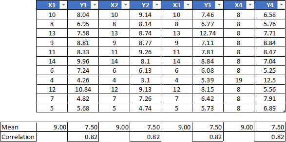
The same data points, when represented using visualization in Figure 2 below, depicts a different trend altogether.
当使用下面的图2中的可视化表示相同的数据点时,它们总共描述了不同的趋势。

It is important to visualize the data before any calculations are carried out. The visual representation can convey much more information when compared to descriptive statistics.
在执行任何计算之前,对数据进行可视化非常重要。 与描述性统计数据相比,视觉表示可以传达更多的信息。
数据可视化的作用 (Role of Data Visualization)
Multiple Business Intelligence Tools (BI) are currently ruling the market with each having its pros and cons. The concept of self-service dashboards was devised to allow stakeholders with little or no knowledge of data science, work independently on data, and derive some findings that might assist their day to day business decisions. We will look at some of the applications of data visualization using Tableau or Python in the examples below.
目前,多种商业智能工具(BI)统治着市场,每种都有其优缺点。 自助服务仪表板的概念旨在使几乎不了解数据科学或根本不了解数据科学的利益相关者,独立地处理数据并得出一些有助于其日常业务决策的发现。 在下面的示例中,我们将介绍一些使用Tableau或Python进行数据可视化的应用程序。
数据检查与清理 (Data Checking and Cleaning)
Data visualization can be used to look for obvious errors in the dataset including nulls, random values, distinct records, the format of dates, sensibility of spatial data, and string and character encoding.
数据可视化可用于查找数据集中的明显错误,包括空值,随机值,不同的记录,日期格式,空间数据的敏感性以及字符串和字符编码。

资料分配 (Data Distribution)
Data visualization can be used to understand the distribution of the data, look for central tendencies (mean, median, and mode), understand the presence of outliers using a boxplot, check for skewness, and ever understand the impact of winsorization on data distribution. Figure 4 below illustrates how box plots can be developed to understand the presence of outliers.
数据可视化可用于了解数据的分布,寻找中心趋势(均值,中位数和众数),使用箱线图了解异常值,检查偏斜度,以及了解Winsorization对数据分布的影响。 下面的图4说明了如何绘制箱形图以了解异常值的存在。

模型假设 (Model Assumptions)
Linear regression and other classification models follow certain underlying assumptions like data has to be normally distributed, the correlation between different independent variables shouldn’t exist, homoscedasticity of error terms, and many more. Hence visualizations are a key to validating some of these assumptions as well.
线性回归和其他分类模型遵循某些基本假设,例如数据必须正态分布,不应该存在不同自变量之间的相关性,误差项的均方差等等。 因此,可视化也是验证其中一些假设的关键。

人在环分析 (Human-in-the-Loop Analytics)
Data scientists often use humans in the loop analytics to get a look and feel of the data, make a hypothesis, run appropriate analytics to validate the hypothesis, and repeat the process till conclusive evidence is determined. E.g. in Python a very popular package Seaborn has a function called pair plot. Pair plots are very useful in determining the relationship between dependent and independent variables. The idea of the visualization is to get a better understanding of the directional sense of if some of the independent variables impact the model results or not.
数据科学家经常在循环分析中使用人工来获得数据的外观和感觉,做出假设,运行适当的分析以验证假设,并重复该过程直到确定结论性证据为止。 例如,在Python中,一个非常受欢迎的软件包Seaborn具有一个称为结对图的函数。 配对图对于确定因变量和自变量之间的关系非常有用。 可视化的想法是更好地理解方向性,即某些自变量是否影响模型结果。

降维 (Dimension Reduction)
While working with multiple variables it is difficult to visualize the data in an n-dimension space. E.g. in a data set that has different customer attributes (say numerical) it is difficult to plot the customers considering all attributes. In scenarios like this, dimension reduction techniques like Principal Component Analysis (PCA) or Factor Analysis can be useful to bring down the attributes to fewer dimensions. PCA finds linear combinations of variables that best explain the observations whereas Factor analysis finds linear combinations of variables that best explain the relationship between the variables. The reduced dimension can then be plotted to analyze the customers in a 2D space.
使用多个变量时,很难在n维空间中可视化数据。 例如,在具有不同客户属性(例如数字)的数据集中,很难考虑所有属性来绘制客户。 在这种情况下,降维技术(例如主成分分析(PCA)或因子分析)可用于将属性降低到更少的维度。 PCA找到最能解释观测结果的变量线性组合,而因子分析则找到最能解释变量之间关系的变量线性组合。 然后可以绘制缩小的尺寸以分析2D空间中的客户。
More information on how to recreate these charts in Python can be found here.
可在此处找到有关如何在Python中重新创建这些图表的更多信息。
分析问题中的数据集类型 (Type of Datasets in Analytical Problems)
It is important to understand the type of datasets to determine the type of visualization that can be applied. E.g. when working with a tabular data a combination of bar graphs and line charts might be useful when compared to spatial data where a map with a density plot might communicate the result effectively. Before we take a deeper look into the type of visualization let’s understand some of the key data types that are commonly used.
重要的是了解数据集的类型,以确定可以应用的可视化类型。 例如,当与表格数据一起使用时,与空间数据相比,条形图和折线图的组合可能会很有用,在空间数据中,带有密度图的地图可能会有效地传达结果。 在深入研究可视化类型之前,让我们了解一些常用的关键数据类型。
表格数据 (Tabular data)
Data organized in tables, a row for each data item, and a column for each of its attributes. E.g. Datasets that are available in Excel, CSV files, Pandas data frame, etc.
数据组织在表格中,每个数据项一行,其每个属性列。 例如,Excel,CSV文件,Pandas数据框等中可用的数据集。
网络数据 (Network data)
Nodes in the network are data items and links between the nodes are relations between. For example a social network.
网络中的节点是数据项,节点之间的链接是它们之间的关系。 例如社交网络。
空间数据: (Spatial data:)
Data which is naturally organized and understood in terms of its spatial location or extent. E.g. latitude and longitude of locations, geography information, suburbs, streets, etc.
根据空间位置或范围自然组织和理解的数据。 例如,位置,地理信息,郊区,街道等的纬度和经度。
文字数据: (Textual data:)
This kind of data set consists of sequences of words and punctuation. E.g. twitter feed or customer complaints.
这种数据集由单词和标点的序列组成。 例如Twitter提要或客户投诉。
视觉词汇 (Visual Vocabulary)
The figures below provide a picture of how different visualizations can be used to depict different scenarios in the data.
下图提供了如何使用不同的可视化图像描述数据中不同场景的图片。


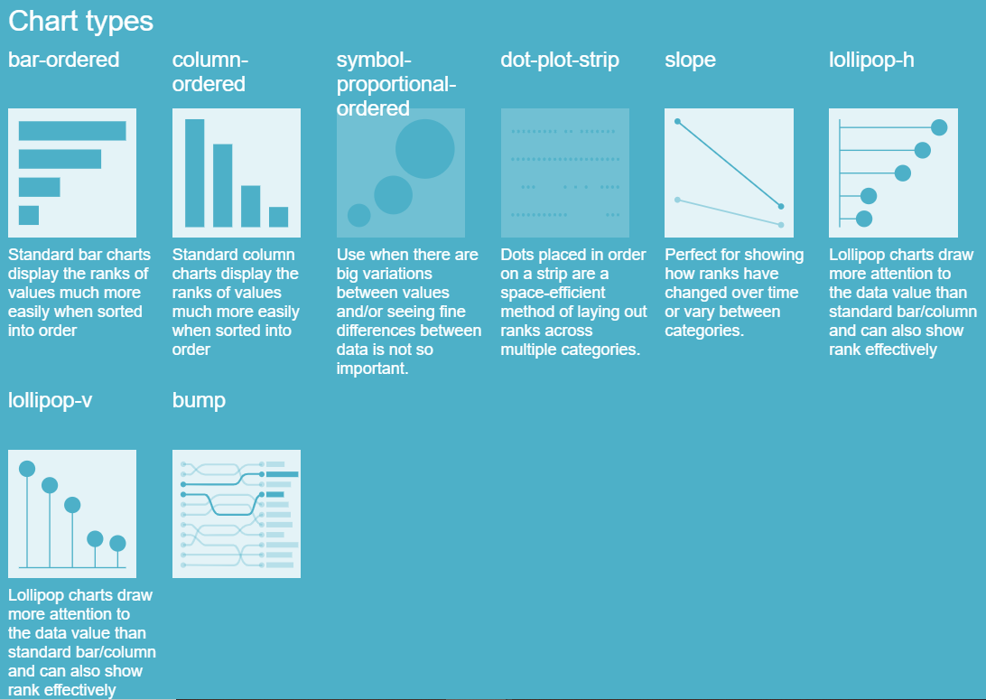
You can find examples of other visualizations here.
您可以在此处找到其他可视化示例。
跨数据类型的可视化效果 (Effectiveness of Visualization across Data Types)
The table below displays the effectiveness of different visuals across data types. To understand the table better we need to have a better understanding of how variables (attributes from the data) can be categorized into different data types. Categorical variables are the ones that don’t have any ordering e.g. Gender, Grades, Marital Status, Job Position, etc. Numerical Variables are segmented into Ordinal and Quantitative variables. Ordinal variables are categories that can be ranked. E.g. Satisfaction (Good, Bad, and Average), Potential (High, Medium, and Low), etc. Quantitative variables are the ones that can take any range of numeric values between -infinity to +infinity. E.g. Age, Salary, Revenue, Sales, etc.
下表显示了跨数据类型的不同视觉效果的有效性。 为了更好地理解表,我们需要更好地了解如何将变量(来自数据的属性)归类为不同的数据类型。 分类变量是没有任何排序的变量 ,例如性别,等级,婚姻状况,工作职位等。 数字变量分为序数 变量和定量变量。 有序变量是可以排序的类别。 例如,满意度(好,坏和平均),潜力(高,中和低)等。 定量变量是可以采用-infinity到+ infinity之间任意数值范围的变量 。 例如年龄,薪水,收入,销售等


结论 (Conclusion)
Data visualization forms the backbone of all analytical projects. It not only helps in gaining insights into the data but can be used as a tool for data pre-processing. Having the right set of visualizations for different data types and business scenarios is the key to effective communication of results.
数据可视化构成所有分析项目的基础。 它不仅有助于获得对数据的见解,而且可以用作数据预处理的工具。 为不同的数据类型和业务场景提供正确的可视化设置是有效传达结果的关键。
About the Author: Advanced analytics professional and management consultant helping companies find solutions for diverse problems through a mix of business, technology, and math on organizational data. A Data Science enthusiast, here to share, learn and contribute; You can connect with me on Linked and Twitter;
作者简介:高级分析专家和管理顾问,通过组织数据的业务,技术和数学相结合,帮助公司找到各种问题的解决方案。 数据科学爱好者,在这里分享,学习和贡献; 您可以在 Linked 和 Twitter上 与我 联系 ;
翻译自: https://towardsdatascience.com/data-visualization-in-data-science-5681cbdde5bf


 1万+
1万+

 被折叠的 条评论
为什么被折叠?
被折叠的 条评论
为什么被折叠?
 到【灌水乐园】发言


