


tailwind css
Dark and light mode support has been a recent trend due to the impact on our eyesight caused by the time spent on devices. With Tailwind CSS and the proper Nuxt.js (Nuxt) modules, we can easily enable this feature, with the ability to customize each mode’s look and feel to your taste.
由于在设备上花费的时间对我们的视力造成了影响,因此对明暗模式的支持已成为最近的趋势。 借助Tailwind CSS和适当的Nuxt.js (Nuxt)模块,我们可以轻松启用此功能,并能够根据您的喜好自定义每种模式的外观。
TL; DR (TL;DR)
In short, you follow the simple steps below to enable dark/light mode with Tailwind CSS and the Nuxt color mode module:
简而言之,您可以按照以下简单步骤使用Tailwind CSS和Nuxt颜色模式模块启用暗/亮模式:
Install a Nuxt project using
yarn create nuxt-app <project-name>and choose Tailwind CSS as a UI framework from the configuration selection. In case of an existing Nuxt project, runyarn add --dev @nuxtjs/tailwindcssand add the module@nuxtjs/tailwindcssto the list ofbuildModulesinnuxt.config.js.使用
yarn create nuxt-app <project-name>安装Nuxt项目,然后从配置选择中选择Tailwind CSS作为UI框架。 如果现有Nuxt项目,请运行yarn add --dev @nuxtjs/tailwindcss并将模块@nuxtjs/tailwindcss添加到buildModules中的nuxt.config.js列表中。Install
tailwindcss-dark-modeand@nuxtjs/color-mode.安装
@nuxtjs/color-modetailwindcss-dark-mode和@nuxtjs/color-mode。Declare the use of
tailwindcss-dark-modeas a plugin in the collection ofpluginsintailwind.config.js. Do the same with@nuxtjs/color-modeby addingrequire('tailwindcss-dark-mode')()to the collection ofpluginsinnuxt.config.js.声明使用的
tailwindcss-dark-mode的集合中的一个插件,plugins在tailwind.config.js。 通过在nuxt.config.js的plugins集合中添加require('tailwindcss-dark-mode')()来对@nuxtjs/color-mode进行相同的nuxt.config.js。Declare the use of dark mode variants per CSS utilities in the
variantsfield intailwind.config.js.在
tailwind.config.js中的variants字段中声明每个CSS实用工具使用深色模式变variants。Start assigning dark mode styles for elements using generated classes with syntax
${dark-mode-variant}:${normal-generated-class-for-css-property}.开始使用语法
${dark-mode-variant}:${normal-generated-class-for-css-property}生成类为元素分配暗模式样式。
Too short to understand? Let’s go through slowly, shall we?
太短了以至于无法理解? 让我们慢慢来吧?
什么是Nuxt.js? (What Is Nuxt.js?)
Nuxt.js — or Nuxt for short — is a server-side rendering (SSR) framework based on Vue.js, and it offers developers:
Nuxt.js(简称为Nuxt)是基于Vue.js的服务器端渲染(SSR)框架,它为开发人员提供:
- Flexibility — With a single codebase, developers have three build options to output their application, such as universal (pure SSR), single-page application (SPA), and static sites. 灵活性-使用单个代码库,开发人员可以使用三种构建选项来输出其应用程序,例如通用(纯SSR),单页应用程序(SPA)和静态站点。
- Organized code structure — A Nuxt app template comes with logical folder structures with a built-in router mechanism. 有组织的代码结构-Nuxt应用程序模板带有带有内置路由器机制的逻辑文件夹结构。
- Performance optimization — It has auto-code-splitting per page, keeping JavaScript bundled size relatively small for faster delivery. 性能优化-它具有每页自动代码拆分功能,可将JavaScript绑定大小保持相对较小,以便更快地交付。
Also, Nuxt is surrounded by a well-maintained ecosystem — the Nuxt community, which provides lots of practical modules, plugins, and support to simplify the development process.
此外,Nuxt周围还有一个维护良好的生态系统-Nuxt社区,该社区提供了许多实用的模块,插件和支持,以简化开发过程。
什么是Tailwind CSS? (What Is Tailwind CSS?)
Tailwind CSS is a very efficient utility-first CSS framework. It offers developers a set of ready classes for different CSS utility properties, such as margin, padding, and font-size for styling.
Tailwind CSS是一个非常有效的实用程序优先CSS框架。 它为开发人员提供了一组用于不同CSS实用程序属性的就绪类,例如margin , padding和font-size用于样式设置。
For example, to make the button above, it’s enough to apply the available classes accordingly:
例如,要使按钮上方,足以相应地应用可用的类:
<button
 class="py-2 px-3 bg-green-500 rounded shadow-md text-white uppercase"
>
Button
</button>
In which:
其中:
py-—prefix for styles applied topadding-topandpadding-bottom, similarly withpx-for settingpadding-leftandpadding-rightpropertiespy-适用于padding-top和padding-bottom样式的前缀,与px-类似,用于设置padding-left和padding-right属性bg-— prefer forbackground, followed by a color palettebg-偏爱background,后跟调色板rounded—set the value ofborder-radiusrounded-设置border-radius的值shadow ——prefix forbox-shadowshadow —box-shadow前缀text-—prefix for any text-related CSS properties (font-sizeandcolor), liketext-whitefor setting thecolorto whitetext-任何与文本相关CSS属性(font-size和color)的前缀,例如text-white用于将color设置为white
We can also combine different classes to create a custom class, such as the .btn class from the classes used in the example above. The significant advantage of Tailwind CSS is that it allows developers to write less (and less repetitive) CSS code for utilities, and hence keep the overall design consistent, with @apply.
我们还可以组合不同的类来创建自定义类,例如上例中使用的类中的.btn类。 Tailwind CSS的显着优势在于,它允许开发人员为实用程序编写更少(和更少重复)CSS代码,从而使总体设计与@apply保持一致。
.btn {
  @apply py-2 px-3 bg-green-500 rounded-md shadow-md text-white uppercase;
}
Tailwind CSS will generate the related styles into a single rule set for the .btn class selector, as seen in the browser:
Tailwind CSS会将相关样式生成为.btn类选择器的单个规则集,如浏览器所示:
By using PurgeCSS in the back, Tailwind CSS offers the ability to remove unused classes in our application and thus optimize the size of CSS needed on production.
通过在后面使用PurgeCSS ,Tailwind CSS可以删除应用程序中未使用的类,从而优化生产所需CSS大小。
Got the idea of Nuxt and Tailwind CSS? Great. How do we start?
有Nuxt和Tailwind CSS的想法吗? 大。 我们如何开始?
使用Tailwind CSS设置Nuxt项目 (Set Up a Nuxt Project With Tailwind CSS)
The most straightforward way to initialize a new Nuxt project is to use the create-nuxt-app scaffolding tool made by the official Nuxt team. To install create-nuxt-app, we use the following command:
初始化新Nuxt项目的最直接方法是使用官方Nuxt团队制作的create-nuxt-app脚手架工具。 要安装create-nuxt-app ,我们使用以下命令:
npm i create-nuxt-appNote: If you have create-nuxt-app installed previously lower than 3.1.0, make sure to rerun this command and update it to the latest version.
注意:如果您以前安装的create-nuxt-app低于3.1.0,请确保重新运行此命令并将其更新为最新版本。
Once we have create-nuxt-app installed, let's create an empty Nuxt project using one of the following methods:
安装create-nuxt-app ,让我们使用以下方法之一创建一个空的Nuxt项目:
#Using npm (v6.1 onwards)npm init nuxt-app <your-project-name>#Or using YARNyarn create nuxt-app <your-project-name>#Or using npxnpx create-nuxt-app <your-project-name>And then select the configuration for our app accordingly.
然后相应地为我们的应用选择配置。
To add Tailwind CSS, we simply choose Tailwind CSS from a selection list of the UI framework, as seen below:
要添加Tailwind CSS,我们只需从UI框架的选择列表中选择Tailwind CSS,如下所示:
And that’s it. We have Tailwind CSS added to our newly-created application and ready to use.
就是这样。 我们已经将Tailwind CSS添加到了我们新创建的应用程序中并可以使用。
Note: For adding Tailwind CSS to existing Nuxt project, we install the Nuxt module @nuxtjs/tailwindcss:
注意 :要将Tailwind CSS添加到现有的Nuxt项目中,请安装Nuxt模块@nuxtjs/tailwindcss :
yarn add --dev @nuxtjs/tailwindcss #OR
npm i --save-dev @nuxtjs/tailwindcss
Then add @nuxtjs/tailwindcss as a module to buildModules (or modules, for Nuxt version < 2.9.0) in the nuxt.config.js file:
然后添加@nuxtjs/tailwindcss作为一个模块来buildModules (或modules ,用于Nuxt版本<2.9.0)在nuxt.config.js文件:
Simple as that.
就那么简单。
Now let’s navigate to our project directory and start theming.
现在,让我们导航到我们的项目目录并开始主题化。
使用Tailwind CSS为项目设置主题 (Theme Your Project With Tailwind CSS)
The Nuxt module for Tailwind CSS will automatically add two files to your project directory:
Tailwind CSS的Nuxt模块将自动将两个文件添加到您的项目目录中:
~/assets/css/tailwind.css— includes all the basic Tailwind styles, likebasics,components, andutilitiesfor use in our application~/assets/css/tailwind.css—包括所有基本的Tailwind样式,例如在我们的应用utilities中使用的basics,components和Utility~/tailwind.config.js— the configuration file for additional customization, as shown below:~/tailwind.config.js—用于其他定制的配置文件,如下所示:
Let’s look a bit into the properties defined in this file:
让我们看一下此文件中定义的属性:
theme— where we set up all the project’s additional customized theming, including color palette, font family, breakpoints, border, minimum/maximum sizes, etc.theme-我们在其中设置项目的所有其他自定义主题,包括调色板,字体系列,断点,边框,最小/最大尺寸等。variant— where we define an array of responsive and pseudo-class variants for selected core utility plugins, such asappearance,borderColor,outline,zIndex, etc.variant—我们为选定的核心实用程序插件定义了响应和伪类变体的数组,例如:appearance,borderColor,outline,zIndex等。plugins— a collection of JavaScript functions that allow us to register additional styles programmaticallyplugins-JavaScript函数的集合,使我们能够以编程方式注册其他样式purge— can be an array, an object, or a Boolean value indicating how we want to remove unused styles (or not). The Nuxt module for Tailwind CSS automatically adds the needed code to enable purging CSS code during production, following with a list of files that have reference to any used CSS styles by name.purge—可以是数组,对象或布尔值,指示我们如何删除(或不删除)未使用的样式。 用于Tailwind CSS的Nuxt模块会自动添加所需的代码,以在生产期间清除CSS代码,然后列出按名称引用了所有使用过CSS样式的文件列表。
We now use tailwind.config.js to configure the custom look and feel for our application.
现在,我们使用tailwind.config.js为我们的应用程序配置自定义外观。
在tailwind.config.js配置您的自定义颜色主题 (Configure Your Custom Color Theme in tailwind.config.js)
Assume we have the following color palettes we would like to use as the main theme in our application:
假设我们要使用以下调色板作为应用程序中的主要主题:
To override the default theme given by Tailwind CSS, we can modify the theme object with the colors field directly.
要覆盖Tailwind CSS提供的默认主题,我们可以直接使用colors字段修改theme对象。
However, in case we would like to keep the default theme, Tailwind CSS provides us the option to add an extra theme by using the theme.extend key, which receives an object of theming options as a value, same as theme.
但是,如果我们想保留默认主题,则Tailwind CSS为我们提供了使用theme.extend键添加一个额外主题的选项,该键接收一个主题选项的对象作为值,与theme相同。
Personally, I recommend using extend to enjoy the benefit of both the main custom theme colors and the default set of colors for other minor uses.
就个人而言,我建议使用extend来享受主要自定义主题颜色和其他次要用途的默认颜色集的好处。
Let’s define our above set of color palettes as properties under the colors field of theme.extend, as shown below:
让我们将上面的调色板集定义为theme.extend的colors字段下的theme.extend ,如下所示:
Tip: You can even group palettes into a nested object under colors and define them as modifiers, keeping your code organized:
提示 :您甚至可以将调色板分组为colors下的嵌套对象,并将它们定义为修饰符,从而使代码井井有条:
That’s all we need to do. Now our color palettes are ready to use.
这就是我们要做的。 现在我们的调色板可以使用了。
在您的Nuxt项目中使用Tailwind CSS (Use Tailwind CSS in Your Nuxt Project)
All the added color palettes are available under generated classes with the following syntax:
所有添加的调色板都可以在生成的类下使用以下语法获得:
${prefix-for-css-property}-${color-key}-${modifier}The prefix is the variant that stands for a CSS property relatively. In this case, Tailwind CSS only generates the new classes for CSS properties that accept color as their value, such as background, color, border, etc. An example of newly generated classes from the above color palette are:
前缀是相对代表CSS属性的变体。 在这种情况下,Tailwind CSS仅为接受颜色作为其值CSS属性生成新类,例如background , color , border等。从上述调色板中新生成的类的示例如下:
To apply our green palette to the background color of the whole app, add bg-green as a class of the main div of the default layout:
要将我们的green调色板应用于整个应用的背景色,请添加bg-green作为默认布局的主要div类:
Our main page will change from the default background color:
我们的主页将从默认的背景颜色更改:
to the selected green color:
到所选的绿色:
Simple right? And we can continue building our app’s custom look and feel with these custom-generated classes.
简单吧? 我们可以使用这些自定义生成的类继续构建应用的自定义外观。
Now let’s continue to our next topic: How do we enable different color themes for dark/light mode with Tailwind CSS?
现在让我们继续下一个主题:如何通过Tailwind CSS为暗/亮模式启用不同的颜色主题?
具有@nuxtjs/color-mode模块的暗/ @nuxtjs/color-mode (Dark/Light Mode With @nuxtjs/color-mode Module)
Now that we have our green color palette ready for use, our next goal is to map green.olive to dark mode as its theme and green.yellow for light mode, according the below design:
现在我们已经准备好使用绿色调色板,我们的下一个目标是根据以下设计,将green.olive映射为暗模式作为主题,将green.yellow为轻模式。
To achieve our goal, we will need to set up two additional plugins:
为了实现我们的目标,我们将需要设置两个额外的插件:
@nuxtjs/color-mode— a Nuxt plugin for toggling between dark/light mode for the site and auto-detecting the right mode from the device's system appearance@nuxtjs/color-mode—一个Nuxt插件 ,用于在站点的暗/亮模式之间切换并从设备的系统外观自动检测正确的模式tailwindcss-dark-mode— a Tailwind CSS plugin for injecting and enabling dark mode variantstailwindcss-dark-modemode-一个Tailwind CSS插件,用于注入和启用黑暗模式变量
添加色彩模式模块 (Add the Color Mode Module)
We first install the Nuxt module @nuxtjs/color-mode by running one of the following commands:
我们首先通过运行以下命令之一来安装Nuxt模块@nuxtjs/color-mode :
yarn add --dev @nuxtjs/color-mode #Or
npm i --save-dev @nuxtjs/color-mode
Then we configure our app to use it as a module of buildModules in nuxt.config.js:
然后,我们将应用程序配置为在nuxt.config.js其用作buildModules的模块:
/* ~/nuxt.config.js */module.exports = {
 buildModules: [ '@nuxtjs/color-mode' ]
}
Once installed, the color mode module will add to the root element <html> a class with the syntax .${colorMode}-mode. The value of colorMode can be dark, light, and system. Also, it exposes to all Nuxt components within the application a helper object $colorMode, containing the following fields:
安装后,颜色模式模块将使用语法.${colorMode}-mode向根元素<html>一个类。 colorMode的值可以是dark , light和system 。 而且,它向应用程序内的所有Nuxt组件提供一个辅助对象$colorMode ,其中包含以下字段:
preference— the actual preferred (selected) color mode by the userpreference—用户实际首选的(选择的)颜色模式value— read-only, indicating the detected color mode from the device's system appearancevalue—只读,指示从设备的系统外观中检测到的颜色模式unknown— read-only, indicating whether we need to render a placeholder.unknown—只读,指示我们是否需要渲染占位符。
We can set the basic color theme (background and text color) for our entire app in response to dark/light mode using the generated class dark-mode and light-mode , as below:
我们可以使用生成的类dark-mode和light-mode ,为整个应用设置基本颜色主题(背景和文本颜色)以响应暗/亮light-mode ,如下所示:
Since our theme is set up, we need a way to toggle between these two modes. So let’s make a button!
由于我们已经设置了主题,因此我们需要一种在这两种模式之间切换的方法。 因此,让我们做一个按钮!
为暗/亮模式设置一个切换按钮 (Make a Toggle Button for Dark/Light Mode)
To switch between dark/light mode, we create a button whose labels will toggle between Dark and Light. Add a new file ColorMode.vue as a Vue component to the components folder and add the following code to the <template> section:
暗/灯光模式之间切换,我们创建了一个按钮,其标签会之间切换Dark和Light 。 将新文件ColorMode.vue作为Vue组件添加到components文件夹,并将以下代码添加到<template>部分:
<!-- ~/components/ColorMode.vue --><button class="btn border border-white capitalize" @click="changeMode">
{{ btnLabel }}
</button>
btnLabel is set as a computed variable:
btnLabel设置为computed变量:
We also define the logic for the changeMode method, which will change the current selected color mode preference of $colorMode to dark if the current view is light, and vice versa.
我们还为changeMode方法定义了逻辑,如果当前视图为light , $colorMode将$colorMode的当前选定颜色模式preference $colorMode为dark ,反之亦然。
The result will be:
结果将是:
Now the button works as we expect.
现在,该按钮可以正常工作了。
There is one problem: What if we want to change the theme on an element explicitly on a state (hover) for dark/light mode? Or to assign different colors to buttons? It will require writing lots of CSS rule sets to accomplish these based on the explicit, such as two different sets of CSS styles for new selectors: .dark-mode button:hover, light-mode button:hover, and so on. Thus we end up with more heavy CSS code that won't cover 100% of use cases, and it's against our initial idea of using Tailwind CSS.
有一个问题:如果要在暗/亮模式的状态(悬停)上显式更改元素的主题该怎么办? 还是为按钮分配不同的颜色? 它将需要编写大量CSS规则集以基于显式实现这些规则,例如,针对新选择器的两组不同CSS样式集: .dark-mode button:hover , light-mode button:hover等等。 因此,我们最终得到了更沉重CSS代码,这些代码无法覆盖100%的用例,这与我们最初使用Tailwind CSS的想法背道而驰。
So what can Tailwind CSS offer us to address these challenges? Let’s check out the next plugin : tailwindcss-dark-mode.
那么,Tailwind CSS可以为我们提供什么来应对这些挑战? 让我们看看下一个插件: tailwindcss-dark-mode 。
使用Tailwind CSS类切换暗/亮模式 (Toggle Dark/Light Mode With Tailwind CSS Classes)
The tailwindcss-dark-mode plugin enables the variants for dark mode so that Tailwind CSS can generate the classes ready for use. To add the plugin to our app, run one of the following commands:
tailwindcss-dark-mode插件启用黑暗模式的变体,以便Tailwind CSS可以生成可供使用的类。 要将插件添加到我们的应用中,请运行以下命令之一:
yarn add --dev tailwindcss-dark-mode #OR
npm i --save-dev tailwindcss-dark-mode
Then we set it for use in plugins as a Tailwind CSS plugin in tailwind.config.js.
然后,我们将其设置为在使用plugins的顺风CSS的插件tailwind.config.js 。
/* ~/tailwind.config.js */module.exports = {//...plugins: [require('tailwindcss-dark-mode')()]
}
This plugin injects all available dark mode variants to our app, such as
此插件会将所有可用的暗模式变体注入到我们的应用中,例如
dark-hover(on hover),dark-group-hover(hovering on a group of elements)dark-hover(悬停时),dark-group-hover(悬停在一组元素上)dark-focus(when focusing on an element),dark-focus-within(when any of its child elements are focused on),dark-focus(当关注一个元素时),dark-focus-within(当其任何子元素被关注时),dark-active(when an element is in active mode)dark-active(当元素处于活动模式时)
However, it is not enough to start using it yet. We need to declare these variants with the core utilities we want to apply to them. Based on that, Tailwind CSS will map them and the related utilities to generated the new classes accordingly. To do so, we define the needed variants with the desired CSS utilities inside the variants field of tailwind.config.js, as shown below:
但是,还不足以开始使用它。 我们需要使用要应用于它们的核心实用程序声明这些变体。 基于此,Tailwind CSS将映射它们和相关实用程序以相应地生成新类。 为此,我们在tailwind.config.js的variants字段内用所需CSS实用工具定义所需的tailwind.config.js ,如下所示:
Tailwind CSS will generate the additional classes for dark mode according to the following syntax:
Tailwind CSS将根据以下语法为黑暗模式生成其他类:
${dark-mode-variant}:${normal-generated-class-for-css-property}Two examples are dark:bg-green-yellow to apply the green-yellow color variant to background-color and dark-hover:bg-green to apply the green color on the background when the element is on hover.
有两个示例dark:bg-green-yellow将green-yellow变体应用到background-color以及dark-hover:bg-green将green在元素悬停时在background上应用。
And lastly, we need to inform Tailwind CSS that our .dark-mode class selector is the main selector for dark mode by mapping it to the darkSelector field of theme in tailwind.config.js:
最后,我们需要告知顺风CSS,我们.dark-mode通过将其映射到类选择是暗模式的主要选择darkSelector场theme在tailwind.config.js :
module.exports = {
 theme: {
  darkSelector: '.dark-mode',
 }
}
Behind the scenes, Tailwind CSS will auto-generate the CSS rule set for dark mode according to the assigned selector, .dark-mode.
在幕后,Tailwind CSS将根据分配的选择器.dark-mode自动为黑暗模式生成CSS规则集。
An example of setting border-color of a button to white color on dark mode is as below:
在黑暗模式下将button border-color设置为white的示例如下:
The generated CSS style on the client side will be something similar to:
在客户端生成CSS样式将类似于:
.dark-mode .dark\:border-white {
 border-color: #fff;
}
This approach ensures the explicit use of dark mode selectors over other Tailwind CSS selectors.
这种方法可确保在其他Tailwind CSS选择器上显式使用暗模式选择器。
And that’s all it takes. We can now indicate the style for dark mode for any CSS utilities with the dark mode variants included in variants by following the class syntax mentioned above.
这就是全部。 现在,我们可以按照上面提到的类语法,为所有CSS实用工具指明暗模式的样式,这些暗模式包含在variants中。
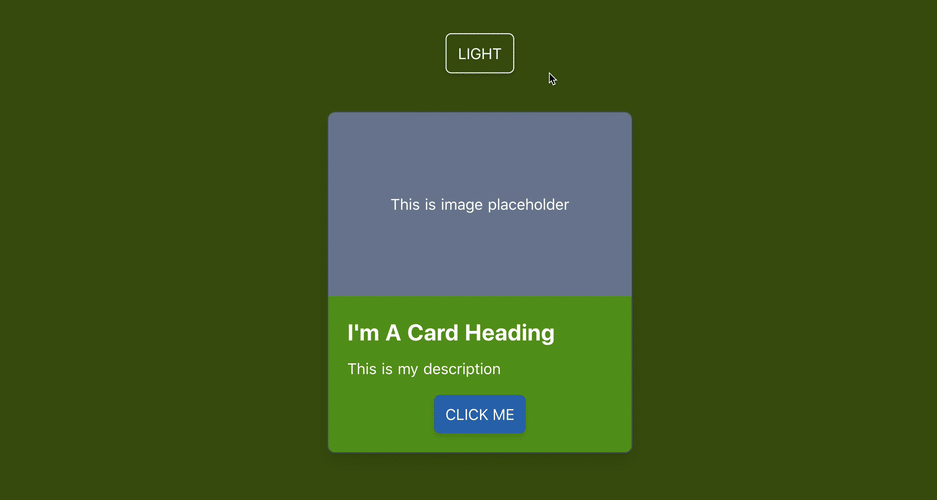
For example, suppose we want to make a simple card following the below design:
例如,假设我们要按照以下设计制作一张简单的卡片:
We first define the card template:
我们首先定义卡片模板:
With the base styles, which are consistent in both modes:
基本样式在两种模式下都保持一致:
Let’s add some required styling for light mode (as our default mode), such as:
让我们为灯光模式(作为我们的默认模式)添加一些必需的样式,例如:
border-whiteandbg-green-limeto the card wrapperdiv.cardborder-white和border-whitebg-green-lime到卡片包装纸div.cardbg-gray-300to the image placeholderdiv.placeholderbg-gray-300到图像占位符div.placeholderbg-blue-300andhover:bg-blue-500for hover state to the card's main buttonbutton.card-btnbg-blue-300和hover:bg-blue-500用于将状态停留在卡的主按钮上button.card-btn
And the corresponding classes for dark mode, starting with dark::
而对于暗模式对应的类别,从dark: :
dark:border-gray-700anddark:bg-greentodiv.carddark:border-gray-700,dark:bg-green,dark:bg-green至div.carddark:bg-gray-600todiv.placeholderdark:bg-gray-600至div.placeholderdark:bg-blue-700and hover statedark-hover:bg-blue-300tobutton.card-btndark:bg-blue-700和悬停状态dark-hover:bg-blue-300到button.card-btn
The result is:
结果是:
We can apply the same approach to style our entire app at the minimum effort needed for theming. Less code to write — isn’t that awesome?
我们可以采用相同的方法以最小的主题化样式来设计整个应用程序。 更少的代码编写-太棒了吗?
Important note: The class dark-mode is assigned programmatically on runtime and does not appear manually as a class value for any component in our code. Hence PurgeCSS will remove all the generated stylings and classes related to it on bundling, as it understands wrongly that this is an unused CSS selector. To prevent this specific behavior, we need to add dark-mode to the list of whitelist selectors for purgeCSS we'd like PurgeCSS to include in nuxt.config.js.
重要说明:类dark-mode是在运行时以编程dark-mode分配的,因此不会手动显示为代码中任何组件的类值。 因此,PurgeCSS将在捆绑时删除所有与之相关的样式和类,因为它错误地理解这是一个未使用CSS选择器。 为了防止这种特定行为,我们需要将dark-mode添加到purgeCSS的whitelist选择器列表中,我们希望PurgeCSS包含在nuxt.config.js 。
/* ~/nuxt.config.js */module.exports = {
 purgeCSS: {
  whitelist: ['dark-mode']
 }
}
So far, so good?
到目前为止,一切都很好?
Next, we are going to see how we can structure our theming configuration in a reusable and organized way.
接下来,我们将看到如何以可重用和有组织的方式构造主题配置。
用CSS变量进行组织 (Be Organized With CSS Variables)
Exactly. Up to this point, our extended theme color palettes for our demo app are organized as below:
究竟。 至此,演示应用程序的扩展主题调色板的组织方式如下:
It’s totally fine to leave as it is. Nevertheless, these HEX color values are hardcoded and known only within tailwind.config.js. If we need to access these colors in a separate <style> section, it is impossible without copy/pasting the value. A good example is if we want to create an app background with gradients. Repeating the hardcoded color value complicates our code and makes it harder to do appropriate adjustments to the colors in the future, especially when we want to change the color palettes.
照原样离开完全可以。 但是,这些十六进制颜色值是经过硬编码的,仅在tailwind.config.js已知。 如果我们需要在单独的<style>部分中访问这些颜色,则无法不复制/粘贴该值。 一个很好的例子是我们是否要创建带有渐变的应用程序背景。 重复使用硬编码的颜色值会使我们的代码复杂化,并使将来很难对颜色进行适当的调整,尤其是当我们要更改调色板时。
That’s why CSS variables are useful.
这就是CSS变量有用的原因。
Instead of manually typing the color values to tailwind.config.js, we add a new CSS file called palettes.css located in the ~/assets/css/ directory, and we declare the color palettes as CSS variables to the :root element of the app.
无需手动在tailwind.config.js键入颜色值,而是在~/assets/css/目录中添加了一个名为palettes.css的新CSS文件,并将调色板作为CSS变量声明为的:root元素该应用程序。
Import this file in ~/assets/css/tailwind.css:
将此文件导入~/assets/css/tailwind.css :
Then replace all the hardcoded color values in tailwind.config.js with the values of defined CSS variables accordingly:
然后用定义CSS变量的值替换tailwind.config.js所有硬编码的颜色值:
We separate the configuration for Tailwind CSS from our color palettes, and those CSS variables are accessible throughout the app. When there is a need to change for color, we only need to make the appropriate change to this palettes.css file, limiting the chance of bugs and keeping the code reusable.
我们将Tailwind CSS的配置与我们的调色板分开,并且这些CSS变量可在整个应用程序中访问。 当需要更改颜色时,我们只需要对此palettes.css文件进行适当的更改,就可以减少错误的机会并保持代码的可重用性。
演示版 (Demo)
The demo code is available for trying.
演示代码可供尝试。
You can also check out my portfolio site’s repo for more Tailwind CSS and Nuxt use cases.
您还可以查看我的投资组合站点的回购,以获取更多Tailwind CSS和Nuxt用例。
摘要 (Summary)
I enjoyed developing my portfolio site with Nuxt and Tailwind CSS. Writing and maintaining CSS code has never been easy, especially with the repetitive utility style (like padding, margin, etc.) and tracking down unused CSS code to remove. But Tailwind CSS helps to solve these two problems smartly.
我喜欢用Nuxt和Tailwind CSS开发我的投资组合网站。 编写和维护CSS代码从未如此简单,特别是具有重复性的实用程序样式(例如padding,margin等),并跟踪未使用CSS代码以将其删除。 但是Tailwind CSS有助于巧妙地解决这两个问题。
Dark/light mode may not be a written requirement for accessibility enhancement, but it is a huge benefit for users. Light sensitivity is becoming more common nowadays, and more large companies like Apple and Google provide dark/light mode by default. So if enabling dark/light mode brings comfort to our users and is easy to implement with Tailwind CSS and Nuxt color mode, why not apply it?
暗/亮模式可能不是增强可访问性的书面要求,但对用户而言是一个巨大的好处。 如今,光敏性变得越来越普遍,默认情况下,像Apple和Google这样的大公司也提供暗/亮模式。 因此,如果启用暗/亮模式使我们的用户感到舒适并且易于使用Tailwind CSS和Nuxt颜色模式实现,那么为什么不应用它呢?
If you haven’t known Nuxt or Tailwind CSS before, I suggest giving them a try and experimenting with their awesomeness and the power they can bring to your web development process. And if you built something with Nuxt and Tailwind CSS, share it with me in the comments.
如果您以前不了解Nuxt或Tailwind CSS,建议您尝试一下它们,并尝试它们的强大功能以及它们可以为您的Web开发流程带来的力量。 如果您使用Nuxt和Tailwind CSS构建了某些内容,请在评论中与我分享。
tailwind css


 866
866


 被折叠的 条评论
为什么被折叠?
被折叠的 条评论
为什么被折叠?
 到【灌水乐园】发言


