


choropleth
简介(我们将创建的内容): (Introduction (what we’ll create):)
GeoPandas is what you’ll be using for creating static non-interactive choropleth maps for any region of your choice, as long as you have the shape-file for that region. You can get an idea of what all is possible with GeoPandas from the video below. We will be making this video in this tutorial.
只要您拥有该区域的形状文件,便可以使用GeoPandas为您选择的任何区域创建静态的非交互式的十字形图。 您可以从下面的视频中了解GeoPandas的所有功能。 我们将在本教程中制作此视频。
本教程的结构: (Structure of the tutorial:)
The tutorial is structured into the following sections:
本教程分为以下几节:
先决条件: (Pre-requisites:)
This tutorial assumes that you are familiar with python and that you have python downloaded and installed in your machine. If you are not familiar with python but have some experience of programming in some other languages, you may still be able to follow this post, depending on your proficiency.
本教程假定您熟悉python,并且已在计算机中下载并安装了python。 如果您不熟悉python,但有一些使用其他语言进行编程的经验,则根据您的熟练程度,仍然可以继续阅读此文章。
安装GeoPandas: (Installing GeoPandas:)
If you are using Anaconda,
如果您正在使用Anaconda,
conda install geopandasIf you aren’t using Anaconda, you need to ensure that the required dependencies are installed, before using the pip installer. The following dependencies are required by GeoPandas:
如果您不使用Anaconda,则在使用pip安装程序之前,需要确保已安装必需的依赖项。 GeoPandas需要以下依赖项:
pandas (version 0.23.4 or later)
pandas (0.23.4版或更高版本)
Once you have these dependencies, you can go ahead with the pip install
一旦有了这些依赖性,就可以继续进行pip安装
pip install geopandasFor more information related to installation, refer to https://geopandas.org/install.html
有关与安装有关的更多信息,请参阅https://geopandas.org/install.html
有关Shapefile的所有信息: (All about Shapefiles:)
A shapefile, as the name suggests, stores the information that can describe a shape. The shape can be a point, a line, or a polygon. The shapefiles that we will use in this series of tutorials will represent the geographical boundaries of states/districts of India. There can be more detailed shapefiles containing, taluka or ward level shapes, or more broad shapefiles, containing country or continent level shapes.
顾名思义,shapefile存储可以描述形状的信息。 形状可以是点,线或多边形。 我们将在本系列教程中使用的shapefile代表印度各州/地区的地理边界。 可以有更详细的shapefile,其中包含taluka或ward级形状,或者更宽泛的shapefile,其中包含国家或大陆级形状。
下载shapefile: (Downloading shapefiles:)
There are several sources from where you can get the desired shapefiles. Some of them are listed below:
有几个来源可以从中获取所需的shapefile。 下面列出了其中一些:
For this and other tutorials requiring shapefiles, we have provided the state and district level shapefiles for India (as per the latest map of India, 2020) in the shape_files folder in the helper repo.
对于本教程和其他需要shapefile的教程,我们在helper repo的shape_files文件夹中提供了印度的州和区级shapefile(根据最新的2020年印度地图)。
构成shapefiles文件夹的文件: (Files constituting the shapefiles folder:)
When you download a shapefile from any source, you will see that there are a lot of files with different extensions in the downloaded folder. Of these, 3 are mandatory and others are optional. The mandatory file extensions are:
从任何来源下载shapefile时,都会看到在下载的文件夹中有许多扩展名不同的文件。 其中,3是强制性的,其他是可选的。 必需的文件扩展名是:
- .shp file — contains the feature geometries (coordinates describing the shape) .shp文件-包含要素几何(描述形状的坐标)
- .dbf file — contains additional attributes of the shape (like name, type, etc.) in dBase format .dbf文件-包含dBase格式的形状的其他属性(例如名称,类型等)
- .shx file — contains index of the feature geometry, allowing a processor to search forward and backward quickly .shx文件-包含要素几何的索引,允许处理器快速向前和向后搜索
You may find several other files present in the downloaded folder. You can get a detailed interpretation of all the extensions here. We will only require the mandatory .shp, .dbf and the .shx files.
您可能会在下载的文件夹中找到其他几个文件。 您可以在此处获得所有扩展的详细说明。 我们只需要必需的.shp,.dbf和.shx文件。
教程入门 (Getting started with the tutorial)
GitHub repo: https://github.com/carnot-technologies/MapVisualizations
GitHub回购: https : //github.com/carnot-technologies/MapVisualizations
Relevant notebook: GeoPandasDemo.ipynb
相关笔记本: GeoPandasDemo.ipynb
View notebook on NBViewer: Click Here
在NBViewer上查看笔记本: 单击此处
导入相关软件包: (Importing relevant packages:)
import numpy as np
import pandas as pd
import shapefile as shp
import matplotlib.pyplot as plt
import seaborn as sns
from datetime import datetime, timedelta
import geopandas as gpd
打开和可视化Shapefile: (Opening and Visualizing the Shapefiles:)
# set the filepath
fp = "shape_files\\India_Districts_2020\\India_Districts.shp"#read the file stored in variable fp
map_df = gpd.read_file(fp)# check data type so we can see that this is a GEOdataframe
map_df.head()
As you can see, this dataframe contains the geometries of the various shapes as well as the various attributes, like district and state names. Here you can try a few experiments to understand why all the three mandatory extensions are required. If you delete the .shx files from the folder, python will throw up an error. If you delete the .dbf file from the folder, python will load a dataframe containing just the shape polygons, and no attribute information. You will not be able to make out which shape belongs to which district.
如您所见,此数据框包含各种形状的几何图形以及各种属性,例如地区和州名称。 在这里,您可以尝试一些实验,以了解为什么需要全部三个强制扩展。 如果您从文件夹中删除.shx文件,python将抛出错误。 如果从文件夹中删除.dbf文件,则python将加载仅包含形状多边形而没有属性信息的数据框。 您将无法确定哪个形状属于哪个区域。

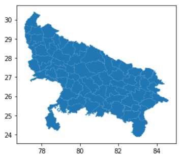
Now, we are interested only in the districts of the Uttar Pradesh (UP) state. Therefore, we will filter the geopandas dataframe, just like we filter a normal dataframe
现在,我们仅对北方邦(UP)州的地区感兴趣。 因此,我们将过滤geopandas数据框,就像我们过滤普通数据框一样
#Isolate the UP districts
map_df_up = map_df[map_df['stname'] == 'UTTAR PRADESH']#Check the resulting UP Plot
map_df_up.plot()
As you can see, from the output plot, we’ve isolated the UP districts. This is a really cool feature of geopandas, you can plot all the shapes contained in the dataframe just by calling .plot().
如您所见,在输出图中,我们隔离了UP区。 这是geopandas的一个非常酷的功能,您只需调用.plot()就可以绘制数据框中包含的所有形状。
加载数据并理解它: (Loading the data and making sense of it:)
The UP_dummy_data.csv in the ‘data’ folder contains the relevant data for this tutorial.
“数据”文件夹中的UP_dummy_data.csv包含本教程的相关数据。
#Get the data CSV file
df = pd.read_csv('data\\UP_dummy_data.csv')
df.head()
As you can see, it has some dummy data related to tractor installations. It contains the tractor model, installation date as well as the installation district. By seeing the video preview of what we are going to create, you would’ve realized that we are interested only in the installation date and district.
如您所见,它具有一些与拖拉机安装相关的虚拟数据。 它包含拖拉机型号,安装日期以及安装区域。 通过查看我们将要创建的内容的视频预览,您将意识到我们仅对安装日期和地区感兴趣。
创建独立的可视化文件: (Creating a stand-alone visualization:)
For now, let’s sideline the installation date field and only look at the aggregate count for each district and try to visualize it.
现在,让我们在安装日期字段旁,仅查看每个区域的合计计数并尝试对其进行可视化。
#Get district wise installation count
df_district = df['installation_district'].value_counts().to_frame()
df_district.reset_index(inplace=True)
df_district.columns = ['district','count']
df_district.head()
Let’s merge this dataframe with the geopandas dataframe
让我们将此数据框与geopandas数据框合并
#Merge the districts df with the geopandas df
merged = map_df_up.set_index('dtname').join(df_district.set_index('district'))
merged.head()
Here, we are setting the district columns as the index in both the geopandas as well as the data dataframes, so that we can get the count of installations against each district in the merged dataframe.
在这里,我们将地区列设置为在地理熊猫和数据数据框中的索引,以便我们可以在合并的数据框中获得针对每个地区的安装数量。
Now let’s just fill the NaN values and generate the plot.
现在,让我们填充NaN值并生成图。
#Fill NA values
merged['count'].fillna(0,inplace=True)
#Get max count
max_installs = merged['count'].max()#Generate the choropleth map
fig, ax = plt.subplots(1, figsize=(20, 12))
merged.plot(column='count', cmap='Blues', linewidth=0.8, ax=ax, edgecolor='0.8')# remove the axis
ax.axis('off')# add a title
ax.set_title('District-wise Dummy Data', fontdict={'fontsize': '25', 'fontweight' : '3'})# Create colorbar as a legend
sm = plt.cm.ScalarMappable(cmap='Blues', norm=plt.Normalize(vmin=0, vmax=max_installs))# add the colorbar to the figure
cbar = fig.colorbar(sm)
There we go. We have our first geopandas visualization ready!
好了 我们已经准备好了第一个Geopandas可视化!

Here, by setting column = ‘count’ in the .plot() arguments, we told geopandas to use the ‘count’ column to decide the color of each individual district. We used the ‘Blues’ colormap for this visualization. You can use the color map of your choice out of the several available options listed here.
在这里,通过在.plot()参数中设置column ='count',我们告诉geopandas使用'count'列来确定每个区域的颜色。 我们使用“蓝调”颜色图进行此可视化。 您可以从此处列出的几个可用选项中使用您选择的颜色图。
创建按日期排列的图像: (Creating date-wise images:)
First, we’ll modify the ‘Installed On’ field to remove the time and convert the resulting column type to datetime.
首先,我们将修改“ Installed On”字段,以删除时间并将生成的列类型转换为datetime。
df['Installed On'] = df['Installed On'].apply(lambda x: x.split('T')[0])
df['Installed On'] = pd.to_datetime(df['Installed On'],format="%Y-%m-%d")
Now, we will essentially generate progressively increasing ‘slices’ of the dataframe we used for the standalone visualization. If the standalone visualization contains data for 110 days, our first visualization will contain data for one day, the second will contains data for two days, and the 110th visualization will contain data for all 110 days. At any point, the visualization will narrate the cumulative story up to that point.
现在,我们将基本上生成用于独立可视化的数据框的逐渐增加的“切片”。 如果独立的可视化包含110天的数据,则我们的第一个可视化将包含一天的数据,第二个可视化将包含两天的数据,而第110个可视化将包含所有110天的数据。 可视化将在任何时候叙述到目前为止的累积故事。
date_min = df['Installed On'].min()
n_days = df['Installed On'].nunique()fig, ax = plt.subplots(1, figsize=(20, 12))for i in range(0,n_days):
    date = date_min+timedelta(days=i)

    #Get cumulative df till that date
    df_c = df[df['Installed On'] <= date]

    #Generate the temporary df
    df_t = df_c['installation_district'].value_counts().to_frame()
    df_t.reset_index(inplace=True)
    df_t.columns = ['dist','count']

    #Get the merged df
    df_m= map_df_up.set_index('dtname').join(df_t.set_index('dist'))
    df_m['count'].fillna(0,inplace=True)
    fig, ax = plt.subplots(1, figsize=(20, 12))
    df_m.plot(column='count',
                cmap='Blues', linewidth=0.8, ax=ax, edgecolor='0.8')

    # remove the axis
    ax.axis('off')
    # add a title
    ax.set_title('District-wise Dummy Data',
                 fontdict={'fontsize': '25', 'fontweight' : '3'})

    # Create colorbar as a legend
    sm = plt.cm.ScalarMappable(cmap='Blues',
            norm=plt.Normalize(vmin=0, vmax=df_t['count'].iloc[0]))
    # add the colorbar to the figure
    cbar = fig.colorbar(sm)
    fontsize = 36

    # Positions for the date
    date_x = 82
    date_y = 29    ax.text(date_x, date_y,
            f"{date.strftime('%b %d, %Y')}",
            color='black',
            fontsize=fontsize)    fig.savefig(f"frames_gpd/frame_{i:03d}.png",
                dpi=100, bbox_inches='tight')
    plt.close()
拼接图像以形成视频: (Stitching the images to form a video:)
Just like in the Cartopy tutorial, we will now stitch the images to form the time-lapse video. For that open your terminal or command prompt, navigate to the frames_gpd folder and run the following command:
就像在Cartopy教程中一样,我们现在将图像拼接起来以形成延时视频。 为此,请打开终端或命令提示符,导航至frames_gpd文件夹并运行以下命令:
ffmpeg -framerate 5 -i frame_%3d.png -c:v h264 -r 30 -s 1920x1080 ./district_video.mp4Our frame rate is 5 frames per second. Our files are named as frame_001.png, frame_002.png, and so on. Therefore, we are asking ffmpeg to look for 3 digits after frame_ by using the command frame_%3d.png. The resolution is specified as 1920x1080 and the name of the video is district_video.mp4.
我们的帧速率是每秒5帧。 我们的文件名为frame_001.png,frame_002.png,依此类推。 因此,我们要求ffmpeg使用命令frame_%3d.png在frame_之后寻找3位数字。 分辨率指定为1920x1080,视频名称为district_video.mp4。
To know more about the different options related to video-encoding using ffmpeg, you can visit https://trac.ffmpeg.org/wiki/Slideshow
要了解有关使用ffmpeg进行视频编码的不同选项的更多信息,请访问https://trac.ffmpeg.org/wiki/Slideshow
何时使用此库: (When to use this library:)
Just like Cartopy, this library should be used when creating static, non-interactive choropleth maps for use in presentations or for hosting on the website. However, if you wish to have an interactive visualization with the ability to zoom, pan, hover, and click, you need to switch to a library like plotly. Also, geopandas comes in handy when you quickly want to visualize your shapefile before moving on to the actual visualization.
就像Cartopy一样,在创建静态的,非交互式的十字形地图时,应使用此库,以用于演示或在网站上托管。 但是,如果您希望具有可缩放,平移,悬停和单击的交互式可视化功能,则需要切换到诸如plotly的库。 此外,当您希望在继续实际可视化之前快速可视化shapefile时,可以使用geopandas。
We are trying to fix some broken benches in the Indian agriculture ecosystem through technology, to improve farmers’ income. If you share the same passion join us in the pursuit, or simply drop us a line on report@carnot.co.in
我们正在尝试通过技术修复印度农业生态系统中一些破烂的长凳 ,以提高农民的收入。 如果您有同样的热情,请加入我们的行列,或者直接给我们写信至report@carnot.co.in
翻译自: https://medium.com/tech-carnot/time-lapse-choropleth-map-visualization-using-geopandas-8adb77a7d14
choropleth


 1360
1360

 被折叠的 条评论
为什么被折叠?
被折叠的 条评论
为什么被折叠?
 到【灌水乐园】发言


