


log mdc
This article is also posted on the Material Design blog.
本文还发布在 Material Design博客上 。
Material Theming is a way to customize Material Components to align with your brand. A Material theme includes color, typography and shape parameters which you can adjust to get near-infinite variations of the components — all while maintaining their core anatomy and usability.
材料主题是自定义材料组件以与您的品牌保持一致的一种方法。 Material主题包含颜色 , 版式和形状参数,您可以调整它们以获取几乎无限的组件变化,同时保持其核心结构和可用性。
On Android, Material Theming can be implemented using the Material Components (MDC) library, from version 1.1.0 onwards. If you’re looking to migrate from the Design Support Library or MDC 1.0.0, take a look at our migration guide.
在Android上,可以使用材料组件(MDC)库从版本1.1.0开始实现材料主题。 如果要从Design Support Library或MDC 1.0.0进行迁移,请查看我们的迁移指南。
This article will be focusing on shape theming.
本文将重点讨论形状主题。
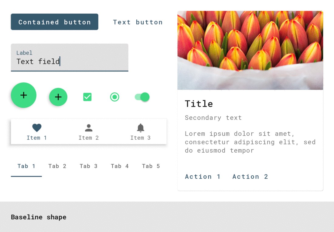
Most widgets have a background shape, but have you ever thought about the ways that shape influences user behavior? Just like color and typography, shape can guide a user’s attention, suggest interaction, and visually distinguish elements in your UI. Material’s shape theming gives you the ability to define global shape values that change the style of components across your app — for example, giving all your cards, dialogs, and menus really friendly rounded corners.
大多数小部件都有背景形状,但是您是否考虑过形状影响用户行为的方式? 就像颜色和版式一样,形状可以引导用户的注意力,建议交互并在视觉上区分UI中的元素。 Material的形状主题使您能够定义全局形状值,这些值会更改应用程序中组件的样式-例如,为所有卡,对话框和菜单提供真正友好的圆角。
形状属性 (Shape attributes)
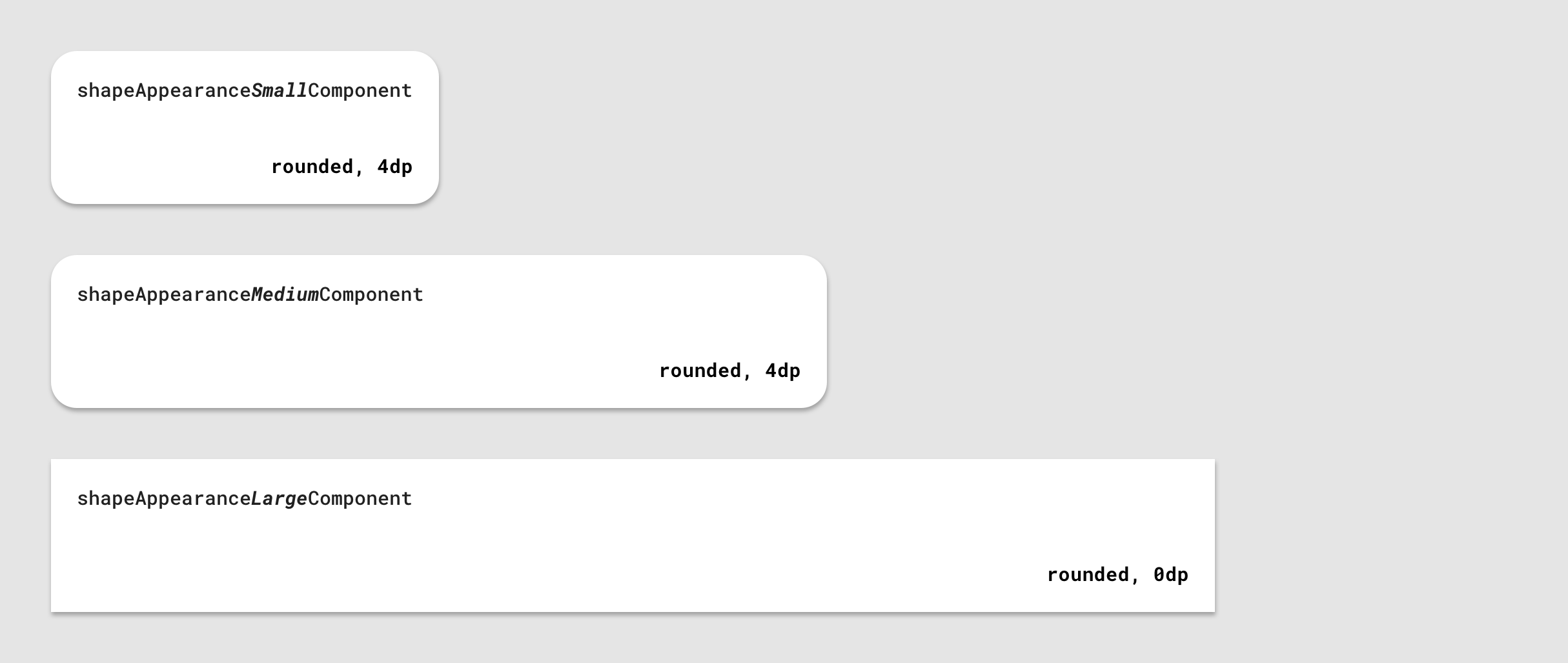
Material Design provides 3 shape “categories” that are applied to the shapeable widgets of your app. Each of these have a design term (eg. “Small components”) along with a corresponding shape attribute that can be overridden in your app theme (eg. shapeAppearanceSmallComponent). There are default “baseline” values (corner size, corner family, etc.) for each category.
Material Design提供了3种形状“类别”,这些类别适用于应用程序的可塑小部件。 其中每个都有一个设计术语(例如“小组件”)以及可以在您的应用主题中覆盖的相应形状属性(例如shapeAppearanceSmallComponent )。 每个类别都有默认的“基准”值(拐角尺寸,拐角族等)。
Material Components use these shape attributes to style backgrounds of the widgets.
材质组件使用这些形状属性来设置小部件的背景样式。
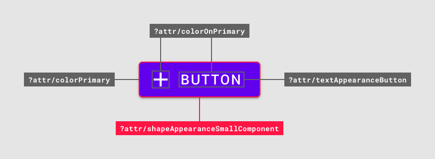
They are applied with eg.
他们被应用例如。
app:shapeAppearance=”?attr/shapeAppearanceSmallComponent”in layouts and widget styles.
在布局和小部件样式中。
In the MDC themes these attributes map to styles, eg.
在MDC主题中,这些属性映射到样式,例如。
<style name=”Theme.MaterialComponents.*” parent="...">
    ...
    <item name=”shapeAppearanceMediumComponent”>
        @style/ShapeAppearance.MaterialComponents.MediumComponent
    </item>
<style />
ShapeAppearance styles and the corresponding attributes are new to MDC. These are discussed in more detail in the Shape resources section below.
ShapeAppearance样式和相应的属性是MDC的新增功能。 这些将在下面的“ 形状资源”部分中详细讨论。
领料形状 (Picking shape)
Figuring out which shape categories to use and the values within them may be the responsibility of a designer and/or derived from your product’s brand. However, it’s still useful to know about the role of each category and in which scenarios they should be used:
弄清楚要使用的形状类别及其中的值可能是设计师的责任和/或源自您的产品品牌。 但是,了解每个类别的角色以及应在哪种情况下使用它们仍然很有用:
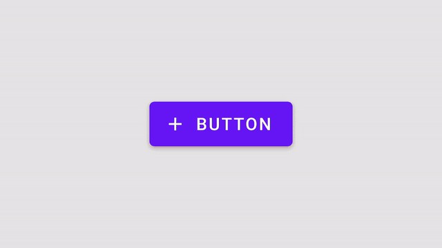
shapeAppearanceSmallComponentis for small-size components like buttons and text fieldsshapeAppearanceSmallComponent用于小型组件,例如按钮和文本字段shapeAppearanceMediumComponentis for medium-size components like cards and dialogsshapeAppearanceMediumComponent用于中等大小的组件,例如卡片和对话框shapeAppearanceLargeComponentis for large-size components like bottom sheetsshapeAppearanceLargeComponent适用于大型组件,如底页
See the shape guidelines for a complete list of mappings from component to shape categories.
有关从组件到形状类别的映射的完整列表,请参见形状准则 。
形状工具 (Shape tool)
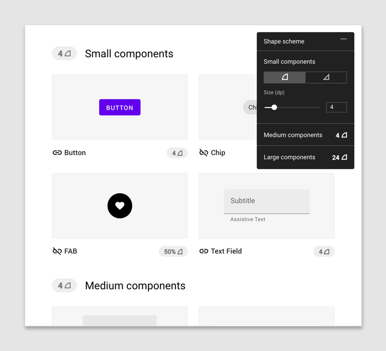
Material Design provides a useful shape customization tool for previewing shape categories and how changes apply to the corners of various components.
材质设计提供了一个有用的形状自定义工具,用于预览形状类别以及更改如何应用于各个组件的角。
塑造资源 (Shape resources)
Shape resources consist mainly of ShapeAppearance styles. These are analogous to TextAppearance styles for type theming; in this case a “style” only concerned with shape attributes. Let’s take a look at what’s available on Android vs. MDC and a few things to keep in mind when declaring styles.
形状资源主要由ShapeAppearance样式组成。 这些类似于用于类型主题化的TextAppearance样式。 在这种情况下,“样式”仅与形状属性有关。 让我们看一下Android vs. MDC上可用的功能,以及声明样式时要记住的一些注意事项。
XML形状和android:background (XML shapes and android:background)
Prior to MDC, you’d typically define a custom background in the res/drawable directory, eg.
在MDC之前,通常需要在res / drawable目录中定义自定义背景,例如。
<shape android:shape="rectangle">
    ...
    <corners android:radius="8dp" />
    <solid android:color="?attr/colorSurface" />
</shape>
which is applied to a widget like so:
应用于像这样的小部件:
<View
    ...
    android:background=”@drawable/shape_background” />
This is a simplified example. XML shape drawables can include a number of other elements, like <inset>s, <stroke>s, <gradient>s, etc. or support multiple states.
这是一个简化的示例。 XML形状可绘制对象可以包含许多其他元素,例如<inset> , <stroke> , <gradient>等等,或支持多种状态。
There are times when this approach is necessary but there are drawbacks to consider:
有时需要这种方法,但有一些缺点需要考虑:
- It lacks many of the useful features of other theming systems (like color and type); predefined attributes to specify shape at the theme level, overlays and the ability to abstract away shape values in styles 它缺少其他主题系统的许多有用功能(例如颜色和类型); 预定义的属性,用于在主题级别指定形状,叠加层以及提取样式中的形状值的功能
Material Design’s shape system supports both rounded and cut corners, but there isn’t an elegant solution to achieve cut corners in XML or programmatically
Material Design的形状系统支持圆角和切角,但是没有一种优雅的解决方案可以用XML或以编程方式实现切角
Applying complex shape treatments, such as the top edge indent on a bottom app bar, would not be possible and would require implementing a custom
Drawable无法应用复杂的形状处理(例如, 底部应用栏上的顶部边缘缩进),并且需要实现自定义
Drawable
ShapeAppearance样式 (ShapeAppearance styles)
MDC offers a new way to define shape. ShapeAppearance styles can be seen as the Android equivalent of Material Design shape categories. They give you a means of defining shape characteristics without needing to deal with drawables directly. They currently only work with MDC widgets and are backed by a new MaterialShapeDrawable class, which is discussed in more detail below.
MDC提供了一种定义形状的新方法。 ShapeAppearance样式可以看作是Android的Material Design形状类别的等效项。 它们为您提供了一种定义形状特征的方法,而无需直接处理可绘制对象。 它们当前仅与MDC小部件一起使用,并由新的MaterialShapeDrawable类提供支持,下面将对其进行详细讨论。
When defining your shape theme, we recommend two approaches to help separate concerns and create a single source of truth for shape theming values in your app:
在定义形状主题时,我们建议两种方法来帮助分离关注点并为应用中的形状主题值创建单一的事实来源:
Store all
ShapeAppearancestyles in a single res/values/shape.xml file将所有
ShapeAppearance样式存储在单个res / values / shape.xml文件中Use the MDC
ShapeAppearancestyles as parents and adhere to the same naming convention使用MDC
ShapeAppearance样式作为父项,并遵循相同的命名约定
Attributes and values you can use within these styles align with those supported by MaterialShapeDrawable:
您可以在这些样式中使用的属性和值与MaterialShapeDrawable支持的属性和值一致:
cornerFamilyis the family of all corners, eitherroundedorcutcornerFamily是rounded或cut的所有角的家庭cornerFamilyTopLeft,cornerFamilyTopRight,cornerFamilyBottomLeftandcornerFamilyBottomRightallow you to change the family of specific corners and take precedence overcornerFamilycornerFamilyTopLeft,cornerFamilyTopRight,cornerFamilyBottomLeft和cornerFamilyBottomRight允许您更改特定角落的族并优先于cornerFamilycornerSizeis the size of all corners, typically adpdimensioncornerSize是所有角的大小,通常是dp尺寸cornerSizeTopLeft,cornerSizeTopRight,cornerSizeBottomLeftandcornerSizeBottomRightallow you to change the size of specific corners and take precedence overcornerSizecornerSizeTopLeft,cornerSizeTopRight,cornerSizeBottomLeft和cornerSizeBottomRight允许您更改特定角落的大小并优先于cornerSize
ShapeAppearance叠加 (ShapeAppearance overlays)
You can also define ShapeAppearance overlays which support all of the same attributes, and act similarly to theme overlays.
您还可以定义ShapeAppearance叠加层,这些叠加层支持所有相同的属性,并且行为类似于主题叠加层。
These can be applied alongside regular ShapeAppearance styles with app:shapeAppearanceOverlay to change the value of specific corner attributes. Here’s an example of a bottom sheet’s overlay, which changes the bottom corners to be flush with the screen, from the MDC source code:
这些可以与带有app:shapeAppearanceOverlay常规ShapeAppearance样式一起app:shapeAppearanceOverlay以更改特定边角属性的值。 这是底页覆盖层的示例,该覆盖层将底角从MDC源代码更改为与屏幕齐平:
Note: Some MDC widgets have overlays applied by default which you may need to consider when adjusting their shapeAppearance. Examples of this include FloatingActionButton and Chip which both set their cornerSize to 50% via an overlay.
注意: 某些MDC窗口小部件默认情况下会应用叠加层,您在调整其 shapeAppearance 时可能需要考虑这些 shapeAppearance 。 这样的示例包括 FloatingActionButton 和 Chip ,它们都 通过覆盖 将它们的 cornerSize 设置 为50%。
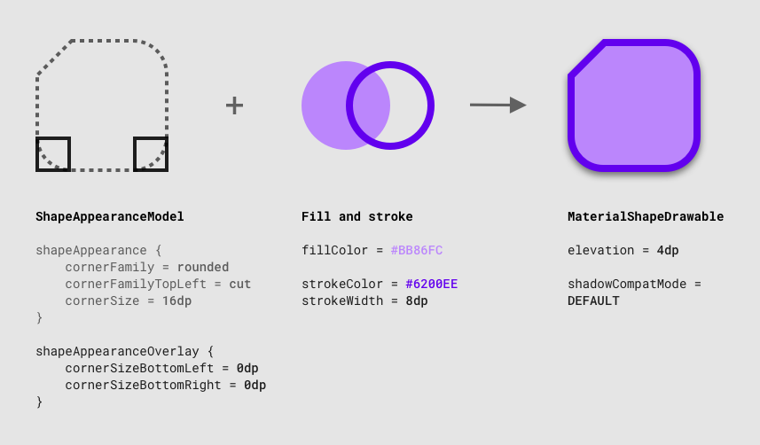
填充和描边 (Fill and stroke)
Unlike XML drawables, ShapeAppearance styles don’t include any notion of fill or stroke. MDC tends to separate concerns by specifying this separately in the main widget styles:
与XML可绘制ShapeAppearance不同, ShapeAppearance样式不包含任何填充或笔触概念。 MDC倾向于通过在主要窗口小部件样式中分别指定关注点来分离关注点:
<style name=”Widget.MaterialComponents.*” parent=”...”>
    ...
    <!-- Fill -->
    <item name=”backgroundTint”>?attr/colorSurface</item>
    <!-- Stroke -->
    <item name="strokeColor">?attr/colorOnSurface</item>
    <item name="strokeWidth">1dp</item>
    <!-- Shape -->
    <item name=”shapeAppearance”>
        ?attr/shapeAppearanceLargeComponent
    </item>
</style>
Note: ShapeAppearance styles and the backing MaterialShapeDrawable class only support solid colors for fills and strokes. There is currently no support for gradients and you would need to use XML drawables with a <gradient> in this case.
注意: ShapeAppearance 样式和背景 MaterialShapeDrawable 类仅支持填充和描边的纯色。 当前不支持渐变, 在这种情况下 ,您需要使用带有 <gradient> XML drawable 。
覆盖应用程序主题中的形状类别 (Overriding shape categories in an app theme)
Let’s take a look at how you can add your chosen shape categories to your app theme by overriding relevant attributes.
让我们看一下如何通过覆盖相关属性将所选形状类别添加到应用程序主题。
First, we recommend setting up your theme(s) to gracefully handle light and dark color palettes while reducing repetition with base themes. For more on this topic, take a look at Chris Banes’ article on dark theme as well as the “Developing Themes with Style” talk given by him and Nick Butcher.
首先,我们建议您设置主题以优雅地处理浅色和深色调色板,同时减少与基本主题的重复。 有关此主题的更多信息,请查看Chris Banes关于深色主题的文章,以及他和Nick Butcher所作的“用风格发展主题”演讲。
Once set up, override the shape attributes you wish to change in your base theme:
设置完成后,在基本主题中覆盖要更改的形状属性:
Material Design components will respond to theme-level shape overrides:
材质设计组件将响应主题级别的形状替代:
MaterialShapeDrawable (MaterialShapeDrawable)
Shape theming is powered by MaterialShapeDrawable. It’s the default background drawable for all MDC widgets and handles rendering shape. Unlike other drawables, it’s not usable in XML and needs to be handled programmatically.
形状主题由MaterialShapeDrawable 。 它是所有MDC小部件的默认背景绘制,并处理渲染形状。 与其他可绘制对象不同, 它在XML中不可用 ,需要以编程方式进行处理。
A MaterialShapeDrawable can be instantiated like so:
MaterialShapeDrawable可以像这样实例化:
ShapeAppearanceModel (ShapeAppearanceModel)
ShapeAppearanceModel is the programmatic equivalent of a ShapeAppearance style and stores data regarding families and sizes of shape corners and edges. MaterialShapeDrawable uses this class to render its shape.
ShapeAppearanceModel是ShapeAppearance样式的编程等效项,并存储有关形状角和边的族和大小的数据。 MaterialShapeDrawable使用此类来渲染其形状。
A builder pattern is used to instantiate a ShapeAppearanceModel:
构建器模式用于实例化ShapeAppearanceModel :
For a more advanced example involving edges and custom paths, see BottomAppBarCutCornersTopEdge from the MDC catalog.
有关涉及边和自定义路径的更高级的示例,请参见MDC目录中的BottomAppBarCutCornersTopEdge 。
填充和描边 (Fill and stroke)
MaterialShapeDrawable handles rendering of fill and stroke. A number of methods exist to adjust these properties:
MaterialShapeDrawable处理填充和描边的渲染。 存在许多调整这些属性的方法:
高程和叠加层 (Elevation and overlays)
MaterialShapeDrawable is responsible for rendering overlays to convey elevation in a dark theme. MDC widgets handle this by default. Here’s how this functionality is enabled and used:
MaterialShapeDrawable负责渲染叠加层以传达深色主题中的高程。 MDC小部件默认情况下会处理此问题。 启用和使用此功能的方法如下:
Take a look at the color theming article as well as Chris Banes’ article on dark theme for more information.
有关更多信息,请查看颜色主题文章以及Chris Banes的有关深色主题的文章。
阴影渲染 (Shadow rendering)
Elevation shadow rendering by the platform is only supported from API 21 onwards. MaterialShapeDrawable offers optional support to backport shadow rendering:
仅从API 21开始才支持平台的高程阴影渲染。 MaterialShapeDrawable提供了对阴影渲染的可选支持:
角点插补 (Corner interpolation)
MaterialShapeDrawable offers methods to interpolate the sizes of all corners. This is a [0.0, 1.0] multiplier on the set corner sizes and can be useful for animations and transitions.
MaterialShapeDrawable提供了插值所有角尺寸的方法。 这是设置的拐角大小的[0.0,1.0]乘数,可用于动画和转场。
MDC小部件中的形状 (Shape in MDC widgets)
Earlier we said that MDC widgets respond to overrides of theme level shape attributes. But how would you know, for example, that a button uses shapeAppearanceSmallComponent as the style for its container? Let’s take a look at a few options.
之前我们说过,MDC小部件会响应主题级别形状属性的覆盖。 但是,例如,您如何知道按钮使用shapeAppearanceSmallComponent作为其容器的样式? 让我们看一些选项。
建立物质主题 (Build a Material Theme)
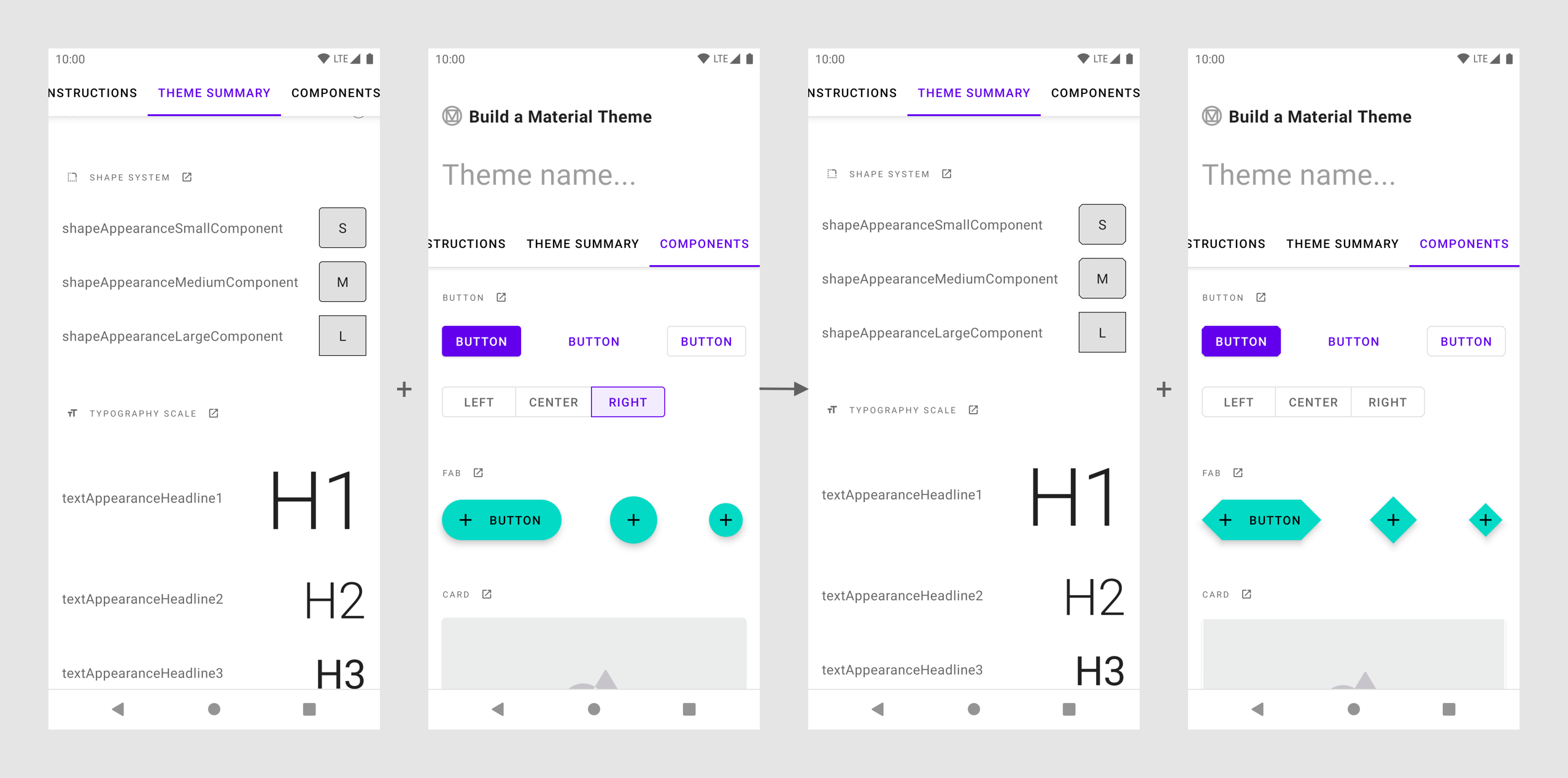
Build a Material Theme is an interactive Android project that lets you create your own Material theme by customizing values for color, typography, and shape. It also includes a catalog of all theming parameters and components. Determining which widgets respond to changes in theme type attributes can be done by:
构建材质主题是一个交互式的Android项目,可让您通过自定义颜色,版式和形状的值来创建自己的材质主题。 它还包括所有主题参数和组件的目录。 确定哪些小部件响应主题类型属性的更改可以通过以下方法完成:
Cloning the project and running the app in Android Studio
克隆项目并在Android Studio中运行应用程序
Adjusting values in res/values/shape.xml as well as res/values/themes.xml
- Observing visual changes by re-running the app 通过重新运行应用程序来观察视觉变化
MDC开发人员文档 (MDC developer docs)
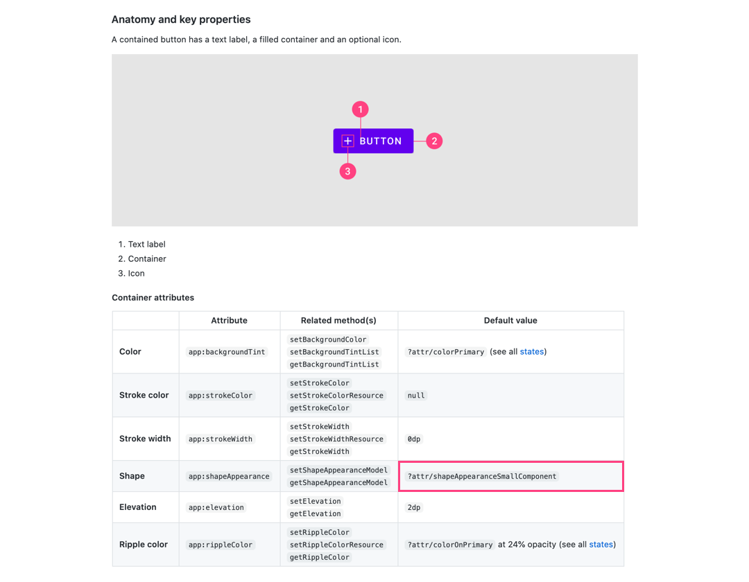
The MDC developer docs have recently been refreshed. As part of this we’ve included attribute tables which include design terminology and default values used in the library. For example, check out the “Anatomy and key properties” sections of the updated buttons doc.
MDC开发人员文档最近已刷新。 作为此过程的一部分,我们包括了属性表,这些属性表包括库中使用的设计术语和默认值。 例如,签出更新后的按钮doc的“解剖和关键属性”部分。
源代码 (Source code)
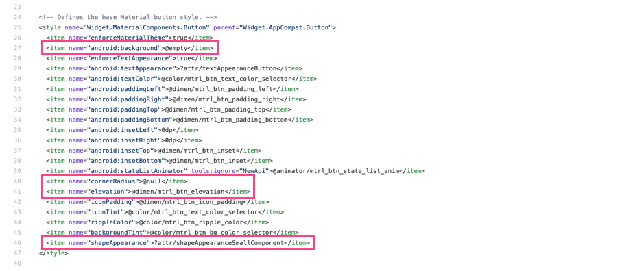
Inspecting the MDC source code is arguably the most reliable approach. MDC uses default styles to achieve Material Theming so it’s a good idea to look at these as well as any styleable attrs and the java file(s). For example, check out the styles, attrs and java file for MaterialButton.
检查MDC源代码可以说是最可靠的方法。 MDC使用默认样式来实现“材质主题”,因此最好查看这些样式以及任何可样式设置的attrs和Java文件。 例如,签出MaterialButton的样式 , 属性和Java文件 。
An interesting observation is how MDC widgets use default styles to ensure MaterialShapeDrawable is the default background. The general approach is:
一个有趣的观察是MDC窗口小部件如何使用默认样式来确保MaterialShapeDrawable是默认背景。 通用方法是:
Set
android:background(and other legacy background-related attrs) to@nullor@emptyIn the widget default style在小部件默认样式
@emptyandroid:background(和其他与背景相关的旧@null)设置为@null或@emptyIf no background is detected when parsing attributes, instantiate a
MaterialShapeDrawableprogrammatically and set this as the background如果在解析属性时未检测到背景,请以编程方式实例化
MaterialShapeDrawable并将其设置为背景If a background has been set (eg. in a layout or custom style) then respect this and do not use
MaterialShapeDrawable如果背景已设置(例如,在布局或自定义样式),那么这种尊重和不使用
MaterialShapeDrawable
自定义视图中的形状 (Shape in custom views)
Your app may include custom widgets you’ve built or gotten from an existing library. Making these views responsive to Material Theming is useful when using them alongside standard MDC widgets. Let’s take a look at what to keep in mind when supporting shape theming for custom widgets.
您的应用可能包括您从现有库中构建或获取的自定义小部件。 与标准MDC小部件一起使用时,使这些视图对“材质主题”做出响应非常有用。 让我们看一下在支持自定义小部件的形状主题设置时要记住的几点。
在<declare-styleable>使用MDC attrs和默认样式 (Use MDC attrs in <declare-styleable>s and default styles)
Allowing your custom views to be styled involves using a <declare-styleable>. Reusing attr names from MDC can be useful for consistency. Default styles that use <declare-styleable>s can also reference MDC theme shape attrs for their values while also using the @null/@empty approach for MaterialShapeDrawable backgrounds:
允许对自定义视图进行样式设置涉及使用<declare-styleable> 。 重用MDC中的attr名称对于保持一致性很有用。 使用<declare-styleable>的默认样式还可以引用MDC主题形状attrs作为其值,同时也将@null / @empty方法用于MaterialShapeDrawable背景:
注意高程和覆盖 (Keep elevation and overlays in mind)
If you want your custom view to support elevation overlays or backported shadow rendering, it’s a good idea to override the setElevation method and pass the value to the MaterialShapeDrawable background:
如果您希望自定义视图支持高程叠加或向后移植阴影渲染,则最好重写setElevation方法并将其值传递给MaterialShapeDrawable背景:
好的,谷歌,下一步是什么? (OK Google, what’s next?)
We’ve been through the process of implementing color theming in your Android app using MDC. Be sure to check out our other posts in this series on why we recommend using MDC, color theming, type theming, dark theme, and Material’s motion system.
我们已经完成了使用MDC在Android应用中实现颜色主题的过程。 请务必查看本系列中的其他文章,以了解我们为什么建议使用MDC,颜色主题,键入主题,深色主题和Material的运动系统。
As always, we encourage you to file bug reports and feature requests on GitHub. Also be sure to check out our Android companion example apps.
与往常一样,我们鼓励您在GitHub上提交错误报告和功能请求 。 另外,请务必查看我们的Android 配套示例应用程序 。
If you’ve successfully implemented shape theming or if you’re having trouble doing so, leave a comment below or reach out to us on Twitter @MaterialDesign and @AndroidDev.
如果您已成功实现形状主题设置,或者在执行形状主题设置时遇到困难,请在下面发表评论,或通过Twitter @MaterialDesign和@AndroidDev与我们联系 。
翻译自: https://medium.com/androiddevelopers/material-theming-with-mdc-shape-126c4e5cd7b4
log mdc


 扫一扫
扫一扫
 972
972

 被折叠的 条评论
为什么被折叠?
被折叠的 条评论
为什么被折叠?
 到【灌水乐园】发言


