


废话就不多说了,直接看看效果吧!
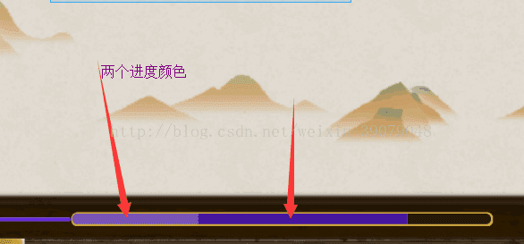
1、progress : 这个大家都非常清楚,设置进度都是用这个属性,不必多解释了(progress 图层在 secondaryProgress之上)
2、secondaryProgress:这个其实也是设置进度的属性,但是它是在Progress图层的下面。
总结:所以上面的效果,紫色渐变用的secondaryProgress属性 设置进度,白色用的是progress属性来设置。这些属性主需要在XML中配置就好。
XML代码如下:
<ProgressBar
    android:secondaryProgress="80"
    android:progress="30"
    android:id="@+id/progressBar"
    style="?android:attr/progressBarStyleHorizontal"
    android:layout_width="match_parent"
    android:layout_height="7.5dp"
    android:layout_marginRight="10dp"
    android:layout_marginTop="31dp"
    android:layout_toLeftOf="@+id/ll_right"
    android:layout_toRightOf="@+id/ll_left"
    android:background="@drawable/arena_enerey_prbg"
    android:max="100"
    android:padding="1dp"
    android:progressDrawable="@drawable/progressbar" />
<layer-list xmlns:android="http://schemas.android.com/apk/res/android">

    <!--背景-->
    <item android:id="@android:id/background">
        <shape>
            <corners android:radius="5dip" />
            <gradient
                android:angle="0"
                android:centerColor="#241809"
                android:centerY="0.75"
                android:endColor="#241809"
                android:startColor="#241809" />
        </shape>
    </item>

    <!--第二层进度颜色  PS:他在prgress进度条颜色图层之下-->
    <item android:id="@android:id/secondaryProgress">
        <clip>
            <shape>
                <corners android:radius="5dip" />
                <gradient
                    android:angle="0"
                    android:centerColor="#47179f"
                    android:centerY="0.75"
                    android:endColor="#672fad"
                    android:startColor="#47179f" />
            </shape>
        </clip>
    </item>

    <!--进度颜色  progress颜色  PS:他在secondarprgress进度条颜色图层之上-->
    <item android:id="@android:id/progress">
        <clip>
            <shape>
                <corners android:radius="5dip" />
                <!--渐变 中间、结束、开始-->
                <gradient
                    android:angle="0"
                    android:centerColor="#4fff"
                    android:endColor="#4fff"
                    android:startColor="#4fff" />
            </shape>
        </clip>
    </item>

</layer-list>


 扫一扫
扫一扫
 2925
2925

 被折叠的 条评论
为什么被折叠?
被折叠的 条评论
为什么被折叠?
 到【灌水乐园】发言


