


利用散点图探索腐败观念指数和人类发展指数之间的关系
import matplotlib.pyplot as plt
import numpy as np
import pandas as pd

from adjustText import adjust_text
from matplotlib.lines import Line2D
from sklearn.linear_model import LinearRegression
数据探索
以下数据如果有需要的同学可关注公众号HsuHeinrich,回复【数据可视化】自动获取~
corruption = pd.read_csv("https://raw.githubusercontent.com/holtzy/The-Python-Graph-Gallery/master/static/data/corruption.csv")

# 数据展示
corrupt = corruption.query("year == 2015").dropna()
corrupt.head()
country:国家的名称。
region:地区名称
year:年份
cpi:腐败感知指数,度量每个国家公共部门的腐败程度。数值范围通常在0-100之间,数值越大,表示该地区或国家公共部门的腐败程度越低。
hdi:人类发展指数,衡量每个国家在健康、教育和生活水平等方面的发展水平。HDI的范围在0-1之间,数值越大,表示人类的发展程度越高。
iso3c:是ISO 3166-1 alpha-3,是由国际标准化组织(ISO)定义的一个国家代码标准
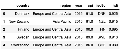
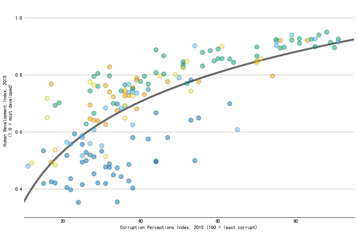
绘制基础散点图
# 设置基础信息
CPI = corrupt["cpi"].values
HDI = corrupt["hdi"].values
# 构造基本布局

# 初始画布
fig, ax = plt.subplots(figsize=(12, 8))
# 背景色
ax.scatter(CPI, HDI);
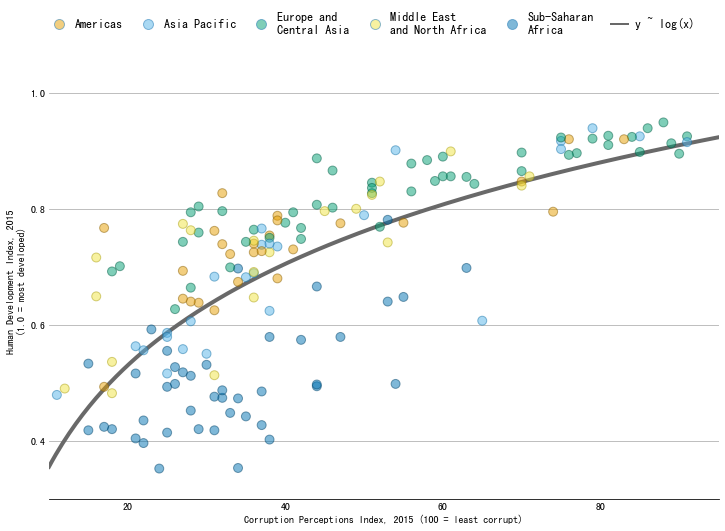
自定义标记颜色
# 自定义颜色亮度调整函数
def adjust_lightness(color, amount=0.5):
    '''
    通过调整amount的值来调整color的亮度,值越大越亮
    '''
    import matplotlib.colors as mc
    import colorsys
    try:
        c = mc.cnames[color]
    except:
        c = color
    c = colorsys.rgb_to_hls(*mc.to_rgb(c))
    return colorsys.hls_to_rgb(c[0], c[1] * amount, c[2])
# 颜色列表
REGION_COLS = ["#E69F00", "#56B4E9", "#009E73", "#F0E442", "#0072B2"]

# region字段类别化
CATEGORY_CODES = pd.Categorical(corrupt["region"]).codes

# 为每个类别分配颜色
COLORS = np.array(REGION_COLS)[CATEGORY_CODES]

# 调整颜色亮度
EDGECOLORS = [adjust_lightness(color, 0.6) for color in COLORS]
# 绘制新的散点图看看
fig, ax = plt.subplots(figsize=(12, 8));
ax.scatter(
    CPI, HDI, color=COLORS, edgecolors=EDGECOLORS,
    s=80, alpha=0.5, zorder=10
);
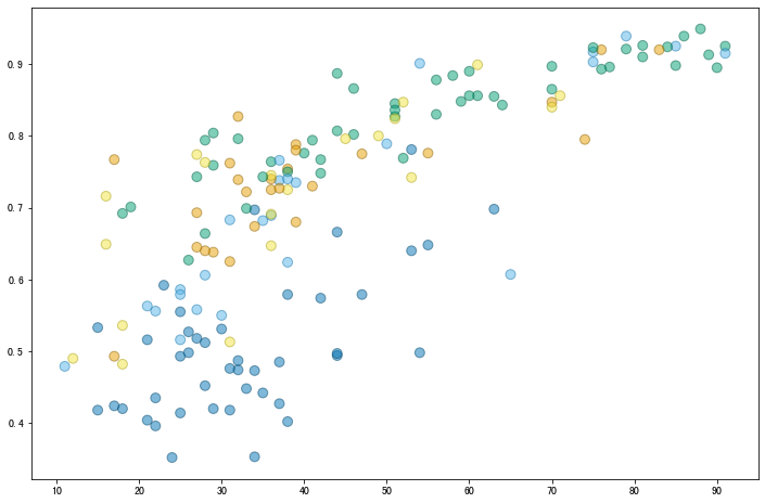
添加回归线
# x,y x需要二维数组形式
X = CPI.reshape(-1, 1)
y = HDI

# 拟合回归,x采用对数形式
linear_regressor = LinearRegression()
linear_regressor.fit(np.log(X), y)

# 计算拟合点
x_pred = np.log(np.linspace(10, 95, num=200).reshape(-1, 1))
y_pred = linear_regressor.predict(x_pred)

# 绘制拟合线
ax.plot(np.exp(x_pred), y_pred, color="#696969", lw=4)
fig
为图表增加更丰富的信息
- 基本布局
# 字体大小
plt.rcParams.update({"font.size": "16"})

# 刻度y
ax.set_ylim(0.3, 1.05)
ax.set_yticks([0.4, 0.6, 0.8, 1.0])

# 刻度x
ax.set_xlim(10, 95)
ax.set_xticks([20, 40, 60, 80])

# 删除刻度线
ax.yaxis.set_tick_params(length=0)
ax.xaxis.set_tick_params(length=0)

# y轴添加网格线
ax.grid(axis="y")

# 删除部分外边框
ax.spines["left"].set_color("none")
ax.spines["right"].set_color("none")
ax.spines["top"].set_color("none")

# 添加轴标签
ax.set_xlabel("Corruption Perceptions Index, 2015 (100 = least corrupt)")
ax.set_ylabel("Human Development Index, 2015\n(1.0 = most developed)")

fig
- 添加图例
# 图例名称
REGIONS = [
    "Americas", "Asia Pacific", "Europe and\nCentral Asia",
    "Middle East\nand North Africa", "Sub-Saharan\nAfrica"
]

# 为图例添加颜色
handles = [
    Line2D(
        [], [], label=label,
        lw=0, # there's no line added, just the marker
        marker="o", # circle marker
        markersize=10,
        markerfacecolor=REGION_COLS[idx], # marker fill color
    )
    for idx, label in enumerate(REGIONS)
]

# 单独为拟合线添加图例信息
handles += [Line2D([], [], label="y ~ log(x)", color="#696969", lw=2)]

# 添加图例
legend = fig.legend(
    handles=handles,
    bbox_to_anchor=[0.5, 0.95], # Located in the top-mid of the figure.
    fontsize=12,
    handletextpad=0.6, # Space between text and marker/line
    handlelength=1.4,
    columnspacing=1.4,
    loc="center",
    ncol=6,
    frameon=False
)

# 设置透明度
for i in range(5):
    handle = legend.legendHandles[i]
    handle.set_alpha(0.5)

fig
- 添加不重叠的标签
# 国家/地区列表
COUNTRIES = corrupt["country"].values

# 突出显示的国家/地区列表
COUNTRY_HIGHLIGHT = [
    "Germany", "Norway", "United States", "Greece", "Singapore",
    "Rwanda", "Russia", "Venezuela", "Sudan", "Iraq", "Ghana",
    "Niger", "Chad", "Kuwait", "Qatar",     "Myanmar", "Nepal",
    "Chile", "Argentina", "Japan", "China"
]

# 添加标签列表,存储指定国家的位置和名称
TEXTS = []
for idx, country in enumerate(COUNTRIES):
    # Only append selected countries
    if country in COUNTRY_HIGHLIGHT:
        x, y = CPI[idx], HDI[idx]
        TEXTS.append(ax.text(x, y, country, fontsize=12))

# 添加不重叠的标签
adjust_text(
    TEXTS,
    expand_points=(3, 3),
    arrowprops=dict(arrowstyle="-", lw=1),
    ax=ax
)

fig
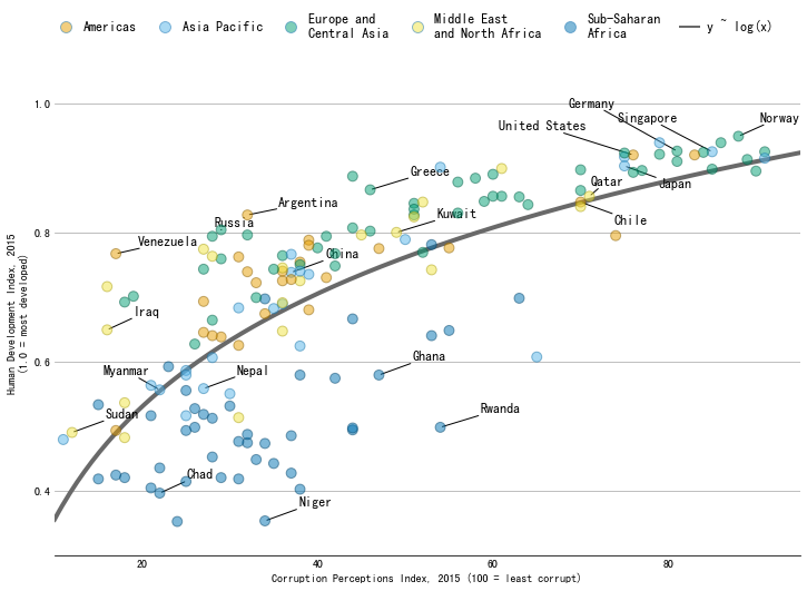
参考:Scatterplot with regression fit and auto-positioned labels in Matplotlib


 1246
1246

 被折叠的 条评论
为什么被折叠?
被折叠的 条评论
为什么被折叠?
 到【灌水乐园】发言


