


使用心冲击信号进行打鼾检测,可用于智能穿戴设备,共3大步骤:1. 探索性数据分析; 2.统计分析;3.打鼾(阻塞性睡眠呼吸暂停)检测
首先导入相关模块
import sys
import warnings
import itertools
warnings.filterwarnings("ignore")
### 数据分析相关模块
import math
from scipy import fftpack,signal
from mne.time_frequency import morlet # 创建Morlet小波

import pandas as pd
import numpy as np

###统计分析相关模块
from scipy.stats import levene, shapiro, f_oneway
from statsmodels.stats.multicomp import pairwise_tukeyhsd, MultiComparison
from statsmodels.formula.api import ols
from statsmodels.stats.anova import anova_lm

#pip install qgrid
import qgrid

# 可视化相关模块
import matplotlib.pyplot as plt
import seaborn as sns
导入数据
test1 = pd.read_csv('sample1.csv', header = None, names = ['Amplitude'])
test2 = pd.read_csv('sample2.csv', header = None, names = ['Amplitude'])
对test1.csv通道数据进行分析,首先看下波形
f, ax = plt.subplots(figsize=(20, 6))
ax.set_xlim(0,1500)
sns.lineplot(x=test1.index, y=test1.Amplitude, data=test1)
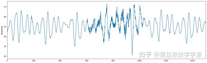
从上面的波形可以观察到,在约 3 秒和约 4 秒时显示出打鼾的迹象(1s有250个点),在打鼾期间,波峰和波谷偏离正常模式。基于以上两点,可以假设在打鼾期间,振动幅值的差异会较大。每一秒的波形都细看一下
fig, axes = plt.subplots(2,3, sharey=False, sharex=False)
fig.set_figwidth(20)
fig.set_figheight(15)
axes[0][0].plot(test1.index[0:249], test1.Amplitude[0:249], label='1st Second')
axes[0][0].plot(test1.index[0:249], test1.Amplitude[0:249].diff(), label='Differenced Seconds')
axes[0][0].legend(loc='best')
axes[0][1].plot(test1.index[250:499], test1.Amplitude[250:499], label='2nd Second')
axes[0][1].plot(test1.index[250:499], test1.Amplitude[250:499].diff(), label='Differenced Seconds')
axes[0][1].legend(loc='best')
axes[0][2].plot(test1.index[500:749], test1.Amplitude[500:749], label='3rd Second')
axes[0][2].plot(test1.index[500:749], test1.Amplitude[500:749].diff(), label='Differenced Seconds')
axes[0][2].legend(loc='best')
axes[1][0].plot(test1.index[750:999], test1.Amplitude[750:999], label='4th Second')
axes[1][0].plot(test1.index[750:999], test1.Amplitude[750:999].diff(), label='Differenced Seconds')
axes[1][0].legend(loc='best')
axes[1][1].plot(test1.index[1000:1249], test1.Amplitude[1000:1249], label='5th Second')
axes[1][1].plot(test1.index[1000:1249], test1.Amplitude[1000:1249].diff(), label='Differenced Seconds')
axes[1][1].legend(loc='best')
axes[1][2].plot(test1.index[1250:1499], test1.Amplitude[1250:1499], label='6th Second')
axes[1][2].plot(test1.index[1250:1499], test1.Amplitude[1250:1499].diff(), label='Differenced Seconds')
axes[1][2].legend(loc='best')
plt.tight_layout()
plt.show()
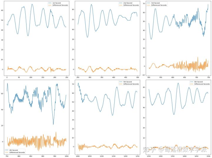
从上图可以看出,打鼾区域的差分序列的幅值波动较大,非打鼾区域的差分序列幅值波动较小。差分序列怎么算我就不多说了,然后我们在 60 秒的窗口中查看一下差分序列
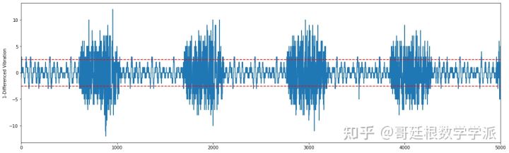
从上图可以看出,打鼾的周期性是显而易见的,差分序列的局部波形和小波的波形极其相似。
下面开始进行统计分析
test1.describe()
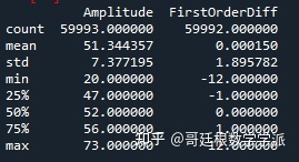
样本平均值 为 51.34 次振动/秒,样本最小值 为 20 次振动/秒,样本最大值 为73 次振动/秒。
开始进行特征工程
def create_features(df):
    """
    1. Avg_Amplitude
    2. Min_Amplitude
    3. Max_Amplitude
    4. StDev_Amplitude
    5. Seconds
    6. Minute
    """

    df2 = pd.DataFrame(data=None)
    array = df.Amplitude[0:59750].values.reshape(-1,250)
    df2['Avg_Amplitude'] = [np.mean(i) for i in array]
    df2['Min_Amplitude'] = [np.min(i) for i in array]
    df2['Max_Amplitude'] = [np.max(i) for i in array]
    df2['StDev_Amplitude'] = [np.std(i) for i in array]
    df2['Seconds'] = np.tile([int(i) for i in range(1,61)], array.shape[0])[0:array.shape[0]]
    df2['Minute'] = np.repeat([minute for minute in ['1st', '2nd', '3rd','4th']], 60)[0:array.shape[0]]
    return df2

data_for_analysis_1 = create_features(df=test1)
绘制平均幅值
plt.figure(figsize=(15, 8))
plt.plot(data_for_analysis_1['Avg_Amplitude'])
plt.xlabel('Time')
plt.ylabel('Average Amplitude')
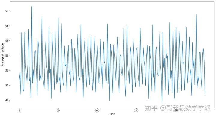
平均每秒幅值看起来没有趋势。绘制每分钟每秒的平均幅值
seconds_based_amplitude = pd.pivot_table(data_for_analysis_1, values='Avg_Amplitude',\
                                         columns='Minute', index='Seconds')
seconds_based_amplitude.plot(figsize=(25,10))
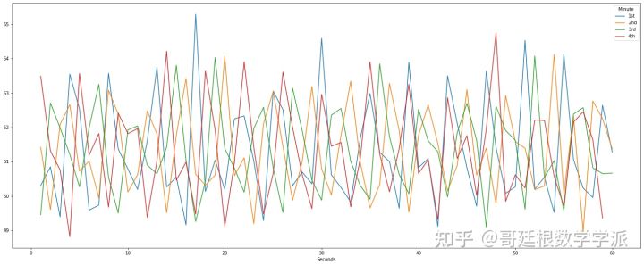
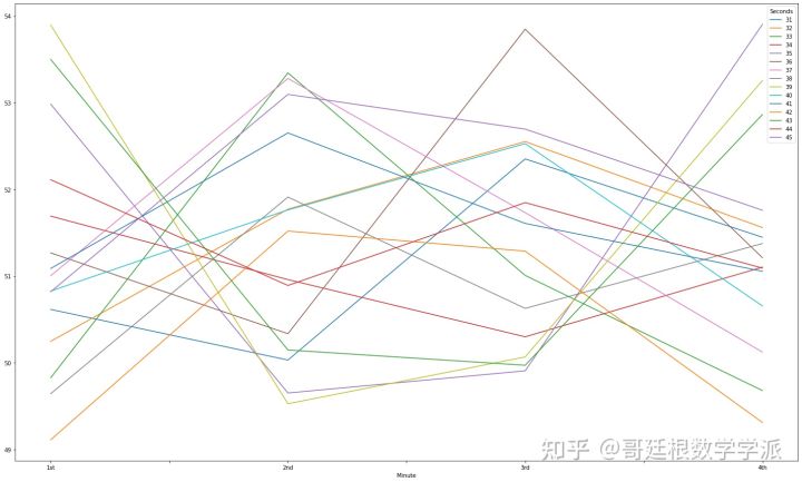
第一分钟的尖峰幅值更加明显,绘制每 15 秒间隔的平均幅值
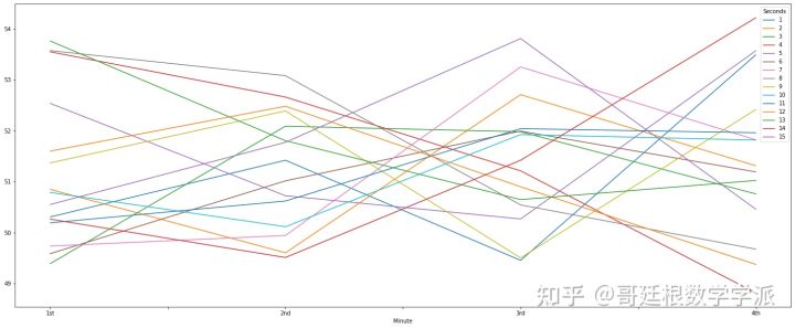
min_winse_variable = pd.pivot_table(data_for_analysis_1, values='Avg_Amplitude',\
                                         columns='Seconds', index='Minute')
#前15秒
min_winse_variable.loc[:, 1:15].plot(figsize=(25,10))
接下来的15秒
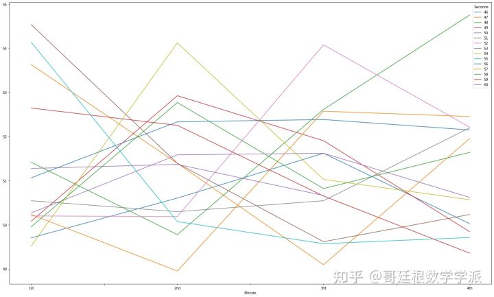
min_winse_variable.loc[:, 16:30].plot(figsize=(25,15))
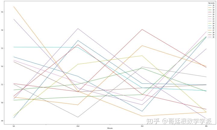
接下来15秒
min_winse_variable.loc[:, 31:45].plot(figsize=(25,15))
最后15秒
min_winse_variable.loc[:, 46:60].plot(figsize=(25,15))
综合起来
min_winse_variable.plot(figsize=(25,15))
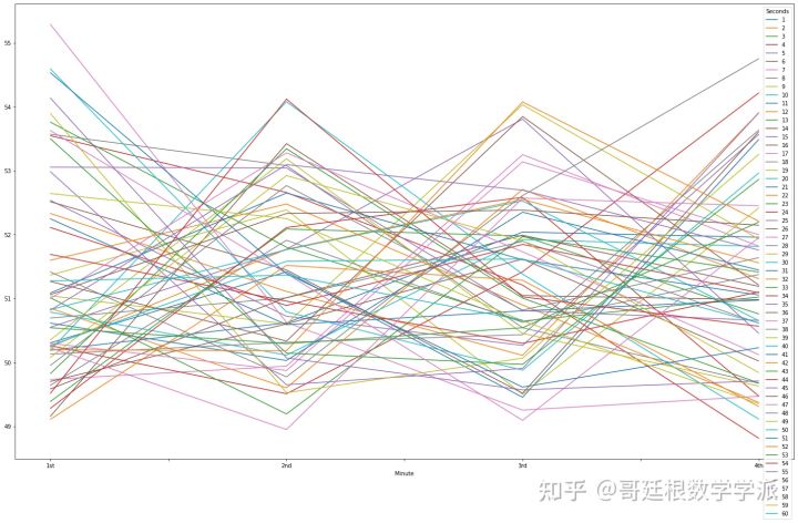
上图观察到第 1 分钟和第 4 分钟的平均幅值变化很大。基于以上繁琐的可视化分析,可以产生几个假设:每分钟平均幅值不变;每分钟平均幅值的方差是均匀的。
data_for_analysis_1['Seconds'] = data_for_analysis_1.Seconds.astype(str)
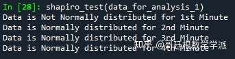
进行统计学上的Shapiro's测试以确认正态性假设
def shapiro_test(df):
    """Function to Conduct Shapiro Test.
    Ho : Data is Normally Distributed.
    Ha : Data is not normally distributed."""
    for val in np.unique(df['Minute']):
        p_val = shapiro(df.query('Minute == "{0}"'.format(val))['Avg_Amplitude'])[1]
        if p_val > 0.05:
            print('Data is Normally distributed for {0} Minute'.format(val))
        else:
            print('Data is Not Normally distributed for {0} Minute'.format(val))


shapiro_test(data_for_analysis_1)
假设每分钟的平均幅值具有相等的方差
levene_pval = levene(data_for_analysis_1.query('Minute == "1st"')['Avg_Amplitude'],\
       data_for_analysis_1.query('Minute == "2nd"')['Avg_Amplitude'],\
       data_for_analysis_1.query('Minute == "3rd"')['Avg_Amplitude'],\
       data_for_analysis_1.query('Minute == "4th"')['Avg_Amplitude'] )[1]

if levene_pval > 0.05:
    print('我们未能拒绝方差相等的零假设')

else:
    print('证据不足,无法得出方差相等的结论')
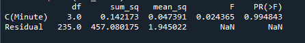
我们未能拒绝方差相等的零假设。由于满足齐次方差的条件,可以进行方差分析
anova_model = ols('Avg_Amplitude ~ C(Minute)', data=data_for_analysis_1).fit()

aov_table = anova_lm(anova_model, type=1)

print(aov_table)
我擦,统计分析是真特么复杂。
最后,开始打鼾检测流程, 定义采样频率和时间向量
sf = 250
times = np.arange(test1.Amplitude.size)/sf
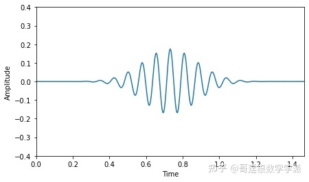
接下来,使用 Morlet 小波对信号进行卷积,至于为什么会用小波处理,也就不用我多说了吧,设置小波参数,并绘图
sf = 250
times = np.arange(test1.Amplitude.size)/sf

#参数
cf = 13     # 中心频率(Hz)
nc = 12     # 振荡次数

# 计算小波
wlt = morlet(sf, [cf], n_cycles=nc)[0]

 #绘图
t = np.arange(wlt.size) / sf
fig, ax = plt.subplots(1, 1, figsize=(7, 4))
ax.plot(t, wlt)
plt.ylim(-0.4, 0.4)
plt.xlim(t[0], t[-1])
plt.xlabel('Time')
plt.ylabel('Amplitude')
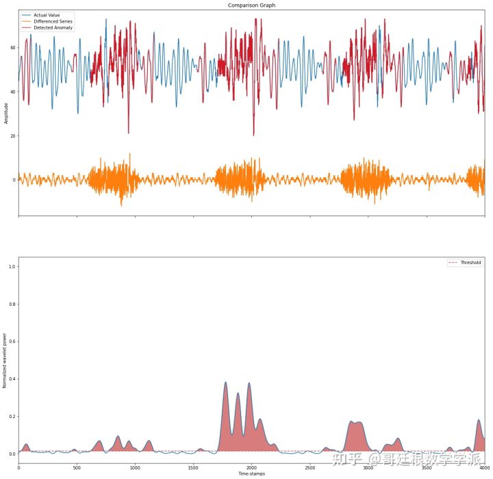
信号与小波卷积,并提取幅度和相位
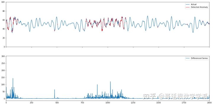
def Wavelet_Formation(df, threshold, window_1, window_2):

    df['FirstOrderDiff'] = df['Amplitude'].diff().bfill()
    analytic = np.convolve(df.FirstOrderDiff, wlt, mode='same')
    magnitude = np.abs(analytic)
    phase = np.angle(analytic)
    # Square and normalize the magnitude from 0 to 1 (using the min and max)
        # Square and normalize the magnitude from 0 to 1 (using the min and max)
    power = np.square(magnitude)
    norm_power = (power - power.min()) / (power.max() - power.min())
        # Define the threshold
    thresh = threshold
        # Find supra-threshold values
    supra_thresh = np.where(norm_power >= thresh)[0]
        # Create vector for plotting purposes
    val_spindles = np.nan * np.zeros(df.FirstOrderDiff.size)
    val_spindles[supra_thresh] = df.Amplitude[supra_thresh]
            # Plot
    fig, (ax1, ax2) = plt.subplots(2, 1, figsize=(20, 20), sharex=True)
    ax1.plot(df.index, df.Amplitude, lw=1.5, label = 'Actual Value')
    ax1.plot(df.index, df.FirstOrderDiff, lw=1.5, label= 'Differenced Series')
    ax1.plot(df.index, val_spindles, color='red', alpha=.8, label='Detected Anomaly') ## Red Region marks the detected Snoring Region.
    ax1.set_xlim(window_1, window_2)
    ax1.set_ylabel('Amplitude')
    ax1.set_title('Comparison Graph')
    ax1.legend(loc='best')

    ax2.plot(df.index,norm_power)
    ax2.set_xlabel('Time-stamps')
    ax2.set_ylabel('Normalized wavelet power')
    ax2.axhline(thresh, ls='--', color='indianred', label='Threshold')
    ax2.fill_between(df.index, norm_power, thresh, where = norm_power >= thresh,color='indianred', alpha=.8)
    plt.legend(loc='best')
查看前 4000 个时间点。
Wavelet_Formation(df=test1,threshold=0.015, window_1=0, window_2=4000)
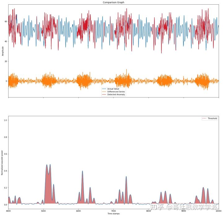
查看前 6000 个时间点。
Wavelet_Formation(df= test1,threshold=0.015, window_1=4000, window_2=10000)
基于差分项的均方误差
详细代码
知乎专栏
基于小波分析的打鼾(阻塞性睡眠呼吸暂停)检测 - 哥廷根数学学派的文章 - 知乎 https://zhuanlan.zhihu.com/p/552210480


 3310
3310


 被折叠的 条评论
为什么被折叠?
被折叠的 条评论
为什么被折叠?
 到【灌水乐园】发言


