


需求
- 图文展示一年中时间分配
- 类型频率及持续时间
tools
Python
Python 做数据分析有完整的工具链条.
往深, 可以实现 Deep Learning 的项目(Scikitlearn/Tensorflow)
往浅, 也可以实现表格(二维矩阵)的处理
本次即使用较浅的部分,处理表格(虽然只有一张, 但很长)
Pandas
数据科学最小工具链
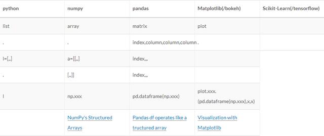
Bokeh
matplotlib 和 bokeh 选哪个?
- [Jupyter 常见可视化框架的选择]- 我希望导出 html并且可交互, 故选择 bokeh.- 内部显示的话, matplotlib也很顺手, 有时会现用它展示, 再重新用 bokeh写一次. 需求->代码实现
以需求为底, 逐步拆解到实现.
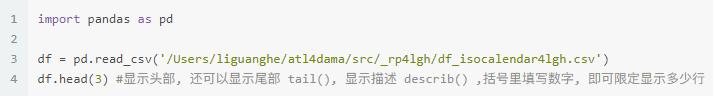
处理 .csv 格式的表格
- 导入, 并将其转化为 DataFrame(以下简称df, pandas 可以处理的数据形式. 如上表格显示, 与 list 相似,也是数据形式, 但可以被 pandas 处理. pandas.DataFrame.from_csv
- 导出也可为 .csv, 因在本项目中不需要导出表格, 故省略.
- 举例
原始数据格式如下
计算各类型每周总用时
目标: 上述列表转化成如下列表
- columns 是各类别
- index 是 week
- values 是 总用时 即每类别每周的总用时
1 df3[44:45]实现
- 增加列, 这列的内容可以根据前面各列的数据, 计算得出.
lambda
pandas.DataFrame.apply
du_start 是开始的秒数, du_end 是结束的秒数. du_time 即结束减去开始, 即持续时间.
1 df['du_time'] = df.apply(lambda x: x.du_end-x.du_start, axis=1)2 df.tail(1)- df中 某一列, 去掉重复的元素后, 有哪些, 可用来分类和计数.
计算有多少类行为, 这些行为都在 act_type 这一列中.
计算有多少周 都在 wn4y 这一列中.
1 import numpy as np2 UniqueAct = df.act_type.unique()- 按照某一列中特有的某一元素 提取行,eg:要从 df 中提取出 在 act_type 中都是 sleep 的行 重组一个矩阵. c = df[df[‘act_type’].isin([‘sleep’])在矩阵 c中提取出 在wn4y 中都是 14 的行 重组一个矩阵 c[c[‘wn4y’].isin([‘14’] 即第14周的所有 sleep 的数据.
- 某一列求和 np.sum(df).[‘columnA’], eg: np.sum((c[c[‘wn4y’].isin([week])])[‘du_time’] 及某一行为某一周的总秒数, /60/60, 可得小时.
- 使用 for in 循环, 即可将所有行为不同周的总小时数计算出来. 添加到 list l. 同时列出 list a(行为) , list w(week). 将三个列表连在一起, 形成新的矩阵. d4 = {‘act’:a, ‘week’:w,’sum’:l} pd.DataFrame(d4)
- 矩阵里的元素只取小数点后一位 .round(1)
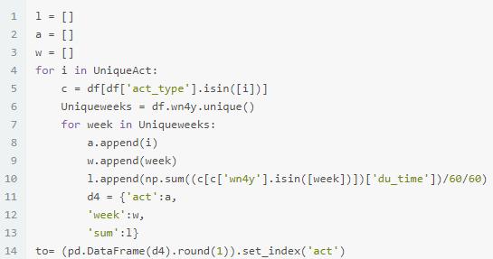
- 将某一列的内容变成 columns 另外一列的内容变成 index, 第三列的内容作为 values的方法.以’ act’作为 index, pandas 针对 index 提供检索的功能 .loc[]eg: ((pd.DataFrame(d4).round(1)).set_index(‘act’)).loc[‘sleep] 即在所有 index 中检出行为 在这个基础上, 再使用 .set_index(‘week’), 将周作为 index事先建立一个纵轴为52周的矩阵, 在这个矩阵后面添加过滤过的矩阵.
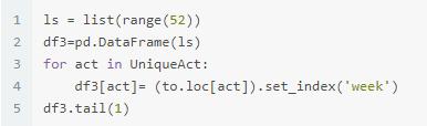
分类制表
有了按照类型分周的总用时的矩阵 df3,可根据自己的希望的分类选择类型, 组建新表. 下面是特有的类型
1 df3.columnsIndex([ 0, '05.Career', '07.social', '07.social:networking', '09.HealthFun:sport', '12.sleep:noonsleep', '04.StudyGrow:reading', '11.traffic', '04.StudyGrow:writer', '04.StudyGrow:ComputerThinking', '09.HealthFun:fun', '08.familylife:washingbeauty', '12.sleep', '08.familylife:families', '08.familylife:dinner', '08.familylife:generalAffair', '04.StudyGrow', '04.StudyGrow:law', '08.familylife:finance', '09.HealthFun', '09.HealthFun:fantasy'], dtype='object')- select data with loc Indexing and Selecting Data
- 举例, 睡眠包括午睡和晚上的睡眠
1 sl =df3.loc[:,['12.sleep','12.sleep:noonsleep']]# :指所有的index,即所有的行, ['','']是要选择的 column, 2 即列sl[44:45]下面分别为 live, healthfun, input,output 的分类表格
- 计算以上各类的总用时, 添加到 df3后面
- 将各大类的总用时再列一张表, 就是5大类总用时的表格
1 df3['Sleep'] = df3.apply(lambda x: x['12.sleep:noonsleep']+x['12.sleep'], axis=1)2 df3['Live'] = df3.apply(lambda x: x['08.familylife:washingbeauty']+x['08.familylife:families']+x['08.familylife:dinner']+x['08.familylife:generalAffair']+x['08.familylife:finance'], axis=1)3 df3['HealthFun'] = df3.apply(lambda x: x['09.HealthFun:sport']+x['09.HealthFun']+x['09.HealthFun:fantasy']+x['09.HealthFun:fun'], axis=1)4 df3['Input'] = df3.apply(lambda x: x['04.StudyGrow:reading']+x['07.social']+x['07.social:networking'], axis=1)5 df3['Output'] = df3.apply(lambda x: x [6 '04.StudyGrow:ComputerThinking']+x['04.StudyGrow:writer']+x['05.Career']+x['04.StudyGrow:law']+x[ '04.StudyGrow'], axis=1)78 ti =df3.loc[:,['Output','Input','Sleep','Live','HealthFun']]9 ti[44:45]- 计算以上各类的总用时, 添加到 df3后面
- 将各大类的总用时再列一张表, 就是5大类总用时的表格
制图
经典的Matplotlib
开篇分析了可视化框架的选择, 虽然本报告使用 bokeh, 但因 Matplotlib 是经典的 jupyter notebook 可视化框架, 这里快速展示一下, 其他可视化框架的原理都跟这差不多.
1 import matplotlib.pyplot as plt2 3 ti.plot.bar(stacked=True); #ti 是矩阵名称, .plot是制图, .bar 是制作柱状图 (stacked=True) 是说折叠的柱状图4 plt.show() #展示图片本报告使用 bokeh
主要是其可导出为 .html, 这样可直接发布到公网, 无需再另行排版或上传图片取得链接等等.
且 bokeh 与 jupyter notebook 对接良好, 图片可直接在notebook 里预览.
1 #from bokeh.io import show, output_file #生成的图片在 html网页显示2 from bokeh.io import output_notebook, show #生成的图片在 jupyter notebook 中的 .ipynb 中显示34 output_notebook()5 #output_file('/Users/liguanghe/liguanghe.github.io/source/_posts/TimeReport.html', title = 'Time Report')bokeh 也可以直接处理 矩阵, 比 matplotlib 多一步
1from bokeh.models import ColumnDataSource2 # 下文中 source3 = ColumnDataSource(ti) source1 = ColumnDataSource(op)... 等bokeh 生成图片
1 pt = figure()2 pt.vbar_stack(ti.columns, x = ti.index,width = 0.9,color=Spectral5,source = source3, 3 legend=[value(x) for x in ti.columns])4 pt.legend.location = "top_left"- 画一个空白的图 p5= figure(height=HEIGHT) ,同时可以设置这个图的长度和高度, 在括号里赋值 height 和 width…
- 这个图是折叠柱状图 .vbar_stack
- 要折叠的内容的 矩阵 ti 中 columns 里的各类. ti.columns( 几个类型)
- 横轴(x)是 矩阵 ti 中的 index (周)
- 每个bar 的宽度是0.9 width = 0.9
- bar 里的不同类要有不同颜色, 用 color 来赋值
这里需要特别注意, 有几类, 就用几个颜色
bokeh.palettes import GnBu5,Greens3,Spectral5,Oranges5,Reds4```
1 - 在[bokeh.palettes](https://bokeh.pydata.org/en/latest/docs/reference/palettes.html)可以选取颜色组合 2 - 这些组合最少三个色, 你只有两个也没关系, 可以自己设定两个颜色, 见下面代码中 ps 那张图.3 - source 就是用什么来做图.4 - legend 是给每一截bar打标签, 即在图中显示每截不同颜色的 bar 是什么. 这里也要注意, 长度和内容应该与图中实际情况一样. ```legend=[value(x) for x in ti.columns- 以上内容在Quickstart — Bokeh有介绍.
1 from bokeh.plotting import figure2 from bokeh.palettes import GnBu5,Greens3,Spectral5,Oranges5,Reds43 from bokeh.core.properties import value4 5 #WIDTH = 5006 HEIGHT = 3007 8 source3 = ColumnDataSource(ti)9 pt = figure()10 pt.vbar_stack(ti.columns, x = ti.index,width = 0.9,color=Spectral5,source = source3, 11 legend=[value(x) for x in ti.columns])12 pt.legend.location = "top_left"13 14 po = figure(height=HEIGHT)15 source1 = ColumnDataSource(op)16 po.vbar_stack(op.columns, x = op.index,width = 0.9,color=GnBu5,source = source1,17 legend=[value(x) for x in op.columns])18 po.legend.location = "top_left"1920 source2 = ColumnDataSource(ip)21 pi = figure(height=HEIGHT,)22 pi.vbar_stack(ip.columns, x = ip.index,width = 0.9,color=Greens3,source = source2, 23 legend=[value(x) for x in ip.columns])24 pi.legend.location = "top_left"2526 colors = ['#ffffcc','#FDE724' ]2728 ps = figure(height=HEIGHT)29 source4 = ColumnDataSource(sl)30 ps = figure(height=HEIGHT,)31 ps.vbar_stack(sl.columns, x = sl.index,width = 0.9,color=colors,source = source4, 32 legend=[value(x) for x in sl.columns])33 ps.legend.location = "top_left"3435 source5= ColumnDataSource(fa)36 pf = figure(height=HEIGHT,)37 pf.vbar_stack(fa.columns, x = fa.index,width = 0.9,color=Oranges5,source = source5, 38 legend=[value(x) for x in fa.columns])39 pf.legend.location = "top_left"404142 source6= ColumnDataSource(hf)43 ph = figure(height=HEIGHT,)44 ph.vbar_stack(hf.columns, x = hf.index,width = 0.9,color=Reds4,source = source6, 45 legend=[value(x) for x in hf.columns])46 ph.legend.location = "top_left"bokeh HTML 排版及插入视窗
- 前面说 bokeh 可输出漂亮的可交互的 html, 将多张图片按照你希望的格式排列在网页上. 不仅是图片, 也可以插入文字/按钮等等
- 先说插入文字/按钮等视窗
Div是可以识别 html 排版语言的小窗口, 把你想要显示的文字填在
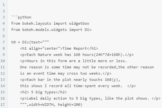
- 除了文字, 还可以填写 function, 给 variable 赋值, 即可显示对应的输出结果.
- frequency 是我编写的 function, 会在下文详解.
1 from lgh7SumFrequency import frequency2 t1 = Div(text='''Output ↑
''' 3 +frequency(cvsf,'04.StudyGrow:ComputerThinking')+'''
04.StudyGrow shows curious.
''',width=WIDTH, height=100)5 t2 = Div(text='''
Input ↑
6
Reading without output is input.
7
Meaningly social is in this part. Others belong to live:familes.
''' 8 +frequency(cvsf,'04.StudyGrow:reading'),width=WIDTH, height=100)9 t3 = Div(text='''
Sleep ↓
10
sleep < 59h
''',width=WIDTH, height=100)11 t4 = Div(text='''
Live
08.familylife:familes includes other social.
''' 11 +frequency(cvsf,'08.familylife:washingbeauty'),width=WIDTH, height=100)12 t5 = Div(text='''
HealthFun
'''+frequency(cvsf,'09.HealthFun:sport')+'''13
09.Healthfun shows curious.
09.Healthfun:fun should be down.
14 ''',width=WIDTH, height=100,)
- 排版, 可以按照坐标的方式, 即 grid, 也可以按照 row 和 column 排列, 这里选择 grid , [widgetbox(t0),none] 则会将他们排在一行, 其他的一次排下去. Laying out Plots and Widgets
1 from bokeh.layouts import gridplot3 grid = gridplot([[widgetbox(t0)],[pt],[t1], [po],[t2],[pi],[t3],[ps],[t4],[pf],[t5],[ph]]) 3 save(grid)show(grid)5 6 show(grid)即可生成 HTML, 输出成果见time report
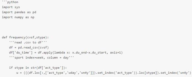
计算频率的 function
制表
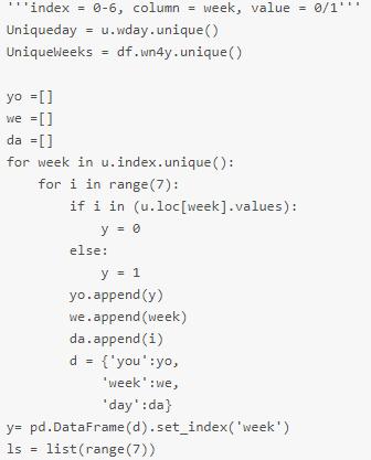
- 一个行动类型一张表
- index: 周
- column: 7天
- value: 有行动是0, 没有行动是1
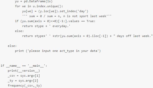
1 import pandas as pd2 import numpy as np3 #import matplotlib.pyplot as plt4 5 u = (((df.loc[:,['act_type','wday','wn4y']]).set_index('act_type')).loc['09.HealthFun:sport']).set_index('wn4y')6 yo =[]7 we=[]8 da = []9 for week in u.index.unique(): 10 for i in range(7): 11 if i in (u.loc[week].values): 12 y = 0 13 else:14 y = 1 15 yo.append(y) 16 we.append(week) 17 da.append(i) 18 d = {'you':yo, 19 'week':we, 20 'day':da} 21 y= pd.DataFrame(d).set_index('week')22 ls = list(range(7))2324 yu = pd.DataFrame(ls) 25 for we in u.index.unique(): 26 yu[we] = (y.loc[we]).set_index('day')27 (yu.T).loc[30:33]根据表格内容输出话语
- 如果 每行的总和是0, 输出: 每天都运动
- 如果 每行总和不是0, 输出: 总和 天没有运动
1 for we in u.index.unique(): 2 yu[we] = (y.loc[we]).set_index('day') 3 ''' sum = 0 / sum = n, n is not sport last week''' 4 if (yu.sum(axis = 0)<=0)[-1:].values == True: 5 return stype + ' everyday.'6 else: 7 return str(yu.sum(axis = 0).iloc[-1]) + " days didn't "+ stype +' last week.'- 转成 function,处理不同的行为
- 如果输入的不是行为列表中的元素, 则输出, 请输入你行为列表中的行为
- 调用这个函式如上文小窗口 t1,t3,t4 中的
最后,小编想说:我是一名python开发工程师,
整理了一套最新的python系统学习教程,
想要这些资料的可以关注私信小编“1或者6”即可(免费分享哦)希望能对你有所帮助.


 2153
2153


 被折叠的 条评论
为什么被折叠?
被折叠的 条评论
为什么被折叠?
 到【灌水乐园】发言


