


Introduction
I love descriptive statistics. Visualizing data and analyzing trends is one of the most exciting aspects of any data science project. But what if we don’t have proper data? Or the data we have is just not sufficient to draw conclusions?
That’s where (ethical) web scraping comes in handy. We can source all kinds of data from around the internet – tabular, images, videos, etc. We just need to know a few specific techniques to extract that data.

We’ll focus on extracting data from the NBA.com website in this article. I’m a huge basketball fan so I thought why not put my knowledge of web scraping and website creation into sports analysis?
You’ll find this article useful even if you’re not an NBA or sports fan. You will get an overall picture of how to gather, store and analyze public and unstructured data and how to go about planning and implementing a web data science project. Whether you want to learn how to do data analysis or you’re interested in sports statistics, you will enjoy the next few minutes for sure.
We’re going to focus on descriptive statistics because that’s always a key element of any data science project.
Tools you should have for this article
The tools we will work with throughout this article are:
- Python as the programming language
- MySQL to store data
- Pandas library to work with the data, and
- Chartify library (thanks to the Spotify guys) to create reports
The Approach we’ll Take in this Project
- Researching the Data Source
- Ensuring Ethical Guidelines are being Followed
- Inspecting the Website for Data Points
- Understanding the Different Data Fields
- Designing our Database
- Fetching and Filtering Data
- Analyzing Data and Generating Reports
Researching the Data Source
We’ve already seen this in the article heading! We are going to use the official NBA Stats site as a data source. I’m a regular user of that site – it contains a treasure trove of data for NBA fans (especially us data science folks). Additionally, the site is superbly formatted, which makes it ideal for scraping.
But we are not going to scrape it. Trust me, there’s an easier and better way to reach the data we’re looking for which I will describe later in the article. We need to first ensure we are not breaking any protocol.
Ensuring Ethical Guidelines are being Followed
We need to make sure that we can use the chosen website ethically as our data source. Why? Because we want to be good website citizens and don’t want to do anything that hampers or messes the website’s servers. How do we do this? Answering the below questions should help:
- Is it publicly available data? – All the data on stats.nba.com is totally available for the public.
- Robots.txt worries? (stats.nba.com/robots.txt) Sitemap: https://stats.nba.com/sitemap.xml; User-agent: * – There are no limitations. Nonetheless, be mindful with the request frequency.
- How do you plan to use the data? – Personal research and for education purposes.
We are good to go as our goals align with these ethical guidelines.
As a side note, I encourage you to answer these questions before you scrape any website. Our approach should not breach or mess up other people’s work.
Inspecting the Website
This is the part where a little knowledge about HTTP and how websites work helps you save a ton of hours. I’m not thoroughly familiar with the site we are trying to get data from, so I need to properly inspect it first to see what’s going on.
This is the starting page we get if we open stats.nba.com:
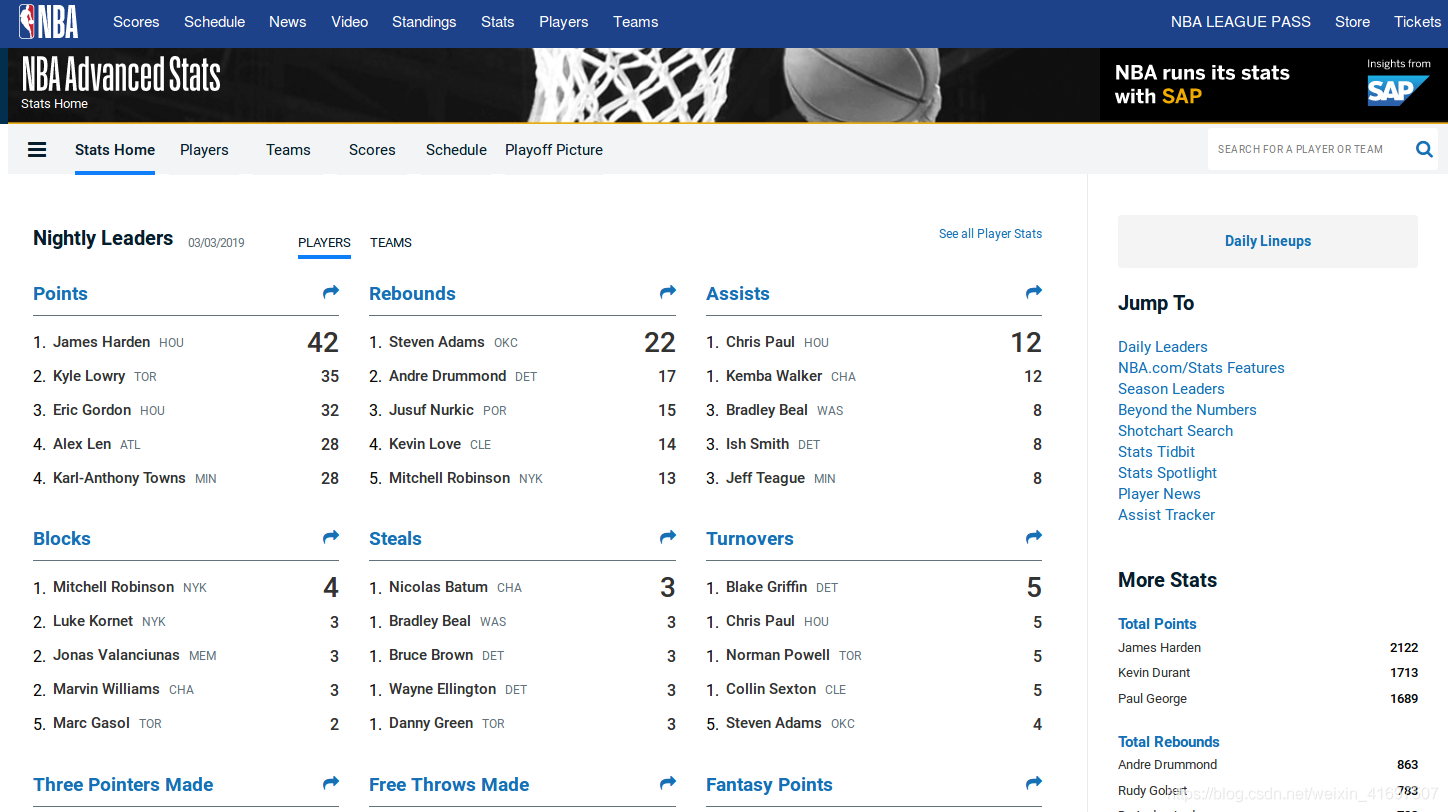
We get a lot of player stats here which we can put aside for now. We want to get data about games – not specific players or teams. Hence, we need to find a page where games and results are displayed.
Moving on to the scores page:
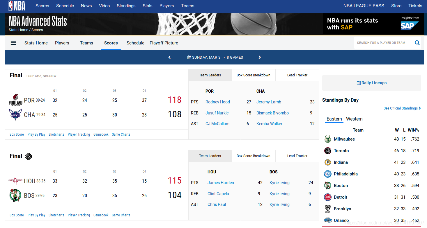
It’s getting better – here the full game results and quarter-by-quarter points are displayed. But we still do not have enough details to build a sufficient dataset. What we’re really looking for is this page:
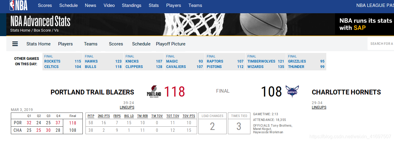
This is the game page. One game per page, in full detail. Here, we can find a bunch of different data fields. This is a good base for building our future database.
Inspecting Requests
Now that we’ve identified where we need to go, it’s time to do some real technical inspection. We’re going to figure out what happens in the background when we request this specific page. In order to do that (I’m using FireFox but should be the same or similar for other browsers):
- Press F12
- Select Network tab
- Reload the page (F5)
Now, we should see all the requests that have been made in the background:
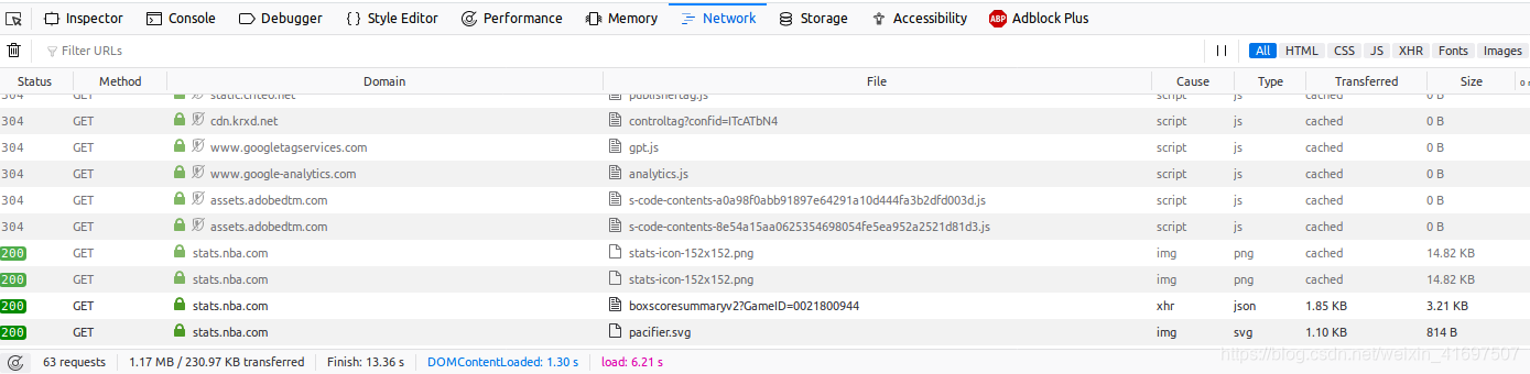
The site made close to 83 requests just displaying one page! Now, we have to filter out the ones that aren’t relevant for us and see only the “data” requests. To do that, toggle the XHR button inside the network tab on the top-right:
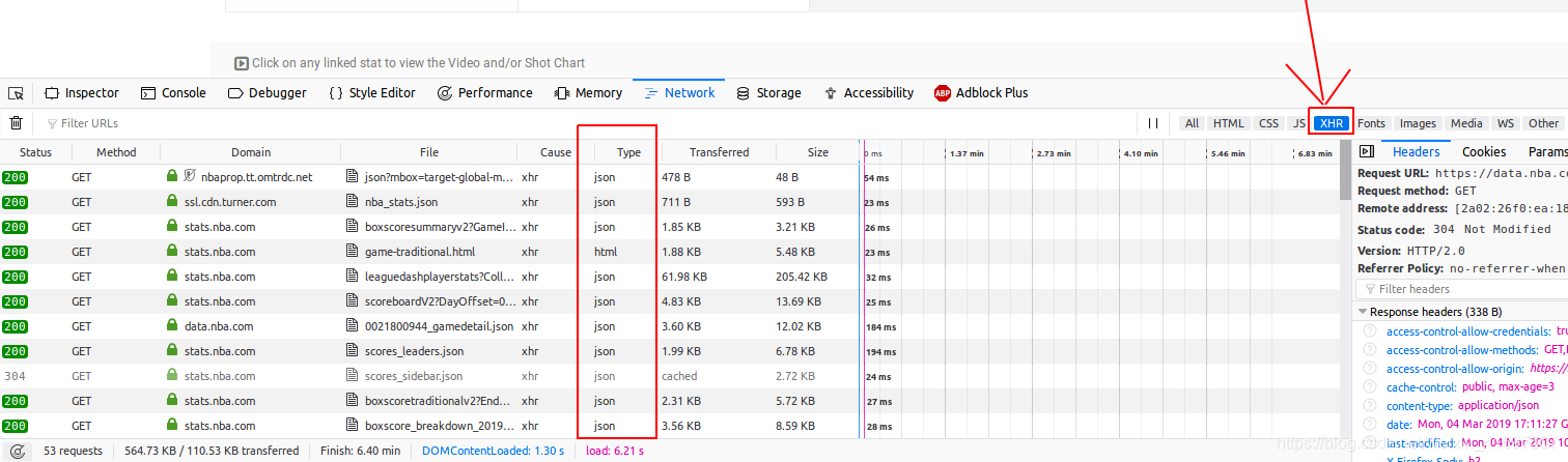
We mostly see requests that have got JSON response after toggling the XHR button. That’s good for us because JSON is a popular format to transfer data from the backend to the frontend. There’s a high chance we’ll find our data inside one of these JSON responses.
Going through some of the JSON endpoints, I found the one which contains the kind of data we are after.
This URL returns a JSON which contains all the data points about a game. That’s why I said earlier that properly inspecting a website before writing a web scraper can save you a ton of hours. There’s already an API we can use so we don’t need to do web scraping to collect data.
Now, the URL request needs one parameter – GameID. Note that each game has a unique GameID. So we have to find a way to collect these Game IDs as well.
Earlier, we were looking at the scores page. This page has each game and a unique GameID for the given day. One possible solution, which we will implement, is to iterate over each day (from the scores pages), collect all GameIDs and then insert these IDs into a database.
We will go through these GameIDs and parse JSONs containing game details. Now figure out what data fields we want to collect from the JSON:
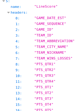
Understanding the Different Data Fields
A basketball game has many kinds of data. This data is about teams, points, players, etc. – there are so many numbers and stats we could collect, it’s mind-blowing! We will narrow our scope to some specific fields for this project:
- GameId: This is not crucial for analysis but database-wise it will be useful to have this information
- GameDate: So we can group by date and get insight from a given gameday. Also for historical analysis
- AwayTeam: Name of the away team
- HomeTeam: Name of the home team
- AwayPts → (Q1, Q2, Q3, Q4): Points scored by the away team. We will create separate fields for quarterly points
- HomePts → (Q1, Q2, Q3, Q4): Points scored by the home team. Separate fields for quarterly points
- Referees → (Referee1, Referee2, Referee3): Each game as three referees. We’re going to store their names separately
- TimesTied: Number of times when both teams had the same score during the game
- LeadChanges: Number of times when the lead changed from one team to the other
- LastMeetingWinner: Winner of the last meeting of the two teams
- Winner: The winning team’s name
Designing our Database
One record stores data about one game.
Generally, when designing a database, the tables and their normalization always depends on the kind of insights we want to gain from the project. For example, you could calculate the winner by looking at the points scored by both teams. Whichever team’s got more points is the winner. But in our case, I’m creating a separate column for the winner. Because I feel like it’s not gonna be a problem for us to have a somewhat redundant field, like this, stored.
With that said, I don’t create a separate column for the points a team scored in the whole game. I just store the quarterly points by both teams. If we will need to know this data we’ll need to always sum up the quarterly points by one team. I think that’s not a big sacrifice considering that this way we can analyze specifically the quarters of each game.
Fetching and Filtering the Data
We will follow the below steps for fetching and filtering our data:
- Iterating over the score pages
- Collecting GameIDs and storing them
- Iterating over game data responses and parsing JSON
- Saving the specified fields into a database
- Cleaning the data
Let’s understand each step in a bit more detail.`
1. Iterating over the score pages
Inspecting even one score page gives us a hint that this page uses a JSON file to get data as well. An example URL of this kind of request:
https://stats.nba.com/stats/scoreboardV2?DayOffset=0&LeagueID=00&gameDate=03/03/2019
Again, rather than scraping data from the page, we use this endpoint to get GameIDs.
url = "https://stats.nba.com/stats/scoreboardV2?DayOffset=0&LeagueID=00&gameDate=03/03/2019"
requests.get(url, headers=self.headers)
2. Collecting GameIds and storing them
We collect GameIDs from the JSON:
games = data["resultSets"][0]["rowSet"]
for i in range(0, len(games)):
   game_id = games[i][2]
   game_ids.append(game_id)
In this code, data is the parsed JSON we requested in the previous step. We’re collecting the GameIDs in a list called game_ids.
Storing this in a database:
with self.conn.cursor() as cursor:
   query = "INSERT INTO Games (GameId) VALUES (%s)"
   params = [(id, ) for id in game_ids]
   cursor.executemany(query, params)
   self.conn.commit()
3. Iterating over game data responses and parsing JSON
In this step, we’re using the previously collected GameIDs:
def fetch_game_ids(self):
   with self.conn.cursor() as cursor:
       query = "SELECT GameId FROM Games"
       cursor.execute(query)
       return [r[0] for r in cursor.fetchall()]

def make_game_request(self, game_id):
   sleep(1)  # seconds
   url = "https://stats.nba.com/stats/boxscoresummaryv2?GameID={game_id}".format(game_id=str(game_id))
   return requests.get(url, headers=self.headers)

def game_details(self):
   game_ids = self.fetch_game_ids()
   for id in game_ids:
       data = self.make_game_request(id).json()
4. Saving the specified fields into the Database
       with self.conn.cursor() as cursor:
    query = ("INSERT IGNORE INTO GameStats ("
            "GameId, GameDate, AwayTeam, HomeTeam, LastMeetingWinner, Q1AwayPts, "
            "Q2AwayPts, Q3AwayPts, Q4AwayPts, Q1HomePts, Q2HomePts, Q3HomePts, Q4HomePts, "
            "Referee1, Referee2, Referee3, TimesTied, LeadChanges, Winner"
            ") VALUES (%s, %s, %s, %s, %s, %s, %s, %s, %s, %s, %s, %s, %s, %s, %s, %s, %s, %s, %s)")
    params = self.filter_details(data)
    cursor.execute(query, params)
    self.conn.commit()
5. Cleaning the data
After storing data about each game played this season, I recognized some outliers in the dataset. I removed the NBA All-Star game from the database because it was a huge outlier with regards to the points total. It shouldn’t be lumped together with the regular season games.
I also had to remove some games that were played in the preseason in early October. So now, we only have regular season data.
Analyzing the Data and Generating Reports
Finally, the fun part: querying the database to generate insightful reports and interesting stats. But first, we need to figure out what reports we want to create:
Overall reports about the dataset
Home court advantage
Scored points distribution
Game points by date
Comparing two teams
Biggest Comebacks
Biggest blowouts
Most points in one gameday
Most exciting games
Prolific referees
These are ad-hoc reports that might be interesting to go through. There are a bunch of other ways to analyze this dataset – I encourage you to come up with more advanced dashboards.
Installing the required libraries
Before we start generating reports, we need to install some libraries we’re going to use.
First, install pandas to handle data tables:
sudo pip install pandas
Next, instead of matplotlib, we’re going to use a relatively new but easy-to-use plotting library called chartify:
sudo pip3 install chartify
Overall reports about the dataset
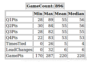
As a warm-up for our data visualization journey, let’s start off with some simple descriptive reports about our fresh dataset:
def describe(self):
   query = ("SELECT *, (Q1Pts+Q2Pts+Q3Pts+Q4Pts) AS GamePts FROM "
            "( SELECT (Q1HomePts+Q1AwayPts) AS Q1Pts, (Q2HomePts+Q2AwayPts) AS Q2Pts, (Q3HomePts+Q3AwayPts) AS Q3Pts, "
            "(Q4HomePts+Q4AwayPts) AS Q4Pts, TimesTied, LeadChanges FROM GameStats"
            ") s")
   df = pd.read_sql(query, self.conn)
   d = {'Mean': df.mean(),
        'Min': df.min(),
        'Max': df.max(),
        'Median': df.median()}
   return pd.DataFrame.from_dict(d, dtype='int32')[["Min", "Max", "Mean", "Median"]]
Home court advantage
Now let’s jump into the real stuff. We’ll generate a pie chart which tells us if there’s any home court advantage, aka, is there more chance to win if the team plays at home, based on statistics?
(Chartify doesn’t yet support pie charts so we’re using the pandas wrapper function for this task, which is essentially matplotlib.)
def pie_win_count(self):
   query = ("SELECT SUM(CASE WHEN Winner=HomeTeam THEN 1 ELSE 0 end) AS HomeWin, "
            "SUM(CASE WHEN Winner=AwayTeam THEN 1 ELSE 0 end) AS AwayWin, "
            "SUM(CASE WHEN Winner='OT' THEN 1 ELSE 0 end) AS OT "
            "FROM GameStats")
   df = pd.read_sql(query, self.conn).transpose()
   df.columns = [""]
   df.plot.pie(subplots=True, autopct='%.2f%%')
   plt.show()
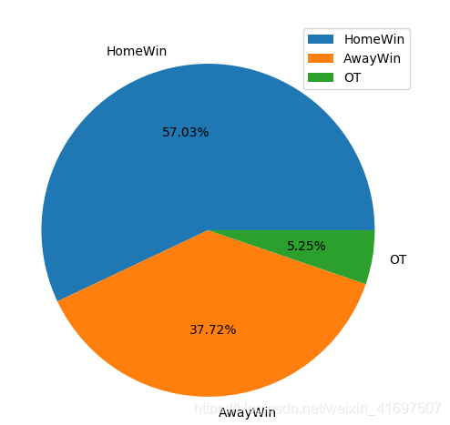
Interesting. Similar to soccer, NBA teams also have a reasonable advantage of playing at home. The home team won 57% of the games. Considering only regulation time results, home wins: 511, away wins: 338, OT: 47.
Scored points distribution
Let’s talk about points. We’ll use the chartify library from here on. Generate a distribution chart of the scored points per game:
def pts(self):
   query = ("SELECT (Q1AwayPts+Q2AwayPts+Q3AwayPts+Q4AwayPts+Q1HomePts+Q2HomePts+Q3HomePts+Q4HomePts) AS Pts FROM GameStats")
   df = pd.read_sql(query, self.conn)

   ch = chartify.Chart(y_axis_type='density', blank_labels=True)
   ch.set_title("Distribution of points")
   ch.axes.set_xaxis_label("Overall Points")
   ch.axes.set_xaxis_tick_values([p for p in range(170, 290, 10)])
   ch.axes.set_xaxis_tick_orientation('diagonal')
   ch.axes.set_yaxis_label("Games")
   ch.plot.histogram(
       data_frame=df,
       values_column='Pts')
   ch.show('html')
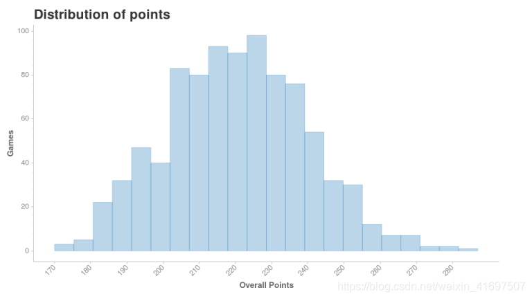
The majority of the games are in the 200-240 range point-wise. That is 100-120 points per team per game. There’s a huge drop in the number of games that are outside of this range.
Game points by date
Now I’m interested to see if there’s any correlation between the date of a game and the number of points scored. For example in soccer, teams score more goals when the season is ending soon.
def pts_history(self):
   query = ("SELECT GameDate, "
            "(Q1HomePts+Q1AwayPts+Q2HomePts+Q2AwayPts+Q3HomePts+Q3AwayPts+Q4HomePts+Q4AwayPts) AS GamePts "
            "FROM GameStats ORDER BY GameDate")
   df = pd.read_sql(query, self.conn)

   ch = chartify.Chart(blank_labels=True, x_axis_type='datetime')
   ch.plot.scatter(
       data_frame=df,
       x_column='GameDate',
       y_column='GamePts')
   ch.set_title("Game Overall Points")
   ch.set_subtitle("By date")
   ch.show("html")
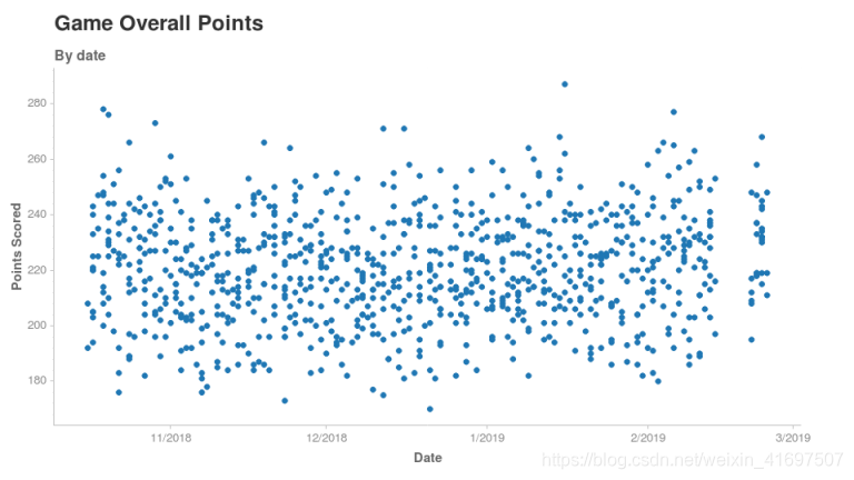
It seems the date of the game doesn’t make any difference to the number of points scored. At least not at a high-level.
See that gap on the right side of our plot? It seems to be falling somewhere in mid-February. As it turns out, no games were played between Feb 15-20. This was the time for the all-star game which we intentionally excluded from our database earlier. Incredible what a simple visualization can reveal, right?
Comparing two teams
It’s always a fun exercise comparing teams to see how they are doing relative to each other. For our study, I chose a high performing team and an underperformer:


These two teams have pretty different point distributions. For Cleveland, it’s very rare to reach 120 points in a game. They usually score between 90 and 110. For Milwaukee, they are usually on the edge or over 120 points.
Based on this chart, it’s not surprising to learn that Bucks are the 1st in their conference while the Cavaliers are second-to-last. It would be interesting to see this chart with Kyrie and Lebron back in the team, but that’s for another time!
Biggest Comebacks
We want to see some comebacks. Who doesn’t love a rip-roaring comeback by a team most consider to be out of the game? We’ll take the cases where a team was down in the first half by a lot but managed to win the game:
def comebacks(self):
   query = ("SELECT *, ABS(Home1stHalf-Away1stHalf) AS Comeback FROM "
            "("
            "SELECT GameDate, AwayTeam, HomeTeam, (Q1AwayPts+Q2AwayPts) AS Away1stHalf, "
            "(Q1HomePts+Q2HomePts) AS Home1stHalf, (Q3AwayPts+Q4AwayPts) AS Away2ndHalf, "
            "(Q3HomePts+Q4HomePts) AS Home2ndHalf FROM GameStats"
            ") s "
            "WHERE (Home1stHalf > Away1stHalf AND Home1stHalf+Home2ndHalf < Away1stHalf+Away2ndHalf) OR "
            "(Home1stHalf < Away1stHalf AND Home1stHalf+Home2ndHalf > Away1stHalf+Away2ndHalf) "
            "ORDER BY `Comeback`  DESC")
   df = pd.read_sql(query, self.conn)
   df["1stHalf"] = df.apply(lambda row: str(row["Away1stHalf"]) + ":" + str(row["Home1stHalf"]), axis=1)
   df["2ndHalf"] = df.apply(lambda row: str(row["Away2ndHalf"]) + ":" + str(row["Home2ndHalf"]), axis=1)
   df = df.drop(["Away1stHalf", "Home1stHalf", "Away2ndHalf", "Home2ndHalf"], axis=1)
   df.index += 1
   return df

The biggest 1st half deficit that one team was able to overcome was 22 points. The winning team scored 70 points in a half in 4 out of these 5 matches.
I want to point out the defensive performance of the Denver Nuggets against Memphis Grizzlies. They restricted the Grizzlies to 32 points in the entire 2nd half. They must have figured something out in the defense in the break.
It’s this kind of analysis that I love doing through visualizations!
Biggest blowouts
If we see the biggest comebacks, we need to check out the biggest blowouts as well. Blowouts are essentials games where one team won by a handsome margin:
def blowouts(self):
   query = ("SELECT *, ABS(AwayPts-HomePts) AS Difference FROM "
            "("
            "SELECT GameDate, AwayTeam, HomeTeam, (Q1AwayPts+Q2AwayPts+Q3AwayPts+Q4AwayPts) AS AwayPts, "
            "(Q1HomePts+Q2HomePts+Q3HomePts+Q4HomePts) AS HomePts FROM GameStats"
            ") s "
            "ORDER BY Difference DESC")
   df = pd.read_sql(query, self.conn)
   df.index += 1
   return df

The biggest blowout was between the Celtics and the Bulls. Boston won 133-77, a ridiculous 56 points win. The surprising thing is that the game was played in Chicago, so Boston was actually the visiting team. Utah Jazz only scored 68 points which are 17 per quarter per team on average. That’s way below the league average for quarterly points per team (28).
Most points in one gameday
Now let’s look at things from a different angle. Which gamedays saw teams scoring points that were way above the league average?
def most_pts_daily(self):
   query = ("SELECT GameDate, COUNT(GameDate) AS GameCount, "           "SUM(Q1HomePts+Q2HomePts+Q3HomePts+Q4HomePts+Q1AwayPts+Q2AwayPts+Q3AwayPts+Q4AwayPts)/COUNT(GameDate) AS PtsPerGame "
            "FROM GameStats GROUP BY GameDate "
            "ORDER BY PtsPerGame DESC")
   df = pd.read_sql(query, self.conn).round(1)
   df.index += 1
   return df

Keep in mind that the average points in an NBA game are 220. So the five days we’re seeing in the above table truly exceeded that average. February 23 is also in this list averaging 235.5 points per game which is outstanding considering that there were 12 games that day.
Most exciting games (Volume 1)
This might be subjective according to what each of us consider “exciting”. For the purpose of this article, we will take the number of lead changes during a game. You can set your own metric and generate a new report as well.
def most_lead_changes(self):
   query = ("SELECT GameDate, AwayTeam, HomeTeam, LeadChanges, "
            "(Q1AwayPts+Q2AwayPts+Q3AwayPts+Q4AwayPts) AS AwayPts, "
            "(Q1HomePts+Q2HomePts+Q3HomePts+Q4HomePts) AS HomePts, "
            "Winner AS Result FROM GameStats "
            "ORDER BY LeadChanges DESC")
   df = pd.read_sql(query, self.conn)
   df.index += 1
   return df
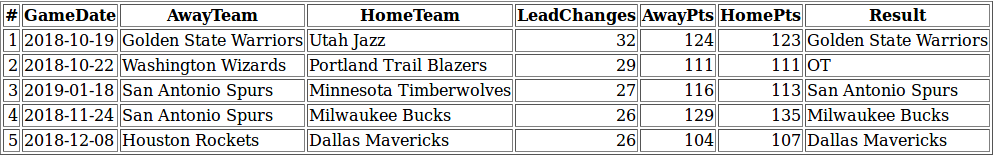
There were 32 lead changes in the Golden State Warriors v Utah Jazz game! The lead changed every 1.5 minutes on average – that sounds like a pulsating affair. Eventually, GSW won the game 124-123. We’ve got two San Antonio Spurs games on the list, maybe the Spurs tend to play give-and-take type of games more often than others?
Most exciting games (Volume 2)
Another way to statistically define exciting games would be based on the number of ties during a game.
def most_ties(self):
   query = ("SELECT GameDate, AwayTeam, HomeTeam, TimesTied, (Q1AwayPts+Q2AwayPts+Q3AwayPts+Q4AwayPts) AS AwayPts, "
            "(Q1HomePts+Q2HomePts+Q3HomePts+Q4HomePts) AS HomePts, Winner AS Result FROM GameStats "
            "ORDER BY TimesTied DESC")
   df = pd.read_sql(query, self.conn)
   df.index += 1
   return df
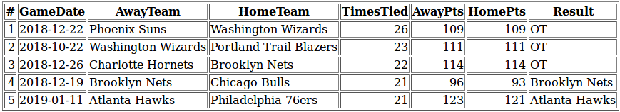
Interestingly, we get totally different matchups in the top 5 compared to the previous list. 3 of the 5 games went into overtime. There were 26 ties during the Suns v Wizards game which means one team tied the game every 108 seconds on average.
Prolific referees
Yes, we will look at a few essential referee stats as well. Love them or hate them, they are a huge part of the game.
def referees(self):
   query = ("SELECT Referee, COUNT(*) AS GameCount FROM "
            "("
            "(SELECT Referee1 AS Referee FROM GameStats) "
            "UNION ALL "
            "(SELECT Referee2 FROM GameStats) "
            "UNION ALL "
            "(SELECT Referee3 FROM GameStats)"
            ") s "
            "GROUP BY Referee ORDER BY GameCount DESC")
   df = pd.read_sql(query, self.conn)
   df.index += 1
   return df
The number of referees in the league (who officiated any games): 68.
Most prolific referees: Karl Lane, Tyler Ford, Pat Fraher, Scott Foster, and Josh Tiven. Each of them officiated 48 games. There were 124 game days in our dataset. That means you cannot watch 3 game days in a row without any of them being on or near the court. Impressive!
End Notes
This article is intended to inspire you on how to make use of web data or other kinds of data. There are more and more tools available that you can use to draw insights from public data. I hope this walkthrough gives you some ideas about how to make data work for you.
You can also use this analysis to build machine learning models. We’ve done the data cleaning and exploration part – take it forward and use your favorite algorithms to predict a team’s chances of winning. The possibilities are endless.
If you have any questions or suggestions, feel free to leave them in the comments section below. Thanks for reading!


 1215
1215


 被折叠的 条评论
为什么被折叠?
被折叠的 条评论
为什么被折叠?
 到【灌水乐园】发言


