实现仪表盘初步思路
- 利用 css 中 圆锥渐变属性 绘制出中心向四周发散的图形。
- 添加遮挡物,与背景色一致,遮盖掉中心内容,达到环形效果。
实现步骤
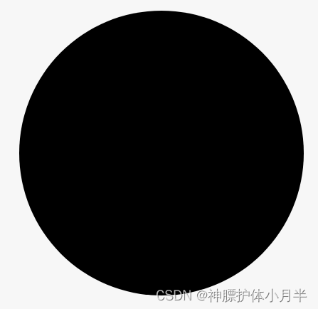
圆形仪表盘背景
<div class="circle">
</div>
<style lang="less" scoped>
.circle {
  width: 400px;
  height: 400px;
  background: #000;
  border-radius: 50%;
}
</style>
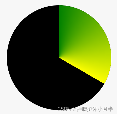
仪表盘渐变底色
- 假如仪表盘数值在 120°,利用圆锥渐变属性,将 120° 到 360° 之间设置为透明色即可
- 当前案例中 conic-gradient 的四个参数
- 第一个渐变色
- 第二个渐变色 + 渐变色的结束位置(仪表盘数值刻度)
- 透明色(或背景色) + 透明色起始位置(仪表盘数值刻度)
- 透明色(或背景色) + 结束刻度(360°)
<div class="circle">
	<div class="percentBox">
    </div>
</div>
<style lang="less" scoped>
.circle {
  width: 400px;
  height: 400px;
  background: #000;
  border-radius: 50%;
  .percentBox {
    width: 400px;
    height: 400px;
    background-image: conic-gradient(
      green,
      yellow 120deg,
      transparent 120deg,
      transparent 360deg
    );
    border-radius: 50%;
  }
}
</style>
遮挡物
- 添加遮挡物,尺寸略小于渐变色部分,颜色设置成与背景同色
<div class="circle">
  	<div class="percentBox">
    	<div class="hide"></div>
  	</div>
</div>
<style lang="less" scoped>
.circle {
  margin: 30px;
  width: 400px;
  height: 400px;
  background: #000;
  border-radius: 50%;
  .percentBox {
    width: 400px;
    height: 400px;
    background-image: conic-gradient(
      green,
      yellow 120deg,
      transparent 120deg,
      transparent 360deg
    );
    border-radius: 50%;
    position: relative;
    .hide {
      width: 350px;
      height: 350px;
      border-radius: 50%;
      background: #000;
      position: absolute;
      left: 50%;
      top: 50%;
      transform: translate(-50%, -50%);
    }
  }
}
</style>
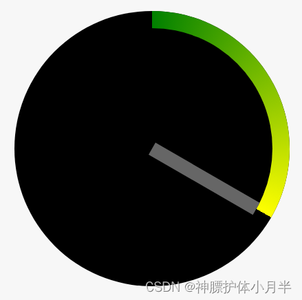
添加指针
- 指针元素以底部中心(bottom center)为原点,进行旋转。即,将指针元素底部中心定位到仪表盘中心,根据实际角度,进行 rotate 旋转。
<div class="circle">
  	<div class="percentBox">
    	<div class="hide"></div>
    	<div class="pointer"></div>
  	</div>
</div>
<style lang="less" scoped>
.circle {
  margin: 30px;
  width: 400px;
  height: 400px;
  background: #000;
  border-radius: 50%;
  .percentBox {
    width: 400px;
    height: 400px;
    background-image: conic-gradient(
      green,
      yellow 120deg,
      transparent 120deg,
      transparent 360deg
    );
    border-radius: 50%;
    position: relative;
    .hide {
      width: 350px;
      height: 350px;
      border-radius: 50%;
      background: #000;
      position: absolute;
      left: 50%;
      top: 50%;
      transform: translate(-50%, -50%);
    }
    .pointer {
      width: 20px;
      height: calc(350px / 2);
      background: #666;
      position: absolute;
      left: 50%;
      top: calc((400px - 350px) / 2);
      transform: translateX(-50%) rotate(120deg);
      transform-origin: bottom center;
    }
  }
}
</style>
效果优化及代码
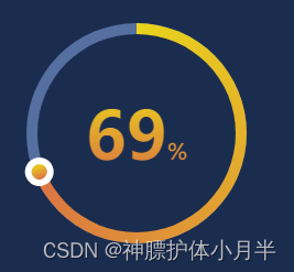
<template>
  <div class="bg">
    <div class="circle">
      <div
        class="percentBox"
        :style="{
          'background-image': `
            conic-gradient(
              rgb(233, 212, 28),
              rgb(218, 115, 67) ${(percent / 100) * 360}deg,
              transparent ${(percent / 100) * 360}deg,
              transparent 360deg
            )`,
        }"
      >
        <div class="hide"></div>
        <div
          class="pointer"
          :style="{
            transform:
              `translateX(-50%) rotate(${(percent / 100) * 360}deg)`,
          }"
        ></div>
        <div class="text">{{ percent }}<span class="unit">%</span></div>
      </div>
    </div>
  </div>
</template>
<script>
export default {
  name: "dashBoard",
  components: {},
  data() {
    return {
      percent: 69,
    };
  },
  mounted() {},
  methods: {},
};
</script>
<style lang="less" scoped>
.bg {
  width: 100%;
  height: 100%;
  background: #1b2d4f;
  padding: 30px;
}
.circle {
  width: 200px;
  height: 200px;
  background: #556fa1;
  border-radius: 50%;
  .percentBox {
    width: 200px;
    height: 200px;
    // background-image: conic-gradient(
    //   rgb(233, 212, 28),
    //   rgb(218, 115, 67) 120deg,
    //   transparent 120deg,
    //   transparent 360deg
    // );
    border-radius: 50%;
    position: relative;
    .hide {
      width: 180px;
      height: 180px;
      border-radius: 50%;
      background: #1b2d4f;
      position: absolute;
      left: 50%;
      top: 50%;
      transform: translate(-50%, -50%);
    }
    .pointer {
      width: 10px;
      height: calc(180px / 2);
      background: transparent;
      position: absolute;
      left: 50%;
      top: calc((200px - 180px) / 2);
      // transform: translateX(-50%) rotate(120deg);
      transform-origin: bottom center;
      &::after {
        content: "";
        width: 14px;
        height: 14px;
        border: 6px solid #fff;
        border-radius: 50%;
        position: absolute;
        top: -18px;
        left: 50%;
        transform: translateX(-50%);
        background-image: linear-gradient(
          90deg,
          rgb(218, 115, 67) 0,
          rgb(233, 212, 28) 100%
        );
      }
    }
    .text {
      position: absolute;
      left: 50%;
      top: 50%;
      transform: translate(-50%, -50%);
      font-size: 60px;
      font-weight: bold;
      color: rgb(218, 115, 67);
      background: linear-gradient(
        to bottom,
        rgb(233, 212, 28),
        rgb(218, 115, 67)
      );
      -webkit-background-clip: text;
      -webkit-text-fill-color: transparent;
      .unit {
        font-size: 20px;
      }
    }
  }
}
</style>


 1064
1064


 被折叠的 条评论
为什么被折叠?
被折叠的 条评论
为什么被折叠?
 到【灌水乐园】发言


