


 本文详细介绍了HTML和CSS中常见的基础组件,包括字体标签、图片、按钮、评分、进度条、搜索、滑动、下拉列表、列表、消息提示、轮播以及工具栏和tab切换等,并提及了HarmonyOS背景。
基础组件
- text : 字体标签,汉字显示必须用字体组件包裹,规范规定,不写不显示
- image:图片标签,属性:src,路径相对路径…/方式
- button:按钮标签,属性:icon图标的路径,按钮带图标
- rating:评分组件,星星显示属性:numstars[number]默认分值的最大值设置(eg: 10),rating[number]设置高亮显示(eg:3.5)
- progress:进度条,属性:type[string] horizontal默认线型性 scale-ring带刻度的圆环 arc圆弧;percent进度值高亮部分,secondarypercent[number]进度条最大值设置
- search:搜索组件,属性:searchbutton[string]: 搜索点击按钮名称设置,hint[string]:搜索框提示语
- slider:滑动组件,属性:showtips[boolean]滑动上方提示进度气泡,step[number]按多少步长滑动;value默认高亮滑动停留值
- list:下拉列表,和list-item-group > list-item搭配使用;属性:scrolleffect[string]收起特效(fade、spring);divider[boolean]属性
- list-item-group:列表组件分组标签,和list-item搭配使用
- list-item:列表组件,可单独使用,属性:primary="true"和list搭配使用时分组选中显示的值,不指定默认显示第一个。
- badge:消息数组件,汉字右上方消息数的组件,属性:visible[boolean]是否显示;count[number]有多少条(未读)消息数;maxcount[number]最大显示值,超过这个值显示+(99+)。
- swiper:swiper轮播组件,属性:autoplay[boolean]是否自动轮播;scrolleffect轮播效果。
<swiper autoplay="true" indicatordisabled="true"scrolleffect="spring" digital="false">
        <image src="/common/swiper1.jpg"></image>
         <image src="/common/swiper2.jpg"></image>
         <image src="/common/swiper3.jpg"></image>
 </swiper>
- toolbar:工具组件,底部工具组件,等于五个只显示5个,大于5个显示4个,其它折叠收起;搭配标签toolbar-item()
- tabs:tab切换列表组件;属性:vertical[boolean]是否横竖向,默认横向,true竖向tab点击选中有问题,但是功能正常
<tabs vertical="true">
        <tab-bar class="nav-box">
            <text>蔬菜区</text>
            <text>肉类区</text>
        </tab-bar>
        <tab-content>
            <div class="con-box">
                <div class="box">
                    <image src="/common/goods/1.png"></image>
                    <text>今日最新菜谱凉拌黄瓜</text>
                    <button icon="/common/cart.png">购买</button>
                </div>
                <div class="box">
                    <image src="/common/goods/1.png"></image>
                    <text>今日最新菜谱凉拌黄瓜</text>
                    <button icon="/common/cart.png">购买</button>
                </div>
        </tab-content>
    </tabs>
- grid-container:弹性盒子布局;于grid-row>grid-col搭配使用
- grid-row:一行
- grid-col:一列; span="0"别问为什么,加上后通过css改变宽度
<grid-container style="margin: 0;">
        <grid-row class="top">
            <grid-col  span="0">
                <text>首    页</text>
            </grid-col>
            <grid-col  span="0">
                <text>选车页</text>
            </grid-col>
            <grid-col  span="0">
                <text>车系点评</text>
            </grid-col>
        </grid-row>
 </grid-container>
以上是一行3列布局
- stepper:步骤标签;和stepper-item搭配使用
<stepper>
        <stepper-item>
            <text>第一步: 请填写车辆基本信息</text>
            <input placeholder="请输入车系名称"></input>
            <input placeholder="请输入车型价格" type="number"></input>
        </stepper-item>
<!--        label接受对象信息,用来设置步骤文本-->
        <stepper-item label="{{ labelConf }}">
            <text>第二步: 请填写车辆销售信息</text>
            <input placeholder="请输入预售额数" type="number"></input>
            <input placeholder="请输入预售额最大数" type="number"></input>
        </stepper-item>
        <stepper-item label="{{ labelConf }}">
            <text>第三步: 请填写商品销售信息</text>
            <div class="lastStep">
                <input type="checkbox" checked="true"></input>
                <text>奥迪</text>
                <input type="checkbox"></input>
                <text>宝马</text>
                <input type="checkbox"></input>
                <text>大奔</text>
            </div>
        </stepper-item>
    </stepper>
注意以上是三个步骤页面,带返回和下一页功能的步骤页面
- for属性:for循环,不支持对象遍历,只支持数组,属性: i d x 索引; idx索引; idx索引;item遍历子元素;tid唯一(标识)key值
<div for="{{classList}}" tid="{{ $idx }}">
        <text>{{$idx}}{{$item}}</text>
 </div>
<div for="{{ (i,ele) in carList}}">
        <text>{{i}}.{{ele.id}}  {{ele.name}}  {{ele.value}}元</text>
 </div>
  <text  for="{{ (i,ele) in carList}}">{{i}}.{{ele.id}}  {{ele.name}}  {{ele.value}}元</text>
- if、elif、else和show 同vue使用原理一致
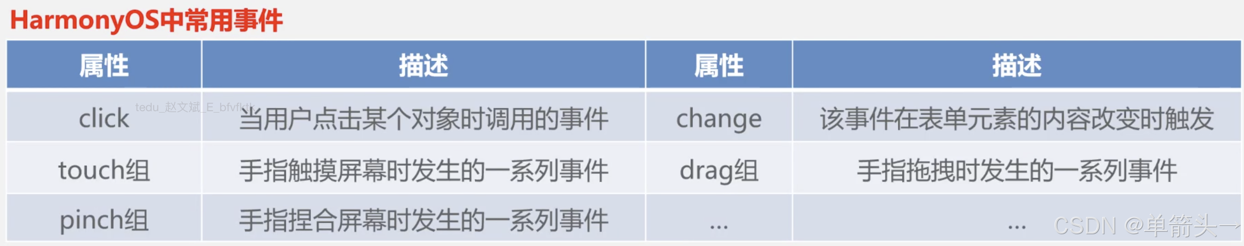
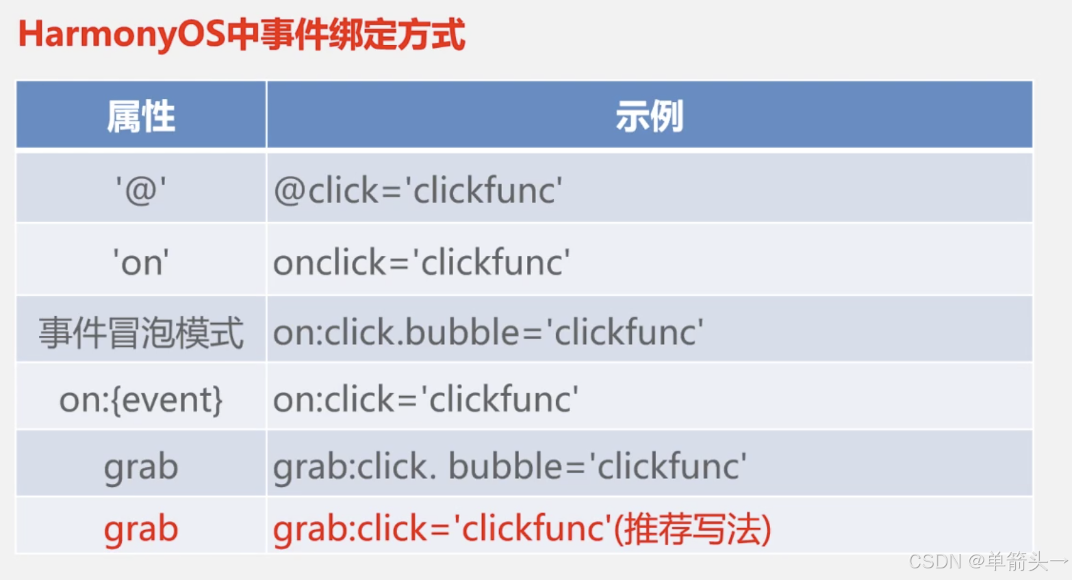
- grap:+事件名;on+事件名(grap:click、on:click)
- 动画
(1) css属性动画: @keyframes
// 设置动画 @keyframes
@keyframes donghua {
	from {
		width: 0;
		opacity:  0;
	}
	to {
		width: 300px;
		opacity:  1;
	}
}
@keyframes donghua1 {
	0% {
		width: 10px;
		opacity:  0;
	}
	50% {
		width: 50%;
		opacity:  .5;
	}
	100% {
		width: 100%;
		opacity:  1;
	}
}
// 调用动画 animation
.classType {
	animation: donghua 2s linear infinite;
}
.classType1 {
	animation: donghua1 3s linear infinite;
}
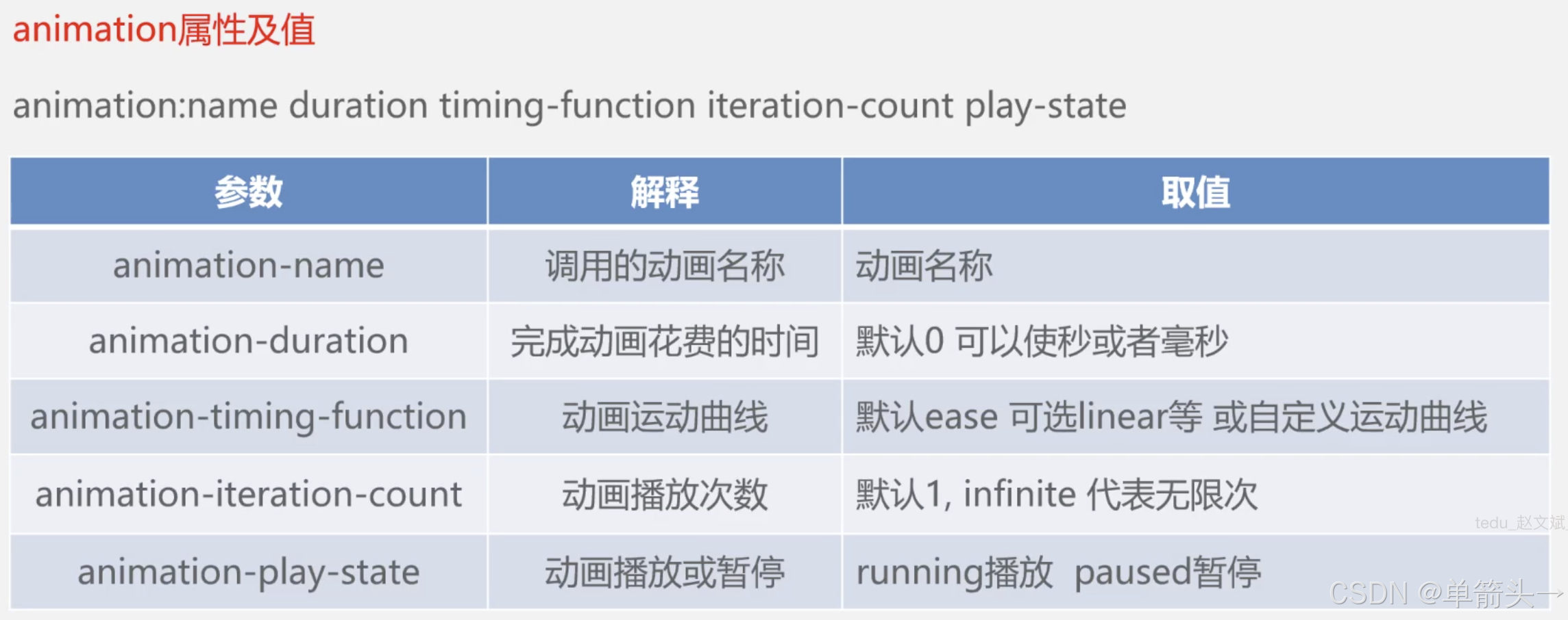
animation: name duration timing-function iteration-count play-state

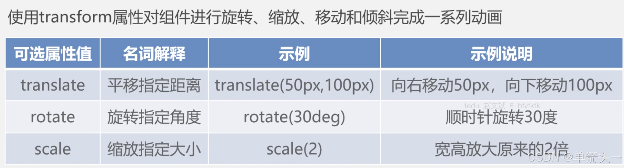
(2) css样式动画 transform
@keyframes divChange {
	0% {
		width: 0;
		opacity:  0;
		transform:  translate(0, 100px) rotate(30deg) scale(1.5);
	}
	50% {
		width: 70%;
		opacity:  .5;
		transform:  translate(100px, 500px) rotate(65deg) scale(3);
	}
	100% {
		width: 100%;
		opacity:  1;
		transform:  translate(500px, 0px) rotate(5deg) scale(1);
	}
}
// 调用动画 animation
.classType {
	animation: divChange 2s linear infinite;
}
(3) 组件js中的动画
一个页面或组件包含hml、js、css, 在js中通过操作页面元素的animate(keyframes, options)方法来追加动画
this.$element(‘元素ID’).animate(keyframes, options)
eg: play()、pause()、cancel()、reverse(); 播放-暂停-取消(结束)-反转(倒放)
// index.hml
<div id="ele"></div>
<button grap:click="onPlay">

// index.js.
data: {
	// 动画针
	keyframes: [
		{
			width: 100px;
			height: 100px;
			backgroundColor: "red",
			transform:  {
				translate: "0, 0",
				scale: 1,
				rotate: 0,
			}
		},
		{
			width: 60px;
			height: 60px;
			backgroundColor: "yellow",
			transform:  {
				translate: "50px, 150px",
				scale: 0.6,
				rotate: 1200,
			}
		},
		{
			width: 100px;
			height: 100px;
			backgroundColor: "green",
			transform:  {
				translate: "250px, 0px",
				scale: 1,
				rotate: 0,
			}
		}
	],
	options: {
		durations: 5s,
		timing: 'linear',
	},
	eleAnimate: null, // 多个动画动作操作避免重复赋值不能继承,没有记录会复位
}
onPlay() {
	// this.$element('ele').animate(this.keyframes, this.options).play();
	this.eleAnimate =. this.$element('ele').animate(this.keyframes, this.options);
	this.eleAnimate.).play();
},
onPause() {
	// 无法继承,会复位
	// this.$element('ele').animate(this.keyframes, this.options).pause();

	// 可以继承和记录
	this.eleAnimate.pause();
}
onCencel() {
	// 无法继承,会复位
	// this.$element('ele').animate(this.keyframes, this.options).cencel()

	// 可以继承和记录
	this.eleAnimate.cencel();
}
onReverse) {
	// 无法继承,会复位
	// this.$element('ele').animate(this.keyframes, this.options).reverse()

	// 可以继承和记录
	this.eleAnimate.reverse();
}
harmonyOS背景介绍及了解请进入https://blog.csdn.net/weixin_42498482/article/details/136698074
harmonyOS的生命周期详述
https://blog.csdn.net/weixin_42498482/article/details/145514073?sharetype=blogdetail&sharerId=145514073&sharerefer=PC&sharesource=weixin_42498482&spm=1011.2480.3001.8118


 扫一扫
扫一扫


 905
905

 被折叠的 条评论
为什么被折叠?
被折叠的 条评论
为什么被折叠?
 到【灌水乐园】发言


