


 本文介绍了如何使用Markdown编辑器创建具有圆环形状的上下内容的时间轴,通过CSS和JavaScript代码实现了线条样式和文本显示,适合时间线展示与项目管理。
圆环形状的上下都有内容的时间轴的实现方法
欢迎使用Markdown编辑器
你好! 以下代码便是具体实现方法,实现效果和下图一致,欢迎大家批评指正。
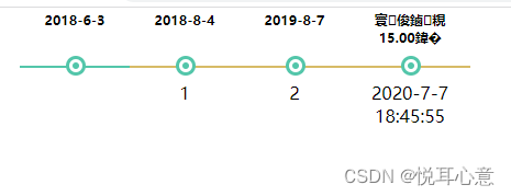
圆环形时间轴实现方法
<html>
  <head>
    <meta content="text/html; charset=gbk" http-equiv="content-type">
    <title></title>
    <style type="text/css">
        :after, :before {
    -webkit-box-sizing: border-box;
    -moz-box-sizing: border-box;
    box-sizing: content-box;
}
       .linesegs{
        list-style-type: none;
        float:left;
        position: relative;
        background-repeat: repeat-x;
        height: 40px;
        margin:0px;
        padding-left:10px;
      }
      .linesegs li{
      float: left;
      width: 110px;
      position: relative;
      background-repeat: no-repeat;
      }
    .linesegs li .lines {
           height:20px;
           width:100%;
        }
    .linesegs li .dashed:after {
        content: '';
        display: block;
        border-top:2px solid rgb(83, 198, 170);
        width: 100%;
        height: 2px;

    }
    .linesegs li .solid:after {
        content: '';
        display: block;
        border-top:2px solid #D7BB67;
        width: 100%;
        height: 2px;

    }
    .linesegs li .radius:before {
        content: '';
        display: block;
        position: relative;
        width: 6px;
        height: 6px;
        /* background-color: rgb(84, 187, 248); 渠道 */

        background-color: rgb(83, 198, 170);

        border-radius: 50%;
        border: 3px solid white ;
        top:6px;
        left: 45%;

        /* box-shadow: 0 0 0 3px rgb(84, 187, 248) ; */
        box-shadow: 0 0 0 3px rgb(83, 198, 170);  /*HIS*/
    }
     .linesegs li .showtext{
        width:100%;
        height:30%;
        display: inline-block;
        text-align: center;
        position: relative;
        left: 0px;
        top: 10px;
      }
      .linesegs li .startdate{
        width:100%;
        height:1px;
        margin-top:20px;
        font-size:12px;
        text-align: center;
        position: relative;
        left:0px;
        bottom: 25px;
      }
  </style>
  </head>
  <body>
  <div class="content" id="content">

  </div>
  <script type="text/javascript">


          var str='[{"title":"张三","linesegs":[{"showtext":"  ","start":"2018-6-3","end":"2018-8-3","shoutype":"0"},{"showtext":"1","start":"2018-8-4","end":"2019-7-5","shoutype":"1"},{"showtext":"2","start":"2019-8-7","end":"2020-7-7","shoutype":"1"}]},{"title":"李四","linesegs":[{"showtext":"1","start":"2018-6-6","end":"2018-10-6","shoutype":"1"}]},{"title":"王五","linesegs":[{"showtext":"2","start":"2018-10-7","end":"2019-10-7","shoutype":"1"}]}]'

var jsonstr=JSON.parse(str);
strhtml='';
for(var i=0;i<jsonstr.length;i++){
//标题,
strhtml+='<div class="contract"> ';
linesegs=jsonstr[i].linesegs

strhtml+='<ul class="linesegs">'
for(var j=0 ;j<linesegs.length;j++){

  strhtml+='<li class="lineseg" style="width:'+100+'px;"> ' ;
  strhtml+='<h3 class="startdate">'+linesegs[j].start+'</h3>';
  //判断是虚线还是实线
  if(linesegs[j].shoutype==0){
   strhtml+=' <div class="dashed radius" ></div>';
  }else{
   strhtml+=' <div class="solid radius" ></div>';
  }

  strhtml+=' <a class="showtext">'+linesegs[j].showtext +' </a> </li>';
}
//最后的结束时间
ends=jsonstr[i].linesegs[jsonstr[i].linesegs.length-1].end;

strhtml+='<li class="lineseg"> <h3 class="startdate">'+'微信支付'+'</br>'+'15.00元'+' </h3> <div class="solid radius" ></div> <a class="showtext">'+'2020-7-7'+'</br>'+'18:45:55'+'</a> </li> </ul> </div>';
break;
}
//写入html
document.getElementById("content").innerHTML=strhtml
//document.getElementsByClassName("content")[0].innerHTML=strhtml
  </script>
  </body>
</html>


 扫一扫
扫一扫


 743
743

 被折叠的 条评论
为什么被折叠?
被折叠的 条评论
为什么被折叠?
 到【灌水乐园】发言


