


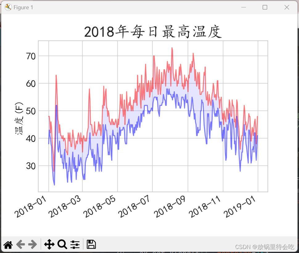
效果图如下:
 使用教材附带CSV文件,代码如下:
import csv
# 导入模块pyplot并为其指定别名plt,以免反复输入pyplot
import matplotlib.pyplot as plt
from datetime import datetime

filename = 'data/sitka_weather_2018_simple.csv'
with open(filename) as f:
    reader = csv.reader(f)
    header_row = next(reader)
    # print(header_row)

    # for index,column_header in enumerate(header_row):
        # print(index, column_header)

    # 从文件中获取日期、最高温度和最低温度
    dates, higs, lows = [], [], []
    highs = []
    for row in reader:
        current_date = datetime.strptime(row[2], '%Y-%m-%d')
        high = int(row[5])
        low = int(row[6])
        dates.append(current_date)
        highs.append(high)
        lows.append(low)
print(highs)

# 根据最高温度和最低温度绘制图形
plt.style.use('seaborn-v0_8-whitegrid')
plt.rcParams['font.sans-serif'] = ['YaHei', 'KaiTi']  # 汉字字体
plt.rcParams['axes.unicode_minus'] = False  # 正常显示符号
# 调用subplots()函数,变量fig表示整张图片,变量ax表示图片中的各个图标
fig, ax = plt.subplots()
ax.plot(dates, highs, c='red', alpha=0.5)
ax.plot(dates, lows, c='blue', alpha=0.5)
ax.fill_between(dates, highs, lows, facecolor='blue', alpha=0.1)

# 设置图形的格式
ax.set_title("2018年每日最高温度", fontsize=24)
ax.set_xlabel('', fontsize=16)
fig.autofmt_xdate()
ax.set_ylabel("温度(F)", fontsize=16)
# 设置刻度标记的大小
ax.tick_params(axis='both', which='major', labelsize=16)

plt.show()
学习中遇到的难点:
生成图表中的汉字出现异常(汉字显示为▯),上网查找解决方案为——在代码中添加以下内容:
plt.rcParams['font.sans-serif'] = ['YaHei', 'KaiTi']  # 汉字字体
plt.rcParams['axes.unicode_minus'] = False  # 正常显示符号
开始把这两行代码放在代码导入模块下方(即from datetime import datetime下面),一直不成功,直到把这两行放到这句之下才生效!!!
plt.style.use('seaborn-v0_8-whitegrid')


 5850
5850


 被折叠的 条评论
为什么被折叠?
被折叠的 条评论
为什么被折叠?
 到【灌水乐园】发言


