


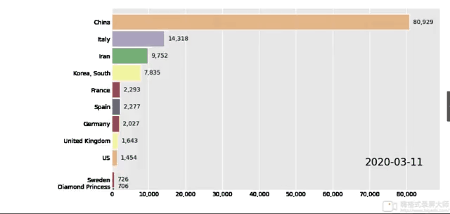
bar_chart_race绘制动态条形图
一、前期准备
- 使用环境:Jupyter Notebook
1、官方参考文档
GitHub :https://github.com/dexplo/bar_chart_race
说明文档:https://www.dexplo.org/bar_chart_race/
2、安装ffmpeg模块
使用换源安装
pip install bar_chart_race -i https://pypi.doubanio.com/simple
3、安装ffmpeg、ImageMagick (重点)
ffmpeg包:不然无法输出 mp4/m4v/mov/等格式的视频,该包比较复杂,需要配置变量环境
注意:此包不能输出gif文件,会报错
ffmpeg官网:http://www.ffmpeg.org/download.html
由于下载可能不便,所以给出百度网盘链接
https://pan.baidu.com/s/1DM9XK18zxuMgBYN8mLDqcA
提取码:132a
具体安装方法可以看看这个博客:
https://baijiahao.baidu.com/s?id=1660327134602942057&wfr=spider&for=pc
ImageMagick包:如果你要创建GIF,需要安装这个包ImageMagick,安装方法与上述类似。
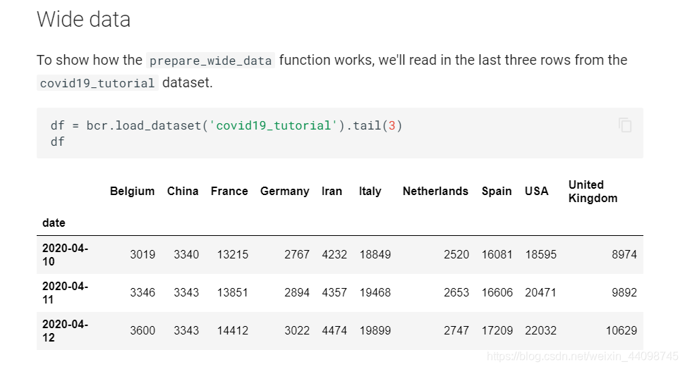
4、数据准备
- 每一行必须是一个单独日期的数据;
- 每一列是一个单独的分类;
- 索引最好是日期数据(可选项);
- 数据必须变化成 pandas.DataFrame 格式;
此为官方数据示例
二、代码实现
data数据链接:https://pan.baidu.com/s/1OEPJVh1Al_DnCqUN1T0U0A
提取码:rdwg
数据是从2020/1/22 至 2021/3/10
import pandas as pd
import bar_chart_race as bcr
pd.set_option("max_rows",8)
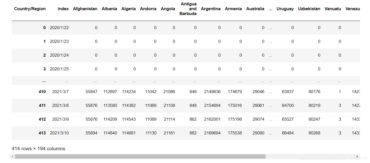
df_all_history = pd.read_csv('data.csv')
# 将Province/State,Lat,Long这几列删除
df_all_history = df_all_history.drop(labels=['Province/State','Lat','Long'],axis=1)
# 每个国家进行聚合
df_all_history = df_all_history.groupby('Country/Region').sum()
# 行列互换
df_all_history = df_all_history.T
# 重新命名索引
df_all_history = df_all_history.reset_index()
# 将索引设为时间序列
df_all_history["date"] = pd.to_datetime(df_all_history["index"],format="%Y/%m/%d")
df_all_history
# 将索引设为date,并将多余的列删除
df_all_history = df_all_history.set_index(keys='date')
df_all_history = df_all_history.drop(columns=["index"])
df_all_history.to_csv('test.csv')
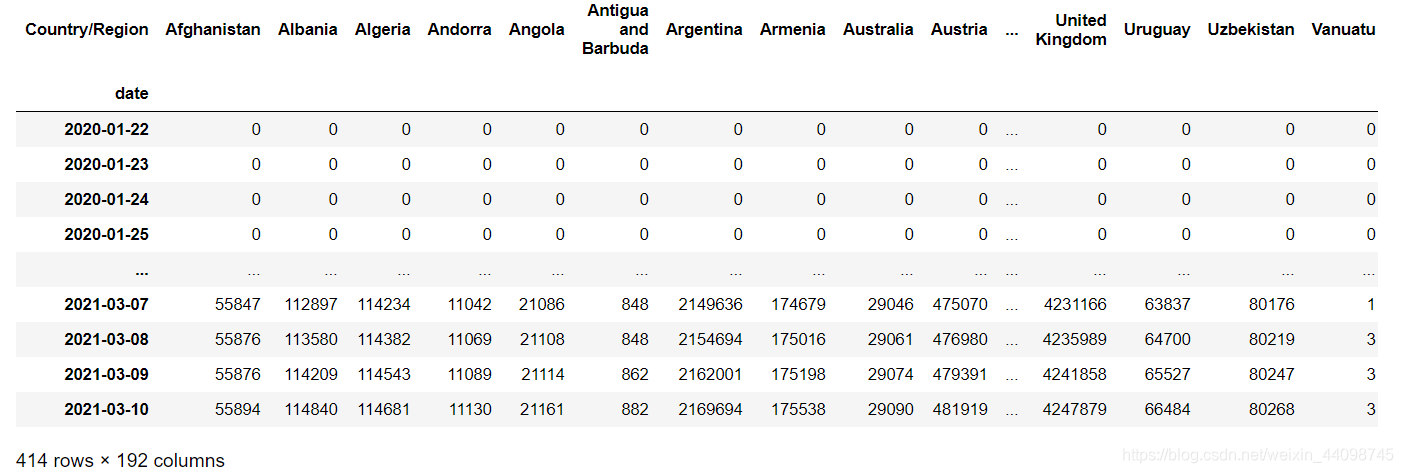
df_all_history.to_csv('test.csv')
df = pd.read_csv('test.csv',index_col=0)
bcr.bar_chart_race(df, 'covid19_horiz.mp4', n_bars=10, cmap='accent', filter_column_colors=True)
如要对图形进行美化或参数调整,可以参考此博客
https://blog.csdn.net/weixin_47139649/article/details/109116992
三、官方画图
官方网址:https://app.flourish.studio/@flourish/bar-chart-race


 3万+
3万+

 被折叠的 条评论
为什么被折叠?
被折叠的 条评论
为什么被折叠?
 到【灌水乐园】发言


