


 本文分享了一种优化CSS波浪效果的方法,通过增大旋转元素并调整其位置,模拟出更自然的缓慢波浪动画。代码示例包括HTML和CSS,使用了关键帧动画实现波浪的旋转效果,背景颜色和混合模式也进行了调整以增强视觉体验。在线链接可供查看实际效果。
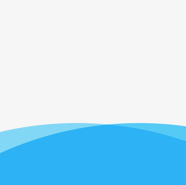
直接上图
之前看其他的波浪效果不是很像,就把它代码优化了一下,将旋转元素调大并靠下,这样能更好的模拟缓慢的波浪效果;
在线地址 link.
代码在下面
// html
<div class="container">
    <div class="wave"></div>
    <div class="wave1"></div>
</div>
//css
.container {
    position: relative;
    width: 500px;
    height:500px;
    margin: 0 auto;
    overflow: hidden;
    background: #f6f6f6;
}

.wave,
.wave1 {
    position: absolute;
    bottom: -375%;
    left:-124%;
    width: 2000px;
    height: 2000px;
    background-color: hsla(196, 100%, 53%, .7);
    border-radius: 45%;
    animation: rotate 8s linear infinite;
    mix-blend-mode: multiply;
}

.wave1 {
    left:-160%;
    bottom: -375%;
    background-color: hsla(196, 100%, 53%, .5);
    animation: rotate 9s linear infinite;
}


@keyframes rotate {
    50% {
        transform: rotate(180deg);
    } 100% {
        transform: rotate(360deg);
    }
}

@keyframes rotate1 {
    50% {
        transform: rotate(360deg);
    } 100% {
        transform: rotate(180deg);
    }
}


 扫一扫
扫一扫


 527
527

 被折叠的 条评论
为什么被折叠?
被折叠的 条评论
为什么被折叠?
 到【灌水乐园】发言


