


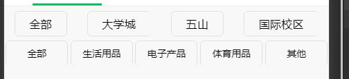
先上效果图
默认情况下这些botton都是按照列的方式排列的
通过在wxss设置
display flex
可达到实现横向排列的效果
此外,flex还有很强大便利的功能,
比如我要横向居中对齐
display flex;
justify-content: center;
这里先讲一下justify-content
由于可以可视化编程,所以自己动手试一下效果就是了
display flex;
justify-content: center;   居中对齐
justify-content: flex-start; 与main start 对齐
justify-content: flex-end; 与main end 对齐
justify-content:	 space-between; flex items之间的距离相等且两端对齐
justify-content: space-evenly;  所有间隔都相等
justify-content: space-around;  flex items之间的距离相等, items与end start的距离是item之间距离的一半
flex-wrap:
display flex;
flex-wrap: nowrap  ;单行显示
flex-wrap: wrap ;多行显示
align-items
align影响的是在竖直方向上的排版
这里只讲比较常用的
display flex;
align-items: center  ;竖直方向上居中
align-items: flex-start
align-items::flex-end
align-content
影响竖直方向上的元素排版,用法同justify-content
align-self
用法基本与align-items一致,只是它是最高级的,即会覆盖掉align-items,align-content的效果
以上效果图用到了
display: flex;
justify-content: space-around;
具体代码如下:
wxml
 <view class = 'campusBotton'>
    <button size = 'mini' >全部</button>
	<button size = 'mini' >大学城</button>
    <button size = 'mini'>五山</button>
    <button size = 'mini'>国际校区</button>
</view>


    <view class = 'categoryBotton'>
              <button class = 'bottonSize'>全部</button>
              <button class = 'bottonSize'>生活用品</button>
              <button class = 'bottonSize'>电子产品</button>
              <button class = 'bottonSize'>体育用品</button>
              <button class = 'bottonSize'>其他</button>
    </view>
wxss:
.campusBotton{
    margin-top: 10rpx;
    display: flex;
    justify-content: space-around;
}
.categoryBotton{
    display: flex;
    justify-content: space-around;
}

.bottonSize{
    margin-top: 10rpx;
    width: 145rpx;
    height: 60rpx;
    font-size: 22rpx;
    vertical-align:middle;
    text-align: center;
    line-height: 60rpx;
}
}
这里其实还涉及到了button修改大小之后,botton中文本部分显示或没有居中对齐的问题,具体解释请看


 993
993


 被折叠的 条评论
为什么被折叠?
被折叠的 条评论
为什么被折叠?
 到【灌水乐园】发言


