


 本文介绍了如何使用matplotlib库在Python中绘制堆积柱状图和百分比堆积柱状图。首先从数据库或CSV文件中读取数据,然后利用pandas和numpy进行数据处理。通过subplots创建对比图,使用bottom参数控制堆积柱状图的起点。在百分比堆积图上,还展示了如何添加柱状图对应的颜色百分比文本。最后提供了完整的代码示例和自定义函数。
matplotlib之堆积柱状图及百分比柱状图
在博主日常的绘图过程,有一种图也是什么常见的绘图工作,就是堆积的柱状图,其实很简单,就注意几个参数即可。 Here we go!
首先是引入数据库:
import matplotlib.pyplot as plt
import numpy as np
import pandas as pd
然后我创建了一个csv文件,这里随机填写了一些数据,详细如下:

接下来用pandas读取数据,用pandas读取csv十分简单,几行代码搞定:
name = csv.Person
salary1 = np.array(csv.Salary1)
salary2 = np.array(csv.Salary2)
salary3 = np.array(csv.Salary3)
这里把pandas对象转成np的array是为了方便之后的array加减操作。
这里展示两种效果,因此用一下subplots函数创建了对比图
fig, axs = plt.subplots(1 , 2, figsize=(10,4))
axs[0].bar(index, salary1, width=0.4, label= 'salary1')
axs[0].bar(index, salary2, width=0.4, bottom=salary1, label= 'salary2')
axs[0].bar(index, salary3, width=0.4, bottom=salary2+salary1, label= 'salary3')
axs[0].set_ylim(0, 30000)
axs[0].set_xticklabels(name, rotation=90)
axs[0].legend(loc='upper left',  shadow=True)

summ = salary1+salary2+salary3
percentage1 = salary1/summ
percentage2 = salary2/summ
percentage3 = salary3/summ

axs[1].bar(index, percentage1, width=0.4, label= salary1)
axs[1].bar(index, percentage2, width=0.4, bottom=percentage1, label= salary2)
axs[1].bar(index, percentage3, width=0.4, bottom=percentage1+percentage2, label= salary3)
axs[1].set_ylim(0,1)
axs[1].set_xticklabels(name, rotation=90)

plt.savefig('9.tiff', dpi=300)
plt.show()

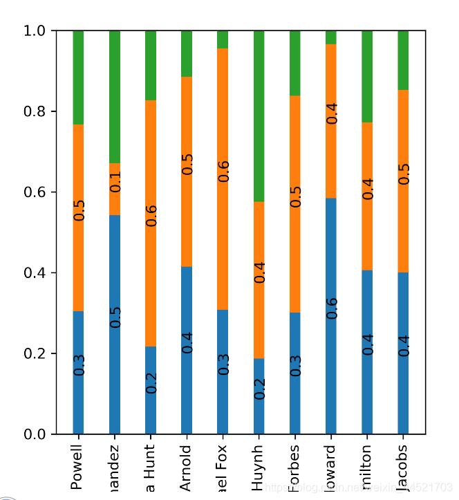
- 这里左边显示了正常的堆积图,右边则显示了百分比堆积图,堆积的要点在于绘制时候的bottom关键字,这决定了柱状图的绘制起点,因此第二段的bottom是第一段的数值,而第三段则为第一、二段想加,
- 另外值得注意点 是,这里的subplots函数,返回对象有两个,前者fig相当于画布,而后者axs相当于在画布上绘制的元素,因此,我们这里是对绘制的元素操作,所以后续都是在ax上展开。
接下来还有一个需求,我们需要在柱状图上显示柱子对应的数值,比如右侧的图,需要加上红绿蓝颜色对应的百分比,那这里我们针对axs[1]继续绘制。
这里先自定义一个函数:
def add_text(x, y, data):
    for x0, y0, data0 in zip(x, y, data):
        axs[1].text(x0, y0, round(data0, 1), rotation=90)
然后给出文本的坐标值以及数值即可:
注意这里绿色那段,由于柱子实在太短,如果要添加一下文本,需要手动微调位置,我这里就没继续添加了,
绘制图像如下
完整代码如下:
import matplotlib.pyplot as plt
import numpy as np
import pandas as pd


def add_text(x, y, data, fontsize=12):
    for x0, y0, data0 in zip(x, y, data):
        axs[1].text(x0, y0, round(data0, 1), rotation=90)

csv = pd.read_csv('salary.csv')
name = csv.Person
salary1 = np.array(csv.Salary1)
salary2 = np.array(csv.Salary2)
salary3 = np.array(csv.Salary3)
index = np.arange(len(name))
width = 0.4

fig, axs = plt.subplots(1, 2, figsize=(10, 5))
axs[0].bar(index, salary1, width=width, label='salary1')
axs[0].bar(index, salary2, width=width, bottom=salary1, label='salary2')
axs[0].bar(index, salary3, width=width, bottom=salary2 + salary1, label='salary3')
axs[0].set_ylim(0, 30000)
axs[0].set_xticks(index)
axs[0].set_xticklabels(name, rotation=90)
axs[0].legend(loc='upper left', shadow=True)

sum = salary1 + salary2 + salary3
percentage1 = salary1 / sum
percentage2 = salary2 / sum
percentage3 = salary3 / sum

axs[1].bar(index, percentage1, width=width, label=salary1)
axs[1].bar(index, percentage2, width=width, bottom=percentage1, label=salary2)
axs[1].bar(index, percentage3, width=width,
           bottom=percentage1 + percentage2, label=salary3)
axs[1].set_ylim(0, 1)
axs[1].set_xticks(index)
axs[1].set_xticklabels(name, rotation=90)

y1 = percentage1/2
y2 = percentage1 + percentage2/2
y3 = sum - percentage3/2

add_text(index-width/2, y1, percentage1)
add_text(index-width/2, y2, percentage2)
# add_text(index-width/2, y3, percentage3)

plt.savefig('9.tiff', dpi=300)
plt.show()
更进一步的,写个自定义的函数,用来传输对象进去,直接调用函数试试:
以下为全代码:
import numpy as np
import matplotlib.pyplot as plt
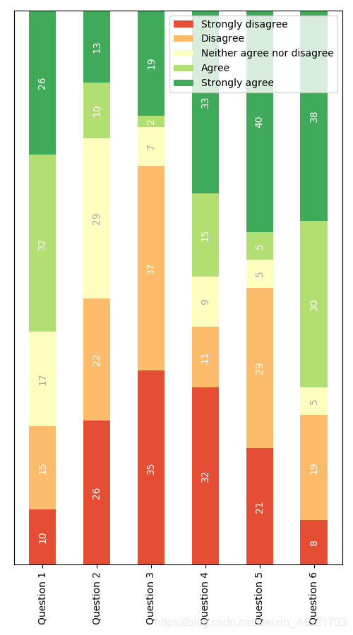
category_names = ['Strongly disagree', 'Disagree',
'Neither agree nor disagree', 'Agree', 'Strongly agree']
results = {
'Question 1': [10, 15, 17, 32, 26],
'Question 2': [26, 22, 29, 10, 13],
'Question 3': [35, 37, 7, 2, 19],
'Question 4': [32, 11, 9, 15, 33],
'Question 5': [21, 29, 5, 5, 40],
'Question 6': [8, 19, 5, 30, 38]
}
def survey(results, category_names):
labels = list(results.keys())
# 获取标签
data = np.array(list(results.values()))
# 获取具体数值
data_cum = data.cumsum(axis=1)
# 逐项加和
category_colors = plt.get_cmap('RdYlGn')(np.linspace(0.15, 0.85, data.shape[1]))
"""
在cmmap中取出五组颜色
category_colors:
[[0.89888504 0.30549789 0.20676663 1. ]
[0.99315648 0.73233372 0.42237601 1. ]
[0.99707805 0.9987697 0.74502115 1. ]
[0.70196078 0.87297193 0.44867359 1. ]
[0.24805844 0.66720492 0.3502499 1. ]]
"""
print(category_colors)
# 常见颜色序列, 在cmap中取色
fig, ax = plt.subplots(figsize=(5, 9))
# 绘图
# ax.invert_xaxis()
# 使其更符合视觉习惯,index本身从下到上
ax.yaxis.set_visible(False)
ax.set_xticklabels(labels=labels, rotation=90)
# 不需要可见
ax.set_ylim(0, np.sum(data, axis=1).max())
for i, (colname, color) in enumerate(zip(category_names, category_colors)):
heights = data[:, i]
# 取第一列数值
starts = data_cum[:, i] - heights
# 取每段的起始点
ax.bar(labels, heights, bottom=starts, width=0.5,
label=colname, color=color)
xcenters = starts + heights / 2
r, g, b, _ = color
text_color = 'white' if r * g * b < 0.5 else 'darkgrey'
for y, (x, c) in enumerate(zip(xcenters, heights)):
ax.text(y, x, str(int(c)), ha='center', va='center',
color=text_color, rotation = 90)
ax.legend()
return fig, ax
survey(results, category_names)
plt.show()
完工!


 1295
1295

 被折叠的 条评论
为什么被折叠?
被折叠的 条评论
为什么被折叠?
 到【灌水乐园】发言


