


在窗口中创建按钮
<Window x:Class="SDKSample.MainWindow"
        xmlns="http://schemas.microsoft.com/winfx/2006/xaml/presentation"
        xmlns:x="http://schemas.microsoft.com/winfx/2006/xaml"
        xmlns:d="http://schemas.microsoft.com/expression/blend/2008"
        xmlns:mc="http://schemas.openxmlformats.org/markup-compatibility/2006"
        xmlns:local="clr-namespace:SDKSample"
        mc:Ignorable="d"
        Title="MainWindow" Width="250" Height="250">
	<StackPanel Margin="10">
		<Label>Unstyled Button</Label>
        <Button>Button 1</Button>
        <Label>Rounded Button</Label>
        <Button" Width="65" Height="65">Button 2</Button>
    </StackPanel>
</Window>
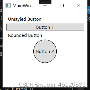
运行界面如下:

创建 ControlTemplete
声明 ControlTemplate 的最常见方法是在 XAML 文件的 Resources 部分中声明为资源。 模板是资源,因此它们遵从适用于所有资源的相同范围规则。 简言之,声明模板的位置会影响模板的应用范围。 例如,如果在应用程序定义 XAML文件的根元素中声明模板,则该模板可以在应用程序中的任何位置使用。 如果在窗口中定义模板,则仅该窗口中的控件可以使用该模板。
首先,将 Window.Resources 元素添加到 MainWindow.xaml 文件,并创建新的ControlTemplete
<Window.Resources>
	<ControlTemplate x:Key="roundbutton" TargetType="Button">
	    <Grid>
	        <Ellipse Fill="{TemplateBinding Background}" Stroke="{TemplateBinding Foreground}" />
	        <ContentPresenter HorizontalAlignment="Center" VerticalAlignment="Center" />
	    </Grid>
	</ControlTemplate>
</Window.Resources>
控件的根元素 Grid
用于绘制按钮圆形外观的 Ellipse
用于显示用户指定的按钮内容的 ContentPresenter
创建新的 ControlTemplate 时,可能仍然想要使用公共属性更改控件外观。 TemplateBinding 标记扩展将ControlTemplate 中元素的属性绑定到由控件定义的公共属性。 使用 TemplateBinding时,可让控件属性用作模板参数。 换言之,设置控件属性后,该值将传递到包含 TemplateBinding 的元素。
请注意,Ellipse 元素的 Fill 和 Stroke 属性绑定到了控件的 Foreground 和 Background 属性。
此外,还将 ContentPresenter 元素添加到了模板。 此模板专为按钮设计,因此请注意该按钮继承自 ContentControl。 此按钮会显示该元素的内容。 可以在该按钮中设置任何内容,例如纯文本,甚至其他控件。
使用模板
将第二个按钮的 Template 属性设置为 roundbutton 资源
<StackPanel Margin="10">
    <Label>Unstyled Button</Label>
    <Button>Button 1</Button>
    <Label>Rounded Button</Label>
    <Button Template="{StaticResource roundbutton}" Width="65" Height="65">Button 2</Button>
</StackPanel>
添加触发器
通过 WPF 提供的动态事件和属性系统,你可以监视特定属性是否是某个值,必要时还可重新设置模板样式。 在此示例中,你将监视按钮的
IsMouseOver 属性。 当鼠标位于控件上方时,使用新颜色设置 Ellipse的样式。 此触发器类型称为
PropertyTrigger。必须为 Ellipse 添加一个可引用的名称,以便于触发器起作用。
<ControlTemplate x:Key="roundbutton" TargetType="Button">
    <Grid>
        <Ellipse x:Name="backgroundElement" Fill="{TemplateBinding Background}" Stroke="{TemplateBinding Foreground}" />
        <ContentPresenter HorizontalAlignment="Center" VerticalAlignment="Center" />
    </Grid>
    <ControlTemplate.Triggers>
        <Trigger Property="IsMouseOver" Value="true">
			<Setter Property="Fill" TargetName="backgroundElement" Value="AliceBlue"/>
        </Trigger>
    </ControlTemplate.Triggers>
</ControlTemplate>
运行,鼠标移到按钮上方按钮2变色。
使用VisualState
首先要从模板删除 <ControlTemplate.Triggers> 元素。
<ControlTemplate x:Key="roundbutton" TargetType="Button">
    <Grid>
        <Ellipse x:Name="backgroundElement" Fill="{TemplateBinding Background}" Stroke="{TemplateBinding Foreground}" />
        <ContentPresenter HorizontalAlignment="Center" VerticalAlignment="Center" />
    </Grid>
</ControlTemplate>
接下来,在控件模板的 根中,添加 <VisualStateManager.VisualStateGroups>,其中包含 CommonStates 的 VisualStateGroup。 定义两种状态:Normal 和 MouseOver。
<ControlTemplate x:Key="roundbutton" TargetType="Button">
    <Grid>
        <VisualStateManager.VisualStateGroups>
            <VisualStateGroup Name="CommonStates">
                <VisualState Name="Normal">
                </VisualState>
                <VisualState Name="MouseOver">
                </VisualState>
            </VisualStateGroup>
        </VisualStateManager.VisualStateGroups>
        <Ellipse x:Name="backgroundElement" Fill="{TemplateBinding Background}" Stroke="{TemplateBinding Foreground}" />
        <ContentPresenter HorizontalAlignment="Center" VerticalAlignment="Center" />
    </Grid>
</ControlTemplate>
触发 VisualState 时,将应用该状态中定义的任何动画。 为每种状态创建动画。 动画位于 Storyboard 元素中。
Normal对椭圆填充进行动画处理,将其还原为控件的 Background 颜色。
<Storyboard>
    <ColorAnimation Storyboard.TargetName="backgroundElement"
        Storyboard.TargetProperty="(Shape.Fill).(SolidColorBrush.Color)"
        To="{TemplateBinding Background}"
        Duration="0:0:0.3"/>
</Storyboard>
MouseOver对椭圆 Background 颜色进行动画处理,将其更改为新颜色 Yellow。
<Storyboard>
    <ColorAnimation Storyboard.TargetName="backgroundElement"
        Storyboard.TargetProperty="(Shape.Fill).(SolidColorBrush.Color)"
        To="Yellow"
        Duration="0:0:0.3"/>
</Storyboard>
最终代码
<Window x:Class="SDKSample.MainWindow"
        xmlns="http://schemas.microsoft.com/winfx/2006/xaml/presentation"
        xmlns:x="http://schemas.microsoft.com/winfx/2006/xaml"
        xmlns:d="http://schemas.microsoft.com/expression/blend/2008"
        xmlns:mc="http://schemas.openxmlformats.org/markup-compatibility/2006"
        xmlns:local="clr-namespace:SDKSample"
        mc:Ignorable="d"
        Title="MainWindow" Width="250" Height="250">
    <Window.Resources>
        <ControlTemplate x:Key="roundbutton" TargetType="Button">
            <Grid>
                <VisualStateManager.VisualStateGroups>
                    <VisualStateGroup x:Name="CommonStates">
                        <VisualState x:Name="Normal">
                            <Storyboard>
                                <ColorAnimation Storyboard.TargetName="backgroundElement"
                                                Storyboard.TargetProperty="(Shape.Fill).(SolidColorBrush.Color)"
                                                To="{TemplateBinding Background}"
                                                Duration="0:0:0.3"/>
                            </Storyboard>
                        </VisualState>
                        <VisualState x:Name="MouseOver">
                            <Storyboard>
                                <ColorAnimation Storyboard.TargetName="backgroundElement"
                                                Storyboard.TargetProperty="(Shape.Fill).(SolidColorBrush.Color)"
                                                To="Yellow"
                                                Duration="0:0:0.3"/>
                            </Storyboard>
                        </VisualState>
                    </VisualStateGroup>
                </VisualStateManager.VisualStateGroups>
                <Ellipse x:Name="backgroundElement" Fill="{TemplateBinding Background}" Stroke="{TemplateBinding Foreground}" />
                <ContentPresenter HorizontalAlignment="Center" VerticalAlignment="Center" />
            </Grid>
        </ControlTemplate>
    </Window.Resources>
    <StackPanel Margin="10">
        <Label>Unstyled Button</Label>
        <Button>Button 1</Button>
        <Label>Rounded Button</Label>
        <Button Template="{StaticResource roundbutton}"  Width="65" Height="65">Button 2</Button>
    </StackPanel>
</Window>


 670
670


 被折叠的 条评论
为什么被折叠?
被折叠的 条评论
为什么被折叠?
 到【灌水乐园】发言


