


Layout 布局
通过基础的 24 分栏,迅速简便地创建布局。
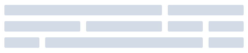
基础布局
使用单一分栏创建基础的栅格布局。

<el-row>
  <el-col :span="24"><div class="grid-content bg-purple-dark"></div></el-col>
</el-row>
<el-row>
  <el-col :span="12"><div class="grid-content bg-purple"></div></el-col>
  <el-col :span="12"><div class="grid-content bg-purple-light"></div></el-col>
</el-row>
<el-row>
  <el-col :span="8"><div class="grid-content bg-purple"></div></el-col>
  <el-col :span="8"><div class="grid-content bg-purple-light"></div></el-col>
  <el-col :span="8"><div class="grid-content bg-purple"></div></el-col>
</el-row>
<el-row>
  <el-col :span="6"><div class="grid-content bg-purple"></div></el-col>
  <el-col :span="6"><div class="grid-content bg-purple-light"></div></el-col>
  <el-col :span="6"><div class="grid-content bg-purple"></div></el-col>
  <el-col :span="6"><div class="grid-content bg-purple-light"></div></el-col>
</el-row>
<el-row>
  <el-col :span="4"><div class="grid-content bg-purple"></div></el-col>
  <el-col :span="4"><div class="grid-content bg-purple-light"></div></el-col>
  <el-col :span="4"><div class="grid-content bg-purple"></div></el-col>
  <el-col :span="4"><div class="grid-content bg-purple-light"></div></el-col>
  <el-col :span="4"><div class="grid-content bg-purple"></div></el-col>
  <el-col :span="4"><div class="grid-content bg-purple-light"></div></el-col>
</el-row>

<style>
  .el-row {
    margin-bottom: 20px;
    &:last-child {
      margin-bottom: 0;
    }
  }
  .el-col {
    border-radius: 4px;
  }
  .bg-purple-dark {
    background: #99a9bf;
  }
  .bg-purple {
    background: #d3dce6;
  }
  .bg-purple-light {
    background: #e5e9f2;
  }
  .grid-content {
    border-radius: 4px;
    min-height: 36px;
  }
  .row-bg {
    padding: 10px 0;
    background-color: #f9fafc;
  }
</style>
分栏间隔
分栏之间存在间隔。

<el-row :gutter="20">
  <el-col :span="6"><div class="grid-content bg-purple"></div></el-col>
  <el-col :span="6"><div class="grid-content bg-purple"></div></el-col>
  <el-col :span="6"><div class="grid-content bg-purple"></div></el-col>
  <el-col :span="6"><div class="grid-content bg-purple"></div></el-col>
</el-row>

<style>
  .el-row {
    margin-bottom: 20px;
    &:last-child {
      margin-bottom: 0;
    }
  }
  .el-col {
    border-radius: 4px;
  }
  .bg-purple-dark {
    background: #99a9bf;
  }
  .bg-purple {
    background: #d3dce6;
  }
  .bg-purple-light {
    background: #e5e9f2;
  }
  .grid-content {
    border-radius: 4px;
    min-height: 36px;
  }
  .row-bg {
    padding: 10px 0;
    background-color: #f9fafc;
  }
</style>
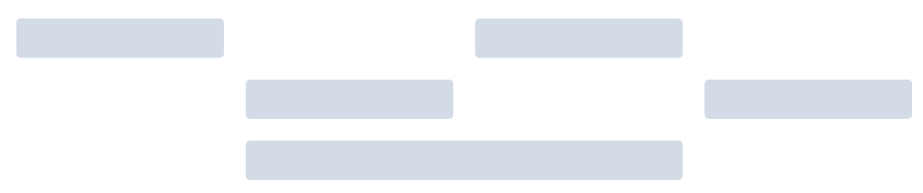
混合布局
通过基础的 1/24 分栏任意扩展组合形成较为复杂的混合布局。
<el-row :gutter="20">
  <el-col :span="16"><div class="grid-content bg-purple"></div></el-col>
  <el-col :span="8"><div class="grid-content bg-purple"></div></el-col>
</el-row>
<el-row :gutter="20">
  <el-col :span="8"><div class="grid-content bg-purple"></div></el-col>
  <el-col :span="8"><div class="grid-content bg-purple"></div></el-col>
  <el-col :span="4"><div class="grid-content bg-purple"></div></el-col>
  <el-col :span="4"><div class="grid-content bg-purple"></div></el-col>
</el-row>
<el-row :gutter="20">
  <el-col :span="4"><div class="grid-content bg-purple"></div></el-col>
  <el-col :span="16"><div class="grid-content bg-purple"></div></el-col>
  <el-col :span="4"><div class="grid-content bg-purple"></div></el-col>
</el-row>

<style>
  .el-row {
    margin-bottom: 20px;
    &:last-child {
      margin-bottom: 0;
    }
  }
  .el-col {
    border-radius: 4px;
  }
  .bg-purple-dark {
    background: #99a9bf;
  }
  .bg-purple {
    background: #d3dce6;
  }
  .bg-purple-light {
    background: #e5e9f2;
  }
  .grid-content {
    border-radius: 4px;
    min-height: 36px;
  }
  .row-bg {
    padding: 10px 0;
    background-color: #f9fafc;
  }
</style>
分栏偏移
支持偏移指定的栏数。
<el-row :gutter="20">
  <el-col :span="6"><div class="grid-content bg-purple"></div></el-col>
  <el-col :span="6" :offset="6"><div class="grid-content bg-purple"></div></el-col>
</el-row>
<el-row :gutter="20">
  <el-col :span="6" :offset="6"><div class="grid-content bg-purple"></div></el-col>
  <el-col :span="6" :offset="6"><div class="grid-content bg-purple"></div></el-col>
</el-row>
<el-row :gutter="20">
  <el-col :span="12" :offset="6"><div class="grid-content bg-purple"></div></el-col>
</el-row>

<style>
  .el-row {
    margin-bottom: 20px;
    &:last-child {
      margin-bottom: 0;
    }
  }
  .el-col {
    border-radius: 4px;
  }
  .bg-purple-dark {
    background: #99a9bf;
  }
  .bg-purple {
    background: #d3dce6;
  }
  .bg-purple-light {
    background: #e5e9f2;
  }
  .grid-content {
    border-radius: 4px;
    min-height: 36px;
  }
  .row-bg {
    padding: 10px 0;
    background-color: #f9fafc;
  }
</style>
对齐方式
通过 flex 布局来对分栏进行灵活的对齐。

<el-row type="flex" class="row-bg">
  <el-col :span="6"><div class="grid-content bg-purple"></div></el-col>
  <el-col :span="6"><div class="grid-content bg-purple-light"></div></el-col>
  <el-col :span="6"><div class="grid-content bg-purple"></div></el-col>
</el-row>
<el-row type="flex" class="row-bg" justify="center">
  <el-col :span="6"><div class="grid-content bg-purple"></div></el-col>
  <el-col :span="6"><div class="grid-content bg-purple-light"></div></el-col>
  <el-col :span="6"><div class="grid-content bg-purple"></div></el-col>
</el-row>
<el-row type="flex" class="row-bg" justify="end">
  <el-col :span="6"><div class="grid-content bg-purple"></div></el-col>
  <el-col :span="6"><div class="grid-content bg-purple-light"></div></el-col>
  <el-col :span="6"><div class="grid-content bg-purple"></div></el-col>
</el-row>
<el-row type="flex" class="row-bg" justify="space-between">
  <el-col :span="6"><div class="grid-content bg-purple"></div></el-col>
  <el-col :span="6"><div class="grid-content bg-purple-light"></div></el-col>
  <el-col :span="6"><div class="grid-content bg-purple"></div></el-col>
</el-row>
<el-row type="flex" class="row-bg" justify="space-around">
  <el-col :span="6"><div class="grid-content bg-purple"></div></el-col>
  <el-col :span="6"><div class="grid-content bg-purple-light"></div></el-col>
  <el-col :span="6"><div class="grid-content bg-purple"></div></el-col>
</el-row>

<style>
  .el-row {
    margin-bottom: 20px;
    &:last-child {
      margin-bottom: 0;
    }
  }
  .el-col {
    border-radius: 4px;
  }
  .bg-purple-dark {
    background: #99a9bf;
  }
  .bg-purple {
    background: #d3dce6;
  }
  .bg-purple-light {
    background: #e5e9f2;
  }
  .grid-content {
    border-radius: 4px;
    min-height: 36px;
  }
  .row-bg {
    padding: 10px 0;
    background-color: #f9fafc;
  }
</style>
响应式布局
参照了 Bootstrap 的 响应式设计,预设了五个响应尺寸:xs、sm、md、lg 和 xl。

<el-row :gutter="10">
  <el-col :xs="8" :sm="6" :md="4" :lg="3" :xl="1"><div class="grid-content bg-purple"></div></el-col>
  <el-col :xs="4" :sm="6" :md="8" :lg="9" :xl="11"><div class="grid-content bg-purple-light"></div></el-col>
  <el-col :xs="4" :sm="6" :md="8" :lg="9" :xl="11"><div class="grid-content bg-purple"></div></el-col>
  <el-col :xs="8" :sm="6" :md="4" :lg="3" :xl="1"><div class="grid-content bg-purple-light"></div></el-col>
</el-row>

<style>
  .el-col {
    border-radius: 4px;
  }
  .bg-purple-dark {
    background: #99a9bf;
  }
  .bg-purple {
    background: #d3dce6;
  }
  .bg-purple-light {
    background: #e5e9f2;
  }
  .grid-content {
    border-radius: 4px;
    min-height: 36px;
  }
</style>
基于断点的隐藏类
Element 额外提供了一系列类名,用于在某些条件下隐藏元素。这些类名可以添加在任何 DOM 元素或自定义组件上。如果需要,请自行引入以下文件:import 'element-ui/lib/theme-chalk/display.css';
Container 布局容器
用于布局的容器组件,方便快速搭建页面的基本结构:
<el-container>:外层容器。当子元素中包含 <el-header> 或 <el-footer> 时,全部子元素会垂直上下排列,否则会水平左右排列。
<el-header>:顶栏容器。
<el-aside>:侧边栏容器。
<el-main>:主要区域容器。
<el-footer>:底栏容器。
常见页面布局

<el-container>
  <el-header>Header</el-header>
  <el-main>Main</el-main>
</el-container>

<el-container>
  <el-header>Header</el-header>
  <el-main>Main</el-main>
  <el-footer>Footer</el-footer>
</el-container>

<el-container>
  <el-aside width="200px">Aside</el-aside>
  <el-main>Main</el-main>
</el-container>

<el-container>
  <el-header>Header</el-header>
  <el-container>
    <el-aside width="200px">Aside</el-aside>
    <el-main>Main</el-main>
  </el-container>
</el-container>

<el-container>
  <el-header>Header</el-header>
  <el-container>
    <el-aside width="200px">Aside</el-aside>
    <el-container>
      <el-main>Main</el-main>
      <el-footer>Footer</el-footer>
    </el-container>
  </el-container>
</el-container>

<el-container>
  <el-aside width="200px">Aside</el-aside>
  <el-container>
    <el-header>Header</el-header>
    <el-main>Main</el-main>
  </el-container>
</el-container>

<el-container>
  <el-aside width="200px">Aside</el-aside>
  <el-container>
    <el-header>Header</el-header>
    <el-main>Main</el-main>
    <el-footer>Footer</el-footer>
  </el-container>
</el-container>

<style>
  .el-header, .el-footer {
    background-color: #B3C0D1;
    color: #333;
    text-align: center;
    line-height: 60px;
  }

  .el-aside {
    background-color: #D3DCE6;
    color: #333;
    text-align: center;
    line-height: 200px;
  }

  .el-main {
    background-color: #E9EEF3;
    color: #333;
    text-align: center;
    line-height: 160px;
  }

  body > .el-container {
    margin-bottom: 40px;
  }

  .el-container:nth-child(5) .el-aside,
  .el-container:nth-child(6) .el-aside {
    line-height: 260px;
  }

  .el-container:nth-child(7) .el-aside {
    line-height: 320px;
  }
</style>
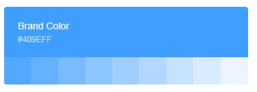
Color 色彩
Element 为了避免视觉传达差异,使用一套特定的调色板来规定颜色,为你所搭建的产品提供一致的外观视觉感受。
主色
Element 主要品牌颜色是鲜艳、友好的蓝色。
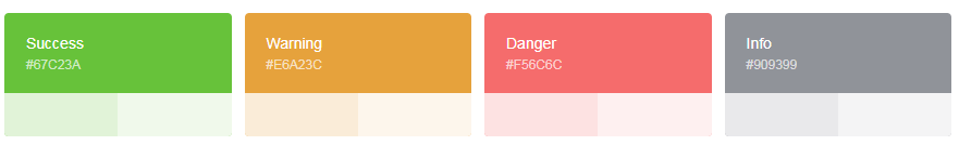
辅助色
除了主色外的场景色,需要在不同的场景中使用(例如危险色表示危险的操作)。
中性色
中性色用于文本、背景和边框颜色。通过运用不同的中性色,来表现层次结构。

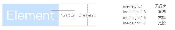
Typography 字体
我们对字体进行统一规范,力求在各个操作系统下都有最佳展示效果。
字体

字号

行高
Font-family 代码
font-family: "Helvetica Neue",Helvetica,"PingFang SC","Hiragino Sans GB","Microsoft YaHei","微软雅黑",Arial,sans-serif;
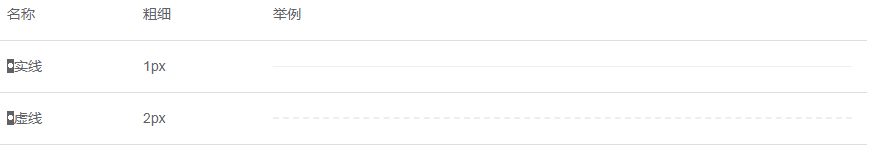
Border 边框
我们对边框进行统一规范,可用于按钮、卡片、弹窗等组件里。
边框
我们提供了以下几种边框样式,以供选择。
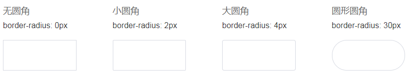
圆角
投影

Icon 图标
提供了一套常用的图标集合。
使用方法
直接通过设置类名为 el-icon-iconName 来使用即可。例如:
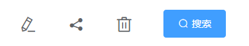
<i class="el-icon-edit"></i>
<i class="el-icon-share"></i>
<i class="el-icon-delete"></i>
<el-button type="primary" icon="el-icon-search">搜索</el-button>
图标集合

等…更多图标请到https://element.eleme.cn/#/zh-CN/component/icon
Button 按钮
常用的操作按钮。
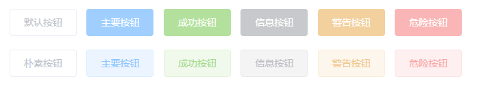
基础用法
基础的按钮用法。

<el-row>
  <el-button>默认按钮</el-button>
  <el-button type="primary">主要按钮</el-button>
  <el-button type="success">成功按钮</el-button>
  <el-button type="info">信息按钮</el-button>
  <el-button type="warning">警告按钮</el-button>
  <el-button type="danger">危险按钮</el-button>
</el-row>

<el-row>
  <el-button plain>朴素按钮</el-button>
  <el-button type="primary" plain>主要按钮</el-button>
  <el-button type="success" plain>成功按钮</el-button>
  <el-button type="info" plain>信息按钮</el-button>
  <el-button type="warning" plain>警告按钮</el-button>
  <el-button type="danger" plain>危险按钮</el-button>
</el-row>

<el-row>
  <el-button round>圆角按钮</el-button>
  <el-button type="primary" round>主要按钮</el-button>
  <el-button type="success" round>成功按钮</el-button>
  <el-button type="info" round>信息按钮</el-button>
  <el-button type="warning" round>警告按钮</el-button>
  <el-button type="danger" round>危险按钮</el-button>
</el-row>

<el-row>
  <el-button icon="el-icon-search" circle></el-button>
  <el-button type="primary" icon="el-icon-edit" circle></el-button>
  <el-button type="success" icon="el-icon-check" circle></el-button>
  <el-button type="info" icon="el-icon-message" circle></el-button>
  <el-button type="warning" icon="el-icon-star-off" circle></el-button>
  <el-button type="danger" icon="el-icon-delete" circle></el-button>
</el-row>
禁用状态
按钮不可用状态。
<el-row>
  <el-button disabled>默认按钮</el-button>
  <el-button type="primary" disabled>主要按钮</el-button>
  <el-button type="success" disabled>成功按钮</el-button>
  <el-button type="info" disabled>信息按钮</el-button>
  <el-button type="warning" disabled>警告按钮</el-button>
  <el-button type="danger" disabled>危险按钮</el-button>
</el-row>

<el-row>
  <el-button plain disabled>朴素按钮</el-button>
  <el-button type="primary" plain disabled>主要按钮</el-button>
  <el-button type="success" plain disabled>成功按钮</el-button>
  <el-button type="info" plain disabled>信息按钮</el-button>
  <el-button type="warning" plain disabled>警告按钮</el-button>
  <el-button type="danger" plain disabled>危险按钮</el-button>
</el-row>
文字按钮
没有边框和背景色的按钮。
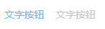
<el-button type="text">文字按钮</el-button>
<el-button type="text" disabled>文字按钮</el-button>
图标按钮
带图标的按钮可增强辨识度(有文字)或节省空间(无文字)。
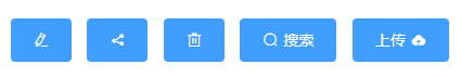
<el-button type="primary" icon="el-icon-edit"></el-button>
<el-button type="primary" icon="el-icon-share"></el-button>
<el-button type="primary" icon="el-icon-delete"></el-button>
<el-button type="primary" icon="el-icon-search">搜索</el-button>
<el-button type="primary">上传<i class="el-icon-upload el-icon--right"></i></el-button>
按钮组
以按钮组的方式出现,常用于多项类似操作。
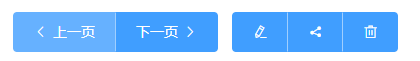
<el-button-group>
  <el-button type="primary" icon="el-icon-arrow-left">上一页</el-button>
  <el-button type="primary">下一页<i class="el-icon-arrow-right el-icon--right"></i></el-button>
</el-button-group>
<el-button-group>
  <el-button type="primary" icon="el-icon-edit"></el-button>
  <el-button type="primary" icon="el-icon-share"></el-button>
  <el-button type="primary" icon="el-icon-delete"></el-button>
</el-button-group>
加载中
点击按钮后进行数据加载操作,在按钮上显示加载状态。
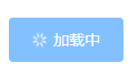
<el-button type="primary" :loading="true">加载中</el-button>
不同尺寸
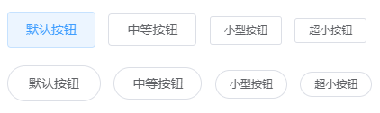
<el-row>
  <el-button>默认按钮</el-button>
  <el-button size="medium">中等按钮</el-button>
  <el-button size="small">小型按钮</el-button>
  <el-button size="mini">超小按钮</el-button>
</el-row>
<el-row>
  <el-button round>默认按钮</el-button>
  <el-button size="medium" round>中等按钮</el-button>
  <el-button size="small" round>小型按钮</el-button>
  <el-button size="mini" round>超小按钮</el-button>
</el-row>
Link 文字链接
文字超链接
文字超链接
基础的文字链接用法。
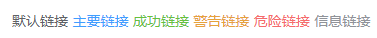
<div>
  <el-link href="https://element.eleme.io" target="_blank">默认链接</el-link>
  <el-link type="primary">主要链接</el-link>
  <el-link type="success">成功链接</el-link>
  <el-link type="warning">警告链接</el-link>
  <el-link type="danger">危险链接</el-link>
  <el-link type="info">信息链接</el-link>
</div>
禁用状态
文字链接不可用状态。

<div>
  <el-link disabled>默认链接</el-link>
  <el-link type="primary" disabled>主要链接</el-link>
  <el-link type="success" disabled>成功链接</el-link>
  <el-link type="warning" disabled>警告链接</el-link>
  <el-link type="danger" disabled>危险链接</el-link>
  <el-link type="info" disabled>信息链接</el-link>
</div>
下划线
文字链接下划线。
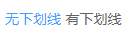
<div>
  <el-link :underline="false">无下划线</el-link>
  <el-link>有下划线</el-link>
</div>
图标
带图标的文字链接可增强辨识度。
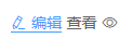
<div>
  <el-link icon="el-icon-edit">编辑</el-link>
  <el-link>查看<i class="el-icon-view el-icon--right"></i> </el-link>
</div>


 3万+
3万+


 被折叠的 条评论
为什么被折叠?
被折叠的 条评论
为什么被折叠?
 到【灌水乐园】发言


