


简单KNN案例
先选择需要的库
import numpy
import matplotlib
import sklearn
from  sklearn.neighbors import  KNeighborsClassifier #KNN分类型
我们写入需要的训练数据,x_train和y_train一一对应的
x_train=[[185,80,43],[170,70,41],[163,45,36],
[165,55,39],[156,41,35]] #身高,体重,鞋码
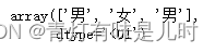
y_train=["男","男","女","男","女"]
选择需要的分类算法,这里KNN,n_neighbors是选择临近的n个点进行计算
knn=KNeighborsClassifier (n_neighbors=3)#创建机器学习的KNN对象
我们对刚才的数据进行训练
knn.fit(x_train,y_train) #训练数据,自适应数据建立数据模型
写入我们测试数据,一会用得到的结果去判断模型怎么样
Test_data=[[185,76,45],[156,43,35],[186,63,41]] #随机数据测试
测试一下数据,看上去还行
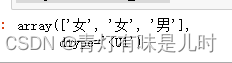
knn.predict(Test_data)
稍微修改一点数据,就发现性别变了,可以知道knn对于一些异常数据可能并不好用。
Test_data=[[185,46,35],[156,43,35],[186,63,41]]
knn.predict(Test_data)
KNN案例绘制
因为是鸢尾花有自带的数据,我们调用库后会给到数据
import sklearn.datasets  as datasets #引用数据
from sklearn.neighbors  import KNeighborsClassifier #KN分类器
我们选择鸢尾花
#抓取数据当作训练的样本
iris=datasets.load_iris() #蓝蝴蝶
iris
训练样本选取间隔两个
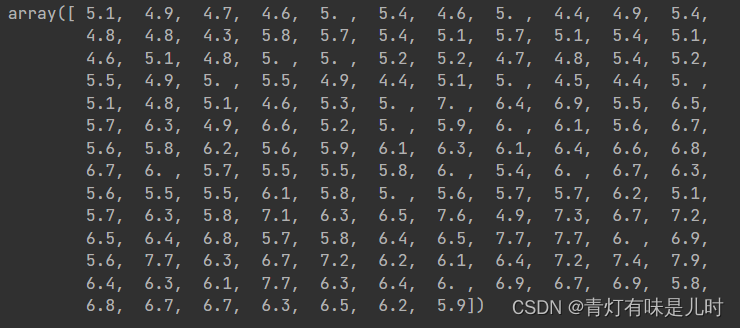
x_train=iris.data[::2] #样本数据
x_train
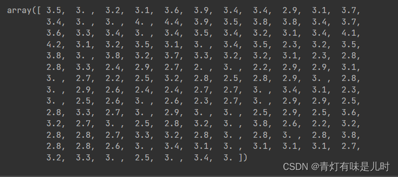
样本数据的结果target选取出来
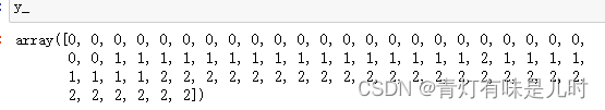
y_train=iris.target[::2] #样本数据
y_train
设置测试数据
x_test=iris.data[1::2] #knn结果
x_test
对应的测试结果
y_test=iris.target[1::2]
y_test
创建KNN分类器
knn=KNeighborsClassifier() #创建KNN分类器
训练数据
knn.fit(x_train,y_train) #训练数据
预测我们的测试集
y_=knn.predict(x_test) #数据预测
我们原来的测试结果
y_test
那么就对测试集进行打分
knn.score(x_test,y_test) #评分,
调用画图的库
import  matplotlib.pyplot as plt
%matplotlib  inline
from  matplotlib.colors  import  ListedColormap #绘图引用的模块
选择
cmap=ListedColormap(["#FF0000","#00FF00","#0000FF"])#颜色列表
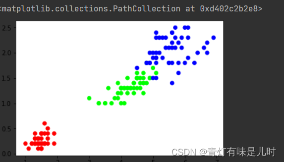
plt.scatter(iris.data[:,2],iris.data[:,3],
            c=iris.target,cmap=cmap) #绘制散点图,根据颜色分类
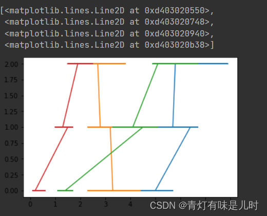
plt.plot(x_test,y_test)
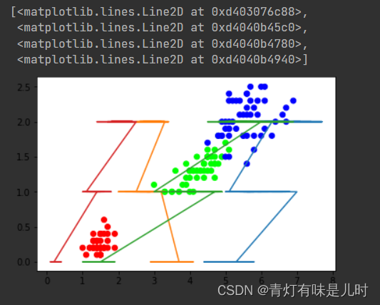
plt.scatter(iris.data[:,2],iris.data[:,3],
            c=iris.target,cmap=cmap)
#plt.plot(x_test,y_test)
plt.plot(x_train,y_train)
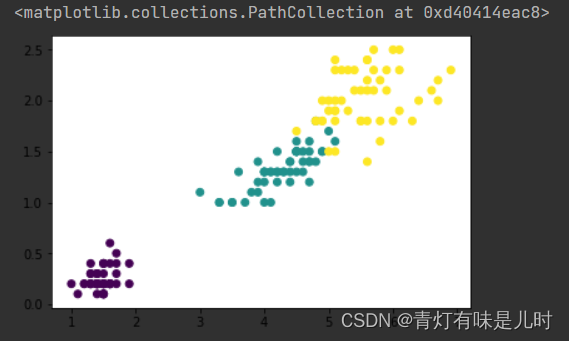
plt.scatter(iris.data[:,2],iris.data[:,3],
            c=iris.target) #绘制散点图,根据颜色分类
plt.scatter(iris.data[:,2],iris.data[:,3])
plt.scatter(iris.data[:,2],iris.data[:,3])
KNN分类
# 导入库:KNeighborsClassifier
import numpy as np
from sklearn.neighbors import KNeighborsClassifier
import matplotlib.pyplot as plt
from matplotlib.colors import ListedColormap
%matplotlib inline
# 导入sklearn自带数据集
from sklearn import datasets
一个知识点:np.c 中的c 是 column(列)的缩写,就是按列叠加两个矩阵,就是把两个矩阵左右组合,要求行数相等。
#抓取训练样本
iris=datasets.load_iris()
x=iris.data[:,:2]
y=iris.target
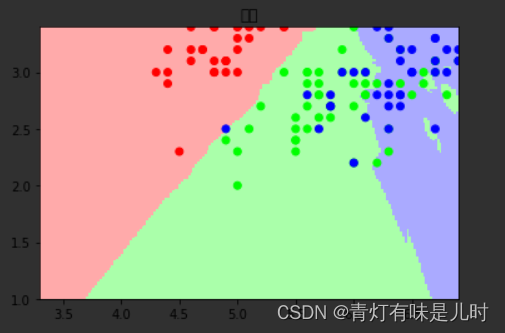
#设置 K NN k=15 ,计算周围临近的15个点
K=15
#图片,x,y每一步的步长
h=0.02
#两个颜色分类
cmap_light=ListedColormap(["#FFAAAA","#AAFFAA","#AAAAFF"])#颜色列
cmap_bold=ListedColormap(["#FF0000","#00FF00","#0000FF"])#颜色列
myknn=KNeighborsClassifier(n_neighbors=K) #设置访问周围15个点
myknn.fit(x,y) #训练数据
#四个数描述图片显示范围
xmin,xmax=x[:,0].min()-1,x[:,0].max()-1
ymin,ymax=x[:,1].min()-1,x[:,1].max()-1
#生成网格
xx,yy=np.meshgrid(np.arange(xmin,xmax,h),
np.arange(ymin,ymax,h))
#预测
z=myknn.predict(np.c_[xx.ravel(),yy.ravel()])
z=z.reshape(xx.shape)
#显示背景颜色
plt.pcolormesh(xx,yy,z,cmap=cmap_light)
#显示点的颜色
plt.scatter(x[:,0],x[:,1],c=y,cmap=cmap_bold)
plt.xlim(xx.min(),xx.max())
plt.ylim(yy.min(),yy.max())
plt.title("分类")
plt.show()
xmin
xmax
x[:,0]
x[:,1]
y
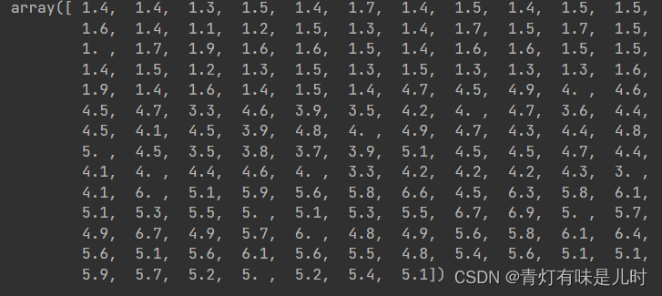
iris.data[:,:][:,2]
KNN回归
# 导入库:KNeighborsClassifier
import numpy as np
from sklearn.neighbors import KNeighborsRegressor #回归
import matplotlib.pyplot as plt
from matplotlib.colors import ListedColormap
%matplotlib inline
# 导入sklearn自带数据集
from sklearn import datasets
np.random.seed(0) #设置随机数种子
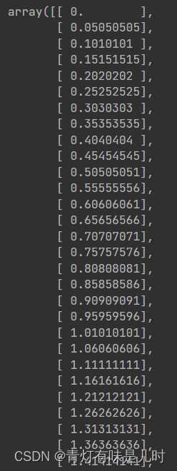
x=np.sort(5*np.random.rand(40,1),axis=0)
x
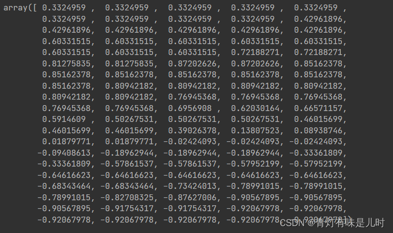
y=np.sin(x).ravel()
y
y[::5]+= 1*(0.5-np.random.rand(8)) #破坏数据的整齐
y
T=np.linspace(0,5,100)[:,np.newaxis]
T
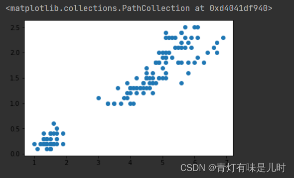
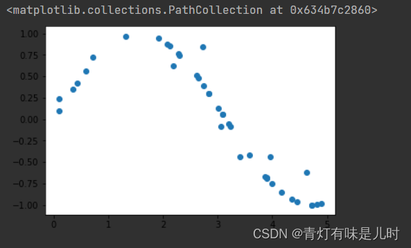
plt.scatter(x,y)
#定义一个knn回归模型
knn=KNeighborsRegressor(n_neighbors=5) #计算临近5个点
knn.fit(x,y) #训练数据
newy=knn.predict(T) #预测
newy
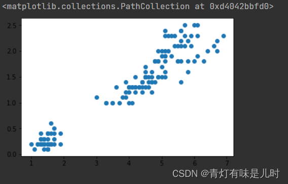
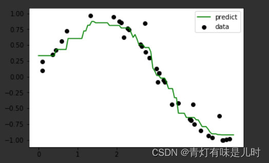
plt.scatter(x,y,c="k",label="data")
plt.plot(T,newy,c="g",label="predict")
plt.axis("tight")
plt.legend()
plt.show()
KNN收入预测
# 导入库:KNeighborsClassifier
import numpy as np
from sklearn.neighbors import KNeighborsClassifier
import matplotlib.pyplot as plt
from matplotlib.colors import ListedColormap
%matplotlib inline
# 导入sklearn自带数据集
from sklearn import datasets
import  pandas as  pd
path=r"C:\Users\Tsinghua-yincheng\Desktop\SZday91\KNNTest\data\adults.txt"
data=pd.read_csv(path)
print(type(data))
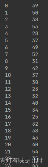
data["age"]
data.shape
data.index
data.columns

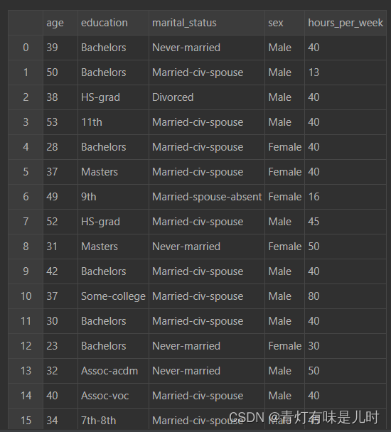
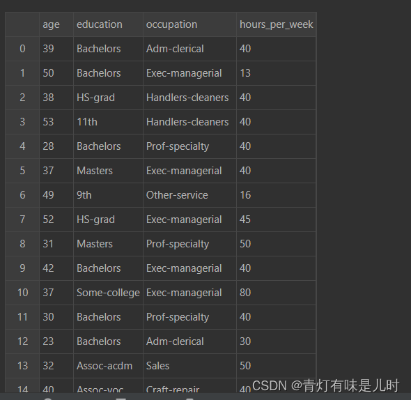
X=data[['age','education','marital_status','sex' ,'hours_per_week']]
X
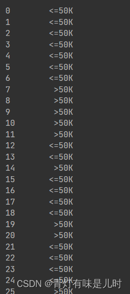
Y=data['salary']
Y
X=data[['age','education','occupation' ,'hours_per_week']]
X
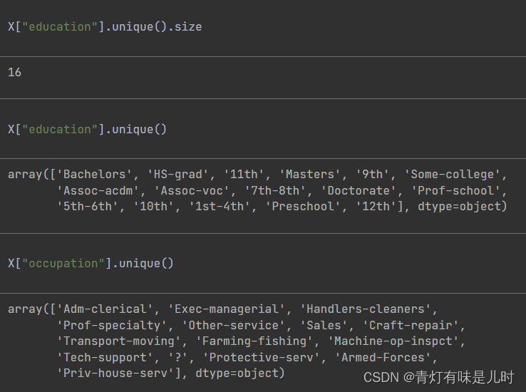
X["education"].unique().size
X["education"].unique()
X["occupation"].unique()
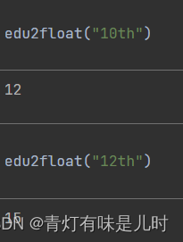
def  edu2float(edu): #任何学历,返回一个数字代表
    return  np.argwhere(X["education"].unique()==edu)[0,0]
edu2float("10th")
edu2float("12th")
def  occupation2float(occupation): #任何学历,返回一个数字代表
    return  np.argwhere(X["occupation"].unique()==occupation)[0,0]
occupation2float("Priv-house-serv")

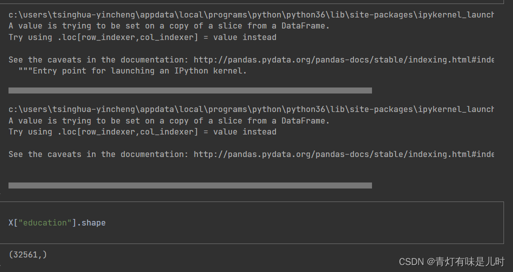
X["occupation"]=X["occupation"].map(occupation2float)
X["education"]=X["education"].map(edu2float)
X["education"].shape
X["education"][12888]
输出:7
X_train=X.iloc[:-1000] #训练数据
X_test=X.iloc[-1000:]#测试数据
Y_train=Y.iloc[:-1000] #训练数据
Y_test=Y.iloc[-1000:]#测试数据
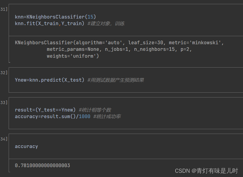
knn=KNeighborsClassifier(15)
knn.fit(X_train,Y_train) #建立对象,训练
Ynew=knn.predict(X_test) #用测试数据产生预测结果
result=(Y_test==Ynew) #统计相等个数
accuracy=result.sum()/1000 #统计成功率
accuracy


 898
898


 被折叠的 条评论
为什么被折叠?
被折叠的 条评论
为什么被折叠?
 到【灌水乐园】发言


