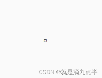
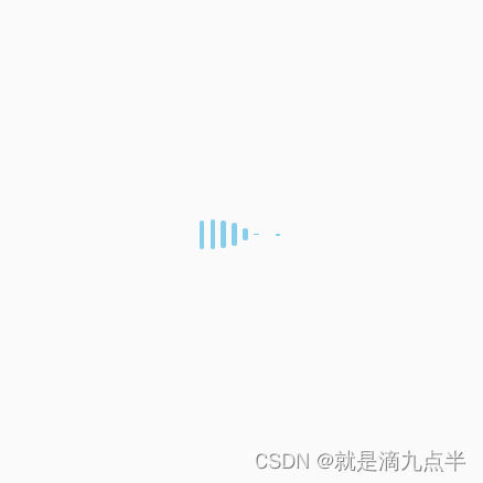
利用 element-ui 中 el-image 组件实现,图片正在加载时的动画

效果:成功失败

代码

<el-image class="style_10" :src="item1">
  <!-- 加载时的动画 -->
  <div slot="placeholder" class="image-slot">
    <div class="item"></div>
    <div class="item"></div>
    <div class="item"></div>
    <div class="item"></div>
    <div class="item"></div>
    <div class="item"></div>
    <div class="item"></div>
    <div class="item"></div>
  </div>
  <!-- 加载失败时的显示 -->
  <div slot="error" class="image-slot">
    <i class="el-icon-picture-outline"></i>
  </div>
</el-image>

样式

.style_10 {
  width: 500px;
  object-fit: cover;
}
.image-slot {
  width: 500px;
  height: 500px;
  display: flex;
  /* 设置子项在y轴方向居中,应该是设置起点在中间,非常有用,不然动画很怪 */
  align-items: center;
  justify-content: center;
}
/* 小竖条 */
.item {
  height: 30px;
  width: 5px;
  background: skyblue;
  /* 加margin,使竖条之间有空隙 */
  margin: 0px 3px;
  /* 圆角 */
  border-radius: 10px;
  /* 动画:名称、时间、循环 */
  animation: loading 1s infinite;
}

/* 设置动画 */
@keyframes loading {
  0% {
    height: 0px;
  }

  50% {
    height: 30px;
  }

  100% {
    height: 0px;
  }
}
/* 为每一个竖条设置延时 */
.item:nth-child(2) {
  animation-delay: 0.1s;
}

.item:nth-child(3) {
  animation-delay: 0.2s;
}

.item:nth-child(4) {
  animation-delay: 0.3s;
}

.item:nth-child(5) {
  animation-delay: 0.4s;
}

.item:nth-child(6) {
  animation-delay: 0.5s;
}

.item:nth-child(7) {
  animation-delay: 0.6s;
}

.item:nth-child(8) {
  animation-delay: 0.7s;
}

Element UI 提供了一个非常方便的文件上传功能,`el-upload` 组件可以帮助你轻松处理文件上传。如果你想封装一个自定义的上传组件,你可以按照以下步骤进行: 1. 引入依赖: 首先,在你的 Vue 组件中引入 Element UI 的 `Upload` 组件和其他必要的样式: ```html <template> <div> <!-- 使用 import 或者 require 根据你的项目设置 --> <el-upload ref="upload" :action="uploadUrl" :on-success="handleSuccess" :before-upload="beforeUpload" multiple></el-upload> </div> </template> ``` 2. 定义属性: - `action`: 上传到服务器的 URL。 - `before-upload`: 用于验证上传前的行为(如检查文件类型、大小等)。 - `handleSuccess`: 文件上传成功的回调,通常在这里接收服务器返回的数据。 ```js export default { data() { return { uploadUrl: '', // 你的上传接口地址 fileList: [], // 存储已上传文件的列表 uploading: false, // 是否正在上传 }; }, methods: { beforeUpload(file) { // 检查文件类型或大小,根据需求修改这里 if (file.size > 1024 * 1024 * 5) { // 限制单个文件不超过5MB this.$message.error('文件大小不能超过5MB'); return false; } const allowedTypes = ['image/jpeg', 'image/png']; // 允许的文件类型 if (!allowedTypes.includes(file.type)) { this.$message.error('只支持图片格式'); return false; } return true; }, handleSuccess(response, file) { // 这里处理服务器响应并更新状态 this.fileList.push({ name: file.name, url: response.url }); this.uploading = false; // 设置为false表示上传完成 }, }, }; ``` 3. 渲染组件传递属性: 当你在父组件中使用这个自定义上传组件,传入上述所需的数据: ```html <custom-uploader :upload-url="yourUploadUrl" v-model="fileList"></custom-uploader> ``` 4. 可选的其他功能: - 取消上传:在 `handleError` 方法中添加取消上传逻辑。 - 前置操作(例如显示加载动画):在 `startLoading` 和 `endLoading` 方法中分别开启和关闭。 记得在实际项目中,可能还需要对错误处理、进度反馈等进行完善。
评论 1
添加红包

请填写红包祝福语或标题

红包个数最小为10个

红包金额最低5元

当前余额3.43前往充值 >
需支付:10.00
成就一亿技术人!
领取后你会自动成为博主和红包主的粉丝 规则
hope_wisdom
发出的红包
实付
使用余额支付
点击重新获取
扫码支付
钱包余额 0

抵扣说明:

1.余额是钱包充值的虚拟货币,按照1:1的比例进行支付金额的抵扣。
2.余额无法直接购买下载,可以购买VIP、付费专栏及课程。

余额充值