


R语言—基础绘图
1.1 字体大小
1.2 点的样式
1.3 线的样式
1.4 线的宽度
1.5 坐标轴的密度分布展示
1.6 边框
1.7 网格线
1.8 点
1.9 线
1.10 线段
1.11 箭头
1.12 多边形
1.13 气泡图
1.14 曲线图
1.15 柱状图
1.16 条形图
1.17 饼图
1.18 双坐标图
1.19 图形的局部放大
R语言—基础绘图
plot(c(0:5), col = 'white')
text(2,4, labels = 'font=1:正常字体(默认)', font = 1)
text(3,3, labels = 'font=2:粗体字体',font = 2)
text(4,2,labels = 'font=3:斜体字体',font = 3)
text(5,1,labels = 'font=4:粗斜体字体',font=4)
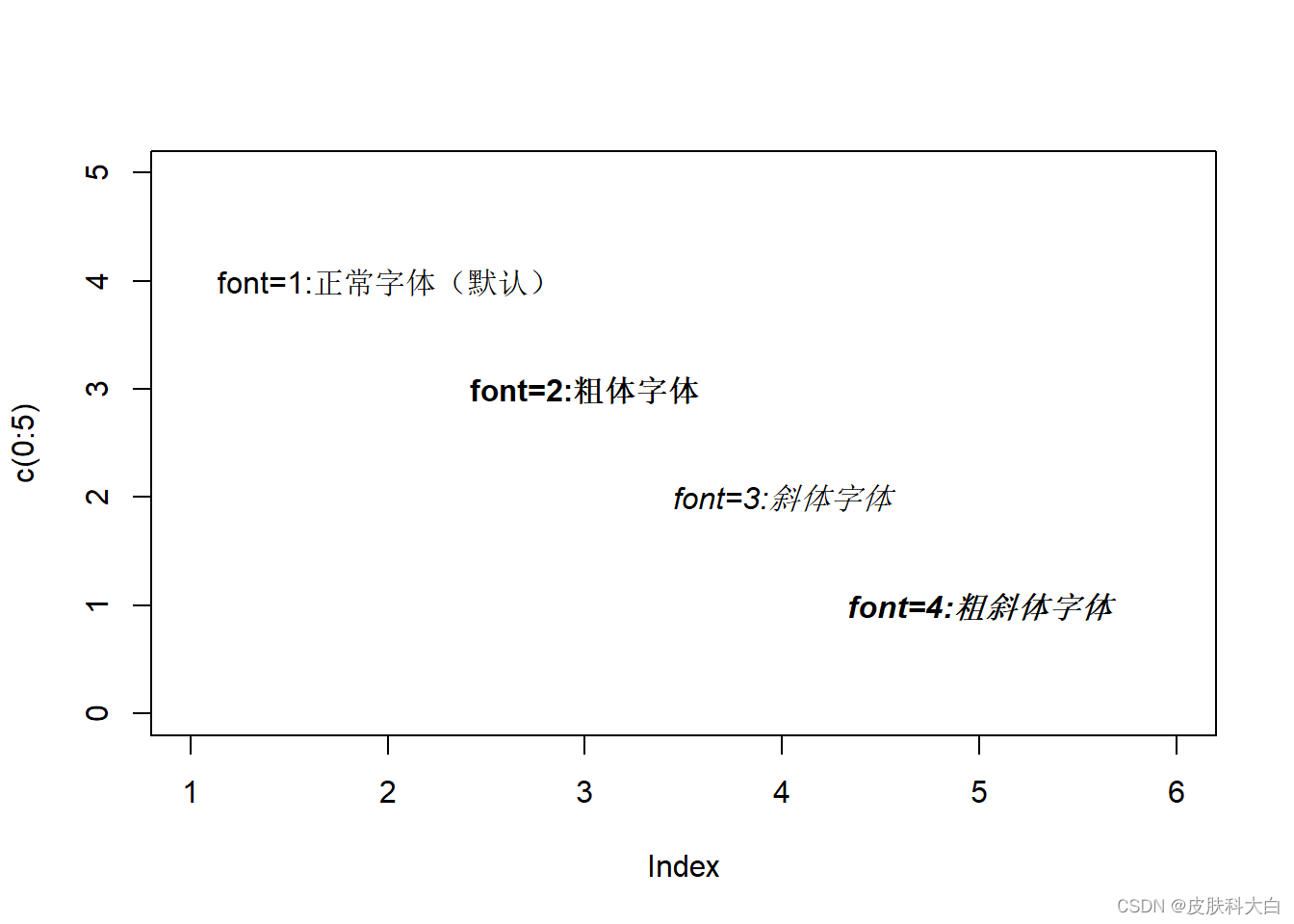
1.1 字体大小
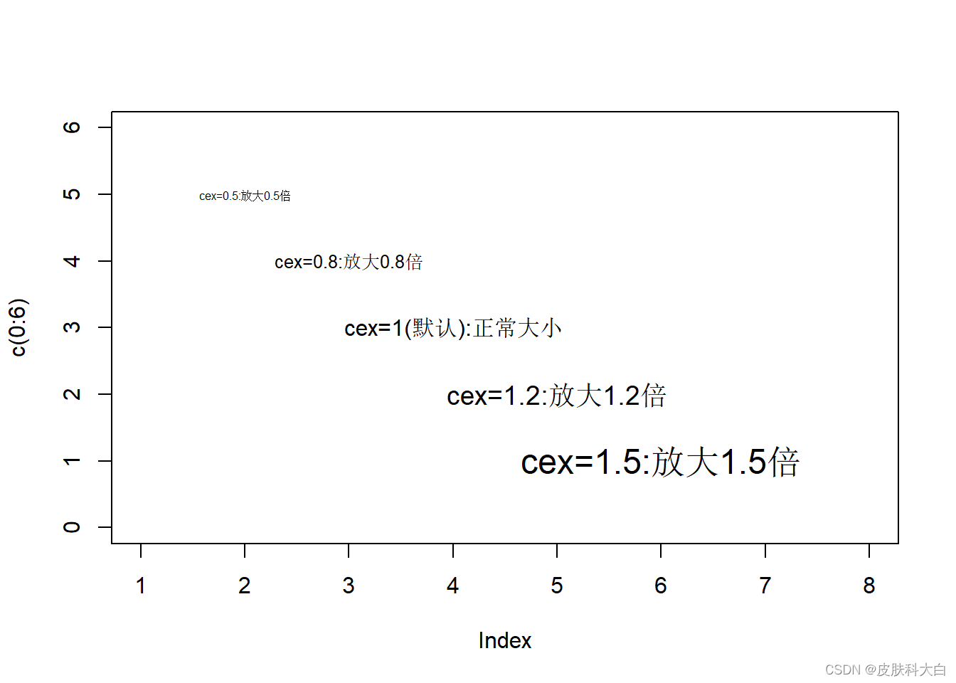
plot(c(0:6),col='white',xlim = c(1,8))
text(2,5,labels = 'cex=0.5:放大0.5倍',cex=0.5)
text(3,4,labels = 'cex=0.8:放大0.8倍',cex=0.8)
text(4,3,labels = 'cex=1(默认):正常大小',cex=1)
text(5,2,labels = 'cex=1.2:放大1.2倍',cex=1.2)
text(6,1,labels = 'cex=1.5:放大1.5倍',cex=1.5)
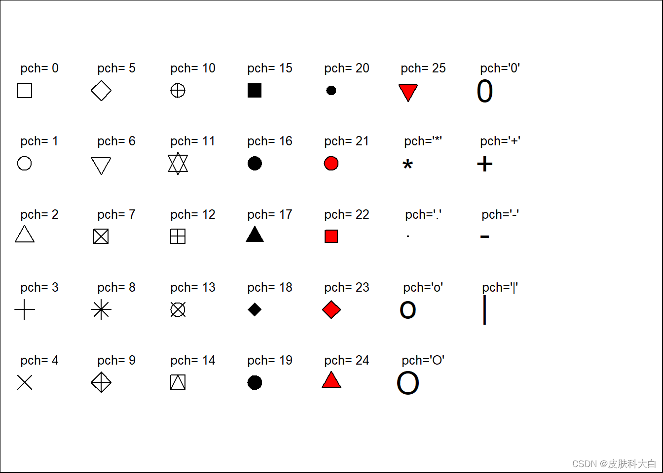
1.2 点的样式
par(mar=c(0,0,0,0))
plot(1,col='white',xlim = c(1,9),ylim = c(1,7))
for(i in 0:25){
  x <- (i%/%5)*1+1
  y <- 6-(i%%5)
  if(length(which(c(21:25)==i)>=1)){
    #21--25的点格式可以设置背景色
    points(x,y,pch=i,bg='red',cex=2)
  }else{
    points(x,y,pch=i,cex=2)
  }
  text(x+0.2,y+0.3,labels = paste('pch=',i),cex=0.8)
}
points(6,5,pch='*',cex=2);text(6.2,5.3,labels = paste('pch=\'*\''),cex=0.8)
points(6,4,pch='.',cex=2);text(6.2,4.3,labels = paste('pch=\'.\''),cex=0.8)
points(6,3,pch='o',cex=2);text(6.2,3.3,labels = paste('pch=\'o\''),cex=0.8)
points(6,2,pch='O',cex=2);text(6.2,2.3,labels = paste('pch=\'O\''),cex=0.8)
points(7,6,pch='0',cex=2);text(7.2,6.3,labels = paste('pch=\'0\''),cex=0.8)
points(7,5,pch='+',cex=2);text(7.2,5.3,labels = paste('pch=\'+\''),cex=0.8)
points(7,4,pch='-',cex=2);text(7.2,4.3,labels = paste('pch=\'-\''),cex=0.8)
points(7,3,pch='|',cex=2);text(7.2,3.3,labels = paste('pch=\'|\''),cex=0.8)
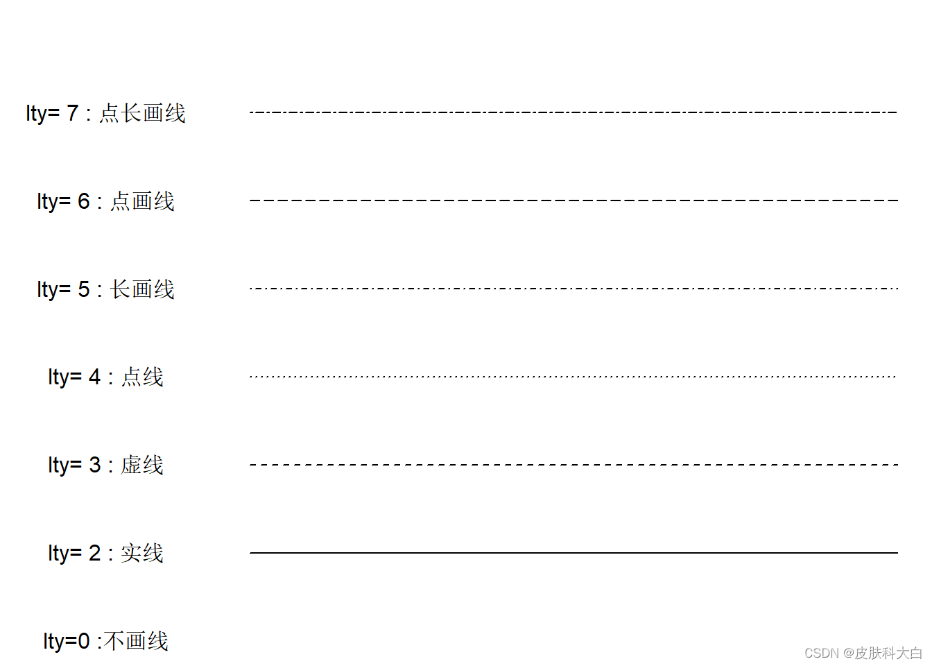
1.3 线的样式
par(mar=c(0,0,0,0))
data = matrix(rep(rep(1:7),10),ncol = 10, nrow = 7)
plot(data[1,],type = 'l',lty=0,ylim = c(1,8),xlim = c(-2,10),axes = F,
     xlab = '', ylab = '')
text(-1,1,labels = paste('lty=0',':不画线'))
id = c('不画线','实线','虚线','点线','长画线','点画线','点长画线')
for(i in 2:7){
  lines(data[i,],lty=i-1)
  text(-1,i,labels = paste('lty=',i,':',id[i]))
}
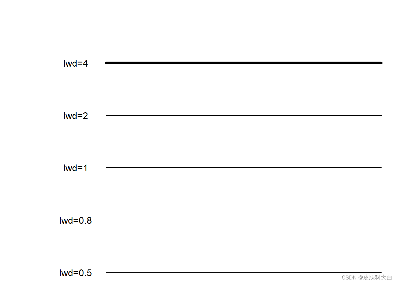
1.4 线的宽度
par(mar=c(0,0,0,0))
data = matrix(rep(rep(1:5),10),ncol = 10, nrow = 5)
plot(data[1,],type = 'l',lwd=0.5,ylim = c(1,6),xlim = c(-2,10),axes = F,
     xlab = '', ylab = '')
text(0,1,labels = 'lwd=0.5')
lines(data[2,],lwd=0.8);text(0,2,labels = 'lwd=0.8')
lines(data[3,],lwd=1);text(0,3,labels = 'lwd=1')
lines(data[4,],lwd=2);text(0,4,labels = 'lwd=2')
lines(data[5,],lwd=4);text(0,5,labels = 'lwd=4')
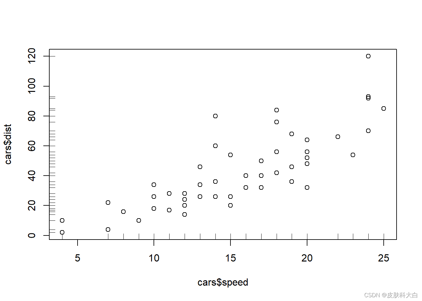
1.5 坐标轴的密度分布展示
plot(cars$speed,cars$dist)
rug(cars$speed)
rug(cars$dist,side = 2)
1.6 边框
x.text <- c('1月','2月','3月','4月','5月','6月','7月','8月','9月','10月','11月','12月')
sales.volume <- c(158721,190094,108441,88092,68709,50116,90117,160044,186045,
                  106334,89092,104933)
id <- c('o','l','7','c','u',']')
par(mfrow=c(2,3))
for (i in 1:length(id)){
  plot(sales.volume,type = 'b',ylim = c(20000,250000),xaxt='n',yaxt='n',
       bty = id[i], main = paste('bty取',id[i],sep=''),xlab='月份',ylab='销量')
  axis(1,at=1:12,labels = x.text,tick = FALSE);axis(2,tick = FALSE)
}
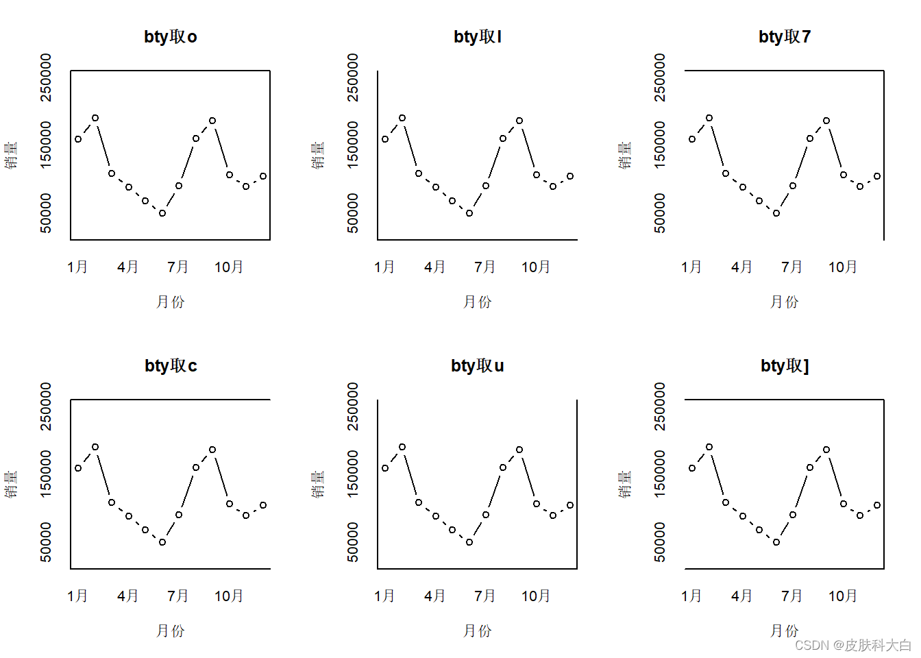
box()函数也可以设置各边框的线条样式,bty-边框,col-颜色,lwd-线宽,lty-线样
1.7 网格线
plot(sales.volume,type = 'b',ylim = c(20000,250000),xaxt='n',yaxt='n',
     main = '月销量趋势图',xlab='月份',ylab='销量(元)')
axis(1,at=1:12,labels = x.text,tick = FALSE)
grid(nx=NA, ny=8, lwd=1, col='skyblue')

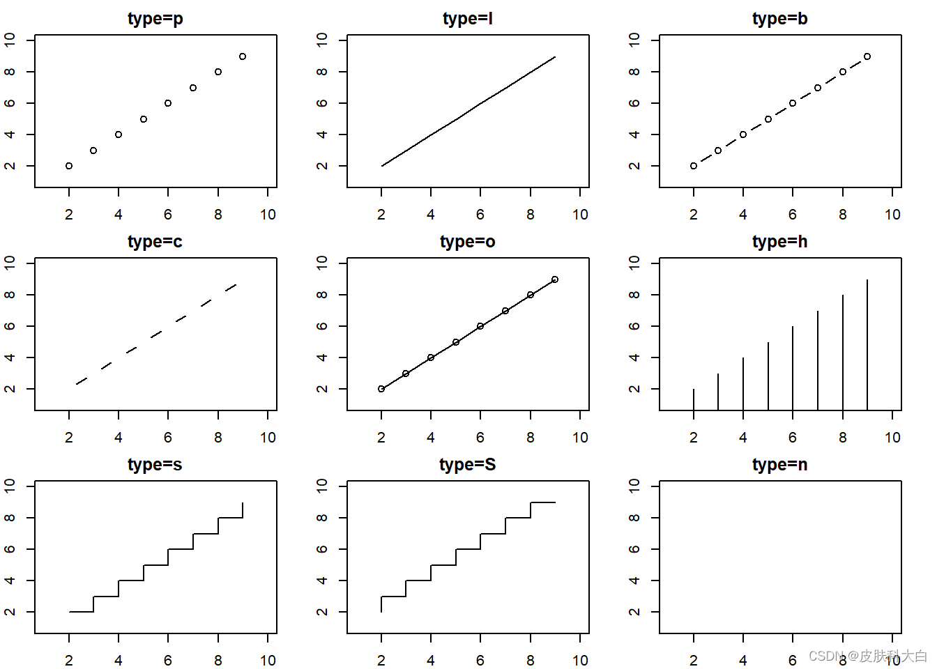
1.8 点
x <- 2:9;y <- 2:9
par(mfrow=c(3,3),mar=c(2,2,2,2))
ida <- c('p','l','b','c','o','h','s','S','n')
for(i in 1:length(ida)){
  plot(1,1,ylim=c(1,10),xlim = c(1,10),col='white',
       main = paste('type=',ida[i],sep = ''))
  points(x,y,type=ida[i])
}
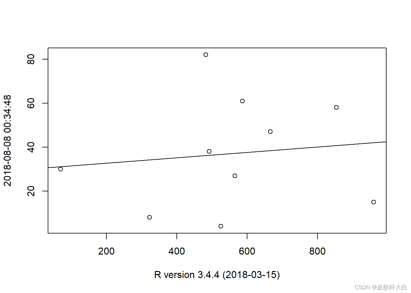
1.9 线
pv <- sample(100,10)
uv <- sample(1000,10)
sol <- lm(pv~uv)
plot(pv~uv,xlab=R.version.string,ylab = Sys.time())
abline(sol)
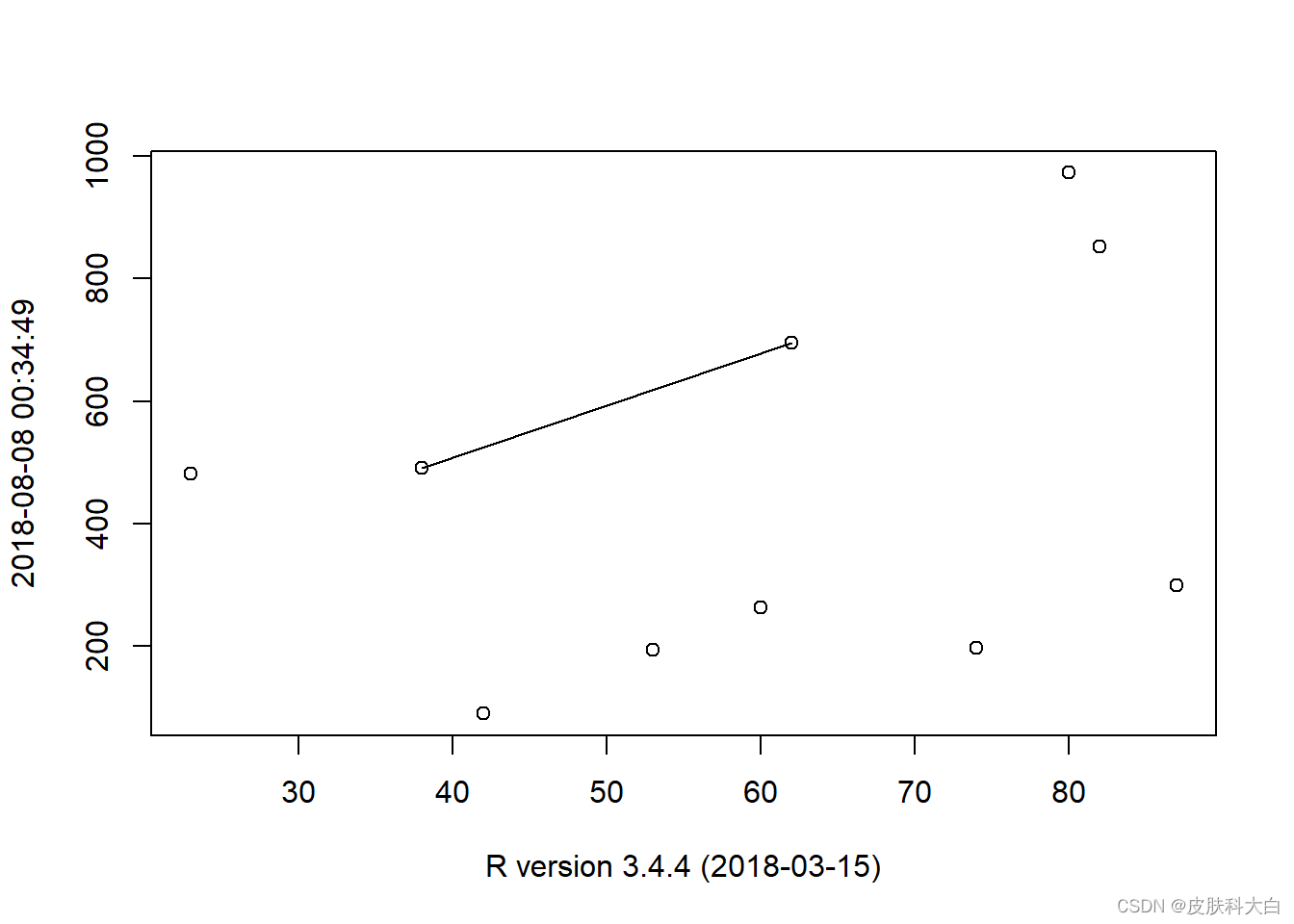
1.10 线段
pv <- sample(100,10)
uv <- sample(1000,10)
plot(pv,uv,xlab=R.version.string,ylab = Sys.time())
segments(pv[1],uv[1],pv[5],uv[5])
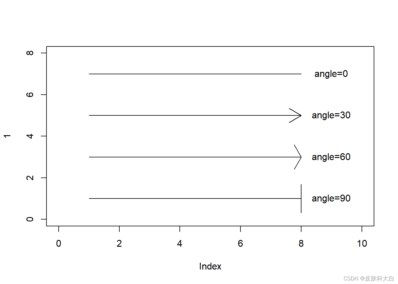
1.11 箭头
plot(1,xlim = c(0,10),ylim = c(0,8),col='white')
arrows(1,1,8,1,angle = 90);text(9,1,'angle=90')
arrows(1,3,8,3,angle = 60);text(9,3,'angle=60')
arrows(1,5,8,5,angle = 30);text(9,5,'angle=30')
arrows(1,7,8,7,angle = 0);text(9,7,'angle=0')
1.12 多边形
par(mfrow = c(2,1))
plot(0,xlim = c(0,10),ylim = c(0,10),col='white')
polygon(x=c(1,1,9,9),y=c(9,1,1,9),col = 'orange',border = 'blue')
plot(0,xlim = c(0,10),ylim = c(0,10),col='white')
polygon(x=c(1,1,9,9),y=c(9,1,9,1),col = 'orange',border = 'blue')
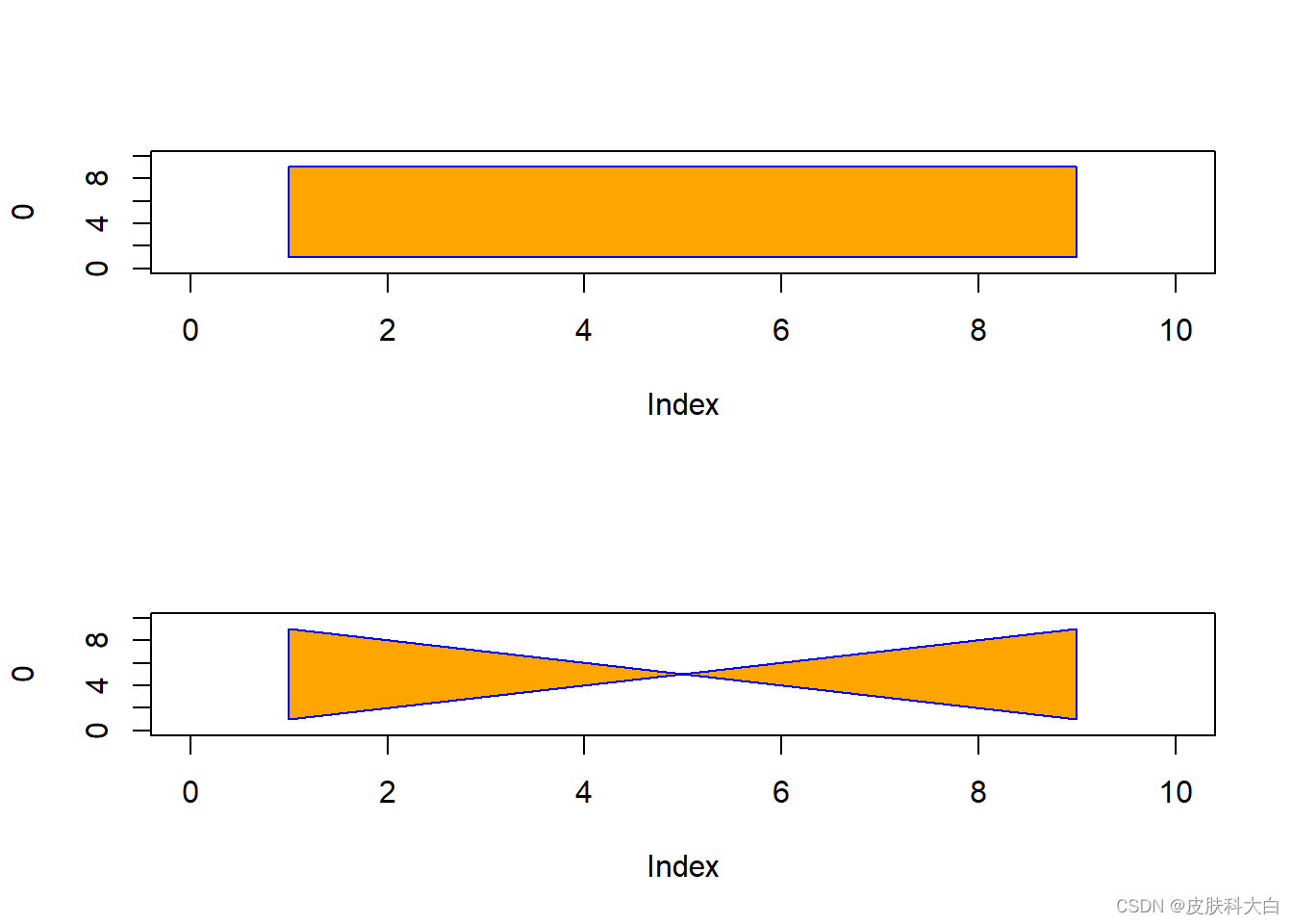
par(mfrow = c(1,1))
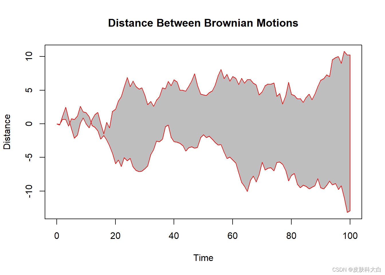
n <- 100
xx <- c(0:n, n:0)
yy <- c(c(0, cumsum(stats::rnorm(n))), rev(c(0, cumsum(stats::rnorm(n)))))
plot (xx, yy, type = "n", xlab = "Time", ylab = "Distance")
polygon(xx, yy, col = "gray", border = "red")
title("Distance Between Brownian Motions")
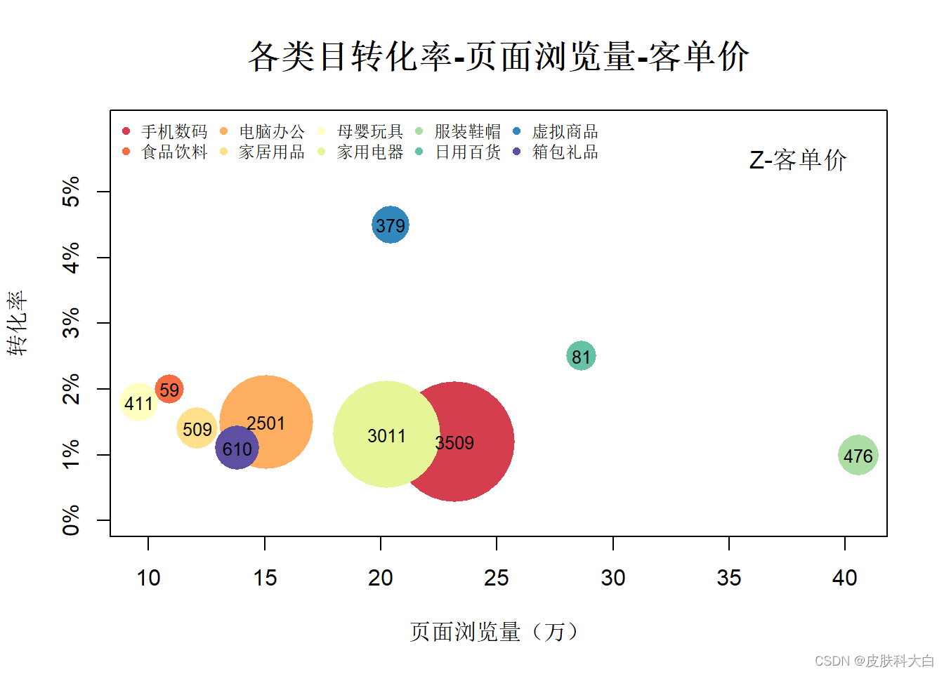
1.13 气泡图
id <- c('手机数码','食品饮料','电脑办公','家居用品','母婴玩具','家用电器','服装鞋帽','日用百货','虚拟商品','箱包礼品')
conver <- c(0.012,0.02,0.015,0.014,0.018,0.013,0.01,0.025,0.045,0.011)
pv <- c(23.19,10.89,15.09,12.11,9.6,20.29,40.56,28.66,20.43,13.84)
price <- c(3509,59,2501,509,411,3011,476,81,379,610)

library(RColorBrewer)
col <- brewer.pal(11,'Spectral')[2:11]

cex.max <- 12
cex.min <- 3
a <- c(cex.max-cex.min)/(max(price)-min(price))
b <- cex.min-a*min(price)
cex2 <- a*price+b
#cex2 <- price/max(price)

plot(pv,conver,col=col,cex=cex2,pch=16,ylim = c(0,0.06),xlab = '页面浏览量(万)',ylab = '转化率',main=list('各类目转化率-页面浏览量-客单价',cex=1.5),yaxt='n')
legend('topleft',legend = id,pch=16,col=col,bty='n',cex=0.75,ncol=5)
axis(2,labels = paste(seq(0,5,1),'%',sep = ''),at=seq(0,0.05,0.01))
text(x=pv,y=conver,labels = price,cex=0.8)
text(x=38,y=0.055,labels = 'Z-客单价',cex=1.1)
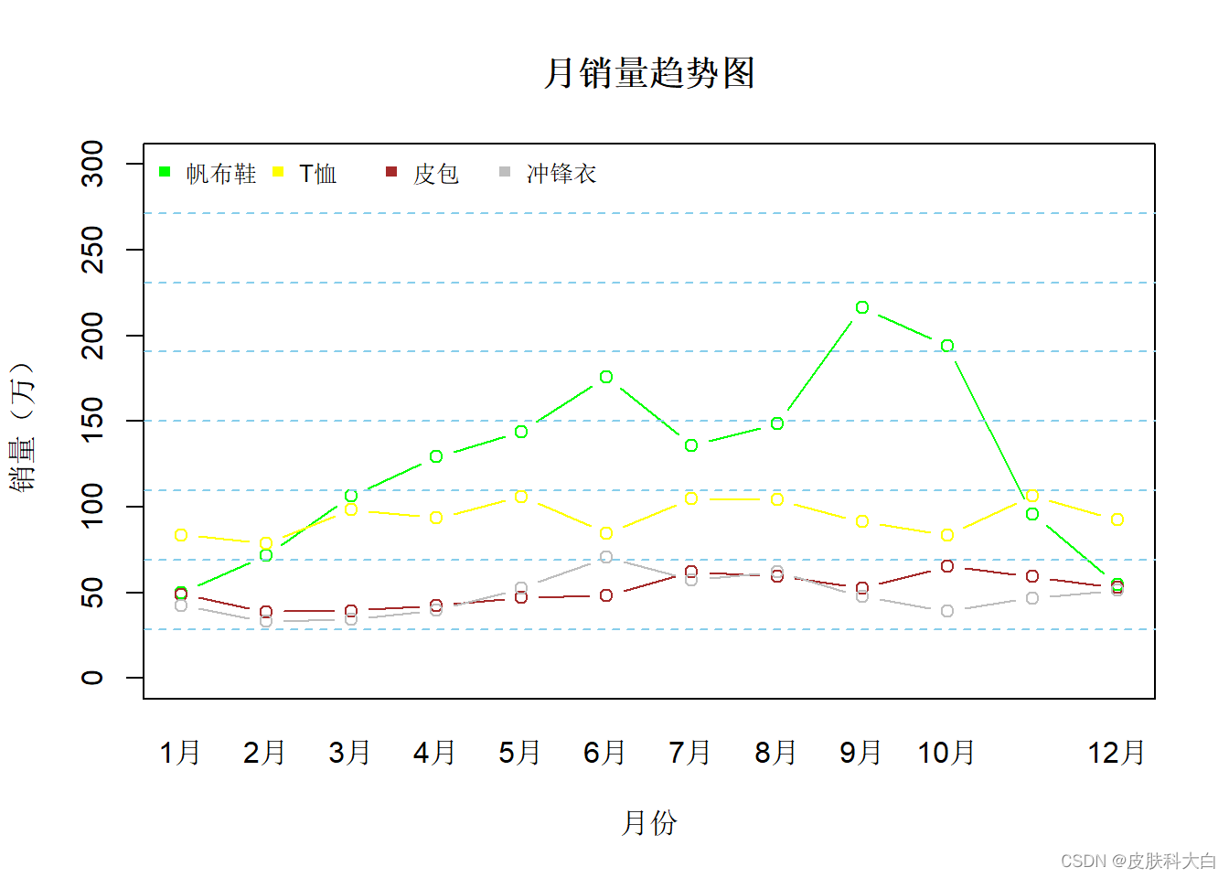
1.14 曲线图
x.text <- c('1月','2月','3月','4月','5月','6月','7月','8月','9月','10月','11月','12月')
sales.1 <- c(49.9,71.5,106.4,129.2,144,176,135.6,148.5,216.4,194.1,95.6,54.4)
sales.2 <- c(83.6,78.8,98.5,93.4,106.0,84.5,105,104.3,91.2,83.5,106.6,92.3)
sales.3 <- c(48.9,38.8,39.3,42.4,47,48.3,62,59.6,52.4,65.2,59.3,53)
sales.4 <- c(42.4,33.2,34.5,39.7,52.6,70.5,57.4,62,47.6,39.1,46.8,51.1)
id <- c('帆布鞋','T恤','皮包','冲锋衣')
col <-c('green','yellow','brown','gray')
plot(sales.1,type = 'b',xaxt='n',ylim = c(0,300),col=col[1],main = '月销量趋势图',xlab = '月份',ylab = '销量(万)')
axis(1,at=1:12,labels = x.text,tick = FALSE)
legend('topleft',legend = id,horiz = T,pch=15,col=col,cex=0.8,bty='n')
grid(nx=NA,ny=8,lwd=1,lty=2,col='skyblue')

lines(sales.2,type = 'b',col=col[2])
lines(sales.3,type = 'b',col=col[3])
lines(sales.4,type = 'b',col=col[4])
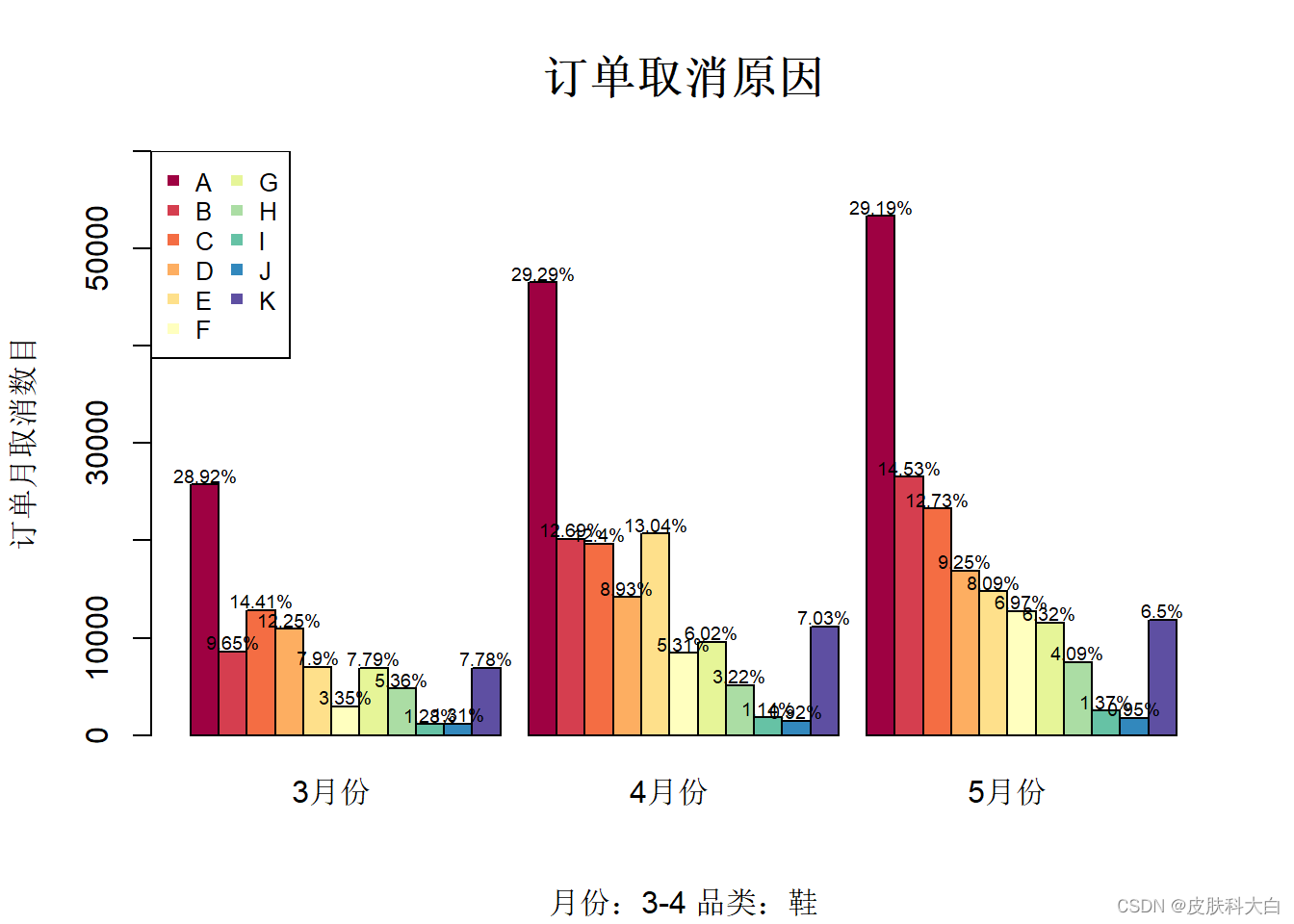
1.15 柱状图
id <- LETTERS[1:11]
month.3 <- c(25746,8595,12832,10910,7034,2978,6934,4770,1137,1164,6926)
month.4 <- c(46496,20150,19682,14177,20703,8434,9560,5113,1804,1468,11156)
month.5 <- c(53346,26547,23271,16909,14786,12733,11545,7483,2506,1743,11869)
data <- matrix(c(month.3,month.4,month.5),ncol = 3)

library(RColorBrewer)
col <- brewer.pal(11,'Spectral')[1:11]

barplot(data,col = col,xaxt='n',beside = TRUE,ylim = c(0,60000))
title(main = list('订单取消原因',cex=1.5),sub = '月份:3-4 品类:鞋',
      ylab='订单月取消数目')
legend('topleft',legend = id,pch = 15,col = col,ncol = 2,cex = 0.8)
axis(1,labels = c('3月份','4月份','5月份'),at=c(6,18,30),tick = FALSE)

per100 <- function(x){
  x <- x/sum(x)
  result <- paste(round(x*10000)/100,'%',sep='')
  result
}

text(labels = c(per100(month.3),per100(month.4),per100(month.5)),cex=0.6,
                x=c(seq(from=1.5,by=1,length.out = 11),seq(from=13.5,by=1,
                length.out=11),seq(from=25.5,by=1,length.out = 11)),
     y=c(month.3,month.4,month.5)+1000)
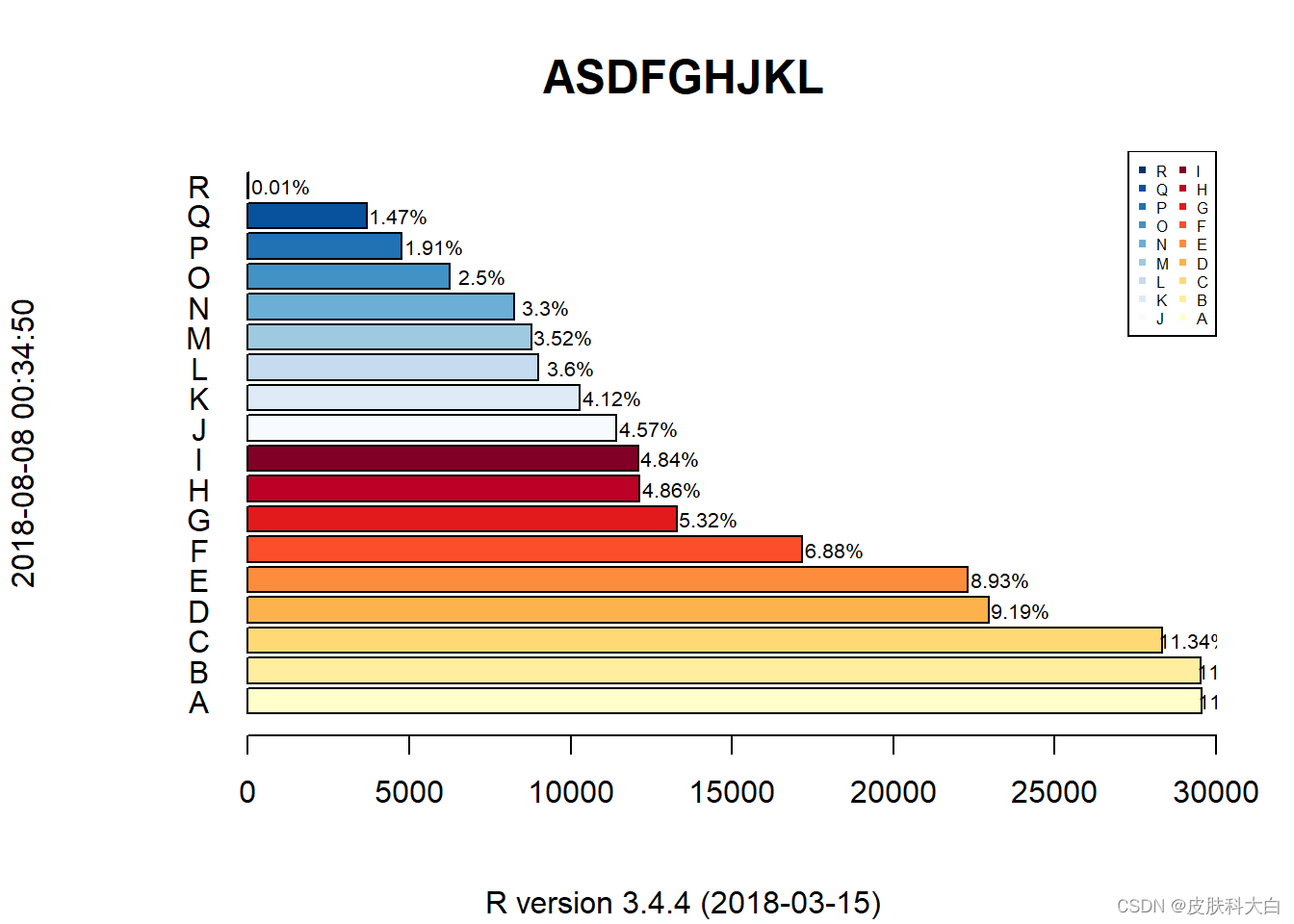
1.16 条形图
id <- LETTERS[1:18]
pv <- sort(sample(30000,18),decreasing = TRUE)

library(RColorBrewer)
col <- c(brewer.pal(9,'YlOrRd')[1:9],brewer.pal(9,'Blues')[1:9])

barplot(pv,col = col,horiz = TRUE,xlim = c(-3e3,3e4))
title(main = list('ASDFGHJKL',cex=1.5),sub = R.version.string,
      ylab = Sys.time())
text(y=seq(from=0.7,length.out = 18,by=1.2),x=-1500,labels = id)
legend('topright',legend = rev(id),pch = 15,col = rev(col),ncol = 2,cex = 0.5)

text(labels=paste(round(1e4*pv/sum(pv))/100,'%',sep=''),cex=0.65,
     y=seq(from=0.7,length.out = 18,by=1.2),x=pv+1000)
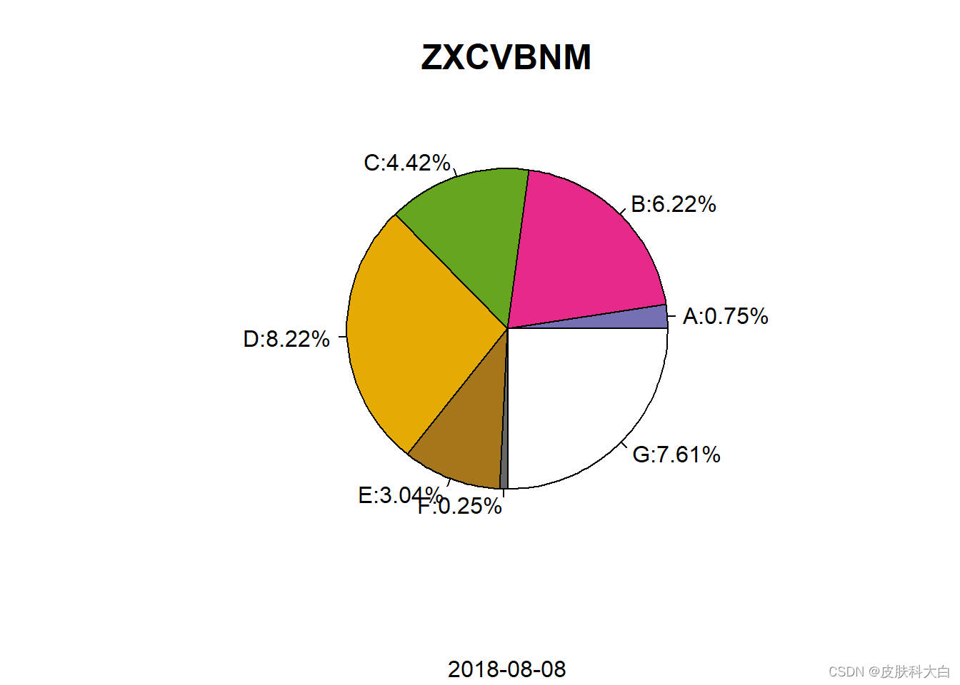
1.17 饼图
data <- LETTERS[1:7]
num <- runif(7)
library(RColorBrewer)
col <- brewer.pal(11,'Dark2')[3:11]
## Warning in brewer.pal(11, "Dark2"): n too large, allowed maximum for palette Dark2 is 8
## Returning the palette you asked for with that many colors
pie(num,col = col,xaxt='n',labels=paste(id,':',round(num*1000)/100,'%',sep=''))
title(main = list('ZXCVBNM',cex=1.5),sub = Sys.Date())
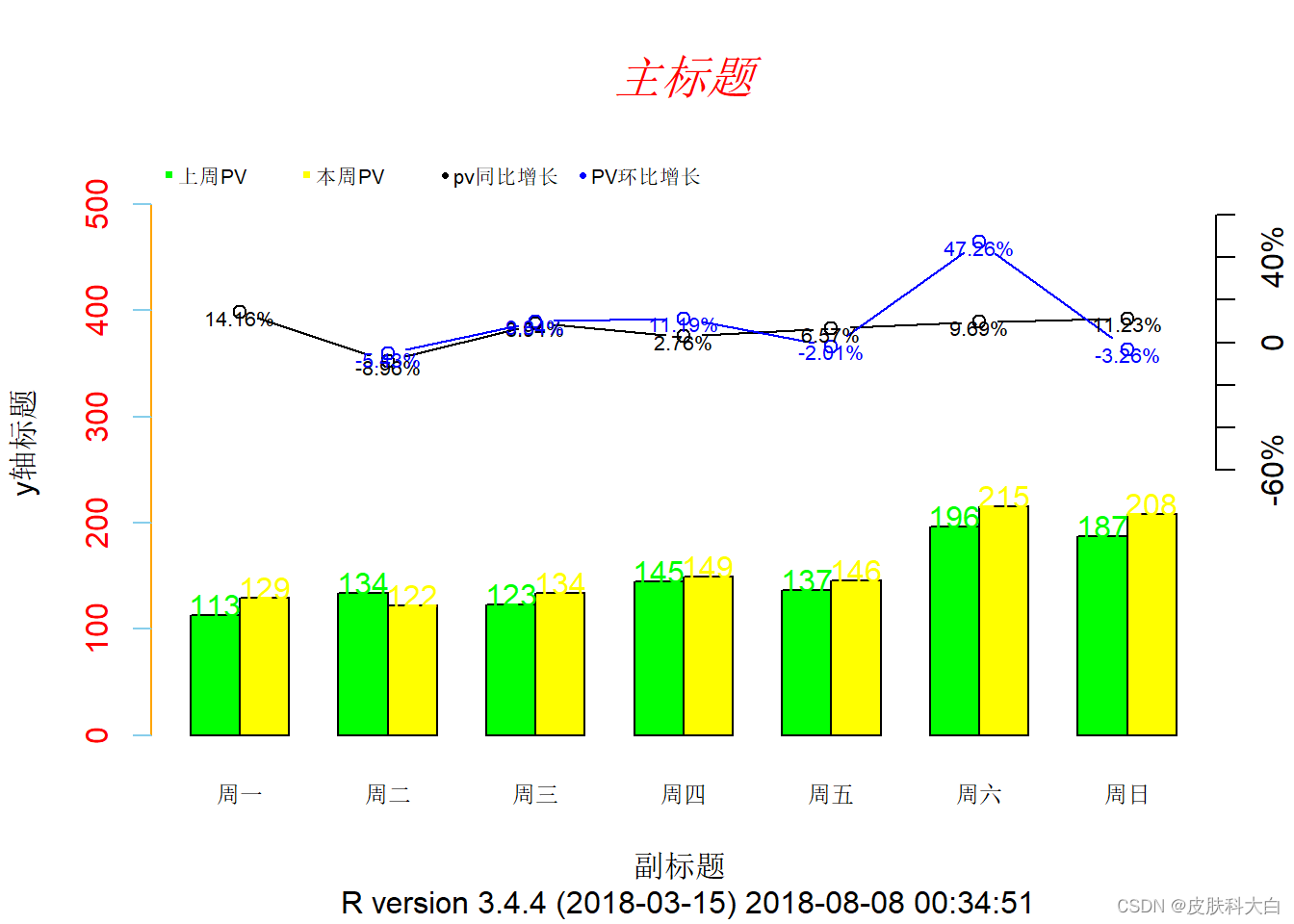
1.18 双坐标图
data <- data.frame(pre=c(113,134,123,145,137,196,187),
                   now=c(129,122,134,149,146,215,208))

ylim.max <- 550
col <- c('green','yellow')
barplot(as.matrix(rbind(data$pre,data$now)),
        beside = TRUE, ylim = c(0, ylim.max), col = col, axes = F)
axis(2,col.axis='red',col='orange',col.ticks = 'skyblue')
#设置坐标
title(main = list('主标题',cex=1.5,col='red',font=3),
      sub = paste('副标题','\n',R.version.string,Sys.time()),
      ylab = 'y轴标题')
#设置图列
text.legend = c('上周PV','本周PV','pv同比增长','PV环比增长')
col2 = c('black','blue')
legend('topleft',pch=c(15,15,16,16),legend = text.legend, col=c(col,col2),
       bty = 'n',horiz = TRUE,cex =0.65,x.intersp=0.5,pt.cex=0.5)

#添加x轴坐标
text.x <- c('周一','周二','周三','周四','周五','周六','周日')
axis(side = 1,c(2,5,8,11,14,17,20),labels = text.x, tick = FALSE, cex.axis=0.75)

#添加副坐标
axis(4,at=seq(from = 250, length.out = 7, by =40),
     labels = c('-60%','-40%','-20%','0','20%','40%','60%'))

#同比增长=(now[t]-pre[t])/pre[t]
same.per.growth <- (data$now - data$pre)/data$pre
#环比增长 = (now[t]-now[t-1])/now[t-1]
ring.growth <- c(NA,diff(data$now)/data$now[1:(length(data$now) -1)])
a <- 200;b <- 370
lines(c(2,5,8,11,14,17,20),a*same.per.growth+b,type = 'b',lwd=1)
lines(c(2,5,8,11,14,17,20),a*ring.growth+b,type = 'b',lwd=1,col='blue')

#在同比和环比曲线上添加文字
j <- 1
for(i in 1:length(data[,1])){
  text(3*i-1,a*same.per.growth[i]+b-5,paste(round(same.per.growth[i]*10000)
    /100,'%',sep = ''),cex = 0.65);j=j+1
  text(3*i-1,a*ring.growth[i]+b-5,paste(round(ring.growth[i]*10000)/100,
      '%',sep = ''),col='blue',cex = 0.65);j=j+2
}

#为柱形图添加文字
j <- 1
for(i in 1:length(data[,1])){
  text(j+0.5,data$pre[i]+10,data$pre[i],col = 'green');j <- j+1
  text(j+0.5,data$now[i]+10,data$now[i],col ='yellow');j <- j+2
}
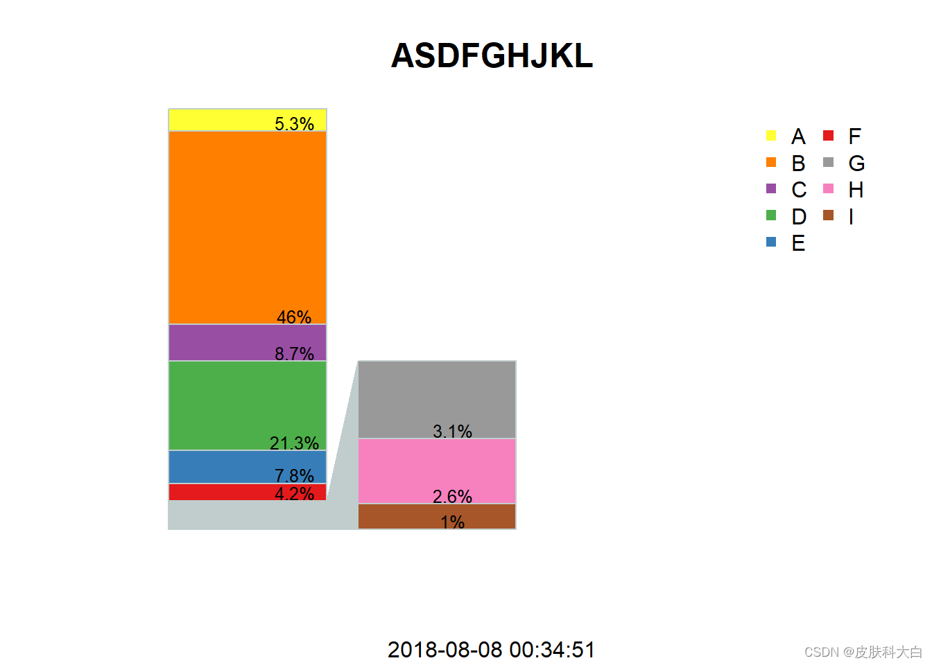
1.19 图形的局部放大
id <- LETTERS[1:9]
num <- c(0.053,0.46,0.087,0.213,0.078,0.042,0.031,0.026,0.01)
data <- data.frame(id=id,num=num)
split <- 6  #设置分割变量
max.bar2 <- 0.4 #设置副柱状图高度变量

bar.data1 = matrix(rev(c(rep(NA, split+1),num[1:split],sum(num[-(1:split)]))),
                  ncol = 2, nrow = split+1)


bar.data2 = matrix(c(rep(NA, split+1),rev(num[-(1:split)]),
                     rep(NA,nrow(data)-split-1)), ncol = 2, nrow = split+1)
## Warning in matrix(c(rep(NA, split + 1), rev(num[-(1:split)]), rep(NA,
## nrow(data) - : 数据长度[12]不是矩阵行数[7]的整倍
library(RColorBrewer)
col <- brewer.pal(12,'Set1')
## Warning in brewer.pal(12, "Set1"): n too large, allowed maximum for palette Set1 is 9
## Returning the palette you asked for with that many colors
barplot(bar.data1,col = c('azure3',col[1:split]),axes = FALSE,ylim = c(0,1),
        xlim = c(0,4.5),border = 'azure3')
barplot(bar.data2*(max.bar2/sum(num[-(1:split)])),col = col[-(1:split)],
        axes = FALSE, add = TRUE, border = 'azure3')
polygon(x=c(1.2,1.2,1.4,1.4),y = c(0,sum(num[-(1:split)]),max.bar2,0),
        col='azure3',border = 'azure3')

labels=paste(round(num*10000)/100,'%',sep = '')
y1 <- 0
for(i in 1:split){
  y1[i] = sum(num[-(1:i)])
}

text(x=1,y=y1+0.02,labels[1:split],cex=0.8)
y2 <- 0
for(i in 1:(nrow(data)-split-1)){
  y2[i] <- sum(num[(split+i+1):nrow(data)])
}
y2 <- c(y2,0)
y2 <- y2*(max.bar2/sum(num[-(1:split)]))
text(x=2,y=y2+0.02,labels[-(1:split)],cex = 0.8)

legend('topright',legend =id,pch=15,col=c(rev(col[1:split]),
            rev(col[-(1:split)])),ncol = 2,bty = 'n')

title(main = list('ASDFGHJKL',cex=1.5),sub = Sys.time())
1 ggplot2准备工作
2 ggplot2基础绘图
2.1 散点图
2.2 散点图-添加拟合曲线
2.3 散点图-着色
2.4 散点图-分面
2.5 箱式图
2.6 直方图和频率多边形
2.7 柱状图
2.8 时间序列图
2.9 路径图
2.10 ggplot2其它统计图
3 透明度设置
4 主题设置
5 无代码绘制ggplot2图
6 ggplot2的扩展包
6.1 GGally
1 ggplot2准备工作
ggplot2便是在上述图形语法的框架下应运而生。使用ggplot2之前需要先安装R软件,步骤如下。
在R主页下载并安装R软件(https://www.r-project.org/)
R软件内通过镜像加载ggplot2,或输入代码:
instal.packages ("ggplot2")
R语言自带的RGui用户界面非常不人性化,强烈推荐使用RStudio来编写和存储代码。 https://www.rstudio.com/products/RStudio/
2 ggplot2基础绘图
本节选取Hadle Wickham的《ggplot2 Elegant Graphics for Data Analysis》第二章有关1999-2008年美国流行车耗油量的数据集(mpg)进行叙述。
cty和hwy——城市和高速路行驶中的耗油量
displ——排气量
drv——动力传感系统
model——车的模型,数据中包括38种
class——车的类型,双人座、SUV、紧凑型等
每一个ggplot2图有三个关键组件: - 1. 数据 - 2. 数据变量和可见属性的图形映射 - 3. 至少一层描述如何表达可见性的图层。
2.1 散点图
ggplot (mpg, aes (x = displ, y = hwy)) +
geom_point()
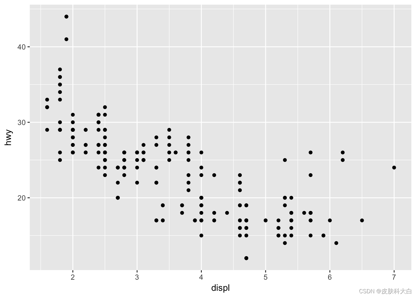
数据:mpg
映射:displ映射至x轴,hwy映射至y轴
图层:用点显示数据
代码解析: 第一行用ggplot () 调入数据mpg,aes () 函数选择变量,并映射到x和y轴,第二行代码利用函数geom_point () 将数据表现为黑色圆点。从中可以看出ggplot2代码简洁,易懂易学。
2.2 散点图-添加拟合曲线
ggplot(mpg, aes(displ, hwy)) +
geom_point() +
geom_smooth(method= "lm")
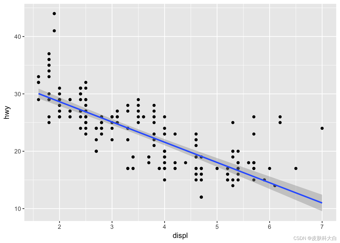
最后一行代码表示在新的图层添加拟合曲线,代码之间使用了符号“+”。一幅图形背后的设计是若干图形语法的叠加,外在的表现是若干R对象的相加。ggplot2对加号的扩展,可以说是神来之笔。
2.3 散点图-着色
ggplot(mpg, aes (displ, hwy, colour=class)) +
geom_point()
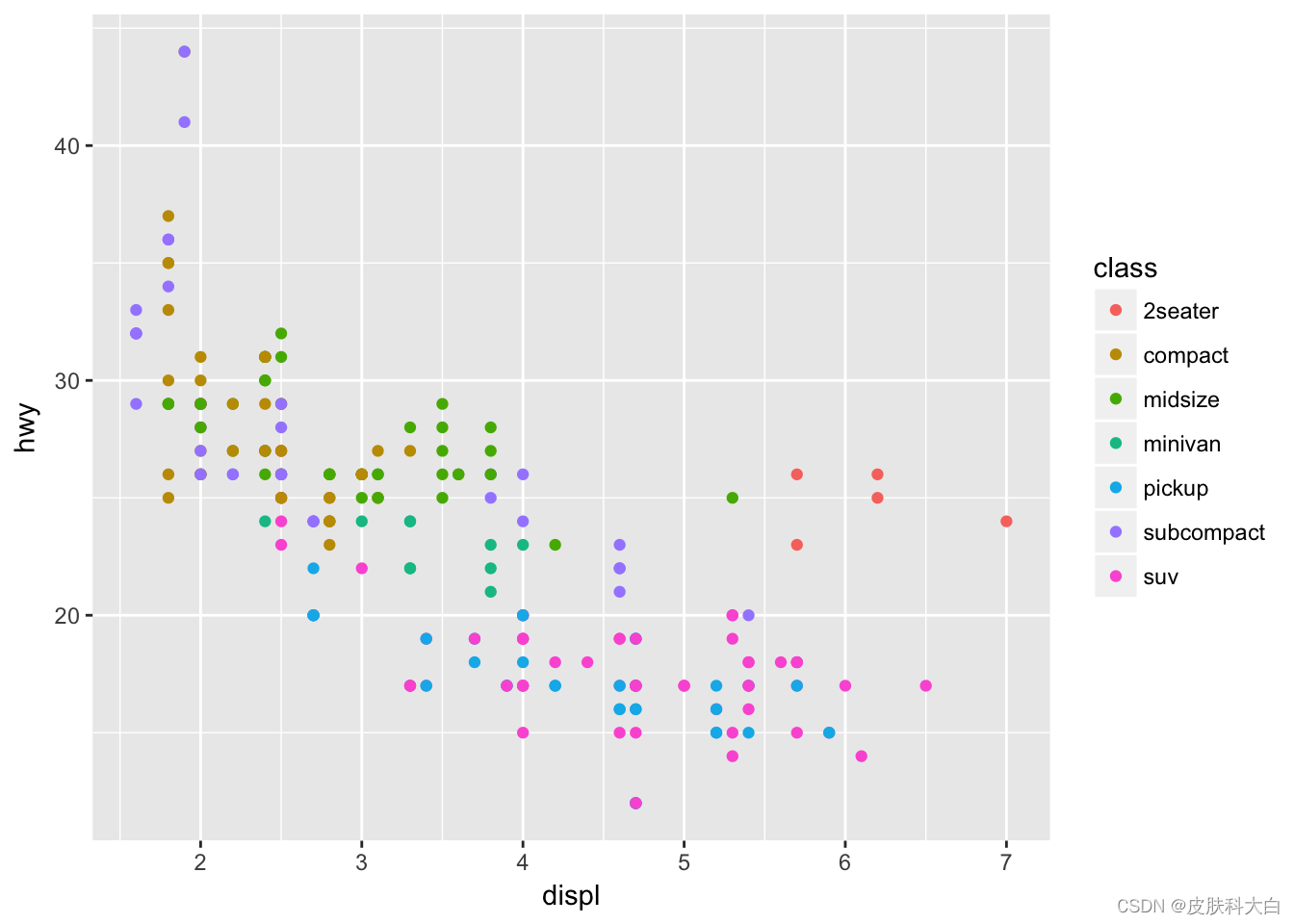
图形属性包括颜色、形状和大小等,在aes () 函数中将某一变量设置为颜色属性,即可对属于不同变量的数据分开着色。
2.4 散点图-分面
ggplot(mpg, aes(displ, hwy)) +
geom_point() +
facet_wrap(~class)
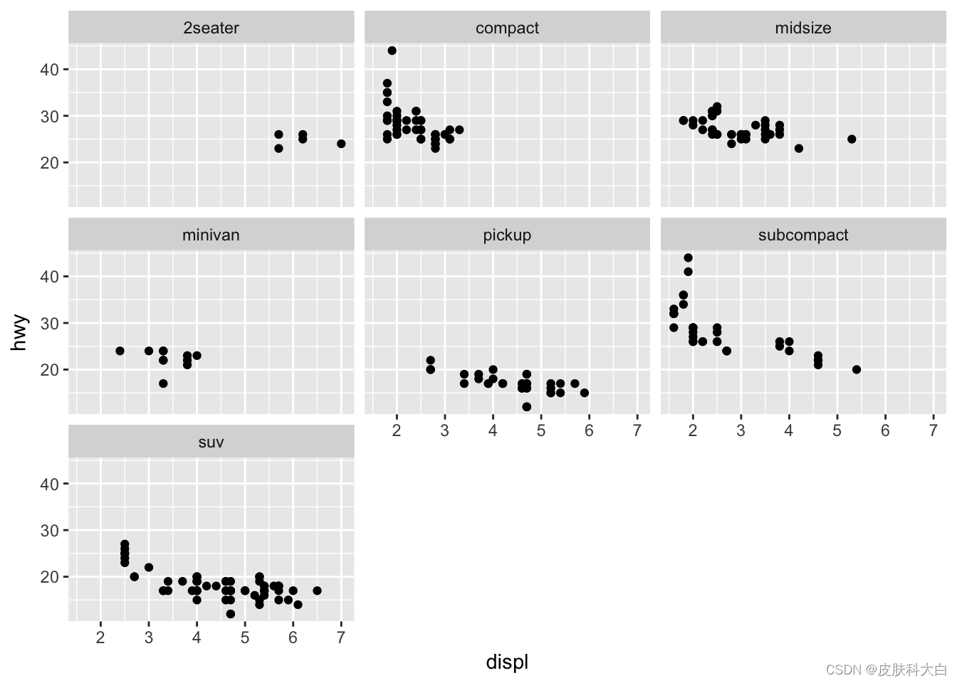
ggplot2分面的目的是对数据子集单独绘图,观察子集之间数据的规律。
2.5 箱式图
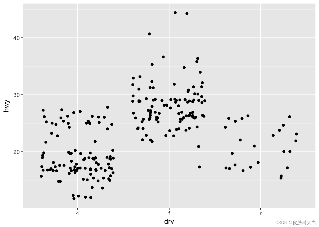
ggplot(mpg, aes(drv, hwy)) + geom_jitter()
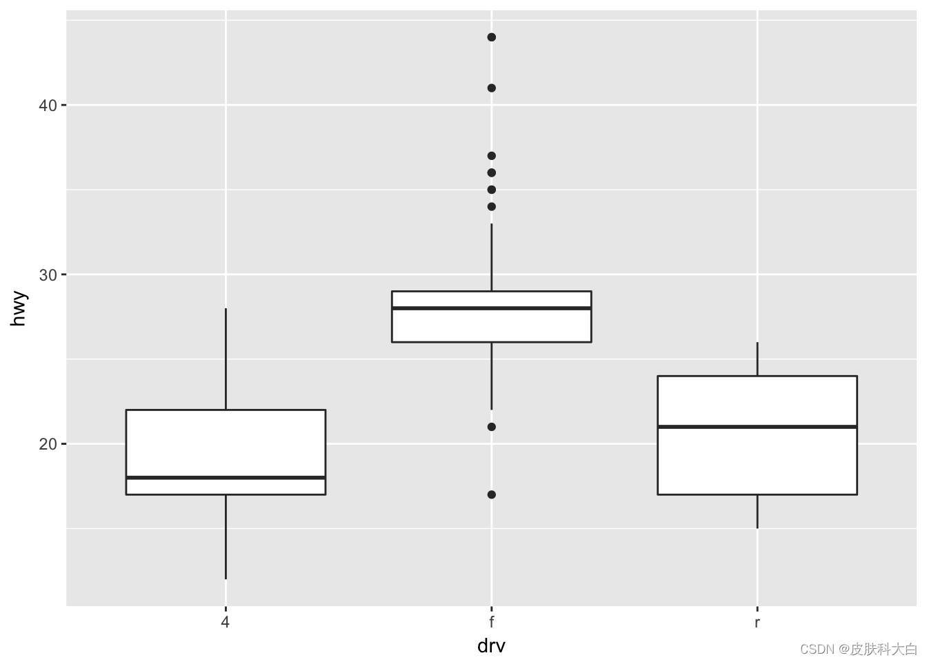
ggplot(mpg, aes(drv, hwy))+ geom_boxplot()
ggplot(mpg, aes(drv, hwy)) + geom_violin()
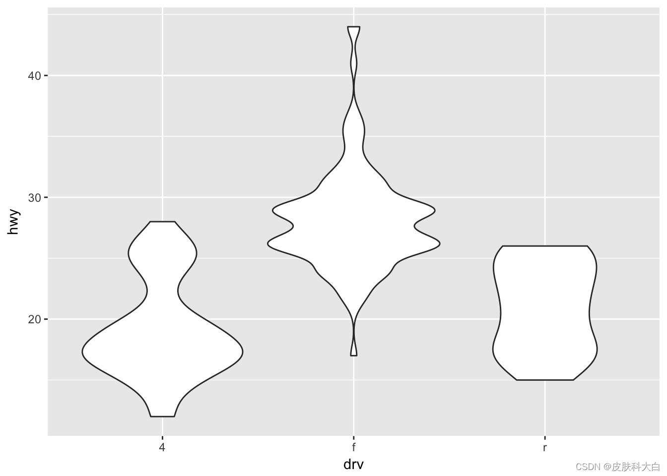
三行代码对应三幅图,如果用“+“把上述代码合并,三张图即可叠加,即ggplot2以图层的模式,构建不同类型的统计图形。
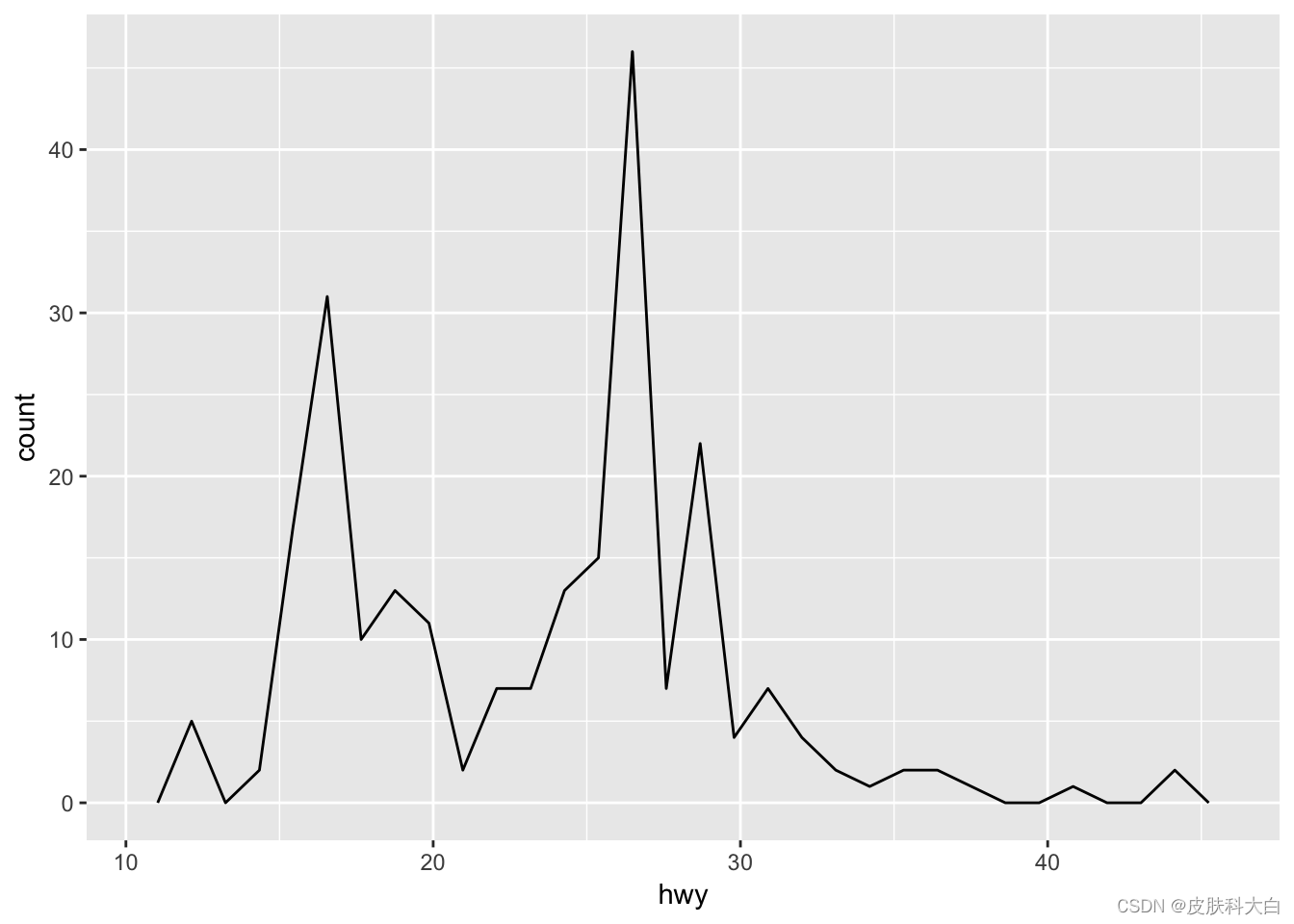
2.6 直方图和频率多边形
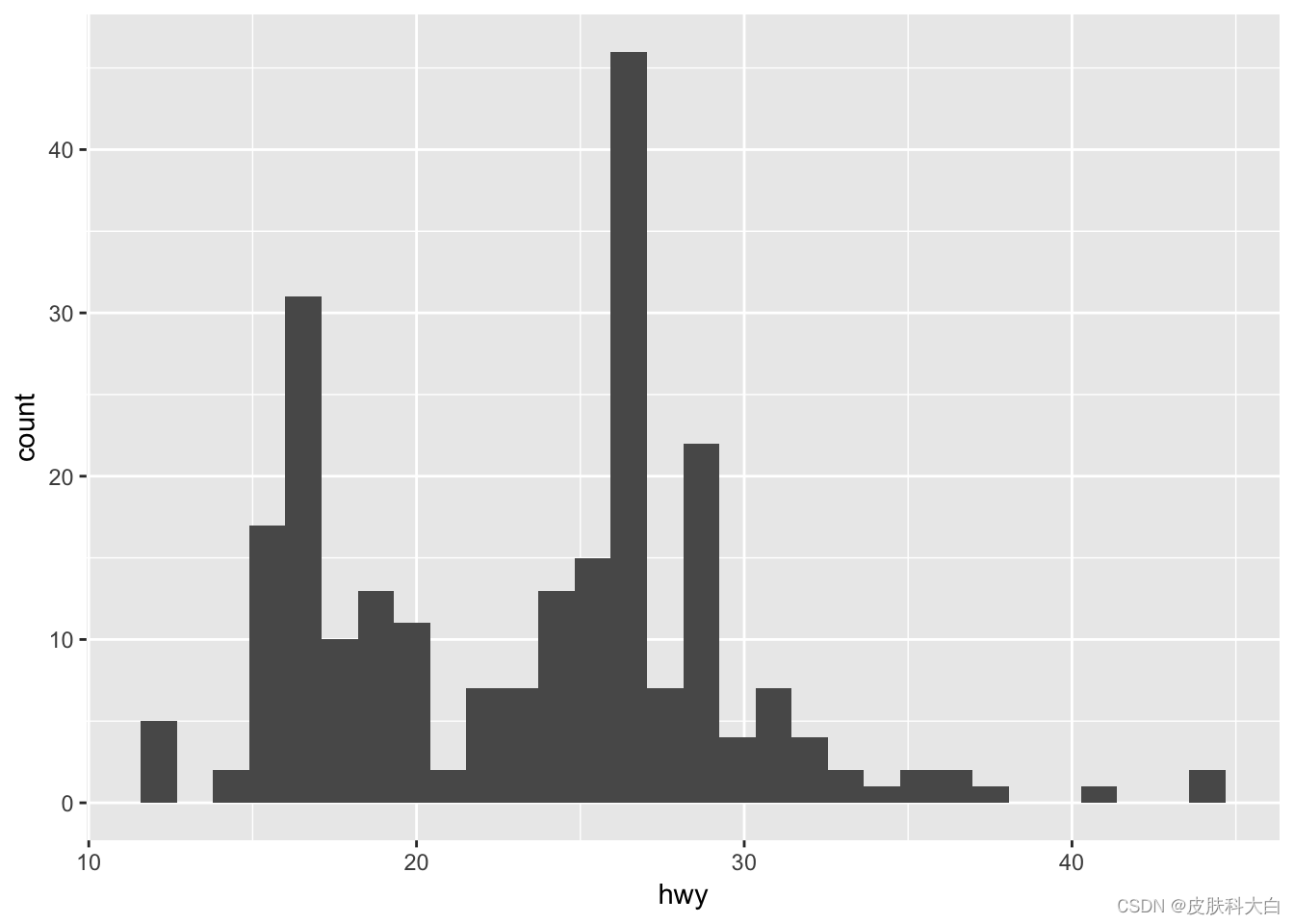
ggplot(mpg, aes(hwy)) + geom_histogram()
## `stat_bin()` using `bins = 30`. Pick better value with `binwidth`.
ggplot(mpg, aes(hwy)) + geom_freqpoly()
## `stat_bin()` using `bins = 30`. Pick better value with `binwidth`.
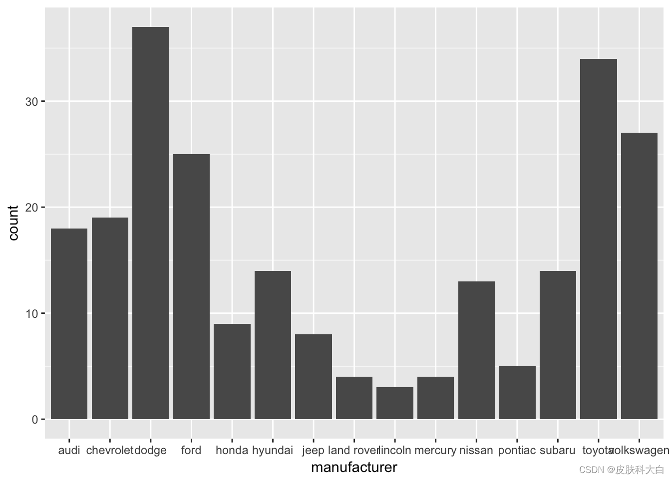
2.7 柱状图
ggplot(mpg, aes(manufacturer)) +
geom_bar()
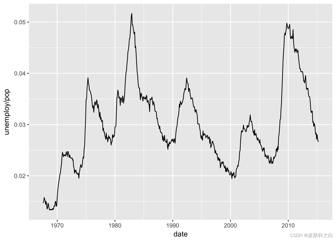
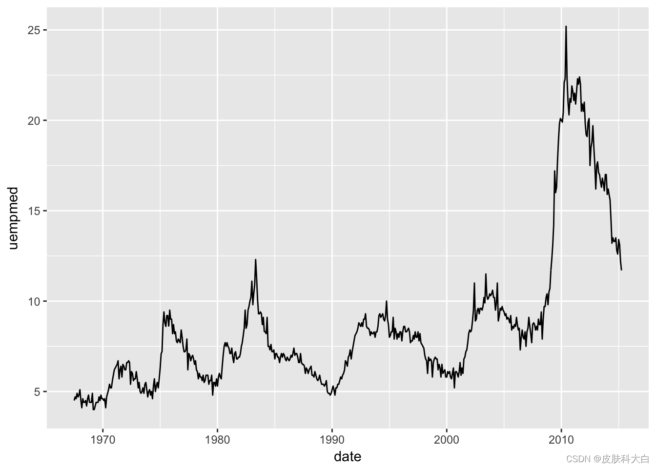
2.8 时间序列图
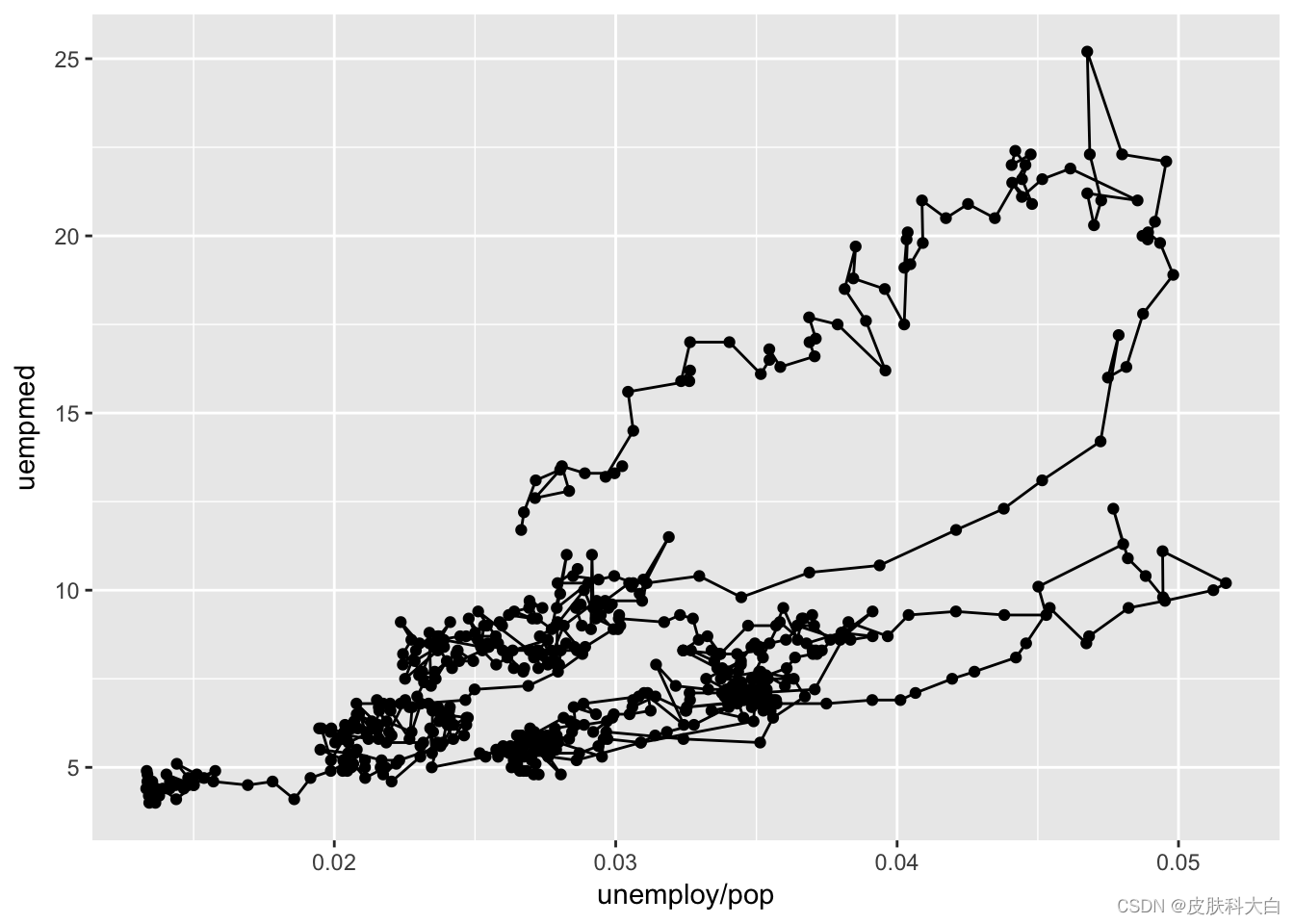
ggplot(economics, aes(date, unemploy / pop)) +geom_line()
## Warning in as.POSIXlt.POSIXct(x): unknown timezone 'default/Asia/Shanghai'
ggplot(economics, aes(date, uempmed)) +geom_line()
2.9 路径图
ggplot(economics, aes(unemploy / pop, uempmed)) +
geom_path() +
geom_point()
year <- function(x) as.POSIXlt(x)$year + 1900
ggplot(economics, aes(unemploy / pop, uempmed)) +
geom_path(colour = "grey50") +
geom_point(aes(colour = year(date)))
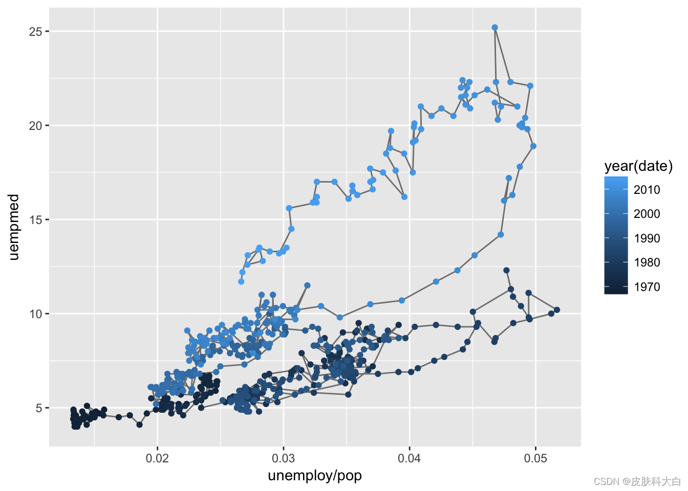
选择aes () 函数,对连续的时间进行变量着色。
2.10 ggplot2其它统计图
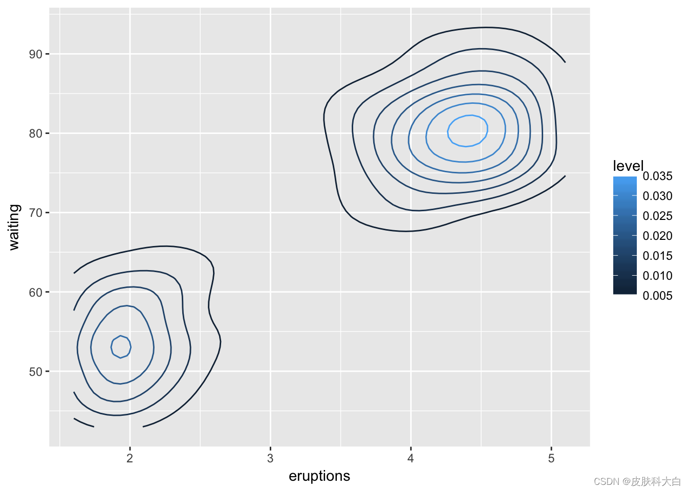
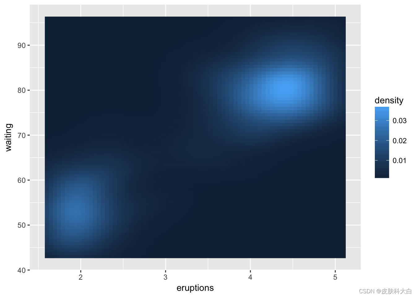
除了散点图、条形图等之外,ggplot2有更广泛的应用。 ### 曲面图
ggplot(faithfuld, aes(eruptions, waiting)) +
geom_contour(aes(z = density, colour = ..level..))
ggplot(faithfuld, aes(eruptions, waiting)) +
geom_raster(aes(fill = density))
3 透明度设置
大量数据点覆盖堆积,将会掩盖数据趋势,可设置透明度加以区分。

norm <- ggplot(df, aes(x, y)) + xlab(NULL) + ylab(NULL)
norm + geom_point (alpha = 1 / 3)
norm + geom_point (alpha = 1 / 5)
norm + geom_point (alpha = 1 / 10)
4 主题设置
ggplot2提供了大量主题设置,利用theme () 函数,快速转换。例如左上图分别添加一行代码,便可得到其它类型的主题。

theme_classic()
theme_minimal()
theme_economist()+ scale_colour_economist()
ggplot2更新很快,拥有大量函数,以实现多种统计图的绘制。
上述所列功能仅为抛砖引玉,详细函数列表和用法参见如下网址: http://ggplot2.tidyverse.org/reference/
5 无代码绘制ggplot2图
尽管ggplot2代码简洁,在不熟悉的前提下,依然会出现许多Bug,为此Keon-Woong Moon编写了Learn ggplot2 Shiny App,将代码的编写转化为图形模块的点击。
http://r-graph.com/
从主页中选择最近的服务器地址,即可打开在线ggplot2绘图网页。
加载数据后,用鼠标选择对应的变量,勾选需要绘制的统计图,即可一键出图。
页面左下方会显示相应的R代码,可以作为学习代码的教程。
ggplot(data=acs,aes(x=Dx,y=age,fill=Dx))+
geom_point(position='jitter',size=0.3)+
geom_violin()+
geom_boxplot(fill='white',width=0.05,outlier.shape=1,outlier.size=16)+
stat_summary(geom='point',fun.y=mean,shape=23,size=3)+
theme(legend.position='none')
Line 1:将变量数据映射到坐标系
Line 2:添加散点图
Line 3:添加小提琴图
Line 4:添加箱式图
Line 5:添加平均值
Line 6:隐藏图例
Shiny App菜单栏的MultiPlot可实现上述4种图形依次保存和排列的功能,并快速输出。
plot提供了ggplot2两个扩展程序包——ggiraph和ggiraphExtra,用来绘制交互式的图形。除此之外,ggplot2拥有大量针对不同领域的扩展包
6 ggplot2的扩展包
自从ggplot2巧妙地在R语言中实现了图形语法,以此为范例的程序包如雨后春笋般涌现。他们怀揣着神圣的总纲,站在巨人的肩上,将统计绘图的功能无限延伸。
animlnt:制作交互图形,增加询问,筛选链接等
ggthemes:提供扩展的图形风格主题
ggmap:提供在线地图服务模块
ggiraph:绘制交互式的ggplot图形
ggstance:实现常见图形的横向版本
GGally:绘制散点图矩阵
ggalt:添加额外的坐标轴、geoms等
ggforce:添加额外geoms等
ggrepel:避免图形标签重叠
ggraph:绘制网络状、树状等特定形状的图形
ggpmisc:光生物学相关扩展
ggbio:提供基因组学数据图形
geomnet:绘制网络状图形
ggExtra:绘制图形的边界直方图
gganimate:绘制动画图
plotROC:绘制交互式ROC曲线图
ggspectra:绘制光谱图
ggnetwork:网络状图形的geoms
ggradar:绘制雷达图
ggTimeSeries:时间序列数据可视化
ggtree:树图可视化
ggtern:绘制三元图
ggseas:季节调整工具
ggenealogy:浏览和展示系谱学数据
http://blog.sina.com.cn/s/blog_15dd952a70102wvuq.html
6.1 GGally
ggplot2分面得到的是完全相同的子集图形,而GGally扩展了该功能,能够绘制散点图矩阵,自定义矩阵中每一个图形元素。
http://ggobi.github.io/ggally/
尽管ggplot2默认条件下即可输出精美的图,但是其核心的图形语法并未限制于常规的统计图形,也未指定图形的外观,这极大地扩展了ggplot2绘图的范围和可能达到的极致美观。
sessionInfo()
## R version 3.4.2 (2017-09-28)
## Platform: x86_64-apple-darwin15.6.0 (64-bit)
## Running under: macOS High Sierra 10.13.4
##
## Matrix products: default
## BLAS: /Library/Frameworks/R.framework/Versions/3.4/Resources/lib/libRblas.0.dylib
## LAPACK: /Library/Frameworks/R.framework/Versions/3.4/Resources/lib/libRlapack.dylib
##
## locale:
## [1] C
##
## attached base packages:
## [1] stats     graphics  grDevices utils     datasets  methods   base
##
## other attached packages:
## [1] ggplot2_2.2.1 rticles_0.4.1
##
## loaded via a namespace (and not attached):
##  [1] Rcpp_0.12.16     knitr_1.20       magrittr_1.5     munsell_0.4.3
##  [5] colorspace_1.3-2 rlang_0.2.0      stringr_1.3.1    plyr_1.8.4
##  [9] tools_3.4.2      grid_3.4.2       gtable_0.2.0     htmltools_0.3.6
## [13] yaml_2.1.18      lazyeval_0.2.1   rprojroot_1.3-2  digest_0.6.15
## [17] tibble_1.4.2     evaluate_0.10.1  rmarkdown_1.9    labeling_0.3
## [21] stringi_1.2.2    compiler_3.4.2   pillar_1.2.2     scales_0.5.0
## [25] backports_1.1.2
前言
ggplot是一个拥有一套完备语法且容易上手的绘图系统,在Python和R中都能引入并使用,在数据分析可视化领域拥有极为广泛的应用。本篇从R的角度介绍如何使用ggplot2包,首先给几个我觉得最值得推荐的理由:
采用“图层”叠加的设计方式,一方面可以增加不同的图之间的联系,另一方面也有利于学习和理解该package,photoshop的老玩家应该比较能理解这个带来的巨大便利
适用范围广,拥有详尽的文档,通过?和对应的函数即可在R中找到函数说明文档和对应的实例
在R和Python中均可使用,降低两门语言之间互相过度的学习成本
基本概念
本文采用ggplot2的自带数据集diamonds。
> head(diamonds)
# A tibble: 6 x 10
  carat cut       color clarity depth table price     x     y     z
  <dbl> <ord>     <ord> <ord>   <dbl> <dbl> <int> <dbl> <dbl> <dbl>
1 0.23  Ideal     E     SI2      61.5    55   326  3.95  3.98  2.43
2 0.21  Premium   E     SI1      59.8    61   326  3.89  3.84  2.31
3 0.23  Good      E     VS1      56.9    65   327  4.05  4.07  2.31
4 0.290 Premium   I     VS2      62.4    58   334  4.2   4.23  2.63
5 0.31  Good      J     SI2      63.3    58   335  4.34  4.35  2.75
6 0.24  Very Good J     VVS2     62.8    57   336  3.94  3.96  2.48

# 变量含义
price  : price in US dollars (\$326–\$18,823)
carat  : weight of the diamond (0.2–5.01)
cut    :   quality of the cut (Fair, Good, Very Good, Premium, Ideal)
color  : diamond colour, from D (best) to J (worst)
clarity: a measurement of how clear the diamond is (I1 (worst), SI2, SI1, VS2, VS1, VVS2, VVS1, IF (best))
x      : length in mm (0–10.74)
y      : width in mm (0–58.9)
z      : depth in mm (0–31.8)
depth  : total depth percentage = z / mean(x, y) = 2 * z / (x + y) (43–79)
table  : width of top of diamond relative to widest point (43–95)
data:数据源,一般是data.frame结构,否则会被转化为该结构
个性映射与共性映射:ggplot()中的mapping = aes()参数属于共性映射,会被之后的geom_xxx()和stat_xxx()所继承,而geom_xxx()和stat_xxx()中的映射参数属于个性映射,仅作用于内部
mapping:映射,包括颜色类型映射color;fill、形状类型映射linetype;size;shape和位置类型映射x,y等
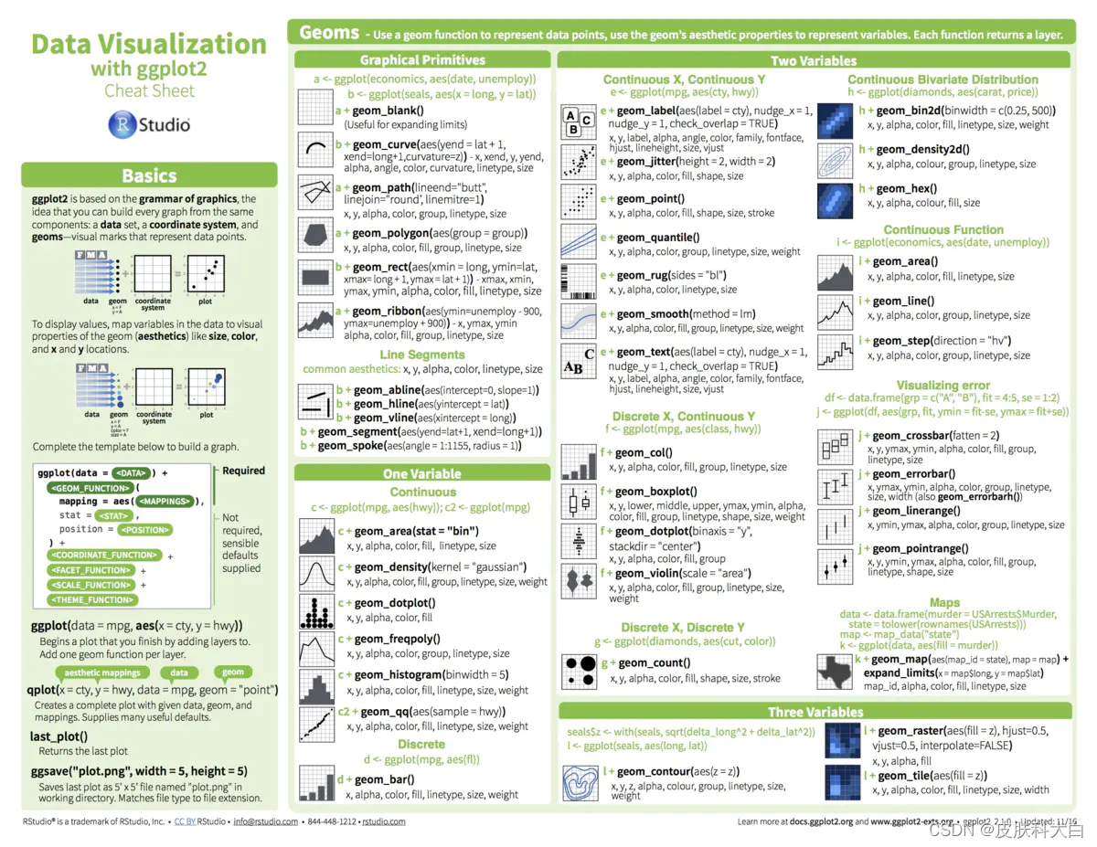
geom_xxx:几何对象,常见的包括点图、折线图、柱形图和直方图等,也包括辅助绘制的曲线、斜线、水平线、竖线和文本等
aesthetic attributes:图形参数,包括colour;size;hape等
facetting:分面,将数据集划分为多个子集subset,然后对于每个子集都绘制相同的图表
theme:指定图表的主题
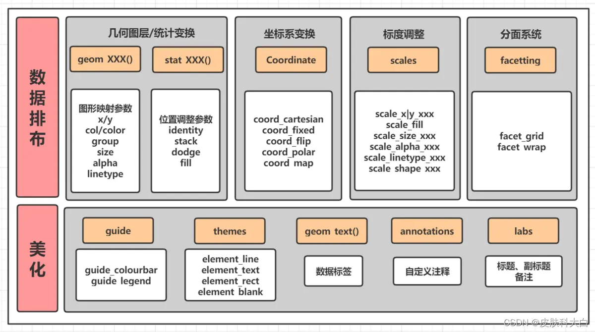
ggplot(data = NALL, mapping = aes(x = , y = )) +   # 数据集
    geom_xxx()|stat_xxx() +       # 几何图层/统计变换
    coord_xxx() +  # 坐标变换, 默认笛卡尔坐标系
    scale_xxx() +  # 标度调整, 调整具体的标度
    facet_xxx() +  # 分面, 将其中一个变量进行分面变换
    guides() +     # 图例调整
    theme()        # 主题系统
这些概念可以等看完全文再回过头看,相当于一个汇总,这些概念都掌握了基本ggplot2的核心逻辑也就理解了

通过实例和RCode从浅到深介绍ggplot2的语法。
- 五脏俱全的散点图
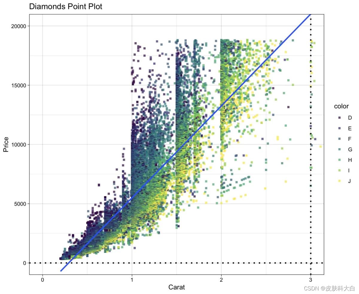
library(ggplot2)

# 表明我们使用diamonds数据集,
ggplot(diamonds) +
  # 绘制散点图: 横坐标x为depth, 纵坐标y为price, 点的颜色通过color列区分,alpha透明度,size点大小,shape形状(实心正方形),stroke点边框的宽度
  geom_point(aes(x = carat, y = price, colour = color), alpha=0.7, size=1.0, shape=15, stroke=1) +
  # 添加拟合线
  geom_smooth(aes(x = carat, y = price), method = 'glm') +
  # 添加水平线
  geom_hline(yintercept = 0, size = 1, linetype = "dotted", color = "black") +
  # 添加垂直线
  geom_vline(xintercept = 3, size = 1, linetype = "dotted", color = "black") +
  # 添加坐标轴与图像标题
  labs(title = "Diamonds Point Plot", x = "Carat", y = "Price") +
  # 调整坐标轴的显示范围
  coord_cartesian(xlim = c(0, 3), ylim = c(0, 20000)) +
  # 更换主题, 这个主题比较简洁, 也可以在ggthemes包中获取其他主题
  theme_linedraw()
2. 自定义图片布局&多种几何绘图
library(gridExtra)
#建立数据集
df <- data.frame(
  x = c(3, 1, 5),
  y = c(2, 4, 6),
  label = c("a","b","c")
)

p <- ggplot(df, aes(x, y, label = label)) +
  # 去掉横坐标信息
  labs(x = NULL, y = NULL) +
  # 切换主题
  theme_linedraw()

p1 <- p + geom_point() + ggtitle("point")
p2 <- p + geom_text() + ggtitle("text")
p3 <- p + geom_bar(stat = "identity") + ggtitle("bar")
p4 <- p + geom_tile() + ggtitle("raster")
p5 <- p + geom_line() + ggtitle("line")
p6 <- p + geom_area() + ggtitle("area")
p7 <- p + geom_path() + ggtitle("path")
p8 <- p + geom_polygon() + ggtitle("polygon")

# 构造ggplot图片列表
plots <- list(p1, p2, p3, p4, p5, p6, p7, p8)
# 自定义图片布局
gridExtra::grid.arrange(grobs = plots, ncol = 4)

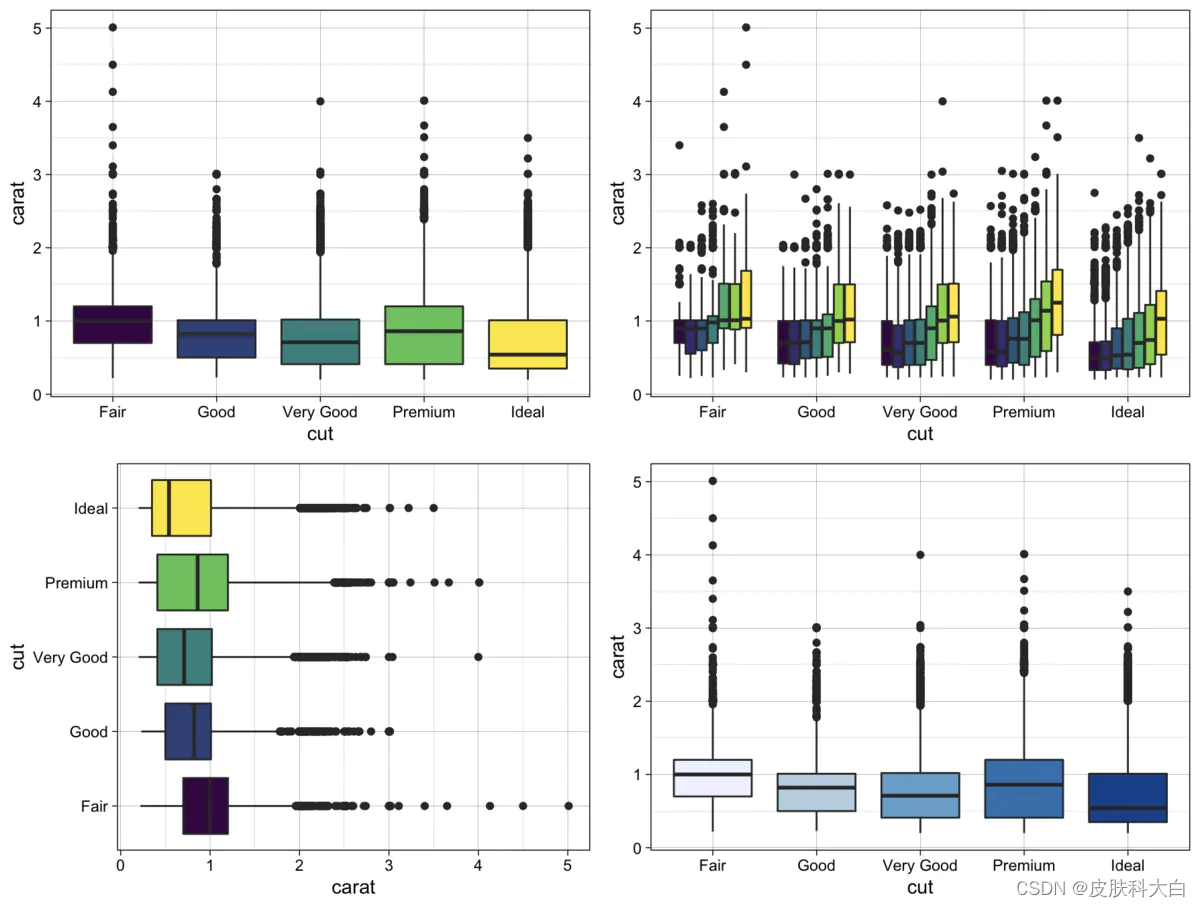
3. 箱线图
统计学中展示数据分散情况的直观图形,在探索性分析中常常用于展示在某个因子型变量下因变量的分散程度。
library(ggplot2) # 绘图
library(ggsci)   # 使用配色

# 使用diamonds数据框, 分类变量为cut, 目标变量为depth
p <- ggplot(diamonds, aes(x = cut, y = carat)) +
  theme_linedraw()

# 一个因子型变量时, 直接用颜色区分不同类别, 后面表示将图例设置在右上角
p1 <- p + geom_boxplot(aes(fill = cut)) + theme(legend.position = "None")
# 两个因子型变量时, 可以将其中一个因子型变量设为x, 将另一个因子型变量设为用图例颜色区分
p2 <- p + geom_boxplot(aes(fill = color)) + theme(legend.position = "None")
# 将箱线图进行转置
p3 <- p + geom_boxplot(aes(fill = cut)) + coord_flip() + theme(legend.position = "None")
# 使用现成的配色方案: 包括scale_fill_jama(), scale_fill_nejm(), scale_fill_lancet(), scale_fill_brewer()(蓝色系)
p4 <- p + geom_boxplot(aes(fill = cut)) + scale_fill_brewer() + theme(legend.position = "None")

# 构造ggplot图片列表
plots <- list(p1, p2, p3, p4)
# 自定义图片布局
gridExtra::grid.arrange(grobs = plots, ncol = 2)
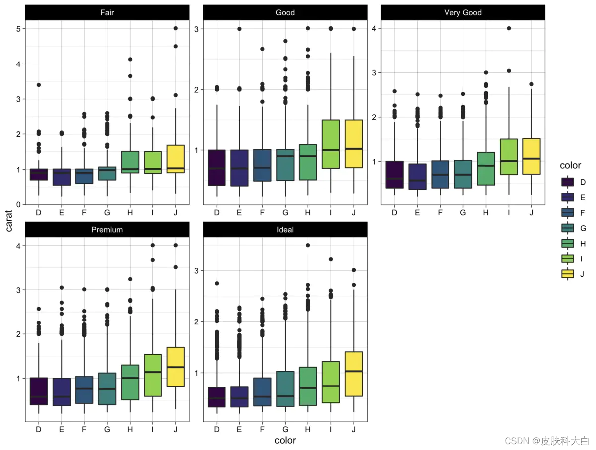
当研究某个连续型变量的箱线图涉及多个离散型分类变量时,我们常使用分面facetting来提高图表的可视性。
library(ggplot2)

ggplot(diamonds, aes(x = color, y = carat)) +
  # 切换主题
  theme_linedraw() +
  # 箱线图颜色根据因子型变量color填色
  geom_boxplot(aes(fill = color)) +
  # 分面: 本质上是将数据框按照因子型变量color类划分为多个子数据集subset, 在每个子数据集上绘制相同的箱线图
  # 注意一般都要加scales="free", 否则子数据集数据尺度相差较大时会被拉扯开
  facet_wrap(~cut, scales="free")
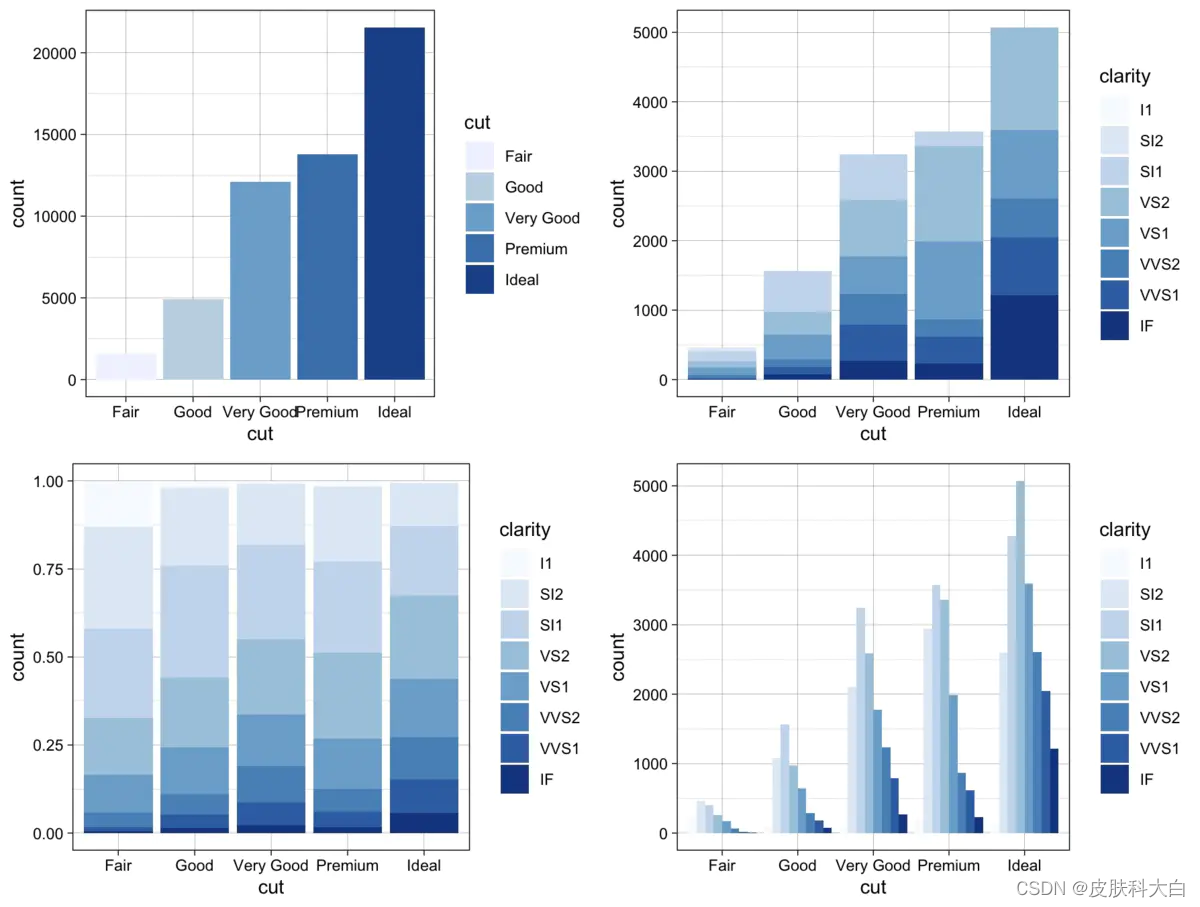
4. 直方图
library(ggplo2)

# 普通的直方图
p1 <- ggplot(data = diamonds) +
  geom_bar(mapping = aes(x = cut, fill = cut)) +
  theme_linedraw() +
  scale_fill_brewer()

# 堆积直方图
p2 <- ggplot(data = diamonds) +
  geom_bar(mapping = aes(x = cut, fill = clarity), position = "identity") +
  theme_linedraw() +
  scale_fill_brewer()

# 累积直方图
p3 <- ggplot(data = diamonds) +
  geom_bar(mapping = aes(x = cut, fill = clarity), position = "fill") +
  theme_linedraw() +
  scale_fill_brewer()

# 分类直方图
p4 <- ggplot(data = diamonds) +
  geom_bar(mapping = aes(x = cut, fill = clarity), position = "dodge") +
  theme_linedraw() +
  scale_fill_brewer()

# 构造ggplot图片列表
plots <- list(p1, p2, p3, p4)
# 自定义图片布局
gridExtra::grid.arrange(grobs = plots, ncol = 2)
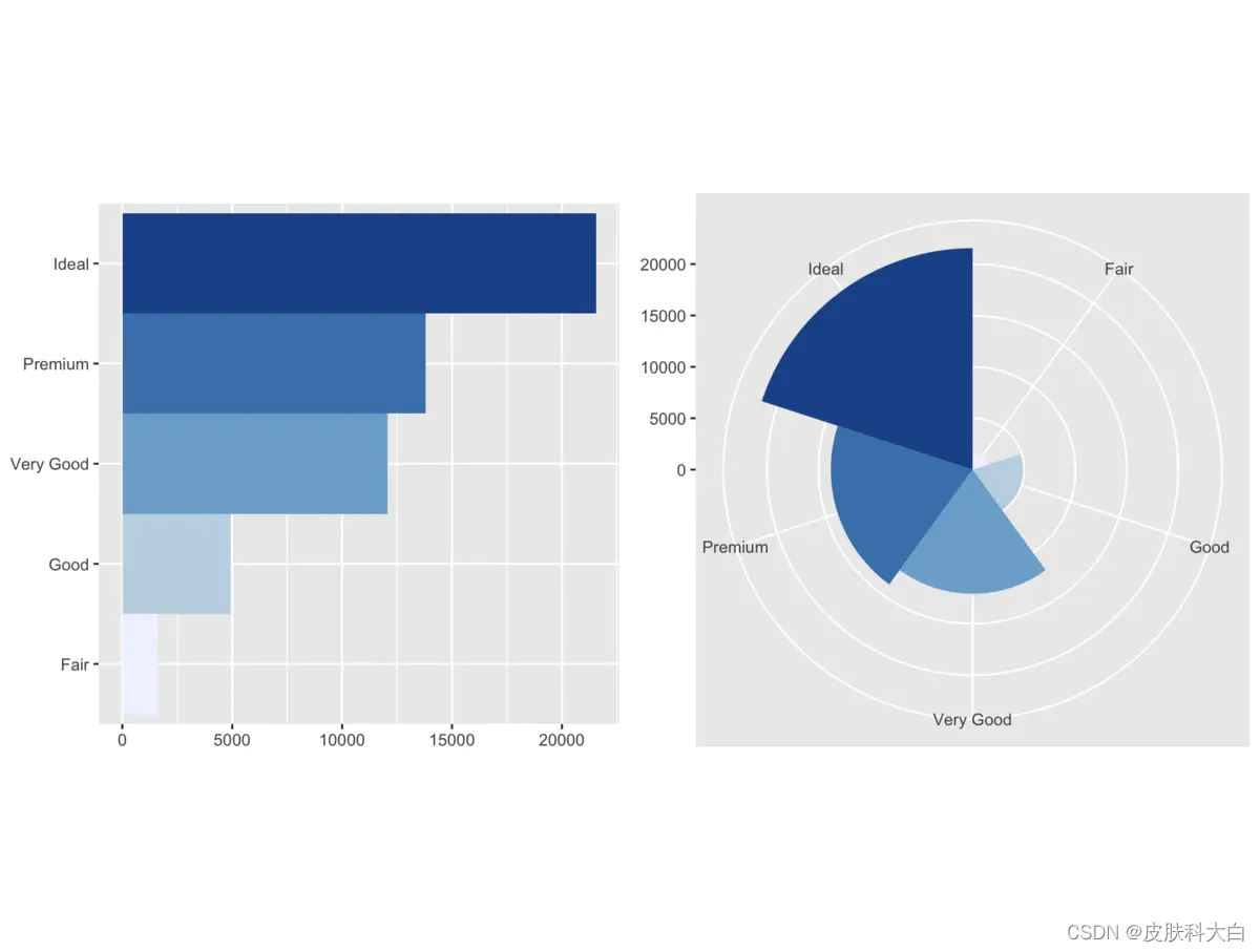
5. 坐标系统
除了前面箱线图使用的coord_flip()方法实现了坐标轴转置,ggplot还提供了很多和坐标系统相关的功能。
library(ggplot2)

bar <- ggplot(data = diamonds) +
  geom_bar(mapping = aes(x = cut, fill = cut), show.legend = FALSE, width = 1) +
  # 指定比率: 长宽比为1, 便于展示图形
  theme(aspect.ratio = 1) +
  scale_fill_brewer() +
  labs(x = NULL, y = NULL)

# 坐标轴转置
bar1 <- bar + coord_flip()
# 绘制极坐标
bar2 <- bar + coord_polar()

# 构造ggplot图片列表
plots <- list(bar1, bar2)
# 自定义图片布局
gridExtra::grid.arrange(grobs = plots, ncol = 2)
6. 瓦片图、 热力图
机器学习中探索性分析我们可以通过corrplot直接绘制所有变量的相关系数图,用于判断总体的相关系数情况。
library(corrplot)
#计算数据集的相关系数矩阵并可视化
mycor = cor(mtcars)
corrplot(mycor, tl.col = "black")
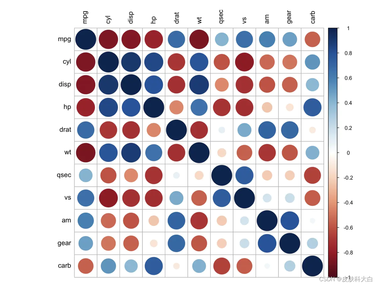
ggplot提供了更加个性化的瓦片图绘制:
library(RColorBrewer)
# 生成相关系数矩阵
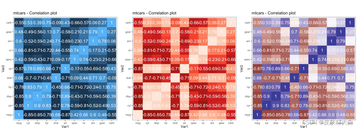
corr <- round(cor(mtcars), 2)
df <- reshape2::melt(corr)
p1 <- ggplot(df, aes(x = Var1, y = Var2, fill = value, label = value)) +
geom_tile() +
theme_bw() +
geom_text(aes(label = value, size = 0.3), color = "white") +
labs(title = "mtcars - Correlation plot") +
theme(text = element_text(size = 10), legend.position = "none", aspect.ratio = 1)
p2 <- p1 + scale_fill_distiller(palette = "Reds")
p3 <- p1 + scale_fill_gradient2()
gridExtra::grid.arrange(p1, p2, p3, ncol=3)
链接:https://www.jianshu.com/p/627d3aa2ec2e
http://r-statistics.co/Top50-Ggplot2-Visualizations-MasterList-R-Code.html
这是关于 ggplot2 的三部分教程的第 3 部分,ggplot2 是 R 中一个美观(且非常流行)的图形框架。本教程主要面向那些对 R 编程语言有一些基本知识并希望制作复杂且美观的图表的人与 R ggplot2。
第 1 部分:ggplot2 简介,涵盖有关构建简单 ggplots 以及修改组件和美学的基本知识。
第 2 部分:自定义外观和感觉,是关于更高级的自定义,例如操作图例、注释、带有刻面和自定义布局的多图
第 3 部分:前 50 个 ggplot2 可视化 - 主列表,应用在第 1 部分和第 2 部分中学到的知识来构建其他类型的 ggplots,例如条形图、箱线图等。
前 50 个 ggplot2 可视化 - 主列表
有效的图表是:
在不歪曲事实的情况下传达正确的信息。
简单而优雅。它不应该强迫你为了得到它而想太多。
美学支持信息而不是掩盖它。
信息不超载。
下面的列表根据其主要目的对可视化进行排序。首先,您可以构建 8 种类型的目标图。因此,在您实际制作情节之前,请尝试确定您希望通过可视化传达或检查的发现和关系。它很可能属于这 8 个类别中的一个(或有时更多)。
相关性
散点图
带环绕的散点图
抖动图
计数图
气泡图
动画气泡图
边际直方图/箱线图
相关图
偏差
发散条
发散的棒棒糖图表
发散点图
面积图
排行
有序条形图
棒棒糖图
点图
斜率图
哑铃情节
分配
直方图
密度图
箱形图
点+箱线图
塔夫特箱线图
小提琴剧情
人口金字塔
作品
华夫饼图
饼形图
树状图
条形图
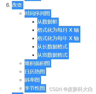
改变
时间序列图
从数据框
格式化为每月 X 轴
格式化为每年 X 轴
从长数据格式
从宽数据格式
堆积面积图
日历热图
斜率图
季节性图
团体
树状图
集群
空间
打开街道地图
谷歌路线图
谷歌混合地图
1.相关性
以下图表有助于检查两个变量的相关程度。


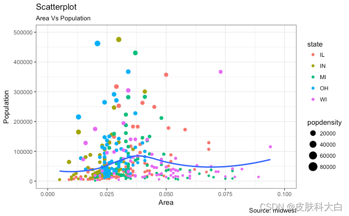
散点图
数据分析最常用的图无疑是散点图。每当您想了解两个变量之间关系的性质时,总是首选散点图。
可以使用geom_point(). 此外,geom_smooth默认情况下绘制平滑线(基于黄土),可以通过设置调整以绘制最佳拟合线method=‘lm’。
# install.packages("ggplot2")
# load package and data
options(scipen=999)  # turn-off scientific notation like 1e+48
library(ggplot2)
theme_set(theme_bw())  # pre-set the bw theme.
data("midwest", package = "ggplot2")
# midwest <- read.csv("http://goo.gl/G1K41K")  # bkup data source

# Scatterplot
gg <- ggplot(midwest, aes(x=area, y=poptotal)) +
  geom_point(aes(col=state, size=popdensity)) +
  geom_smooth(method="loess", se=F) +
  xlim(c(0, 0.1)) +
  ylim(c(0, 500000)) +
  labs(subtitle="Area Vs Population",
       y="Population",
       x="Area",
       title="Scatterplot",
       caption = "Source: midwest")

plot(gg)
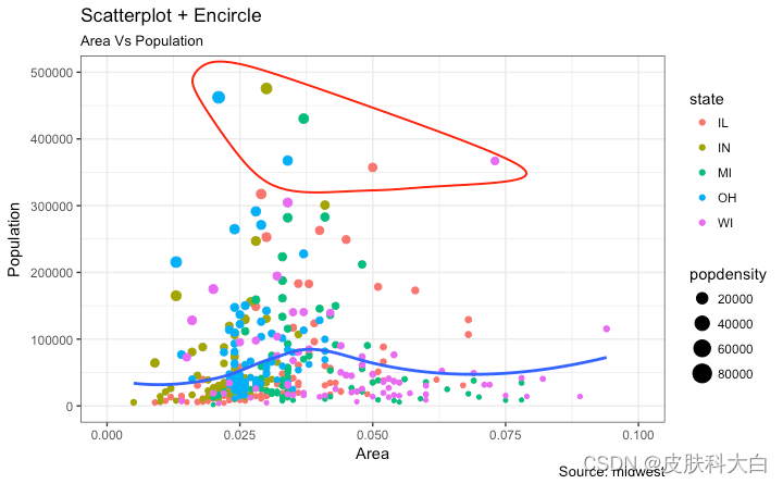
带环绕的散点图
在呈现结果时,有时我会在图表中圈出某些特殊的点或区域,以引起对那些特殊情况的注意。这可以使用geom_encircle()inggalt包方便地完成。
在geom_encircle()中,将 设置为data仅包含点(行)或兴趣的新数据框。此外,您可以expand弯曲曲线以便在点外通过。曲线的color和size(粗细)也可以修改。请参见下面的示例。
# install 'ggalt' pkg
# devtools::install_github("hrbrmstr/ggalt")
options(scipen = 999)
library(ggplot2)
library(ggalt)
midwest_select <- midwest[midwest$poptotal > 350000 &
                            midwest$poptotal <= 500000 &
                            midwest$area > 0.01 &
                            midwest$area < 0.1, ]

# Plot
ggplot(midwest, aes(x=area, y=poptotal)) +
  geom_point(aes(col=state, size=popdensity)) +   # draw points
  geom_smooth(method="loess", se=F) +
  xlim(c(0, 0.1)) +
  ylim(c(0, 500000)) +   # draw smoothing line
  geom_encircle(aes(x=area, y=poptotal),
                data=midwest_select,
                color="red",
                size=2,
                expand=0.08) +   # encircle
  labs(subtitle="Area Vs Population",
       y="Population",
       x="Area",
       title="Scatterplot + Encircle",
       caption="Source: midwest")
抖动图
让我们看一个绘制散点图的新数据。这一次,我将使用mpg数据集绘制城市里程 ( cty) 与高速公路里程 ( hwy)。
# load package and data
library(ggplot2)
data(mpg, package="ggplot2") # alternate source: "http://goo.gl/uEeRGu")
theme_set(theme_bw())  # pre-set the bw theme.

g <- ggplot(mpg, aes(cty, hwy))

# Scatterplot
g + geom_point() +
  geom_smooth(method="lm", se=F) +
  labs(subtitle="mpg: city vs highway mileage",
       y="hwy",
       x="cty",
       title="Scatterplot with overlapping points",
       caption="Source: midwest")
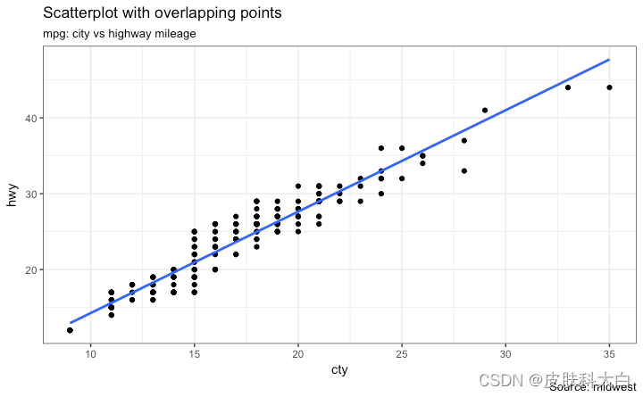
我们在这里得到的是mpg数据集中城市和高速公路里程的散点图。我们已经看到了类似的散点图,它看起来很简洁,清楚地说明了城市里程 ( cty) 和高速公路里程 ( hwy) 之间的相关性。
但是,这个看似无辜的情节却隐藏着一些东西。你可以找到?
原始数据有 234 个数据点,但图表似乎显示的点较少。发生了什么?这是因为有许多重叠点显示为一个点。cty和都是源数据集中的整数这一事实使得hwy隐藏这个细节更加方便。因此,下次使用整数制作散点图时要格外小心。
那么如何处理呢?选项很少。我们可以用 制作抖动图jitter_geom()。顾名思义,重叠点根据width参数控制的阈值在其原始位置周围随机抖动
# load package and data
library(ggplot2)
data(mpg, package="ggplot2")
# mpg <- read.csv("http://goo.gl/uEeRGu")

# Scatterplot
theme_set(theme_bw())  # pre-set the bw theme.
g <- ggplot(mpg, aes(cty, hwy))
g + geom_jitter(width = .5, size=1) +
  labs(subtitle="mpg: city vs highway mileage",
       y="hwy",
       x="cty",
       title="Jittered Points")
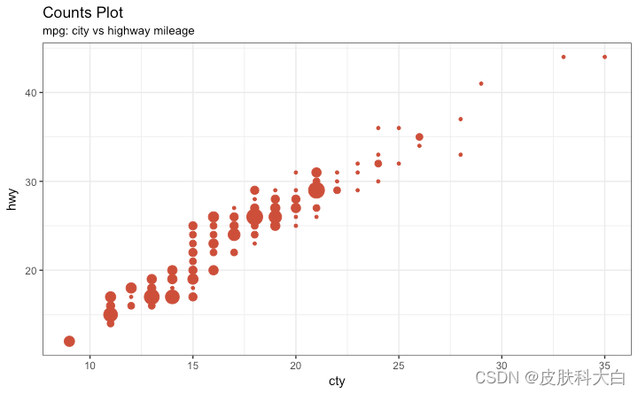
计数图
克服数据点重叠问题的第二个选项是使用所谓的计数图。哪里有更多的点重叠,圆的大小就会变大。
# load package and data
library(ggplot2)
data(mpg, package="ggplot2")
# mpg <- read.csv("http://goo.gl/uEeRGu")

# Scatterplot
theme_set(theme_bw())  # pre-set the bw theme.
g <- ggplot(mpg, aes(cty, hwy))
g + geom_count(col="tomato3", show.legend=F) +
  labs(subtitle="mpg: city vs highway mileage",
       y="hwy",
       x="cty",
       title="Counts Plot")
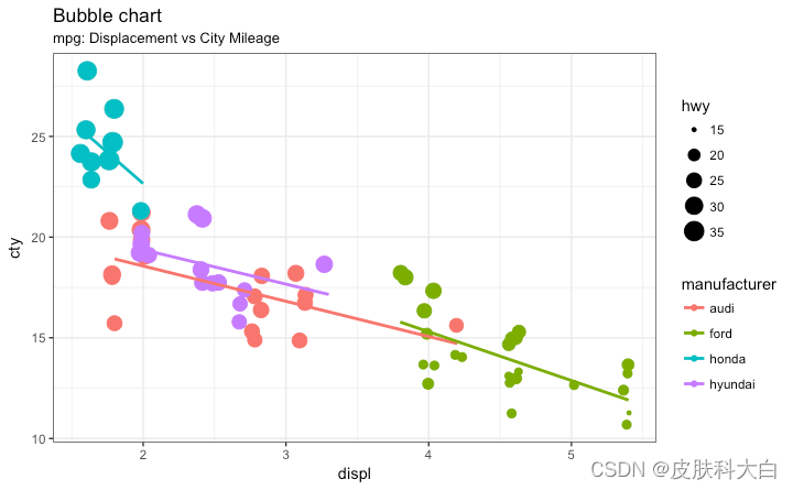
气泡图
虽然散点图可让您比较 2 个连续变量之间的关系,但如果您想根据以下内容了解基础组内的关系,则气泡图非常有用:
一个分类变量(通过改变颜色)和
另一个连续变量(通过改变点的大小)。
简而言之,如果您有 4 维数据,其中两个是数字(X 和 Y),另一个是分类(颜色)和另一个数字变量(大小),气泡图更合适。
气泡图清楚地区分displ了制造商之间的范围以及最佳拟合线的斜率如何变化,从而提供了组之间更好的视觉比较。
# load package and data
library(ggplot2)
data(mpg, package="ggplot2")
# mpg <- read.csv("http://goo.gl/uEeRGu")

mpg_select <- mpg[mpg$manufacturer %in% c("audi", "ford", "honda", "hyundai"), ]

# Scatterplot
theme_set(theme_bw())  # pre-set the bw theme.
g <- ggplot(mpg_select, aes(displ, cty)) +
  labs(subtitle="mpg: Displacement vs City Mileage",
       title="Bubble chart")

g + geom_jitter(aes(col=manufacturer, size=hwy)) +
  geom_smooth(aes(col=manufacturer), method="lm", se=F)


 23
23

 被折叠的 条评论
为什么被折叠?
被折叠的 条评论
为什么被折叠?
 到【灌水乐园】发言


