


本人不会描述,大概做好的样子如下所示: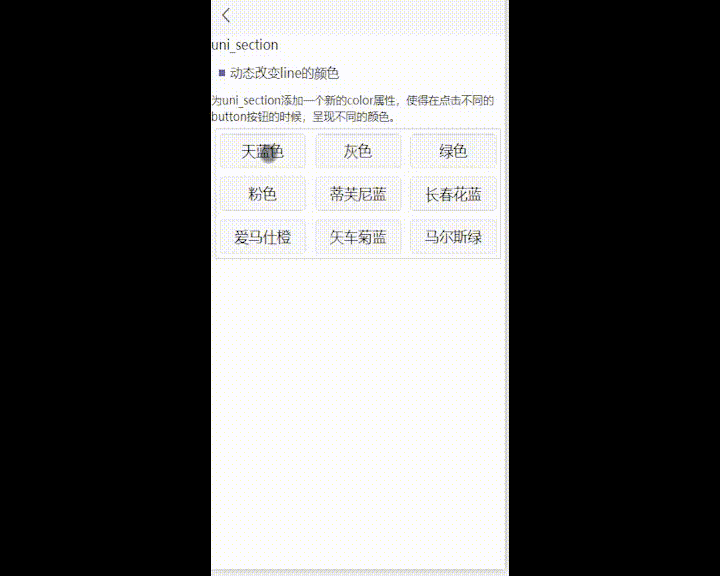
菜鸟上路:设计一个页面的时候,大佬要求点击不同的按钮,做到uni-section组件的type属性发生颜色变化。上穷碧落下黄泉,茫茫百度找不见,于是乎打开了uni-section封装好的代码。既然它把代码都给我了,我改点东西不过分吧。
1/ 在uni-section组件script的props中添加color。
color:{
    type:String,
	default:'#2979ff'
},
props是接收从父页面传递过来的数据,例如props中的type,是决定un-section前面标识是竖线(line)、方块(square)还是圆圈(circle),再例如title是决定uni-section 的标题,subtitle是决定uni-section的副标题。那我添加一个color作为type的颜色,很是合理。
2/注销uni-section页面css中 .uni-section-header -- &__decoration 的background-color。
在uni-section这个组件的第四行的位置有这样一段代码,
<view class="uni-section-header__decoration" v-if="type" :class="type" />
这就是决定uni-section前面那段标识符号的属性。v-if表示当传递过来的type属性为真的时候显示,然后class属性为type,这就是说,我如果什么都不传递,则uni-section前面的小竖线或者方块圆圈都不会显示,结合它的css代码,当传递的参数为line 的时候,uni-section前面的标识符号为一个高为4px,宽为12px 的小竖线,当传递的是circle的时候,是……当传递的是square的时候,是……它们拥有同一个背景色,
      &__decoration{
        margin-right: 6px;
        // background-color: $uni-primary;
        &.line {
          width: 4px;
          height: 12px;
          border-radius: 10px;
        }

        &.circle {
          width: 8px;
          height: 8px;
          border-top-right-radius: 50px;
          border-top-left-radius: 50px;
          border-bottom-left-radius: 50px;
          border-bottom-right-radius: 50px;
        }

        &.square {
          width: 8px;
          height: 8px;
        }
      }
注释掉之后,为uni-section第四行这段代码添加一个style,用来动态接收一个color,从而改变背景色。
<view class="uni-section-header__decoration" v-if="type" :class="type" :style="{'background-color':color}" />
3/主页面的使用
在主页面和往常一样使用uni-section即可,只不过可以动态传递一个color参数,color的值可以通过一些button来修改。
		<uni-section title="动态改变line的颜色" :color="color" type="square"
		titleFontSize="32rpx">
			为uni_section添加一个新的color属性,使得在点击不同的button按钮的时候,呈现不同的颜色。
		</uni-section>
		<view class="btn1">
			<button @click="onclick('skyblue')">天蓝色</button>
			<button @click="onclick('grey')">灰色</button>
			<button @click="onclick('green')">绿色</button>
			<button @click="onclick('pink')">粉色</button>
			<button @click="onclick('#81D8D0')">蒂芙尼蓝</button>
			<button @click="onclick('#6667AB')">长春花蓝</button>
			<button @click="onclick('#EB5C20')">爱马仕橙</button>
			<button @click="onclick('#6495ED')">矢车菊蓝</button>
			<button @click="onclick('#008F8E')">马尔斯绿</button>
		</view>
主页面定义一个color参数,令button按钮的点击操作传递一个color值,this.color=color,从而实现点击按钮,改变uni-section前面标识颜色。
侥幸修改插件代码成功,后来听大佬说,别人插件的代码尽量还是少修改为好,没办法,谁让我只想到了这一种方式捏。=3=
所有代码如下:(说不太清楚,直接看我丑陋的代码即可)
主页面使用代码:
<template>
	<view class="content">
		uni_section
		<uni-section title="动态改变line的颜色" :color="color" type="square"
		titleFontSize="32rpx">
			为uni_section添加一个新的color属性,使得在点击不同的button按钮的时候,呈现不同的颜色。
		</uni-section>
		<view class="btn1">
			<button @click="onclick('skyblue')">天蓝色</button>
			<button @click="onclick('grey')">灰色</button>
			<button @click="onclick('green')">绿色</button>
			<button @click="onclick('pink')">粉色</button>
			<button @click="onclick('#81D8D0')">蒂芙尼蓝</button>
			<button @click="onclick('#6667AB')">长春花蓝</button>
			<button @click="onclick('#EB5C20')">爱马仕橙</button>
			<button @click="onclick('#6495ED')">矢车菊蓝</button>
			<button @click="onclick('#008F8E')">马尔斯绿</button>
		</view>
	</view>
</template>

<script>
	export default {
		data() {
			return {
				color:'#2979ff'
			}
		},
		methods: {
			// 通过点击,修改uni-section中line的颜色
			onclick(color){
				this.color=color
			}
		}
	}
</script>

<style lang="scss" scoped>
	// 设置scoped 使得css样式只在当前页面生效
	.content{
		width: 100%;
		height: 100%;
		font-size: 32rpx;
		.btn1{
			margin: 10rpx;
			min-height: 100rpx;
			height: auto;
			display: flex;
			align-items: center;
			justify-content: space-between;
			flex-wrap: wrap;
			border: 1px solid #ccc;
			border-radius: 5rpx;
			button{
				width: 220rpx;
				height: 80rpx;
				line-height: 80rpx;
				margin: 10rpx;
			}
		}
	}

</style>
uni-section插件代码:
<template>
	<view class="uni-section">
		<view class="uni-section-header" @click="onClick">
			<view class="uni-section-header__decoration" v-if="type" :class="type" :style="{'background-color':color}"></view>

			<slot v-else name="decoration"></slot>

			<view class="uni-section-header__content">
			  <text :style="{'font-size':titleFontSize,'color':titleColor}" class="uni-section__content-title" :class="{'distraction':!subTitle}">{{ title }}</text>
			  <text v-if="subTitle" :style="{'font-size':subTitleFontSize,'color':subTitleColor}" class="uni-section-header__content-sub">{{ subTitle }}</text>
			</view>

			<view class="uni-section-header__slot-right">
			  <slot name="right"></slot>
			</view>
		</view>

		<view class="uni-section-content" :style="{padding: _padding}">
			<slot />
		</view>
	</view>
</template>

<script>

	/**
	 * Section 标题栏
	 * @description 标题栏
	 * @property {String} type = [line|circle|square] 标题装饰类型
	 * 	@value line 竖线
	 * 	@value circle 圆形
	 * 	@value square 正方形
	 * @property {String} title 主标题
	 * @property {String} titleFontSize 主标题字体大小
	 * @property {String} titleColor 主标题字体颜色
	 * @property {String} subTitle 副标题
	 * @property {String} subTitleFontSize 副标题字体大小
	 * @property {String} subTitleColor 副标题字体颜色
	 * @property {String} padding 默认插槽 padding
	 */

	export default {
		name: 'UniSection',
		emits:['click'],
		props: {
			type: {
				type: String,
				default: ''
			},
				color:{
					type:String,
					default:'#2979ff'
				},
			title: {
				type: String,
				required: true,
				default: ''
			},
			titleFontSize: {
				type: String,
				default: '14px'
			},
			titleColor:{
				type: String,
				default: '#333'
			},
			subTitle: {
				type: String,
				default: ''
			},
			subTitleFontSize: {
				type: String,
				default: '12px'
			},
			subTitleColor: {
				type: String,
				default: '#999'
			},
			padding: {
				type: [Boolean, String],
				default: false
			}
		},
		computed:{
			_padding(){
				if(typeof this.padding === 'string'){
					return this.padding
				}
				return this.padding?'10px':''
			}
		},
		watch: {
			title(newVal) {
				if (uni.report && newVal !== '') {
					uni.report('title', newVal)
				}
			}
		},
		methods: {
			onClick() {
				this.$emit('click')
			}
		}
	}
</script>
<style lang="scss" >
	$uni-primary: #2979ff !default;

	.uni-section {
		background-color: #fff;
    .uni-section-header {
      position: relative;
      /* #ifndef APP-NVUE */
      display: flex;
      /* #endif */
      flex-direction: row;
      align-items: center;
      padding: 12px 10px;
      font-weight: normal;

      &__decoration{
        margin-right: 6px;
        // background-color: $uni-primary;
        &.line {
          width: 4px;
          height: 12px;
          border-radius: 10px;
        }

        &.circle {
          width: 8px;
          height: 8px;
          border-top-right-radius: 50px;
          border-top-left-radius: 50px;
          border-bottom-left-radius: 50px;
          border-bottom-right-radius: 50px;
        }

        &.square {
          width: 8px;
          height: 8px;
        }
      }

      &__content {
        /* #ifndef APP-NVUE */
        display: flex;
        /* #endif */
        flex-direction: column;
        flex: 1;
        color: #333;

        .distraction {
          flex-direction: row;
          align-items: center;
        }
        &-sub {
          margin-top: 2px;
        }
      }

      &__slot-right{
        font-size: 14px;
      }
    }

    .uni-section-content{
      font-size: 14px;
    }
	}
</style>


 扫一扫
扫一扫


 765
765

 被折叠的 条评论
为什么被折叠?
被折叠的 条评论
为什么被折叠?
 到【灌水乐园】发言


