


一、简述
- 描述:如何修改Android中Button、ImageButton的原生显示样式,使得显示效果更加符合人的审美,从UI设计上吸引客户的使用率。
- 难度:初级
- 知识点:xmlns-shape的使用
- 展示
- 在实际项目中的应用
UI工程师可以决定样式,但色彩却不是UI工程师能够决定的,所以此项目基础色彩基本由 白和灰 来展示。


二、xmlns-shape
1、了解
为了记忆方便,仅说明本篇内使用到元素。
| 元素 | 使用效果 |
|---|---|
| solid | 设置背景颜色 |
| padding | 设置内边距 |
| corners | 设置圆角 |
| stroke | 设置边框阴影 |
2、深入了解corners
(1)图示

(2)属性
| 象限值 | 属性 | 使用效果 |
|---|---|---|
| 一 | topRightRadius | 设置右上角弧度 |
| 二 | bottomRightRadius | 设置右下角弧度 |
| 三 | bottomLeftRadius | 设置左下角弧度 |
| 四 | topLeftRadius | 设置左上角弧度 |
三、UI设计
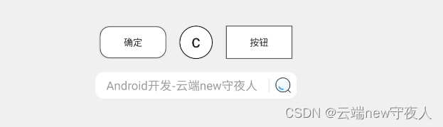
1、圆角按钮
- 图示
- 样式设计(res -> drawable -> shape.xml)
<?xml version="1.0" encoding="utf-8"?>
<shape xmlns:android="http://schemas.android.com/apk/res/android"
    android:shape="rectangle">

    <!--  背景  -->
    <solid android:color="#FFF"/>

    <!--  内边距  -->
    <padding
        android:right="10dp"
        android:top="10dp"
        android:left="10dp"
        android:bottom="10dp"/>

    <!--  圆角  -->
    <corners android:radius="14dp"/>

    <!--  阴影  -->
    <stroke
        android:width="1dp"
        android:color="#535252"/>

</shape>
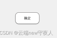
2、圆形按钮
- 图示
- 样式设计(res -> drawable -> shape_circular.xml)
<?xml version="1.0" encoding="utf-8"?>
<shape xmlns:android="http://schemas.android.com/apk/res/android"
    android:shape="rectangle">
    <!--设置颜色-->
    <solid android:color="#FFF"/>

    <!--设置圆角-->
    <corners android:radius="25dp"/>

    <!--  阴影  -->
    <stroke
        android:width="1dp"
        android:color="#000000"/>

</shape>
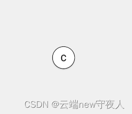
3、普通按钮
-
图示
-
样式设计(res -> drawable -> stroke.xml)
<?xml version="1.0" encoding="utf-8"?>
<shape xmlns:android="http://schemas.android.com/apk/res/android"
    android:shape="rectangle">

    <!--  颜色  -->
    <solid android:color="#FFF"/>

    <!--  内边距  -->
    <padding
        android:right="10dp"
        android:top="10dp"
        android:left="10dp"
        android:bottom="10dp"/>

    <!--  阴影  -->
    <stroke
        android:width="1dp"
        android:color="#535252"/>

</shape>
4、圆角搜索组合按钮
- 图示

- 样式设计1(res -> drawable -> shape12.xml)
<?xml version="1.0" encoding="utf-8"?>
<shape xmlns:android="http://schemas.android.com/apk/res/android"
    android:shape="rectangle">

    <!--设置颜色-->
    <solid android:color="#FFF"/>

    <!--设置圆角-->
    <corners
        android:topRightRadius="12dp"
        android:bottomRightRadius="12dp"/>

</shape>
- 样式设计2(res -> drawable -> shape34.xml)
<?xml version="1.0" encoding="utf-8"?>
<shape xmlns:android="http://schemas.android.com/apk/res/android"
    android:shape="rectangle">

    <!--设置颜色-->
    <solid android:color="#FFF"/>

    <!--设置圆角-->
    <corners
        android:topLeftRadius="12dp"
        android:bottomLeftRadius="12dp"/>

</shape>
四、具体使用
<?xml version="1.0" encoding="utf-8"?>
<LinearLayout xmlns:android="http://schemas.android.com/apk/res/android"
    xmlns:app="http://schemas.android.com/apk/res-auto"
    xmlns:tools="http://schemas.android.com/tools"
    android:layout_width="match_parent"
    android:layout_height="match_parent"
    tools:context=".MainActivity"
    android:background="#F0F0F0"
    android:orientation="vertical">

    <LinearLayout
        android:layout_width="match_parent"
        android:layout_height="wrap_content"
        android:padding="10dp"
        android:layout_marginTop="40dp"
        android:gravity="center">

    	<!--  圆角按钮  -->
        <Button
            android:layout_width="100dp"
            android:layout_height="wrap_content"
            android:background="@drawable/shape"
            android:text="确定"/>

    	<!--  圆形按钮  -->
        <Button
            android:layout_width="50dp"
            android:layout_height="50dp"
            android:layout_marginLeft="20dp"
            android:background="@drawable/shape_circular"
            android:text="C"
            android:textSize="20dp"/>

    	<!--  普通按钮  -->
        <Button
            android:layout_width="100dp"
            android:layout_height="50dp"
            android:layout_marginLeft="20dp"
            android:background="@drawable/stroke"
            android:text="按钮"
            />

    </LinearLayout>

    <!--  圆角搜索组合按钮  -->
    <LinearLayout
        android:layout_width="match_parent"
        android:layout_height="wrap_content"
        android:padding="10dp"
        android:gravity="center">

        <EditText
            android:id="@+id/comm_search"
            android:layout_width="260dp"
            android:layout_height="40dp"
            android:background="@drawable/shape34"
            android:gravity="center"
            android:hint="Android开发-云端new守夜人"/>

        <LinearLayout
            android:layout_width="3dp"
            android:layout_height="40dp"
            android:gravity="center"
            android:background="#FFF">

            <TextView
                android:layout_width="3dp"
                android:layout_height="20dp"
                android:background="#F0F0F0"/>

        </LinearLayout>

        <LinearLayout
            android:layout_width="40dp"
            android:layout_height="40dp"
            android:gravity="center"
            android:background="@drawable/shape12">

            <ImageButton
                android:id="@+id/cSearch"
                android:layout_width="25dp"
                android:layout_height="25dp"
                android:background="@drawable/sousuo"
                android:gravity="center"
                android:text="搜索" />

        </LinearLayout>

    </LinearLayout>

</LinearLayout>


 6148
6148


 被折叠的 条评论
为什么被折叠?
被折叠的 条评论
为什么被折叠?
 到【灌水乐园】发言


