


生信碱移
BPG:生成高质量可出版图表
BoutrosLab.plotting.general (BPG) 是由加州大学的研究者开发的 R 包,包含多种绘图函数,如条形图、散点图、热图,以及组合图。这些函数提供了极大的易用性和定制参数选项,可以广泛用于生物医学应用以及各类通用绘图。当然,每个函数还提供有效的默认设置,使数据绘图更加高效,并且使用标准颜色方案更容易生成高质量图表。
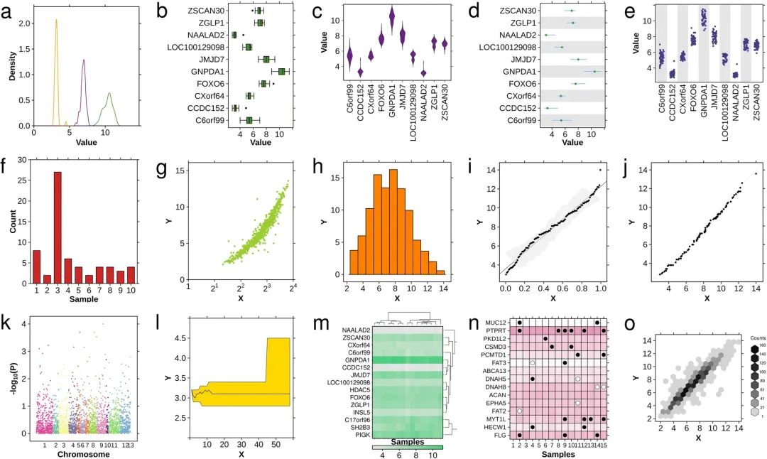
▲ 使用BPG生成的示例图片
BPG 中可用的基本图表类型包括:密度图、箱线图、小提琴图、线段图、条带图、条形图、散点图、直方图、qq拟合图、qq比较图、曼哈顿图、多边形图、热图、点图和六边形图。
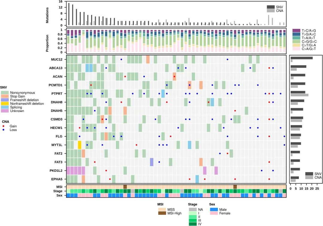
▲ 使用 BPG 组合多种图形
此外,BPG 的 create.multiplot 函数能够将多种图表类型组合成一个单一的图形,如上图所示。注意:create.multipanelplot和create.multiplot目前都支持,但建议使用create.multipanelplot。随着该R包的开发,create.multiplot 将被弃用。
一、内置数据
BPG 包含几个内置数据来演示其绘图功能:
| 数据集名称 | 功能描述 |
|---|---|
| CNA | 来自结肠癌患者的拷贝数畸变(CNA)数据 |
| SNV | 来自结肠癌患者的单核苷酸变异(SNV)数据 |
| microarray | 结肠癌患者的微阵列基因表达矩阵 |
| patient | 描述58名结肠癌患者临床性状的数据集 |
给各位老铁看看内置数据的表头:
#install.packages("BoutrosLab.plotting.general")
library(BoutrosLab.plotting.general)

# CNA 数据
data(CNA)
CNA[1:5, 1:5]
#       Sample01 Sample02 Sample03 Sample04 Sample05
#MUC12         0        1        0        0        0
#PTPRT         0        1        0        0        0
#PKD1L2        0        0        0        0        0
#CSMD3         0        0        0        0        0
#PCMTD1        0        0        0        0        0

# SNV数据
data(SNV)
SNV[1:5, 1:5]
#      Sample01 Sample02 Sample03 Sample04 Sample05
#MUC12        NA       NA        1       NA       NA
#PTPRT         1       NA        1       NA       NA
#PKD1L2       NA       NA        8        1       NA
#CSMD3        NA       NA        1       NA       NA
#PCMTD1       NA       NA       NA        1       NA

# microarray数据
data(microarray)
microarray[1:5, 1:5]
#             Sample01 Sample02 Sample03 Sample04 Sample05
#NAALAD2           3.2      2.9      3.0      3.2      3.1
#GNPDA1           10.7      9.5     10.5     10.6     10.6
#ZSCAN30           6.8      6.3      7.0      6.9      6.7
#ZGLP1             7.3      6.5      7.4      7.4      7.5
#LOC100129098      5.6      4.7      5.4      5.5      5.

# patient数据
data(patient)
patient[1:5, 1:5]
#          sex stage msi prop.CAGT prop.CTGA
#Sample01 male    IV MSS     0.227     0.511
#Sample02 male    IV MSS     0.144     0.495
#Sample03 male    II MSS     0.382     0.225
#Sample04 male    IV MSS     0.222     0.328
#Sample05 male    IV MSS     0.242     0.366
二、一些运行示例
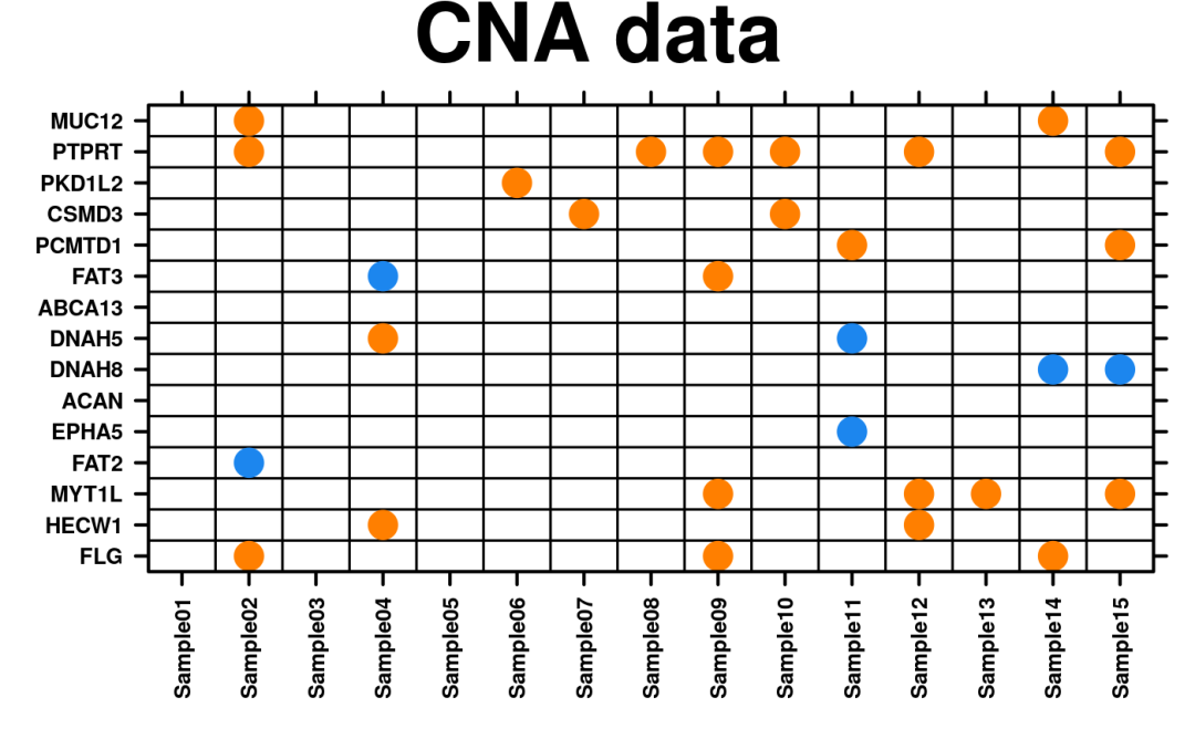
1.create.dotmap点图可视化CNV数据:
data(CNA)
create.dotmap(
    # filename = tempfile(pattern = 'Using_CNA_dataset', fileext = '.tiff'),
    x = CNA[1:15, 1:15],
    main = 'CNA data',
    xaxis.cex = 0.8,
    yaxis.cex = 0.8,
    xaxis.rot = 90,
    description = 'Dotmap created by BoutrosLab.plotting.general',
    resolution = 50
    )
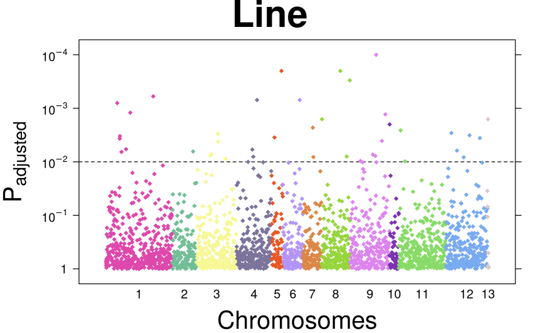
2.create.manhattanplot绘制曼哈顿图:
# 构建数据,查看下方英文注释
# set up chromosome covariate colours to use for chr covariate, below
chr.colours <- force.colour.scheme(microarray$Chr, scheme = 'chromosome')

# make chr covariate and chr labels
chr.n.genes       <- vector()
chr.tck           <- vector()
chr.pos.genes     <- vector()
chr.break         <- vector()
chr.break[1]      <- 0
# get a list of chromosomes to loop
chr <- unique(microarray$Chr)

# loop over each chromosome
for ( i in 1:length(chr) ) {

  # get the number of genes that belong to one chromosome
  n <- sum(microarray$Chr == chr[i])

  # calculate where the labels go
  chr.n.genes[i]   <- n
  chr.break[i+1] <- n + chr.break[i]
  chr.pos.genes[i] <- floor(chr.n.genes[i]/2)
  chr.tck[i]       <- chr.pos.genes[i] + which(microarray$Chr == chr[i])[1]
}
# add an indicator function for the data-frame
microarray$ind <- 1:nrow(microarray)

# 可视化
create.manhattanplot(
  # filename = tempfile(pattern = 'Manhattan_Added_Line', fileext = '.tiff'),
  formula = -log10(pval) ~ ind,
  data = microarray,
  main = 'Line',
  xlab.label = expression('Chromosomes'),
  ylab.label = expression('P'['adjusted']),
  xat = chr.tck,
  xaxis.lab = c(1:22, 'X', 'Y'),
  xaxis.tck = 0,
  xaxis.cex = 1,
  yaxis.cex = 1,
  yat = seq(0,5,1),
  yaxis.lab = c(
    1,
    expression(10^-1),
    expression(10^-2),
    expression(10^-3),
    expression(10^-4)
  ),
  col = chr.colours,
  pch = 18,
  cex = 0.75,
  # draw horizontal line
  abline.h = 2,
  abline.lty = 2,
  abline.lwd = 1,
  abline.col = 'black',
  description = 'Manhattan plot created using BoutrosLab.plotting.general',
  resolution = 200
)
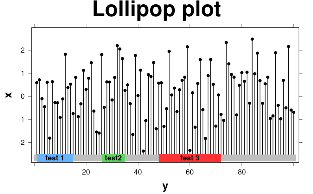
3.create.lollipopplot使用棒棒糖图进行基因突变可视化:
set.seed(12345);
lollipop.data <- data.frame(
    y = seq(1,100,1),
    x = rnorm(100)
    )

create.lollipopplot(
    # filename = tempfile(pattern = 'Lollipop_Simple', fileext = '.tiff'),
    formula = x ~ y,
    data = lollipop.data,
    main = 'Lollipop plot',
    xaxis.cex = 1,
    xlimits = c(-1,102),
    yaxis.cex = 1,
    xaxis.fontface = 1,
    yaxis.fontface = 1,
    xlab.cex = 1.5,
    ylab.cex = 1.5,
    pch = 21,
    col = 'black',
    fill = 'transparent',
    description = 'Scatter plot created by BoutrosLab.plotting.general',
    regions.start = c(1,26,48),
    regions.stop = c(15,35,72),
    regions.labels = c("test 1", "test2", "test 3"),
    regions.color = c("#66b3ff", "#5cd65c", "#ff3333")
    )
更多示例可以参考官方文档:
-
https://uclahs-cds.github.io/package-BoutrosLab-plotting-general/index.html
三、BPG 中的函数简介
下方展示了 BPG 中的大部分可用函数:
| 函数名称 | 功能描述 |
|---|---|
auto.axis() | 为给定数据集创建理想的标签和值(检测对数刻度) |
colour.gradient() | 创建颜色渐变 |
covariates.grob() | 创建一个或多个协变量条 |
create.barplot() | 创建条形图 |
create.boxplot() | 创建箱线图 |
create.colourkey() | 创建颜色键 |
create.dendrogram() | 生成树状图 |
create.densityplot() | 创建密度图 |
create.dotmap() | 创建带有彩色背景的点图 |
create.gif() | 创建GIF动画 |
create.heatmap() | 创建热图 |
create.hexbinplot() | 创建六边形图 |
create.histogram() | 创建直方图 |
create.lollipopplot() | 创建棒棒糖图 |
create.manhattanplot() | 创建曼哈顿图 |
create.multipanelplot() | 将多个图拼接在一起 |
create.multiplot() | 将多个图拼接在一起 |
create.polygonplot() | 创建多边形图 |
create.qqplot.comparison() | 创建两个样本的Q-Q图 |
create.qqplot.fit() | 创建一个样本的Q-Q图 |
create.qqplot.fit.confidence.interval() | 为单样本Q-Q图创建置信区间 |
create.scatterplot() | 创建散点图 |
create.segplot() | 创建线段图 |
create.stripplot() | 创建条带图 |
create.violinplot() | 创建小提琴图 |
critical.value.ks.test() | Kolmogorov-Smirnov检验的临界值 |
default.colours() | 提供默认的颜色方案 |
display.colours() | 显示R颜色及对应的灰度颜色 |
display.statistical.result() | 在图中显示统计结果的实用函数 |
dist() | 距离矩阵计算 |
force.colour.scheme() | 根据预定义的颜色方案,返回相应的颜色向量 |
generate.at.final() | 为create.densityplot()生成替代默认刻度位置 |
get.corr.key() | 相关性键 |
get.correlation.p.and.corr() | 计算相关性及其统计显著性 |
get.defaults() | 获取操作系统特定的默认属性 |
get.line.breaks() | 获取换行符 |
legend.grob() | 生成图例grob |
panel.BL.bwplot | 修复颜色问题的lattice::panel.bwplot替代函数 |
pcawg.colours() | 返回标准的PCAWG颜色调色板 |
scientific.notation() | 在图中使用科学计数法 |
show.available.palettes() | 显示可用的颜色调色板 |
thousands.split() | 将字符串按千位分组 |
write.metadata() | 写入元数据 |
write.plot() | 通过标准化和集中所有输出处理简化绘图 |
高强度冲浪
欢迎关注
今天就分享到这


 794
794

 被折叠的 条评论
为什么被折叠?
被折叠的 条评论
为什么被折叠?
 到【灌水乐园】发言


