


Python数据分析之可视化数据matplotlib/seaborn
Python最方便的画图库:matplotlib / seaborn
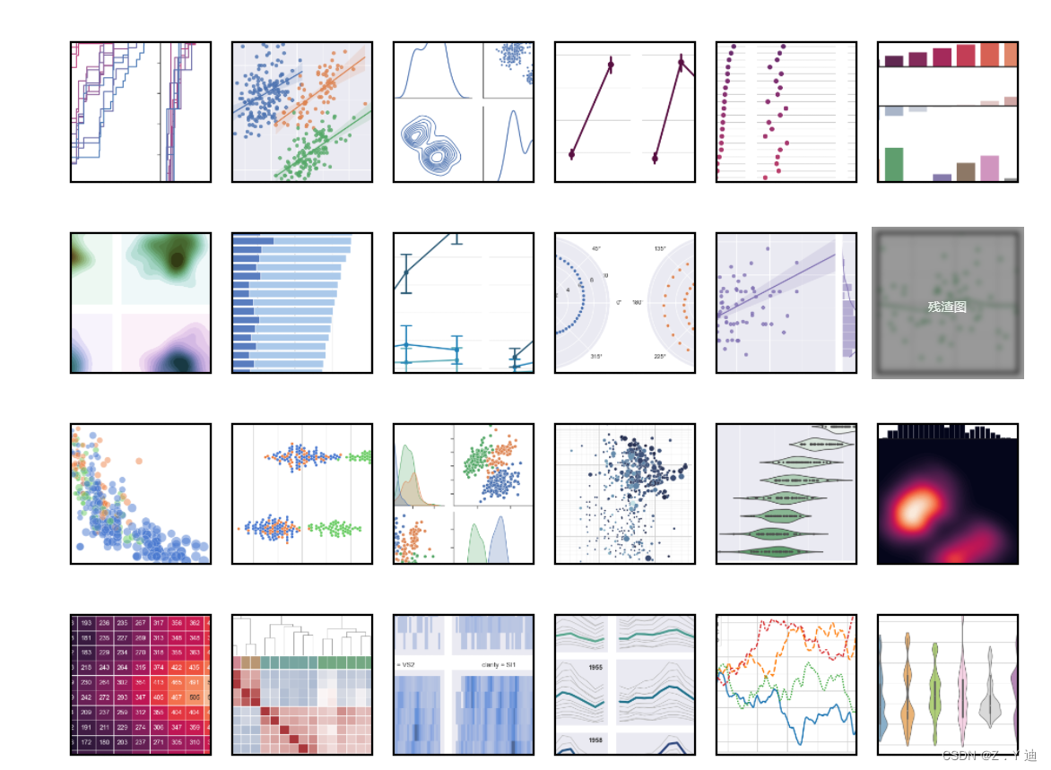
seaborn可画出如下图:(当然很有很多很多漂亮的图)
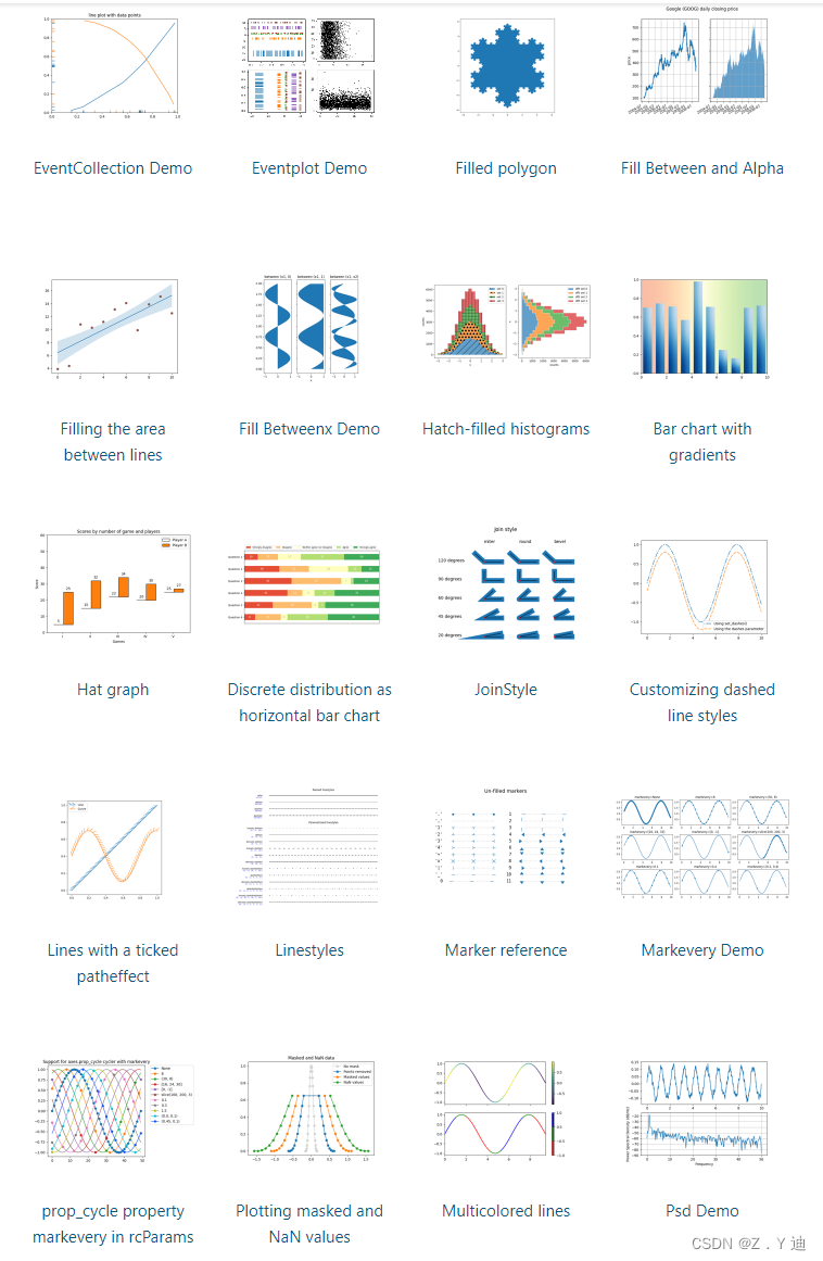
matpltlib可画出以下图:(当然很有很多很多漂亮的图)
最友好的地方是,这两种库都直接给出了各种绘图的所有源代码,只需要替换数据即可!
如下:
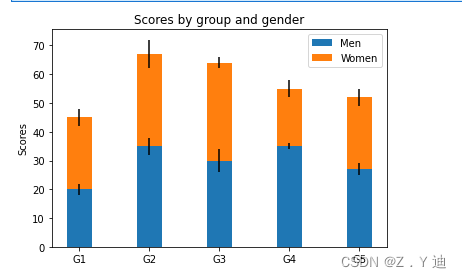
import matplotlib.pyplot as plt


labels = ['G1', 'G2', 'G3', 'G4', 'G5']
men_means = [20, 35, 30, 35, 27]
women_means = [25, 32, 34, 20, 25]
men_std = [2, 3, 4, 1, 2]
women_std = [3, 5, 2, 3, 3]
width = 0.35       # the width of the bars: can also be len(x) sequence

fig, ax = plt.subplots()

ax.bar(labels, men_means, width, yerr=men_std, label='Men')
ax.bar(labels, women_means, width, yerr=women_std, bottom=men_means,
       label='Women')

ax.set_ylabel('Scores')
ax.set_title('Scores by group and gender')
ax.legend()

plt.show()
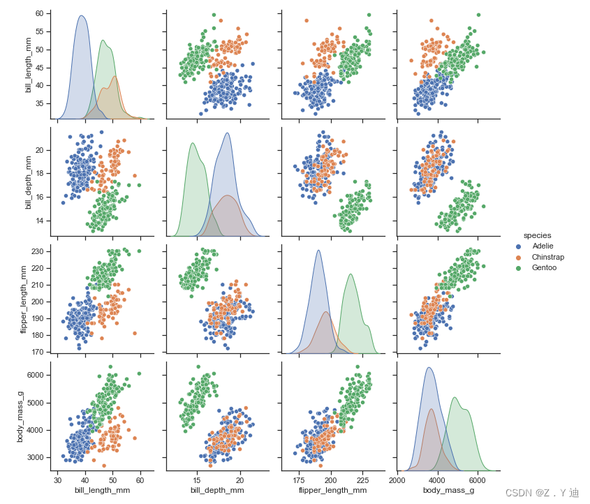
import seaborn as sns
sns.set_theme(style="ticks")

df = sns.load_dataset("penguins")
sns.pairplot(df, hue="species")


 790
790


 被折叠的 条评论
为什么被折叠?
被折叠的 条评论
为什么被折叠?
 到【灌水乐园】发言


