


小提琴图、箱形图和抖动图都可以用来展现数据的分布情况,但是侧重点又有所不同,通过ggplot2的图层叠加功能可以很容易地将三者合一,从而使图形的信息量更加丰富。
本篇使用的示例数据是iris:
library(ggplot2)
library(dplyr)
data <- iris
head(data)

##   Sepal.Length Sepal.Width Petal.Length Petal.Width Species
## 1          5.1         3.5          1.4         0.2  setosa
## 2          4.9         3.0          1.4         0.2  setosa
## 3          4.7         3.2          1.3         0.2  setosa
## 4          4.6         3.1          1.5         0.2  setosa
## 5          5.0         3.6          1.4         0.2  setosa
## 6          5.4         3.9          1.7         0.4  setosa
Species变量是因子变量,描述的是鸢尾属植物的种类。
1 相关图形绘制函数
绘制小提琴图的函数及语法结构:
geom_violin(
  mapping = NULL,
  data = NULL,
  stat = "ydensity",
  position = "dodge",
  ...,
  draw_quantiles = NULL,
  trim = TRUE,
  scale = "area",
  na.rm = FALSE,
  orientation = NA,
  show.legend = NA,
  inherit.aes = TRUE
)
draw_quantiles:在小提琴图内部绘制对应数据分位数的水平线,默认值为无;
trim:是否去除小提琴两端的尖角,默认为是;
scale:默认值
area表示所有小提琴面积相等,可选项count表示小提琴面积与对应样本数成正比,width表示小提琴图的最大宽度相等。
前面推文已经介绍过基础绘图系统中箱形图的绘制方法:
ggplot2中对应的函数以及参数大体与基础系统类似:
geom_boxplot(
  mapping = NULL,
  data = NULL,
  stat = "boxplot",
  position = "dodge2",
  ...,
  outlier.colour = NULL,
  outlier.color = NULL,
  outlier.fill = NULL,
  outlier.shape = 19,
  outlier.size = 1.5,
  outlier.stroke = 0.5,
  outlier.alpha = NULL,
  notch = FALSE,
  notchwidth = 0.5,
  varwidth = FALSE,
  na.rm = FALSE,
  orientation = NA,
  show.legend = NA,
  inherit.aes = TRUE
)
notch:调整箱形形状;
varwidth:默认值为FASLE,为TRUE时表示箱形宽度与样本数成正比。
抖动图是对散点在横坐标方向做随机抖动,以更好地展现数据在纵坐标方向的分布状态。相关函数的语法结构如下:
geom_jitter(
  mapping = NULL,
  data = NULL,
  stat = "identity",
  position = "jitter",
  ...,
  width = NULL,
  height = NULL,
  na.rm = FALSE,
  show.legend = NA,
  inherit.aes = TRUE
)
2 三图合一
在绘制图形之前,需要明确的一点是,这三类图形都要求x参数必须是因子变量。示例数据中Species本身已经是因子变量了,因此不需要再进行类型转换。
class(data$Species)

## [1] "factor"
首先,不用对图形做过多的美化,只使用必要的函数,顺便查看某些参数取值的效果:
小提琴图:将
trim参数设置为FALSE,观察不去除尖角的效果;通过draw_quantiles参数在小提琴图内部绘制出对应四分位的水平线;箱形图:通过
width参数控制宽度,使其能够落在小提琴内部;抖动图:通过
width参数控制随机抖动程度。
ggplot(data, aes(x = Species, y = Sepal.Length )) +
  geom_violin(trim = F,
              draw_quantiles = c(0.25, 0.5, 0.75)) +
  geom_boxplot(width = 0.2) +
  geom_jitter(width = 0.2)
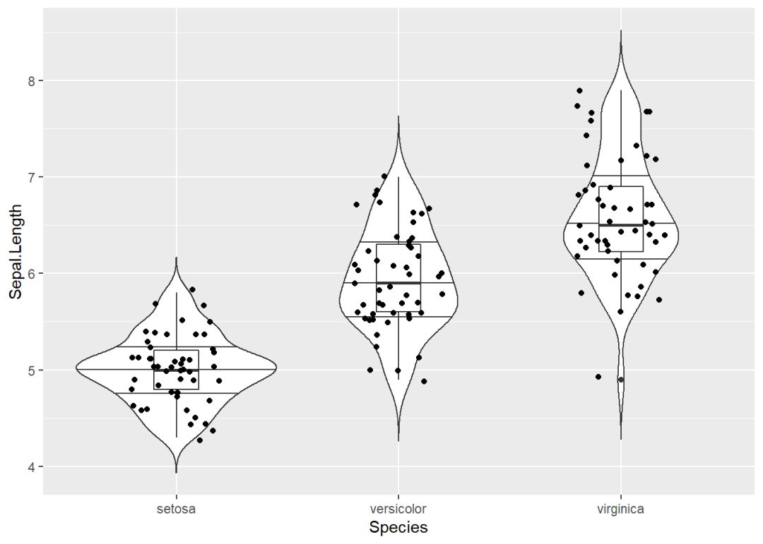
从图中可以发现,小提琴图绘制出的四分位水平线与箱形图对应的水平线并不完全重合。
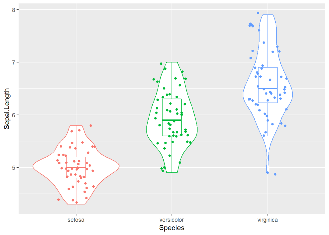
然后,可以通过映射函数aes对图形进行美化。此外,根据前图的效果,对相应参数的取值进行调整:
所有图形的颜色都根据
Species变量进行分组;小提琴图:
trim和draw_quantiles参数恢复默认值。
ggplot(data, aes(x = Species, y = Sepal.Length )) +
  geom_violin(aes(col = Species)) +
  geom_boxplot(aes(col = Species),width = 0.2) +
  geom_jitter(aes(col = Species), width = 0.2)

因为绘图函数较多,可以直接在ggplot中的映射函数中对颜色进行设置。
此外,图中的图例显得多余。因为它是由于在aes函数中对col参数设置而产生的,在guides函数中设置col = F可以将其去除。
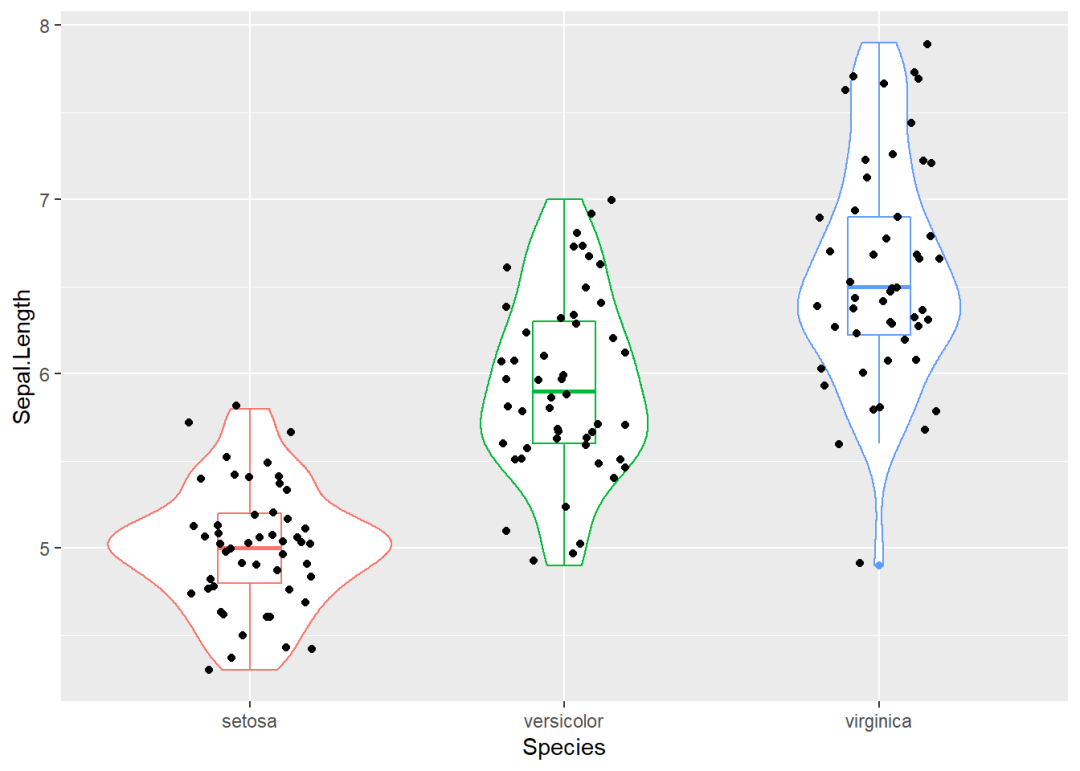
ggplot(data, aes(x = Species, y = Sepal.Length, col = Species)) +
  geom_violin() +
  geom_boxplot(width = 0.2) +
  geom_jitter(width = 0.2) +
  guides(col = F)
抖动图的散点颜色没必要进行分组设置,想让它始终保持为黑色,单独在相应函数中进行设置即可。
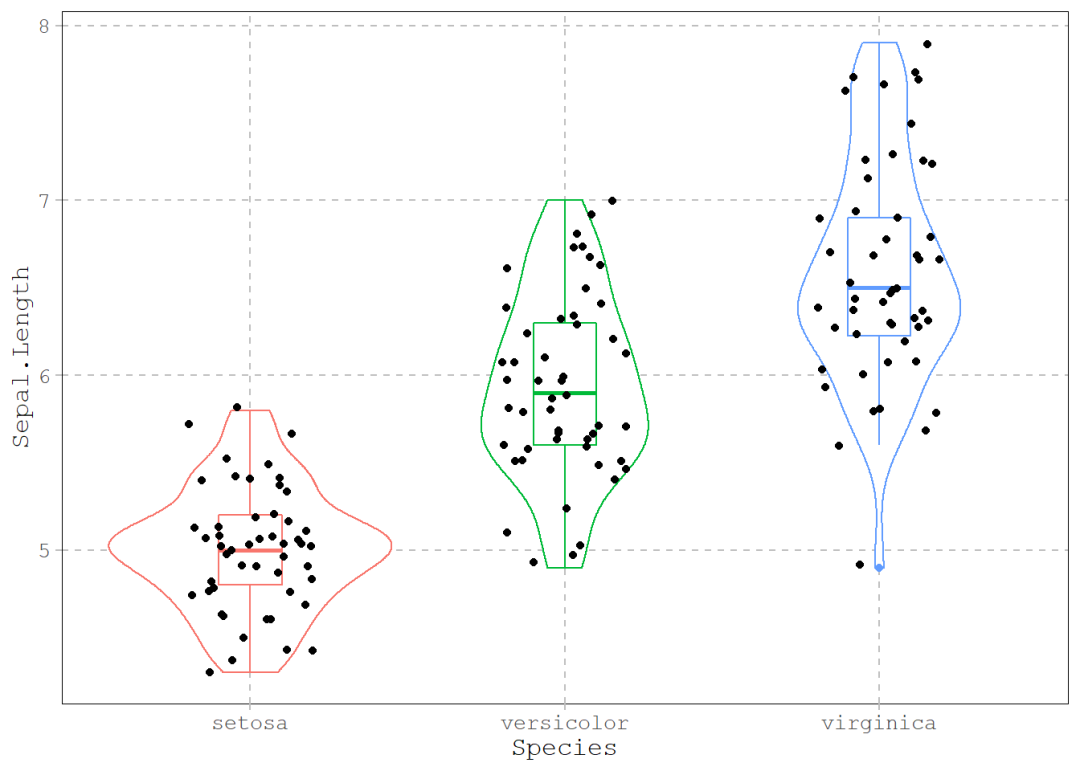
ggplot(data, aes(x = Species, y = Sepal.Length, col = Species),
       show.legend = F) +
  geom_violin() +
  geom_boxplot(width = 0.2) +
  geom_jitter(width = 0.2, col = "black") +
  guides(col = F) -> p
p
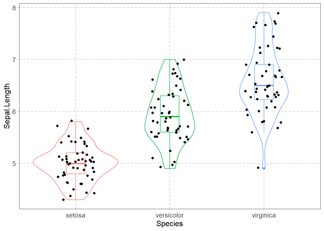
确定了图形的基本形态,再使用theme函数对其细节进行调整。这里仍然使用前篇推文的相关设置,直接复制过来即可。
p +
  theme( axis.line = element_line(color = "black", size = 0.2),
         axis.title = element_text(size = 12),
         axis.text = element_text(size = 10),
         axis.ticks = element_line(colour = "grey"),

         panel.background = element_blank(),
         panel.border = element_rect(fill = NA, size = 0.3),
         panel.grid.major = element_line(linetype = 2, colour = "grey", size = 0.5),

         plot.title = element_text(size = 12, hjust = 0.5)) -> p2
p2
ggplot2的theme函数的设置具有很好的可移植性。
最后,我们再调整下图中文本的字体:
text参数可以调整图中所有文本类要素的属性。
p2 +
  theme(text = element_text(family = "mono")) -> p3
p3


 1200
1200


 被折叠的 条评论
为什么被折叠?
被折叠的 条评论
为什么被折叠?
 到【灌水乐园】发言


