


弹性布局(Flex)提供更加有效的方式对容器中的子元素进行排列、对齐和分配剩余空间。常用于页面头部导航栏的均匀分布、页面框架的搭建、多行数据的排列等。
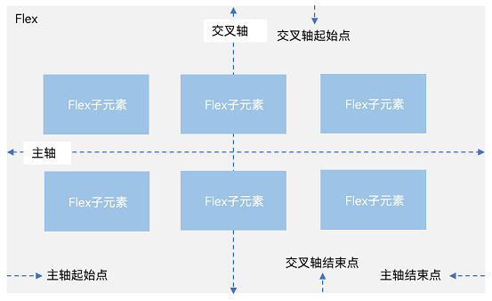
容器默认存在主轴与交叉轴,子元素默认沿主轴排列,子元素在主轴方向的尺寸称为主轴尺寸,在交叉轴方向的尺寸称为交叉轴尺寸。
图1 主轴为水平方向的Flex容器示意图
基本概念
-
主轴:Flex组件布局方向的轴线,子元素默认沿着主轴排列。主轴开始的位置称为主轴起始点,结束位置称为主轴结束点。
-
交叉轴:垂直于主轴方向的轴线。交叉轴开始的位置称为交叉轴起始点,结束位置称为交叉轴结束点。
布局方向
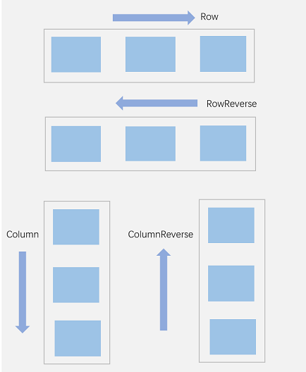
在弹性布局中,容器的子元素可以按照任意方向排列。通过设置参数direction,可以决定主轴的方向,从而控制子元素的排列方向。
图2 弹性布局方向图
-
FlexDirection.Row(默认值):主轴为水平方向,子元素从起始端沿着水平方向开始排布。
Flex({ direction: FlexDirection.Row }) {
  Text('1').width('33%').height(50).backgroundColor(0xF5DEB3)
  Text('2').width('33%').height(50).backgroundColor(0xD2B48C)
  Text('3').width('33%').height(50).backgroundColor(0xF5DEB3)
}
.height(70)
.width('90%')
.padding(10)
.backgroundColor(0xAFEEEE)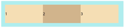
-
FlexDirection.RowReverse:主轴为水平方向,子元素从终点端沿着FlexDirection. Row相反的方向开始排布。
Flex({ direction: FlexDirection.RowReverse }) {
  Text('1').width('33%').height(50).backgroundColor(0xF5DEB3)
  Text('2').width('33%').height(50).backgroundColor(0xD2B48C)
  Text('3').width('33%').height(50).backgroundColor(0xF5DEB3)
}
.height(70)
.width('90%')
.padding(10)
.backgroundColor(0xAFEEEE)
-
FlexDirection.Column:主轴为垂直方向,子元素从起始端沿着垂直方向开始排布。
Flex({ direction: FlexDirection.Column }) {
  Text('1').width('100%').height(50).backgroundColor(0xF5DEB3)
  Text('2').width('100%').height(50).backgroundColor(0xD2B48C)
  Text('3').width('100%').height(50).backgroundColor(0xF5DEB3)
}
.height(70)
.width('90%')
.padding(10)
.backgroundColor(0xAFEEEE)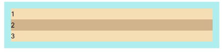
-
FlexDirection.ColumnReverse:主轴为垂直方向,子元素从终点端沿着FlexDirection. Column相反的方向开始排布。
Flex({ direction: FlexDirection.ColumnReverse }) {
  Text('1').width('100%').height(50).backgroundColor(0xF5DEB3)
  Text('2').width('100%').height(50).backgroundColor(0xD2B48C)
  Text('3').width('100%').height(50).backgroundColor(0xF5DEB3)
}
.height(70)
.width('90%')
.padding(10)
.backgroundColor(0xAFEEEE)
布局换行
弹性布局分为单行布局和多行布局。默认情况下,Flex容器中的子元素都排在一条线(又称“轴线”)上。wrap属性控制当子元素主轴尺寸之和大于容器主轴尺寸时,Flex是单行布局还是多行布局。在多行布局时,通过交叉轴方向,确认新行排列方向。
-
FlexWrap. NoWrap(默认值):不换行。如果子元素的宽度总和大于父元素的宽度,则子元素会被压缩宽度。
Flex({ wrap: FlexWrap.NoWrap }) {
  Text('1').width('50%').height(50).backgroundColor(0xF5DEB3)
  Text('2').width('50%').height(50).backgroundColor(0xD2B48C)
  Text('3').width('50%').height(50).backgroundColor(0xF5DEB3)
}
.width('90%')
.padding(10)
.backgroundColor(0xAFEEEE)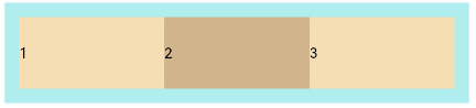
-
FlexWrap. Wrap:换行,每一行子元素按照主轴方向排列。
Flex({ wrap: FlexWrap.Wrap }) {
  Text('1').width('50%').height(50).backgroundColor(0xF5DEB3)
  Text('2').width('50%').height(50).backgroundColor(0xD2B48C)
  Text('3').width('50%').height(50).backgroundColor(0xD2B48C)
}
.width('90%')
.padding(10)
.backgroundColor(0xAFEEEE)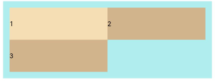
-
FlexWrap. WrapReverse:换行,每一行子元素按照主轴反方向排列。
Flex({ wrap: FlexWrap.WrapReverse}) {
  Text('1').width('50%').height(50).backgroundColor(0xF5DEB3)
  Text('2').width('50%').height(50).backgroundColor(0xD2B48C)
  Text('3').width('50%').height(50).backgroundColor(0xF5DEB3)
}
.width('90%')
.padding(1
 最低0.47元/天 解锁文章


 扫一扫
扫一扫


 1529
1529

 被折叠的 条评论
为什么被折叠?
被折叠的 条评论
为什么被折叠?
 到【灌水乐园】发言


