


本文是关于使用react、ts和antd组件实现的一个效果,当前组件已封装好,直接传值就可以使用了,基本原理是把antd组件里面的radio的组件进行一个修改,直接把原来的样式去掉,让他成纯文字的,点击就变颜色。也可以在此基础上进行二次开发,有需自取!
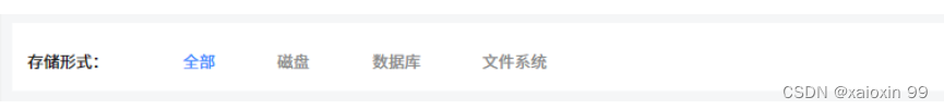
效果如图所示:
代码如下:
index.tsx
// RadioButtonGroup.tsx
import React, { useState } from 'react';
import { Radio } from 'antd';
import './index.scss';
/*
  Radio封装组件:
    必须传的参数:options,defaultValue,size
    可选参数:onSelect(),activeColor,buttonWidth

  参数的含义:
    options:选项,包含label和value属性,用法 options = {option},option =[{label:全部; value:'全部'}]
    defaultValue: 默认值,加载时展示什么,
    size:大小,只允许'small' || 'default' || 'large'
    onSelect():回调函数,用于处理单选按钮被选中时的逻辑。该函数接收一个参数 value,表示被选中的按钮的值。
                在 handleButtonClick 函数中,当单选按钮被点击时,会调用 onSelect 函数,并传递当前按钮的值 value 给它。
                这样,父组件可以通过传递一个 onSelect 回调函数来监听单选按钮的选中事件,并在选中时执行特定的业务逻辑。
    activeColor:激活时的颜色,默认#3B89FF
    buttonWidth:宽度,默认120px
 */

interface RadioButtonGroupProps {
  options: { label: string; value: string }[];
  defaultValue: string;
  size: string; // 字符串字面量联合类型
  onSelect?: (value: any) => void;
  activeColor?: string;
  buttonWidth?: string;
}

const RadioButtonGroup: React.FC<RadioButtonGroupProps> = ({
  options,
  defaultValue,
  onSelect,
  activeColor = '#3B89FF ',
  buttonWidth = '120px',
}) => {
  const [activeButton, setActiveButton] = useState(defaultValue);

  const handleButtonClick = (value: string) => {
    setActiveButton(value);
    if (onSelect) {
      onSelect(value);
    }
  };

  const getButtonStyle = (value: string) => ({
    border: 'none',
    background: '#fff',
    color: activeButton === value ? activeColor : 'black',
    width: buttonWidth,
    outline: 'none',
    boxShadow: 'none',
    borderRadius: '0',
    borderRight: 'none',
  });

  return (
    <div>
      <Radio.Group defaultValue={defaultValue} size={'small' || 'default' || 'large'} style={{ border: 'none' }}>
        {options.map((option) => (
          <Radio.Button
            key={option.value}
            value={option.value}
            style={getButtonStyle(option.value)}
            onClick={() => handleButtonClick(option.value)}
          >
            {option.label}
          </Radio.Button>
        ))}
      </Radio.Group>
    </div>
  );
};

export default RadioButtonGroup;
index.scss
.ant-radio-button-wrapper:not(:first-child)::before {
  background-color: transparent;
}

.skin-blue .ant-radio-button-wrapper-checked:not(.ant-radio-button-wrapper-disabled)::before {
  background: "none" !important;
  opacity: 0;
}

.ant-radio-button-wrapper::before {
  background-color: "none" !important;
  padding: 0 !important;
}

.skin-blue .ant-radio-button-wrapper-checked:not(.ant-radio-button-wrapper-disabled)::before {
  background: "none" !important;
  opacity: 0 !important;
}

.ant-radio-button-wrapper-checked:not(.ant-radio-button-wrapper-disabled) {

   border-color: none !important;
}
.skin-blue .ant-radio-button-wrapper-checked:not(.ant-radio-button-wrapper-disabled)::before {
  background: none !important;
}
.ant-radio-button-wrapper-checked:not(.ant-radio-button-wrapper-disabled)::before {
  background-color:  none !important;
}

.ant-radio-button-wrapper-checked:not(.ant-radio-button-wrapper-disabled)::before {
  background-color: none !important;
}
.skin-blue .ant-radio-button-wrapper-checked:not(.ant-radio-button-wrapper-disabled) {
  background-color: none !important;
  border-color:  none !important;

}
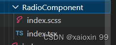
文件路径如下:


 扫一扫
扫一扫


 975
975

 被折叠的 条评论
为什么被折叠?
被折叠的 条评论
为什么被折叠?
 到【灌水乐园】发言


