


疫情可视化-seaborn+pyspark+pyecharts(内附报告)
1、要求:
数据集自定,以Pvthon为编程语言,使用Spark对数据进行分析,并对分析结果进行可视化。
具体包括以下几部分:
(1)实验环境
(2)实验数据集
(3)pyspark的分析
(4)结果可视化
2、疫情数据爬取
目标网页:bd疫情报告

我的最初想法认为数据是通过异步加载,通过分析结构发现数据就在网页中,只是它位于js代码中,是通过js定位然后传入数据。
我直接通过xpath定位数据id到数据所在位置

但是该出数据量很大,经过json化和长时间的结构分析,得出国内的数据在
国外数据
但是要求是国外前二十的数据,并没有在结构中发现,于是拿出所有的国外疫情数据,在后续编写代码进行提取。
[外链图片转存失败,源站可能有防盗链机制,建议将图片保存下来直接上传(img-D9ZB2jPP-1669302363945)(file:///C:\Users\86180\AppData\Local\Temp\ksohtml16984\wps5.png)]
以上拿出所有的国内外数据,下一步通过seaborn和matpoltlib进行数据的可视化展示
代码
from lxml import etree
import json
import requests
import pandas as pd

#爬取的网址(bd疫情)
url="https://www.xxxx.com"
#伪装请求头
headers ={'User-Agent':'Mozilla/xx'}
#获取网页地址
response=requests.get(url,timeout=30,headers=headers)
print(response.text)
html=etree.HTML(response.text)
#在网页中寻找我们想要的数据(可以找到对应标签右键复制xpath)
result=html.xpath('//*[@id="captain-config"]/text()')
#print(result)
#result[0]不是真正的字典类型,而是json字符串
#需要通过json.loads转化json字符串为Python的字典类型
result=json.loads(result[0])
#print(result)
#一层一层找自己所用到的数据
result_out=result["component"][0]
print(result_out)

#获取国内疫情数据(找到了
result_in=result["component"][0]["caseList"]
# print(result_in)

ws=[]
#用append生成表第一行
time=result["component"][0]['mapLastUpdatedTime']
#循环遍历数据,按照位置顺序,将数据加入到excel中
for each in result_in:
    temp_list=[each['area'],each['confirmed'],each['died'],each['crued'],each['confirmedRelative']]
    ws.append(temp_list)
ws_df=pd.DataFrame(ws)
ws_df.to_csv("china_data.csv",mode="a", index=False, encoding='utf_8_sig',header=['国家','累计确诊','死亡','治愈','新增'])
#获取国外疫情数据
result_for=result["component"][0]['caseOutsideList']
fws=[]
#循环遍历数据,按照位置顺序,将数据加入到excel中
for each in result_for:
    temp_list=[each['area'],each['confirmed'],each['died'],each['crued'],each['confirmedRelative']]
    fws.append(temp_list)
fws_df = pd.DataFrame(fws)
fws_df.to_csv("forien_data.csv", mode="a", index=False, encoding='utf_8_sig',header=['国家','累计确诊','死亡','治愈','新增'])
3、pyspark数据处理
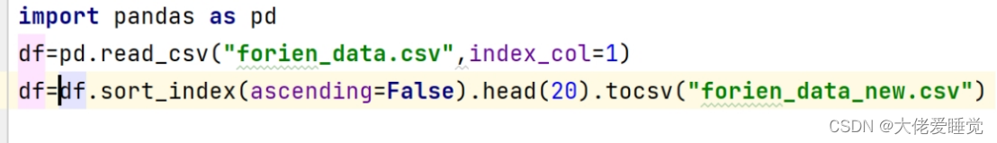
原始数据集是以.csv文件组织的,为了方便spark读取生成RDD或者DataFrame,读取数据为dataframe,通过累计确诊排序取出前十个国家。
具体代码如下:
from pyspark.sql import SparkSession
import findspark

findspark.init()
spark=SparkSession.builder.appName("data_processing").getOrCreate()

df=spark.read.csv('forien_data.csv',inferSchema=True,header=True).sort(["累计确诊"]).collect()[:10]
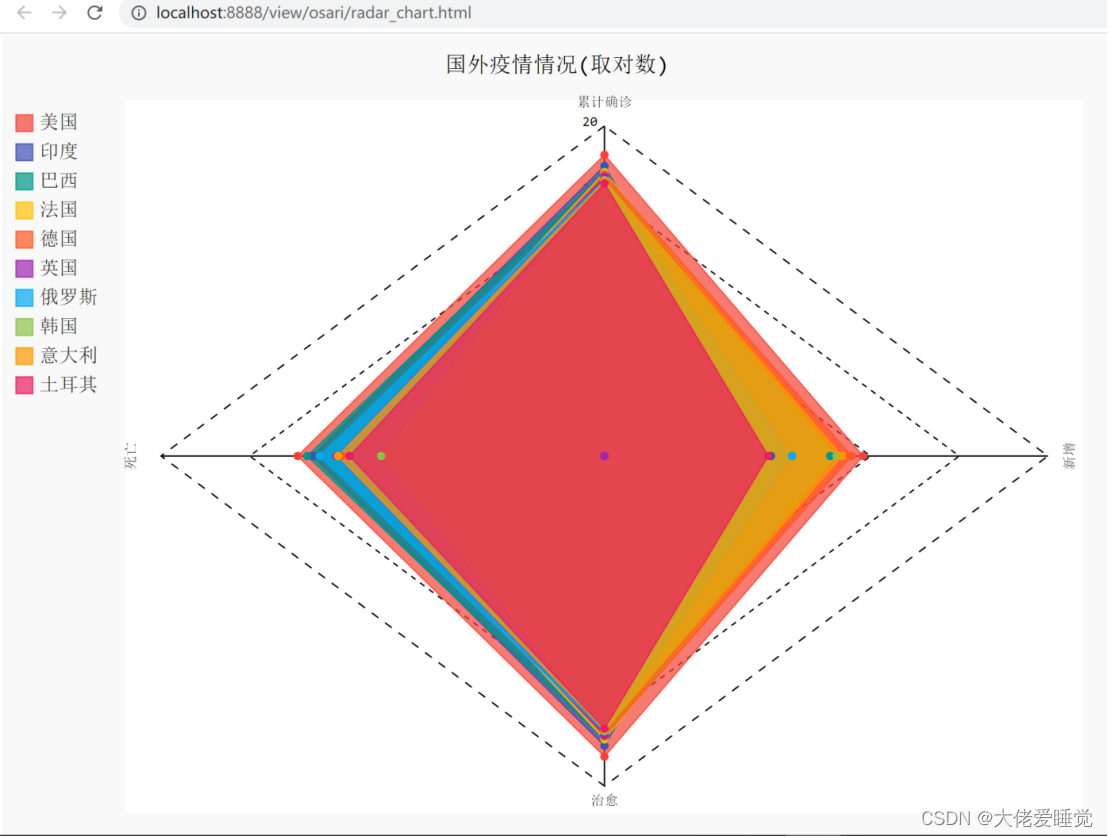
4、seaborn数据可视化
选择使用python第三方库pyecharts作为可视化工具。
在使用前,需要安装pyecharts,安装代码如下:
pip install pyecharts
具体可视化实现代码组织与定义一个draw_Radar函数,对得到的数据分别采集进入数据内容,生成radar_chart.html
from pyspark.sql import SparkSession
import findspark
from pyecharts import options as opts
from pyecharts.charts import Radar
from pyecharts.commons.utils import JsCode

findspark.init()
spark=SparkSession.builder.appName("data_processing").getOrCreate()

def draw_Radar(data_radar):
    scope=[]

    for col in range(1, data_radar.shape[1]):
        dic = {}
        dic['name'] = data_radar.columns[col]
        dic['max'], dic['min'] = max(data_radar.iloc[:, col]), 0
        scope.append(dic)
    c = (
        # Radar()
        Radar(init_opts=opts.InitOpts(bg_color={"type": "pattern", "image": JsCode("img"), "repeat": "no-repeat"}))
            .add_js_funcs("""    var img = new Image();
                              img.src = '背景.jpg';    """)
            .add_schema(
            schema=scope,
            shape="circle",
            center=["50%", "50%"],  # 宽高:900px*500px
            radius="60%",
            angleaxis_opts=opts.AngleAxisOpts(
                min_=0,
                max_=360,
                is_clockwise=False,
                interval=10,
                axistick_opts=opts.AxisTickOpts(is_show=True),
                axislabel_opts=opts.LabelOpts(is_show=True),
                axisline_opts=opts.AxisLineOpts(is_show=True),
                splitline_opts=opts.SplitLineOpts(is_show=True)
            ),
            radiusaxis_opts=opts.RadiusAxisOpts(
                min_=0,
                max_=30,
                interval=5,
                splitarea_opts=opts.SplitAreaOpts(
                    is_show=True, areastyle_opts=opts.AreaStyleOpts(opacity=1)
                ),
            ),
            polar_opts=opts.PolarOpts(),
            splitline_opt=opts.SplitLineOpts(is_show=False)
        )
            .add(
            series_name="美国",
            data=data_radar[0],
            areastyle_opts=opts.AreaStyleOpts(opacity=0.2),
            linestyle_opts=opts.LineStyleOpts(width=2),
            color='#fc5a50'
        )

            .set_series_opts(label_opts=opts.LabelOpts(is_show=False))
            .set_global_opts(title_opts=opts.TitleOpts(title='员工评价', subtitle='林老头ss', pos_left='left'))
            .render("雷达图示例.html")
    )
if __name__ == '__main__':
    df=spark.read.csv('forien_data.csv',inferSchema=True,header=True).sort(["累计确诊"]).collect()[:10]
    draw_Radar(df)
绘制的图像展示
如果需要绘制其他图像,直接根据我提供的数据,找一些pyecharts模板,把数据放进去就可以绘制了
报告为spark6


 3933
3933


 被折叠的 条评论
为什么被折叠?
被折叠的 条评论
为什么被折叠?
 到【灌水乐园】发言


