


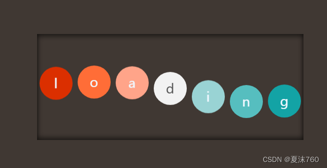
今天我们来实现一个好玩的动画,会跳跃的LOGO。
这个案例主要运用的也是css3的动画效果来实现的,通过设置keyframes动画的不同阶段的动画效果来实现。
这个案例的主要思路就是设置keyframes不同百分比的时候的动画效果,这个调起来稍微麻烦一点。因为这个动画的每个字母的下落时间不一样,我们还需要设置每个字母的下落时间。
不废话,上代码!!!
<!DOCTYPE html>
<html lang="en">

<head>
    <meta charset="UTF-8">
    <meta http-equiv="X-UA-Compatible" content="IE=edge">
    <meta name="viewport" content="width=device-width, initial-scale=1.0">
    <title>Document</title>
    <style>
        /* 先给盒子设置一个样式 */
        .box {
            width: 532px;
            height: 212px;
            background-color: rgb(80, 61, 37);
            /* 这里我们给盒子设置一个内阴影效果,如果不设置inset属性,他的阴影是在外边的 */
            box-shadow: 0px 0px 9px 7px #333 inset;
            /* 这里我们要设置一个超出隐藏效果,因为我们要设置字母的下落距离,不隐藏的话字母下落的距离超过盒子,视觉效果会大打折扣 */
            overflow: hidden;
        }

        /* 这里我们给每个字母设置一个样 并且让他左浮动*/
        .box>div {
            height: 66px;
            float: left;
            margin: 0px 5px;
            text-align: center;
            line-height: 66px;
            font-size: 20px;
            font-weight: bold;
            /* 在这里我们先给字母设置一下translateY属性让他向上移动一段距离,如果不设置的话字母是从盒子
            的内边下落的,效果很差,所以我们可以让字母再向上移动一些 在让字母落下来*/
            transform: translateY(-68px);
        }

        /* 和上一个案例相似,因为给div一个一个加class类名太麻烦,所以我们会是使用选择器来选择div */
        .box>div:nth-child(1) {
            display: inline-block;
            width: 66px;
            height: 66px;
            border-radius: 50%;
            background-color: rgb(233, 60, 60);
            color: #f0f8ff;
            /* 这里我们设置动画效果,给动画起一个名字,设置旋转动画的时间 ,让动画从头到尾的速度是相同的
            并让他无限循环播放,最后让他从最后一帧开始动画*/
            animation: go 2.5s linear infinite forwards;
        }

        .box>div:nth-child(2) {
            display: inline-block;
            width: 66px;
            height: 66px;
            border-radius: 50%;
            background-color: rgb(243, 129, 52);
            color: #f0f7fe;
            animation: go 2.5s linear infinite forwards;
            /* 由于字母的下落时间都是不一样的,所以我们可以给除了第一个字母外的其他字母加上一个延迟时间,让
            每个字母下落的时候都比前一个字母晚一点下落*/
            animation-delay: 0.1s;
        }

        .box>div:nth-child(3) {
            display: inline-block;
            width: 66px;
            height: 66px;
            border-radius: 50%;
            background-color: rgb(245, 146, 54);
            color: #f0f6fc;
            animation: go 2.5s linear infinite forwards;
            animation-delay: 0.2s;
        }

        .box>div:nth-child(4) {
            display: inline-block;
            width: 66px;
            height: 66px;
            border-radius: 50%;
            background-color: rgb(255, 254, 254);
            color: #555;
            animation: go 2.5s linear infinite forwards;
            animation-delay: 0.3s;
        }

        .box>div:nth-child(5) {
            display: inline-block;
            width: 66px;
            height: 66px;
            border-radius: 50%;
            background-color: rgb(137, 209, 214);
            color: #f0f8ff;
            animation: go 2.5s linear infinite forwards;
            animation-delay: 0.4s;
        }

        .box>div:nth-child(6) {
            display: inline-block;
            width: 66px;
            height: 66px;
            border-radius: 50%;
            background-color: rgb(107, 182, 212);
            color: #f0f8ff;
            animation: go 2.5s linear infinite forwards;
            animation-delay: 0.5s;
        }

        .box>div:nth-child(7) {
            display: inline-block;
            width: 66px;
            height: 66px;
            border-radius: 50%;
            background-color: rgb(43, 107, 133);
            color: #f0f8ff;
            animation: go 2.5s linear infinite forwards;
            animation-delay: 0.6s;
        }

        /* 这里我们来设置动画,通过使用百分比的格式来设置动画。 */
        @keyframes go {
            10% {
                transform: translateY(75px);
            }

            30% {
                transform: translateY(50px);
            }

            70% {
                transform: translateY(75px);
            }

            80% {
                transform: translateY(50px);
            }

            95% {
                transform: translateY(250px);
            }

            100% {
                transform: translateY(250px);
            }
        }
    </style>
</head>

<body>
    <div class="box">
        <div>l</div>
        <div>o</div>
        <div>a</div>
        <div>d</div>
        <div>i</div>
        <div>n</div>
        <div>g</div>
    </div>
</body>

</html>
这个动画效果实现起来还是比较容易的,有一点麻烦的是调节他的动画效果,在不同的百分比的状态下来调节运动的幅度有一丢丢麻烦。
如有错误请指正


 扫一扫
扫一扫


 2305
2305

 被折叠的 条评论
为什么被折叠?
被折叠的 条评论
为什么被折叠?
 到【灌水乐园】发言


