


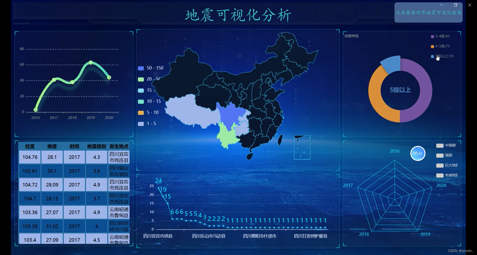
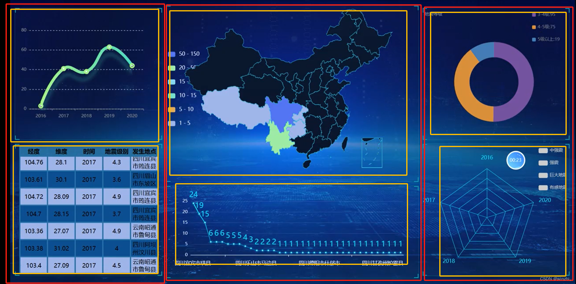
本系列文章最终呈现效果如下
1、大屏整体
可视化大屏分为头部和内容
<body>
<header>可视化大屏头部</header>
<div>主体内容</div>
</body>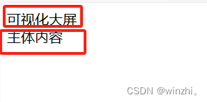
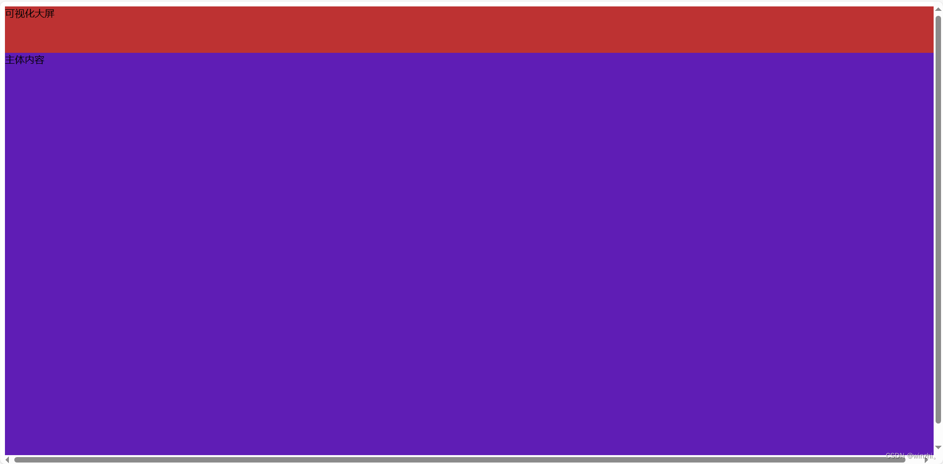
我们将电脑屏幕横纵比例都分为100%
大屏头部高为10%,主体内容百分之90%,宽都为100%
<style>
    header {
      height: 10vh;/*vw,vh:当前视窗宽高的百分比,100vh代表视窗高的100%*/
      width: 100vw;
      background-color: #bd3232;
    }

    .box {
      height: 90vh;
      width: 100vw;
      background-color: #5f1db5;//建议开发时填充背景色,适当调整
    }
  </style>

</head>

<body>


  <header>可视化大屏</header>
  <div class="box">主体内容</div>

</body>
给头部、主题部分设置宽高后页面展示效果:
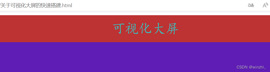
2、头部字体调整
<style>
    header {
      height: 10vh;
      width: 100vw;
      background-color: #bd3232;
      /* 字体居中 */
      font-family: "楷体";
      /*字体颜色*/
      color: rgb(51, 190, 190);
      /*文字居中*/
      text-align: center;
      /*上下居中*/
      line-height: 10vh;
      /*文字大小*/
      font-size: 5vh;
    }
    .box {
      height: 90vh;
      width: 100vw;
      background-color: #5f1db5;  /*建议开发时填充背景色,适当调整*/
    }
  </style>
</head>
<body>
  <header>可视化大屏</header>
  <div class="box">主体内容</div>
</body>
大屏头部效果:
3、大屏内容部分
分析最终搭建的划分布局结构:
主要为三部分如图左中右(红框),六小板块(黄框)
这六个小板块分别在左中右三个div盒子中
相应盒子结构代码:
  <header>可视化大屏</header>
  <div class="box">

    <div class="left">
      <div></div>
      <div></div>
    </div>
    <div class="center">
      <div></div>
      <div></div>
    </div>
    <div class="right">
      <div></div>
      <div></div>
    </div>
  </div>
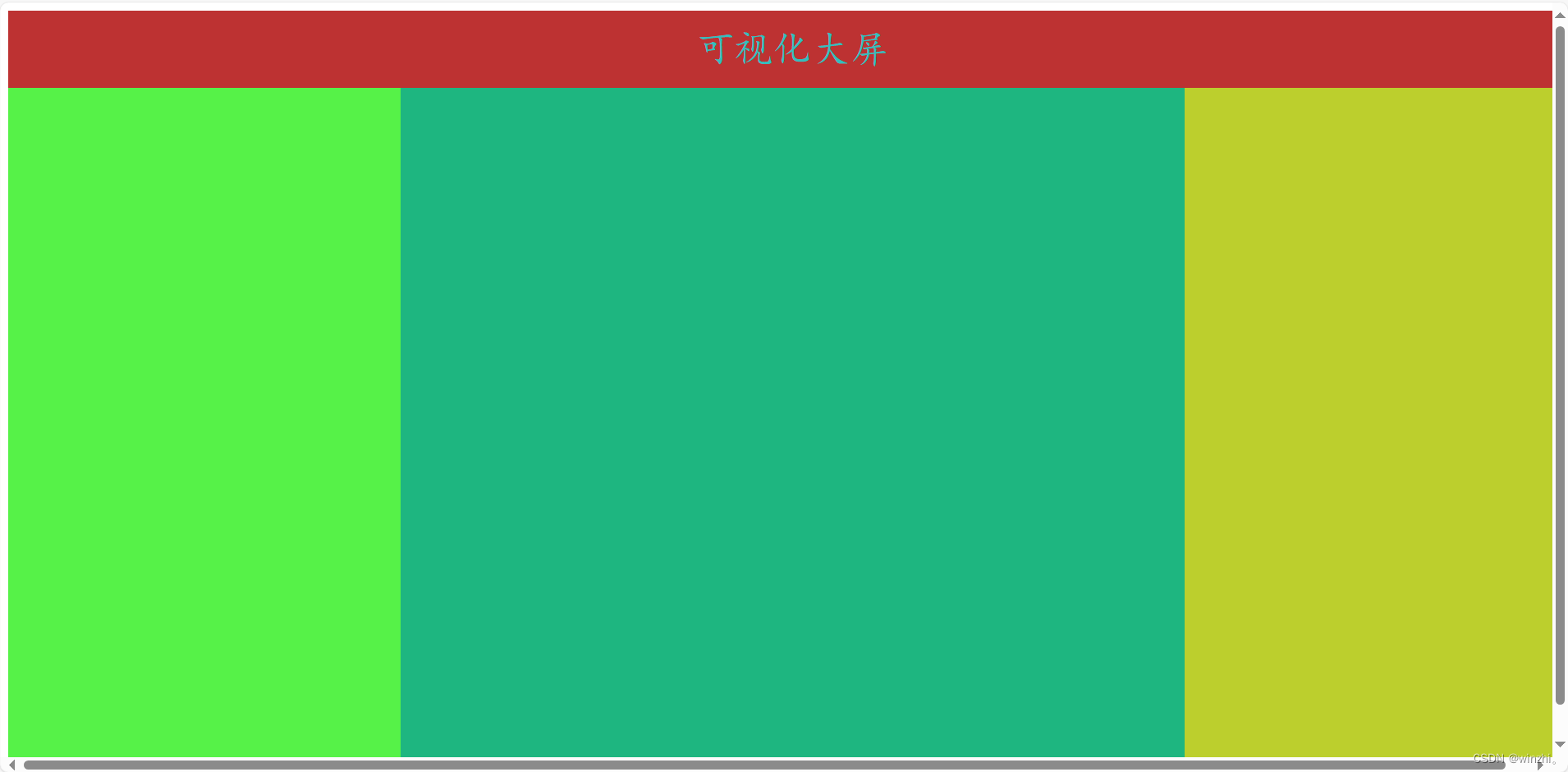
1、左中右三个盒子布局
博主布局一般使用弹性盒子(display:flex),左中右盒子的父级(box)主体大盒子样式添加以下属性,左中右盒子设设置大小
<style>
    .box {
      height: 90vh;
      width: 100vw;
      background-color: #5f1db5;
      /* 弹性布局 */
      display: flex;/*弹性布局,默认主轴方向为x轴方向*/
    }
    .left {
      flex: 1;/*flex继承主轴方向上的大小比例*/
      height: 90vh;
      /*或者100%,继承父级高度*/
      /* 宽可以 */
      background-color: #56f248;
    }
    .center {
      flex: 2;
      height: 90vh;
      background-color: #1eb680;
    }
    .right {
      flex: 1;
      height: 90vh;
      background-color: #bccf2d;
    }
  </style>
</head>
<body>
  <header>可视化大屏</header>
  <div class="box">
    <div class="left">
      <div></div>
      <div></div>
    </div>
    <div class="center">
      <div></div>
      <div></div>
    </div>
    <div class="right">
      <div></div>
      <div></div>
    </div>
  </div>
</body>
展示效果如下
2、左右盒子的上下四个小盒子
由于左右盒子的四个小盒子对称大小相等所以控制盒子大小等可以直接用一个一样的类选择器减少代码量
但是首先得为四个小盒子父级:左右盒子设置flex属性,并将主轴方向设置为y轴方向
<style>
    header {
      height: 10vh;
      width: 100vw;
      background-color: #bd3232;
      font-family: "楷体";
      color: rgb(51, 190, 190);
      text-align: center;
      line-height: 10vh;
      font-size: 5vh;
    }
    .box {
      height: 90vh;
      width: 100vw;
      background-color: #5f1db5;
      /* 弹性布局 */
      display: flex;
      /*弹性布局,默认主轴方向为x轴方向*/
    }
    .left {
      flex: 1;
      /*flex继承主轴方向上的大小比例*/
      height: 90vh;
      /*或者100%,继承父级高度*/
      /* 宽可以 */
      background-color: #56f248;
      display: flex;
      flex-direction: column;/*修改主轴方向为y轴方向*/
    }
    .center {
      flex: 2;
      height: 90vh;
      background-color: #1eb680;
      display: flex;
      flex-direction: column;
    }
    .right {
      flex: 1;
      height: 90vh;
      background-color: #bccf2d;
      display: flex;
      flex-direction: column;
    }
    .four {
      flex: 1;
      width: 100%;
      /*设置宽度继承父级*/
      background-color: #fff;
      border: solid 1px red;/*设置边框便于观察*/
    }
  </style>
</head>
<body>
  <header>可视化大屏</header>
  <div class="box">
    <div class="left">
      <div class="four"></div>
      <div class="four"></div>
    </div>
    <div class="center">
      <div></div>
      <div></div>
    </div>
    <div class="right">
      <div class="four"></div>
      <div class="four"></div>
    </div>
  </div>
</body>
展示效果如下
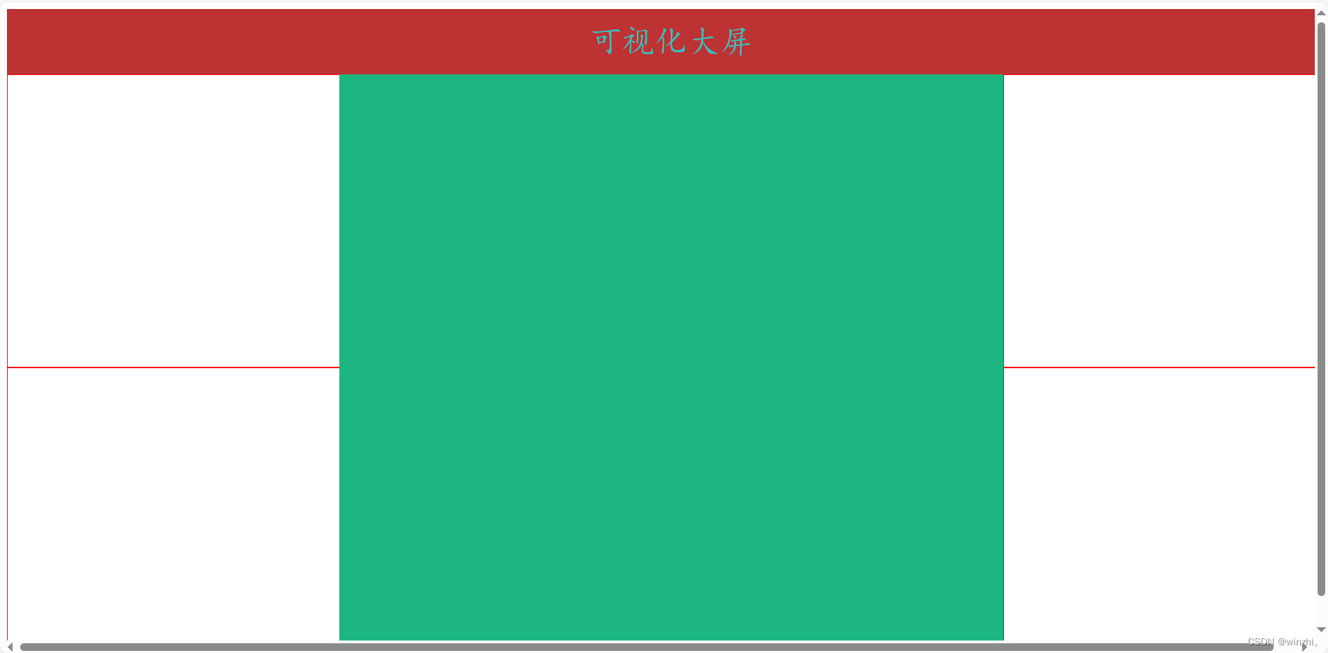 3、中间盒子的上下两个小盒子
中间盒子的上下两个小盒子同四个小盒子一样,不过得单独设置
也要给父级盒子设置display:flex属性
代码如下:
<style>
    header {
      height: 10vh;
      width: 100vw;
      background-color: #bd3232;
      font-family: "楷体";
      color: rgb(51, 190, 190);
      text-align: center;
      line-height: 10vh;
      font-size: 5vh;
    }
    .box {
      height: 90vh;
      width: 100vw;
      background-color: #5f1db5;
      /* 弹性布局 */
      display: flex;
      /*弹性布局,默认主轴方向为x轴方向*/
    }

    .left {
      flex: 1;
      /*flex继承主轴方向上的大小比例*/
      height: 90vh;
      /*或者100%,继承父级高度*/
      /* 宽可以 */
      background-color: #56f248;
      display: flex;
      flex-direction: column;
      /*修改主轴方向为y轴方向*/
    }

    /* 中间盒子 */
    .center {
      flex: 2;
      height: 90vh;
      background-color: #1eb680;
      display: flex;
      flex-direction: column;
    }

    /*中间盒子上下两个小盒子*/
    .top {
      flex: 1;
      height: 45vh;
      background-color: #b91515;

    }

    .buttom {
      flex: 0.7;
      height: 45vh;
      background-color: #461aab;

    }

    .right {
      flex: 1;
      height: 90vh;
      background-color: #bccf2d;
      display: flex;
      flex-direction: column;
    }
    .four {
      flex: 1;
      width: 100%;
      /*设置宽度继承父级*/
      background-color: #fff;
      border: solid 1px red;
    }
  </style>
</head>

<body>
  <header>可视化大屏</header>
  <div class="box">
    <div class="left">
      <div class="four"></div>
      <div class="four"></div>
    </div>
    <div class="center">
      <div class="top"></div>
      <div class="buttom"></div>
    </div>
    <div class="right">
      <div class="four"></div>
      <div class="four"></div>
    </div>
  </div>
</body>
效果如下:
到此可视化大屏的简单搭建完成:剩下的便是对布局的修饰美化过程
给winzhi点点关注下期文章不迷路
下期文章:《关于可视化大屏布局快速搭建2》
-----关于flex可视化大屏布局修饰美化,主侧轴(xy轴)的排列方式


 扫一扫
扫一扫


 1304
1304

 被折叠的 条评论
为什么被折叠?
被折叠的 条评论
为什么被折叠?
 到【灌水乐园】发言


