


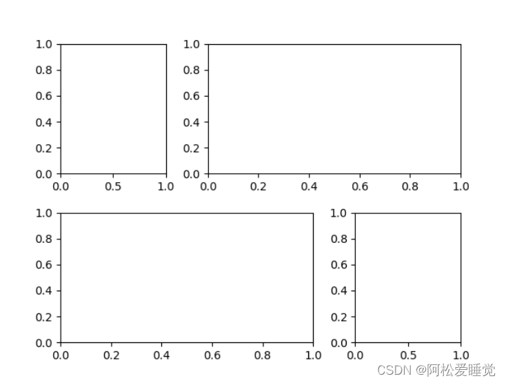
除了网格子图,
matplotlib还支持不规则的多行多列子图网格。
plt.GridSpec()对象本事不能直接创建一个图形,他只是 plt.subplot()命令可以识别的简易接口。
这里创建了一个带行列间距的2×3网格:
grid = plt.GridSpec(2, 3, wspace=0.4, hspace=0.3)
plt.GridSpec()支持通过类似python切片的语法设置子图的位置和扩展尺寸:
plt.subplot(grid[0, 0])
plt.subplot(grid[0, 1:])
plt.subplot(grid[1, :2])
plt.subplot(grid[1, 2])
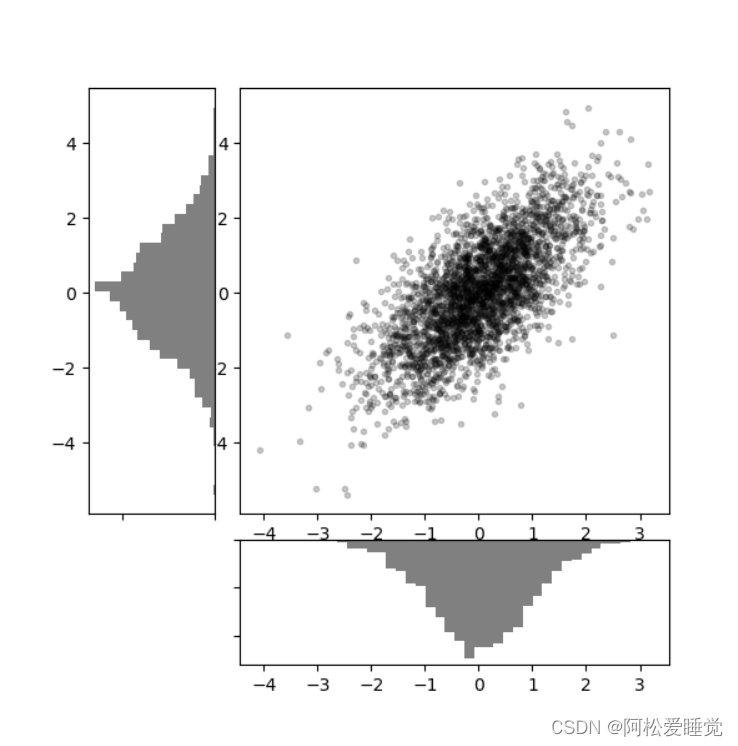
这种灵活的网格排列方式用途十分广泛,接下来我们用它创建多轴频次直方图:
# 创建一些正态分布数据
mean = [0, 0]
cov = [[1, 1], [1, 2]]
x, y = np.random.multivariate_normal(mean, cov, 3000).T
# 设置坐标轴和网格配置方式
fig = plt.figure(figsize=(6, 6))
grid = plt.GridSpec(4, 4, hspace=0.2, wspace=0.2)
main_ax = fig.add_subplot(grid[:-1, 1:])
y_hist = fig.add_subplot(grid[:-1, 0], xticklabels=[], sharey=main_ax)
x_hist = fig.add_subplot(grid[-1, 1:], yticklabels=[], sharex=main_ax)
# 主坐标轴画散点图
main_ax.plot(x, y, 'ok', markersize=3, alpha=0.2)
# 次坐标轴画频次直方图
x_hist.hist(x, 40, histtype='stepfilled',
orientation='vertical', color='gray')
x_hist.invert_yaxis()
y_hist.hist(y, 40, histtype='stepfilled',
orientation='horizontal', color='gray')
y_hist.invert_xaxis()


 542
542


 被折叠的 条评论
为什么被折叠?
被折叠的 条评论
为什么被折叠?
 到【灌水乐园】发言


