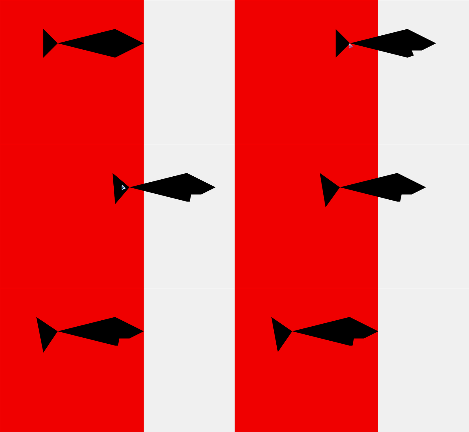
<!DOCTYPE html>
<html>
	<head>
		<meta charset="utf-8" />
		<title></title>
		<style type="text/css">
			body,html{
				margin:0px;
				padding:0px;
			}
			section{
				position: absolute;
				width:600px;
				height:600px;
				background:red;
				transition: all 1s;
				transform: rotate(0deg);
			}
			section:hover .fig{
				transition: all 1s;

				/*transform:scale(2.4);*/
				transform:translate(50%);

			}
			.fig{
				background: #090909;
				position: absolute;
			  	top: 0;
			  	right: 0;
			  	bottom: 0;
			  	left: 0;
			  	transition: all 1s;
				transform: rotate(0deg);
			  	/*-webkit-transition: all .3s;
 				 transition: all .3s;*/
			}
			.fig {
				  -webkit-animation: fish 0.5s linear infinite alternate;
				          animation: fish 0.5s linear infinite alternate;/*alternate会将css倒叙执行*/
				  }
			@-webkit-keyframes fish {
  0%, 30% {
    -webkit-clip-path: polygon(80% 20%, 100% 30%, 90% 35%, 83% 35%, 82% 40%, 80% 40%, 40% 30%, 30% 40%, 30% 20%, 40% 30%);
            clip-path: polygon(80% 20%, 100% 30%, 90% 35%, 83% 35%, 82% 40%, 80% 40%, 40% 30%, 30% 40%, 30% 20%, 40% 30%);
  }
  30%, 60%{
  	-webkit-clip-path: polygon(80% 20%, 100% 30%, 90% 35%, 83% 35%, 82% 40%, 80% 40%, 40% 30%, 30% 45%, 25% 20%, 40% 30%);
            clip-path: polygon(80% 20%, 100% 30%, 90% 35%, 83% 35%, 82% 40%, 80% 40%, 40% 30%, 30% 45%, 25% 20%, 40% 30%);
  }
  60%, 90%{
  	-webkit-clip-path: polygon(80% 20%, 100% 30%, 90% 35%, 83% 35%, 82% 40%, 80% 40%, 40% 30%, 30% 40%, 30% 20%, 40% 30%);
            clip-path: polygon(80% 20%, 100% 30%, 90% 35%, 83% 35%, 82% 40%, 80% 40%, 40% 30%, 30% 40%, 30% 20%, 40% 30%);
  }
  90%, 100% {
    -webkit-clip-path: polygon(80% 20%, 100% 30%, 90% 35%, 83% 35%, 90% 35%, 80% 40%, 40% 30%, 30% 40%, 30% 20%, 40% 30%);
            clip-path: polygon(80% 20%, 100% 30%, 90% 35%, 83% 35%, 90% 35%, 80% 40%, 40% 30%, 30% 40%, 30% 20%, 40% 30%);
  }
}
			@keyframes fish {
  0%, 30% {
    -webkit-clip-path: polygon(80% 20%, 100% 30%, 90% 35%, 83% 35%, 82% 40%, 80% 40%, 40% 30%, 30% 40%, 30% 20%, 40% 30%);
            clip-path: polygon(80% 20%, 100% 30%, 90% 35%, 83% 35%, 82% 40%, 80% 40%, 40% 30%, 30% 40%, 30% 20%, 40% 30%);
  }
  30%, 60%{
  	-webkit-clip-path: polygon(80% 20%, 100% 30%, 90% 35%, 83% 35%, 82% 40%, 80% 40%, 40% 30%, 30% 45%, 25% 20%, 40% 30%);
            clip-path: polygon(80% 20%, 100% 30%, 90% 35%, 83% 35%, 82% 40%, 80% 40%, 40% 30%, 30% 45%, 25% 20%, 40% 30%);
  }
  60%, 90%{
  	-webkit-clip-path: polygon(80% 20%, 100% 30%, 90% 35%, 83% 35%, 82% 40%, 80% 40%, 40% 30%, 30% 40%, 30% 20%, 40% 30%);
            clip-path: polygon(80% 20%, 100% 30%, 90% 35%, 83% 35%, 82% 40%, 80% 40%, 40% 30%, 30% 40%, 30% 20%, 40% 30%);
  }
  90%, 100% {
    -webkit-clip-path: polygon(80% 20%, 100% 30%, 90% 35%, 83% 35%, 90% 35%, 80% 40%, 40% 30%, 30% 40%, 30% 20%, 40% 30%);
            clip-path: polygon(80% 20%, 100% 30%, 90% 35%, 83% 35%, 90% 35%, 80% 40%, 40% 30%, 30% 40%, 30% 20%, 40% 30%);
  }
}
		</style>
	</head>
	<body>
		<section>
			<div class="fig"></div>
		</section>
	</body>
</html>
下面是代码链接


 459
459


 被折叠的 条评论
为什么被折叠?


